CSS Animation – Tokyo Tower Neon Sign
Tokyo’s skyline is iconic, mixing the traditional and high-tech. Let’s make a CSS-animated Tokyo Tower neon sign in this step-by-step article.
Introduction
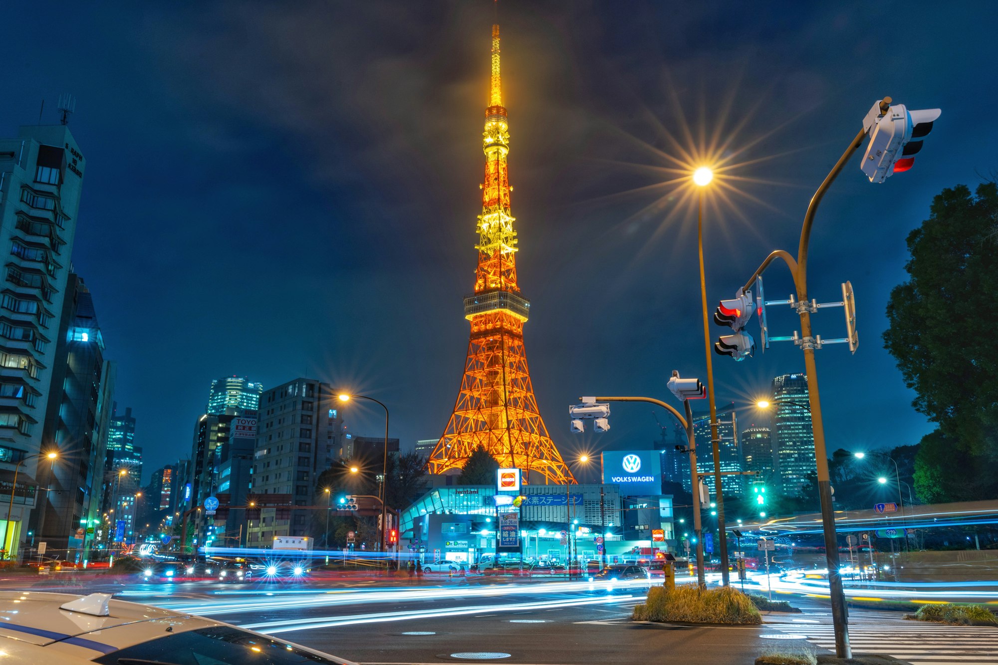
Tokyo Tower is a world-renowned landmark, decorating the Tokyo skyline.
In this article, you’ll learn to animate a Tokyo Tower neon sign using CSS. You’ll combine the CSS opacity property and @keyframes at-rule percentage keyframes to control the neon sign animation.
Preview

The Tokyo Tower neon sign has three animation components:
- The circle shape
- Tokyo Tower
- Tokyo text
You will be animating this neon sign CSS art.
 Pyxofy
Prerequisites
Essential CSS and HTML knowledge will help you understand the concepts and techniques introduced in this article. Jump over to this article if you require an HTML and CSS primer.
We assume that you have set up tools to manipulate CSS. If you haven’t, this article will show you how to set them up.
Please read this article if you’re unfamiliar with CSS animation and the @keyframes at-rule property.
HTML Structure
<div class="container">
  <!-- Tokyo Tower Neon Sign -->
  <div class="circle"></div>
  <div class="tokyo-tower">
    <div class="antenna"></div>
    <div class="main-deck"></div>
    <div class="top-deck"></div>
    <div class="spire-shadow">
      <div class="spire-border"></div>
      <div class="spire-inset"></div>
      <div class="spire"></div>
    </div>
    <div class="base-spire-shadow">
      <div class="base-spire-border"></div>
      <div class="base-spire-inset"></div>
      <div class="base-spire"></div>
    </div>
    <div class="arch"></div>
    <div class="base"></div>
  </div>
  <div class="tokyo-text">
    <span>T</span>
    <span class="flicker">O</span>
    <span>K</span>
    <span>Y</span>
    <span class="flicker">O</span>
  </div>
</div>
container is the outermost enclosure. It enables the content to be centered and draws a light gray border. The rest of the divs represent each animation sequence.
Keep the HTML structure as is for the animation to display correctly.
Body and Container Div CSS
CSS code for the body and container div.
/* Body and Container Settings */
/* Center shapes */
body {
  margin: 0;
  padding: 0;
  height: 100vh;
  display: flex;
  justify-content: center;
  align-items: center;
  flex-wrap: wrap;
}

/* Set background and border color */
.container {
  min-width: 500px;
  height: 500px;
  border: 5px solid lightgray;
  background: black;
  position: relative;
  margin: 5px;
  display: flex;
  justify-content: center;
  align-items: center;
  overflow: hidden;
}
Circle
The circle shape animation sequence:
- Fade in
- Flicker two times

.circle {
  animation: circle-animation linear infinite 5s;
}
The circle animation’s name is circle-animation. The easing function is set to linear and will loop infinitely with the infinite property value. The animation will last for five seconds, 5s.
With the exception of the animation name, the remaining animation components will follow the same CSS property values.
First, let’s make the fade in animation sequence.
/* Circle Animation */
@keyframes circle-animation {
  from {
    opacity: 0;
  }
  to {
    opacity: 1;
  }
}
You’ll use the CSS opacity property to control the circle’s opacity value. A property value of 0 will make the circle fully transparent. To make the circle fully opaque, set the property value to 1.

You can read this article to learn more about fade effects with opacity.
Pyxofy

Next, using opacity and the @keyframes at-rule percentage keyframes, you’ll create a flicker effect.
@keyframes circle-animation {
  from {
    opacity: 0;
  }
  81% {
    opacity: 1;
  }
  82% {
    opacity: 0;
  }
  83% {
    opacity: 1;
  }
  86% {
    opacity: 0;
  }
  87% {
    opacity: 1;
  }
  to {
    opacity: 1;
  }
}
By switching the opacity property value from 1 to 0 and back in a short span, in this case between 81% and 82% and between 86% and 87%, you can simulate a flicker effect. You can control the flicker length by changing the percentage values.
Full CSS code
/* Circle Animation */
@keyframes circle-animation {
  from {
    opacity: 0;
  }
  30% {
    opacity: 0;
  }
  71% {
    opacity: 1;
  }
  81% {
    opacity: 1;
  }
  82% {
    opacity: 0;
  }
  83% {
    opacity: 1;
  }
  86% {
    opacity: 0;
  }
  87% {
    opacity: 1;
  }
  to {
    opacity: 1;
  }
}

In the next section, let’s work on the Tokyo Tower animation.
Tokyo Tower
The Tokyo Tower animation sequence will start from the base and work its way up to the antenna component.

Base Animation
Let’s start with the base shape.

.base {
  animation: base linear infinite 5s;
}
@keyframes base {
  from {
    opacity: 0;
  }
  2% {
    opacity: 0;
  }
  3% {
    opacity: 1;
  }
  to {
    opacity: 1;
  }
}
The base shape will remain fully transparent from the start of the animation until the 2% mark. It will be opaque from the 3% mark all the way to the end of the five-second animation.
Arch Animation
The arch animation immediately follows the base animation sequence.

.arch {
  animation: arch linear infinite 5s;
}
@keyframes arch {
  from {
    opacity: 0;
  }
  4% {
    opacity: 0;
  }
  5% {
    opacity: 1;
  }
  to {
    opacity: 1;
  }
}
The arch follows a similar animation pattern as the base. It starts as transparent and becomes opaque from the 5% mark all the way to the end of the animation.
Base Spire Animation
The base spire is made up of four components:
- Shadow
- Border
- Inset
- Spire

The base spire HTML looks like this.
<div class="base-spire-shadow">
	<div class="base-spire-border"></div>
    <div class="base-spire-inset"></div>
    <div class="base-spire"></div>
</div>
You’ll set the animation in the enclosing div, in this instance, base-spire-shadow.
.base-spire-shadow {
  animation: base-spire linear infinite 5s;
}
@keyframes base-spire {
  from {
    opacity: 0;
  }
  6% {
    opacity: 0;
  }
  7% {
    opacity: 1;
  }
  to {
    opacity: 1;
  }
}
The base spire will start as transparent and will turn opaque from 7%.
Next up is the main deck animation sequence.
Main Deck Animation
A slight modification of the HTML and CSS code is needed to make the main deck animation.

In the original CSS art article, the main deck and the top deck were combined into one div tag, <div class="decks"></div>.
To animate the main and top decks separately, you need to split them into two separate divs.
Before: Combined Main Deck and Top Deck HTML<div class="decks"></div>
Decks CSS
.decks {
  position: absolute;
  width: 34px;
  height: 34px;
  top: 106px;
  left: 118px;
  background: black;
  border: solid 2px white;
  box-shadow: 0 0 7px #ff4f00, 0 0 12px #f5d8ca, inset 0 0 5px #ff4f00, inset 0 0 6px #f5d8ca;
}
After: Main Deck HTML<div class="main-deck"></div>
Main Deck CSS
.main-deck {
  position: absolute;
  width: 93px;
  height: 34px;
  top: 222px;
  left: 88px;
  background: black;
  border: solid 2px white;
  box-shadow: 0 0 7px #ff4f00, 0 0 12px #f5d8ca, inset 0 0 5px #ff4f00,
    inset 0 0 6px #f5d8ca;
}
Top Deck HTML<div class="top-deck"></div>
Top Deck CSS
.top-deck {
  position: absolute;
  width: 34px;
  height: 34px;
  top: 106px;
  left: 118px;
  background: black;
  border: solid 2px white;
  box-shadow: 0 0 7px #ff4f00, 0 0 12px #f5d8ca, inset 0 0 5px #ff4f00,
    inset 0 0 6px #f5d8ca;
}
Now that the main and top decks are split, you can start animating each component.
.main-deck {
  animation: main-deck linear infinite 5s;
}
@keyframes main-deck {
  from {
    opacity: 0;
  }
  10% {
    opacity: 0;
  }
  11% {
    opacity: 1;
  }
  to {
    opacity: 1;
  }
}
The main deck will be transparent, opacity: 0, until the 10% percentage mark. From the 11% mark onwards, it will be fully opaque, opacity: 1.
Up next is the spire animation.
Spire Animation
The spire is similarly constructed as the base spire. You’ll apply the animation on the enclosing div, in this case, spire-shadow.

.spire-shadow {
  animation: spire linear infinite 5s;
}
/* Spire Animation */
@keyframes spire {
  from {
    opacity: 0;
  }
  18% {
    opacity: 0;
  }
  19% {
    opacity: 1;
  }
  to {
    opacity: 1;
  }
}
The spire will be opaque from the 19% mark and remain so until the end of the animation duration.
Top Deck Animation
The top deck is the second to the last component. It follows the animation pattern in the previous components.

.top-deck {
  animation: top-deck linear infinite 5s;
}
@keyframes top-deck {
  from {
    opacity: 0;
  }
  23% {
    opacity: 0;
  }
  24% {
    opacity: 1;
  }
  to {
    opacity: 1;
  }
}
From the 24% mark the top deck will be opaque until the end of the animation.
Antenna Animation
The antenna is the last Tokyo Tower component.
.antenna {
  animation: antenna linear infinite 5s;
}
@keyframes antenna {
  from {
    opacity: 0;
  }
  25% {
    opacity: 0;
  }
  26% {
    opacity: 1;
  }
  to {
    opacity: 1;
  }
}
The animation duration is 5 seconds, 5s, and the antenna is opaque from the 26% keyframe mark to the end of the animation duration.
You have completed the Tokyo Tower animation. In the next section, let’s work on the Tokyo Text animation sequence.
Tokyo Text
The Tokyo Text has two animations:
- Transparent to opaque
Applied on all text. - Flicker effect
Applied to “O” text only.

First, let’s tackle the transparent to opaque animation sequence.
.tokyo-text {
  animation: tokyo-text linear infinite 5s;
}
/* Tokyo Text Animation */
@keyframes tokyo-text {
  from {
    opacity: 0;
  }
  29% {
    opacity: 0;
  }
  30% {
    opacity: 1;
  }
  to {
    opacity: 1;
  }
}
The animation pattern is similar to the previous component animation. Tokyo Text will be opaque from the 30% keyframe mark to the end of the animation duration.
Next, the flicker effect.

To apply the flicker effect to only the “O” text, you add a class to it as follows.
<div class="tokyo-text">
	<span>T</span>
    <span class="flicker">O</span>
    <span>K</span>
    <span>Y</span>
    <span class="flicker">O</span>
</div>
For this article, we added the flicker effect to the “O” text, <span class="flicker">O</span>. You can add the flicker effect to any text by adding the flicker class to any of the span div tags.

.flicker {
  animation: flicker linear infinite 5s;
}
Two flicker effects are happening during the animation sequence.
- Double flicker
The double flicker happens early, between keyframes37%and52%, by alternating theopacityproperty value from1to0and vice versa. - Single flicker
The single flicker happens later, between keyframes77%and80%.
@keyframes flicker {
  from {
    opacity: 0;
  }
  37% {
    opacity: 1;
  }
  39% {
    opacity: 0;
  }
  45% {
    opacity: 1;
  }
  50% {
    opacity: 0;
  }
  52% {
    opacity: 1;
  }
  55% {
    opacity: 1;
  }
  77% {
    opacity: 1;
  }
  78% {
    opacity: 0;
  }
  80% {
    opacity: 1;
  }
  to {
    opacity: 1;
  }
}

You can see and play with the complete code on Pyxofy’s CodePen page.
See the Pen CSS Animation - Tokyo Tower Neon Sign by Pyxofy (@pyxofy) on CodePen.
Conclusion
In this article, you learned how to use the CSS opacity property. Combining it with the @keyframes at-rule, you simulated transparent-to-opaque, fade-in, and flicker effects.
With the @keyframes percentage property, you controlled the timing of each component’s appearance and disappearance from the screen. You learned how to target specific texts by adding classes to it.
What effect will you create with opacity? Share your masterpiece with us on LinkedIn, Threads, Mastodon, X (Twitter) @pyxofy or Facebook.
We hope you liked this article. Kindly share it with your network. We appreciate it.
Related Articles
Pyxofy Pyxofy
 Pyxofy