CSS Art – Japanese Boat – Part 1
Boats are versatile, timeless modes of transportation. Using CSS, let’s learn how to create one, in this step-by-step article.

Introduction
Boats are fascinating. They float on water and can carry all sorts of loads, from organic produce to airplane components. We’ve used them for millennia, and we’ll continue using them in the future.
In this article, you’ll combine multiple CSS functions such as polygon(), repeating-linear-gradient, path(), and many more to make a Japanese-style boat.
Preview
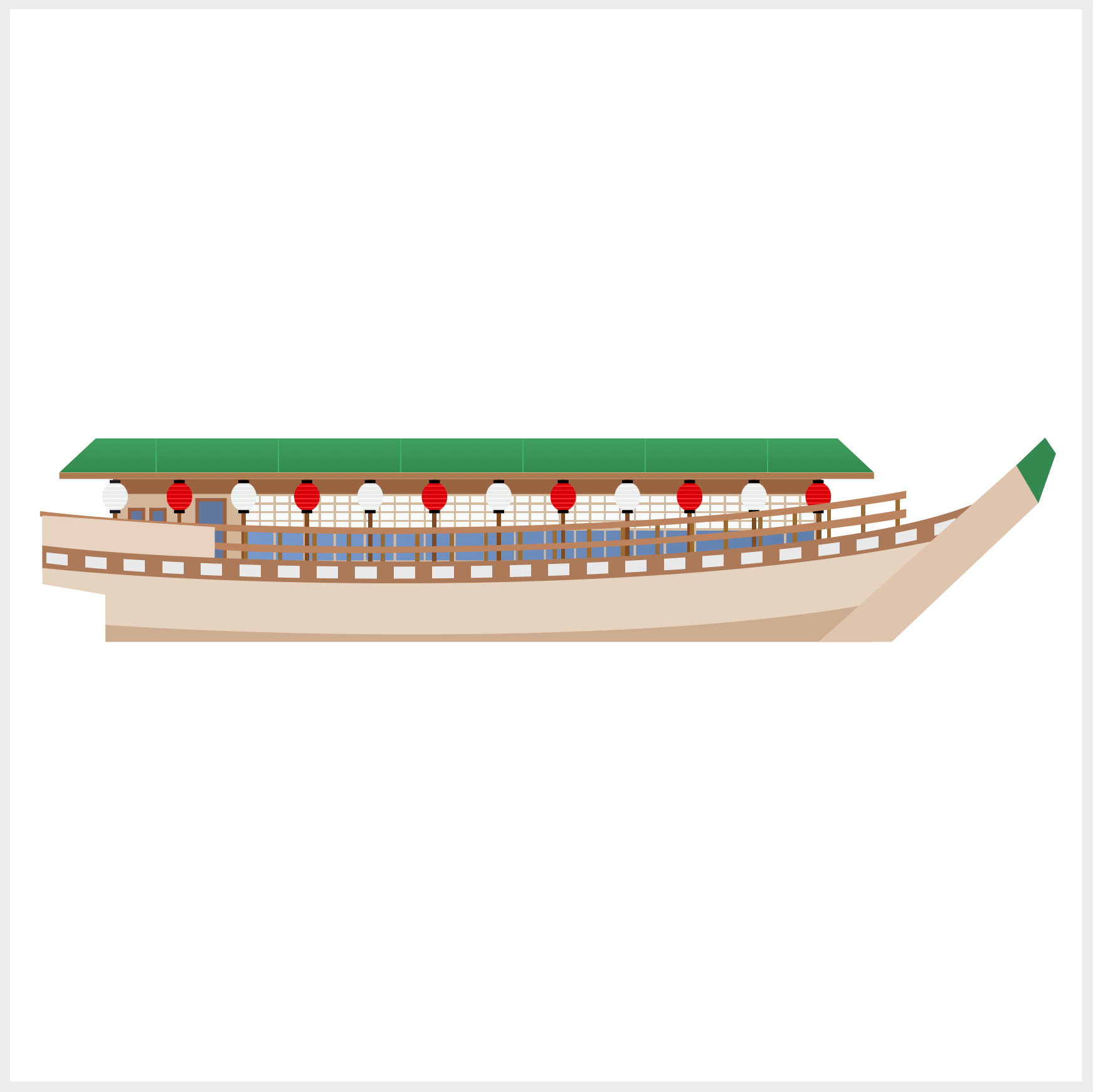
For part 1, you’ll make these boat components.
- Bow and Bow Tip
- Keel
- Hull
- Deck
- Side Wall
- Rails and Rail Poles
- Door and Windows
The rest of the boat components will be explained in part 2.
Prerequisites
Essential CSS and HTML knowledge will help you understand the concepts and techniques introduced in this article. Jump over to this article if you require an HTML and CSS primer.
We assume that you have set up tools to create CSS art. If you haven’t, this article will show you how to set them up.
HTML Structure
<div class="container">
  <!-- Japanese Boat -->
  <div class="boat">
    <div class="roof"></div>
    <div class="cabin">
      <div class="cabin-window"></div>
    </div>
    <div class="door-window"></div>
    <div class="posts"></div>
    <div class="lanterns">
      <div class="lantern-1"></div>
      <div class="lantern-2"></div>
      <div class="lantern-3"></div>
      <div class="lantern-4"></div>
      <div class="lantern-5"></div>
      <div class="lantern-6"></div>
      <div class="lantern-7"></div>
      <div class="lantern-8"></div>
      <div class="lantern-9"></div>
      <div class="lantern-10"></div>
      <div class="lantern-11"></div>
      <div class="lantern-12"></div>
    </div>
    <div class="rail-pole"></div>
    <div class="rail-1"></div>
    <div class="rail-2"></div>
    <div class="side-wall"></div>
    <div class="deck"></div>
    <div class="hull"></div>
    <div class="keel"></div>
    <div class="bow"></div>
    <div class="bow-tip"></div>
  </div>
</div>
container is the outermost enclosure. It enables the content to be centered and draws a light gray border. The rest of the divs represent each image component.
Keep the HTML structure as is for the image to display correctly.
Body and Container Div CSS
CSS code for the body and container div.
/* Body and Container Settings */
/* Center shapes */
body {
  margin: 0;
  padding: 0;
  height: 100vh;
  display: flex;
  justify-content: center;
  align-items: center;
  flex-wrap: wrap;
}

/* Set background and border color */
.container {
  min-width: 500px;
  height: 500px;
  border: 5px solid lightgray;
  background: transparent;
  position: relative;
  margin: 5px;
  display: flex;
  justify-content: center;
  align-items: center;
  overflow: hidden;
}
Bow and Bow Tip
The bow and bow tip are modified trapezoid shapes. Trapezoids and other multi-sided shapes are easily created using the CSS polygon() function.
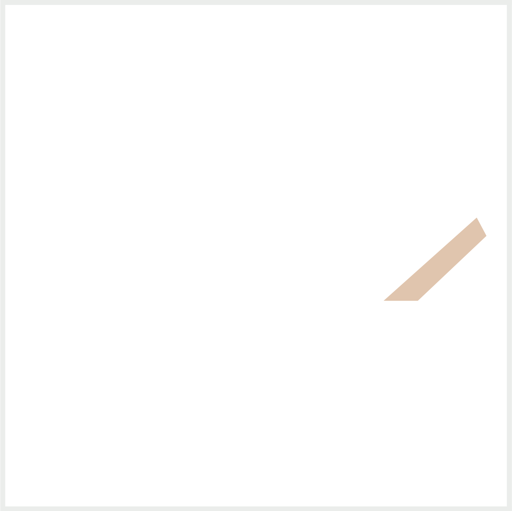
.bow {
  position: absolute;
  width: 108px;
  height: 83px;
  left: 376px;
  top: 212px;
  background: #e1c5ae;
  clip-path: polygon(87% 0, 96% 22%, 31% 102%, 1% 100%);
}
Let’s break down the polygon() code. The first percent number represents the x-axis or horizontal line (left to right), and the second number represents the y-axis or vertical line (up and down).
87% 0(upper left corner)
With87%set as your x-axis, the shape starts at 87% of thewidth, in this instance,108px.0set as the y-axis means that the shape starts at the top of theheight, which is83px. This pattern repeats for the rest of the percentage numbers.96% 22%(upper right corner)31% 102%(lower right corner)1% 100%(lower left corner)
This article dives deeps into making shapes with the polygon() function.

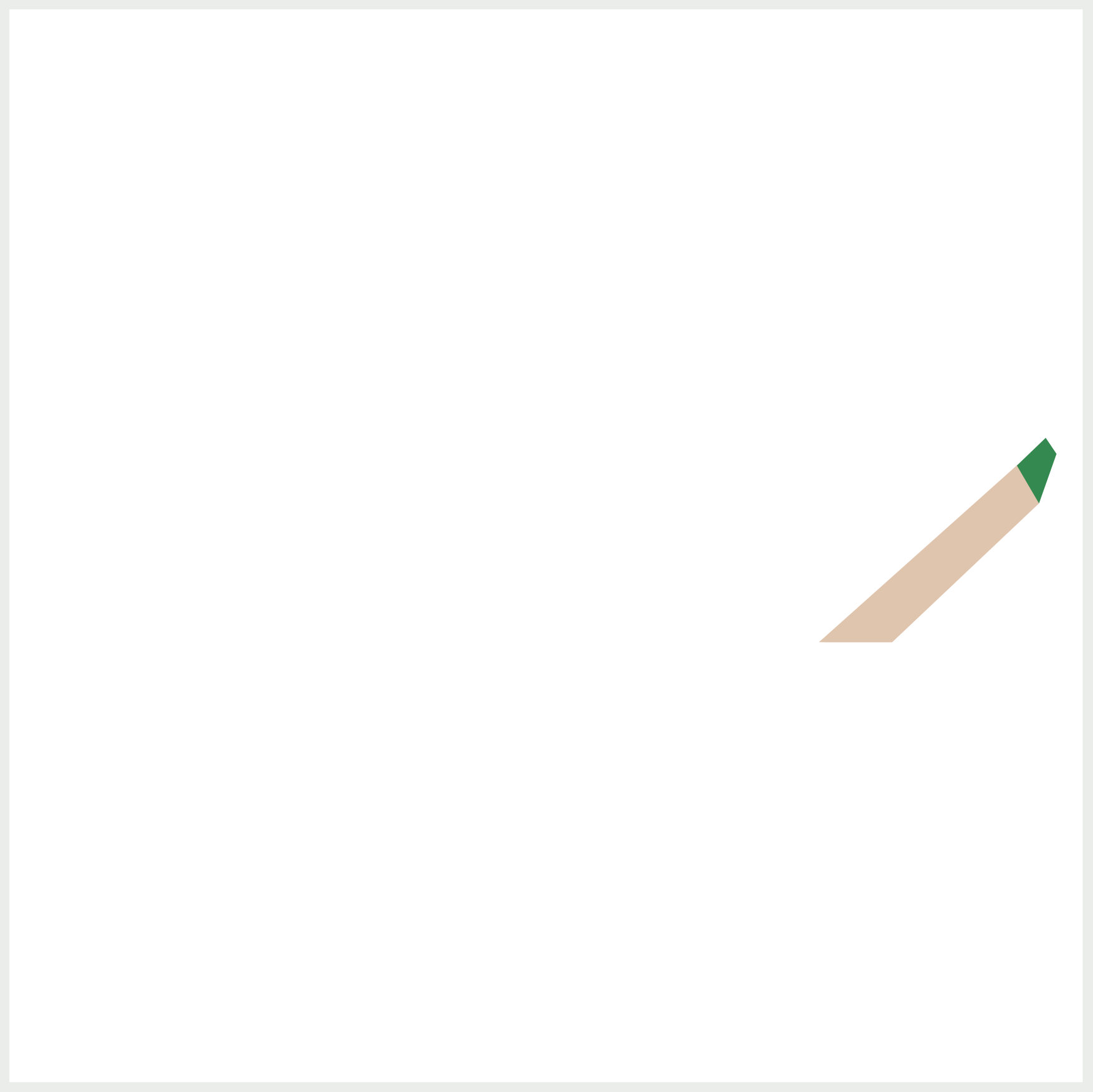
.bow-tip {
  position: absolute;
  width: 24px;
  height: 34px;
  left: 466px;
  top: 198px;
  background: #338950;
  clip-path: polygon(70% 5%, 91% 27%, 57% 95%, 14% 43%);
}
The bow tip is positioned on top of the bow. Similar to the bow shape, you use the polygon() function to make it.
Let’s make the keel in the next section.
Keel
The keel has an irregular curving shape. You’ll use the CSS path() function to make this shape.
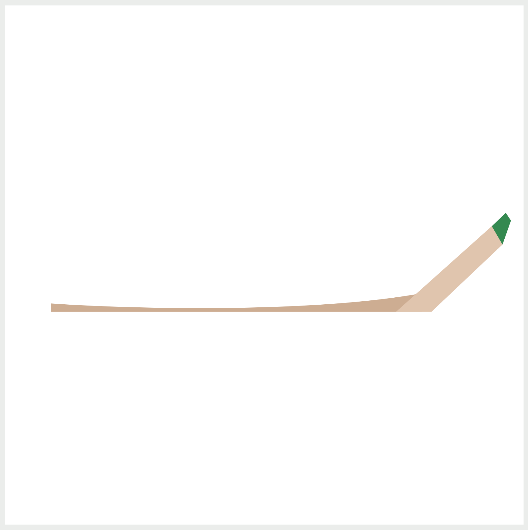
.keel {
  position: absolute;
  width: 358px;
  height: 18px;
  left: 44.5px;
  top: 277px;
  background: #cdad92;
  clip-path: path("M 0,10 C 70,15 250,20 358,0 L 358, 20 L 0,20 Z");
}
The keel is 358px wide and 18px high. It connects to the bow component and is usually underwater. Check this article to learn how to make vector shapes with path().

Next up is the hull component.
Hull
Similar to the keel in the previous section, the hull component has an irregular shape.
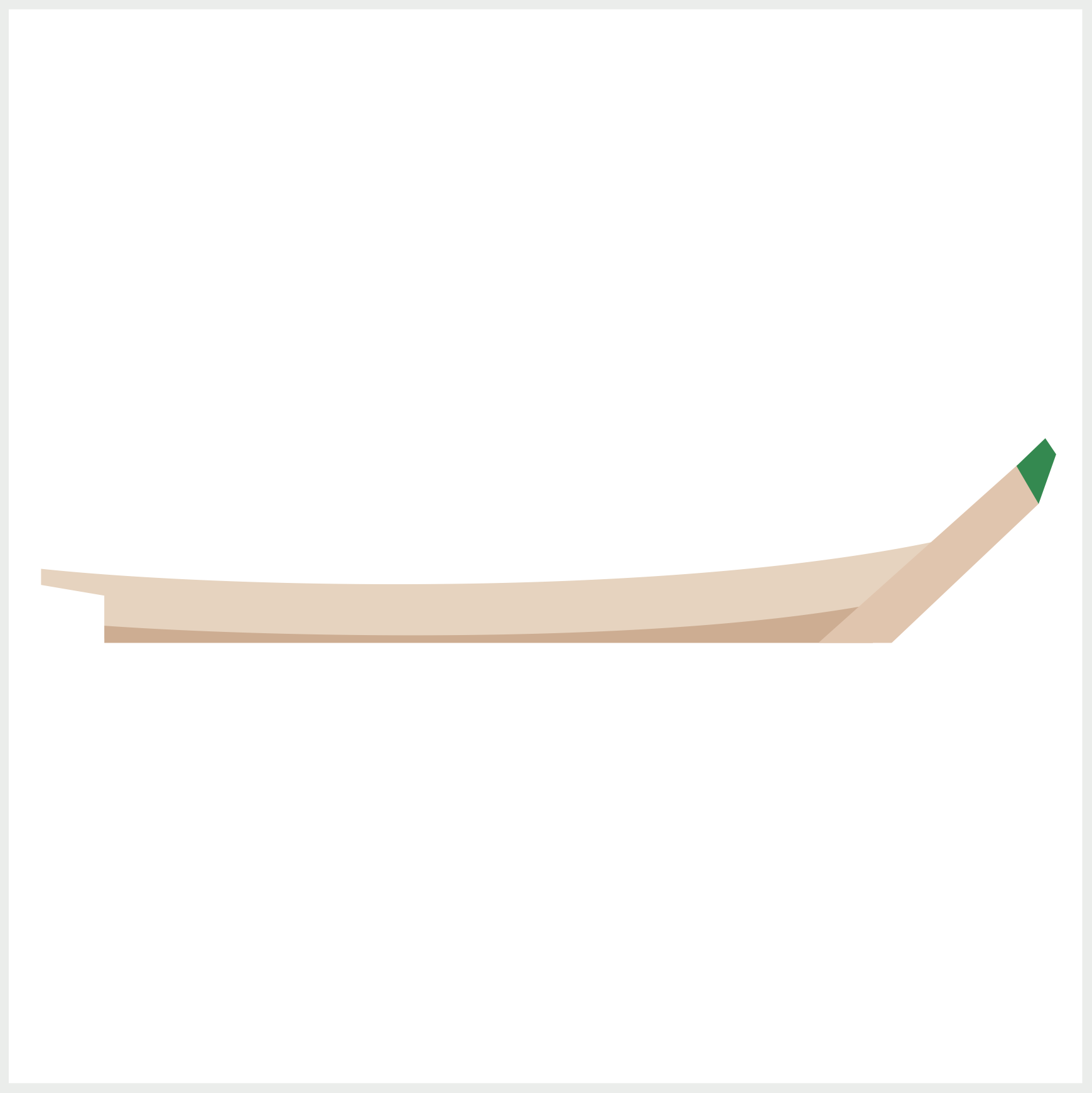
.hull {
  position: absolute;
  width: 420px;
  height: 46px;
  left: 15px;
  top: 247px;
  background: #e6d3bf;
  clip-path: path(
    "M 0,13.5 C 90,23 295,27 420,0 L 400,40 L 29.5,50 L 29.5,26 L 0,21 Z"
  );
}
Same as the previous keel shape, you use the CSS path() function to make the hull. The hull sits on top of the keel component and is connected to the bow component.
Let’s tackle the deck component in the next section.
Deck
The deck has two sections:
- Brown base
- Repeating light gray rectangle pattern
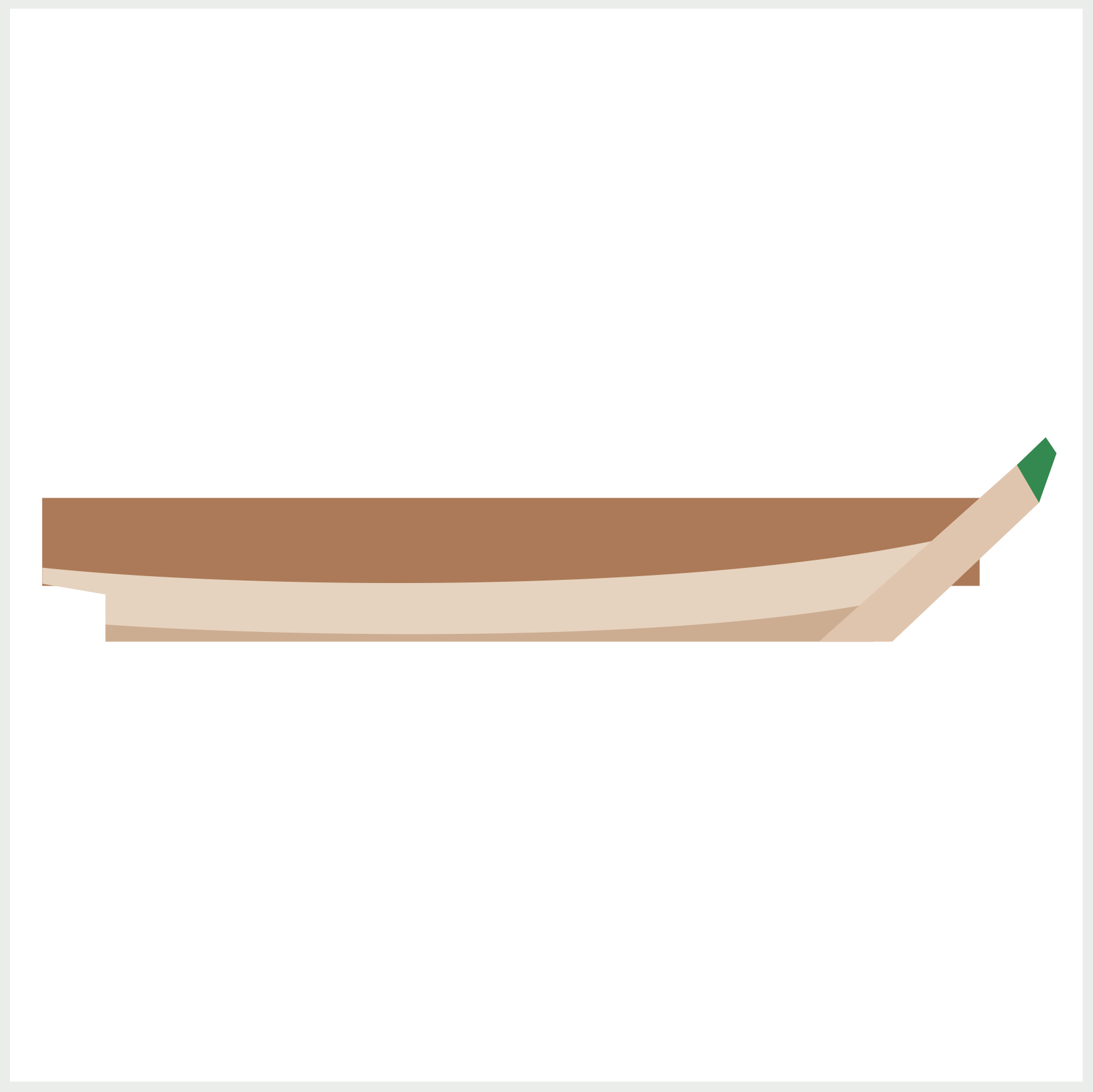
.deck {
  position: absolute;
  width: 437px;
  height: 41px;
  left: 15px;
  top: 228px;
  background: #ad7a58;
}
The deck brown base rectangle is 437px wide and 41px high. To get the brown color, you set the background property value to #ad7a58.
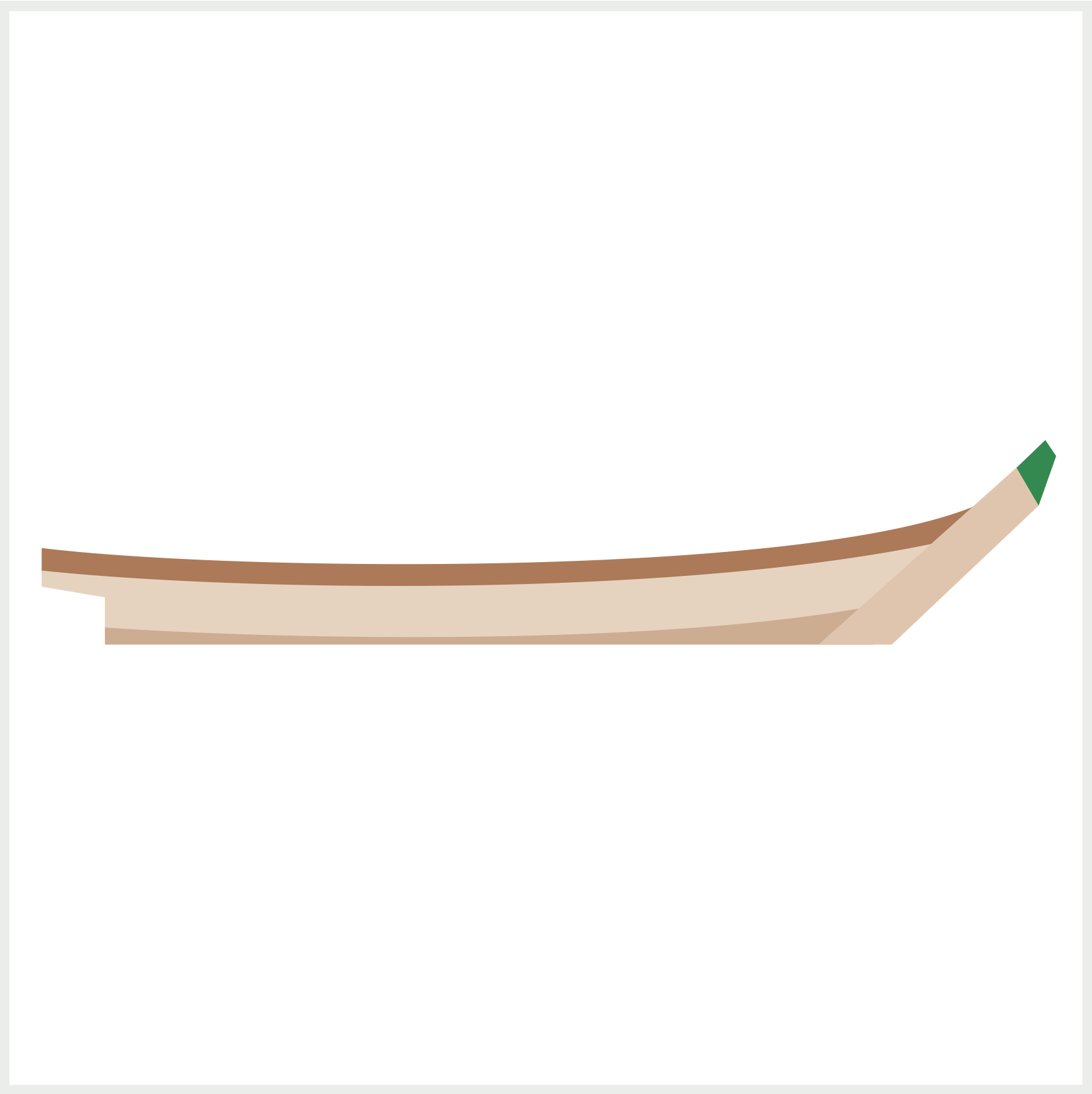
.deck {
  clip-path: path("M 0,22 C 90,33 356,36 436,2 L 418,20 C 305,47 90,42 0,33");
}
Using the path() function, you shape the original rectangle shape into a thin, curved shape.
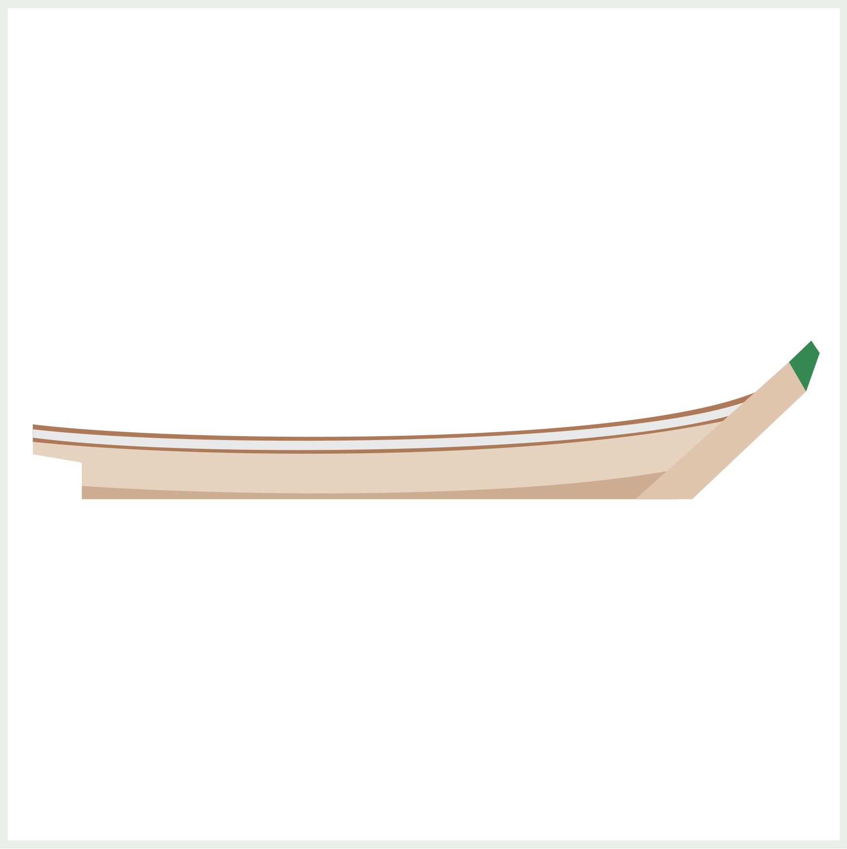
Next, you’ll make the light gray base and use the CSS repeating-linear-gradient() function to make the repeating rectangles.
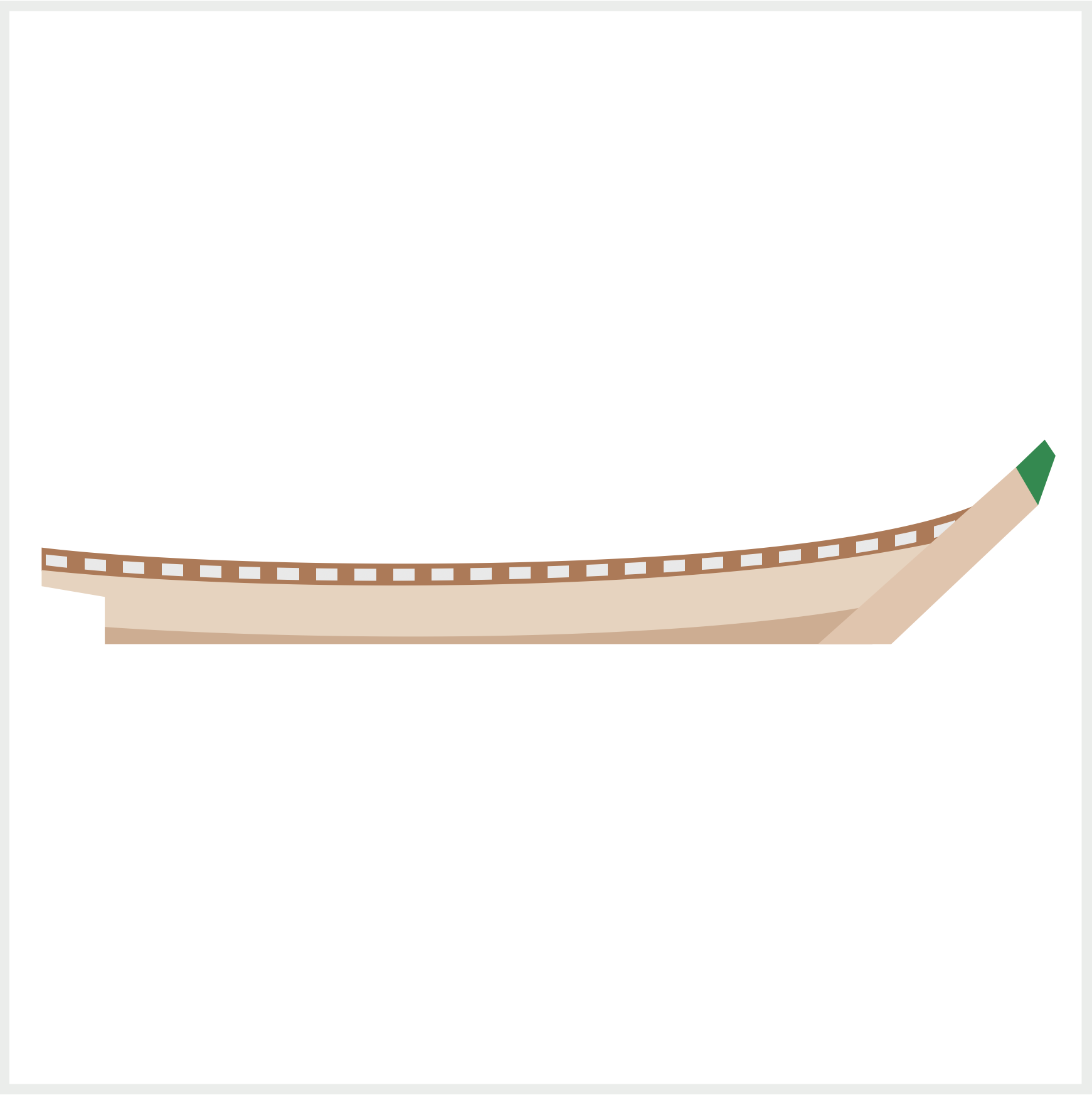
The repeating light gray rectangle pattern is placed on top of the brown base using the CSS ::before pseudo-element.
.deck::before {
  content: "";
  position: absolute;
  width: 437px;
  height: 41px;
  left: 0px;
  top: -1px;
  background: repeating-linear-gradient(
    to right,
    transparent,
    transparent 2px,
    #e9e9e9 2px,
    #e9e9e9 12px,
    transparent 10px,
    transparent 18px
  );
  clip-path: path(
    "M 0,26 C 105,38 369,36 436,6.5 L 420,17.5 C 330,42 90,43 0,31"
  );
}
Let’s break down the repeating-linear-gradient() code.
First, we set the repeat direction with to right. You set a transparent 2-pixel area with transparent, transparent 2px. Next, you make the light gray rectangle using #e9e9e9 2px, #e9e9e9 12px. Finally, you set another transparent area with transparent 10px, transparent 18px.
CSS gradients are explained in depth in this article.
Up next is the side wall.
Side Wall
Similar to bow and bow tip, we use the polygon() function to make the side wall.
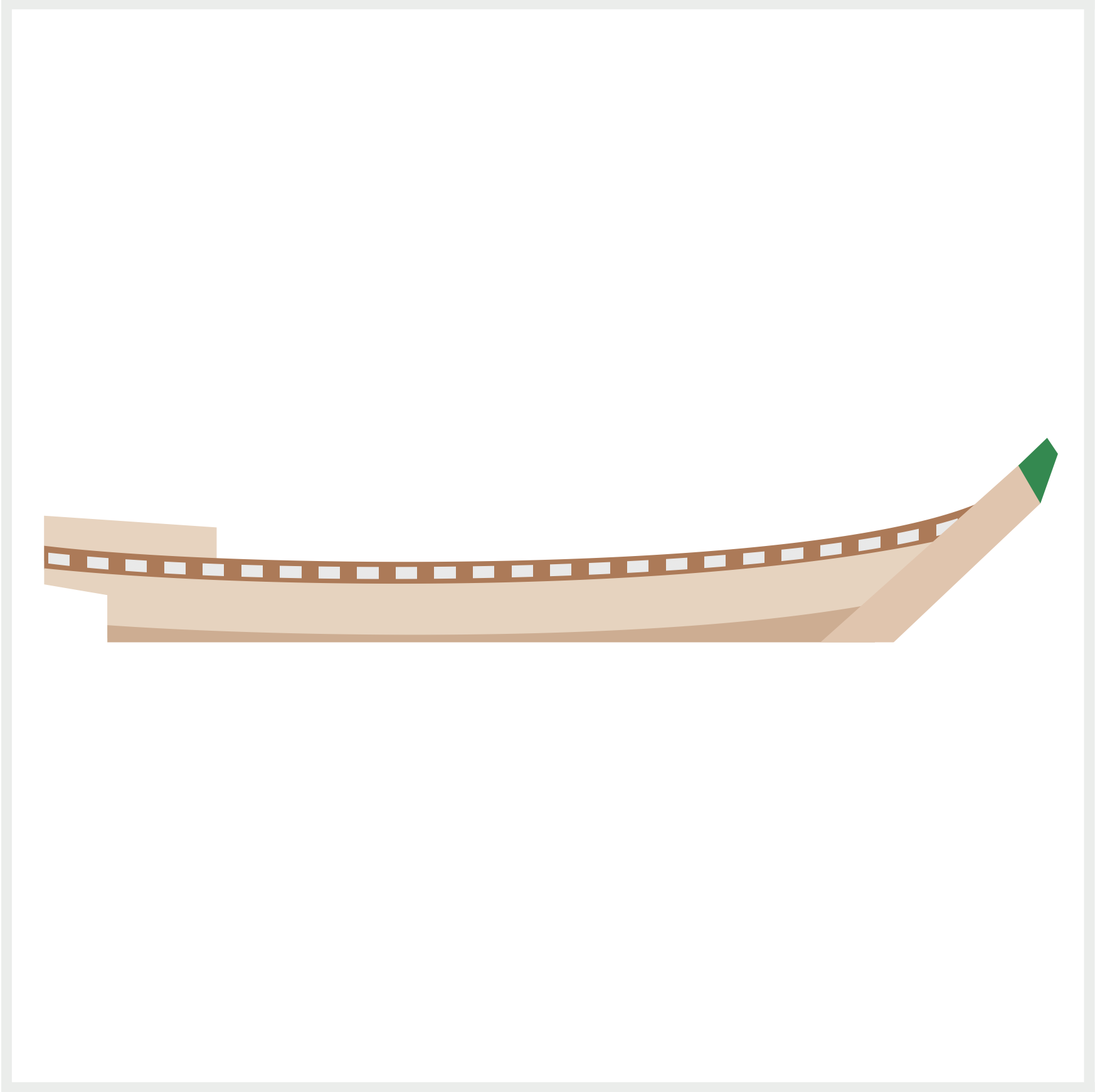
.side-wall {
  position: absolute;
  width: 80.5px;
  height: 21px;
  left: 15px;
  top: 236px;
  background: #e7d3bf;
  clip-path: polygon(0% 0%, 100% 26%, 100% 100%, 0% 100%);
}
Rails and Rail Pole
In this section, you’ll make two rails, bottom and top, and the rail poles.
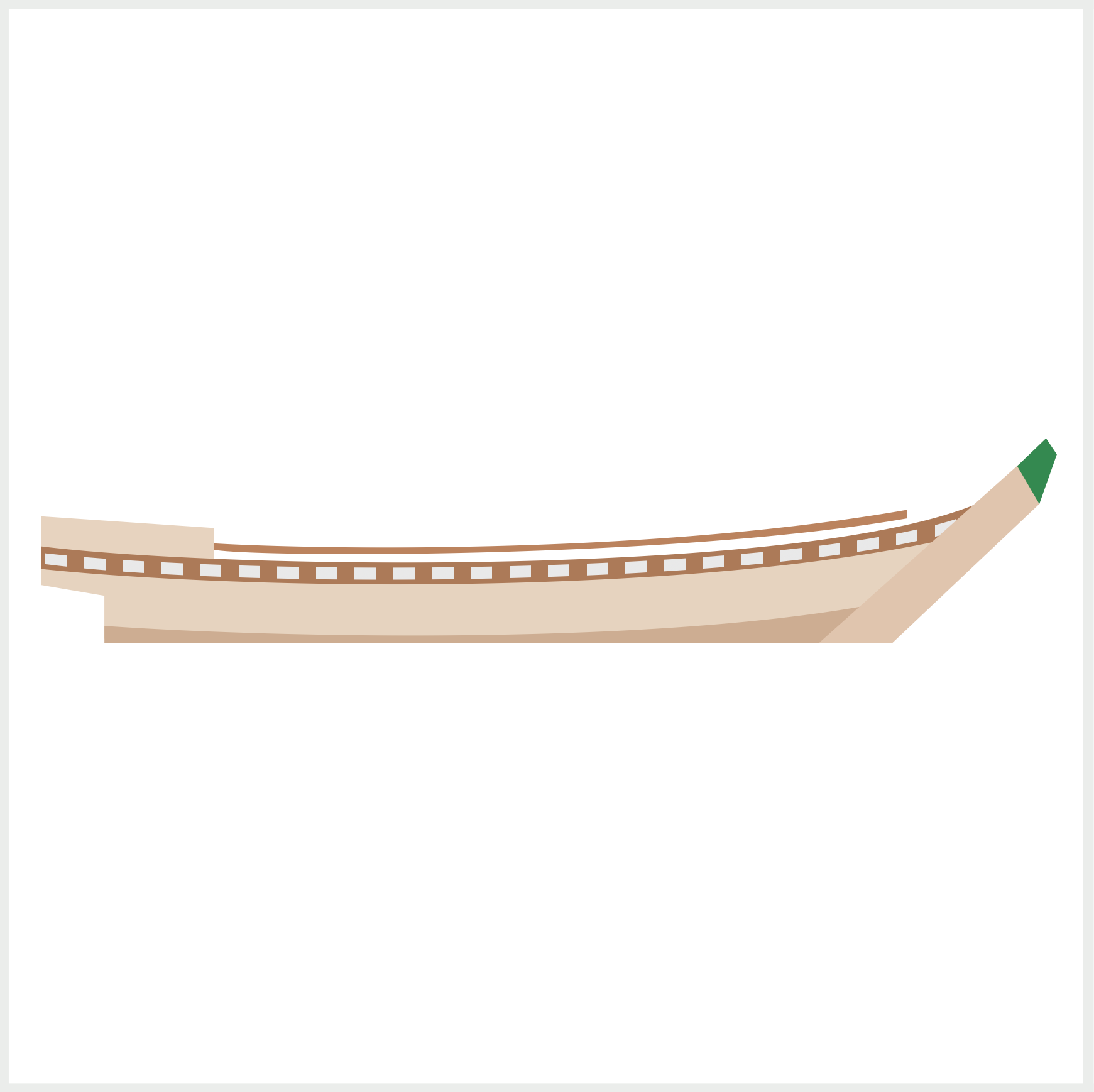
.rail-1 {
  position: absolute;
  width: 411px;
  height: 33px;
  left: 12px;
  top: 222px;
  background: #bb835e;
  clip-path: path(
    "M 2,12 C 94,23 290,24 406,2.5 L 406,6 C 290,26 94,27 2,14.5 Z"
  );
}
Rail 1 is the bottom rail and connects to the side wall. You use the CSS path() function to create the thin, curved rail shape.
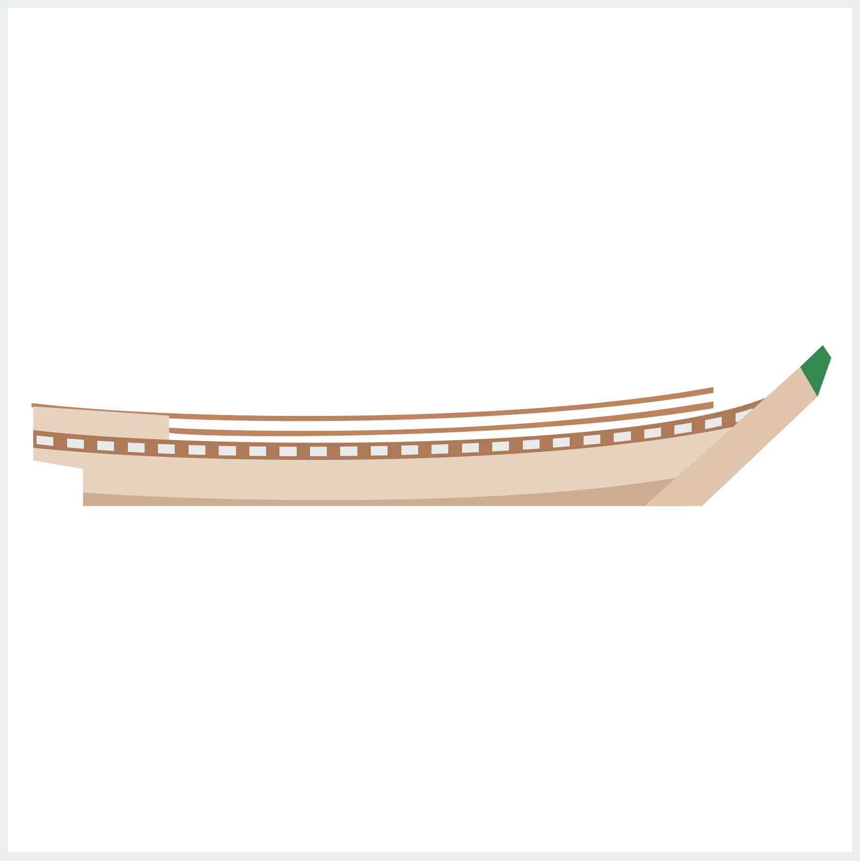
.rail-2 {
  position: absolute;
  width: 411px;
  height: 25px;
  left: 12px;
  top: 231px;
  background: #bb835e;
  clip-path: path(
    "M 82,17.5 C 120,20 280,24 406,2 L 406,6 C 290,26 82,24 82,20 Z"
  );
}
Rail 2 is the top rail and extends all the way to the end of the side wall.
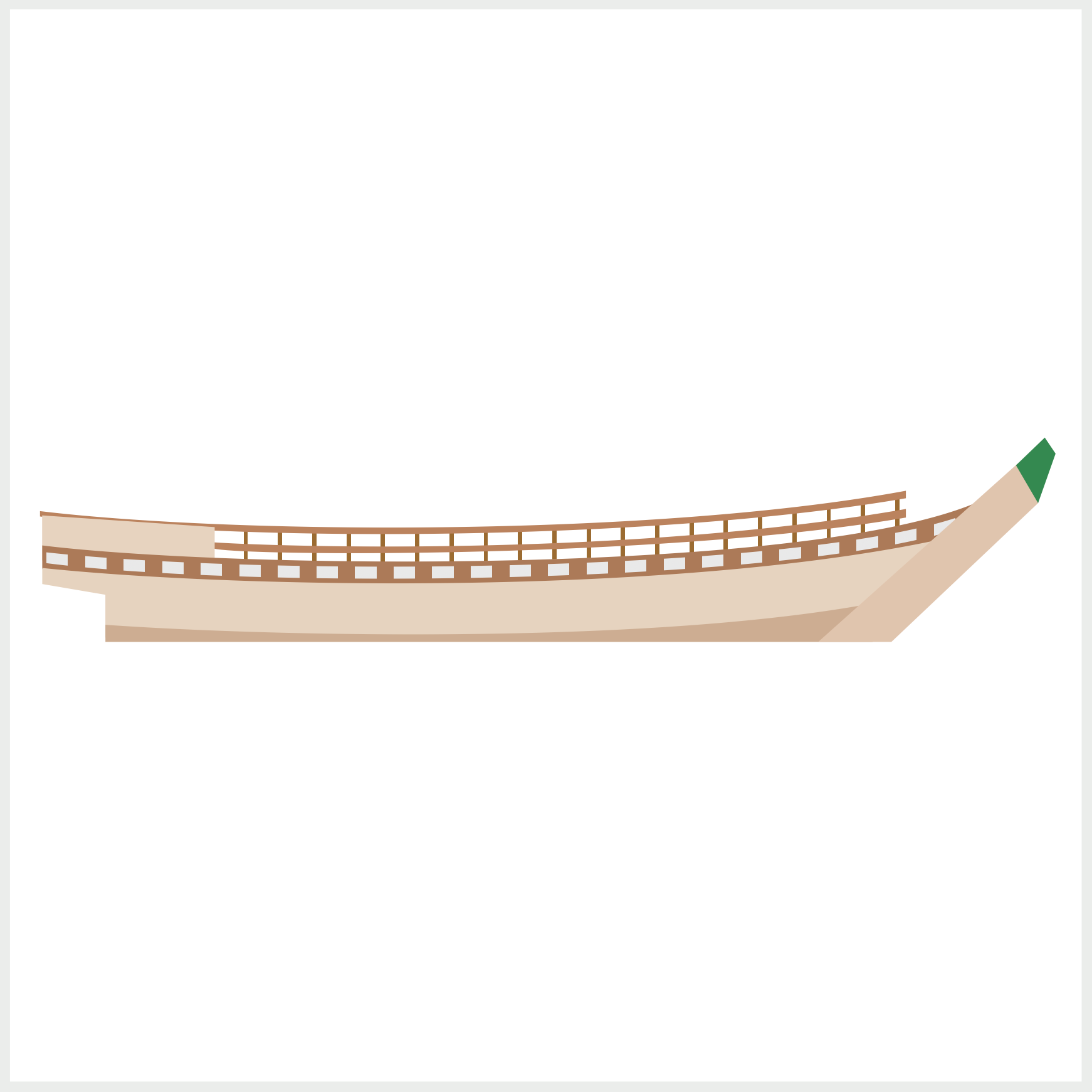
.rail-pole {
  position: absolute;
  width: 323px;
  height: 32px;
  left: 95px;
  top: 227px;
  background: repeating-linear-gradient(
    to right,
    transparent,
    transparent 14px,
    #9b6b31 14px,
    #9b6b31 16px,
    transparent 16px
  );
  clip-path: path("M 0,14 C 94,21 260,10 323,0 L 323,13 C 290,28 94,34 0,29 Z");
}
Similar to the deck rectangle pattern, we use the CSS repeating-linear-gradient() function to make the rail poles. The repeat direction is set to right. You set a transparent 14-pixel area with transparent, transparent 14px. Next, you make the 2-pixel brown rail poles with #9b6b31 14px, #9b6b31 16px. You set another transparent area with transparent 16px.
The rails and rail poles are done. Let’s move on to the last section and make the door and windows.
Door and Windows
Compared to the previous components, the door and windows are simple to make. The side wall is temporarily removed from the reference images so you can see the door and windows.
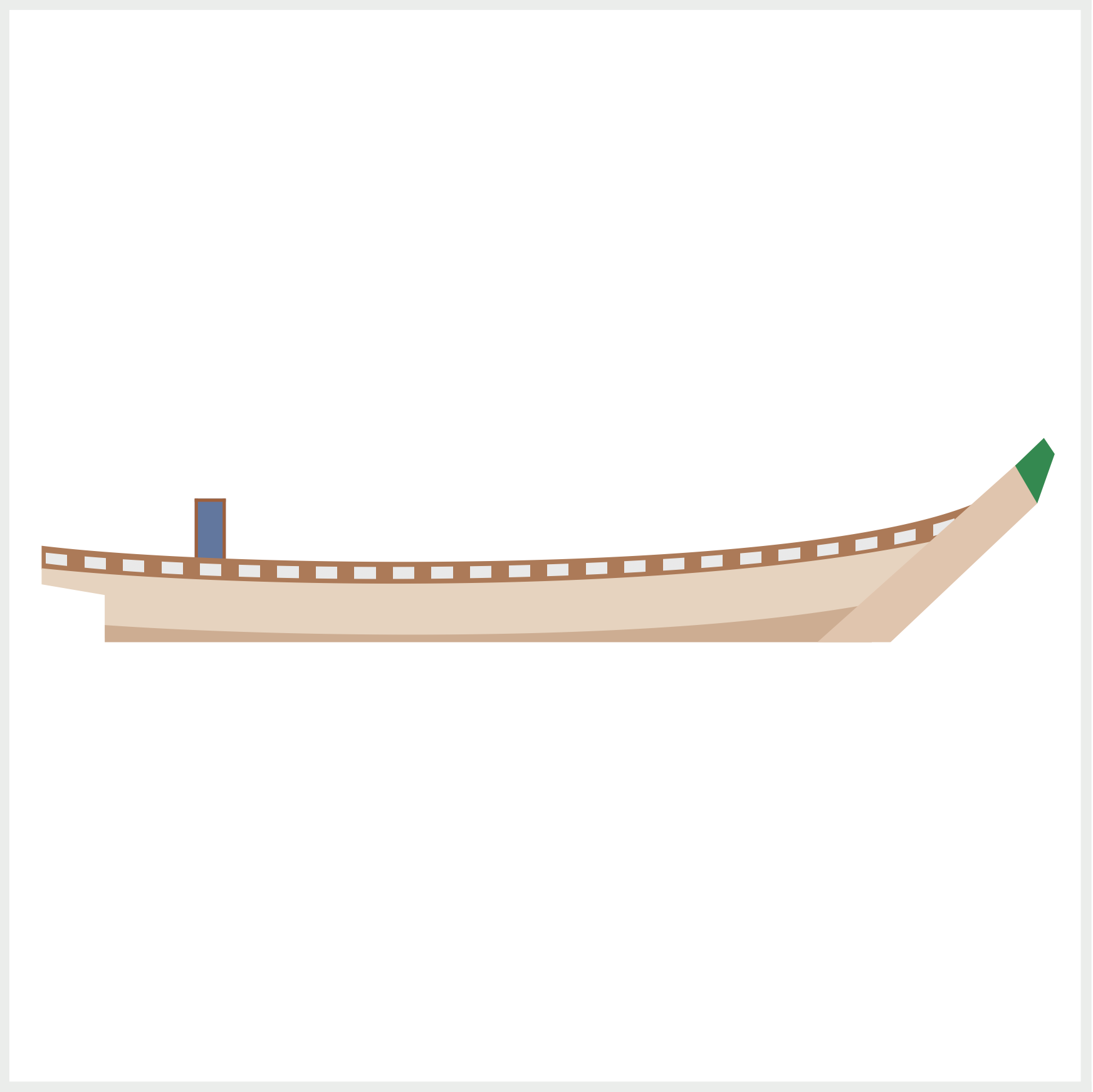
.door-window {
  position: absolute;
  width: 11.5px;
  height: 27px;
  left: 86.5px;
  top: 228px;
  background: #62779e;
  border: 1.5px solid #9e603c;
}
The door is a dark blue rectangle, #62779e, with a dark brown, #9e603c, 1.5-pixel solid border.
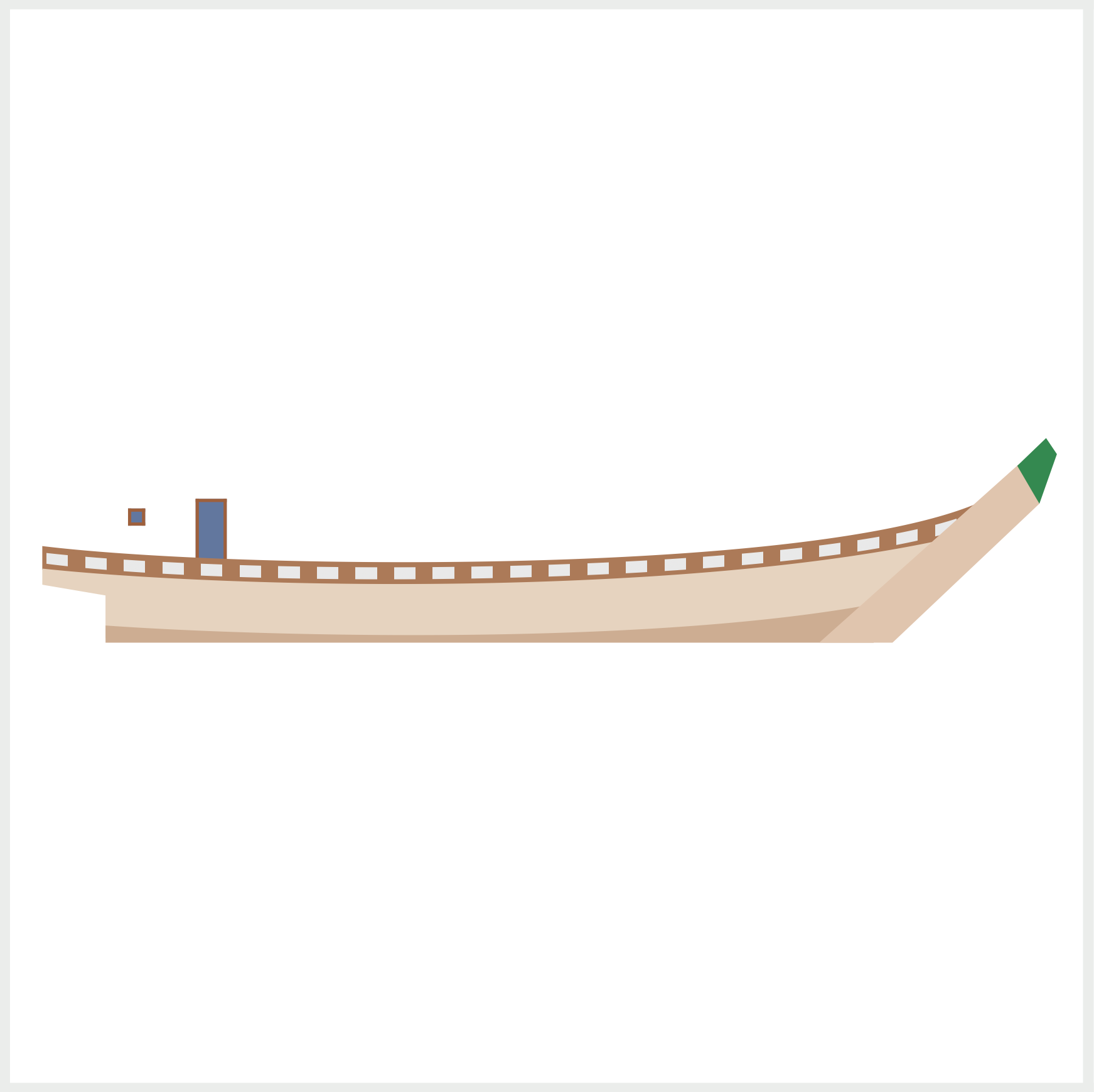
.door-window::before {
  content: "";
  position: absolute;
  width: 5px;
  height: 5px;
  left: -33px;
  top: 3px;
  background: #62779e;
  border: 1.5px solid #9e603c;
}
Window 1 and window 2 are identical dark blue squares with a dark brown border.
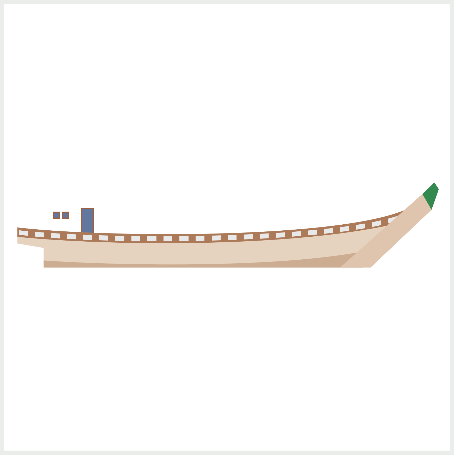
.door-window::after {
  content: "";
  position: absolute;
  width: 5px;
  height: 5px;
  left: -23px;
  top: 3px;
  background: #62779e;
  border: 1.5px solid #9e603c;
}
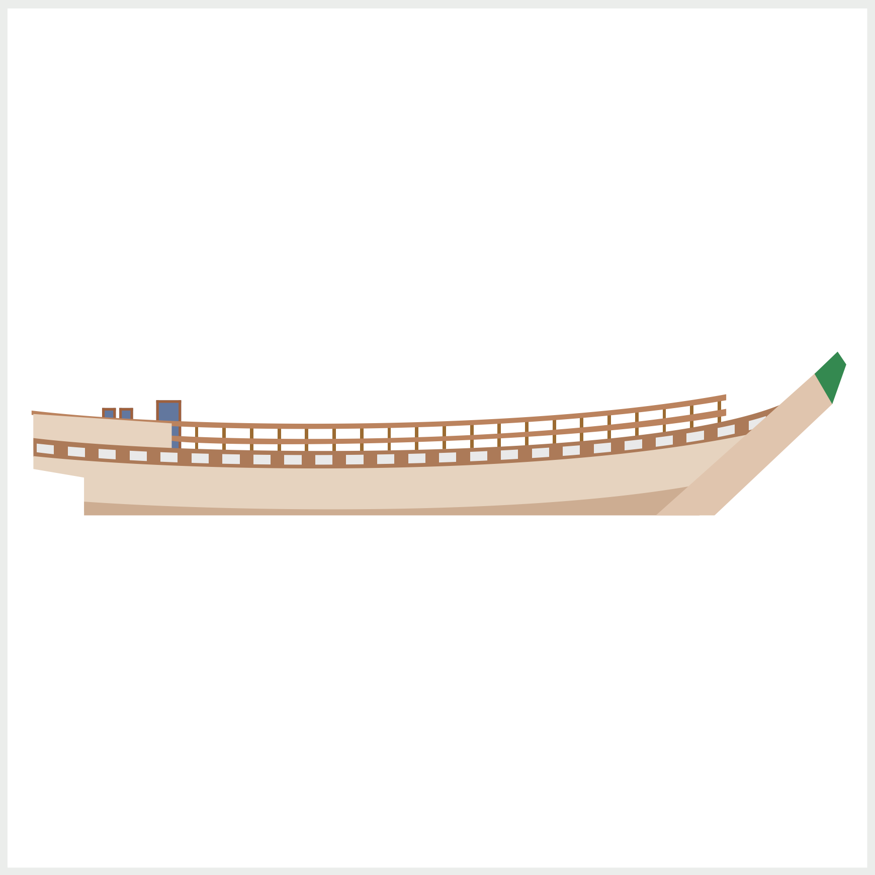
We’ll finish part 1 here and continue building the rest of the boat’s components in part 2.
You can see and play with the complete code on Pyxofy’s CodePen page.
See the Pen CSS Art - Japanese Boat by Pyxofy (@pyxofy) on CodePen.
Conclusion
In this article, you learned how to make advanced CSS shapes using the polygon() and path() functions. Familiarizing yourself with both functions enables you to create unique and fascinating shapes with CSS.
You combined transparent and opaque colors with the CSS repeating-linear-gradient() function to make repeating rectangles and stripe patterns. Using CSS pseudo-elements such as ::before and ::after, you were able to layer shapes, making interesting stacking combinations.
Modify the CSS code to your liking and then share your masterpiece with us on LinkedIn, Threads, Mastodon, X (Twitter) @pyxofy , or Facebook.
We hope you liked this article. Kindly share it with your network. We appreciate it.
Related Articles
