CSS Art – Making Irregular Shapes Using clip-path path() Function
U.S. Route 66 is the Main Street of America. Join us in creating this legendary highway route sign using CSS in this step-by-step article.

Introduction
The U.S. Route 66 is legendary and is associated with pop culture songs, TV shows, and movies. Starting from Chicago, Illinois, and ending in Santa Monica Beach, California, it is home to picturesque landscapes, structures, and monuments.
Learn how to make this iconic highway sign using CSS in this article. Here’s a list of CSS properties you'll learn in this article:
clip-pathpath()polygon()font-familyfont-weightfont-sizecolor
Preview
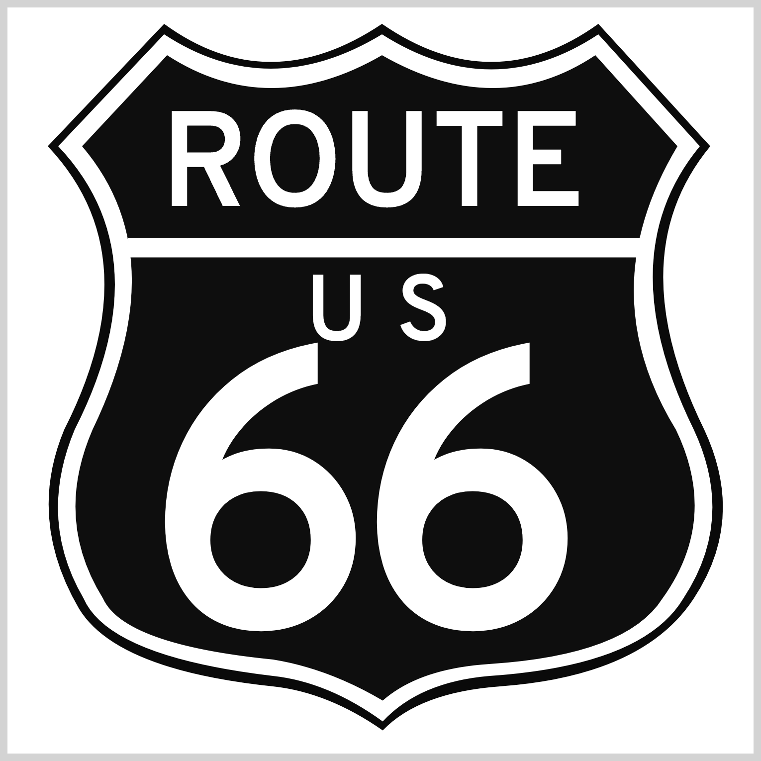
The highway sign consists of these components:
- Route Sign Outline
- Shield
- Inner Shield
- Horizontal Bar
- Route
- U.S.
- Sixty Six
The irregular shape components are created using the CSS path() function. Read this article to get up to speed on how to use the path() function and SVG Path commands.

Prerequisites
Essential CSS and HTML knowledge will help you understand the concepts and techniques introduced in this article. Jump over to this article if you require an HTML and CSS primer.
We assume that you have set up tools to create CSS art. If you haven’t, this article will show you how to set them up.
HTML Structure
<div class="container">
  <div class="outline"></div>
  <div class="shield"></div>
  <div class="inner-shield"></div>
  <div class="bar"></div>
  <div class="route">ROUTE</div>
  <div class="us-1">U</div>
  <div class="us-2">S</div>
  <div class="six-1">6</div>
  <div class="six-2">6</div>
</div>
container is the outermost enclosure. It enables the content to be centered and draws a light gray border. The rest of the divs represent each image component.
Keep the HTML structure as is for the image to display correctly.
Body and Container Div CSS
CSS code for the body and container div.
/* Body and Container Settings */
/* Center shapes */
body {
  margin: 0;
  padding: 0;
  height: 100vh;
  display: flex;
  justify-content: center;
  align-items: center;
  flex-wrap: wrap;
}

/* Set background and border color */
.container {
  width: 500px;
  height: 500px;
  border: 5px solid lightgray;
  background: transparent;
  position: relative;
  margin: 5px;
  display: flex;
  justify-content: center;
  align-items: center;
}
Shared Properties
Prior to tackling each component, let’s go through their shared CSS properties. Consolidating shared properties decreases redundant code and makes your CSS code more manageable.
/* Shared Properties */
.outline,
.shield,
.inner-shield,
.bar,
.route,
.us-1,
.us-2,
.six-1,
.six-2 {
  position: absolute;
  font-family: "Overpass", serif;
  font-weight: 700;
  color: #ffffff;
}
- All components’
positionproperty value is set toabsolute. - Google Font “Overpass” is set as a
font-familyproperty, andserifis set as the secondary fallback value. - Font weight is set to
700or bold value. - The font color value is set to
#ffffff, a pure white hue.
Let’s start working on the first component, the route sign outline, in the next section.
Route Sign Outline
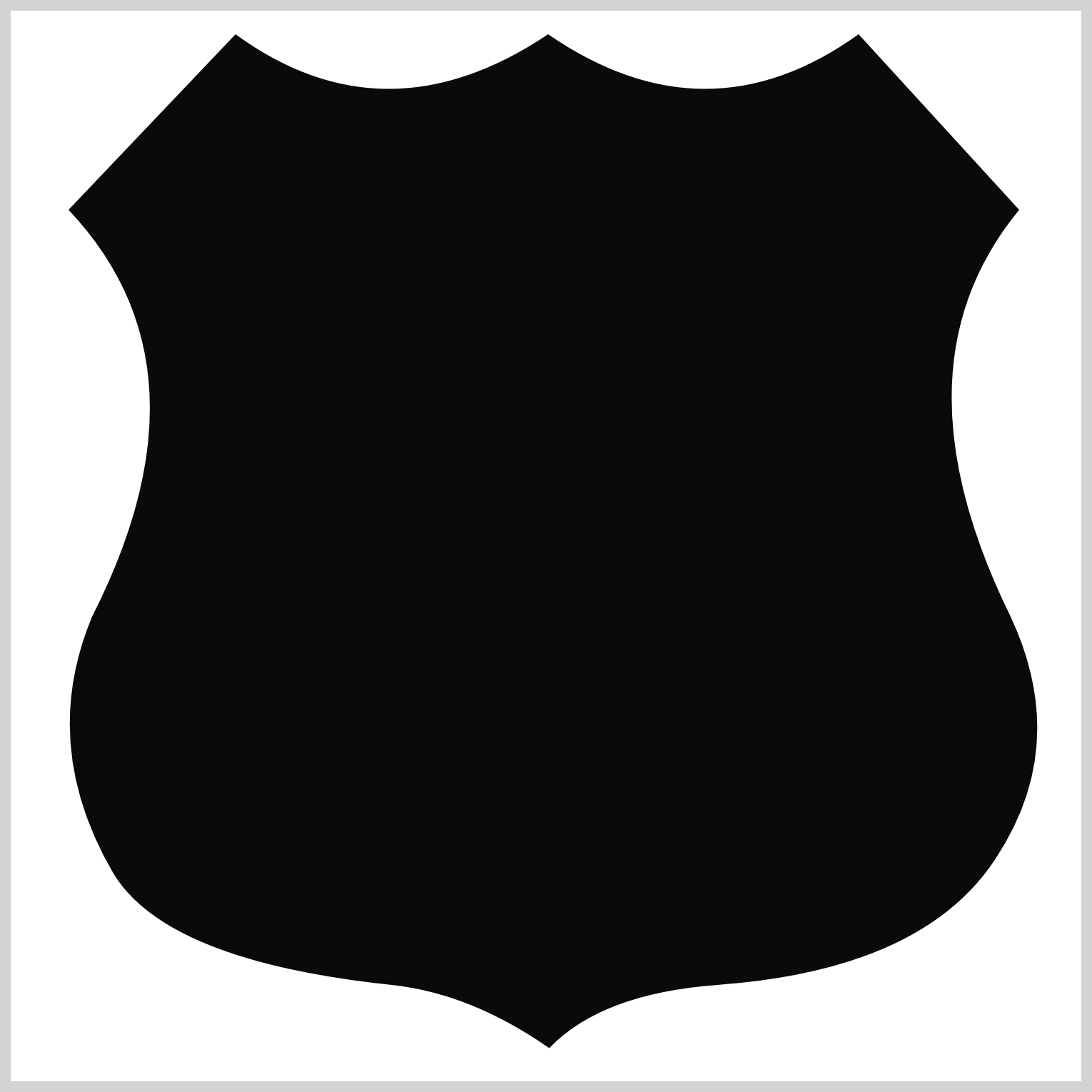
The route sign outline is a solid black outline functioning as a background for the shield and inner shield components. It’s an irregular shape, and you’ll use the CSS clip-path path() function to make it.
/* Outline */
.outline {
  background: #0a0a0a;
  width: 475px;
  height: 485px;
  top: 7px;
  left: 13px;
  clip-path: path(
    "M 238,4 Q 312,55 383,4 L 458,86 Q 397,160 454,276 Q 482,336 447,389 Q 413,441 317,448 Q 263,452 238.5,477.5 Q 202,452 165,448 Q 60,437 35,396 Q 0,336 25,276 Q 84,160 14,86 L 92,4 Q 162,55 238,4"
  );
}
- The background color is set to
#0a0a0a, a dark shade. - The width is
475pxand the height is set to485px. - The element is positioned
7pxfrom the top and13pxfrom the left.
The outline starts as a square shape. To create the shield outline, you’ll be combining multiple path() function SVG commands.
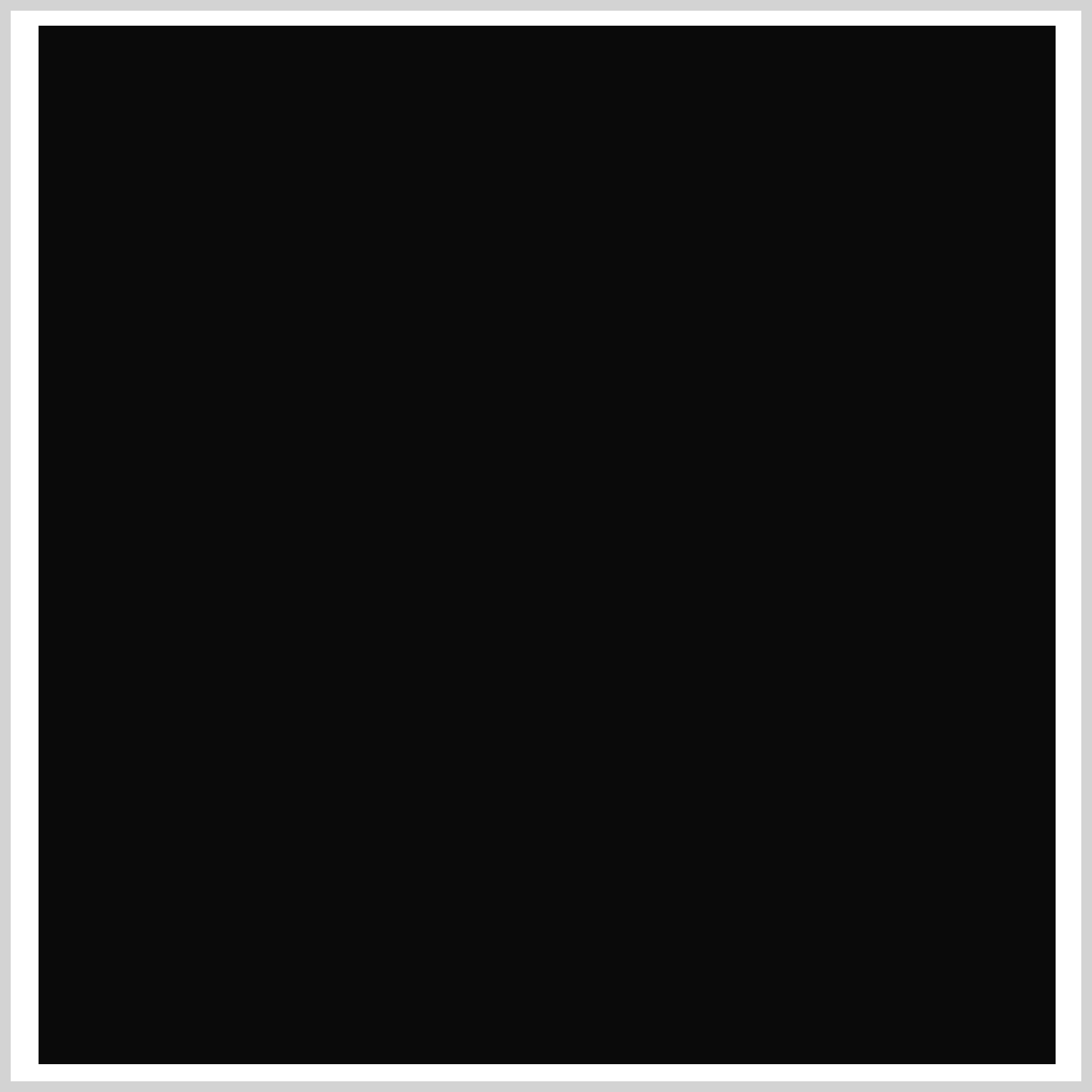
To make the path() SVG commands more readable, let’s break down each command.
M 238,4
Q 312,55 383,4
L 458,86
Q 397,160 454,276
Q 482,336 447,389
Q 413,441 317,448
Q 263,452 238.5,477.5
Q 202,452 165,448
Q 60,437 35,396
Q 0,336 25,276
Q 84,160 14,86
L 92,4
Q 162,55 238,4
You’ll be using three SVG commands:
Mstands for “Move To”.Lmeans “Line To”.Qequates to “Quadratic Bézier Curve”.
Uppercase letters indicate absolute exact coordinates, and lowercase letters are relative coordinates. The numbers between the commas are x and y coordinates.
M 238,4means pick up the pen and Move to238pixels on the x-axis and4pixels on the y-axis.Q 312,55 383,4equates to put down the pen and Draw a Quadratic Bézier curve from the current point to a new point at383pixels on the x-axis and4pixels on the y-axis.312,55sets the x and y coordinates for the Bézier curve control point. The control point controls the curvature of the Bézier curve.L 458,86stands for draw a Line to x:458, y:86.
You can use an SVG Path Visualizer to see the SVG commands in action. The handles are the Bézier curve control points.
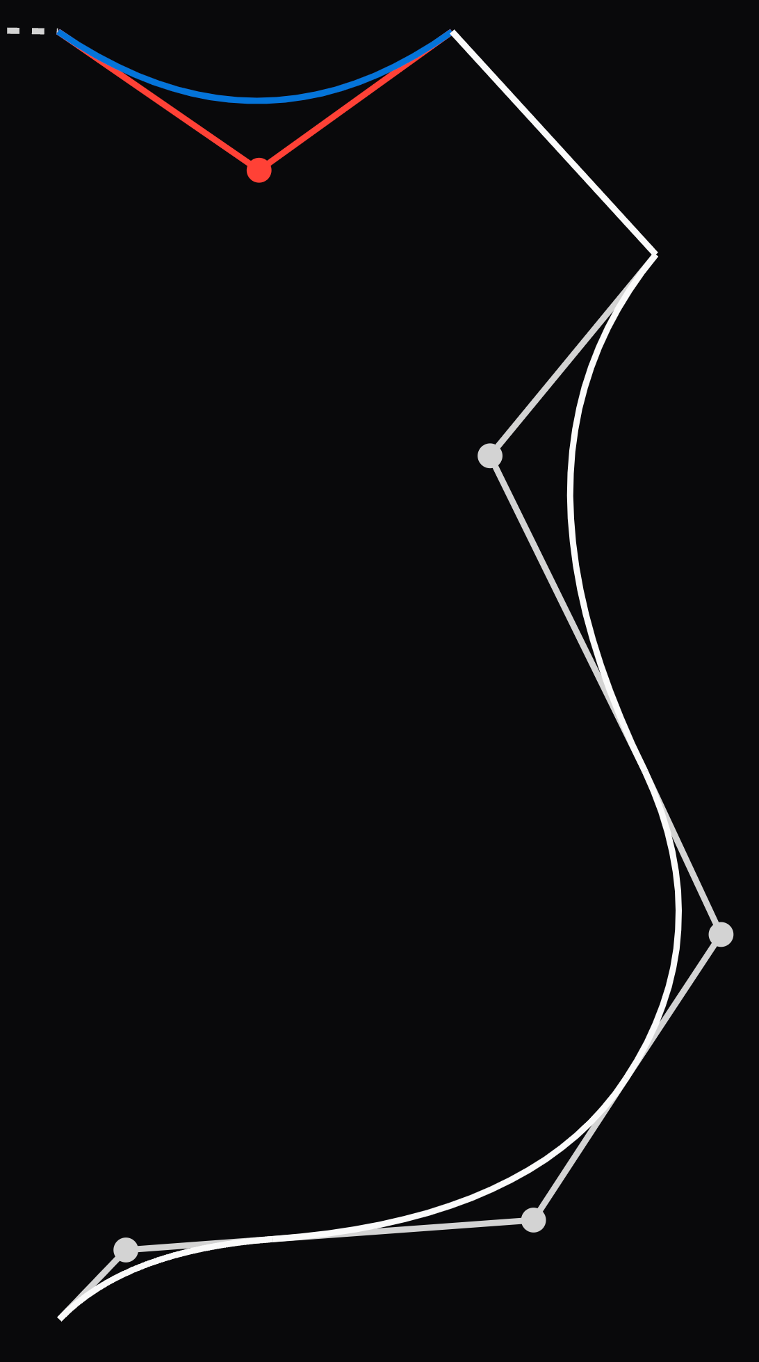
Take note that the x and y coordinate values need to be within the square shape’s width: 475px and height: 485px dimensions. Any value over the dimensions will be clipped.
The following images break down the SVG commands in detail.
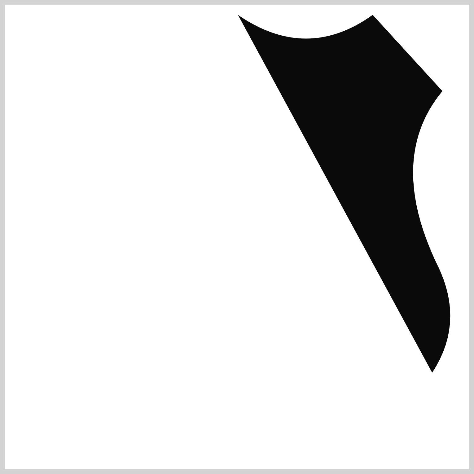
M 238,4
Q 312,55 383,4
L 458,86
Q 397,160 454,276
Q 482,336 447,389
The image is roughly 30% complete at this point. path() SVG images are easier to create when you start at the top midpoint and work clockwise.
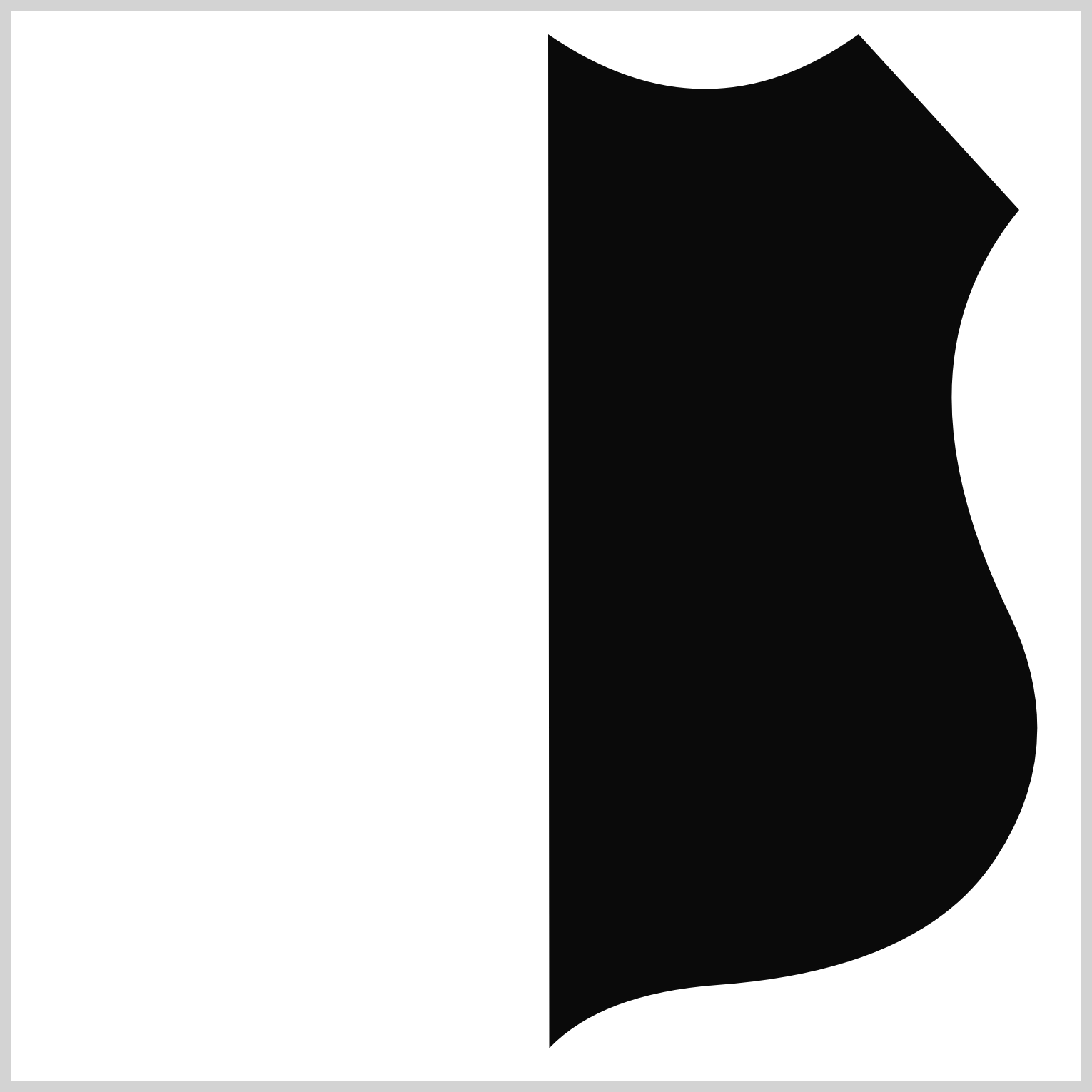
M 238,4
Q 312,55 383,4
L 458,86
Q 397,160 454,276
Q 482,336 447,389
Q 413,441 317,448
Q 263,452 238.5,477.5
You can use decimal numbers in your SVG commands, such as Q 238.5,477.5, to make your image more precise.
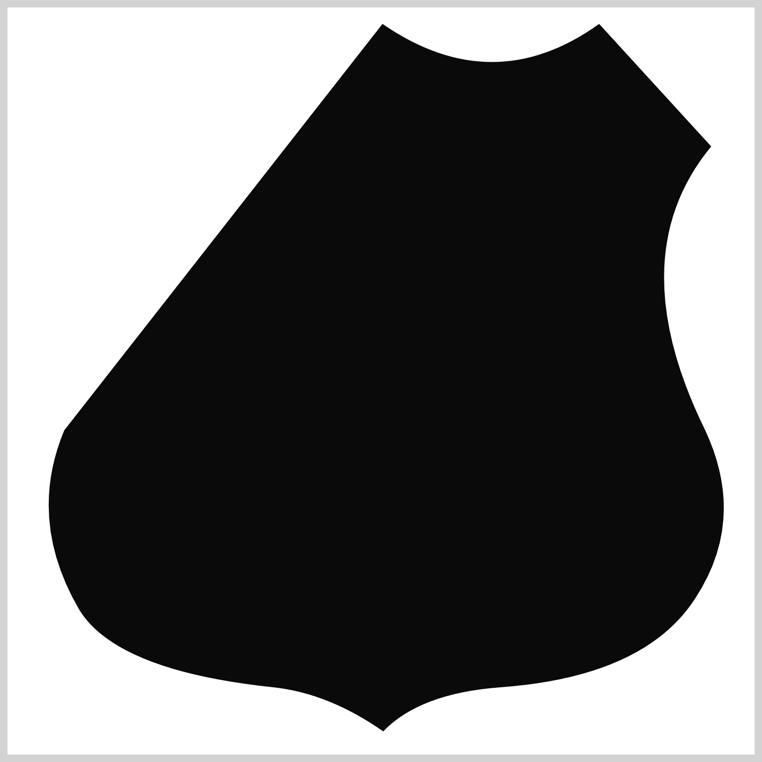
M 238,4
Q 312,55 383,4
L 458,86
Q 397,160 454,276
Q 482,336 447,389
Q 413,441 317,448
Q 263,452 238.5,477.5
Q 202,452 165,448
Q 60,437 35,396
Q 0,336 25,276
The above code is roughly 80% percent of the SVG command. To ensure you don’t have gaps in your SVG image, ensure that your starting point, in this instance, M 238,4 and your endpoint Q 162,55 238,4 have the same coordinate values.
You now have a working knowledge of the path() function SVG commands. Let’s continue working on the rest of the image components in the following sections.
Shield
The shield and the following inner shield sections follow the CSS path() SVG commands in the previous section.
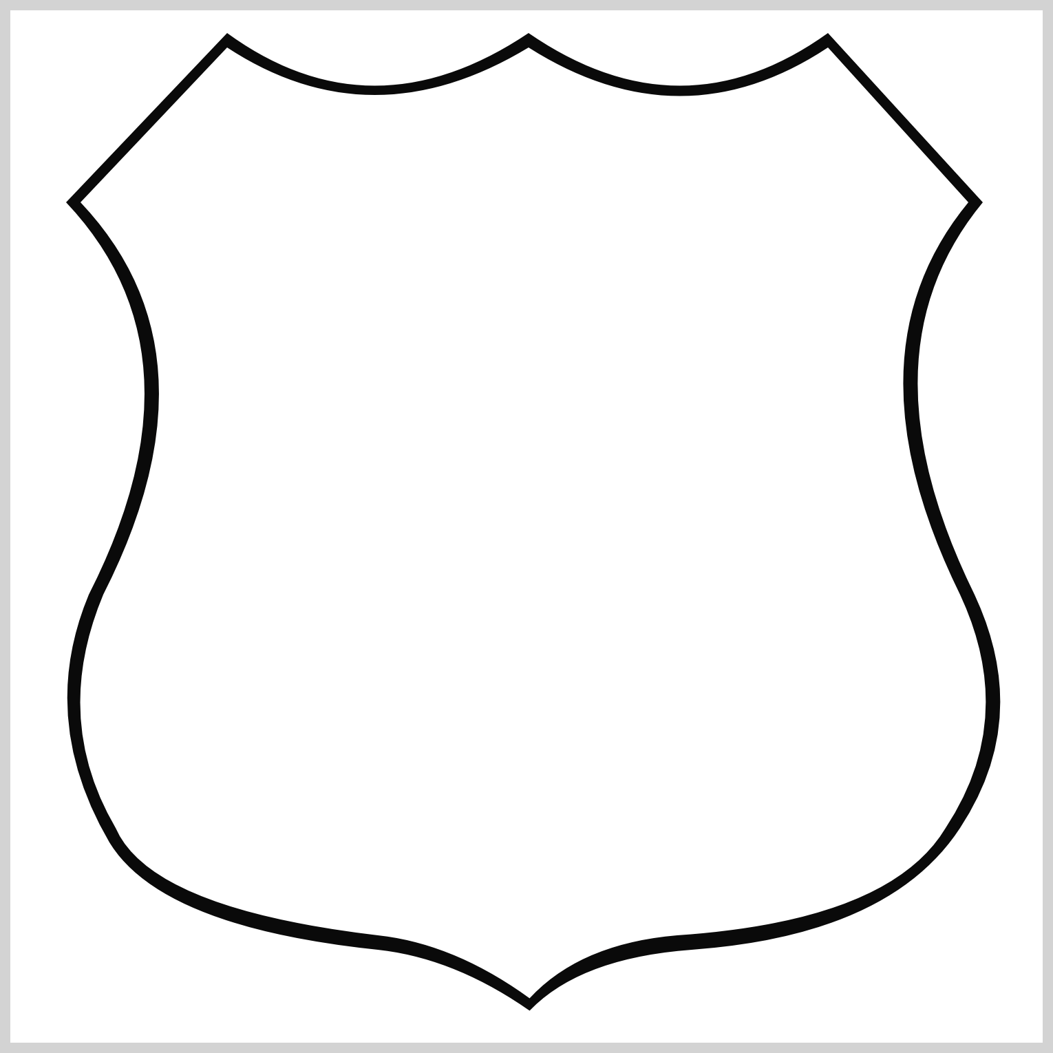
/* Shield */
.shield {
  background: #ffffff;
  width: 475px;
  height: 485px;
  top: 7px;
  left: 13px;
  clip-path: path(
    "M 238,11 Q 312,58 383,11 L 451,86 Q 390,160 447,276 Q 475,336 440,389 Q 413,434 310,441 Q 263,445 238.5,471.5 Q 202,445 165,441 Q 55,428 38,389 Q 7,336 32,276 Q 91,160 21,86 L 92,11 Q 162,57 238,11"
  );
}
The shield background color is #ffffff, a white hue. The SVG commands within the path() function are slightly modified to scale down the shield so it fits within the outline shape.
Inner Shield
The inner shield color is set to #0e0e0e, the same as the outline shape.
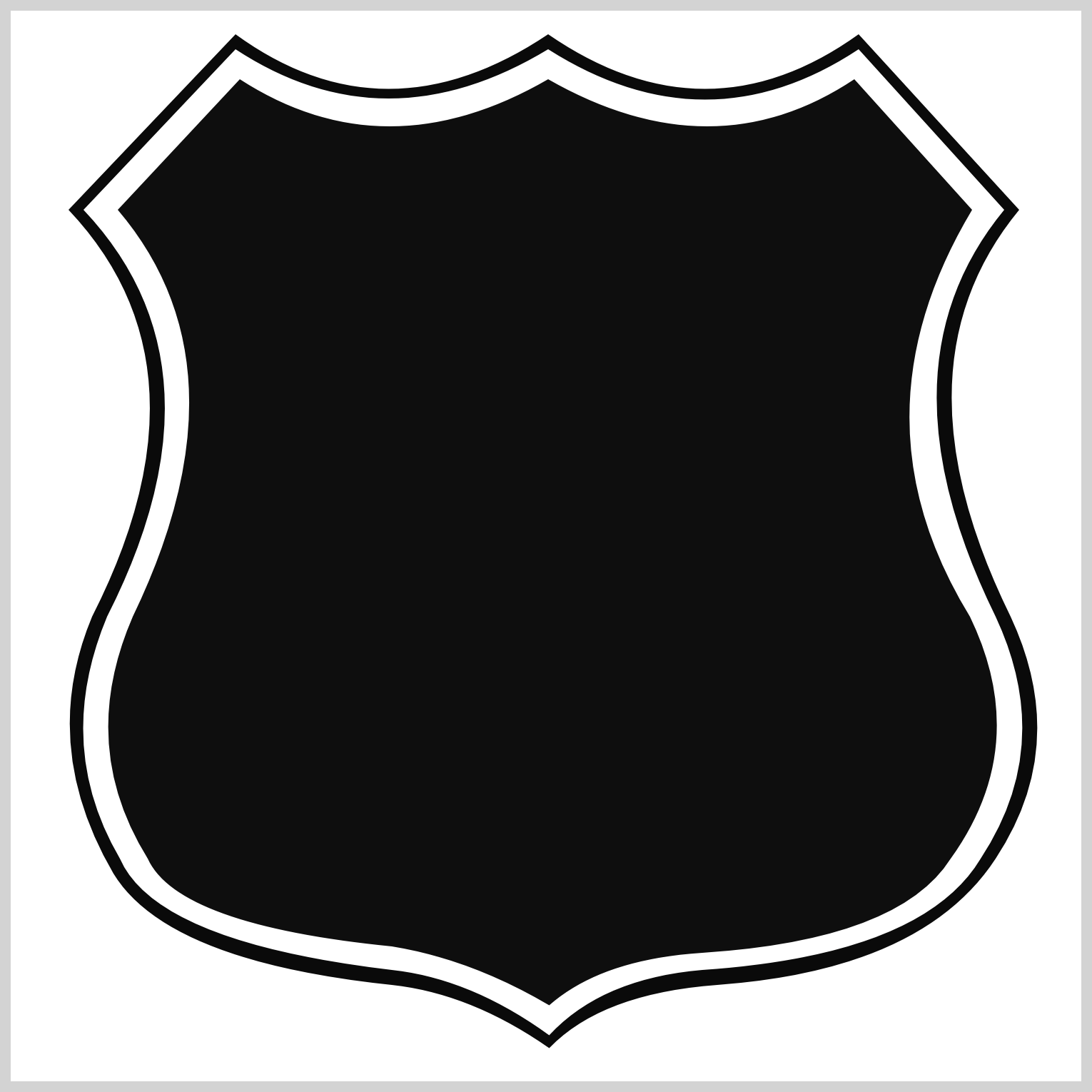
/* Inner Shield */
.inner-shield {
  background: #0e0e0e;
  width: 475px;
  height: 485px;
  top: 7px;
  left: 13px;
  clip-path: path(
    "M 238,25 Q 315,69 381,25 L 436,86 Q 378,183 435,276 Q 464,336 426,389 Q 402,427 310,433 Q 263,436 238.5,457.5 Q 202,436 165,430 Q 65,420 51,389 Q 18,336 44,276 Q 100,160 37,86 L 94,25 Q 162,69 238,25"
  );
}
Similar to the shield shape, the inner shield SVG commands are modified. Use the SVG Visualizer Tool introduced in the Route Sign Outline section to visualize the SVG commands.
Horizontal Bar
The CSS polygon() function is used to make the horizontal bar that splits the upper and lower portion of the shield shape.
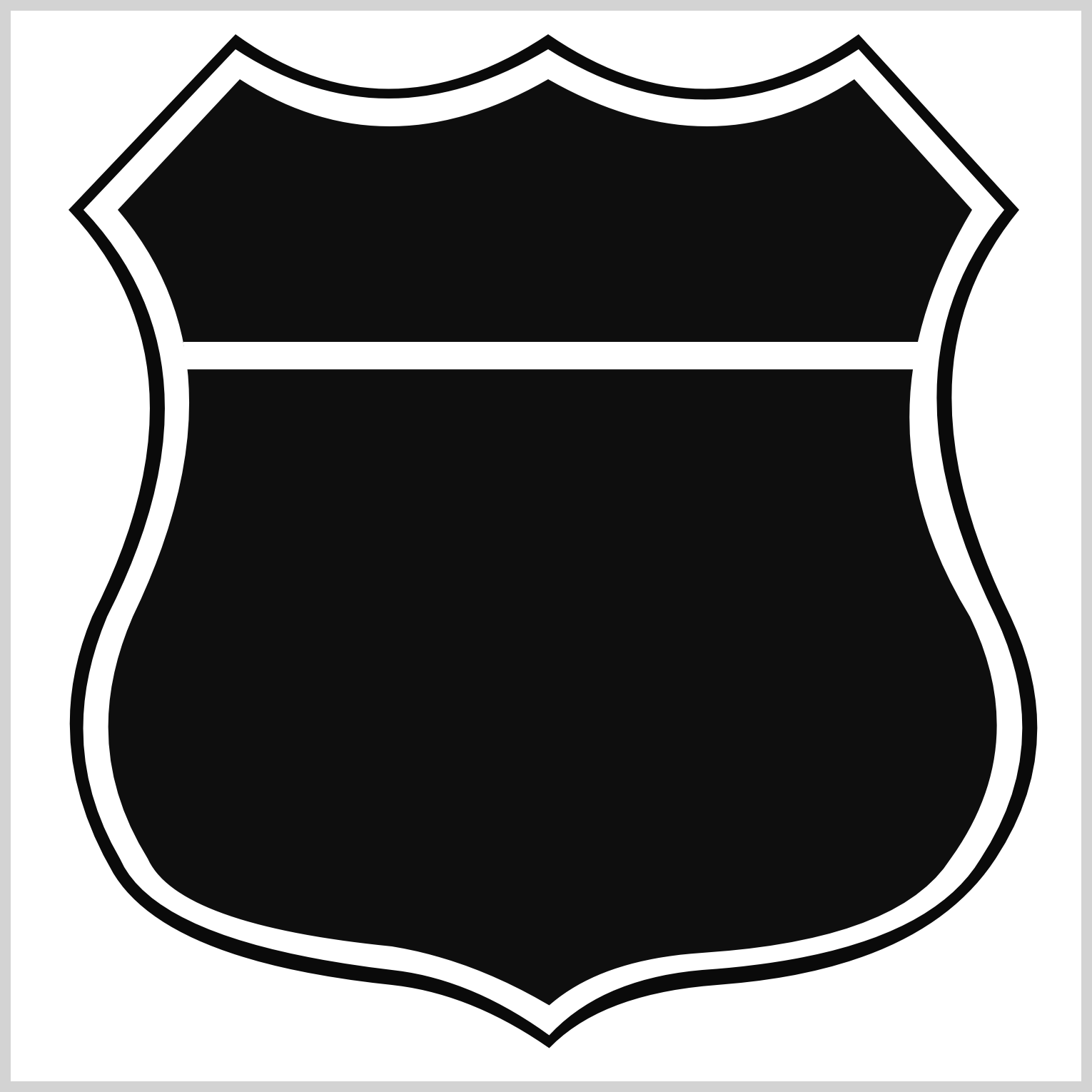
/* Bar */
.bar {
  background: #ffffff;
  width: 343.5px;
  height: 13px;
  top: 154.5px;
  left: 80.5px;
  clip-path: polygon(0 0, 100% 0, 99.3% 100%, 0.5% 100%);
}
The main reason to utilize the polygon() function to make the horizontal bar is it enables you to taper corners. The lower left and right-hand sides of the bar need to be slightly tapered to match the shield’s curvature.
The number pairs indicate the x and y-axis coordinates.
polygon(0 0, 100% 0, 99.3% 100%, 0.5% 100%)
0 0is the upper left-side corner100% 0indicates the upper right-side corner99.3% 100%is the lower right-side corner0.5% 100%equates to the lower left-side corner
The lower right and left side corners are slightly tapered compared to the upper corners, using 99.3% and 0.5% property values, respectively.
The shape components are completed, so let’s start working on the letterings in the following sections.
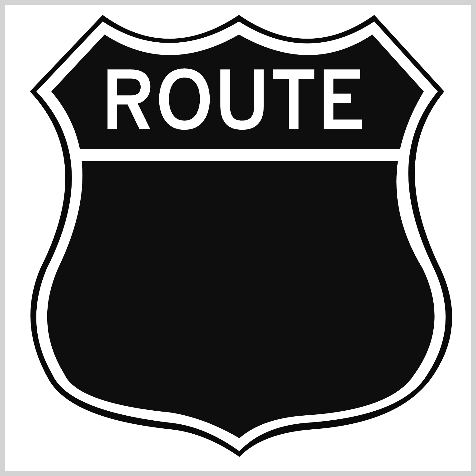
Route
The route lettering is located on the top half of the shield.
<div class="route">ROUTE</div>
Make sure to type all the letters in uppercase in the <div> HTML element.
/* Route */
.route {
  width: 284px;
  height: 73px;
  top: 55px;
  left: 103px;
  font-size: 87px;
}
The route lettering is 284px wide and 73px high and positioned 55px from the top and 103px from the left. The font size is set to 87px.
Next up is the U.S. lettering.
U.S.
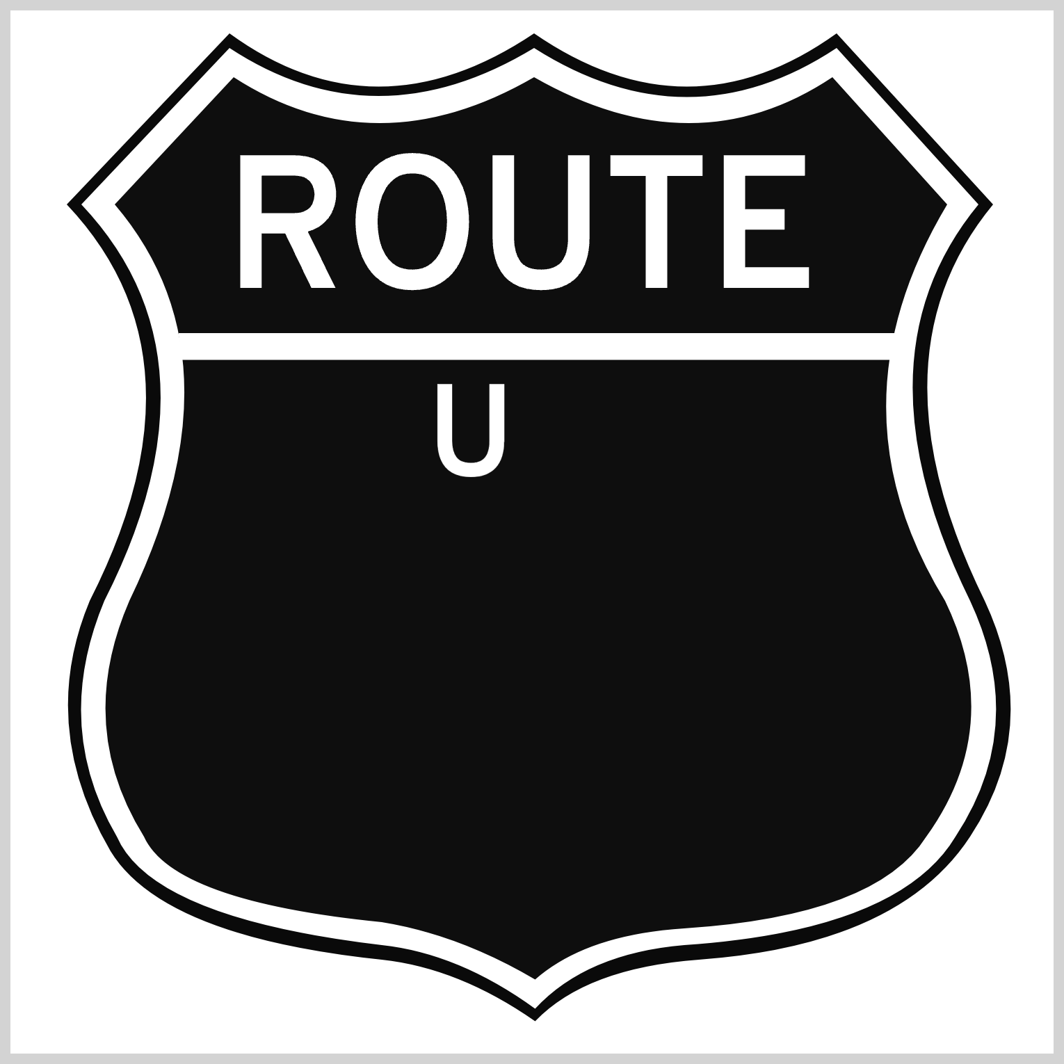
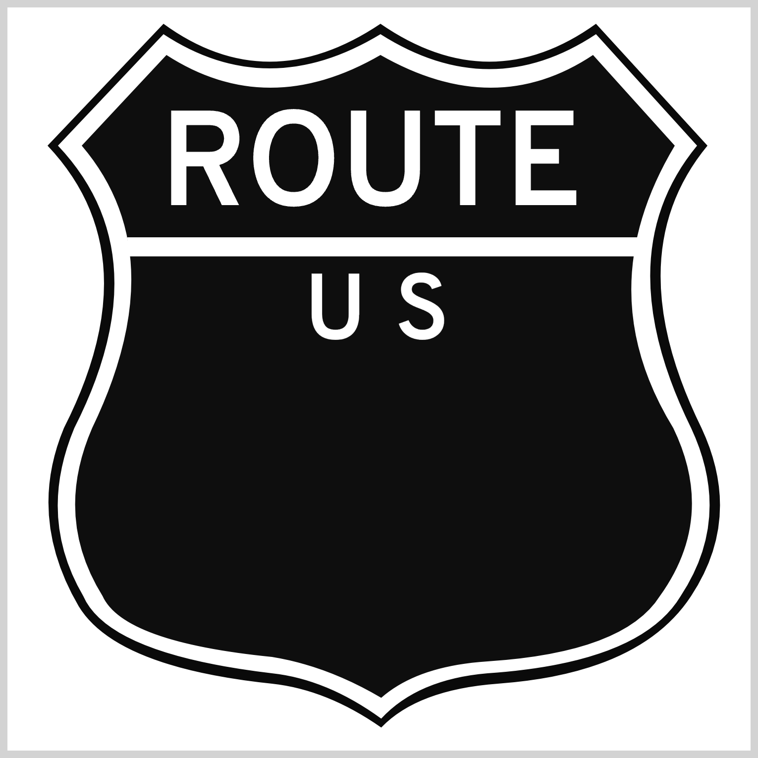
The U.S. lettering is right below the horizontal bar and centered. You’ll split the letters into two HTML <div>s for more precise positioning.
<div class="us-1">U</div>
<div class="us-2">S</div>
/* U.S. 1 */
.us-1 {
  width: 80px;
  height: 58px;
  top: 169px;
  left: 200px;
  font-size: 60px;
}
The font size is set to 60px for both letters. The width and height property values are 80px and 58px. The “U” letter’s left position is 200px.
/* U.S. 2 */
.us-2 {
  width: 80px;
  height: 58px;
  top: 169px;
  left: 261px;
  font-size: 60px;
}
Besides the left position of 261px, the rest of the “S” property values are similar to the previous values.
Onward to the final section.
Sixty Six
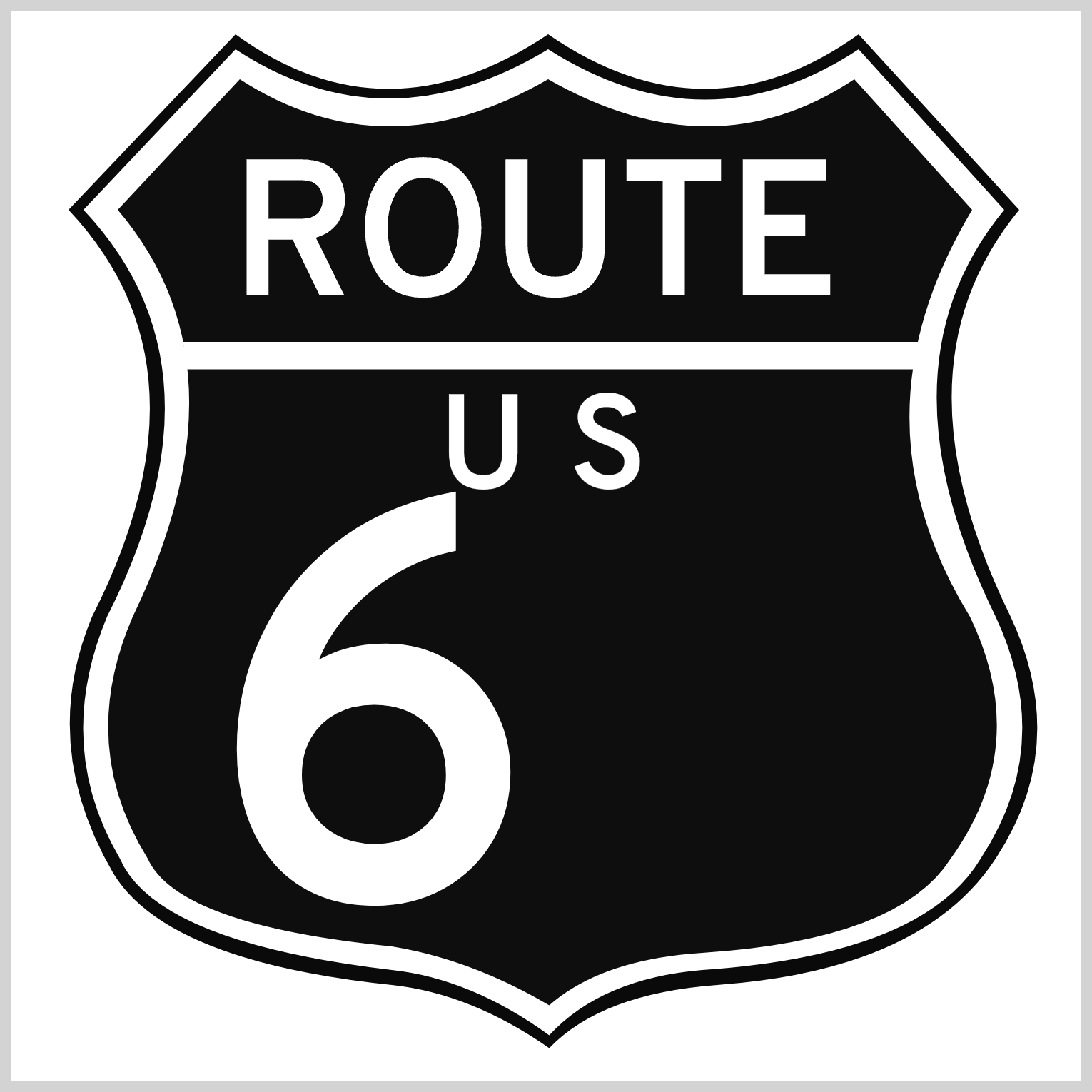
The sixty-six lettering is the most prominent letter in the signage. It’s located in the middle of the lower half of the shield. Similar to the previous U.S. lettering, you’ll split sixty-six into two HTML <div> for better positioning.
<div class="six-1">6</div>
<div class="six-2">6</div>
/* Six - 1 */
.six-1 {
  width: 150px;
  height: 192px;
  top: 186px;
  left: 93px;
  font-size: 255px;
}
Besides the left property value, all property values are identical for both sixes. The width is set to 150px and height is 192px. The position is 186px from the top. The first six’s left position is 93px.

/* Six - 2 */
.six-2 {
  width: 150px;
  height: 192px;
  top: 186px;
  left: 235px;
  font-size: 255px;
}
The second six’s left position is set to 235px. The font size is set to 255px for both letters.
You can see and play with the complete code on Pyxofy’s CodePen page.
See the Pen CSS Art – Making Irregular Shapes Using clip-path path() Function by Pyxofy (@pyxofy) on CodePen.
Conclusion
You learned how to combine the CSS path() and polygon() functions in this article to create irregular shapes such as shields and tapered horizontal bars. You learned how to manipulate lettering using font-family, font-weight, and font-size CSS properties.
The SVG Commands such as M, Q, and L can be tricky to use at first, but with practice, you’ll be able to use them to create unusual and irregular shapes. Use SVG Visualizer tools to speed up your SVG image creation workflow.
What irregular shapes will you be creating with path() and SVG Commands? Share your masterpiece with us on LinkedIn, Threads, Mastodon, X (Twitter) @pyxofy, or Facebook.
We hope you liked this article. Kindly share it with your network. We appreciate it.
Related Articles
