CSS Art – Koinobori Carp Streamer – Part 2
Reusing CSS code to make multiple images is a time-saving technique. Learn how to make carp scales, a Mother and Child Carp, in this step-by-step article.

Introduction
In part 1 of this two-part article series, you learned the process for creating the arrow wheel, pole, and Father Carp. In part 2, you will delve into crafting the scales, Mother Carp and Child Carp.
You’ll learn how to use the following CSS properties and functions in this article:
Preview
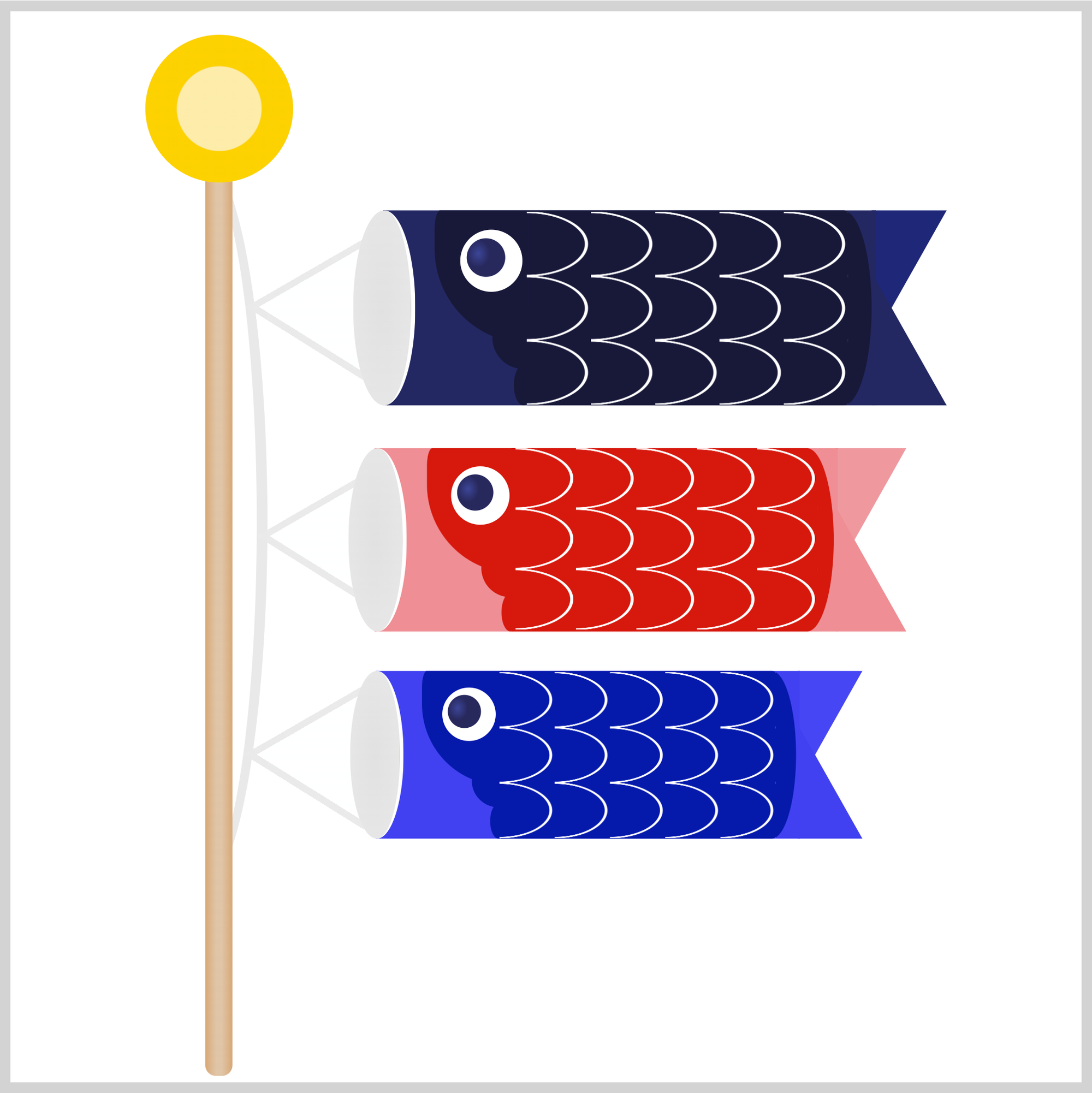
In part 2 of this two-part article series, you’ll create the scales, Mother and Child Carp.
Prerequisites
Essential CSS and HTML knowledge will help you understand the concepts and techniques introduced in this article. Jump over to this article if you require an HTML and CSS primer.
We assume that you have set up tools to create CSS art. If you haven’t, this article will show you how to set them up.
HTML Structure
<div class="container">
  <div class="pole-cord">
    <div class="father-carp-string">
      <div class="string"></div>
    </div>
    <div class="mother-carp-string">
      <div class="string"></div>
    </div>
    <div class="child-carp-string">
      <div class="string"></div>
    </div>
  </div>
  <div class="pole"></div>
  <div class="arrow-wheel"></div>
  <div class="father-carp">
    <div class="tail"></div>
    <div class="body"></div>
    <div class="mouth"></div>
    <div class="gill"></div>
    <div class="scales"></div>
    <div class="eye"></div>
  </div>
  <div class="mother-carp">
    <div class="tail"></div>
    <div class="body"></div>
    <div class="mouth"></div>
    <div class="gill"></div>
    <div class="scales"></div>
    <div class="eye"></div>
  </div>
  <div class="child-carp">
    <div class="tail"></div>
    <div class="body"></div>
    <div class="mouth"></div>
    <div class="gill"></div>
    <div class="scales"></div>
    <div class="eye"></div>
  </div>
</div>
container is the outermost enclosure. It enables the content to be centered and draws a light gray border. The rest of the divs represent each image component.
Keep the HTML structure as is for the image to display correctly.
Body and Container Div CSS
CSS code for the body and container div.
/* Body and Container Settings */
/* Center shapes */
body {
  margin: 0;
  padding: 0;
  height: 100vh;
  display: flex;
  justify-content: center;
  align-items: center;
  flex-wrap: wrap;
}

/* Set background and border color */
.container {
  min-width: 500px;
  height: 500px;
  border: 5px solid lightgray;
  background: transparent;
  position: relative;
  margin: 5px;
  display: flex;
  justify-content: center;
  align-items: center;
  overflow: hidden;
Scales
The carp scales are made with a repeating image pattern. This technique is similar to making repeating background patterns.
.scales {
  position: absolute;
  width: 150px;
  height: 90px;
  left: 241px;
  top: 93.5px;
}
You create the container, scales, by setting CSS width and height property values. You position it with the left and top CSS properties.

First, you create a single image; in this example, you use the CSS radial-gradient() function to create an ellipse.
.scales {
  background: radial-gradient(
    100% 53% at 0 50%,
    transparent 90%,
    white 91% 95%,
    transparent 96%
  );
}
100% 53%controls the width and height of the single scale image.at 0 50%controls the scale image position.transparent 90%creates a transparent area from 0% to 90%.white 91% 95%draws a white area between 91% and 95%.transparent 96%makes a transparent area from 96% and 100%.
The scale image is done. Next you’ll make it repeat using the CSS background-size property.

.scales {
  background-size: 30px 30px;
}
Unless you specify otherwise, a background image will repeat by default. You set the image background size to 30px 30px, giving a square container for the scale image. You can change the image size by changing the background-size property values. The first value controls the image’s horizontal size, and the second value controls the vertical size.
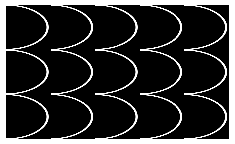
Ok, you’ve completed the scales. In the next section, you’ll start working on Mother Carp.
Mother Carp
The Mother and Child Carp are made with the same image components you used for Father Carp in part 1 of this two-part article series.
.mother-carp {
  position: absolute;
  left: 170px;
  top: 204px;
  transform: scale(0.94);
}
Since you’re using the same Father Carp image components, we need to scale it down using the transform: scale() function. For Mother Carp, you set the scale to 0.94, which means the images will be around 6% smaller. To position Mother Carp, you use the CSS left and top properties.
A key benefit of reusing CSS image components is that you only need to adjust properties that differ from the original image design, rather than creating everything from scratch.
Let’s work on Mother Carp’s image components in the following sections.
String
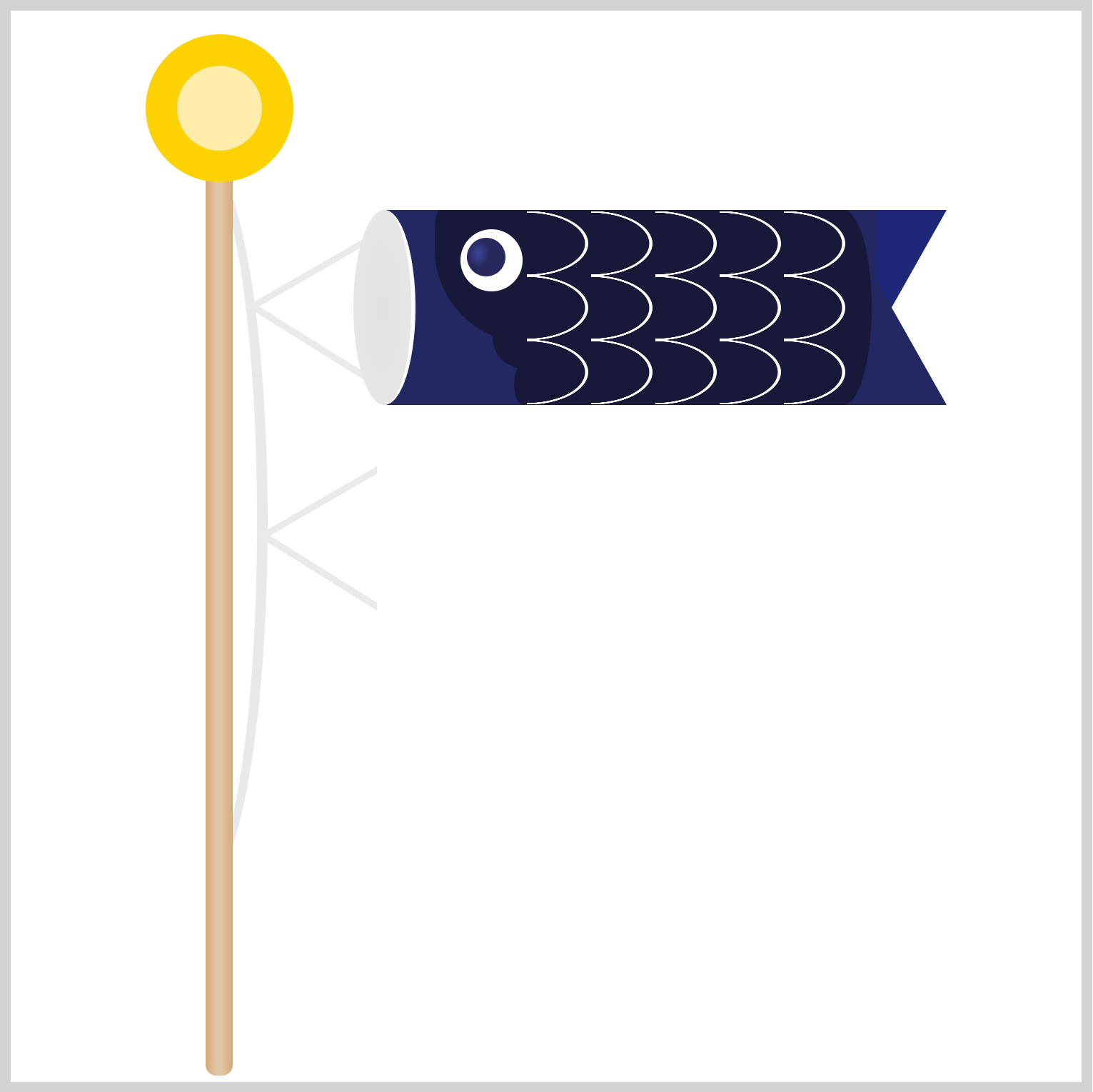
.mother-carp-string {
  position: absolute;
  left: 53px;
  top: 137px;
}
Mother Carp’s string is positioned 53px from the left and 137px from the top.
Mouth

.mother-carp .mouth {
  position: absolute;
  left: -13px;
  top: 0px;
}
Similar to the previous string, we only need to position the mouth image component. You set the CSS left to -13px and the top to 0px.
Body
In this section, you’ll make Mother Carp’s body base and trunk. You’ll change the default colors to red and pinkish tones.
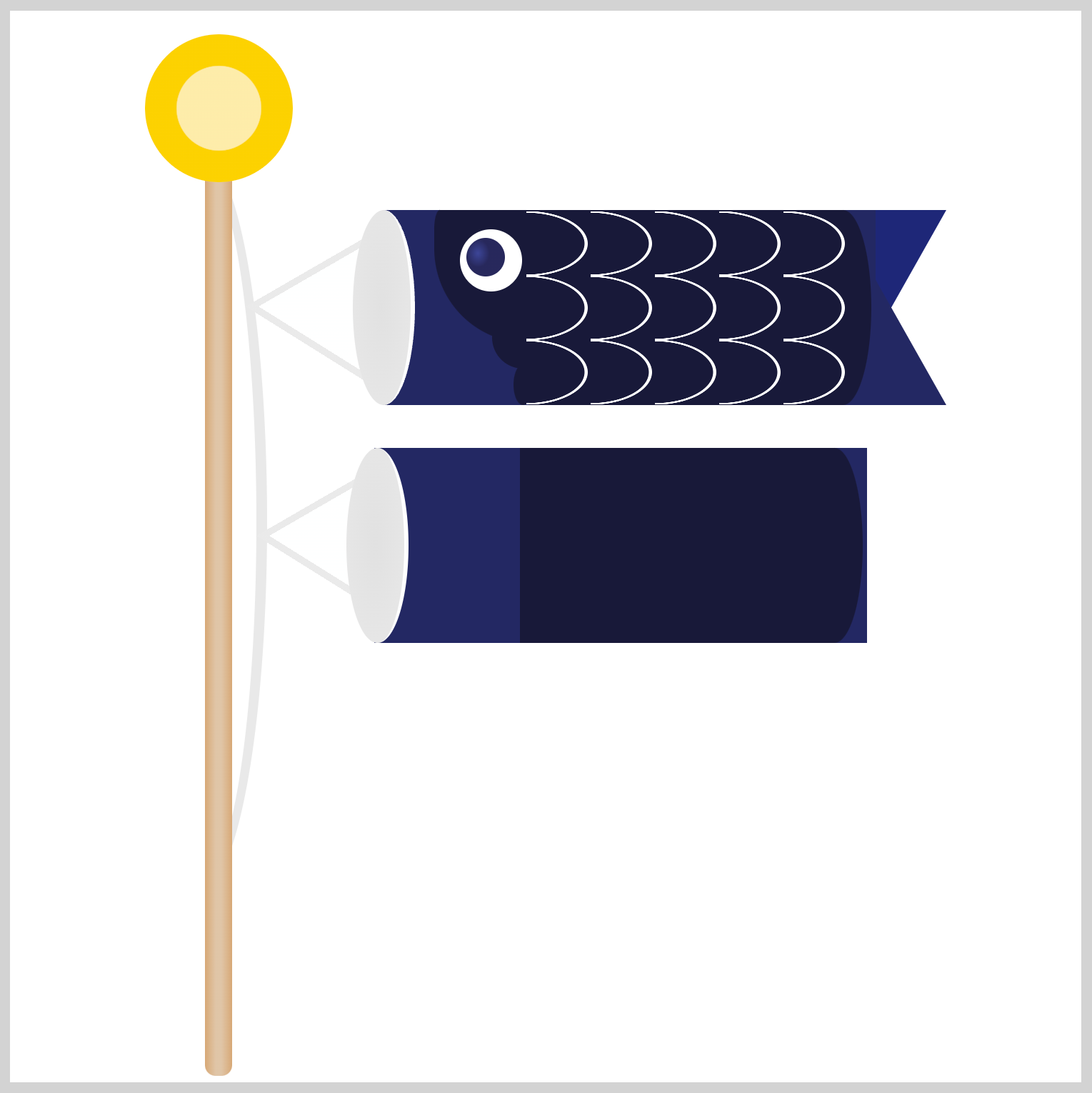
First, you’ll change the body base color.
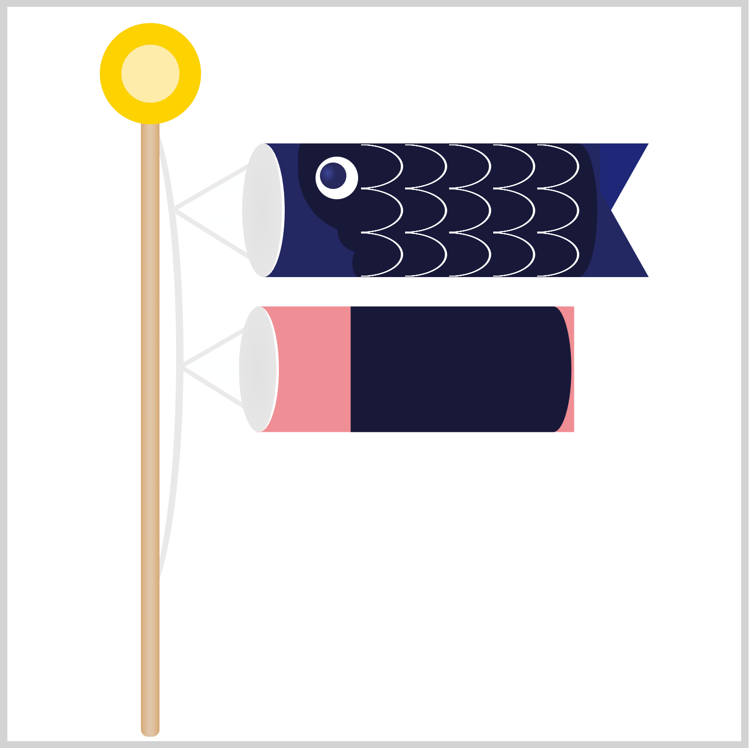
.mother-carp .body {
  position: absolute;
  left: 0px;
  top: 0px;
  background: #ef8e94;
}
To change the body base color, you set the background property value to #ef8e94, a rosy pink hue.
Next, you’ll change the trunk color.
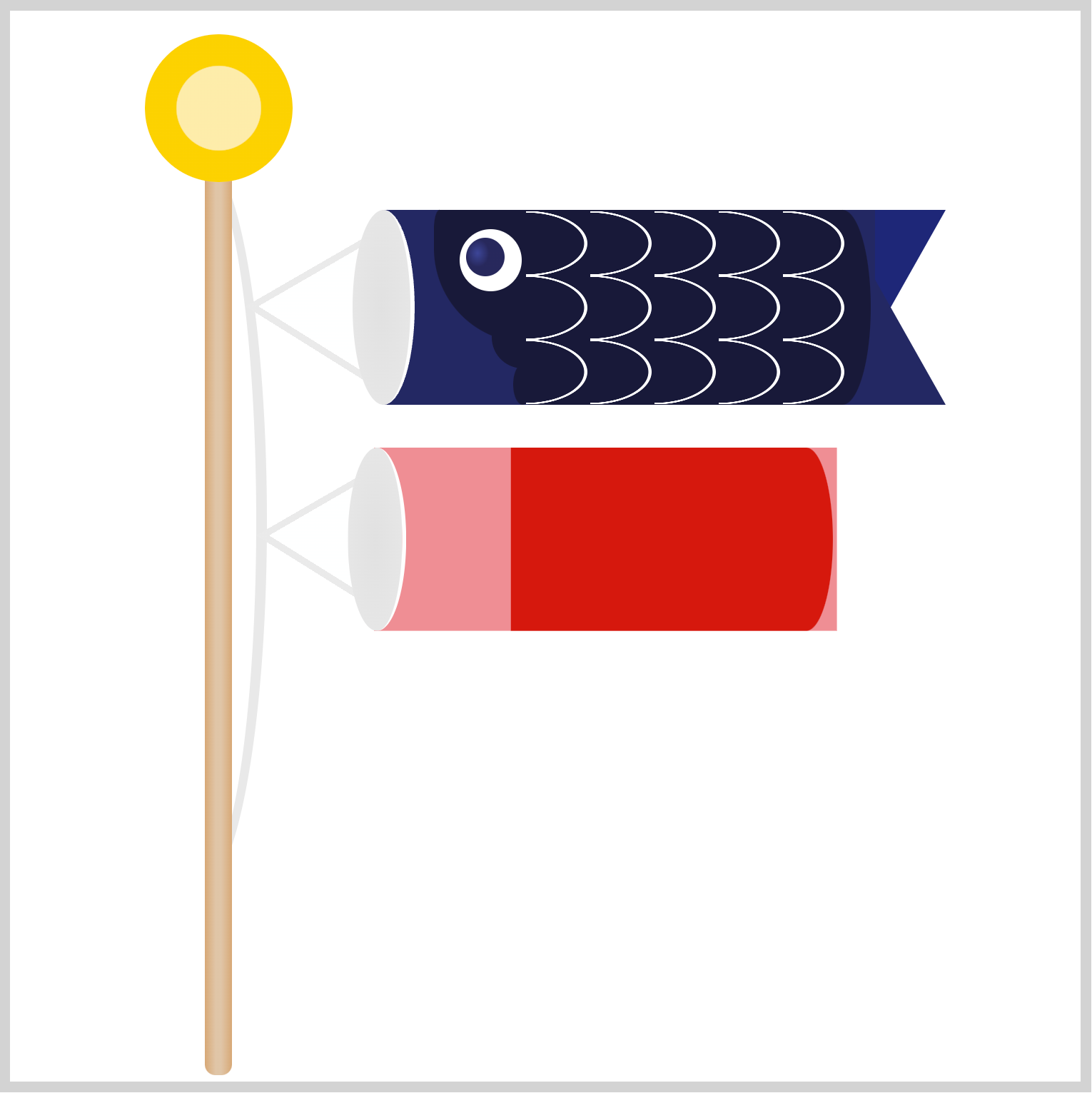
.mother-carp .body::before {
  background: #d6160d;
}
Setting background to #d6160d changes the color from the default dark blue to a deep, lava red.
The body and trunk are done. Let’s move on to the tail section.
Tail
You will set the tail colors to match the body and trunk color.
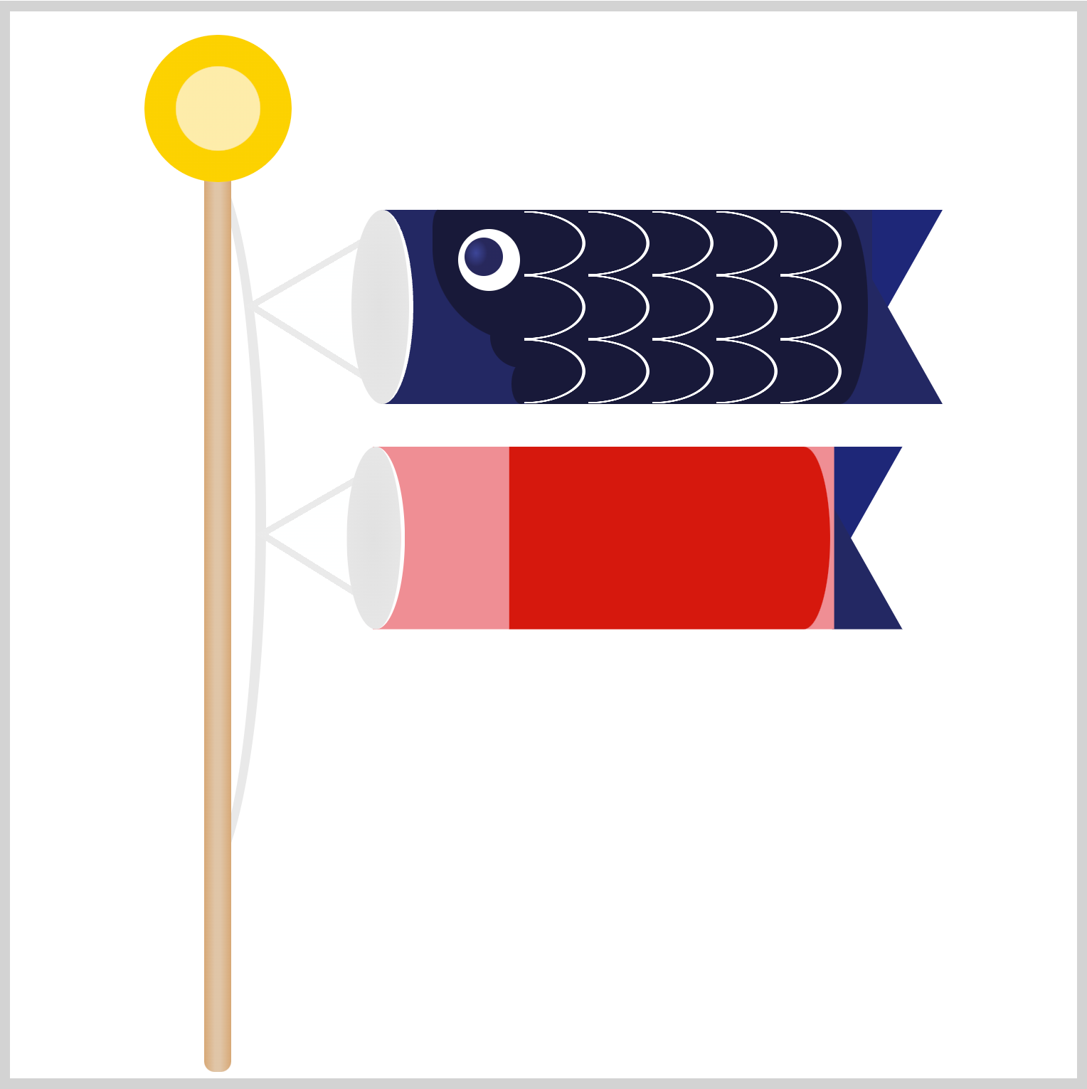
Since we’re reusing Father Carp’s tail, its initial color will be dark blue.
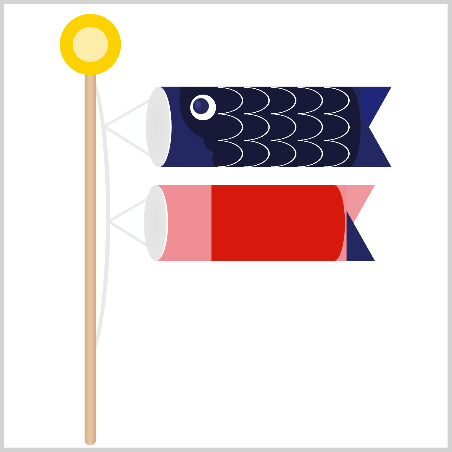
.mother-carp .tail {
  position: absolute;
  left: 229px;
  top: 0px;
  border-top: 62px solid #ef999e;
}
You only need to change to the border-top color value; the rest remains the same. Set the border-top color value to #ef999e to give it a light pink color.
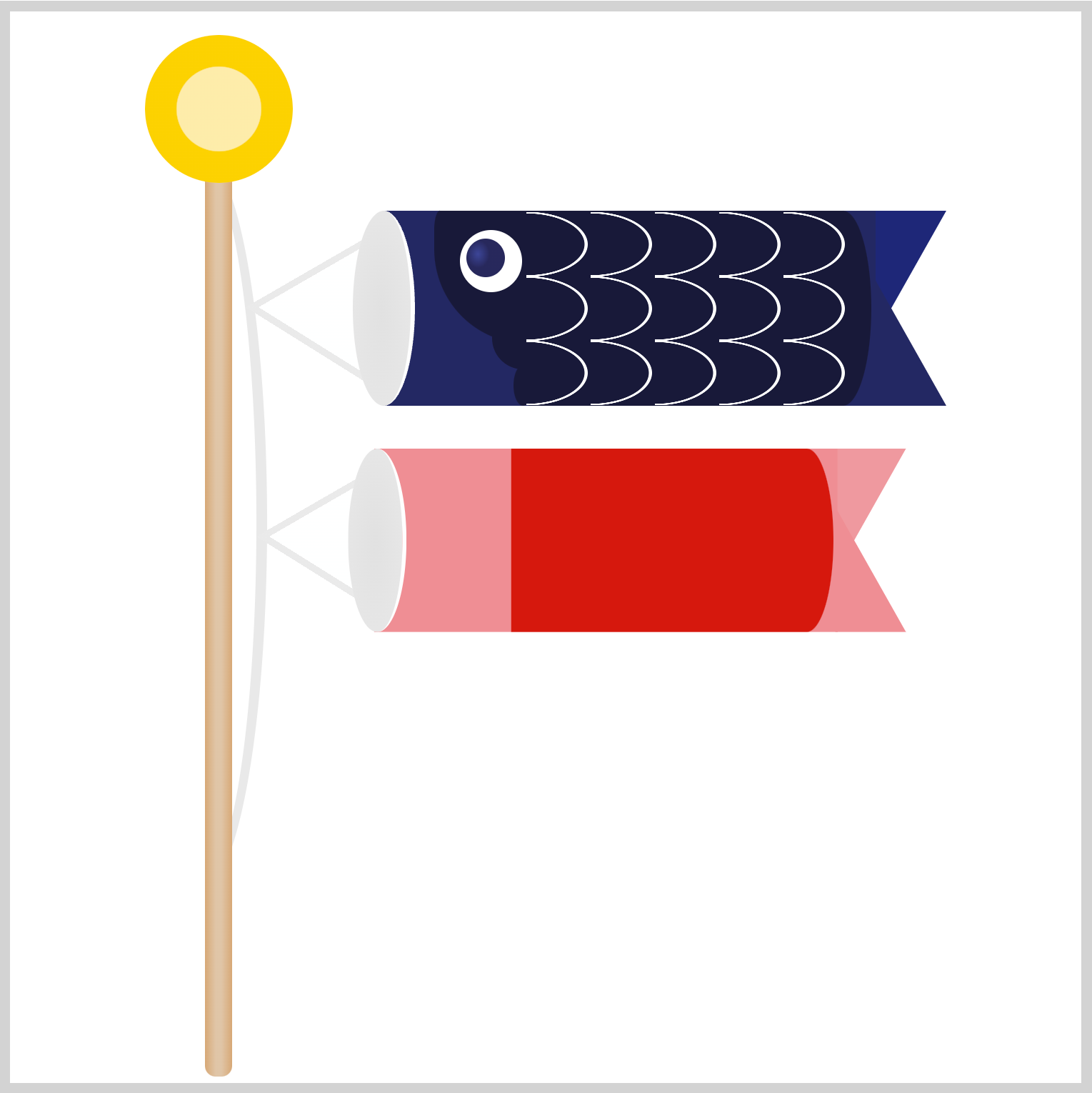
.mother-carp .tail::before {
  border-bottom: 62px solid #ef8e94;
}
The bottom tail color is the same #ef8e94 you used for the body base.
Next up is the eye section.
Eye
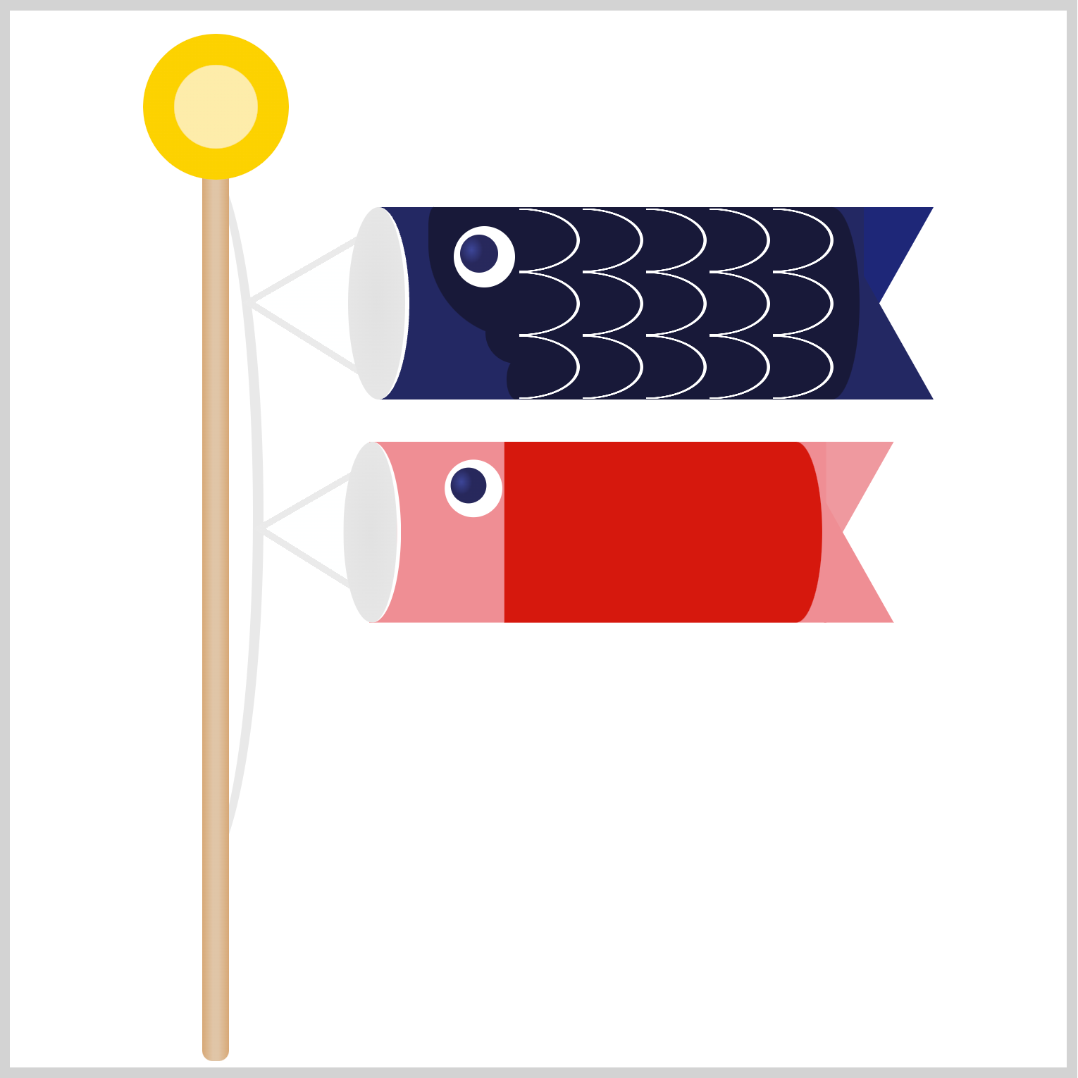
.mother-carp .eye {
  position: absolute;
  left: 38px;
  top: 9px;
}
For the eye, you need to adjust its position. You set the left CSS property value to 38px and top to 9px.
That’s it for the eye, onward to the gill section.
Gill

You will modify the gill color and position to match Mother Carp’s body.
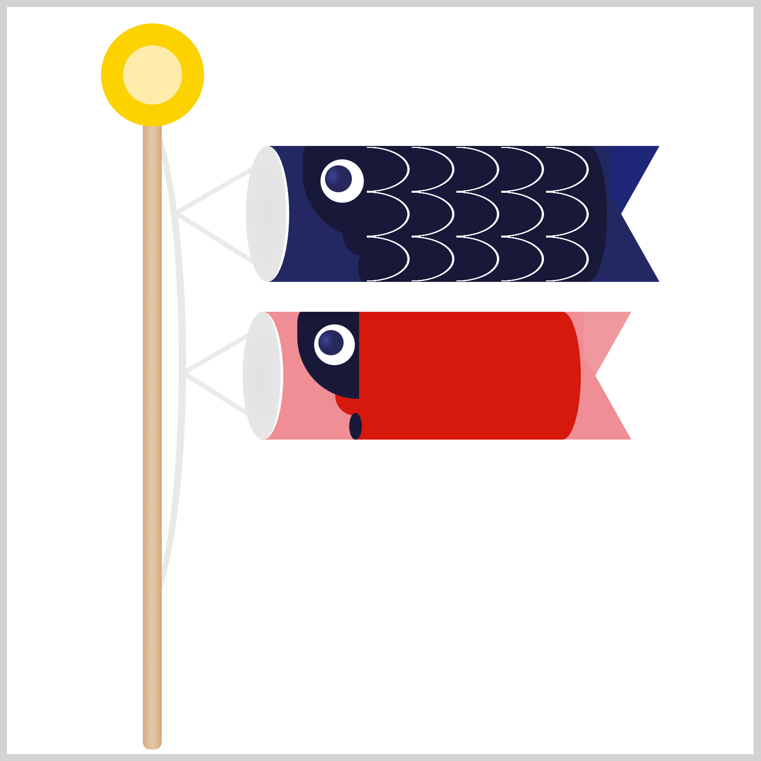
.mother-carp .gill {
  position: absolute;
  left: 53px;
  top: 45px;
  background: #d6160d;
}
First, you'll adjust the gill position to left: 53px and top: 45px. Second, you will change the background color to #d6160d, which is the trunk color.

.mother-carp .gill::before {
  background: #d6160d;
}
For the ellipse and rectangle with rounded corners, the only modification required is to change the background color to #d6160d.

.mother-carp .gill::after {
  background: #d6160d;
}
You’re almost done with Mother Carp. Let’s finish it by configuring the scales.
Scales

.mother-carp .scales {
  position: absolute;
  left: 70px;
  top: 0px;
}
To finalize Mother Carp, set the CSS left to 70px and the top to 0px.
Congratulations on completing Mother Carp. In the next section, you’ll work on Child Carp.
Child Carp
The Child Carp will be created like the Mother Carp, with the main differences being in image size and colors. Most attributes and the creation method are the same as when making the Mother Carp in the previous sections.
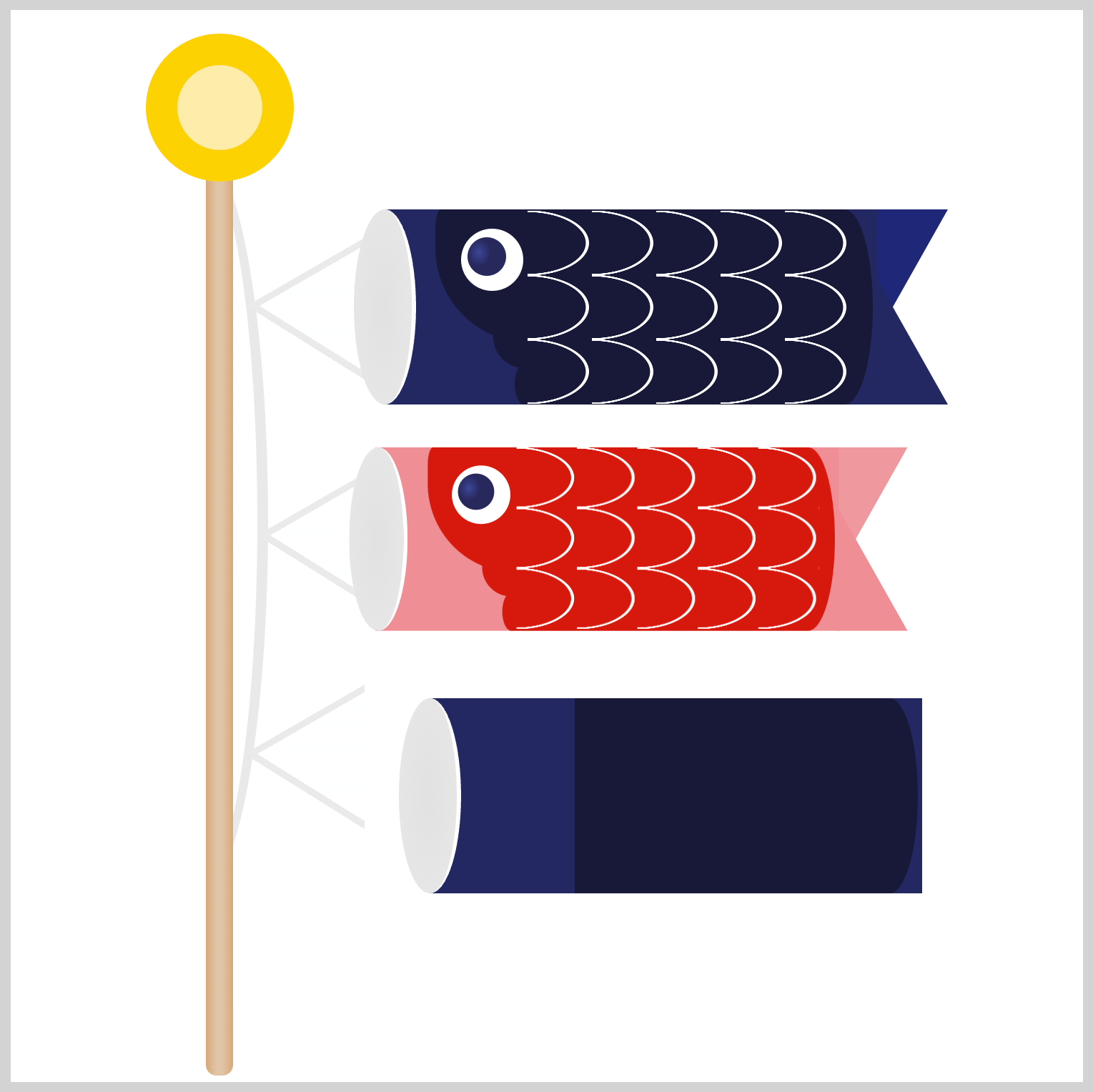
.child-carp {
  position: absolute;
  left: 21px;
  top: 228px;
  transform: scale(0.86);
}
Since you’ll be using Father Carp’s image components, you need to scale them down first. You use the CSS scale() function to scale the image components to roughly 86%, and you do that by inserting 0.86 inside the function.
For the sake of brevity, detailed instructions will not be repeated for the remaining Child Carp sections, as they have already been covered in the Mother Carp sections.
String
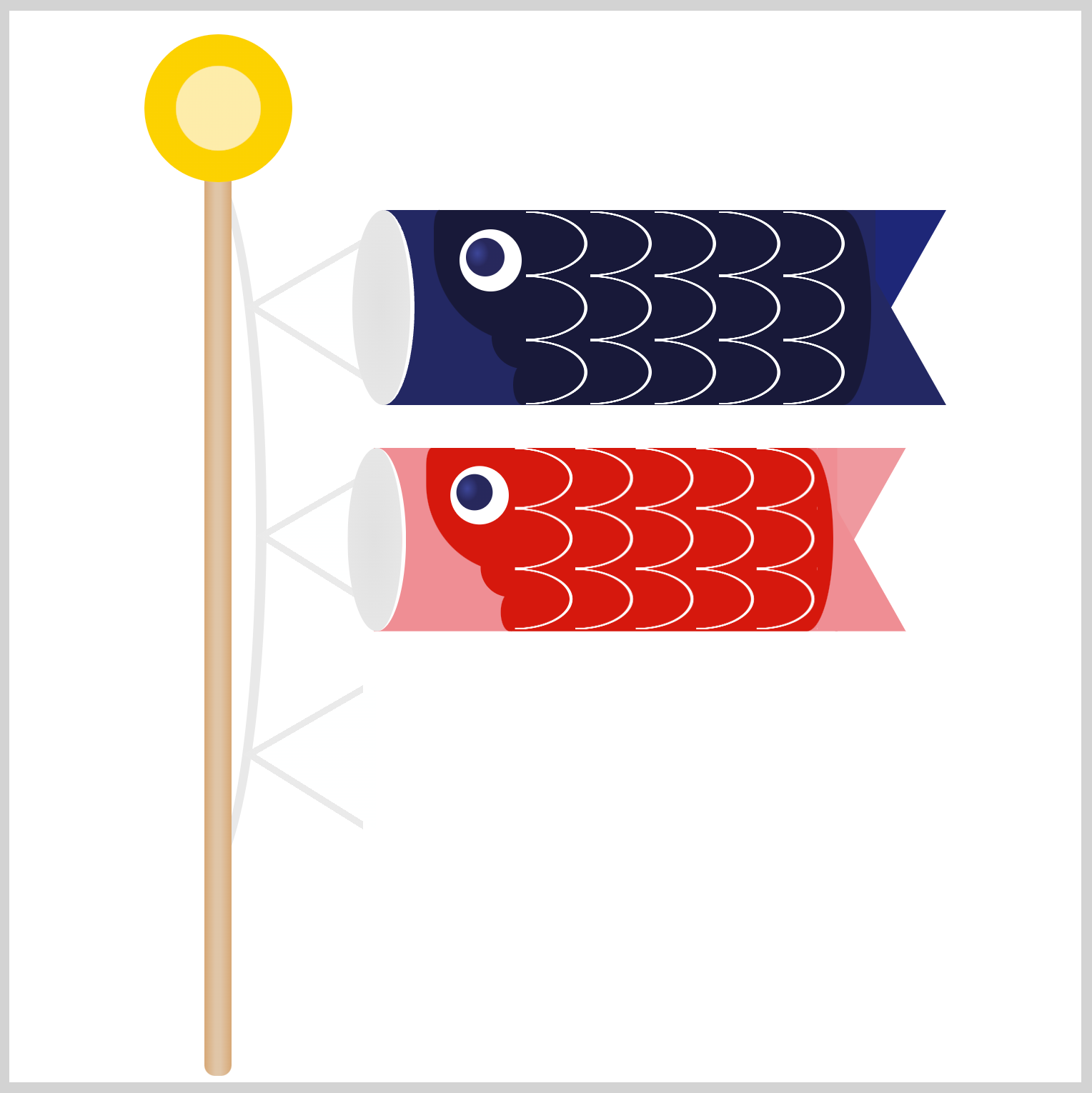
.child-carp-string {
  position: absolute;
  left: 47px;
  top: 239px;
}
Mouth

.child-carp .mouth {
  position: absolute;
  left: 160px;
  top: 93px;
}
Body
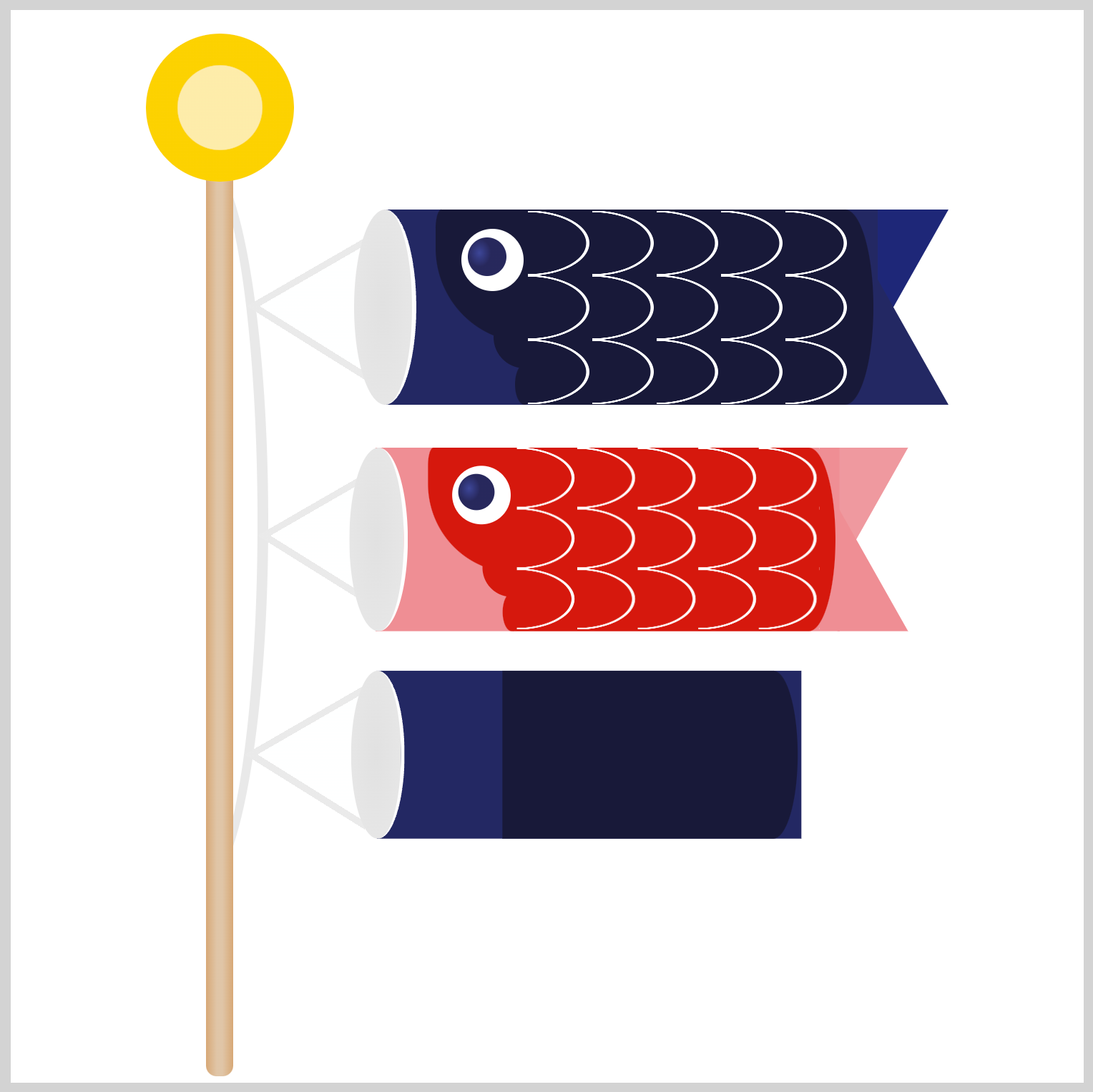
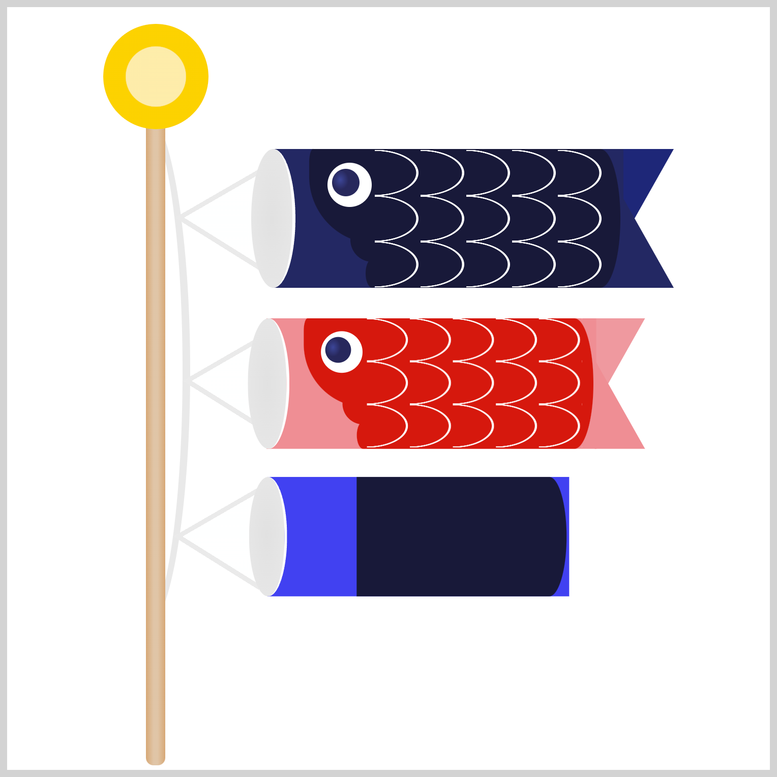
.child-carp .body {
  background: #3f42f1;
}
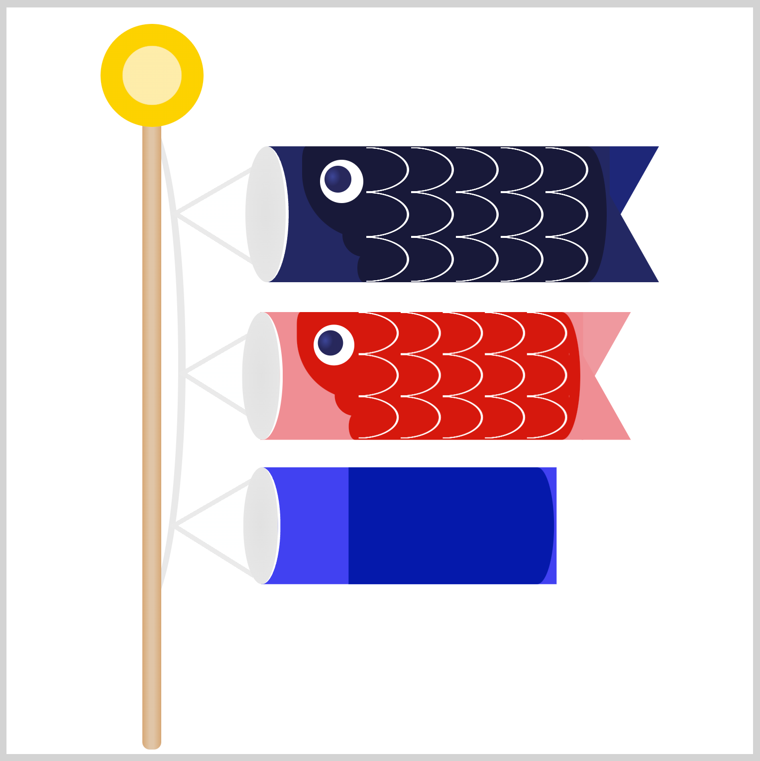
.child-carp .body::before {
  background: #011aab;
}
Tail

.child-carp .tail {
  position: absolute;
  left: 403px;
  top: 93px;
  border-top: 62px solid #4447f4;
}

.child-carp .tail::before {
  border-bottom: 62px solid #3f42f1;
}

Eye
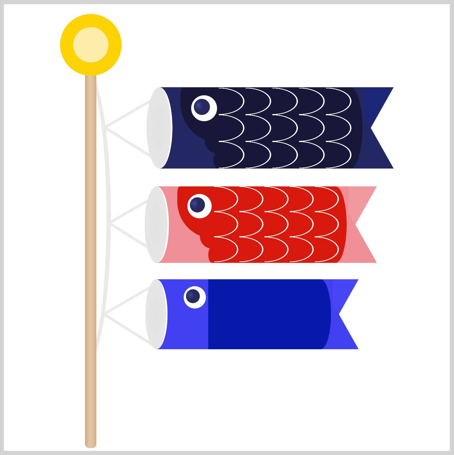
.mother-carp .eye {
  position: absolute;
  left: 38px;
  top: 9px;
}
Gill


.child-carp .gill {
  position: absolute;
  left: 226px;
  top: 138px;
  background: #011aab;
}

.child-carp .gill::before {
  background: #011aab;
}
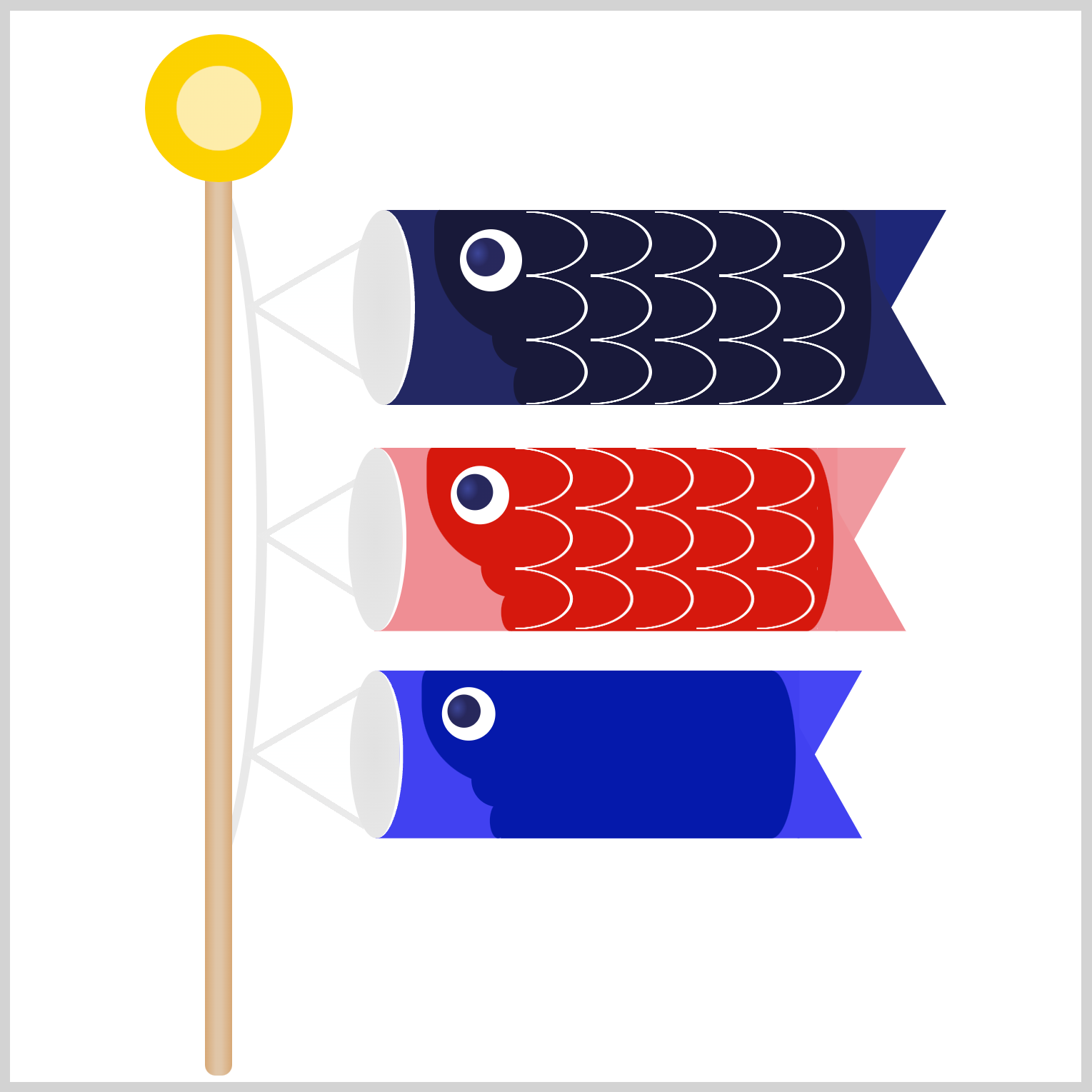
.child-carp .gill::after {
  background: #011aab;
}
Scales

.child-carp .scales {
  position: absolute;
  left: 241px;
  top: 94px;
}
You can see and play with the complete code on Pyxofy’s CodePen page.
See the Pen CSS Art - Koinobori Carp Streamer by Pyxofy (@pyxofy) on CodePen.
Conclusion
You learned how to reuse CSS code in part 2 of this two-part article series to create multiple images, a big time-saving technique. Using the CSS transform: scale() function, you were able to scale down images without manual adjustments.
Using the radial-gradient() function and background-size, you crafted intricate fish scale designs that seamlessly repeat, allowing you to adorn all three carp with these captivating patterns.
Repeating patterns and image scaling techniques are fun. Start creating art with them and share your masterpiece with us on LinkedIn, Threads, Mastodon, X (Twitter) @pyxofy , or Facebook.
We hope you liked this article. Kindly share it with your network. We appreciate it.
Related Articles

