CSS Art – Koinobori Carp Streamer – Part 1
Koi carp represents courage and determination in the Land of the Rising Sun. Join us in creating the symbolic Koinobori step-by-step using CSS.

Introduction
Koinobori , or carp streamer, is displayed to celebrate Children’s Day in Japan. It’s a carp-shaped windsock which can be as small as a sticker or can be as long as 100 meters and weigh 350 kg!
You’ll use these CSS properties and functions to create multiple Koinobori component images.
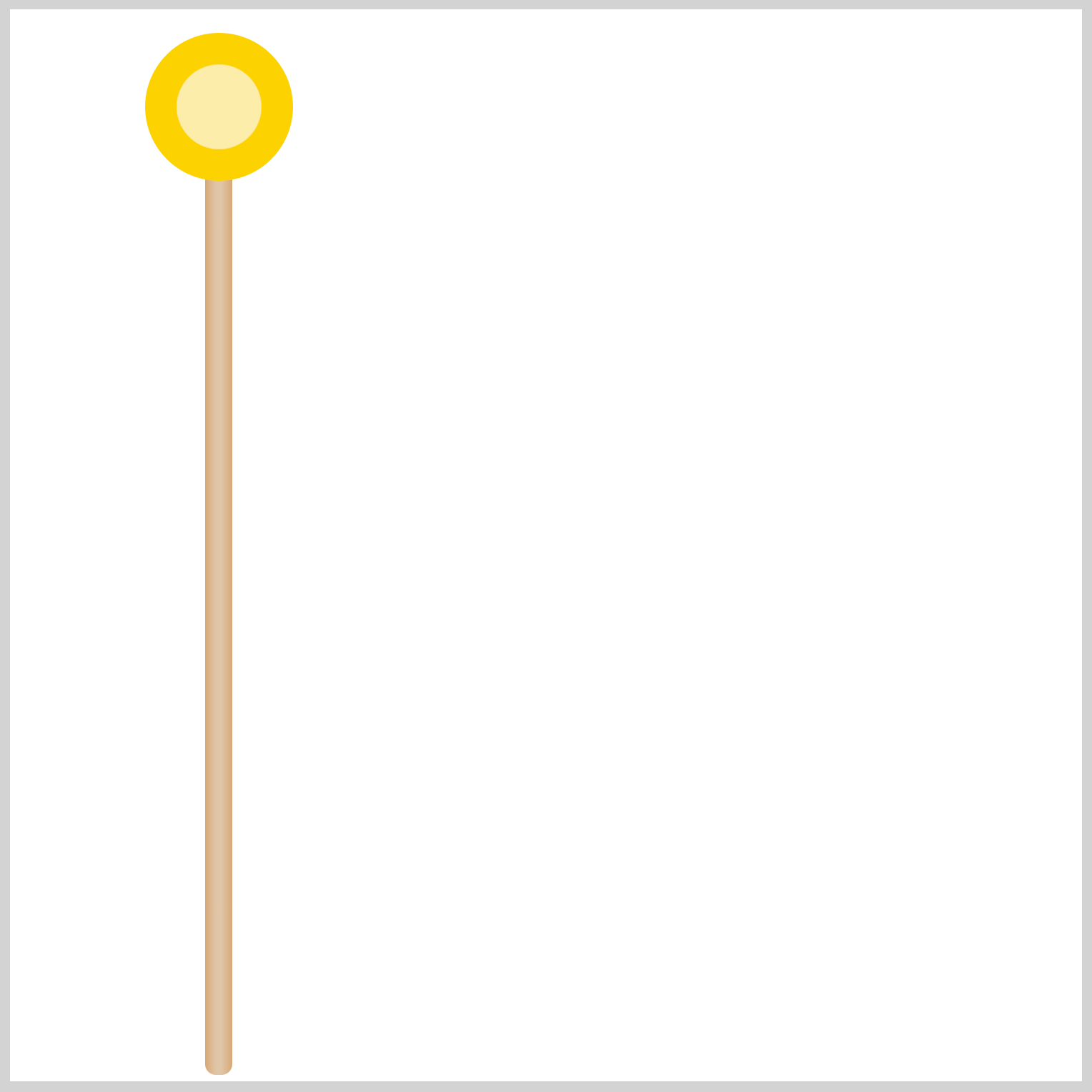
Preview
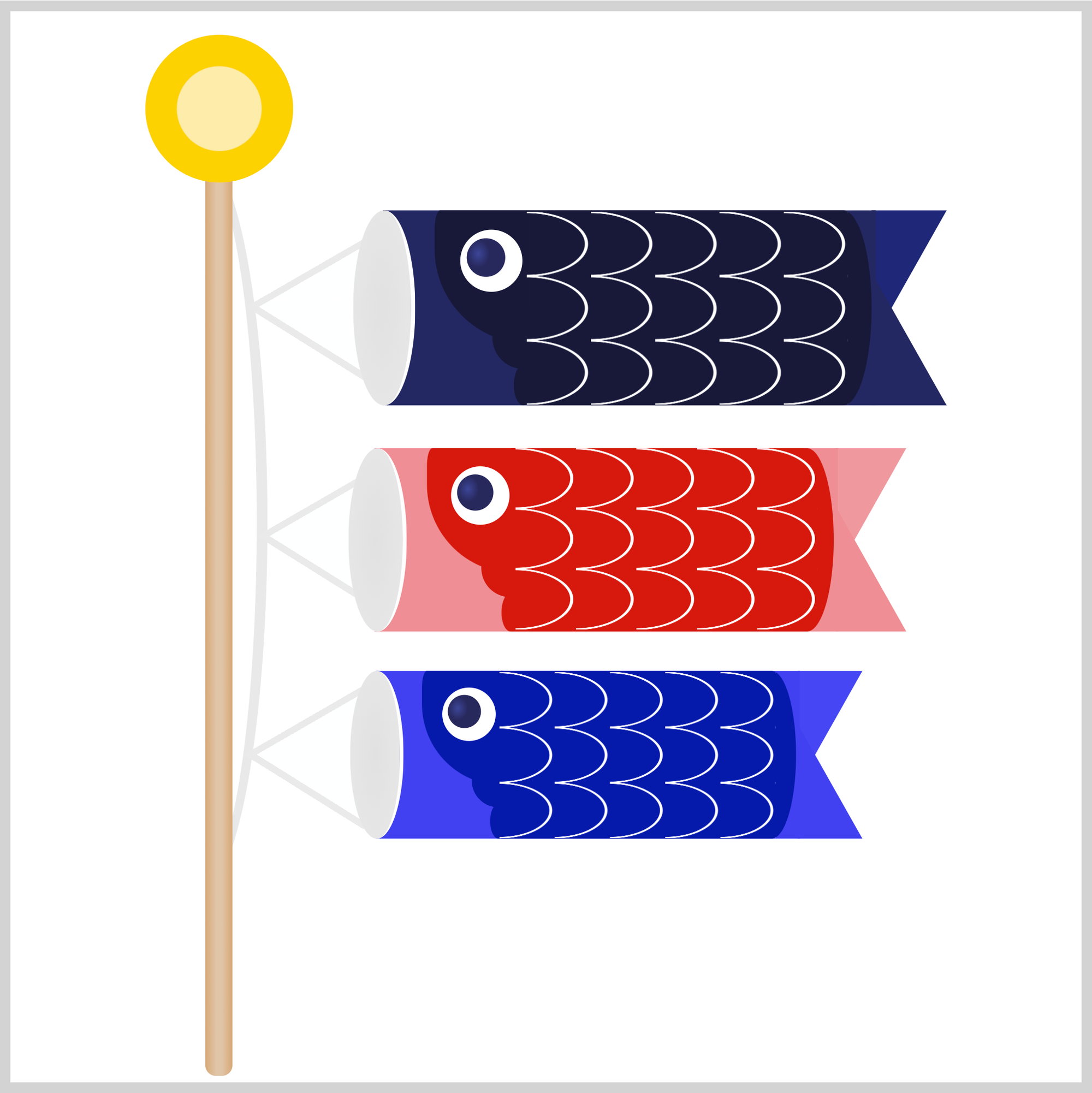
For part 1 of this two-part article, you’ll create these components.
- Arrow Wheel
- Pole
- Cord and Strings
- Father Carp
- Mouth and Body
- Tail
- Eye
- Gill
The scales, Mother Carp, and Child Carp will be explained in part 2 of this article series.
Prerequisites
Essential CSS and HTML knowledge will help you understand the concepts and techniques introduced in this article. Jump over to this article if you require an HTML and CSS primer.
We assume that you have set up tools to create CSS animation. If you haven’t, this article will show you how to set them up.
HTML Structure
<div class="container">
  <div class="pole-cord">
    <div class="father-carp-string">
      <div class="string"></div>
    </div>
  </div>
  <div class="pole"></div>
  <div class="arrow-wheel"></div>
  <div class="father-carp">
    <div class="tail"></div>
    <div class="body"></div>
    <div class="mouth"></div>
    <div class="gill"></div>
    <div class="scales"></div>
    <div class="eye"></div>
  </div>
</div>
container is the outermost enclosure. It enables the content to be centered and draws a light gray border.
The rest of the divs represent each image component. Keep the HTML structure as is for the image to display correctly.
Body and Container Div CSS
CSS code for the body and container div.
/* Body and Container Settings */
/* Center shapes */
body {
  margin: 0;
  padding: 0;
  height: 100vh;
  display: flex;
  justify-content: center;
  align-items: center;
  flex-wrap: wrap;
}

/* Set background and border color */
.container {
  min-width: 500px;
  height: 500px;
  border: 5px solid lightgray;
  background: transparent;
  position: relative;
  margin: 5px;
  display: flex;
  justify-content: center;
  align-items: center;
  overflow: hidden;
}
Arrow Wheel
The first component you’ll create is the arrow wheel. Traditional Koinobori arrow wheels consist of arrows pointing inwards, acting as wheel spokes. We have simplified the arrow wheel design for this article.
/* Arrow Wheel */
.arrow-wheel {
  position: absolute;
  width: 69px;
  height: 69px;
  left: 63px;
  top: 11px;
  background: radial-gradient(#fdecaa 40%, #fcd100 41%);
  border-radius: 50%;
}
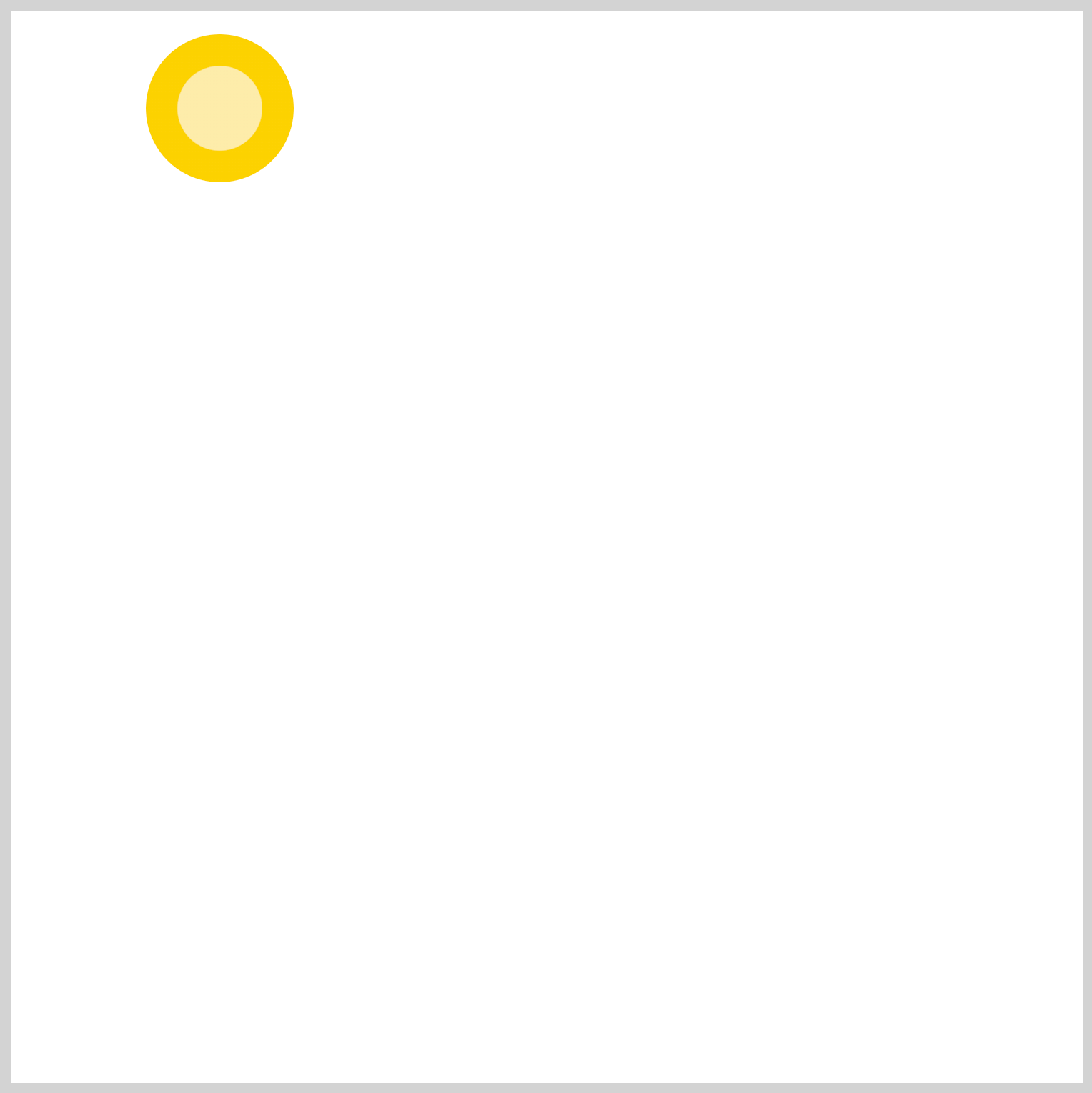
To avoid creating two circle shapes, you’ll use the CSS radial-gradient() function to simulate two overlapping circles.
background: radial-gradient(#fdecaa 40%, #fcd100 41%);
#fdecaa, a light yellow hue, occupies 0% to 40% of the circle.#fcd100, a yellow-orange color, stretches from 41% to 100% of the circle.
Let’s work on the pole in the next section.
Pole
The pole is a thin, vertically elongated rectangle. The bottom corners are slightly rounded. You’ll use the CSS linear-gradient() function to give it a rounded look.
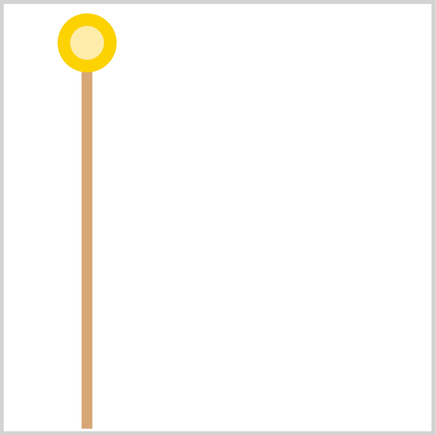
/* Pole */
.pole {
  position: absolute;
  width: 12.5px;
  height: 418px;
  left: 91px;
  top: 79px;
  background: linear-gradient(to right, #d7a876, #e0c5a7 40% 60%, #d7a876);
  border-radius: 0px 0px 5px 5px;
}

background: linear-gradient(to right, #d7a876, #e0c5a7 40% 60%, #d7a876);
First, you set the gradient direction to right. The base color, #d7a876, a light yellowish tan color, occupies the shape’s 0% to 39% and 61% to 100%. The highlight color, #e0c5a7, is set to occupy the middle portion, ranging between 40% and 60%.
You use border-radius: 0px 0px 5px 5px; to round the bottom left and right side of the rectangle.
Up next will be the cord and strings.
Cord and Strings
The cord and strings section consists of:
- The
pole-cordis the light gray arch component. father-carp-stringfor positioning the Father Carp string.stringis the triangle shape connecting the carp steamers to the light gray pole cord. This component will be reused for Mother and Child Carp in part 2 of this article.
Here’s the HTML code for reference.
<div class="pole-cord">
  <div class="father-carp-string">
    <div class="string"></div>
  </div>
</div>
string is enclosed by father-carp-string. pole-cord is the parent div, enclosing both components.

/* Pole Cord */
.pole-cord {
  position: absolute;
  width: 53px;
  height: 335px;
  left: 57px;
  top: 66px;
  border: 5px solid transparent;
  border-right: 5px solid #e9e9e9;
  border-radius: 50%;
}
You use the CSS border property to make the pole string. The shape is an ellipse with a light gray right border, border-right: 5px solid #e9e9e9;. The rest of the borders are transparent, border: 5px solid transparent;.
.father-carp-string {
  position: absolute;
  left: 48px;
  top: 30px;
}
Using the CSS left and top properties, you position the Father Carp string.

The string that connects the carps to the pole cord is made using the CSS conic-gradient() function. You first create the light gray, #eaeaea, triangle, then overlay a white, #feffff, triangle on top.
/* Light Gray Triangle */
.string {
  position: absolute;
  width: 56px;
  height: 74px;
  background: conic-gradient(
    from 0deg at 0% 50%,
    transparent 60deg,
    #eaeaea 60deg 122deg,
    transparent 122deg
  );
}
Let’s break down the conic-gradient() code.
from 0deg at 0% 50%sets the gradient to start the angle from0degrees and positions it at the middle right area. You control the gradient position with0%on the x-axis and50%on the y-axis.- A transparent area is painted from 0 to 60 degrees with
transparent 60degand 122 degrees to 360 degrees withtransparent 122deg. #eaeaea 60deg 122degpaints a light gray color between 60 degrees and 122 degrees, creating the triangle shape.

/* White Triangle */
.string::after {
  content: "";
  position: absolute;
  width: 56px;
  height: 70px;
  left: 6px;
  top: 2px;
  background: conic-gradient(
    from 0deg at 0% 50%,
    transparent 60deg,
    #feffff 60deg 122deg,
    transparent 122deg
  );
}
Besides the position and size, the white triangle is a mirror image of the light gray triangle. You position the white triangle on top of the light gray triangle.
You can learn more about CSS gradients in this article.
 Pyxofy
Father Carp

In the consecutive sections, you’ll be building Father Carp. Father Carp is the largest carp and is usually colored in dark colors.
The first component will be the mouth and then the body.
Mouth and Body
The mouth is an ellipse shape. You’ll use the radial-gradient() function to give it a slight gradient. To provide the mouth with a more rounded look, you will set a white right border.

.mouth {
  position: absolute;
  width: 27px;
  height: 91px;
  left: 160px;
  top: 93px;
  background: radial-gradient(#e1e1e1, #e8e8e8);
  border-right: 2px solid #fefefe;
  border-radius: 50%;
}
The radial-gradient() will have two colors, #e1e1e1, sometimes referred to as Chinese White, and #e8e8e8, a platinum color. To slightly separate the mouth and body components, you apply a white, 2-pixel solid border with border-right: 2px solid #fefefe;.
Next up is the body component.

.body {
  position: absolute;
  width: 230px;
  height: 91px;
  left: 174px;
  top: 93px;
  background: #232862;
}
The body base color is set to #232862, an indigo shade.

.body::before {
  content: "";
  position: absolute;
  width: 160px;
  height: 91px;
  left: 68px;
  top: 0px;
  background: #181939;
}
You’ll make and place another rectangle on top of the body base. This will serve as the carp’s trunk. You set its color to #181939, a dark blue shade.

.body::before {
  border-radius: 0px 14px 14px 0px / 0px 48px 48px 0px;
}
To finish out the body component, you round the upper and bottom right corners.
Let’s tackle the tail component in the next section.
Tail
The tail component is made with two right-angled triangles. The top and bottom triangle colors are slightly modified.

.tail {
  position: absolute;
  width: 0;
  height: 0;
  left: 402px;
  top: 93px;
  border-top: 62px solid #1d2777;
  border-right: 35px solid transparent;
}
You use the CSS border-top and border-right properties to create the tails. You can change its size by changing the border width, in this instance, 62px and 35px.
border-top: 62px solid #1d2777;makes the colored portion of the triangle.- The
border-right: 35px solid transparent;makes transparent area of the triangle.
The top tail color is a lighter shade of blue, #1d2777.

.tail::before {
  content: "";
  position: absolute;
  width: 0;
  height: 0;
  left: 0;
  top: -33px;
  border-bottom: 62px solid #232862;
  border-right: 35px solid transparent;
}
For the bottom tail, we use the border-bottom CSS property. Besides its position, -33px, and color, #232862, the rest of the property values are similar to the top tail.
Check this article to learn how to make and manipulate CSS shapes.
Pyxofy
Let’s make the carp eye in the next section.
Eye
The carp’s eye are composed of a base circle shape and a radial gradient for the iris.

.eye {
  position: absolute;
  width: 29px;
  height: 29px;
  left: 210px;
  top: 102px;
  background: white;
  border-radius: 50%;
}
The eye base is a white circle. To make a circle versus an ellipse, the width and height CSS property values should be the same; in this shape, it’s 29px. The border-radius needs to be set to 50% to produce a circle shape.

You make a smaller circle for the carp’s eye iris and position it slightly to the upper left corner.

.eye::before {
  content: "";
  position: absolute;
  width: 18px;
  height: 18px;
  left: 3px;
  top: 4px;
  background: radial-gradient(50% 60% at 30% 40%, #3c4698, #27285c 60%);
  border-radius: 50%;
}
The radial gradient is made with background: radial-gradient(50% 60% at 30% 40%, #3c4698, #27285c 60%);
50% 60%controls the size of the gradient.at 30% 40%controls the position of the gradient.#3c4698a light blue hue, starts from0%and ends at60%. The indigo color,#27285c, goes from60%to100%.
For the last section of this article, you’ll be making the gill.
Gill
The gill you’ll be making in this section will have three parts: A small circle, an ellipse, and a rectangle with rounded corners.

.gill {
  position: absolute;
  width: 29px;
  height: 29px;
  left: 225px;
  top: 138px;
  background: #181939;
  border-radius: 50%;
}
The circle’s circumference is 29px wide and placed 225px on the left and 138px from the top.

.gill::before {
  content: "";
  position: absolute;
  width: 9px;
  height: 19px;
  left: 10px;
  top: 27px;
  background: #181939;
  border-radius: 50%;
}
The ellipse is placed right below the circle, left is set to 10px, and the top is set to 27px.

.gill::after {
  content: "";
  position: absolute;
  width: 44px;
  height: 62px;
  left: -27px;
  top: -45px;
  background: #181939;
}
The last rectangle shape is 44px wide and 62px high and is placed above the circle.

.gill::after {
  border-radius: 3px 0px 0px 50px / 10px 0px 0px 50px;
}
Using the CSS border-radius property, you round out the top left, 3px, and bottom left, 50px, corners of the rectangle.
You can see and play with the complete code on Pyxofy’s CodePen page.
See the Pen CSS Art - Koinobori Carp Streamer by Pyxofy (@pyxofy) on CodePen.
Conclusion
Part 1 of this two-part article series showed you how to use border and border-radius to create circles, ellipses, and uniquely shaped rectangles.
Using CSS gradient functions such as radial-gradient, linear-gradient, and conic-gradient, you learned how to create triangles, spheres, and highlights.
In part 2, we’ll create the scales, Mother and Child Carp. In the meantime, feel free to modify the CSS code to your liking and share your masterpiece with us on LinkedIn, Threads, Mastodon, X (Twitter) @pyxofy , or Facebook.
We hope you liked this article. Kindly share it with your network. We appreciate it.
Related Articles
Pyxofy Pyxofy
 Pyxofy