CSS Art – Japanese Boat – Part 2
In part two, you’ll learn how to combine multiple linear gradients to complete the rest of the Japanese boat step-by-step.

Introduction
In part 1 of this two-part article, you learned how to make the bow, keel, and deck. In part 2, you’ll continue making the rest of the Japanese boat.
You’ll learn how to combine the CSS linear-gradient(), the repeating-linear-gradient() functions, and pseudo-elements such as ::before and ::after to make repeating line patterns.

Preview

For part 2, you will be making these boat components.
- Cabin
- Cabin Windows
- Lanterns
- Lantern Posts
- Roof
Prerequisites
Essential CSS and HTML knowledge will help you understand the concepts and techniques introduced in this article. Jump over to this article if you require an HTML and CSS primer.
We assume that you have set up tools to create CSS art. If you haven’t, this article will show you how to set them up.
HTML Structure
<div class="container">
  <!-- Japanese Boat -->
  <div class="boat">
    <div class="roof"></div>
    <div class="cabin">
      <div class="cabin-window"></div>
    </div>
    <div class="door-window"></div>
    <div class="posts"></div>
    <div class="lanterns">
      <div class="lantern-1"></div>
      <div class="lantern-2"></div>
      <div class="lantern-3"></div>
      <div class="lantern-4"></div>
      <div class="lantern-5"></div>
      <div class="lantern-6"></div>
      <div class="lantern-7"></div>
      <div class="lantern-8"></div>
      <div class="lantern-9"></div>
      <div class="lantern-10"></div>
      <div class="lantern-11"></div>
      <div class="lantern-12"></div>
    </div>
    <div class="rail-pole"></div>
    <div class="rail-1"></div>
    <div class="rail-2"></div>
    <div class="side-wall"></div>
    <div class="deck"></div>
    <div class="hull"></div>
    <div class="keel"></div>
    <div class="bow"></div>
    <div class="bow-tip"></div>
  </div>
</div>
container is the outermost enclosure. It enables the content to be centered and draws a light gray border. The rest of the divs represent each image component.
Keep the HTML structure as is for the image to display correctly.
Body and Container Div CSS
CSS code for the body and container div.
/* Body and Container Settings */
/* Center shapes */
body {
  margin: 0;
  padding: 0;
  height: 100vh;
  display: flex;
  justify-content: center;
  align-items: center;
  flex-wrap: wrap;
}

/* Set background and border color */
.container {
  min-width: 500px;
  height: 500px;
  border: 5px solid lightgray;
  background: transparent;
  position: relative;
  margin: 5px;
  display: flex;
  justify-content: center;
  align-items: center;
  overflow: hidden;
}
Cabin
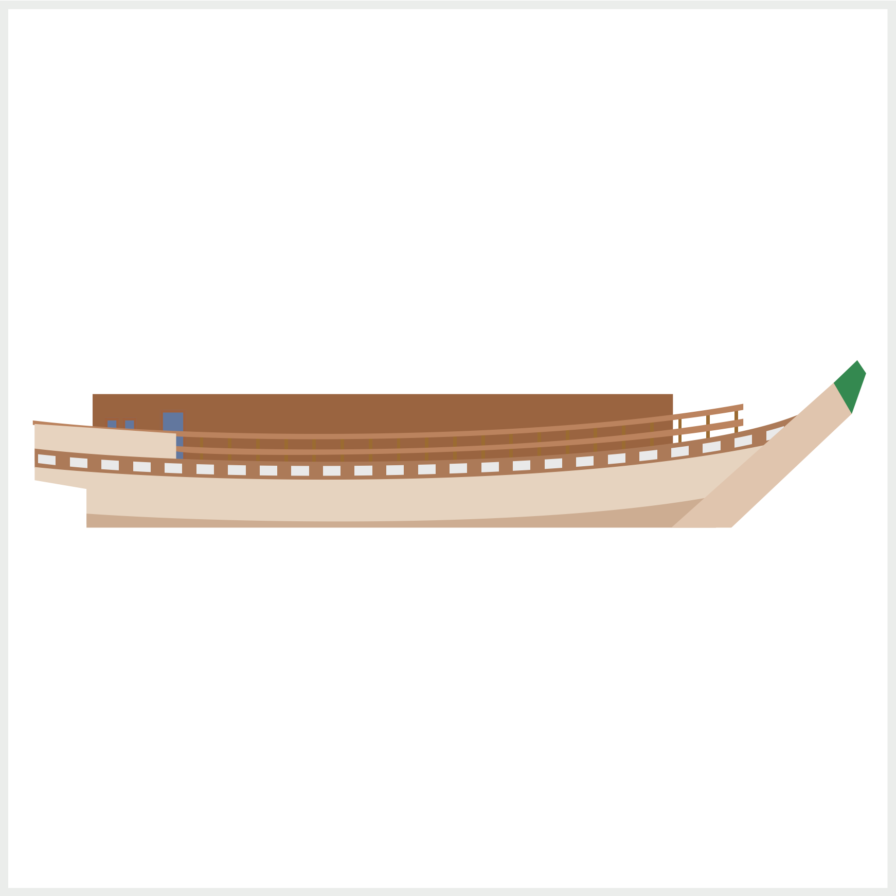
The cabin is situated on top of the deck where the guests reside while they’re on the boat.
.cabin {
  position: absolute;
  width: 330px;
  height: 40px;
  left: 48px;
  top: 219px;
  background: #9a6440;
}
You start the cabin with a brown rectangle,330px wide and 40px high. This brown rectangle will serve as the cabin’s base shape.

.cabin::before {
  content: "";
  position: absolute;
  width: 61px;
  height: 33px;
  left: 0px;
  top: 7px;
  background: #d4b69b;
}
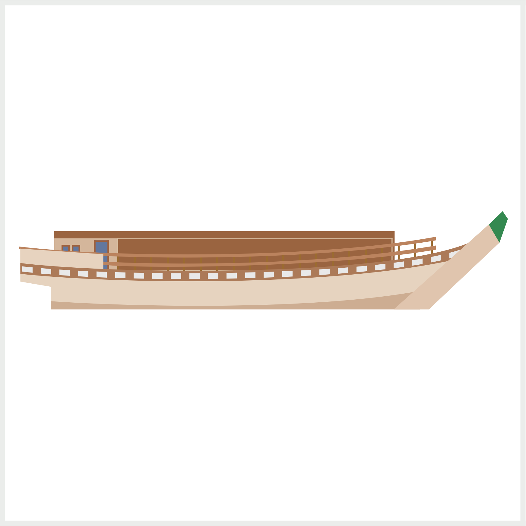
Using the CSS ::before pseudo-element, you’ll make a light brown rectangle to separate the main cabin area from the door and windows. The rectangle is 33px high and 61px wide.
In the next section, you’ll make the cabin windows.
Cabin Windows
The cabin has two types of windows:
- Light blue glass pane
- “Shoji” Japanese paper screen
/* Cabin Window */
.cabin-window {
  position: absolute;
  width: 265px;
  height: 30px;
  left: 61px;
  top: 7px;
  border: 1px solid #d9c0a2;
}
First, you’ll make the cabin windows border using border: 1px solid #d9c0a2;. The border is a solid light brown color, #d9c0a2 and 1px wide.
/* Cabin Window */
.cabin-window {
  background: linear-gradient(
    to right,
    #7899cc,
    #607fab
  );
}
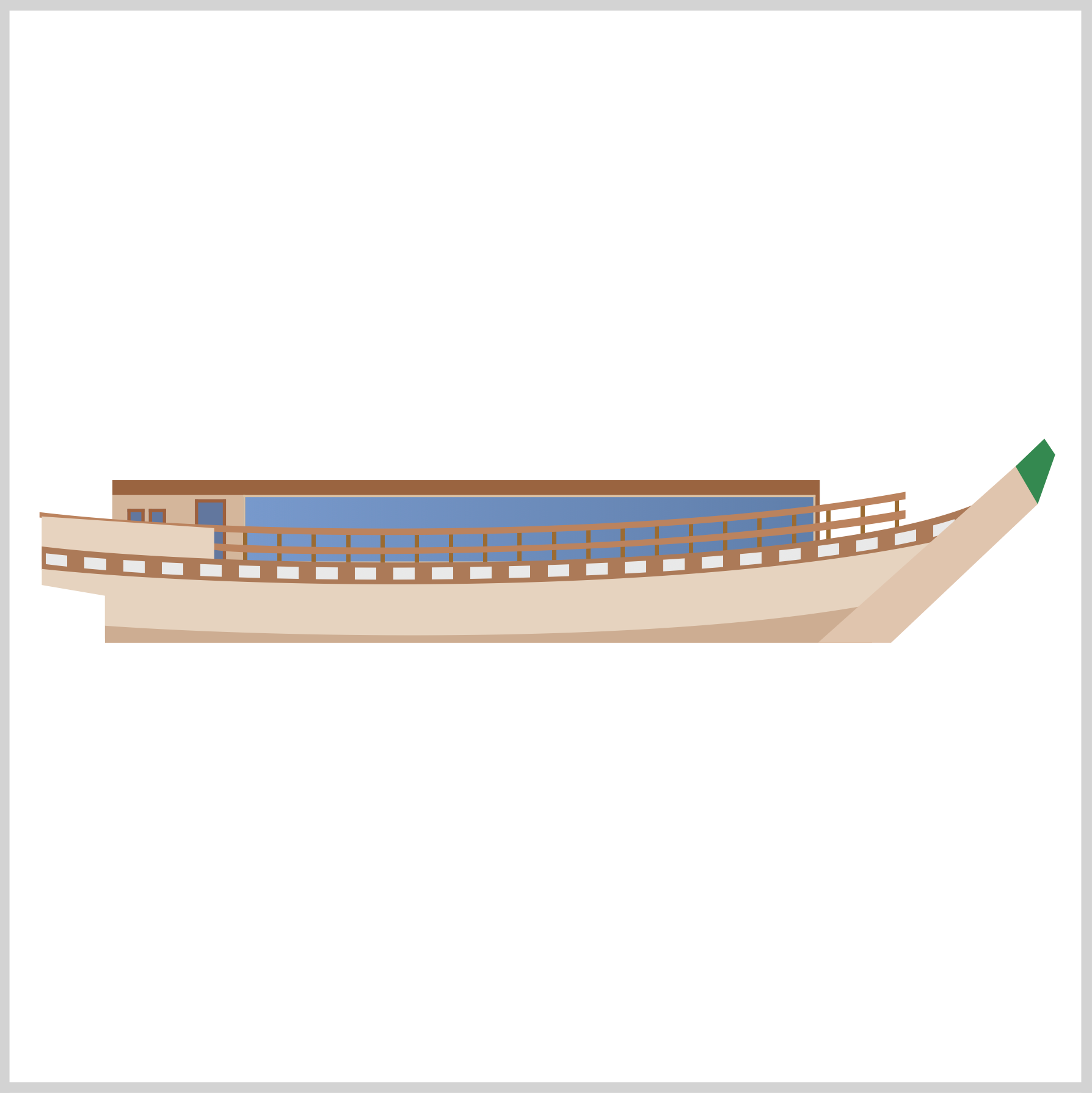
To simulate a glass pane, you’ll add a linear gradient. The linear gradient direction is to right. The color will transition from #7899cc to #607fab.

/* Cabin Window */
.cabin-window {
  background: repeating-linear-gradient(
      to right,
      transparent,
      transparent 13px,
      #d4bba0 13px,
      #d4bba0 14px
    ),
    linear-gradient(to right, #7899cc, #607fab);
}
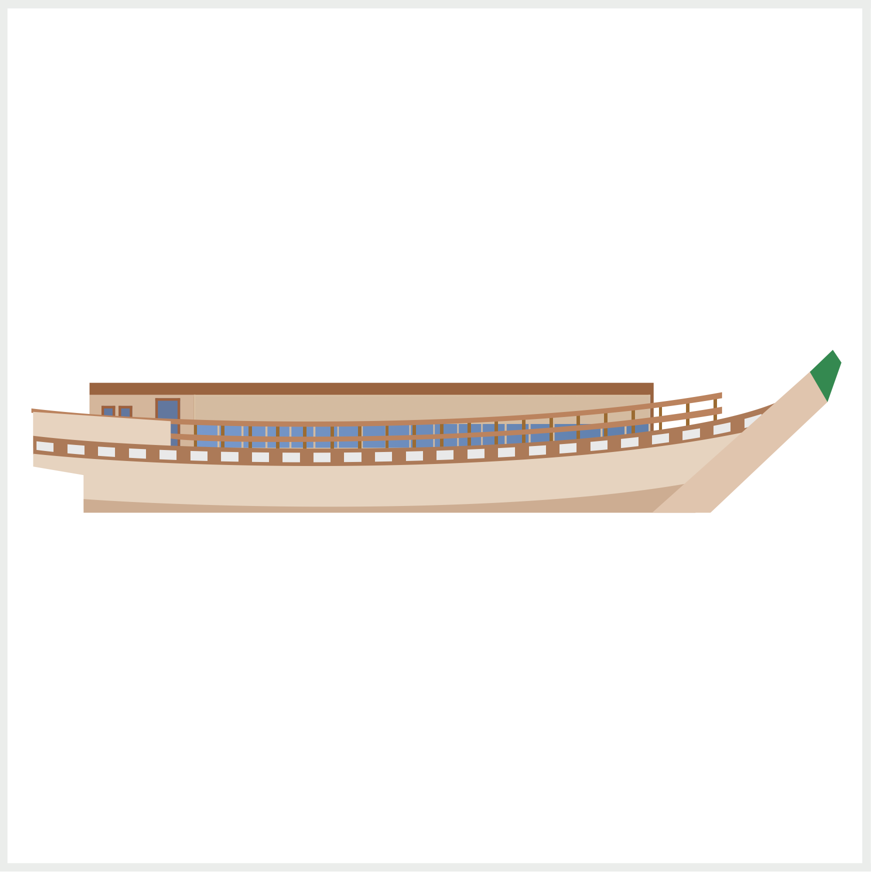
The glass pane needs to be divided into single units. You use the repeating-linear-gradient() CSS function to create the divider. The repeating linear gradient direction is to right. To let the light blue glass show through, you create a transparent area with transparent, transparent 13px. Next, you create the light brown 1-pixel dividers using #d4bba0 13px, #d4bba0 14px.
When mixing linear-gradient() and repeating-linear-gradient() functions, ensure you separate them with a comma, ,, for them to display properly.
.cabin-window::before {
  content: "";
  position: absolute;
  width: 265px;
  height: 16px;
  left: 0px;
  top: 0px;
  background: repeating-linear-gradient(
      to right,
      transparent,
      transparent 6px,
      #d4bba0 6px,
      #d4bba0 7px
    ),
      linear-gradient(#d4bba0, #d4bba0);
}
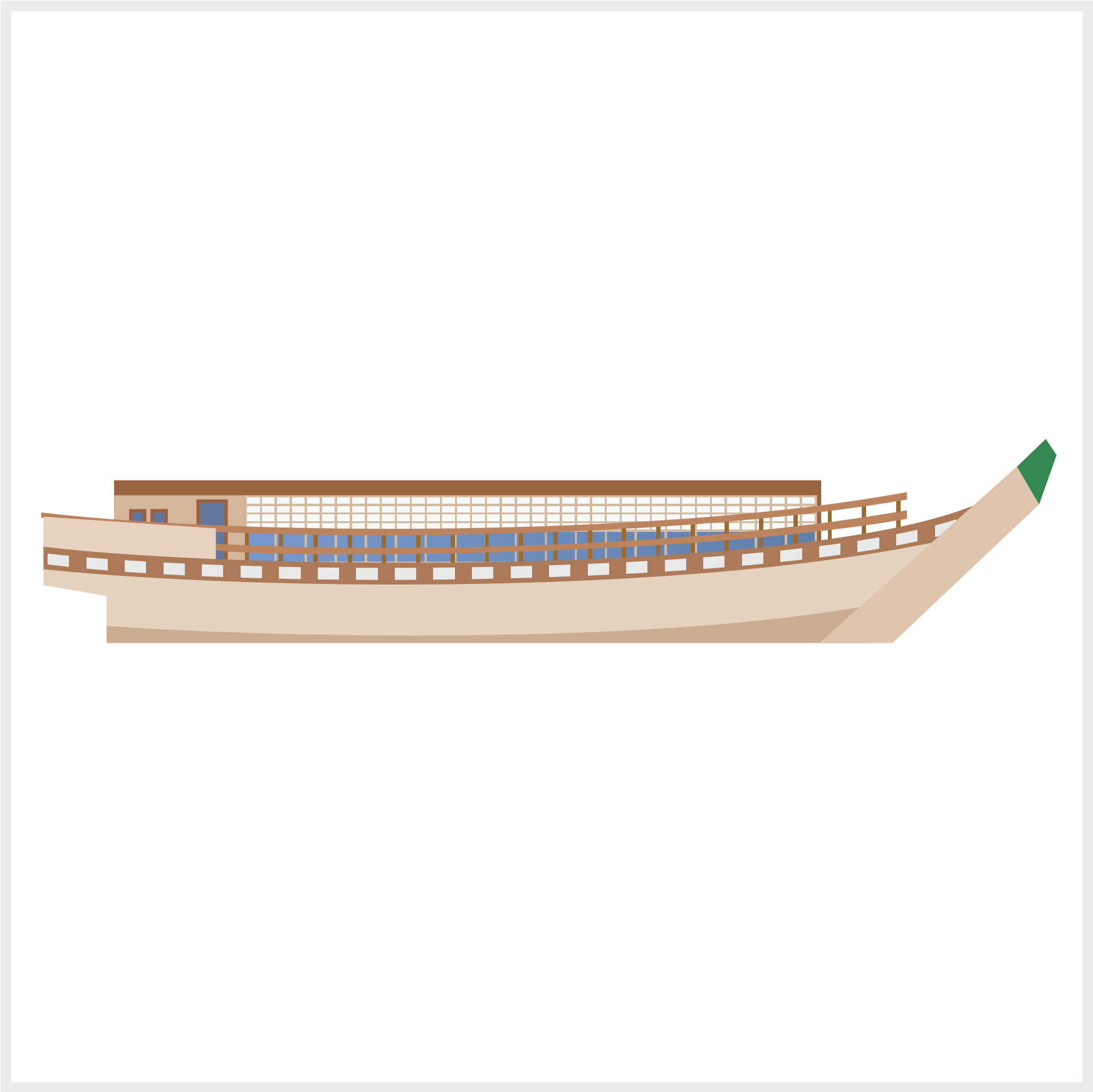
The “Shoji” Japanese paper screen will be layered on top of the glass pane using the ::before CSS pseudo-element. Similar to the glass pane divider, you’ll combine the repeating-linear-gradient() and linear-gradient() to create the light brown base and divider.
Since the base and the divider are the same color, #d4bba0, you won’t see the separation in this step. You’ll see them once we layer the light gray repeating gradient in the following step.
.cabin-window::before {
  background: repeating-linear-gradient(
      to right,
      transparent,
      transparent 6px,
      #d4bba0 6px,
      #d4bba0 7px
    ),
    repeating-linear-gradient(
      to bottom,
      #f7faf8,
      #f7faf8 3px,
      transparent 3px,
      transparent 4px
    ),
    linear-gradient(#d4bba0, #d4bba0);
}
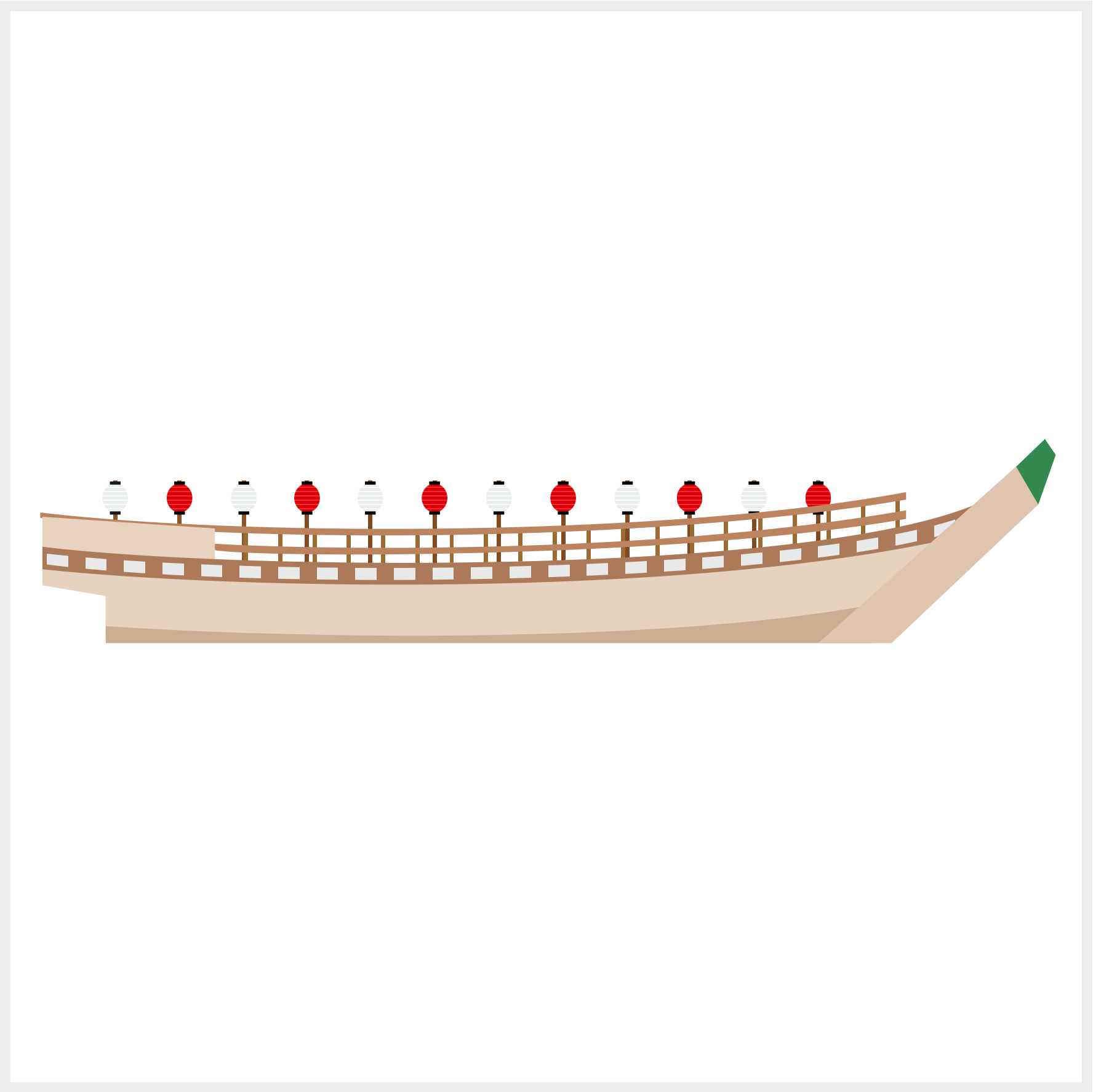
You add a repeating linear gradient to make the light gray, #f7faf8, rectangles. Take note that the direction is to bottom for the light gray repeating linear gradient.
The cabin and windows are done. Jump over to the next section to learn how to make the lanterns.
Lanterns
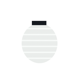
Lanterns are a prominent feature of our Japanese boat design. You will create a total of twelve lanterns. The lantern colors alternate between light gray and bright red.
Let’s tackle the light gray lantern first.
Light Gray Lantern
The light gray lantern consists of four parts.
- Ellipse
- Stripes
- Top Rectangle
- Bottom Rectangle

/* Light Gray Lantern */
.lantern-1 {
  position: absolute;
  width: 12px;
  height: 13.5px;
  left: 43px;
  top: 220.5px;
  border-radius: 50%;
}
The height of the lantern, 13.5px, is slightly larger than the width, 12px, to simulate an ellipse shape. Remember basic CSS shapes are initially square, and you use border-radius: 50% to round its corners.

/* Light Gray Lantern */
.lantern-1 {
  background: repeating-linear-gradient(
    #eaedeb,
    #eaedeb 1.5px,
    #f7faf8 1.5px,
    #f7faf8 2px
  );
}
You use the repeating-linear-gradient() function to make the horizontal stripes. The stripes are 0.5 pixels high. First, you create the light gray area with #eaedeb, #eaedeb 1.5px. Next, you make the stripe with a much lighter gray shade with #f7faf8 1.5px, #f7faf8 2px.
/* Light Gray Lantern */
.lantern-1::before {
  content: "";
  position: absolute;
  width: 5px;
  height: 1.5px;
  left: 3.5px;
  top: -0.8px;
  background: #161a20;
}
You use CSS pseudo-elements ::before and ::after to make and position the top and bottom rectangles. The top and bottom rectangles are 5px wide and 1.5px high.

/* Light Gray Lantern */
.lantern-1::after {
  content: "";
  position: absolute;
  width: 5px;
  height: 1.5px;
  left: 3.5px;
  top: 13px;
  background: #161a20;
}
Up next is the bright red lantern.
Bright Red Lantern
Besides the color, the bright red lantern is an exact twin of the light gray lantern.


/* Bright Red Lantern */
.lantern-2 {
  position: absolute;
  width: 12px;
  height: 13.5px;
  left: 73px;
  top: 220.5px;
  background: repeating-linear-gradient(
    #d7000a,
    #d7000a 1.5px,
    #f62a2c 1.5px,
    #f62a2c 2px
  );
  border-radius: 50%;
}

/* Bright Red Lantern */
.lantern-2::before {
  content: "";
  position: absolute;
  width: 5px;
  height: 1.5px;
  left: 3.5px;
  top: -0.8px;
  background: black;
}

/* Bright Red Lantern */
.lantern-2::after {
  content: "";
  position: absolute;
  width: 5px;
  height: 1.5px;
  left: 3.5px;
  top: 13px;
  background: black;
}
Each lantern has its own designated HTML div tag and CSS classes from lantern-1 to lantern-12. The individual lanterns are enclosed in the lanterns HTML div tag.
<div class="lanterns">
  <div class="lantern-1"></div>
  <div class="lantern-2"></div>
  <div class="lantern-3"></div>
  <div class="lantern-4"></div>
  <div class="lantern-5"></div>
  <div class="lantern-6"></div>
  <div class="lantern-7"></div>
  <div class="lantern-8"></div>
  <div class="lantern-9"></div>
  <div class="lantern-10"></div>
  <div class="lantern-11"></div>
  <div class="lantern-12"></div>
</div>
The completed lanterns should look like the reference image below.

In the next section, you’ll work on the lantern posts.
Lantern Posts
The lantern posts are made by alternating between a transparent area and a 2px wide brown shape.

The lantern posts need to align with the lanterns. You want the posts to be right in the middle of the lanterns. Using repeating-linear-gradient() would have made the code simpler, but because of the precise location requirement, each post had to be adjusted manually.
/* Posts */
.posts {
  position: absolute;
  width: 330.5px;
  height: 39px;
  left: 48px;
  top: 219px;
  background: linear-gradient(
    to right,
    #8d5429,
    #8d5429 2px,
    transparent 2px,
    transparent 30px,
    #8d5429 30px,
    #8d5429 32px,
    transparent 32px,
    transparent 60px,
    #8d5429 60px,
    #8d5429 62px,
    transparent 62px,
    transparent 89.5px,
    #814a20 89.5px,
    #814a20 91.5px,
    transparent 91.5px,
    transparent 119px,
    #814a20 119px,
    #814a20 121px,
    transparent 121px,
    transparent 149px,
    #814a20 149px,
    #814a20 151px,
    transparent 151px,
    transparent 179px,
    #814a20 179px,
    #814a20 181px,
    transparent 181px,
    transparent 209px,
    #814a20 209px,
    #814a20 211px,
    transparent 211px,
    transparent 239px,
    #814a20 239px,
    #814a20 241px,
    transparent 241px,
    transparent 268px,
    #814a20 268px,
    #814a20 270px,
    transparent 270px,
    transparent 298px,
    #814a20 298px,
    #814a20 300px,
    transparent 300px,
    transparent 328px,
    #814a20 328px,
    #814a20 330px,
    transparent 330px
  );
}
You need to ensure that the transparent area and brown shapes start and stop at the same pixel location. For example, #8d5429 2px, transparent 2px, you see that the brown shape and the transparent area both start and stop at 2px. If they don’t start and stop at the same pixel location, you’ll get a gradation effect, where brown will fade to transparent and vice versa, which you don’t want in this instance.
In the final section, let’s make the roof.
Roof
The roof is made of two parts: a green trapezoid shape and a brown rectangular ledge shape. It has repeating vertical lines to simulate roof slates.
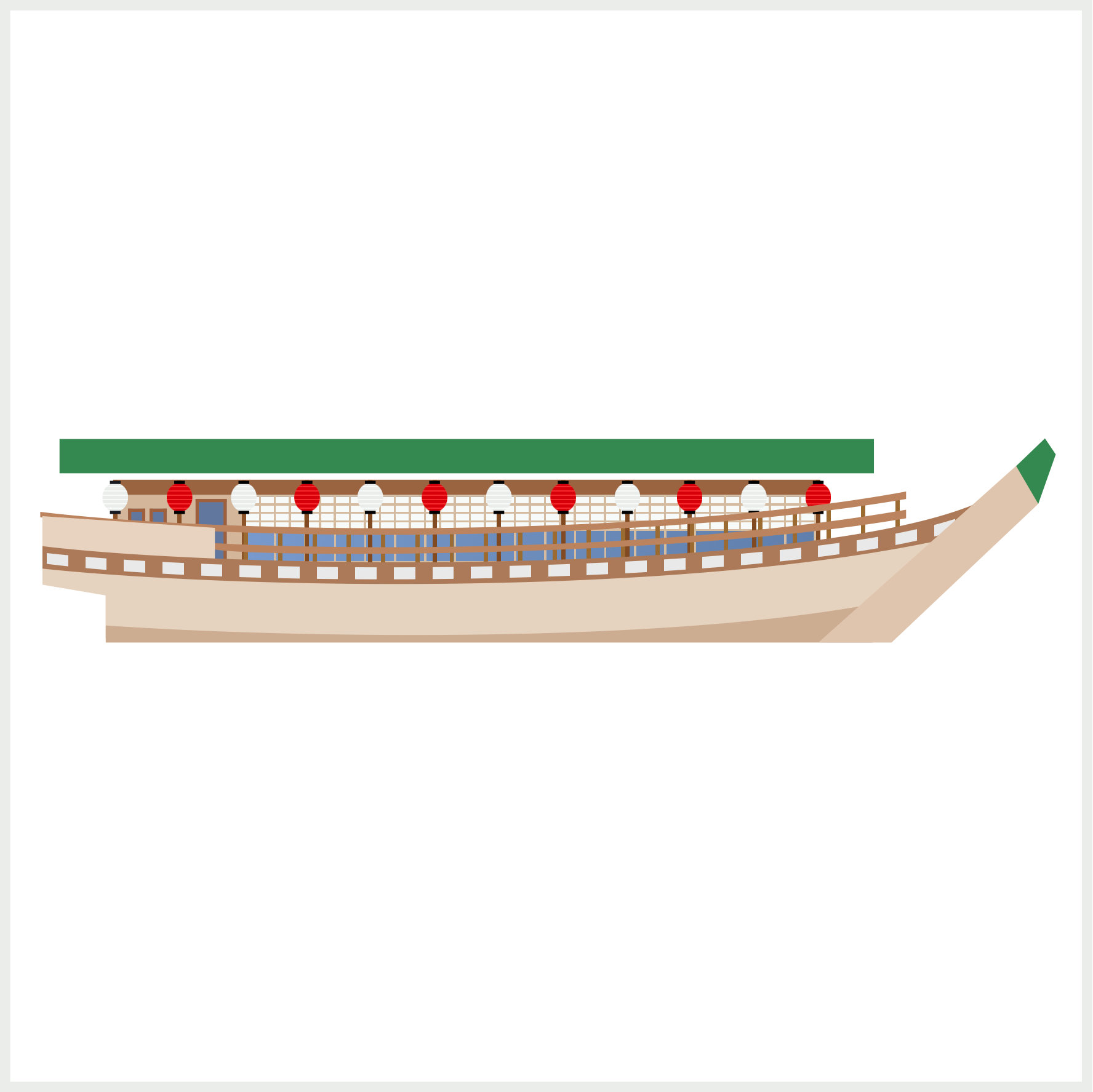
You start with a vanilla rectangle and use the CSS polygon() function to change it to a trapezoid shape.

/* Green Roof */
.roof::after {
  content: "";
  position: absolute;
  width: 380px;
  height: 16px;
  left: 0px;
  top: -16px;
  clip-path: polygon(4.5% 0%, 95.5% 0%, 100% 100%, 0% 100%);
}
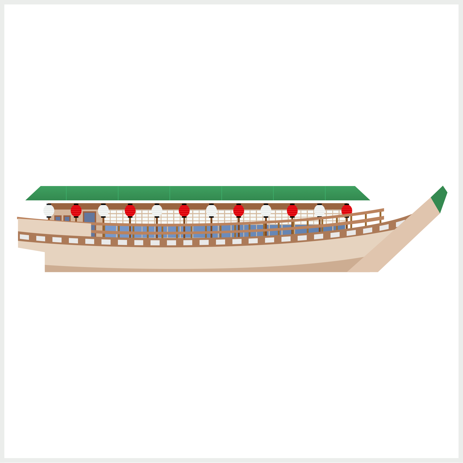
/* Green Roof */
.roof::after {
  background: repeating-linear-gradient(
      to right,
      transparent,
      transparent 45px,
      #3eb26d 45px,
      #3eb26d 45.5px,
      transparent 45.5px,
      transparent 57px
    ),
    linear-gradient(#3fa060, #338950);
}
You use the repeating-linear-gradient() CSS function to make the repeating vertical roof lines. You start with a transparent area that will let the green background shine through with transparent, transparent 45px. The 0.5px wide light green lines are created with #3eb26d 45px, #3eb26d 45.5px. You make another transparent using transparent 45.5px, transparent 57px.
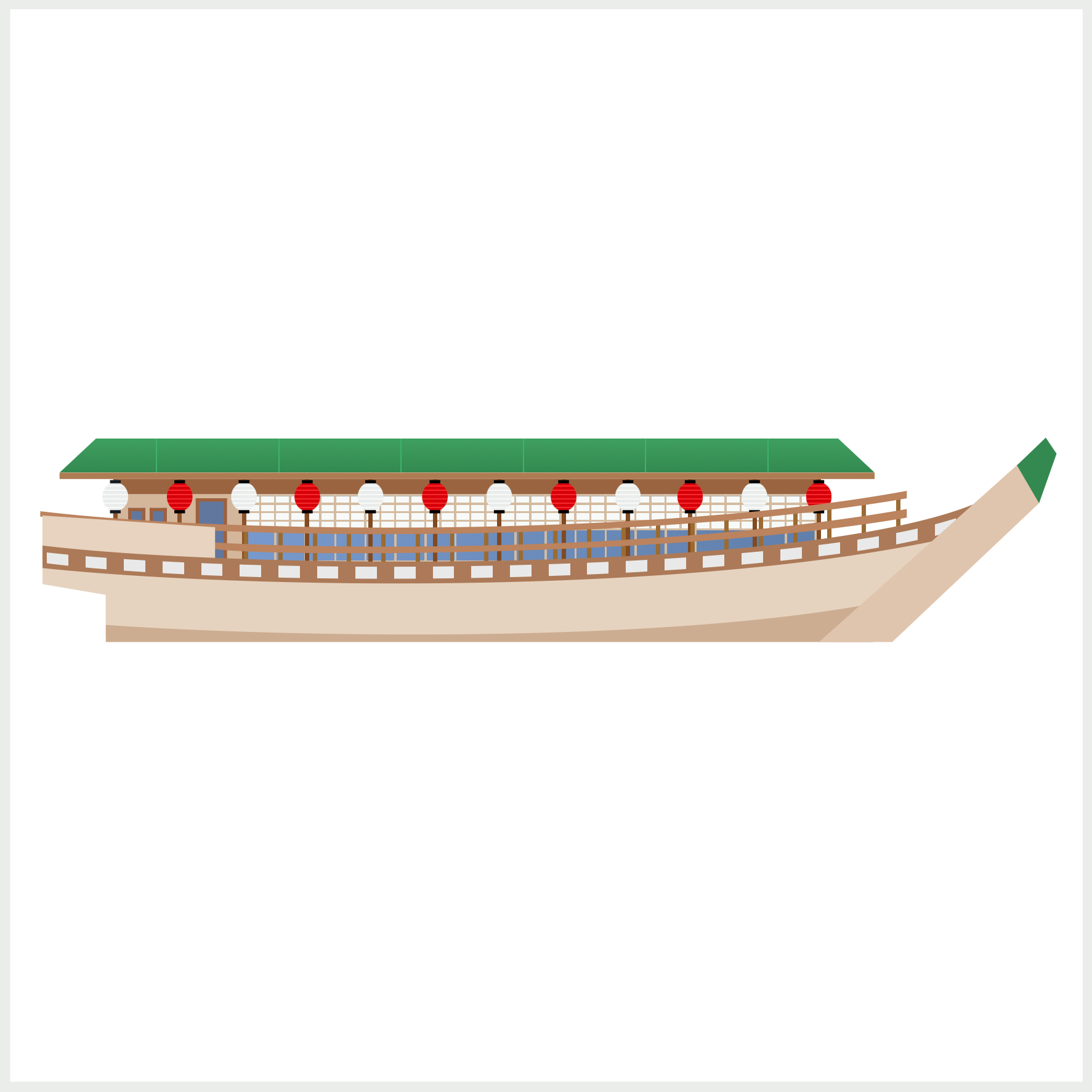
/* Roof Brown Ledge */
.roof {
  position: absolute;
  width: 380px;
  height: 3px;
  left: 23px;
  top: 216px;
  background: #af7c52;
}
The brown ledge is a simple rectangle, 380px wide and 3px high.
You can see and play with the complete code on Pyxofy’s CodePen page.
See the Pen CSS Art - Japanese Boat by Pyxofy (@pyxofy) on CodePen.
Conclusion
In this two-part article, you learned how to use CSS pseudo-elements, ::before and ::after to layer different shapes and patterns.
By combining two or even three repeating-linear-gradient() and linear-gradient() functions, you were able to layer multiple transparent and opaque shapes, creating repeating patterns and lines.
What will you create using the new CSS techniques in your tool belt? Share your masterpiece with us on LinkedIn, Threads, Mastodon, X (Twitter) @pyxofy or Facebook.
We hope you liked this article. Kindly share it with your network. We appreciate it.
Related Articles
