CSS Art - Isometric Image Design with CSS Transforms and Linear Gradients - Part 2
In Part 2 of this step-by-step article, let’s finish the isometric front-load washing machine image using multiple CSS properties and functions.

Introduction
In Part 1 of this two-part article series, you discovered how to create the container gradient and the front section of the washing machine. Part 2 will instruct you on crafting the side and top sections of the front-load washing machine by utilizing various CSS properties and functions.
You’ll explore these CSS properties and functions in this article:
transformlinear-gradient()- pseudo-elements
::beforeand::after translate()rotate()
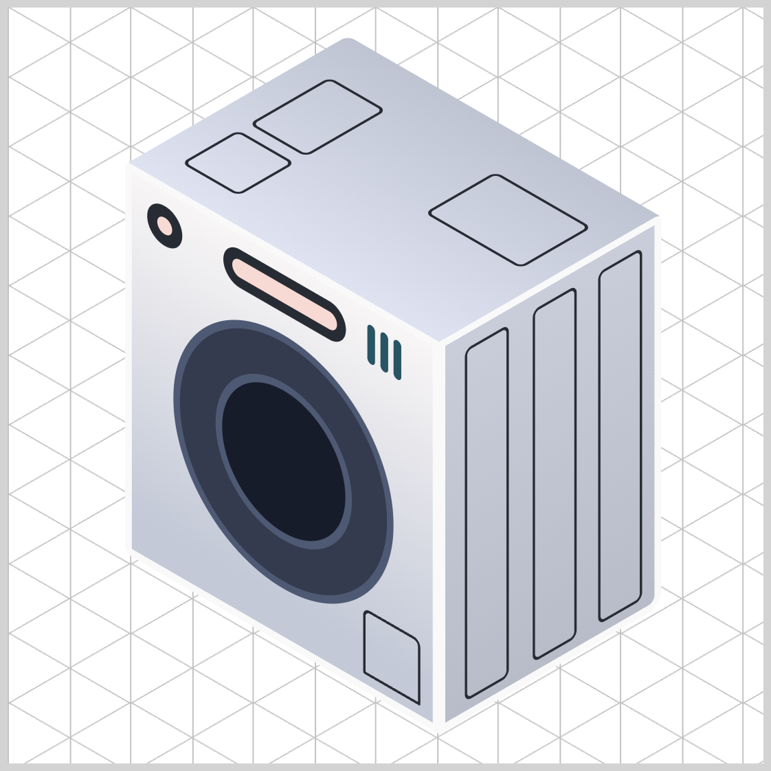
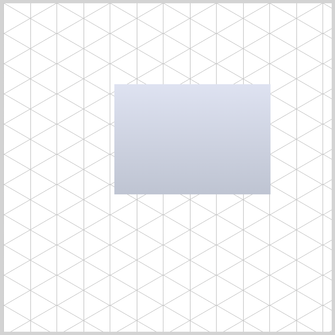
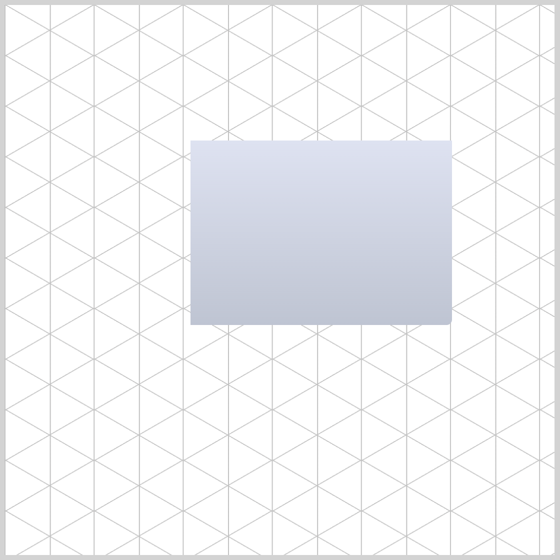
Preview

Prerequisites
Essential CSS and HTML knowledge will help you understand the concepts and techniques introduced in this article. Jump over to this article if you require an HTML and CSS primer.
We assume you have configured tools to modify CSS. If not, this article will guide you through the setup process.
HTML Structure
<div class="container">
  <div class="isometric-washing-machine">
    <div class="washing-machine-top">
      <div class="detergent-cover"></div>
      <div class="softener-cover"></div>
      <div class="lint-filter-cover"></div>
    </div>
    <div class="washing-machine-front">
      <div class="door"></div>
      <div class="door-window"></div>
      <div class="power-button"></div>
      <div class="screen"></div>
      <div class="switches"></div>
      <div class="filter-cover"></div>
    </div>
    <div class="washing-machine-side">
      <div class="side-panels"></div>
    </div>
  </div>
</div>
container is the outermost enclosure. It enables the content to be centered and draws a light gray border. The rest of the divs represent each image component.
Keep the HTML structure as is for the image to display correctly.
Body and Container Div CSS
CSS code for the body and container div.
/* Body and Container Settings */
/* Center shapes */
body {
  margin: 0;
  padding: 0;
  height: 100vh;
  display: flex;
  justify-content: center;
  align-items: center;
  flex-wrap: wrap;
}

/* Set background and border color */
.container {
  min-width: 500px;
  height: 500px;
  border: 5px solid lightgray;
  background: linear-gradient(#0d7df5, #085bb5, #043468, #085bb5);
  position: relative;
  margin: 5px;
  display: flex;
  justify-content: center;
  align-items: center;
}
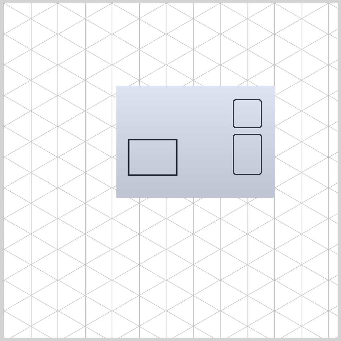
Washing Machine Side Section
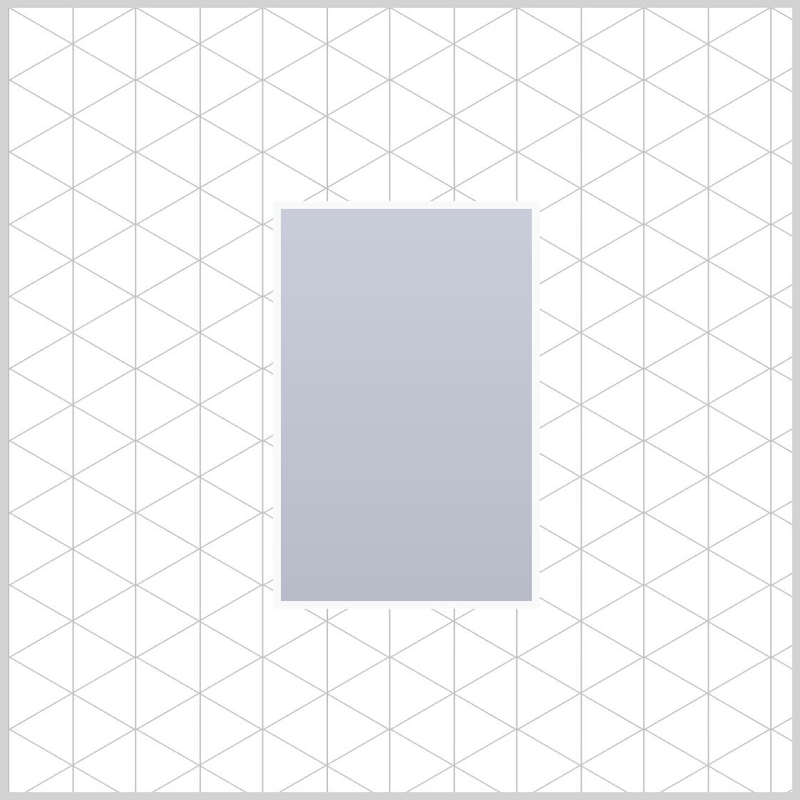
The side section of the front-load washing machine’s basic shape is a tall rectangle and features three side panels.
/* Isometric Washing Machine Side */
.washing-machine-side {
  height: 250px;
  width: 160px;
  background: #c3c9d7; -> To be replaced with gradient
  transform-origin: 0 0;
}
The side section has a height of 250px and a width of 160px. Its transform-origin property value is set to 0 0. The background color is temporarily set to #c3c9d7, which will be replaced with a linear gradient in the next step.
.washing-machine-side {
  background: linear-gradient(#c9cdda, #b8bcc8);
}
A linear gradient background is added to enhance the depth of the image. It starts as light gray, #c9cdda, and transitions to a silver color, #b8bcc8.
.washing-machine-side {
  border: 5px solid #f9f9f9;
}
5px solid #f9f9f9; creates a 5-pixel solid white border around the side section image.
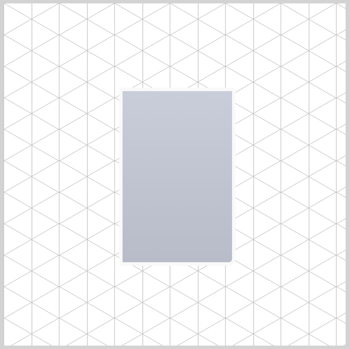
.washing-machine-side {
  border-radius: 0px 5px 10px 0px;
}
To complete the side section, apply a 5-pixel (5px) border radius to the upper right corner and a 10-pixel (10px) radius to the lower right corner.
Next, let’s create the three side panels.
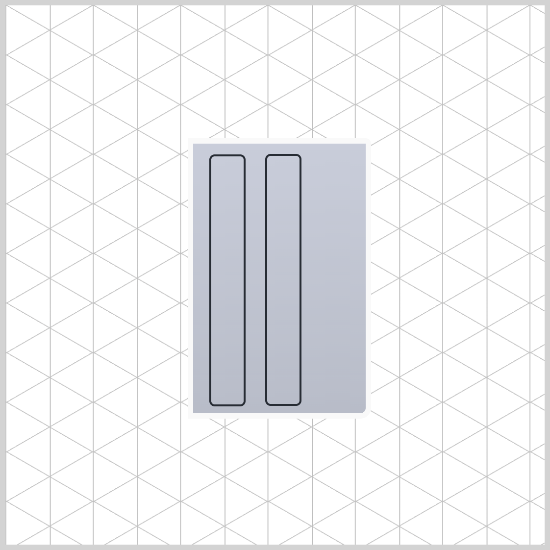
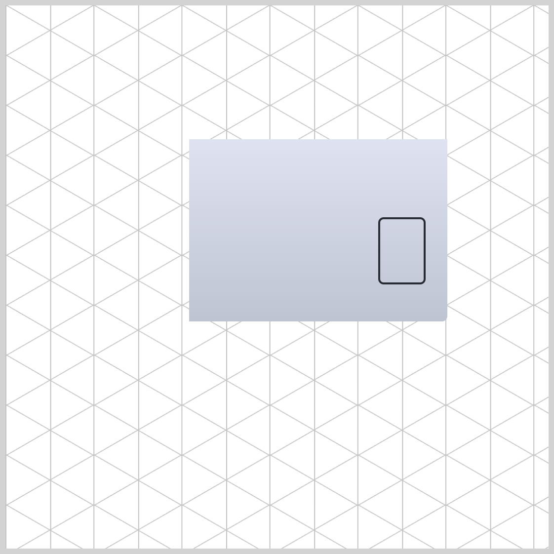
Side Panels
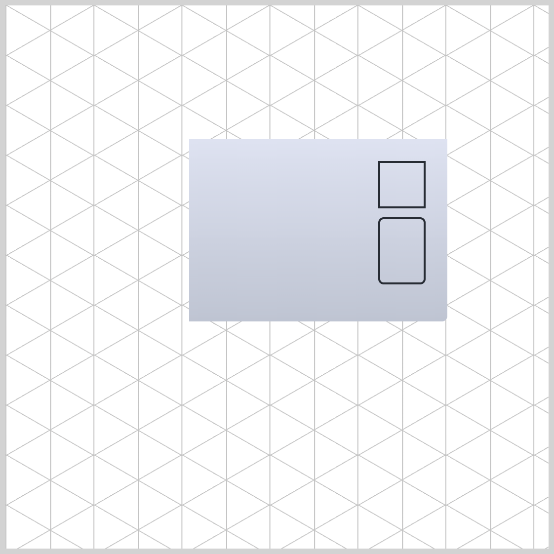
The side section features three black side panels. To create these panels, you’ll use CSS pseudo-elements ::before and ::after.
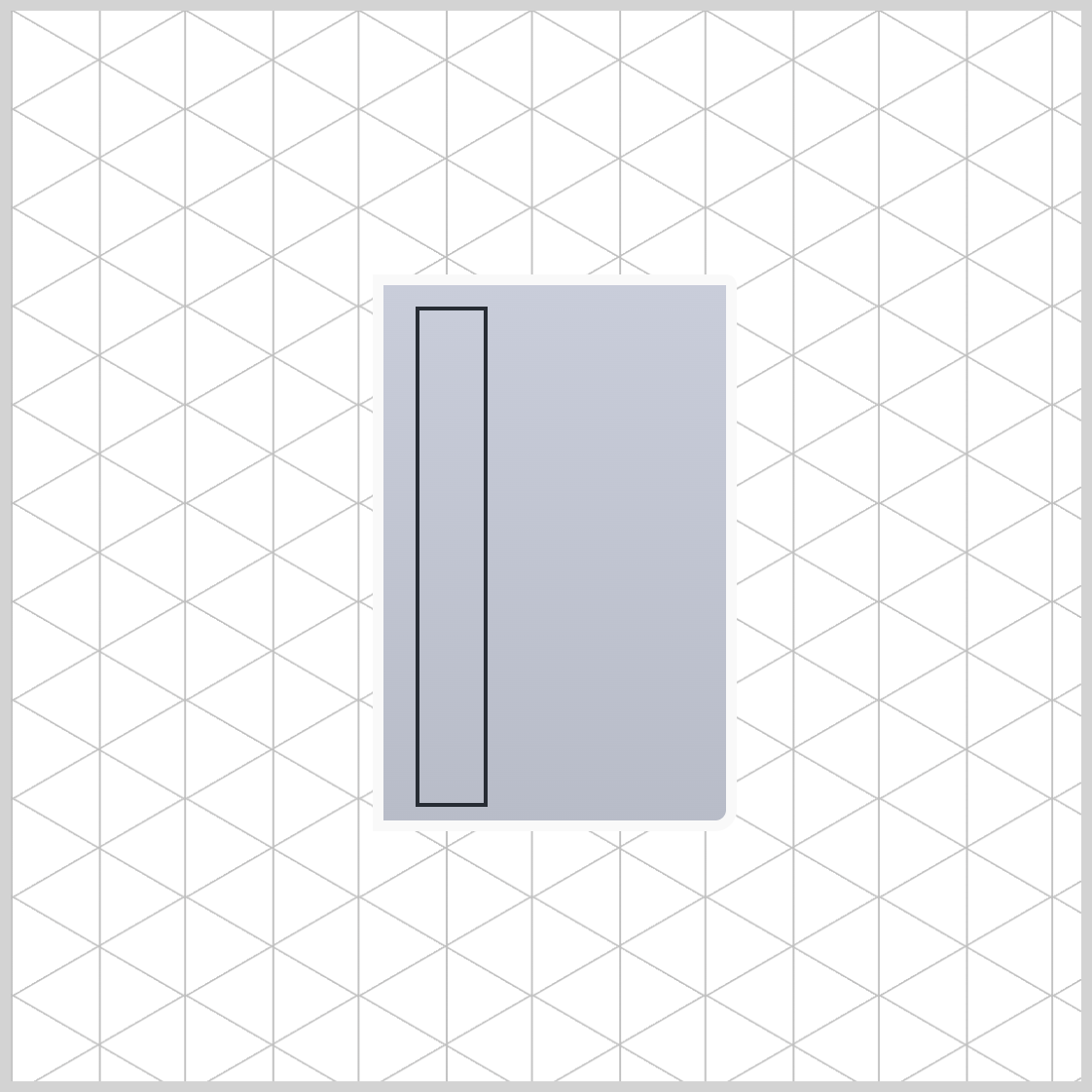
.side-panels {
  width: 30px;
  height: 230px;
  top: 10px;
  left: 15px;
  border: 2px solid #272c34;
}
The base side panel has a width of 30px and a height of 230px. It’s placed 10px from the top and 15px from the left edge. It has a 2px solid dark slate gray (#272c34) border.
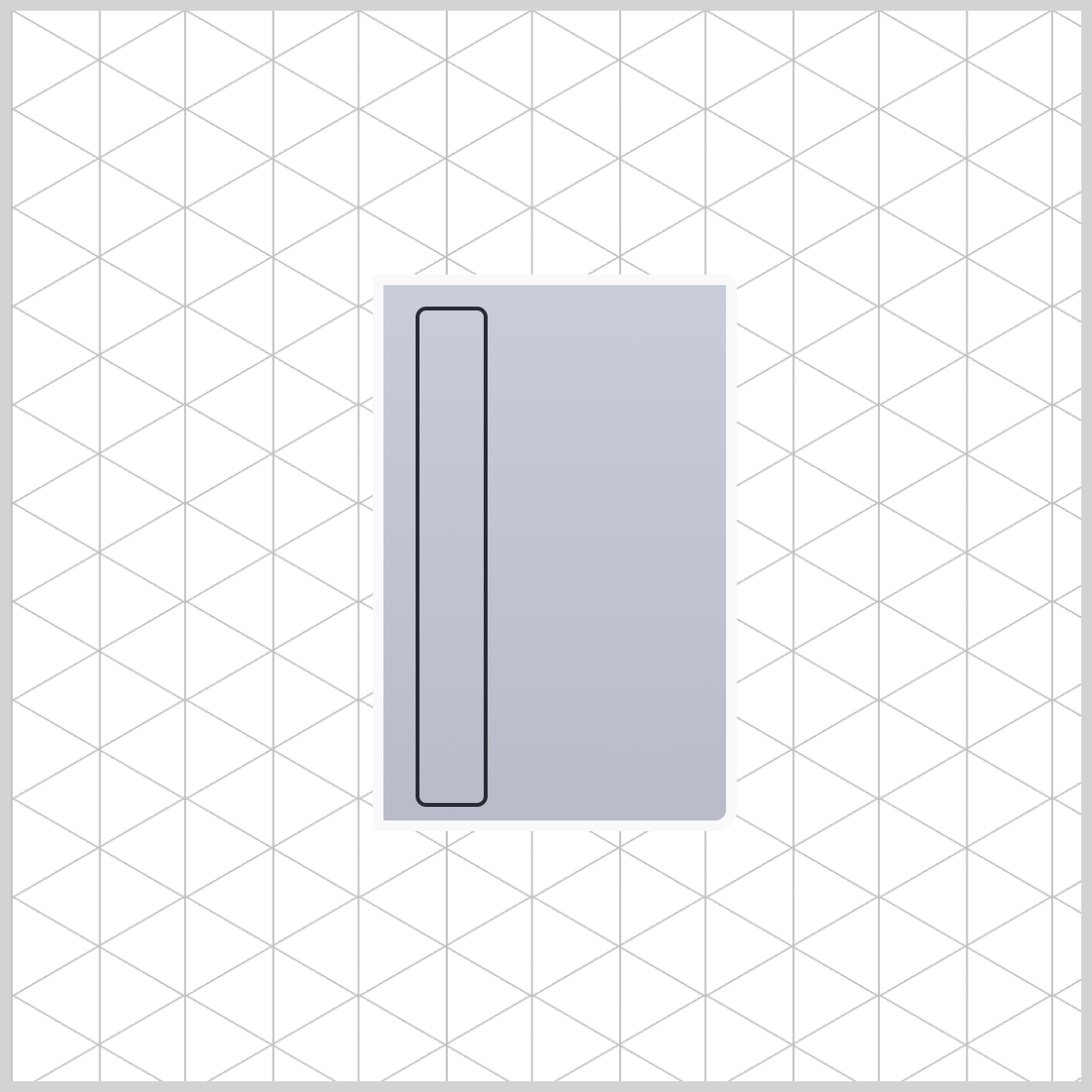
.side-panels {
  border-radius: 5px;
}
The border radius is adjusted to 5px to soften its sharp corners.
.side-panels::before {
  content: "";
  width: inherit;
  height: inherit;
  top: -2px;
  left: 50px;
  border: inherit;
  border-radius: inherit;
}
All property values are inherited from the base side panel, except for the top and left property values. The second panel is placed -2px from the top and 50px from the left.
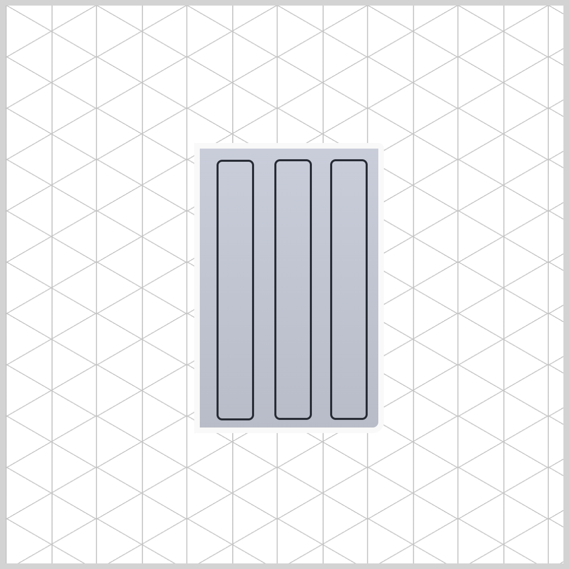
.side-panels::after {
  content: "";
  width: inherit;
  height: inherit;
  top: -2px;
  left: 100px;
  border: inherit;
  border-radius: inherit;
}
The top property value of the third panel is configured to -2px, while its left property value is set to 100px.
We’ve completed the side panels. In the following article section, you’ll adjust its angle.
Side Section Isometric Angle
Let’s complete the side section by giving it an isometric angle using the CSS transform property.
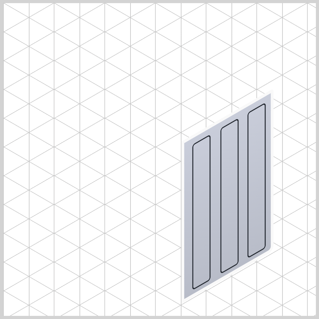
.washing-machine-side {
  transform: rotate(-30deg) skewX(-30deg) scaleY(0.866)
    translate(134px, 165.5px);
}
rotate(-30deg)rotates the side section by -30 degrees.- Use
skewX(-30deg)to skew or tilt the side section. scaleY(0.866)reduces the side section’s height to 86.6%, creating an isometric angle.- Move or translate the image location with
translate(134px, 165.5px).
Next, we will cover how to create the top section of the washing machine.
Washing Machine Top Section
The top section of the washing machine image includes its basic shape and various covers, such as those for detergent, softener, and the lint filter.
/* Isometric Washing Machine Top */
.washing-machine-top {
  width: 238px;
  height: 168px;
  background: #dee2f1; -> To be replaced with gradient
  transform-origin: 0 0;
}
The top section has a height of 168px and a width of 238px. The background color is temporarily set to #dee2f1, which will be replaced with a linear gradient. Its transform-origin property value is set to 0 0.
.washing-machine-top {
  background: linear-gradient(#dee2f1, #bec4d2);
}
A linear gradient background enhances the image's depth, starting with a pastel blue-gray, #dee2f1, and shifting to a light steel blue, #bec4d2.
.washing-machine-top {
  border-radius: 0px 0px 5px 0px;
}
To finish the top section, apply a 5-pixel border radius to its lower right corner using 0px 0px 5px 0px.
Next up is the detergent cover.
Detergent Cover
The detergent cover, along with the softener and lint filter covers, consists of rectangles of different sizes with rounded corners.

.detergent-cover {
  width: 40px;
  height: 58px;
  top: 72px;
  left: 174px;
  border: 2px solid #272c34;
}
- The width property value is set to
40pxand height is set to58px. - The location of the detergent cover is set to
72pxfrom the top and174pxfrom the left edge. 2px solid #272c34creates a solid black border that is 2 pixels thick. The following softener and lint filter cover will share the same border properties.
.detergent-cover {
  border-radius: 5px;
}
A border radius of 5 pixels (5px) is used to smooth the edges of the rectangles. The softener and lint filter cover has the same border radius configuration.
Softener Cover
The softener cover is a square shape with rounded corners and is placed on top of the detergent cover.
.softener-cover {
  width: 40px;
  height: 40px;
  top: 20px;
  left: 174px;
  border: 2px solid #272c34;
}
The width and height property values are both set to 40px. The softener cover is positioned 20px from the top and 174px from the left.

.softener-cover {
  border-radius: 5px;
}
Now that the softener cover is finished let’s make the lint filter cover in the next section.
Lint Filter Cover
The lint filter cover will be larger compared to the previous two covers.
.lint-filter-cover {
  width: 70px;
  height: 51px;
  top: 80px;
  left: 18px;
  border: 2px solid #272c34;
}
70pxis set as the width property value.- The height is set to
51px. - The lint cover is positioned
80pxfrom the top and18pxfrom the left edge.

.lint-filter-cover {
  border-radius: 5px;
}
The lint filter cover is complete. Let’s move on to the last article section.
Top Section Isometric Angle
Like the side section, you need to adjust the top section to an isometric angle using the CSS transform property.
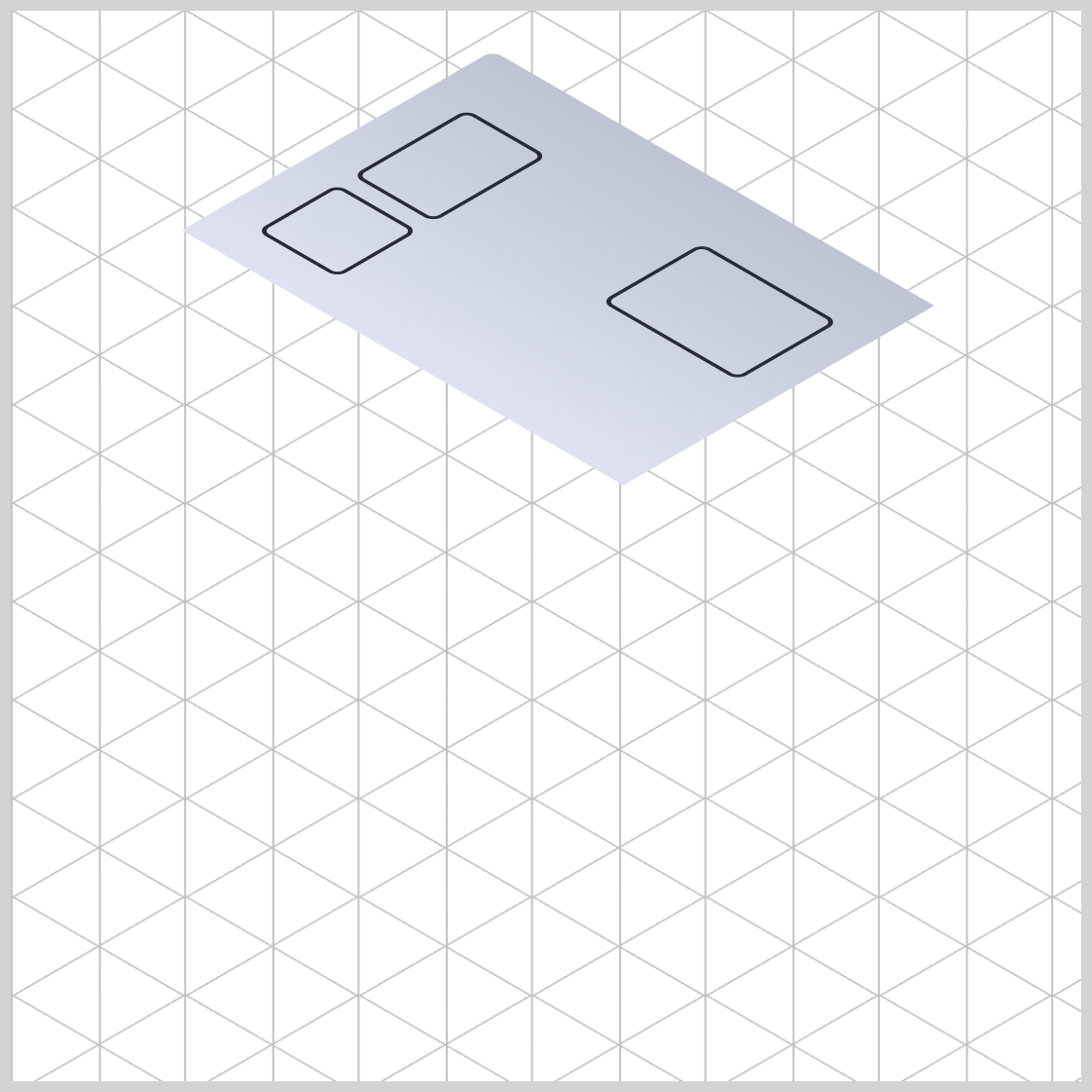
.washing-machine-top {
  transform: rotate(210deg) skewX(-30deg) scaleY(0.866) translate(-166px, -31px);
}
First, rotate it by 210 degrees (210deg), and then apply a -30 degrees horizontal skew using skewX(-30deg). Next, scale it vertically with scaleY(0.866), which gives the top section its isometric angle. Finally, move or translate the top section using translate(-166px, -31px).
You can see and play with the complete code on Pyxofy’s CodePen page.
See the Pen CSS Art – Isometric Image Design with CSS Transforms and Linear Gradients by Pyxofy (@pyxofy) on CodePen.
Conclusion
In the second installment of this two-part article series, you learned how to make the side and top sections of the front-load washing machine.
You discovered how to integrate CSS functions and properties like linear-gradient(), transform, scale(), rotate(), and border-radius to create various parts of the washing machine.
CSS pseudo-elements ::before and ::after allow you to insert additional elements into a single HTML div, enabling you to make the side panels easily.
What isometric image will you make with CSS? Share your masterpiece with us on LinkedIn, Threads, Bluesky, Mastodon, X (Twitter) @pyxofy, or Facebook.
We hope you liked this article. Kindly share it with your network. We appreciate it.
Related Articles
 Pyxofy
 Pyxofy
 Pyxofy