CSS Art - Isometric Image Design with CSS Transforms and Linear Gradients - Part 1
Join us in creating a three-dimensional (3D-ish) front-load washing machine using only CSS properties and functions in this step-by-step article.

Introduction
Simulating real objects using CSS is always fun and inspiring. It can be challenging at first, but once you master combining multiple CSS properties, such as the transform and linear-gradient() functions, you’ll be creating eye-catching images in no time.
This article series, divided into two parts, will guide you through creating an isometric image of a front-load washing machine using just CSS and HTML.
- In Part 1, you will learn to create the container gradient and the front section of the washing machine.
- Part 2 will demonstrate how to make the side and top sections of the washing machine.
CSS properties and functions introduced in this article:
transformlinear-gradient()::beforeand::afterpseudo-elementstranslate()rotate()
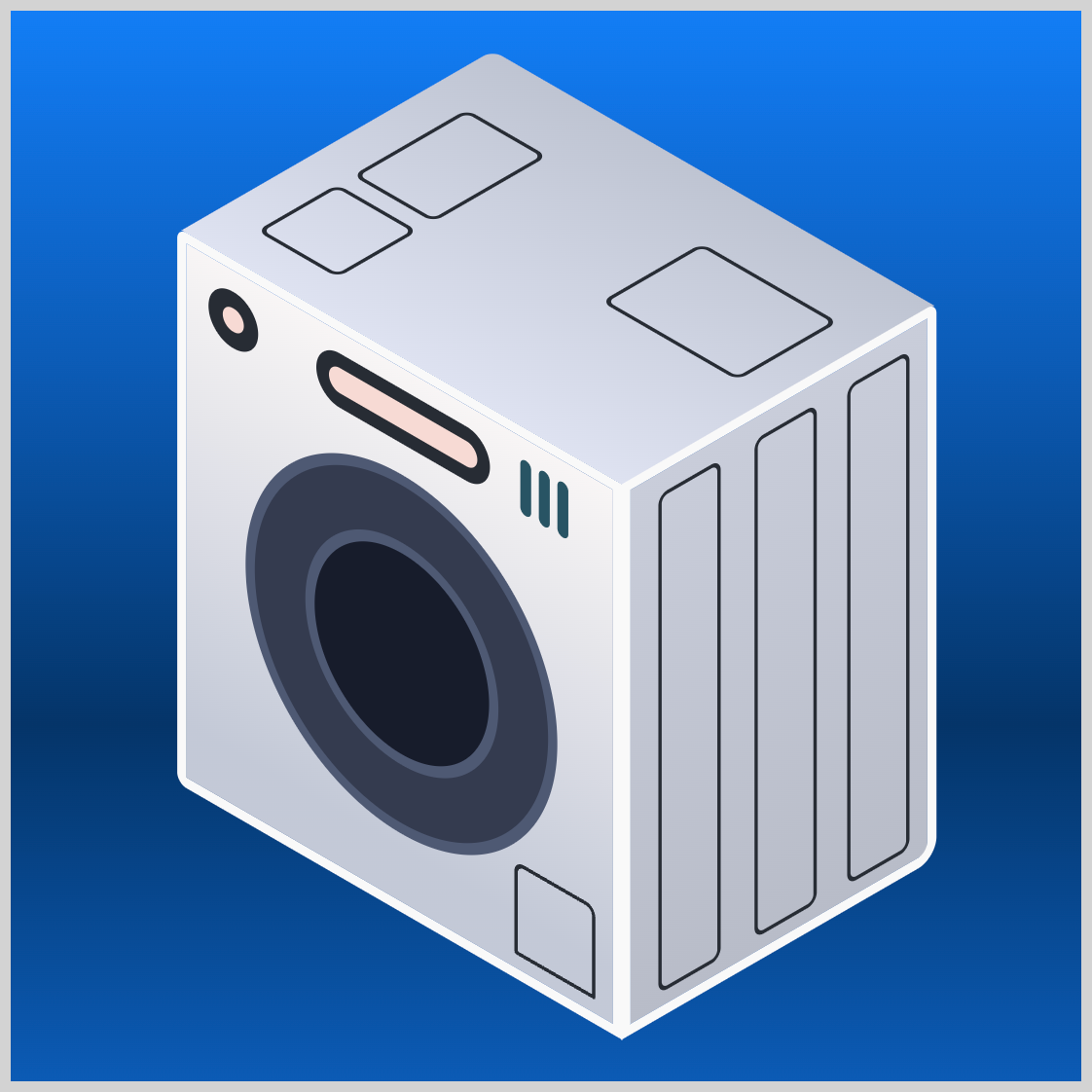
Preview
You’ll create an isometric front-load washing machine using the CSS transform property and the linear-gradient() function.
Prerequisites
Essential CSS and HTML knowledge will help you understand the concepts and techniques introduced in this article. Jump over to this article if you require an HTML and CSS primer.
We assume you have configured tools to modify CSS. If not, this article will guide you through the setup process.
HTML Structure
<div class="container">
  <div class="isometric-washing-machine">
    <div class="washing-machine-top">
      <div class="detergent-cover"></div>
      <div class="softener-cover"></div>
      <div class="lint-filter-cover"></div>
    </div>
    <div class="washing-machine-front">
      <div class="door"></div>
      <div class="door-window"></div>
      <div class="power-button"></div>
      <div class="screen"></div>
      <div class="switches"></div>
      <div class="filter-cover"></div>
    </div>
    <div class="washing-machine-side">
      <div class="side-panels"></div>
    </div>
  </div>
</div>
container is the outermost enclosure. It enables the content to be centered and draws a light gray border. The rest of the divs represent each image component.
Keep the HTML structure as is for the image to display correctly.
Body and Container Div CSS
CSS code for the body and container div.
/* Body and Container Settings */
/* Center shapes */
body {
  margin: 0;
  padding: 0;
  height: 100vh;
  display: flex;
  justify-content: center;
  align-items: center;
  flex-wrap: wrap;
}

/* Set background and border color */
.container {
  min-width: 500px;
  height: 500px;
  border: 5px solid lightgray;
  background: linear-gradient(#0d7df5, #085bb5, #043468, #085bb5);
  position: relative;
  margin: 5px;
  display: flex;
  justify-content: center;
  align-items: center;
}
Common Properties
The isometric washing machine consists of various components that share similar CSS properties.
/* Common Properties */
.isometric-washing-machine,
.washing-machine-top,
.washing-machine-front,
.washing-machine-side,
.door,
.door-window,
.power-button,
.screen,
.switches,
.switches::before,
.switches::after,
.filter-cover,
.side-panels,
.side-panels::before,
.side-panels::after,
.detergent-cover,
.softener-cover,
.lint-filter-cover {
  position: absolute;
  transform-style: preserve-3d;
}
- The position property value will be
absolute. - The transform style property is configured to
preserve-3d, meaning the element's children will be arranged in three-dimensional (3D) space.
Let’s create the gradient background in the next section.
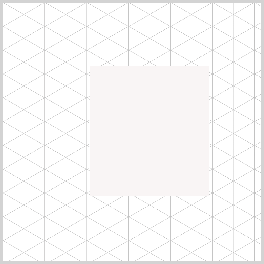
Container Gradient Background
The background gradient improves the isometric washing machine’s 3D-ish effect. You will blend three shades of blue to form the gradient background for the container.

/* Set background and border color */
.container {
  background: linear-gradient(#0d7df5, #085bb5, #043468, #085bb5);
}
The gradient begins at the top with Azure blue, #0d7df5, and smoothly shifts to sapphire blue, #085bb5. Around 70% down, it changes to #043468, a deep midnight blue, before returning to sapphire blue at the end to finish the gradient.
Refer to this article for a detailed explanation of CSS gradients.
 Pyxofy
With the background gradient finished, the next step is to work on the washing machine’s front section.
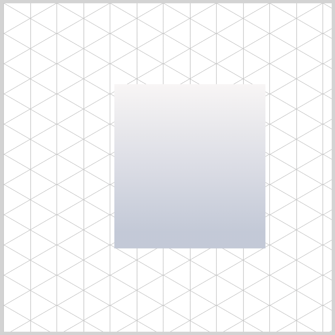
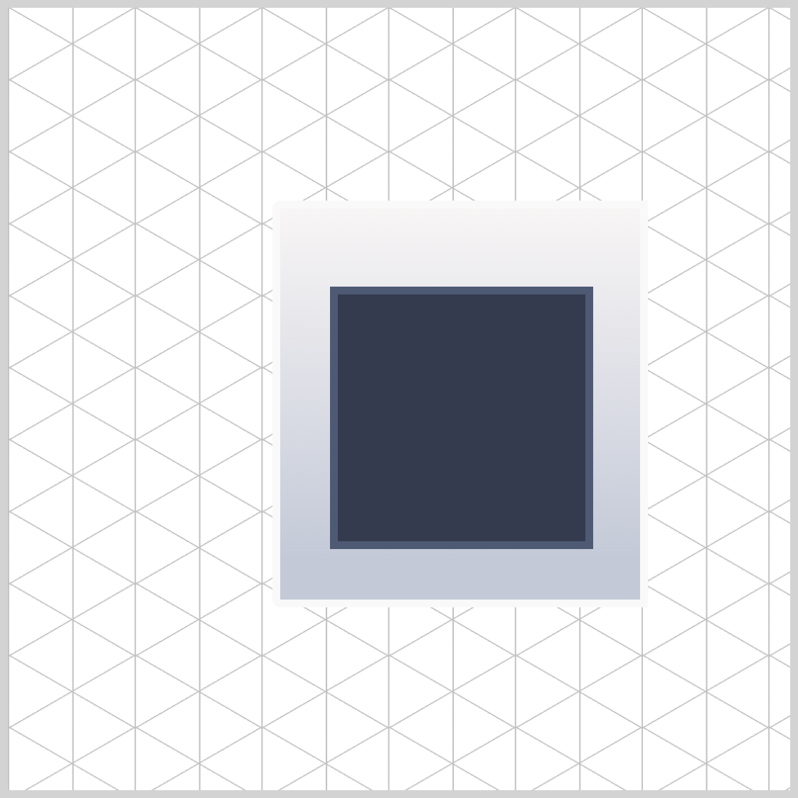
Washing Machine Front Section
The front section of the washing machine serves as its central visual aspect and features numerous details in comparison to other sections. To simplify creation, the front section will be designed at a flat, two-dimensional (2D) angle before being adjusted to an isometric angle later on.
/* Isometric Washing Machine Front */
.washing-machine-front {
  height: 250px;
  width: 230px;
  background: #f8f5f5; -> To be replaced with gradient
}
The front section is a vertically elongated rectangle. The height property value is set to 250px and the width is set to 230px.
.washing-machine-front {
  background: linear-gradient(#f8f5f5, #c3c9d7 90%);
}
To add depth to the image, create a linear gradient background that begins at the top and flows downward. It will start with a light beige, #f8f5f5, and shift to a lavender gray, #c3c9d7, starting from the 90% mark.
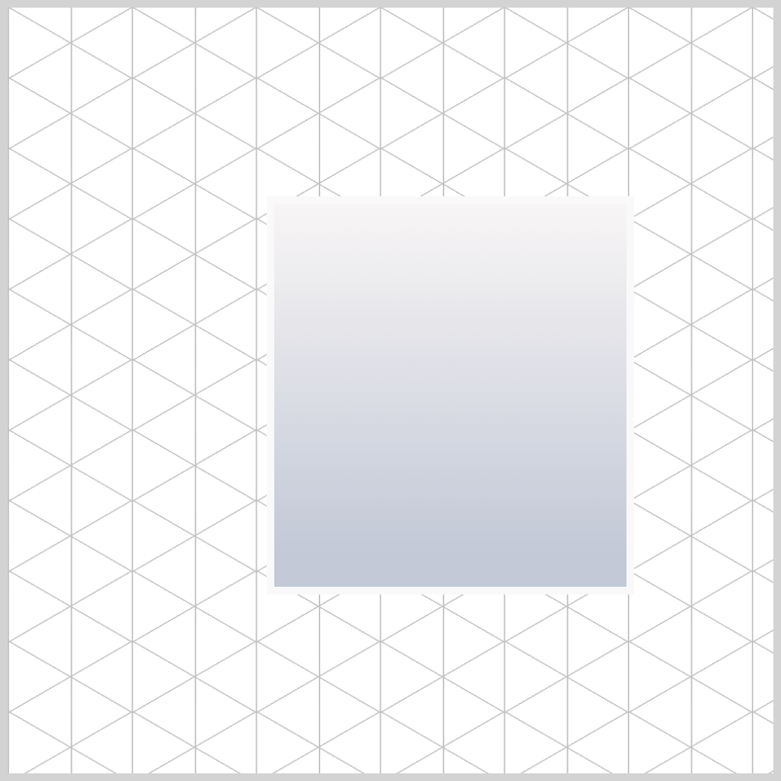
.washing-machine-front {
  border: 5px solid #f9f9f9;
}
Apply a solid white border of 5 pixels to the front section with the CSS rule border: 5px solid #f9f9f9;.

.washing-machine-front {
  border-radius: 5px 0px 0px 5px;
}
To finish up the front section, apply border-radius: 5px 0px 0px 5px; rule to round the top left and lower left corners of the rectangle.
Let’s move on and make the door in the next section.
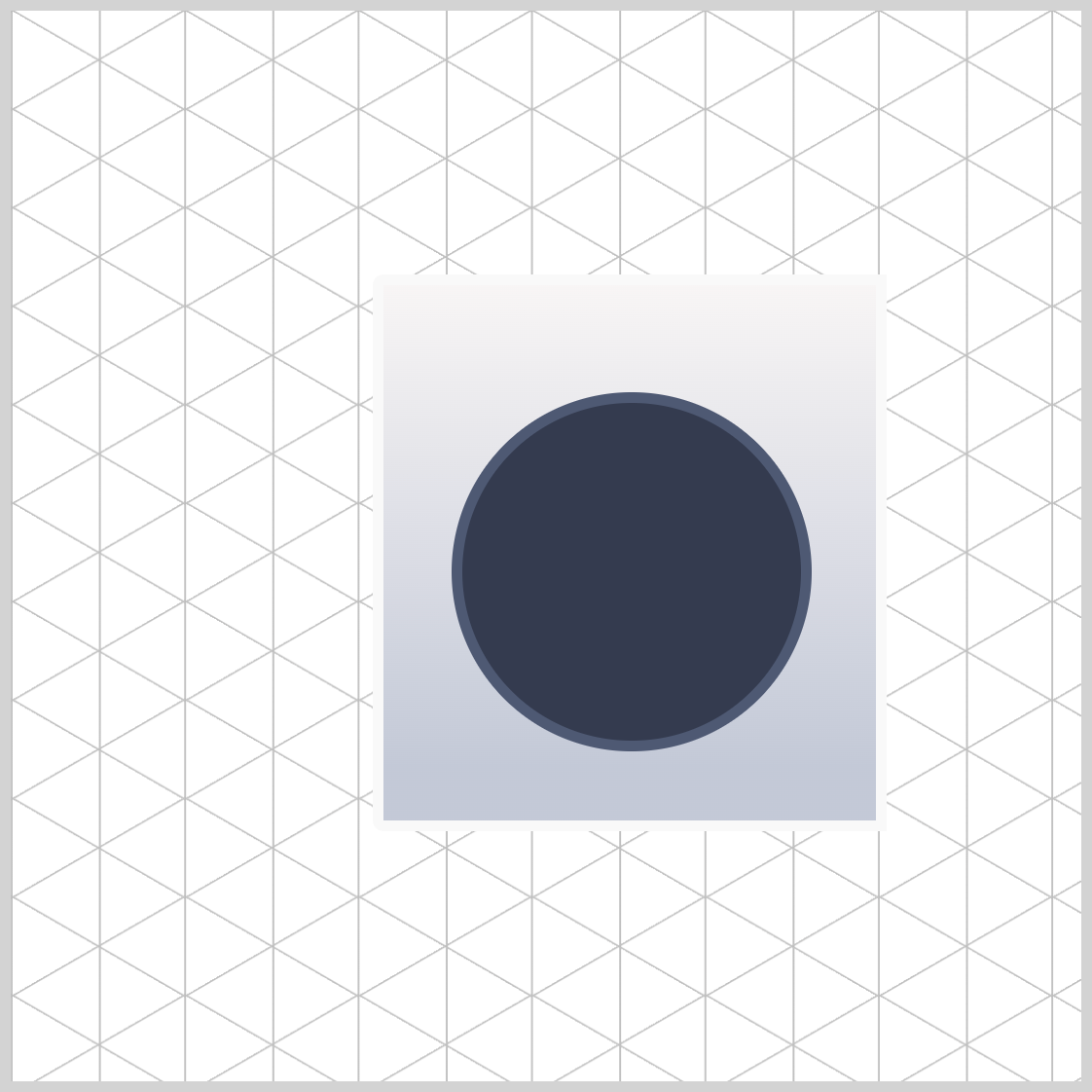
Door
The door begins as a square and transforms into a circle. Like the front section, it will also have borders.
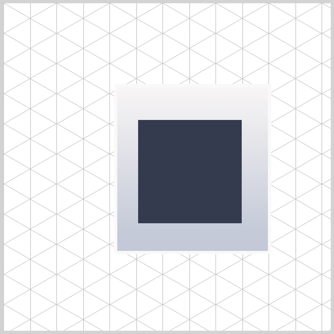
.door {
  width: 158px;
  height: 158px;
  top: 50px;
  left: 32px;
  background: #333b4e;
}
The square has dimensions of 158px in height and width. It is placed 50px from the top edge and 32px from the left side. The background color is a charcoal shade represented by #333b4e.
.door {
  border: 5px solid #4e5973;
}
The door features a solid 5-pixel border in slate gray, #4e5973.
.door {
  border-radius: 50%;
}
Round out the square shape to a circle using the border-radius: 50%; rule.
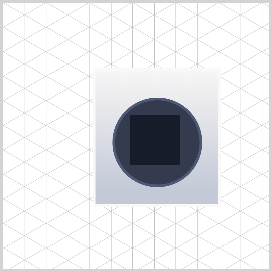
Door Window
The door window is a smaller variant of the door image. This section will briefly outline only the differences between the door and the door window.
.door-window {
  width: 94px;
  height: 94px;
  top: 82px;
  left: 64px;
  background: #171c2b;
}
Both width and height CSS property values are set to 94px. The door window image is placed 82px from the top edge and 64px from the left side. Its color is set to a dark gunmetal shade with #171c2b.

.door-window {
  border: 5px solid #4e5973;
}

.door-window {
  border-radius: 50%;
}
Next up is the power button.
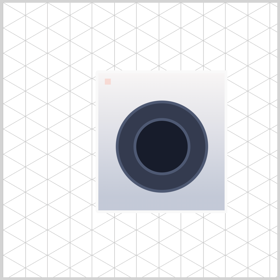
Power Button
The power button, found in the top left corner, resembles the previous door and door window with its circular design.
.power-button {
  width: 11px;
  height: 11px;
  top: 10px;
  left: 12px;
  background: #f6dad4;
}
The power button is a square measuring 11px wide, located 10px from the top edge and 12px from the left side. Its background is a champagne pink, specified as #f6dad4.
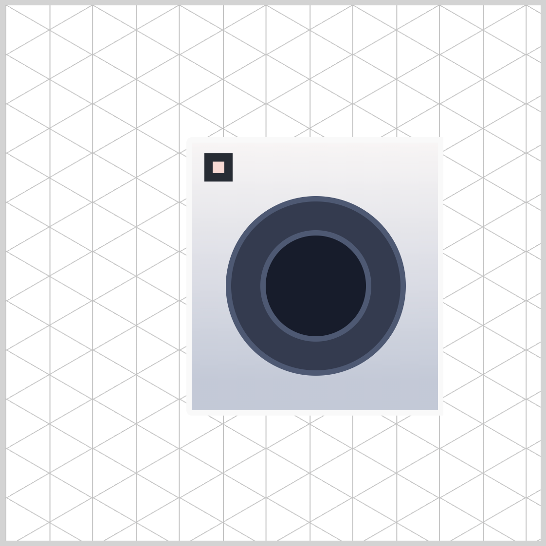
.power-button {
  border: 8px solid #272c34;
}
Give the power button an 8-pixel solid and dark gray slate border using border: 8px solid #272c34;.

.power-button {
  border-radius: 50%;
}
Transform the square shape to a circle by setting the border-radius to 50%.
Let’s move on to the next section and make the screen component.
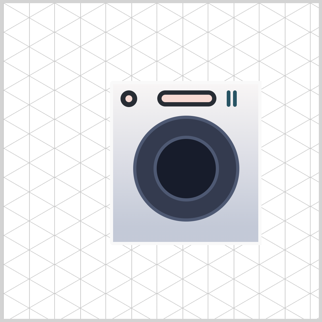
Screen
The washing machine screen is a horizontally elongated rectangle and uses the same color scheme as the previous power button.

.screen {
  width: 80px;
  height: 12px;
  top: 10px;
  left: 70px;
  background: #f6dad4;
}
- Width is set to
80px. - The height property value is
12px. - The top and left property values are set to
10pxand70px. #f6dad4, a champagne pink color, is set as the background color.
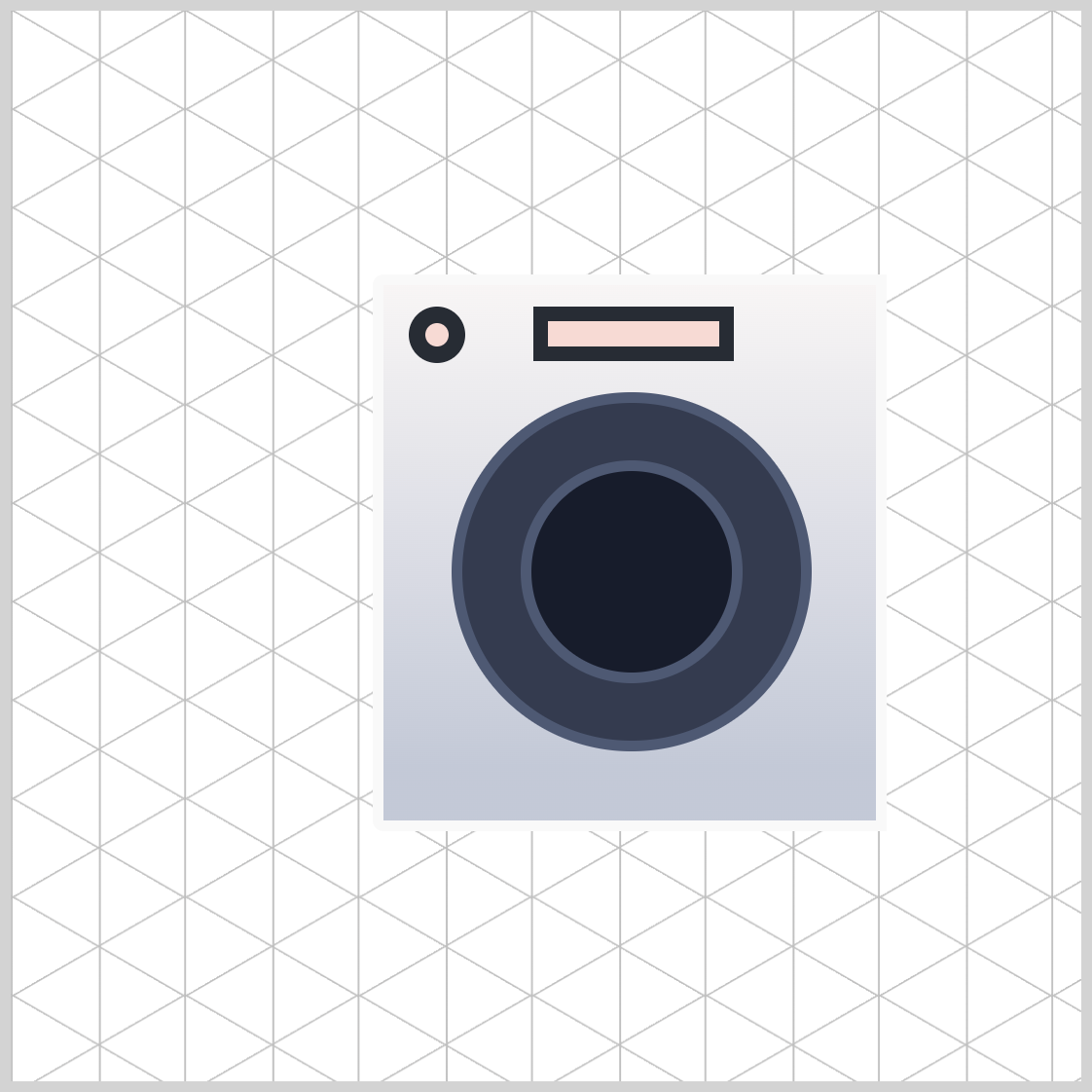
.screen {
  border: 7px solid #272c34;
}
The screen border is solid, 7 pixels thick, and is dark slate gray using #272c34.
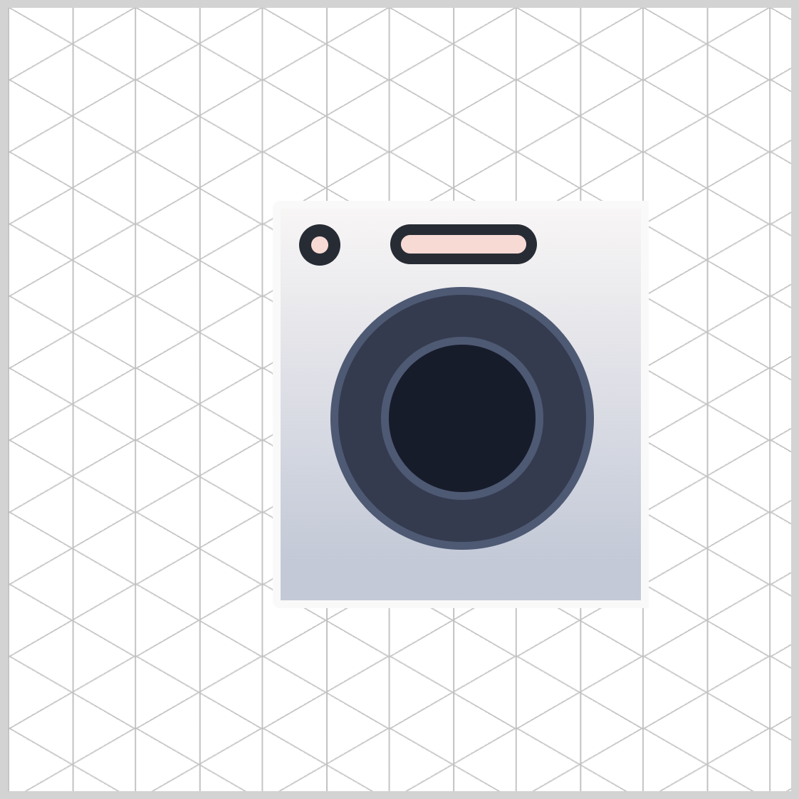
.screen {
  border-radius: 30px;
}
Soften the border edges of the screen with border-radius: 30px;.
Let’s make the switches in the next section.
Switches
The switches have a slim, vertical rectangle design. Once you've created the first switch, use the CSS pseudo-elements ::before and ::after to create the second and third switches.
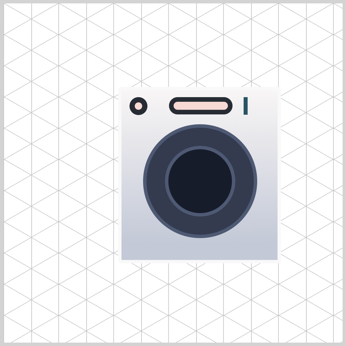
.switches {
  width: 6px;
  height: 26px;
  top: 10px;
  left: 180px;
  background: #285463;
}
The switch's basic shape is 6px wide and 26px high. It is positioned 10px from the top and 180px from the left side. #285463, a midnight teal shade, is set as its background color.

.switches {
  border-radius: 10px;
}
Round out the switch borders by 10px.
.switches::before {
  content: "";
  width: inherit;
  height: inherit;
  top: 0px;
  left: 10px;
  background: inherit;
  border-radius: inherit;
}
The second and third switches inherit their width, height, background, and border-radius property values from the first switch image using inherit. The second switch is placed 10px on the left side.
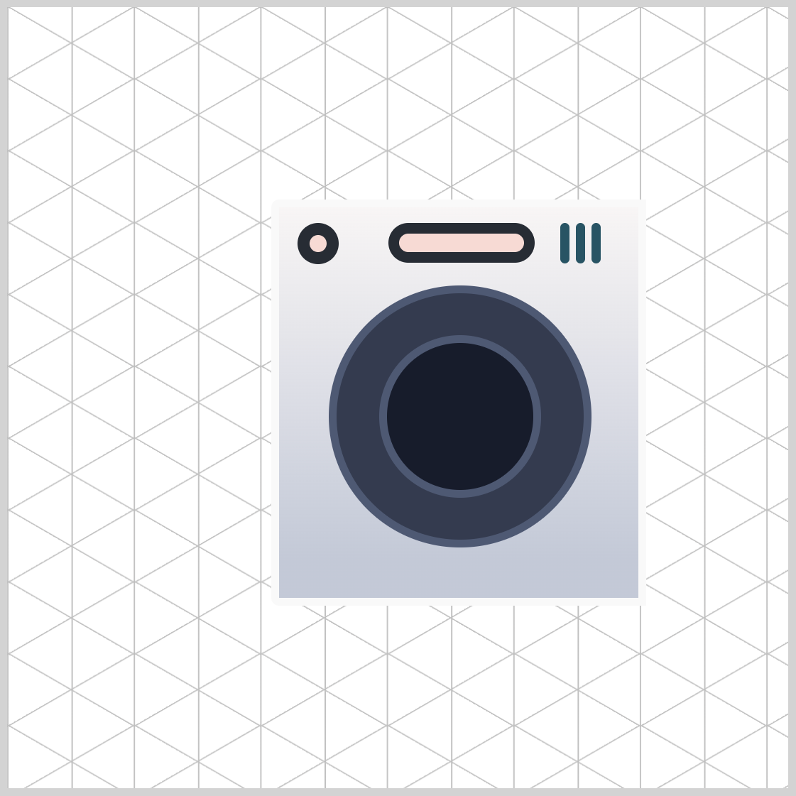
.switches::after {
  content: "";
  width: inherit;
  height: inherit;
  top: 0px;
  left: 20px;
  background: inherit;
  border-radius: inherit;
}
The third switch is located 20px away from the left side.
Up next is the filter cover, the final front section component.
Filter Cover
The washing filter cover is a square shape, placed at the lower right-hand side of the front section.

.filter-cover {
  width: 40px;
  height: 40px;
  top: 200px;
  left: 177px;
  border: 2px solid #272c34;
}
The filter cover’s width and height property values are set to 40px. It is positioned 200px from the top edge and 177px from the left side. It has a 2-pixel solid dark slate border.
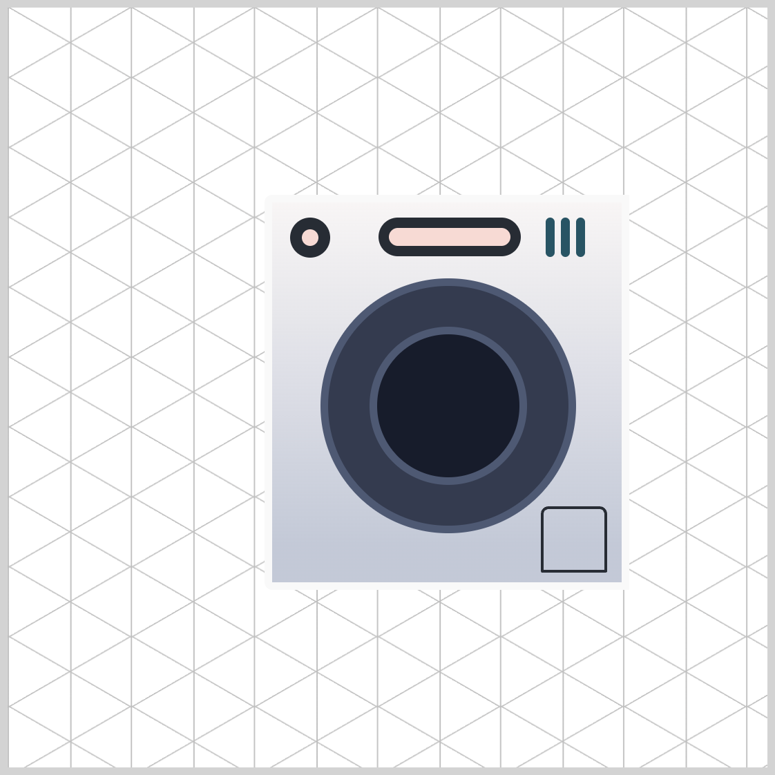
.filter-cover {
  border-radius: 5px 5px 1px 1px;
}
The border-radius property values for the top left and right corners are 5px, while the bottom corners are 1px.
Let’s move on to the last section of this article, where you’ll set the front section’s isometric angle.
Front Section Isometric Angle
To finalize the front section of the washing machine, you’ll adjust its isometric angle using the CSS transform property.
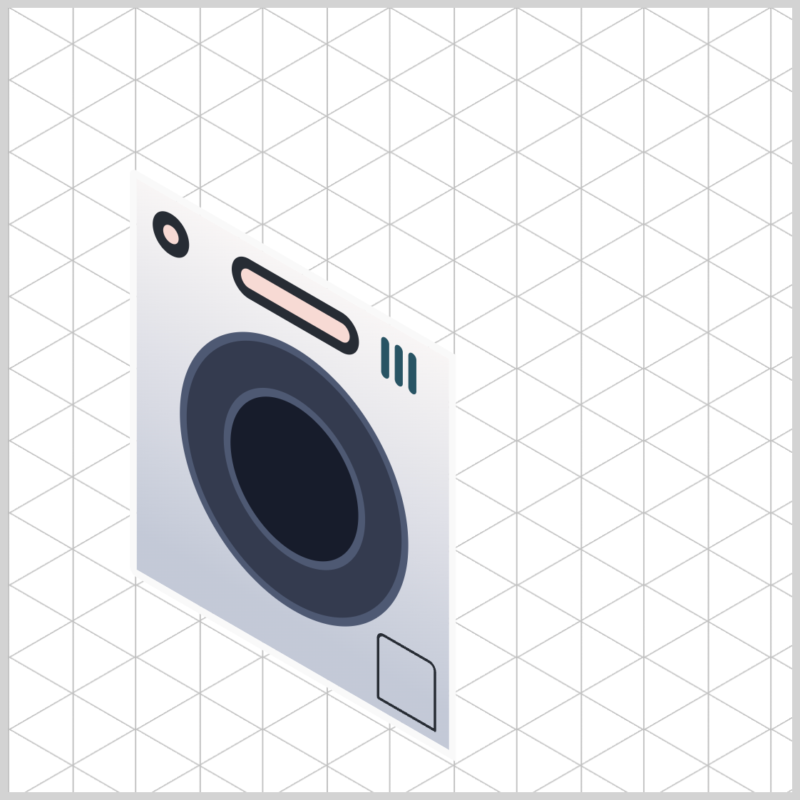
/* Isometric Washing Machine Front */
.washing-machine-front {
  transform: rotate(30deg) skewX(30deg) scaleY(0.866) translate(-124px, 100px);
}
rotate(30deg)rotates the front section by 30 degrees.- Skew the front section by 30 degrees with
skewX(30deg). scaleY(0.866)reduces the front section’s vertical y-axis to 86.6%, creating an isometric angle.- Shift or translate the image location using
translate(-124px, 100px).
Check this article to dive deep into CSS transform and isometric cubes.
 Pyxofy
In part 2 of this article series, we will cover how to create the washing machine’s side and top sections.
You can see and play with the complete code on Pyxofy’s CodePen page.
See the Pen CSS Art – Isometric Image Design with CSS Transforms and Linear Gradients by Pyxofy (@pyxofy) on CodePen.
Conclusion
This article demonstrated how to create isometric images utilizing various CSS properties and functions like transform, linear-gradient(), and pseudo-elements such as ::before and ::after.
The rotate(), skewX(), scaleY()and translate() transformed a two-dimensional (2D) image to a more three-dimensional (3D) like isometric image. The potential images that can be generated through the combination of CSS properties and functions are limitless; indeed, the only constraint is one's imagination.
What will you create with your newfound knowledge? Share your masterpiece with us on LinkedIn, Threads, Bluesky, Mastodon, X (Twitter) @pyxofy, or Facebook.
We hope you liked this article. Kindly share it with your network. We appreciate it.
Related Articles
 Pyxofy
 Pyxofy
 Pyxofy
 Pyxofy