CSS Art – How to Make Vector Shapes with path()
Make basic and advanced shapes with CSS path() function and Scalable Vector Graphics (SVGs). Find out how in this step-by-step article.

Introduction
Scalable Vector Graphics or SVGs are XML-based images that are used all over the web. They’re super lightweight and highly scalable.
We’ll explore how to make SVGs in this article. Starting with basic shapes such as rectangles and ellipses. We’ll show you how to make them with text.
Next we’ll tackle more advanced shapes such as hearts, crosses, and Bézier curves.
Preview
Preview of the shapes we will be creating. We will combine horizontal, vertical lines and Bézier curves in making these shapes.
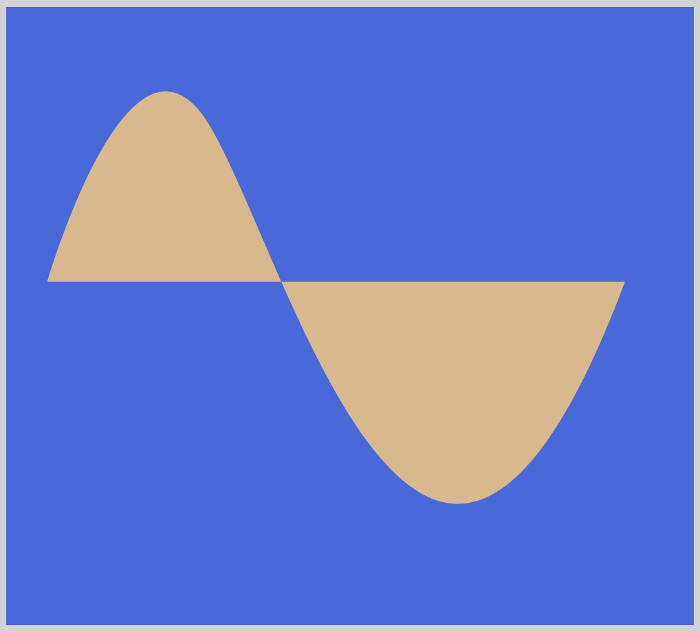
Let’s explore how to make these smooth Bézier curves.
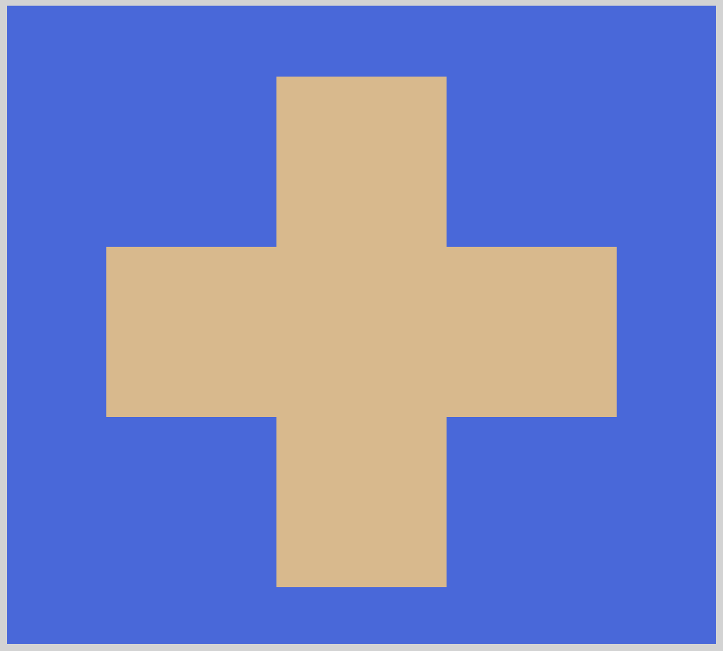
We will combine multiple lines, both vertical and horizontal, to make this simple cross.
Prerequisites
We don’t assume prior knowledge of CSS or HTML, but it helps if you have some familiarity with how they work. Jump over to this article if you require an HTML and CSS primer.
We assume that you have set up tools to create CSS art. If you haven’t, this article will show you how to set them up.
HTML Structure
HTML code for our examples.
<!-- CSS art code here -->
<div class="container">
  <div class="svg-path-square"></div>
</div>
<div class="container">
  <div class="svg-path-rectangle"></div>
</div>
<div class="container">
  <div class="svg-path-circle"></div>
</div>
<div class="container">
  <div class="svg-path-ellipse"></div>
</div>
<div class="container">
  <div class="svg-path-triangle"></div>
</div>
<div class="container">
  <div class="svg-path-cross"></div>
</div>
<div class="container">
  <div class="svg-path-quad"></div>
</div>
<div class="container">
  <div class="svg-path-cubic"></div>
</div>
<div class="container">
  <div class="svg-path-smooth-curve"></div>
</div>
<div class="container">
  <div class="svg-path-heart"></div>
</div>
<div class="container"> enables us to center the art and put a light gray border. The rest of divs represent each of our shape examples.
What are Scalable Vector Graphics (SVG)?
Mozilla Developer Network (MDN) defines SVG as follows:
Scalable Vector Graphics (SVG) are an XML-based markup language for describing two-dimensional based vector graphics.
It's a text-based, open Web standard for describing images that can be rendered cleanly at any size and are designed specifically to work well with other web standards including CSS, DOM, JavaScript, and SMIL.
SVG is, essentially, to graphics what HTML is to text.
SVG images and icons are all over the web. Compared to other graphics formats such as JPEG or PNG, SVGs are mathematical vectors. They can be rendered at any size without losing image quality. It scales well and doesn’t get pixelated.
SVG are XML-based text. The examples that we will show in this article can all be edited with your favorite text editor. Being text, you can search, index, script and compress them.
The World Wide Web Consortium (W3C) has been developing SVG since 1999.
The Grid
Before making SVGs, let us talk about the Grid system that it uses.
All elements in SVG utilizes a coordinate system, commonly called a grid system. The top-left corner of the document is the point of origin or (0,0). Take not that most computer drawing routines uses the same grid system.
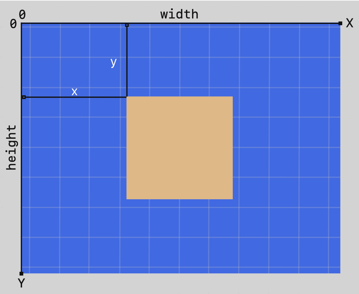
Positions are then measured in pixels from the top-left corner. The positive x-axis or horizontal direction goes to the right. Positive y-axis or vertical directions points downwards.
Note that this is different from how it was explained in school, where the direction of the y-axis is flipped.
Implementing SVG
There are multiple ways to implement, make SVGs.
You can use HTML tags to make them. Sample code for a rectangle followed by a circle.
<!-- Rectangle -->
<rect x="10" y="10" width="30" height="30" stroke="black" fill="transparent" stroke-width="5"/>

<!-- Circle -->
<circle cx="25" cy="75" r="20" stroke="red" fill="transparent" stroke-width="5"/>
Another way is to insert them in CSS clip-path path() function. Sample code for a rectangle followed by an ellipse.
/* Rectangle */
clip-path: path("M 45,80 L 445,80 L 445,350 L 45,350 Z");

/* Ellipse */
clip-path: path("M 240,365 A 190,130 0 1 0 239,365 Z");
For all the following examples, we will use the CSS clip-path path() method.
SVG Path Commands
SVG defines 2 line categories and 6 types of path commands, for a total of 20 commands.
- An uppercase letter specifies absolute coordinates.
- A lowercase letter specifies relative coordinates.
- Move To:
M,m - Line To:
L,l,H,h,V,v - Close Path:
Z,z
- Cubic Bézier Curve:
C,c,S,s - Quadratic Bézier Curve:
Q,q,T,t - Elliptical Arc Curve:
A,a
Let’s explore basic SVG shapes in the next section.
Basic Shapes
Square
CSS Code:
.svg-path-square {
	width: 500px;
	height: 450px;
	background: burlywood;
	clip-path: path("M 90,75 L 420,75 L 420,380 L 90,380 Z");
}
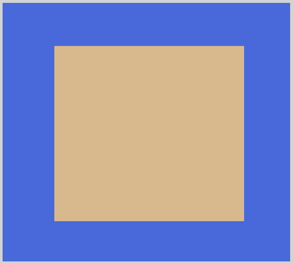
Let’s go ahead and breakdown the code within the path() function.
M 90,75
TheMor Move To command picks up our SVG pen and moves it90on thexor horizontal axis and75on theyor vertical axis. To make it more readable, we put a comma between thexandyvalues. You can replace the comma,with a space if you find it more readable.L 420,75
Next, theLor Line To command draws a line from x:90, y:75 to x:420, y:75.L 420, 380
Same as above, we draw a line from the last coordinates, x:420, y:75, to x:420, y:380.L 90, 380
Our last Line To command draws a line from x:420, y:380 to x:90, y:380.Z
The Close Path orZcommand closes our path. For this example, a line will be automatically drawn from x:90, y:380 to our start point, x:90, y:75, to make a closed square.
Our next example is a rectangle.
Rectangle
CSS Code:
.svg-path-rectangle {
	width: 500px;
	height: 450px;
	background-color: burlywood;
	clip-path: path("M 45,80 L 445,80 L 445,350 L 45,350 Z");
}
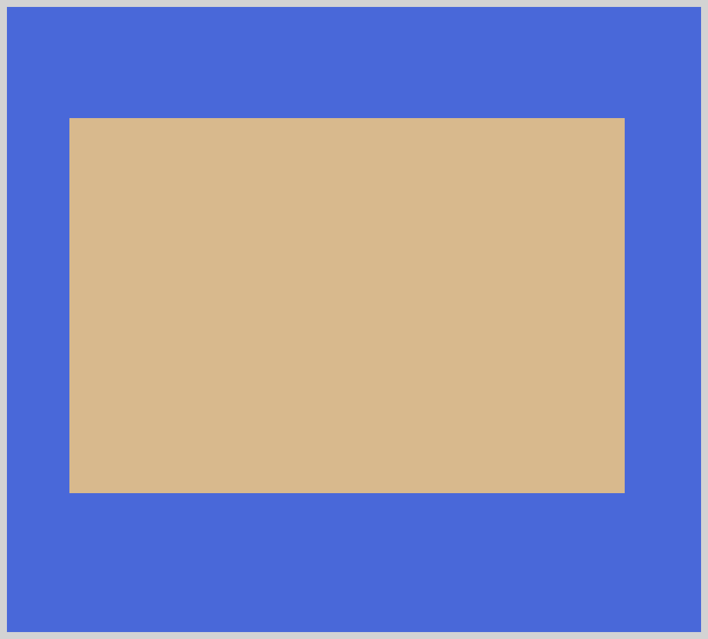
Rectangles are elongated squares. With some minor tweaks, the commands and values we used for the square applies to the rectangle example.
Next up, circle.
Circle
CSS Code:
.svg-path-circle {
	width: 500px;
	height: 450px;
	background-color: burlywood;
	clip-path: path("M 240,365 A 150,150 0 1 0 239,365 Z");
}
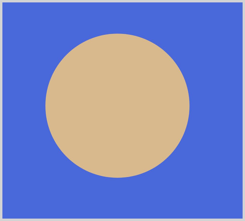
Circles use the A(a) or the Elliptical Arc Curve command. Let’s go over the syntax.
/* Absolute coordinates */
A rx ry x-axis-rotation large-arc-flag sweep-flag x y

/* Relative coordinates */
a rx ry x-axis-rotation large-arc-flag sweep-flag dx dy
A 150,150is our x-radius, the following
150150is our y-radius value. You can control the dimension of the circle by increasing or decreasing both values.0
This values is our x-axis rotation. Give it a positive value, the arc will move clockwise. A negative value will move the arc counter-clockwise.1
We use this parameter to turn on, or off, thelarge-arc-flag. This flag determines if the arc should be greater than or less than 180 degrees. A value of1means it’s turned on.0
Our second parameter,sweep-flagdetermines if the arc should begin moving at positive angles or negative ones.0means it’s turned off.239,365
This is our end coordinates,239on the x-axis and365on the y-axis.
The large-arc-flag and sweep-flag may be hard to understand at first. Use this interactive tool to play around with the parameters and see how each affects the circle shape.
Ellipse
CSS Code:
.svg-path-ellipse {
	width: 500px;
	height: 450px;
	background-color: burlywood;
	clip-path: path("M 240,365 A 190,130 0 1 0 239,365 Z");
}
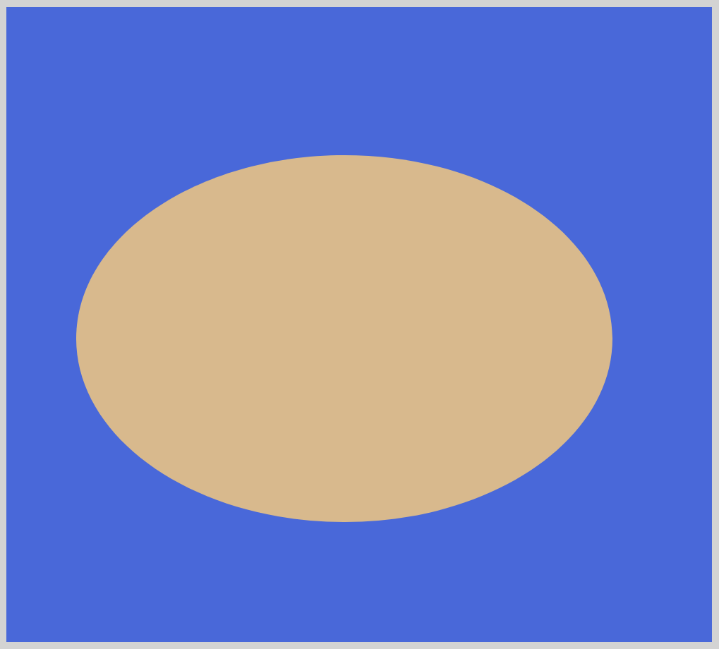
The ellipse shape is a slightly modified version of the circle shape.
A 190,130
Our x-radius,190, and y-radius,130, gives our ellipse a horizontally elongated shape.
Change both radii to modify the ellipse shape.
Our last basic shape is the triangle.
Triangle
CSS Code:
.svg-path-triangle {
	width: 500px;
	height: 450px;
	background-color: burlywood;
	clip-path: path("M 250,70 L 70,350 L 430,350 Z");
}
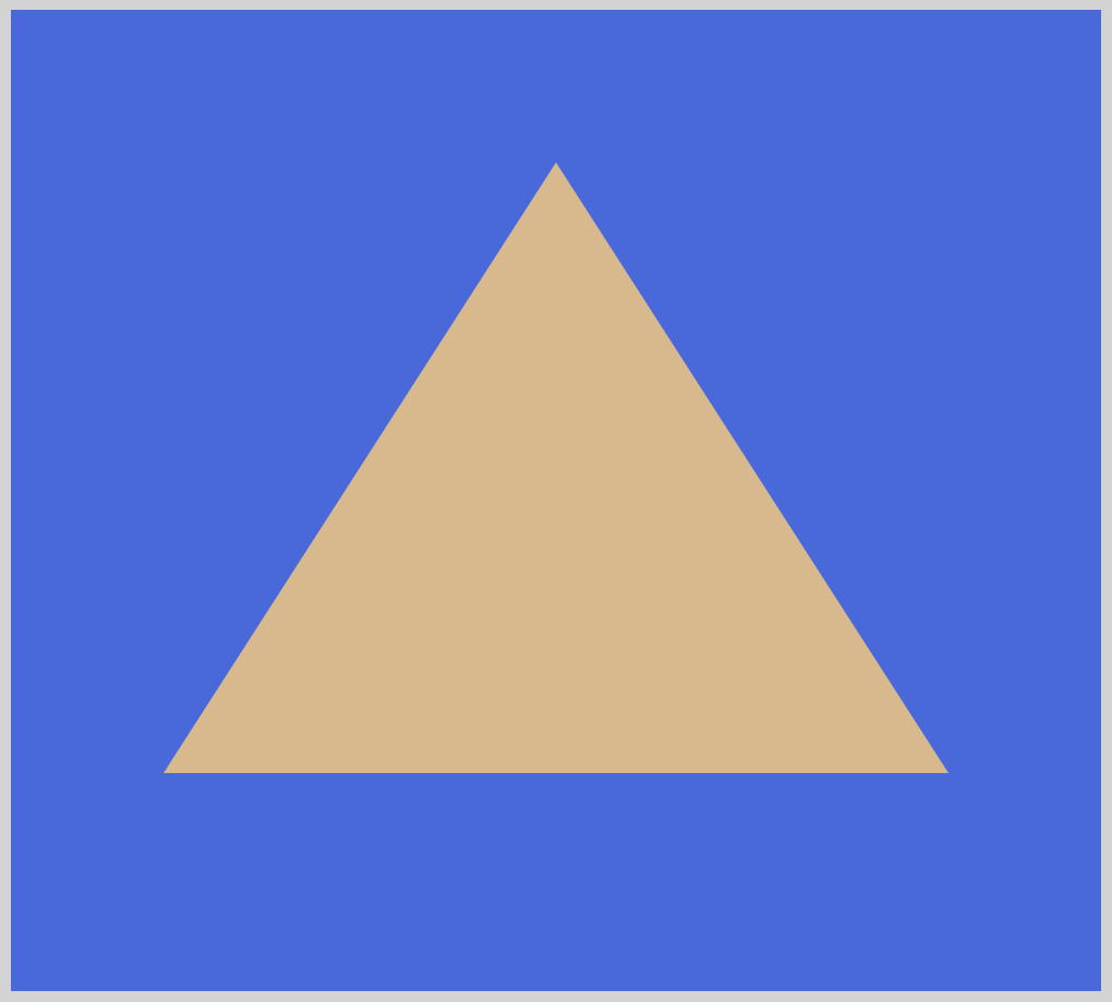
To create a triangle, the logic is similar to making squares and rectangles. We use the L command to draw the lines. The Z command auto-closes the path. This means we don’t have to explicitly draw a line from x:430, y:350 to our starting coordinates.
Advanced Shapes
Our first advanced shape will be a cross.
In the basic shapes example, we used L or Line To command to draw lines. For the cross shape, we will demonstrate how to use the H(h) or Horizontal Line command and V(v) or Vertical Line command.
As their names imply, they can only move in one direction, vertically or horizontally.
Cross
CSS Code:
.svg-path-cross {
	width: 500px;
	height: 450px;
	background-color: burlywood;
	clip-path: path(
		"M 190,50 h 120 v 120 h 120 v 120 h -120 v 120 h -120 v -120 h -120 v -120 h 120 z"
	);
}

M 190,50
We move our SVG drawing pen to190pixels on the x-axis and50pixels on the y-axis.h 120
Our first line will be drawn horizontally. From our initial location of190on the x-axis, it will draw a horizontal line moving to the right by120. You may have noticed that the letter is in lowercase. This indicates that the coordinates are relative.v 120
Our next command will draw a vertical line on the y-axis. The line will be drawn downwards by120. At this point, the image should look like an inverted “L”.
Except for the next command, for brevity, we won’t go through the rest of the commands and code of the example.h -120andv -120
A minus value will draw a line in the reverse direction of our defaults.h -120will draw a horizontal line, moving to the left instead of the default right direction.v -120will draw a vertical line moving up versus the default down direction.
Our next sections will explain how to make Bézier curves such as Quadratic, Cubic and Smooth Curve. Compared to our basic shapes, the next shapes will have additional coordinates for the position of the Bézier curve control points.
You may have encountered Bézier curve control points before. They’re widely used in path tools for applications such as Affinity Designer, Sketch, Figma, Inkscape, Adobe Illustrator or Photoshop.
Quadratic
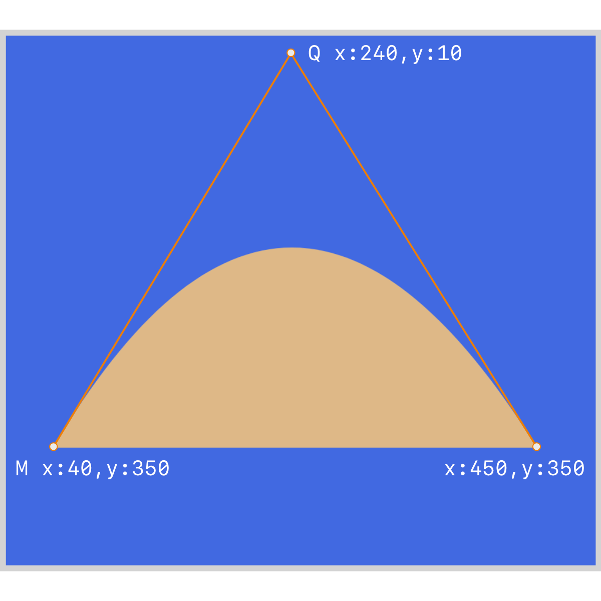
A quadratic curve has one Bézier curve control point.
CSS Code:
.svg-path-quad {
	width: 500px;
	height: 450px;
	background-color: burlywood;
	clip-path: path("M 40,350 Q 240,10 450,350 z");
}
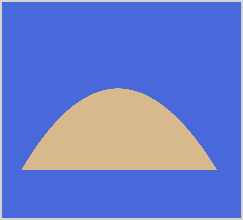
Bézier curve control points do not show on the screen. Let’s use the below illustration to explain how we position the control points. Quadratic curves require two coordinates. One for the control point that controls the slope of the shape. Another for the end point of the curve.
