CSS Art – How to Make Gradients
Gradients are powerful tools for your CSS art tool belt. We’ll learn about linear, radial and conic gradients. Then let’s make repeating patterns.

Introduction
We will discuss CSS gradients in this article. CSS currently has three gradients types, linear, radial and conic. By using gradients, we can simulate smooth transition between two or more colors.
You can make gradients that transition to transparent backgrounds. With a good grasp of gradients, you can create more dimensions and add contour to your art.
We don’t assume prior knowledge of CSS or HTML, but it helps if you have some familiarity with how they work. Jump over to the below article if you need an HTML and CSS primer.

We assume that you have set up tools to create CSS art. If you haven’t, the below article will show you how to set them up.

CSS Gradients
Gradients fall under the CSS Images Module. A gradient is an image that progressively transitions between two or more colors. You can use this transition to apply subtle shading in background images, information cards, buttons, and other web images.
The current CSS specification has three types of gradients.
You can repeat gradients. This is handy when creating stripe or checker patterns.
Let’s start with linear gradient.
Linear Gradient
Linear gradients can be made by defining a minimum of two color stops. You use the linear-gradient() function to generate linear gradients.
Syntax:
background-image: linear-gradient(angle, color-stop1, color-stop2, color-hints);
Let’s go through a couple of examples.
First up is the default linear gradient. Top to bottom gradient using peru and seashell color keywords.
CSS Code:
.linear-gradient {
  width: 450px;
  height: 350px;
  background: linear-gradient(peru, seashell);
}
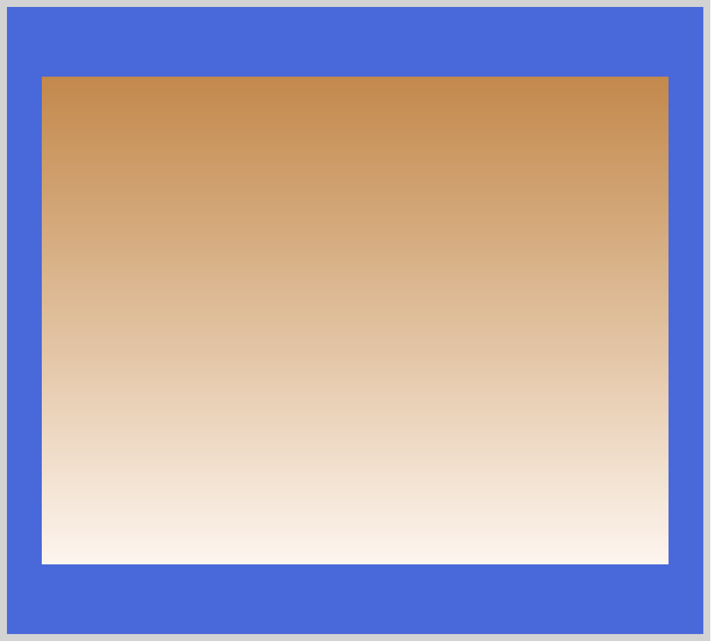
Top to bottom is the default transition for linear-gradient(). peru will be the top color and will gradually fade to seashell, our second or bottom color.
You can control the direction of the gradient line with angles, deg, or by using keywords such as to top or to right. The keywords correspond to respective angles.
Positive angle numbers rotate clockwise, negative numbers rotate counterclockwise. 0deg will be point upward. If you want to point your gradient to the right, you can use 90deg or to right keyword. Below are angles and their corresponding keywords.
0degis the same asto top.90degcorresponds toto right.180degpoints downwards, same asto bottom.270degpoint to the left, same asto left.
You can specify box corners with keywords, such as to top left. Let’s take a look at a linear gradient with to top left keyword.
CSS Code:
.linear-gradient-to-top-left {
  width: 450px;
  height: 350px;
  background: linear-gradient(to top left, peru, seashell);
}
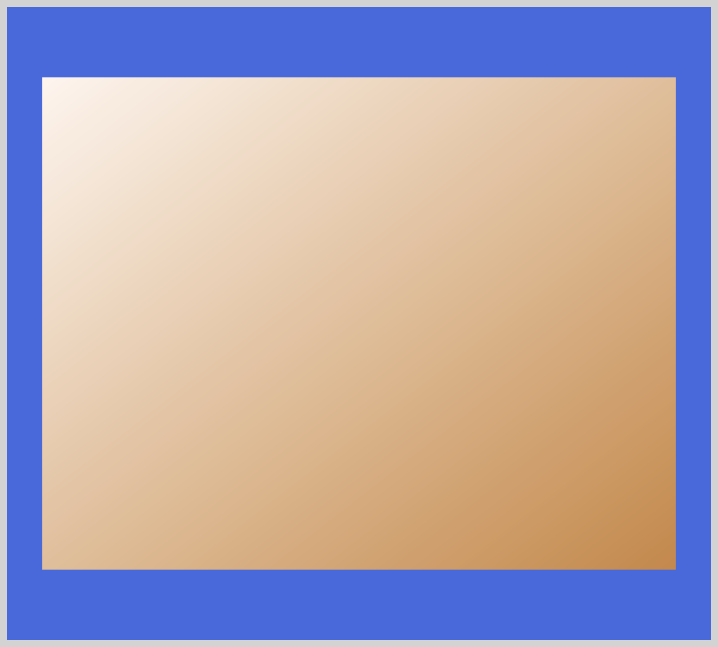
The to top left keyword will be typed first, followed by the first color, in this instance peru and finally with the second color seashell. peru will start from the bottom right and transition towards seashell ending in the top-left corner.
Besides simple directional transitions, we can make repeating linear patterns as well. Let’s look at an example using the repeating-linear-gradient() function.
CSS Code:
.linear-gradient-repeat {
  width: 450px;
  height: 350px;
  background: repeating-linear-gradient(45deg, peru 20%, seashell 40%);
}
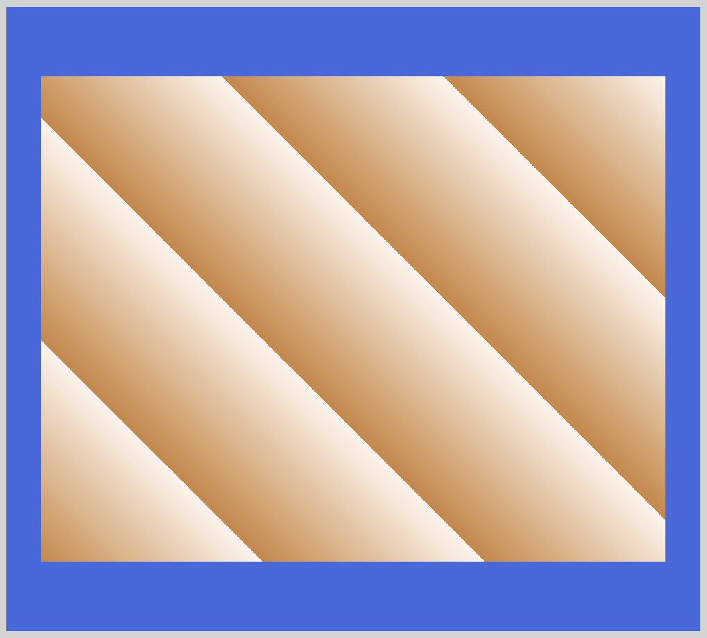
Let's break down the CSS code.
- With
45deg, we set the gradation angle to 45 degrees. peruis our starting point color.20%is a color hint. What this means is that from 0% to 20% you will have a solidperucolor. Nextseashellwill start from40%and go all the way to 100%. A gradation will be done for the two colors between 20% and 40%.- The above color pattern repeats within the image box set
widthandheight.
Using color stop positions, let’s set three solid colors.
CSS Code:
.linear-gradient-three-colors {
  width: 450px;
  height: 350px;
  background: linear-gradient(
    seashell 0 33%,
    peru 33% 65%,
    darkmagenta 65% 100%
  );
}
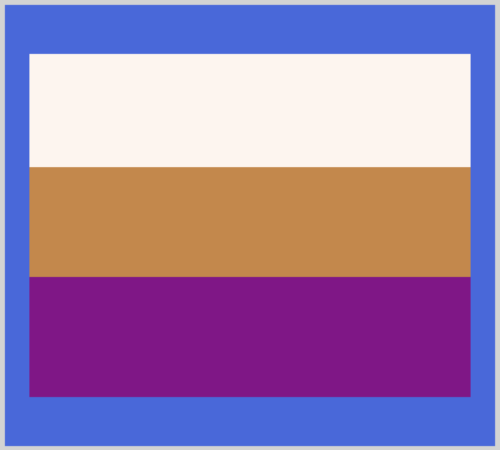
Using stop color positions, we set three colors:
- From 0% to 33% we set color to
seashell. peruoccupies 33% to 65%.- Finally,
darkmagentais set to occupy 65% to 100%.
For the colors to be cleanly separated, the color stop positions need to start and stop precisely. If you leave a gap between the color stop positions, the browser will transition the colors within the gap.
In the next section, let’s work on radial gradients.

Radial Gradient
Using the radial-gradient() function, we can create images such as ellipses and circles. This image is a progressive transition between two or more colors that radiate from an origin.
Syntax:
background-image: radial-gradient(shape size at position, start-color-stop, ..., last-color-stop);
Let’s break down the syntax.
shape: Defines the shape of the gradient. You can choose ellipse, which is the default, or circle.
size: Defines the size of the gradient.
- farthest-corner (default)
- closest-side
- closest-corner
- farthest-side
position: Defines the position of the gradient. Default is center. You can use top, left, bottom or any other position that is interpreted the same was as background-position or transform-origin.
start-color-stop, ..., last-color-stop: You can set color stops as start-color-stop,last-color-stop and the gradients will be transition between them. You can include one or two (optional) stop positions after the color stop.
Let’s take a look at a couple of examples to see how radial gradient works. First let’s look at the default radial gradient.
CSS code:
.radial-gradient {
  width: 450px;
  height: 350px;
  background: radial-gradient(peru, seashell);
}
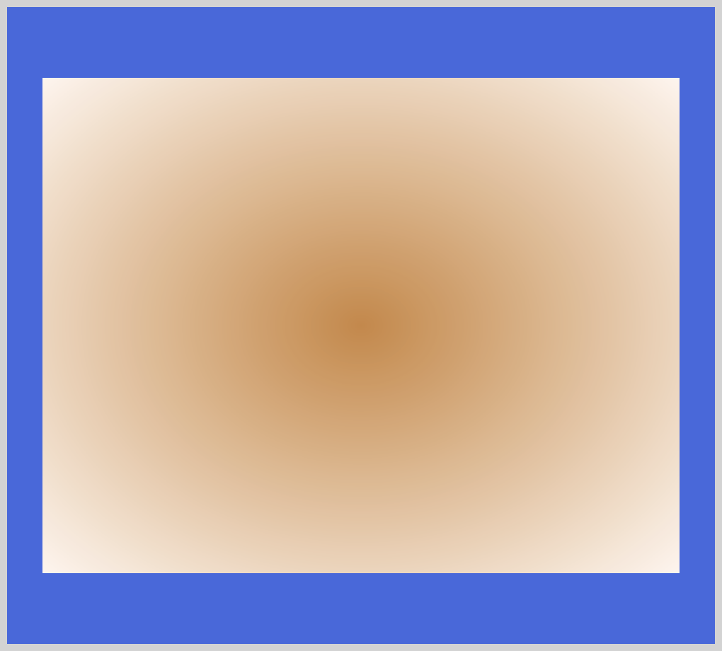
Since we did not include the shape and position, the gradient defaults to ellipse and center. Our start color stop is peru and transitions from the center outward to seashell our last color stop.
For the next example, let’s set shape to circle and give it a specific size.
CSS code:
.radial-gradient-circle {
  width: 450px;
  height: 350px;
  background: radial-gradient(circle 160px, peru, seashell);
}
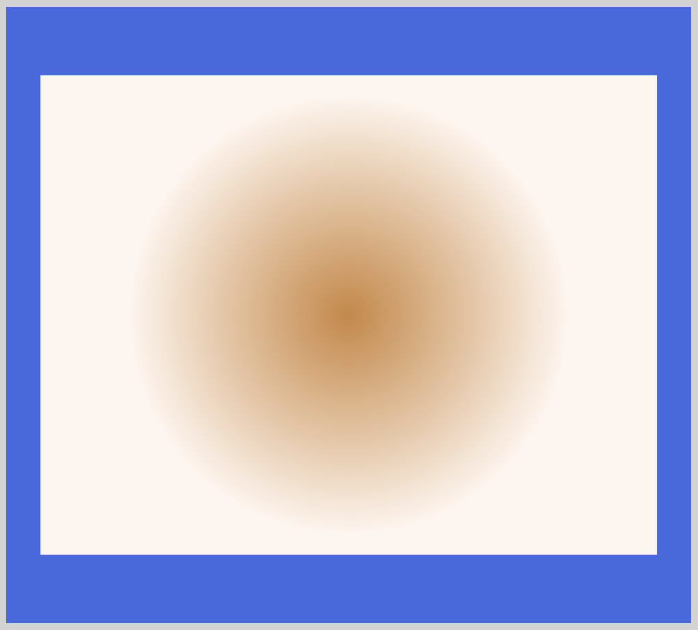
After specifying shape as circle, we follow it with 160px. This locks the circle size explicitly to 160px. Take note that circle shape only accepts size value. Ellipse accepts both size and percentage value. This may change in future CSS specifications.
In the next example, let’s move the radial gradients starting position.
CSS code:
.radial-gradient-circle-bottom-left {
  width: 450px;
  height: 350px;
  background: radial-gradient(circle at bottom left, peru, seashell);
}
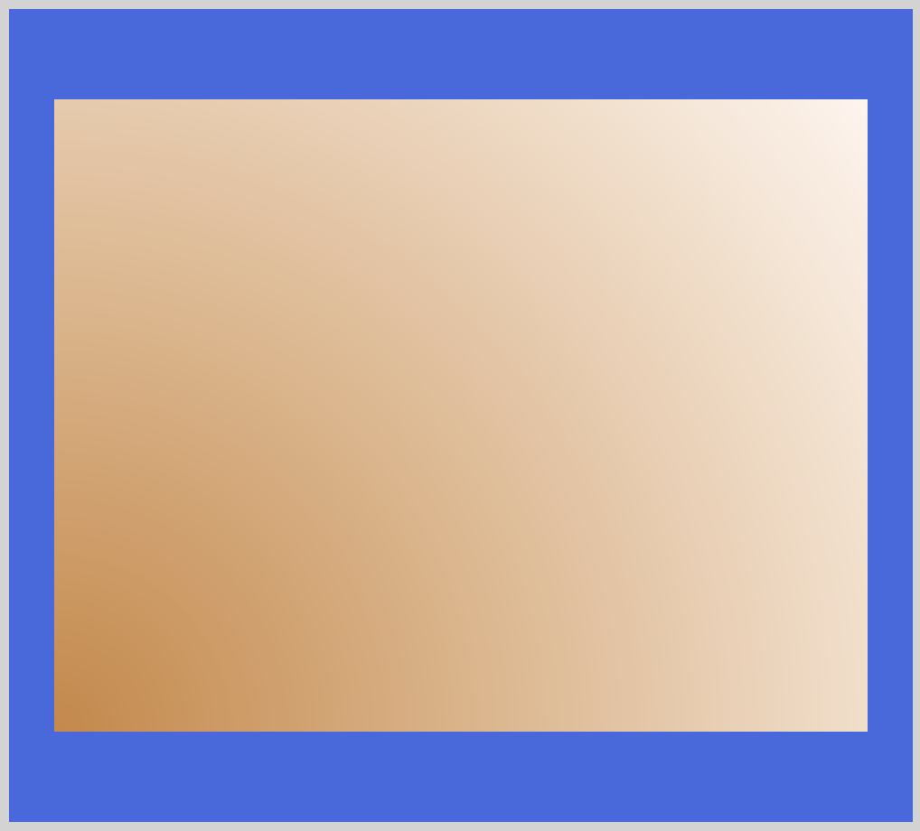
With circle at bottom left we moved the center of the circle to the bottom-left corner. peru will start from the bottom-left corner and fade to seashell on all other corners. This is handy, let’s say, when you want to simulate ambient light effects.
Let’s create three color stops in the next example.
CSS code:
.radial-gradient-three-colors {
  width: 450px;
  height: 350px;
  background: radial-gradient(
    circle,
    darkmagenta 0 25%,
    seashell 25% 55%,
    peru 55% 100%
  );
}
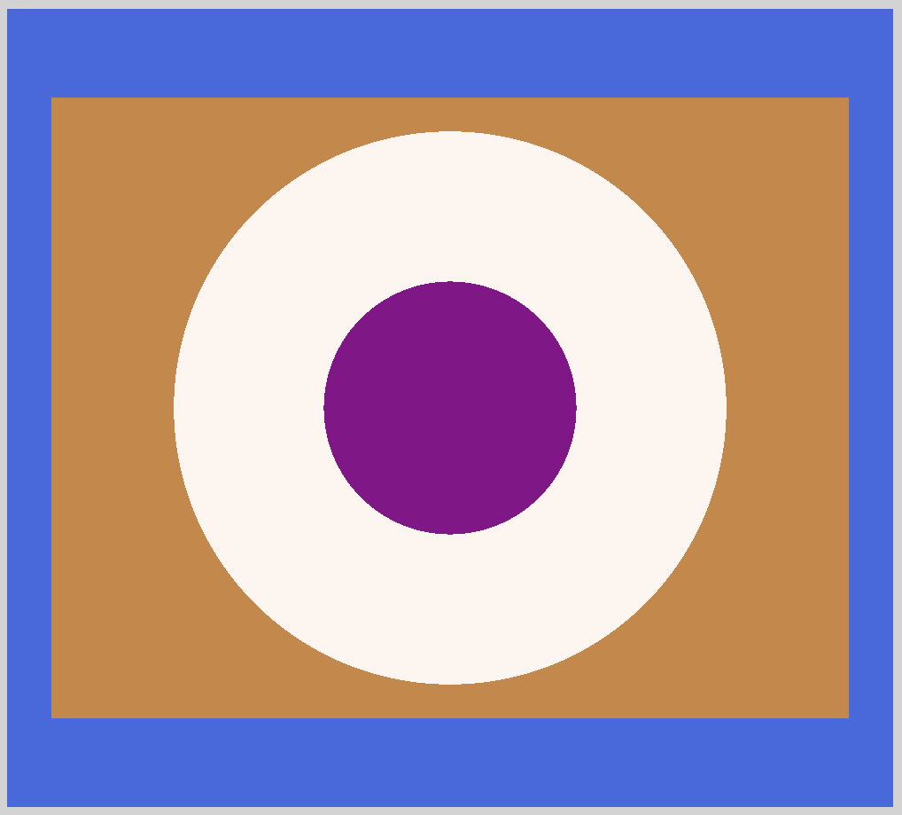
Similar to the previous linear gradient example, we use color stop position to control the color proportions.
- With
0and25%we setdarkmagentato start from the center. seashellstarts from25%and stops at55%.- From
55%to the edge or100%, we set the color toperu.
You can make each color proportion shrink or grow with the color stop position percentages.
For our last radial gradient example, let's see how we can make repeating patterns.
CSS code:
.radial-gradient-repeat {
  width: 450px;
  height: 350px;
  background: repeating-radial-gradient(circle at 100%, peru 15%, seashell 30%);
}
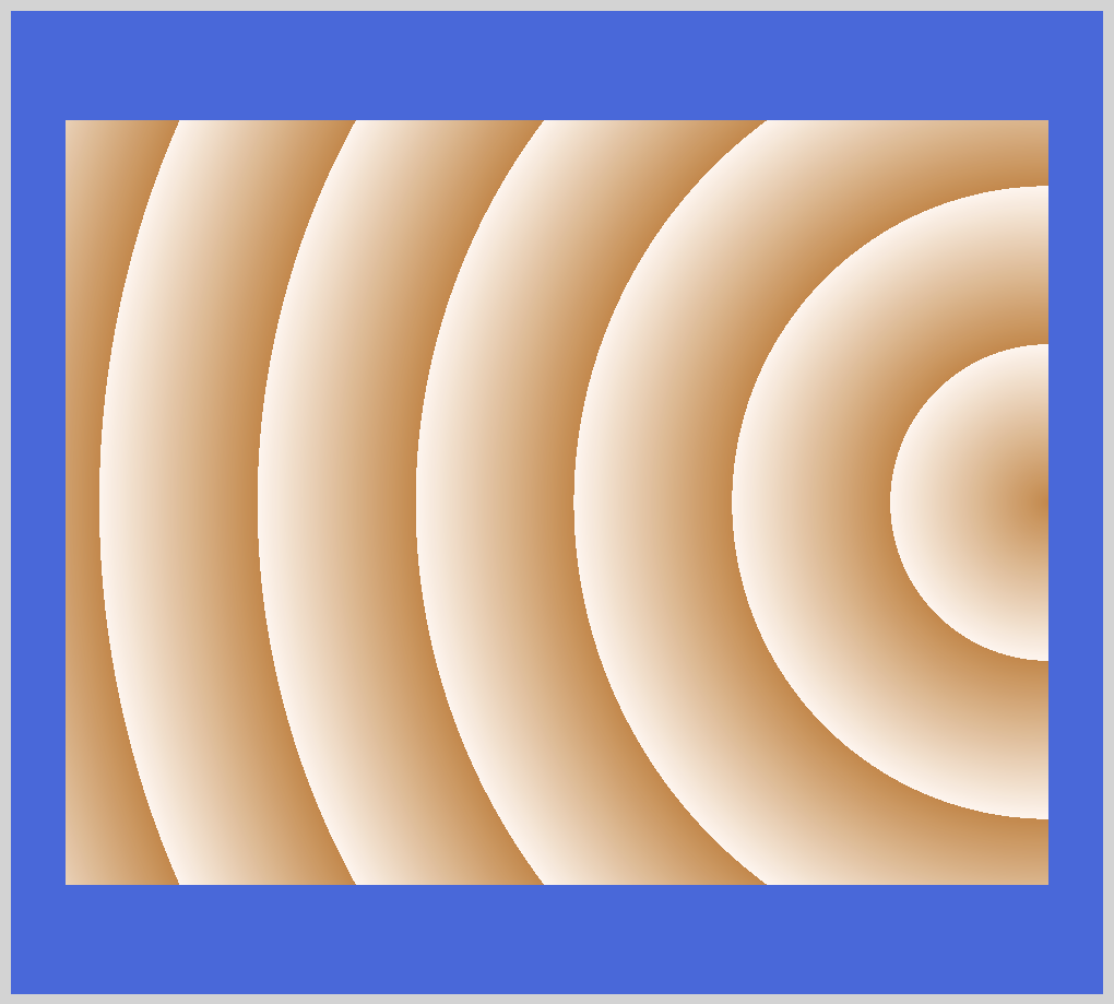
We use repeating-radial-gradient() function to repeat radial gradient patterns. circle at 100% pushes the circle center all the way to the right. You can use different percentage values to control the circle center position.
Using color hints, we set peru to 15% and seashell to 30% respectively.
Conic gradient is our third and final gradient.
Conic Gradient
With the conic-gradient() function, you can generate color transitions progressively around a circle point. At a minimum, you need to define two colors for it to work. You can use conic gradients to generate color wheels or pie charts.
Syntax:
background-image: conic-gradient([from angle] [at position,] color [degree], color [degree], ...);
Let’s break down the syntax.
angle: Defines the gradient rotation in clockwise direction. You must precede angle with the from keyterm. Default value is 0deg.
Below are units you can use with angle.
degfor degrees (360 degrees).gradfor gradients (400 gradians).radfor radiants (2π radians).turnfor turns (1 turn in a circle).
Although not in the CSS specification, browsers accept percent (%) values. 100% equals 360 degrees.
position: You set the center of the gradient with position. If omitted, the default will be center.
Let’s explore different examples to see what we can create with conic gradients.
First is a simple conic gradient.
CSS code:
.conic-gradient {
  width: 450px;
  height: 350px;
  background: conic-gradient(seashell, peru);
}
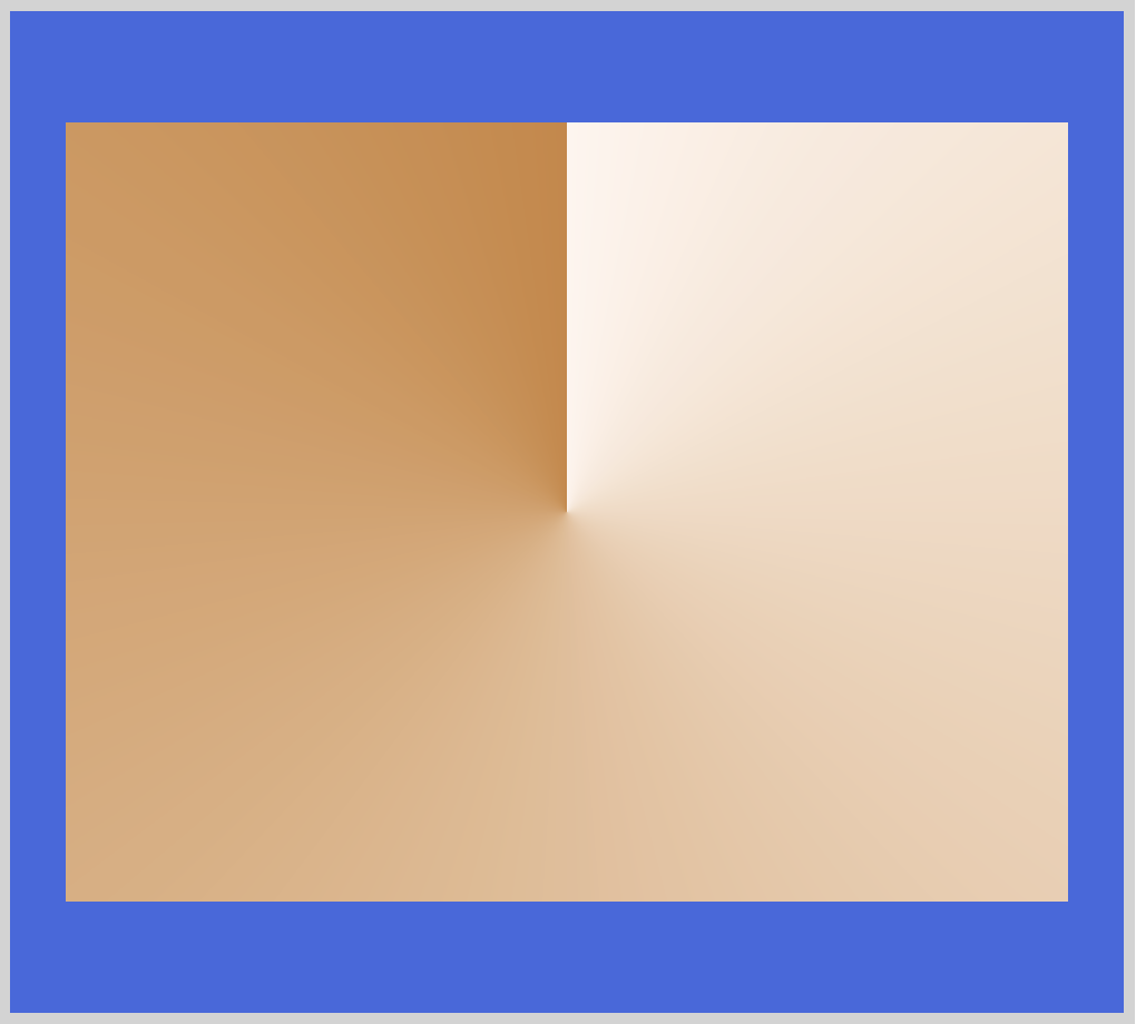
Our first or start color stop seashell starts from the default 0deg angle and center position, transitioning to our last or ending color stop peru. Next, let’s change the starting position for seashell and peru.
CSS code:
.conic-gradient-position {
  width: 450px;
  height: 350px;
  background: conic-gradient(from 180deg, seashell, peru);
}
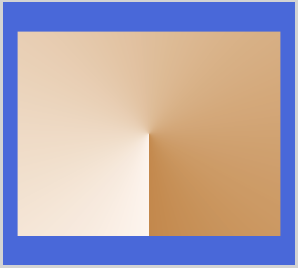
With from 180deg we adjusted the starting position from the default 0deg to 180deg. Play around with the rotation degree to achieve your desired gradation effect.
Next, let’s see how we can split the colors evenly.
CSS code:
.conic-gradient-two-colors {
  width: 450px;
  height: 350px;
  background: conic-gradient(seashell 180deg, peru 0deg);
}
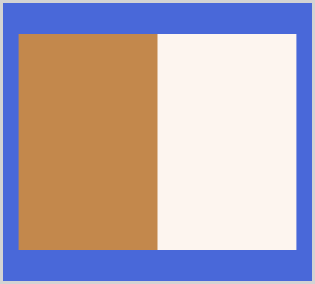
By setting seashell to 180deg we split the colors position 50/50 within the image box. seashell will stop at 180 degrees, then peru will start from 180 degrees and end at 360 degrees. Don’t forget to set peru to 0deg. If you forget to set it you won’t get a solid color but a transition fade instead.
Let’s expand on this in the next example.
CSS code:
.conic-gradient-two-colors-expanded {
  width: 450px;
  height: 350px;
  background: conic-gradient(seashell 235deg, peru 0deg);
}
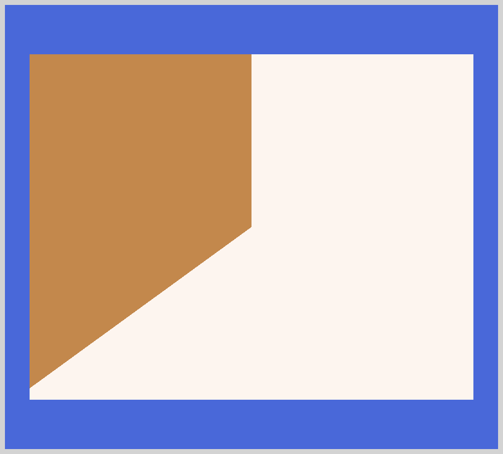
We set seashell to 235deg in this example. Remember, besides degrees you can use radiant, turn, or gradient as well.
For our next example, let’s explore how to make repeating conic gradients.
CSS code:
.conic-gradient-repeating {
  width: 450px;
  height: 350px;
  background: repeating-conic-gradient(seashell, peru 36deg);
}
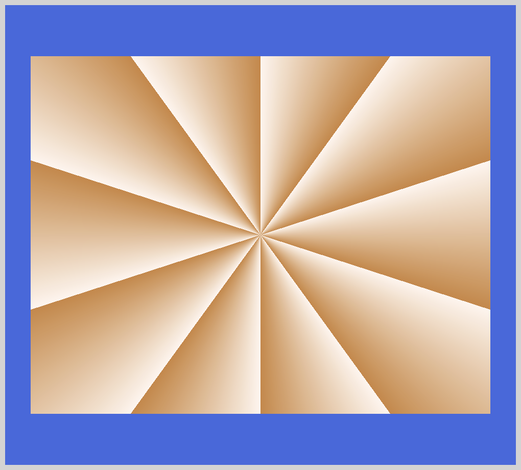
Similar to linear and radial gradients, conic has a repeating function. We use repeating-conic-gradient() function to make repeating conic patterns.
repeating-conic-gradient(seashell, peru 36deg); generates the repeating pattern. You can make interesting pattern through experimentation. Modify the above code to include three colors. Set the colors to start from different positions.
Let’s create a pie chart in our next example.
CSS code:
.conic-gradient-chart {
  width: 400px;
  height: 400px;
  background: conic-gradient(seashell 40%, darkmagenta 0deg 70%, peru 0deg);
  border-radius: 50%;
}
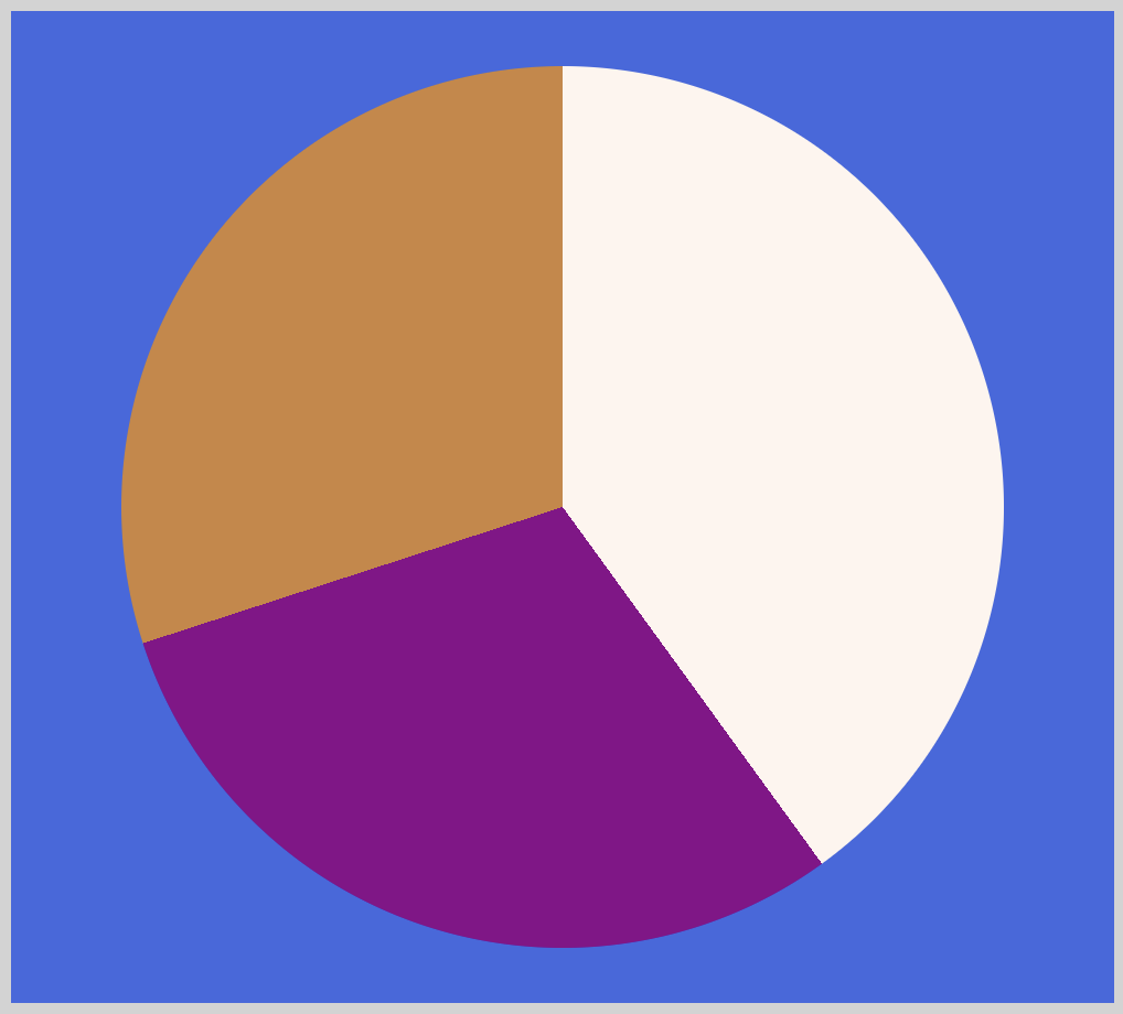
We rounded the gradient borders with border-radius: 50%;. We set width and height to 400px for a nice circle. You can control color start and stop positions with percentages. 40% for seashell, 70% for darkmagenta.
For our last example, let’s make a conic gradient with multiple colors.
CSS code:
.conic-gradient-multi-color {
  width: 450px;
  height: 350px;
  background: conic-gradient(
    seashell 0deg 72deg,
    burlywood 72deg 144deg,
    darkmagenta 144deg 216deg,
    orange 216deg 288deg,
    peru 288deg 360deg
  );
}
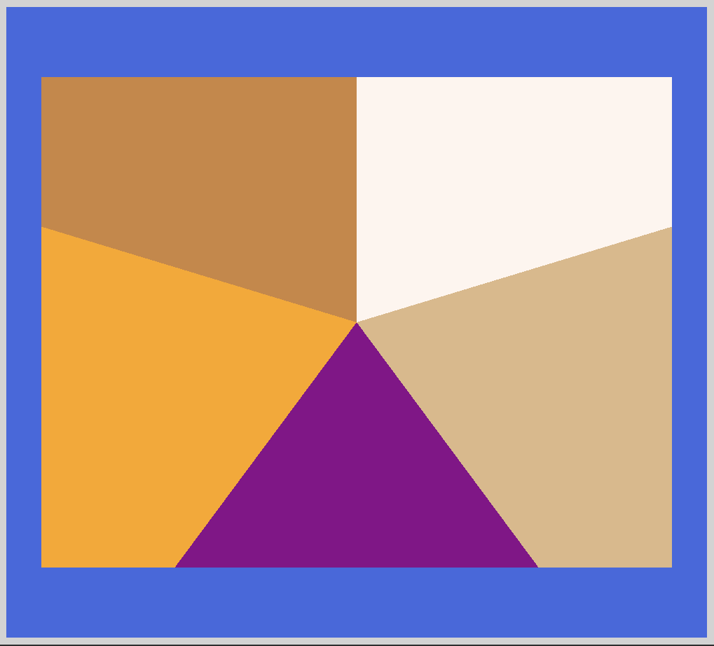
By give each color stop a start and end positions, we can control the ratio for each color. For seashell, 0deg is our start position and 72deg is our end position. Our next color burlywood we start from 72deg. This is the exact position where seashell ended.
By leaving no gaps between the colors, we prevent the browser from creating a transition between the two colors. If you want transitions between the colors, leave gaps between them.
We’re all done with our gradient examples. Pat yourself on the back for coming this far. You can see and play with all the gradient code at Pyxofy’s CodePen page.
See the Pen CSS Art - Gradients by Pyxofy (@pyxofy) on CodePen.
Conclusion
In this article, we learned how to make linear, radial and conic gradients. We expanded the examples and made repeating patterns, single and multicolored gradients.
Each gradient has unique design properties, indispensable for CSS art. With our conic example, we simulated pie charts. Make tricolor flags with linear gradients. How about make a bullseye pattern using repeating radial gradients?
We’re always excited to see what unique shapes and patterns you make with gradients. Share them with us on Twitter @pyxofy, on LinkedIn or Facebook.
We hope you liked this article. Kindly share this article with your network. We really appreciate it.
Related Articles


