CSS Art – How to Make Advanced Shapes with clip-path
Make any shape you can imagine with CSS clip-path. In this article let’s make stars, triangles, circles and even letters step-by-step.

Introduction
CSS has many tools to make shapes. We will show you how to make advanced shapes using CSS clip-path in this article.
With clip-path you can make basic shapes such as circles, squares, ellipses, and rectangles.
Using clip-path polygon() function you can make triangles, stars, even letters of the alphabet. The polygon() function gives you flexibility to create any shape you can imagine.
Preview
Here is a quick preview of what we’ll be creating step-by-step.
Basic Shapes
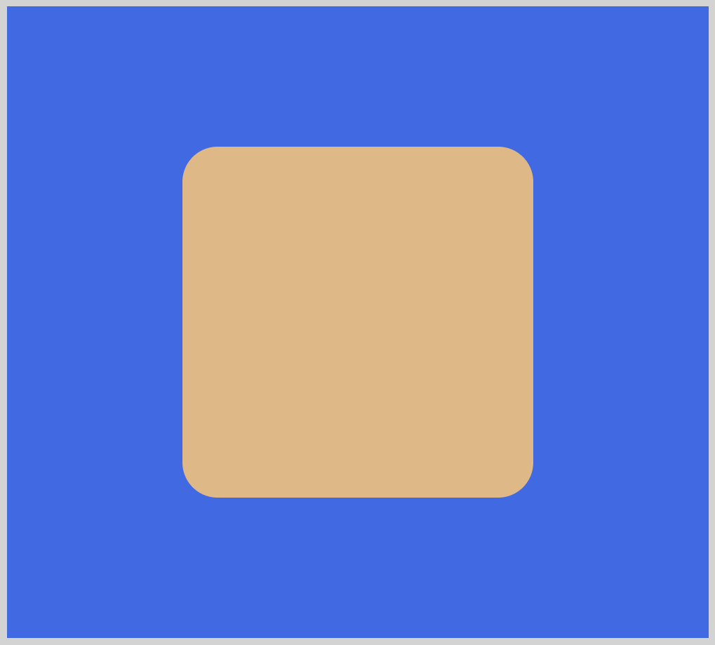
Similar to the square pictured above, we will be creating basic shapes using clip-path.
- Rectangle
- Circle
- Ellipse
Advanced Shapes using polygon()
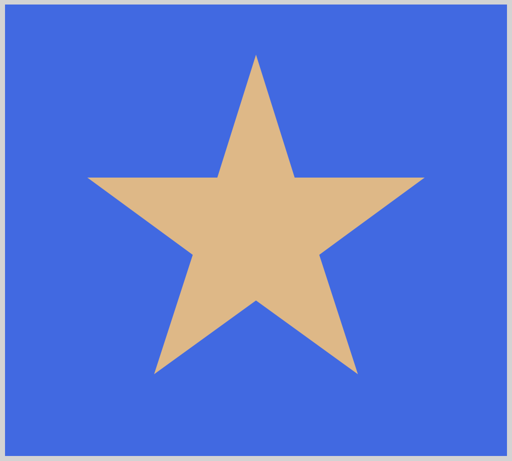
After you’re comfortable creating the basic shapes, we’ll tackle advanced shapes using the polygon() function.
- Star
- Letter
X - Triangle
Prerequisites
We don’t assume prior knowledge of CSS or HTML, but it helps if you have some familiarity with how they work. Jump over to this article if you require an HTML and CSS primer.
We assume that you have set up tools to create CSS art. If you haven’t, this article will show you how to set them up.
HTML Structure
Here’s HTML code for our examples.
<!-- clip-path Basic Shapes -->
<div class="container">
	<div class="clip-path-inset-square"></div>
</div>

<div class="container">
	<div class="clip-path-inset-rectangle"></div>
</div>

<div class="container">
	<div class="clip-path-circle"></div>
</div>

<div class="container">
	<div class="clip-path-ellipse"></div>
</div>

<!-- clip-path Advanced Shapes using polygon() -->
<div class="container">
	<div class="clip-path-polygon-triangle"></div>
</div>

<div class="container">
	<div class="clip-path-polygon-x"></div>
</div>

<div class="container">
	<div class="clip-path-polygon-star"></div>
</div>
A container class encloses each shape example.
For reference, here’s the CSS code for the container class.
/* Body and Container Settings */
/* Center shapes */
body {
  margin: 0;
  padding: 0;
  height: 100vh;
  display: flex;
  justify-content: center;
  align-items: center;
  flex-wrap: wrap;
}

/* Set blue background and light gray border */
.container {
  width: 500px;
  height: 450px;
  border: 5px solid lightgray;
  background: royalblue;
  position: relative;
  margin: 5px;
  display: flex;
  justify-content: center;
  align-items: center;
}
Please have no hesitation to change the background color, border color to the color of your choice.
Are you ready to start building shapes with clip-path?
Let’s start with basic shapes in the next section.
Basic Shapes
Basic shapes are the fundamental building blocks for creating CSS art. Let’s go through a couple of examples on how to create basic shapes using CSS clip-path.
Square
Square shape is our first example.
CSS Code:
.clip-path-inset-square {
	width: 250px;
	height: 250px;
	background-color: burlywood;
	clip-path: inset(0% 0% 0% 0% round 10%);
}
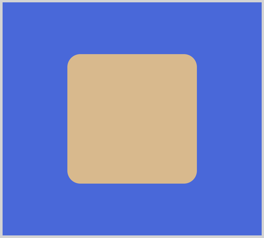
Let’s break down the square shape CSS code.
widthandheight
ThewidthandheightCSS properties will determine the size of the shape. For squares, you want both values to be the same, for this example we set it to250px.clip-path: inset(0% 0% 0% 0% round 10%)
Directly after theclip-path:property, we type inset(). The first four arguments are length values.
For this example, we set it to0%. When you set all four arguments, it corresponds to top, right, bottom and left offset from the reference box inward.
The position of the edges will be defined by the values we set, making the inset square bigger or smaller. Changing each argument, you can make each side of the shape change it’s length.
The optionalround 10%argument gives us the rounded corners. It is a shorthand syntax for CSS border-radius.
Next, let’s see how we can make a rectangle.
Rectangle
You can consider rectangles as elongated squares. It can be elongated horizontally like our example below. It can be elongated vertically as well.
CSS Code:
.clip-path-inset-rectangle {
	width: 400px;
	height: 250px;
	background-color: burlywood;
	clip-path: inset(0% 0% 0% 0% round 5%);
}
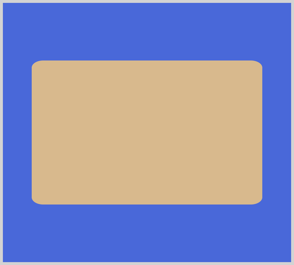
- We set the rectangle’s shape with
width: 400px;andheight: 250px;. If you reverse the property values, you will get a vertically elongated rectangle. clip-path: inset(0% 0% 0% 0% round 5%);
Similar to the square shape, we gave the rectangle rounded corners. Removinground 5%will result in a rectangle with sharp corners.- As with the square example, we can change the
inset()values to control the length of each rectangle’s sides.
Up next, circles, and ellipses.
Circle
In this example, we’ll make a basic circle shape.
CSS Code:
.clip-path-circle {
	width: 250px;
	height: 250px;
	background-color: burlywood;
	clip-path: circle(50%);
}
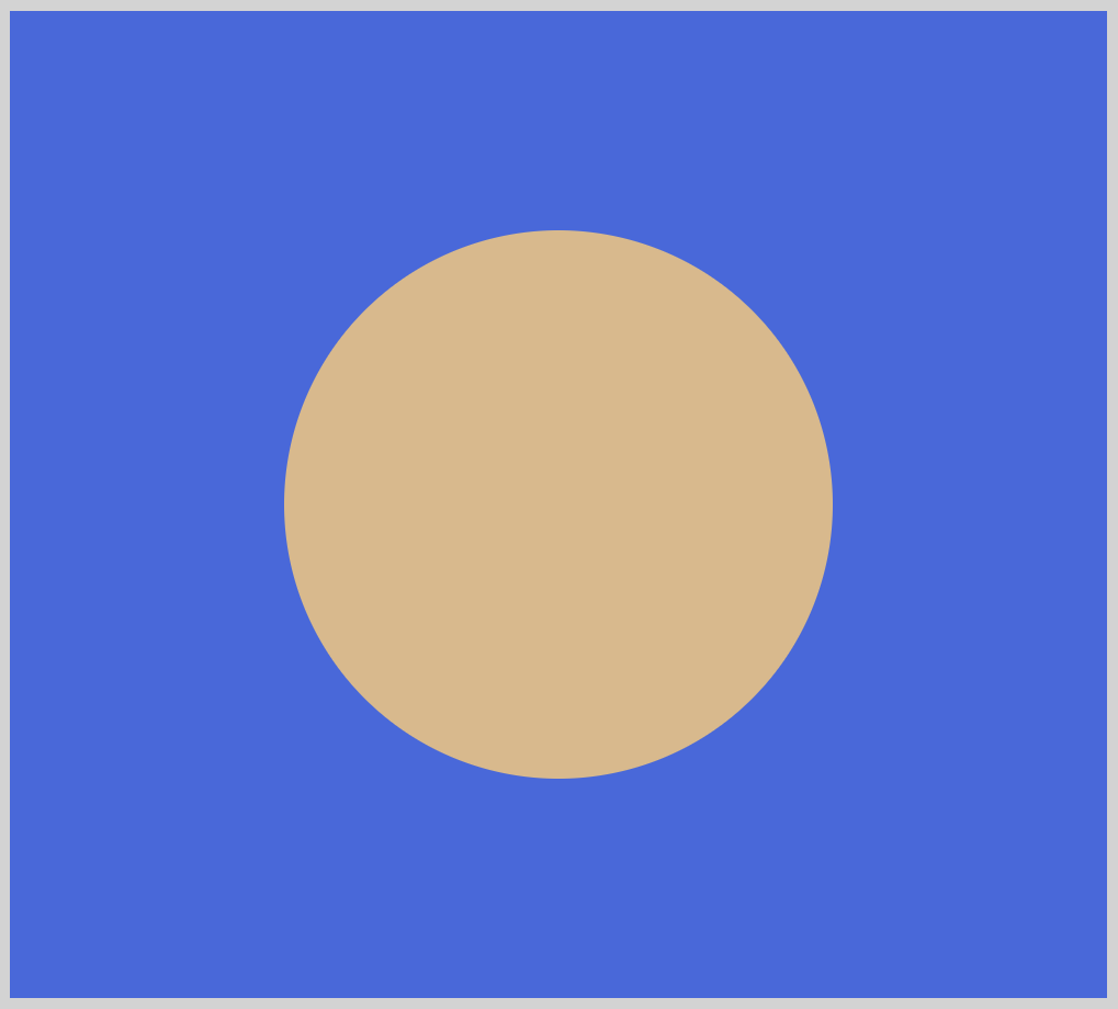
- Similar to a square, the
widthandheightvalue property should be the same to produce a circle. clip-path: circle(50%);
The50%argument controls the circle shape radius. You can increase or decrease the size of the circle by changing the value of the radius.
We did not assign a position value. Hence, our circle is centered, which is the default. You can use keywords such asat top leftto make quarter circles.
For reference here’s a non exhaustive list of position values you can use.centerleftcenter topright 8.5%bottom 12vmin right -6px10% 20%8rem 14px
Here’s a great article from Mozilla Developer Network (MDN) about position values.
Ellipse
Let’s make an ellipse in this example.
CSS Code:
.clip-path-ellipse {
	width: 350px;
	height: 350px;
	background-color: burlywood;
	clip-path: ellipse(50% 30% at center);
}
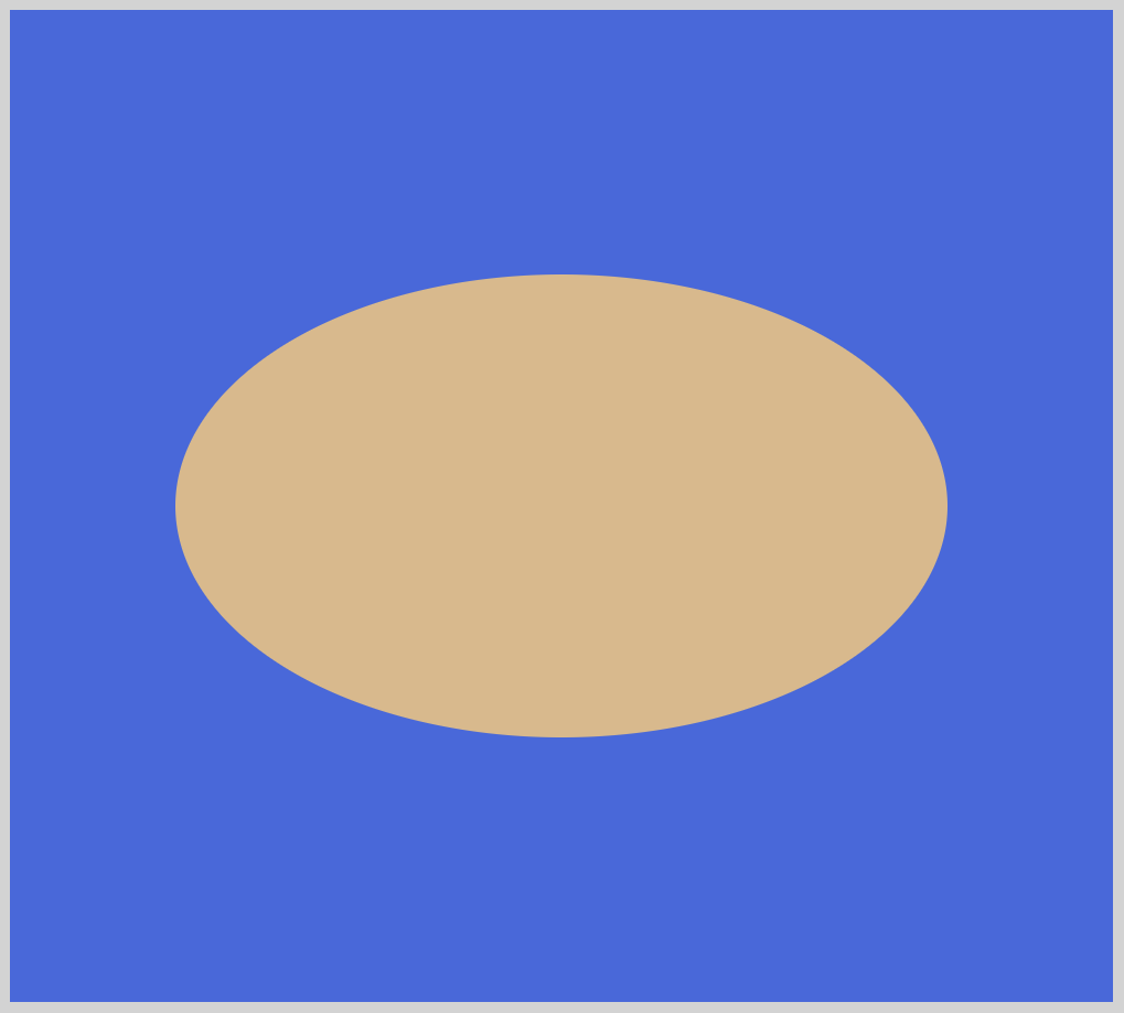
clip-path: ellipse(50% 30% at center);
An ellipse is essentially a squashed circle.
You control the shape of the ellipse by setting two radii, x and y, in that order. In this example,50%will be our x radius and30%is our y radius.
If you reduce the y radius, let’s say to10%, it will result to a very flat ellipse. For the reverse where you reduce the x radius,50%, to a lower number will result in a vertically elongate ellipse.- We positioned the ellipse in the center with
at center.
We are finished with basic shapes. In the next section, we’ll explore advanced shapes using polygon() function.
Advanced Shapes using polygon()
For our basic shape example we used inset(), circle(), and ellipse() functions.
Our next examples will use the polygon() function.
polygon() is the most complex function in the CSS Basic Shape type.
It enables you to make shapes with many sides. It uses coordinates to draw lines making the sides. polygon() accepts a minimum of 3 pairs of coordinates, which draws a triangle.
Coordinate Pairs Overview
Before we start creating shapes with polygon(), let’s dive deeper on how coordinate pairs work.
Coordinate pairs are always in this format, x-axis y-axis.
You set the coordinates of the x-axis or the horizontal location first, then you set the y-axis or the vertical location. You must separate coordinate pairs with a comma ,.
Coordinate values start with 0% or 0, the maximum value is 100%. The illustration below details the position of the x-axis and y-axis.
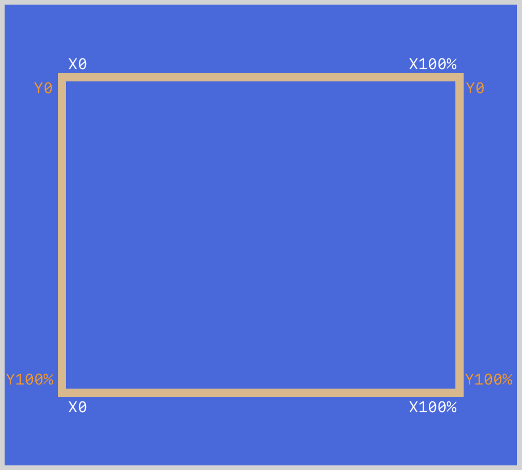
Coordinates will start from the top-left corner.
- Top-left corner:
0% 0% - Top-right corner:
100% 0% - Bottom-right corner:
100% 100% - Bottom-left corner:
0% 100%
The coordinate pairs draws lines within the reference box of the shape.
The first pair begins drawing a line, moving towards the second pair. Then, from the second coordinate pairs, a line is drawn to the third pair. The last pair will always auto-close the path, meaning that the last coordinate pairs will draw a line towards the first coordinate pairs.
The ending of a line is always the beginning of a new line.
Let’s see coordinate pairs in action. First up is triangle shape.
Triangle
You may consider the triangle a basic shape, we agree. In the context of clip-path, we use polygon() function to create triangles.
Making triangles with the polygon() function is more complex compared to other shapes made with inset(), circle() and ellipse.
CSS Code:
.clip-path-polygon-triangle {
	width: 350px;
	height: 350px;
	background-color: burlywood;
	clip-path: polygon(50% 0%, 0% 100%, 100% 100%);
}
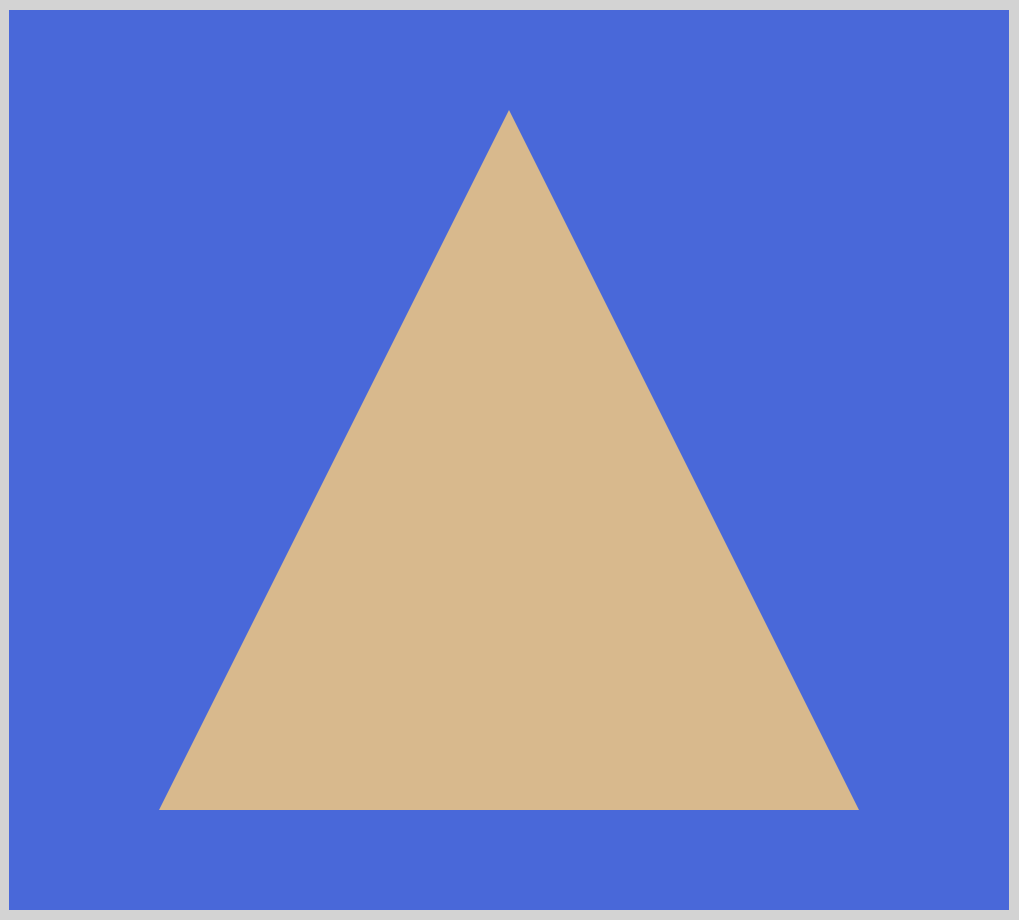
clip-path: polygon(50% 0%, 0% 100%, 100% 100%);
Triangles always have three sides. This corresponds to three coordinate pairs.50% 0%draws a line from 50% on the x-axis and 0% on the y-axis.0% 100%is the second coordinate and the ending of the first line. A line starts 0% on the x-axis and 100% on the y-axis. The line is drawn towards the last pair.100% 100%is where the line ends.- The path will auto-close. This means a line will be automatically drawn from the last coordinate pairs to the first coordinate pairs.
Our next example will simulate a letter of the alphabet.
Letter X
In this example, let's see how we can create the letter X.
CSS Code:
.clip-path-polygon-x {
	width: 350px;
	height: 350px;
	background-color: burlywood;
	clip-path: polygon(
		20% 0%,
		0% 20%,
		30% 50%,
		0% 80%,
		20% 100%,
		50% 70%,
		80% 100%,
		100% 80%,
		70% 50%,
		100% 20%,
		80% 0%,
		50% 30%
	);
}
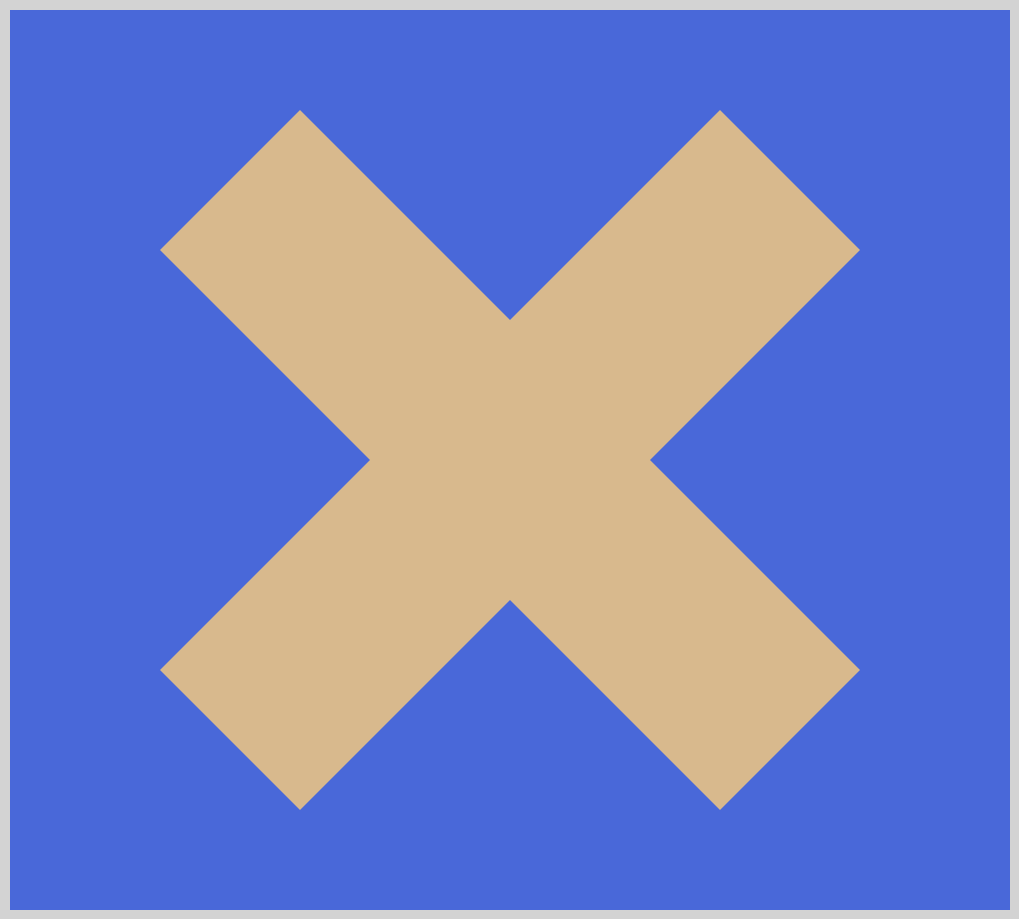
Compared to the triangle shape, the letter X example is more complex. We have a total of 12 coordinate pairs to make this shape. The below illustration shows how the 12 coordinate pairs are each drawn consecutively within the shape’s reference box.
For the below illustration, we’ll refer to the first coordinate pairs as “Begin Line”. For the last coordinate pairs, we’ll refer to it as “End Line”.
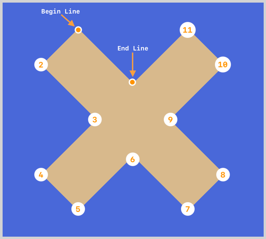
20% 0%is our Begin Line. This is where the first line will be drawn from.- From the Begin Line coordinate pairs, each line is drawn counter-clockwise, consecutively according to the following coordinate pairs. Use the numbers in the illustration to follow how the line is drawn between the coordinate pairs.
50% 30%is our End Line. The last line ends at this coordinate.- The path will auto-close itself, meaning that a line will be drawn from the End Line to the Begin Line automatically.
Using the above technique, try to create different letters of the alphabet. The letter Y, K or any other alphabet that doesn’t have curves can be created with polygon().
Let’s move to our last example.

