CSS Art – How to Make a Sporty Electric Car
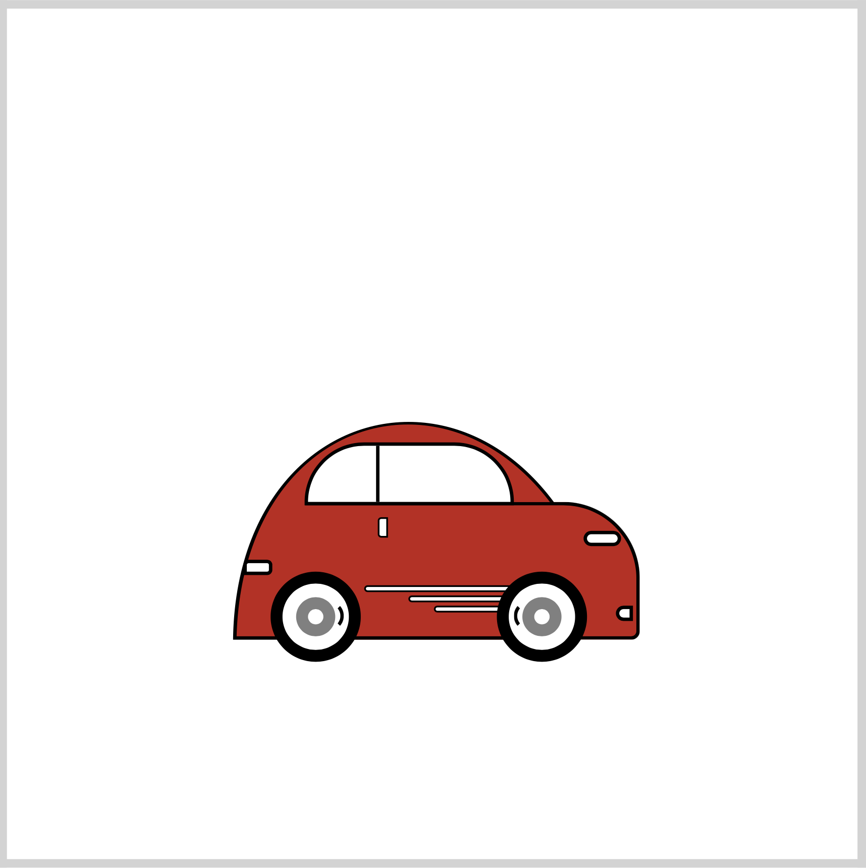
Electric Vehicles (EVs) are eco-friendly and overall good for the planet. You’ll learn how to make a sporty version in this step-by-step article.
Introduction
Electric Vehicles (TVs) are the future of mobility. In this step-by-step article, you’ll learn how to make one using CSS.
CSS pseudo-elements selectors ::before and ::after are used extensively in this article. Read this article if you are unfamiliar with them.
Read this article if you’re new to the CSS clip-path: path() function.

Preview
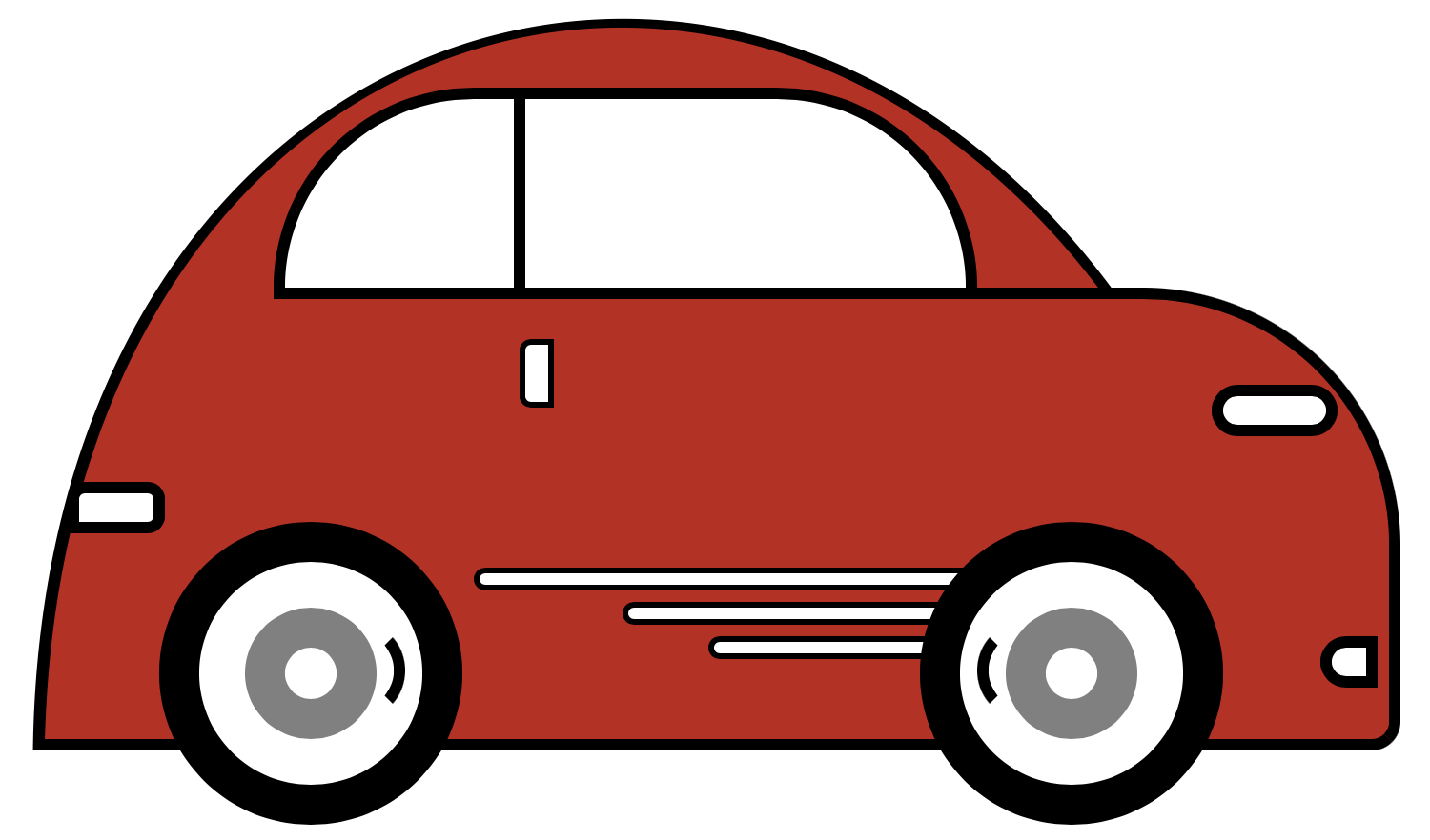
Sporty Electric Car Preview
Prerequisites
Essential CSS and HTML knowledge will help you understand the concepts and techniques introduced in this article. Jump over to this article if you require an HTML and CSS primer.
We assume that you have set up tools to create CSS art. If you haven’t, this article will show you how to set them up.
HTML Structure
<div class="container">
  <!-- Car -->
  <div class="car-container">
    <div class="car-roof"></div>
    <div class="car-body"></div>
    <div class="design-line"></div>
    <div class="front-tire"></div>
    <div class="back-tire"></div>
    <div class="window"></div>
    <div class="head-light"></div>
    <div class="fog-light"></div>
    <div class="door-line"></div>
    <div class="tail-light"></div>
  </div>
</div>
container is the outermost enclosure. It enables the content to be centered and draws a light gray border. The rest of the divs represent each image component.
Keep the HTML structure as is for the image to display correctly.
Body and Container Div CSS
CSS code for the body and container div.
/* Body and Container Settings */
/* Center shapes */
body {
  margin: 0;
  padding: 0;
  height: 100vh;
  display: flex;
  justify-content: center;
  align-items: center;
  flex-wrap: wrap;
}

/* Set background and border color */
.container {
  min-width: 500px;
  height: 500px;
  border: 5px solid lightgray;
  background: white;
  position: relative;
  margin: 5px;
  display: flex;
  justify-content: center;
  align-items: center;
}
Car Container
The first CSS class you’ll make is the car-container. The car container positions the car within its parent container.
.car-container {
  position: absolute;
  width: 250px;
  height: 250px;
  top: 10px;
  left: 10px;
}
Next, let’s make the car roof.
Roof
The roof has two parts.
- Outline
- Color Shape
The outline will act as a border for the color shape.
The CSS clip-path: path function makes the shape. You can read this article if you’re unfamiliar with it.
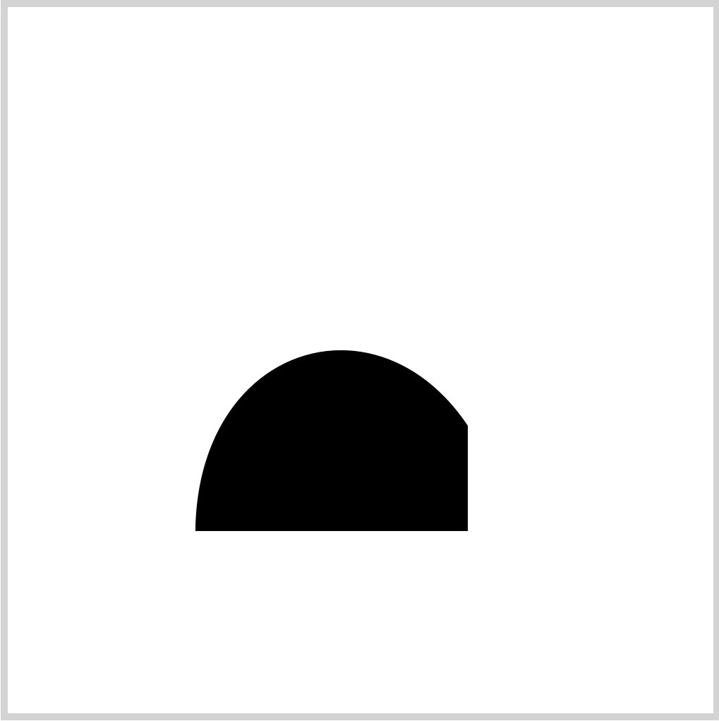
.car-roof {
  position: absolute;
  width: 198px;
  height: 137px;
  top: 224px;
  left: 118px;
  background: black;
  clip-path: path("M 5 146 C 0 -24 196 -49 229 146 Z");
}
positionis set toabsolute.widthis198pxandheightis137px.- The roof outline is positioned
224pxfrom thetopand118pxfrom theleft. blackis set for thebackgroundcolor.clip-path: path("M 5 146 C 0 -24 196 -49 229 146 Z");clips our shape to a half circle with a vertical splice on the front area.
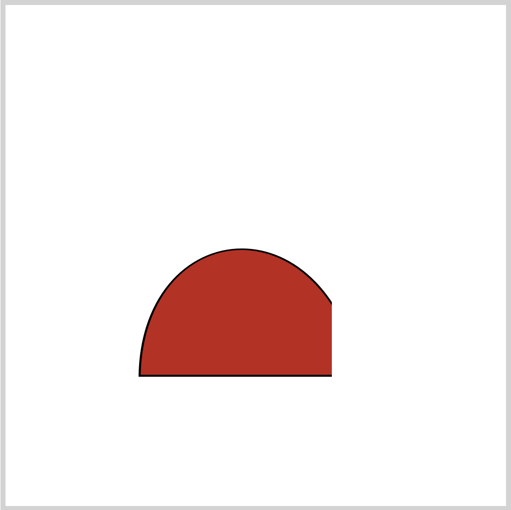
.car-roof::before {
  content: "";
  position: absolute;
  width: 198px;
  height: 135px;
  top: 0px;
  left: 0px;
  background: #c2211a;
  clip-path: path("M 7 146 C 3 -23 193 -46 228 146 Z");
}
The CSS pseudo-element ::before selector styles the color shape. It’s a slightly smaller version of the black outline.
- The
backgroundcolor is#c2211a, a torch red hue.
Let’s make the body in the next section.
Body
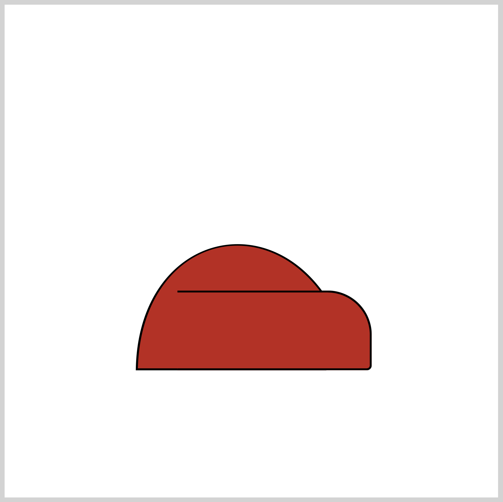
.car-body {
  position: absolute;
  width: 195px;
  height: 77px;
  top: 280px;
  left: 165px;
  background: #c2211a;
  border-radius: 0px 45px 5px 0px;
  border: 2px solid black;
  border-left: transparent;
}
- The car body
backgroundcolor will be the same as the previous roof section,#c2211a. border-radiuscontrols the car body curves. The top right corner radius is set to45pxand the bottom right corner is set to5px.- The border is set to
2px solid black. The left border color is set totransparent.
Now that you’ve finished the car body, let’s work on the window.
Window
The window has two parts. One is the curved white shape, and the other is the dividing line.
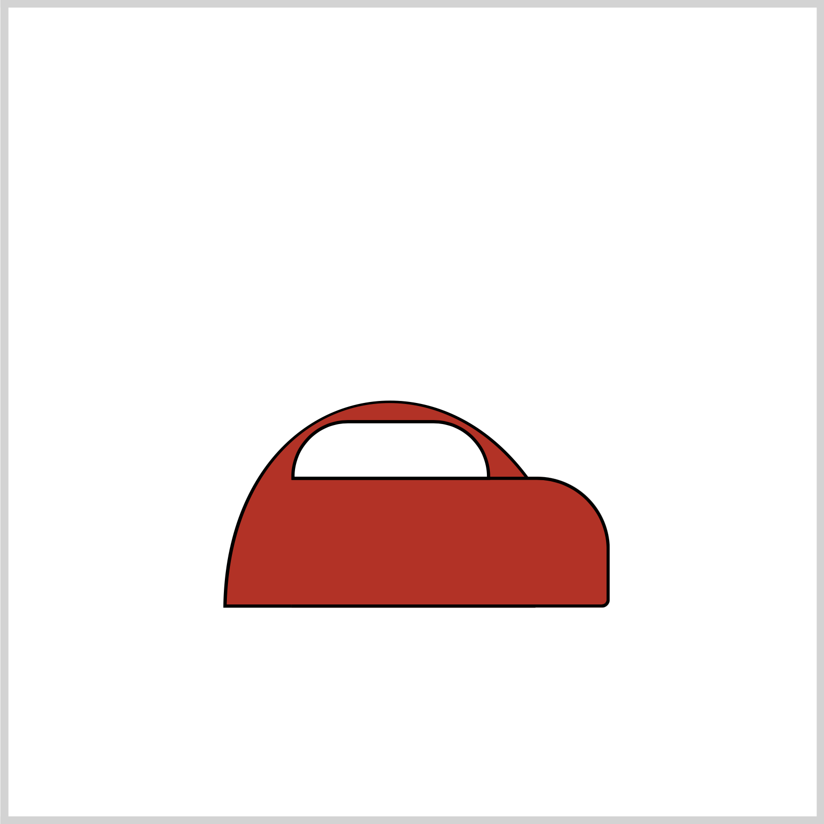
.window {
  position: absolute;
  width: 119px;
  height: 33px;
  top: 245px;
  left: 165px;
  background: white;
  border: 2px solid black;
  border-radius: 35px 35px 0px 0px;
}
- The
backgroundcolor is set towhite. - Top left and top right
border-radiusis set to35px.

.window::before {
  content: "";
  position: absolute;
  width: 2px;
  height: 33px;
  top: 0px;
  left: 40px;
  background: transparent;
  border-left: 2px solid black;
}
::before pseudo-element selector is used to create the divider. The background color is set to transparent, and the left border is styled as a solid two-pixel black line.
Next up will be the headlight.
Headlight
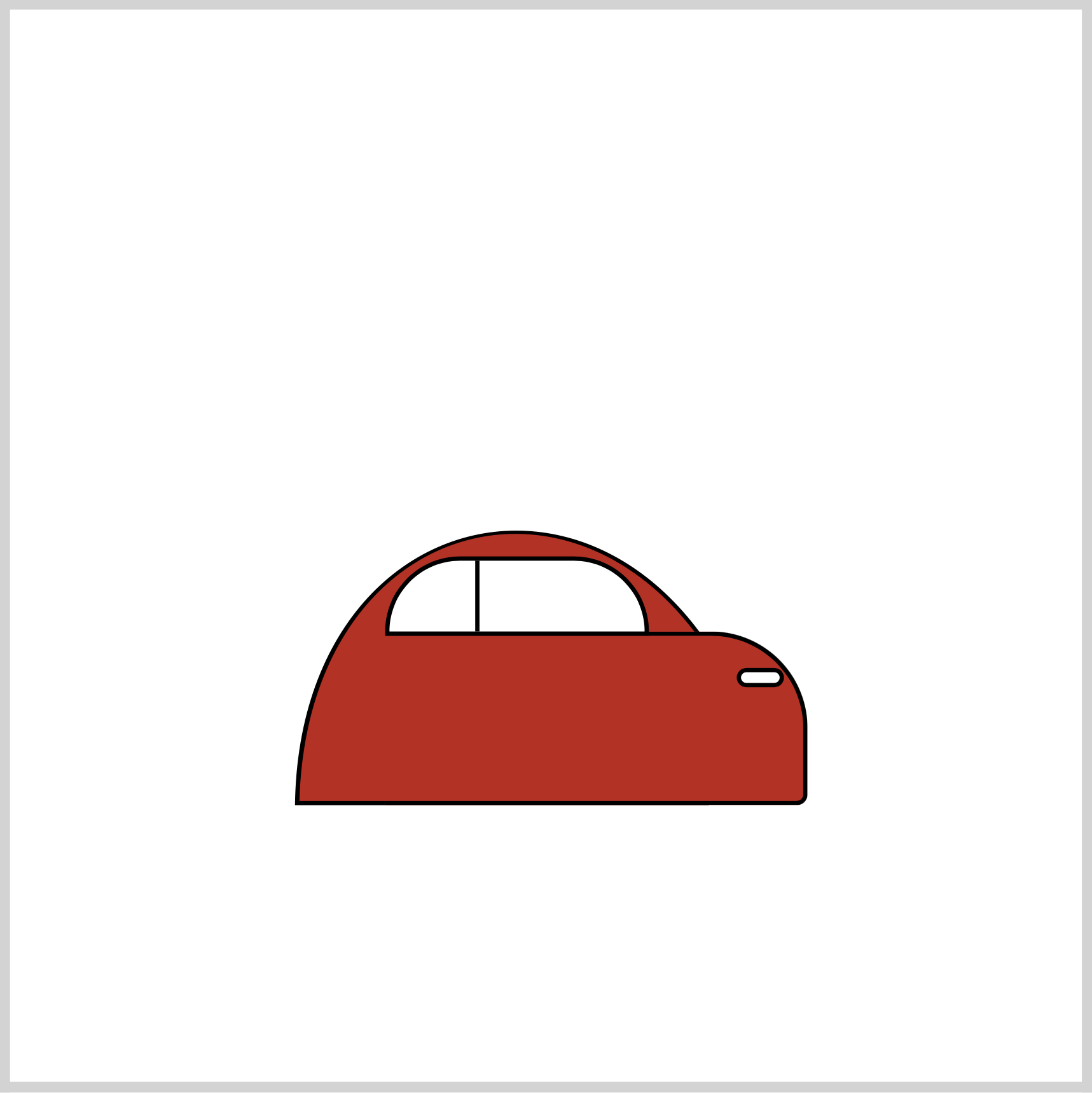
.head-light {
  position: absolute;
  width: 18px;
  height: 5px;
  top: 297px;
  left: 329px;
  background: white;
  border-radius: 5px;
  border: 2px solid black;
}
The headlight has a simple design: a rectangle with rounded corners. The border-radius is set to 5px.
Fog Light
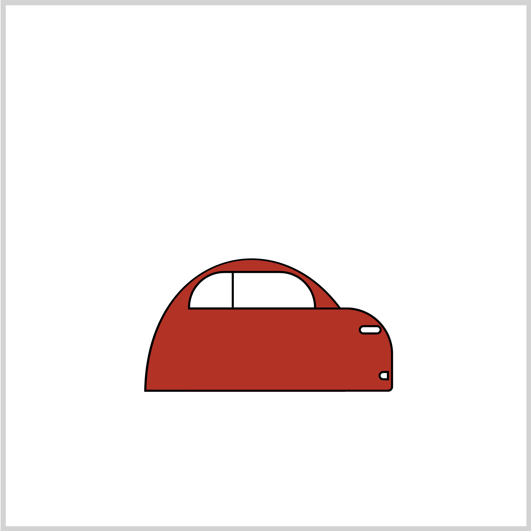
.fog-light {
  position: absolute;
  width: 6px;
  height: 5px;
  top: 341px;
  left: 348px;
  background: white;
  border-radius: 5px 0px 0px 5px;
  border: 2px solid black;
}
To give the upper and lower left corners a rounded shape, the border-radius is set to 5px 0px 0px 5px.
Let’s make the design line in the next section.
Design Line
The design line is three identical elongated rectangles with rounded corners.
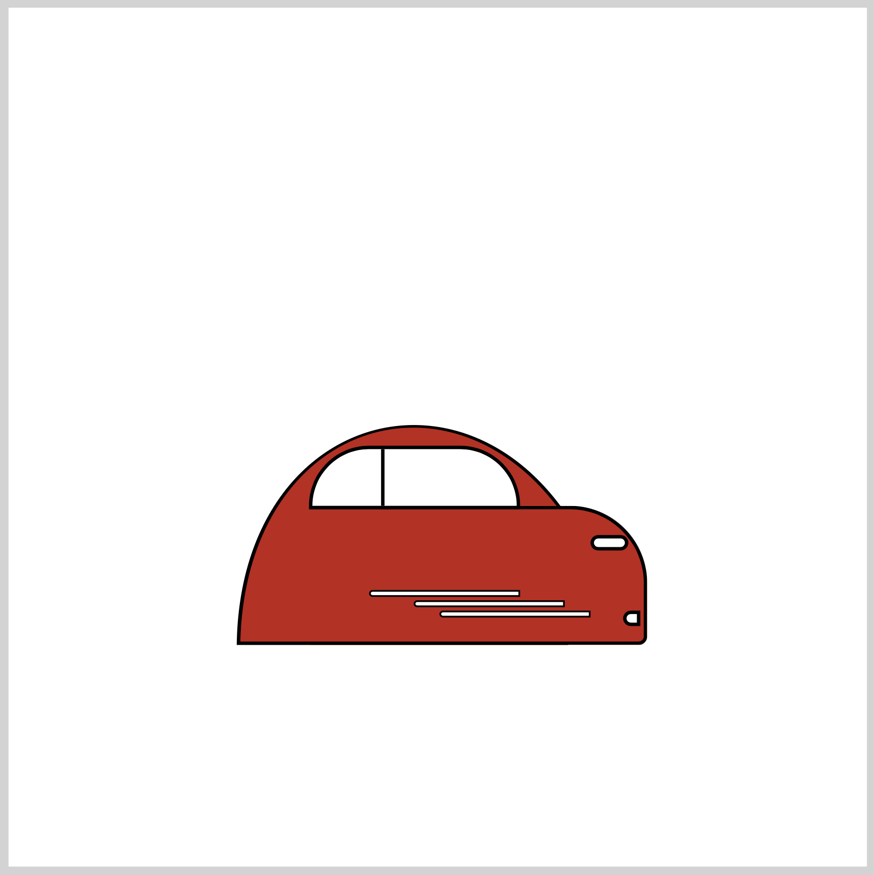
.design-line {
  position: absolute;
  width: 86px;
  height: 2px;
  top: 329px;
  left: 200px;
  background: white;
  border-radius: 5px 0px 0px 5px;
  border: 1px solid black;
}

.design-line::before {
  content: "";
  position: absolute;
  width: 86px;
  height: 2px;
  top: 5px;
  left: 25px;
  background: white;
  border-radius: 5px 0px 0px 5px;
  border: 1px solid black;
}

.design-line::after {
  content: "";
  position: absolute;
  width: 86px;
  height: 2px;
  top: 11px;
  left: 40px;
  background: white;
  border-radius: 5px 0px 0px 5px;
  border: 1px solid black;
}
Pay attention to each design line’s top and left values. All three are positioned differently within the car body. Besides the position, other style elements are identical.
Front Tire
The front tire has two parts: the outer tire, which is the black circle, and the inner rim, which is the gray circle. A black semi-circle is added for a subtle motion effect.
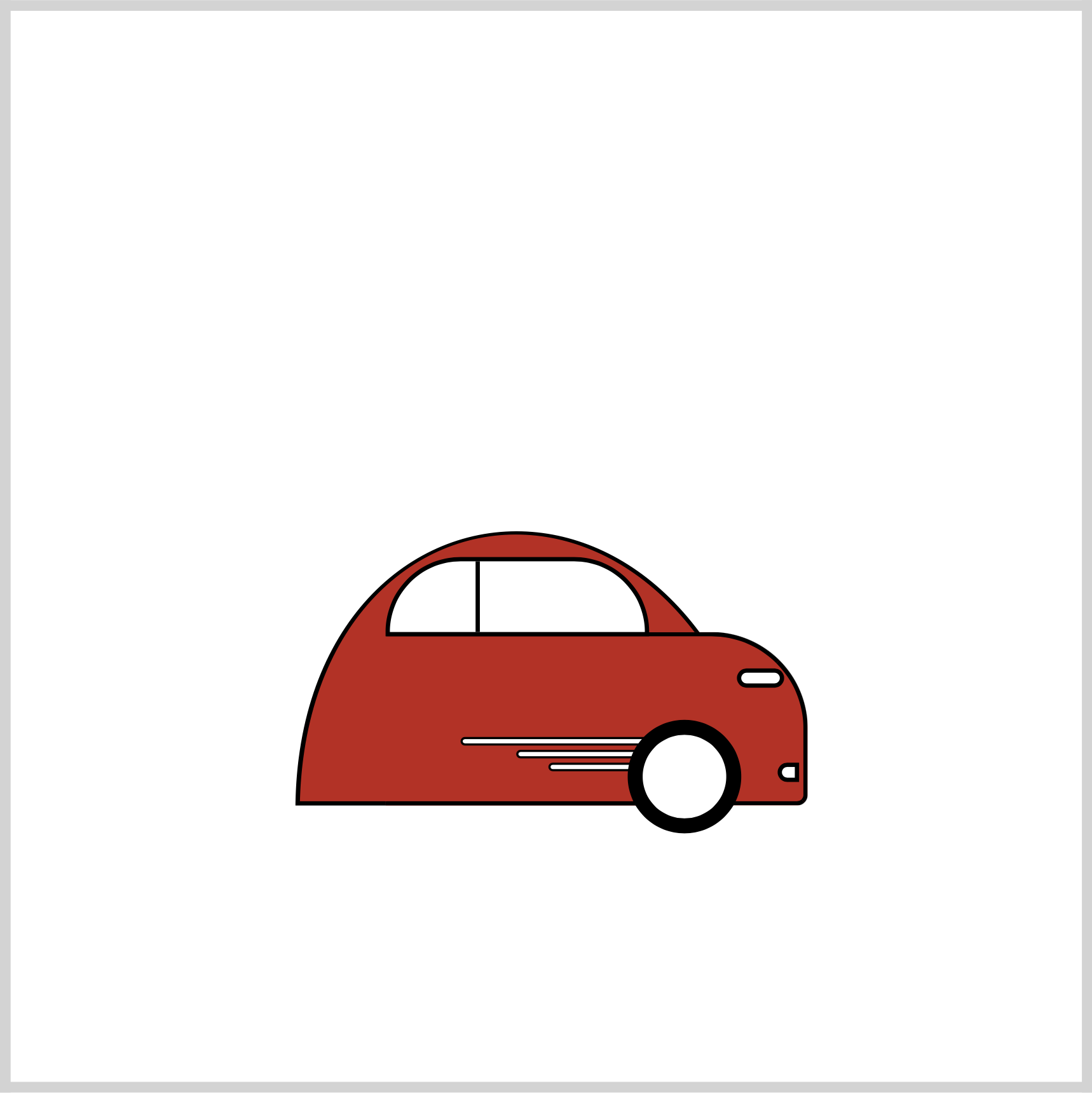
.front-tire {
  position: absolute;
  width: 39px;
  height: 39px;
  top: 321px;
  left: 278px;
  background: white;
  border: 7px solid black;
  border-radius: 50%;
}
The 7px solid black border simulates the tire. border-radius: 50% converts the square shape to a circle.
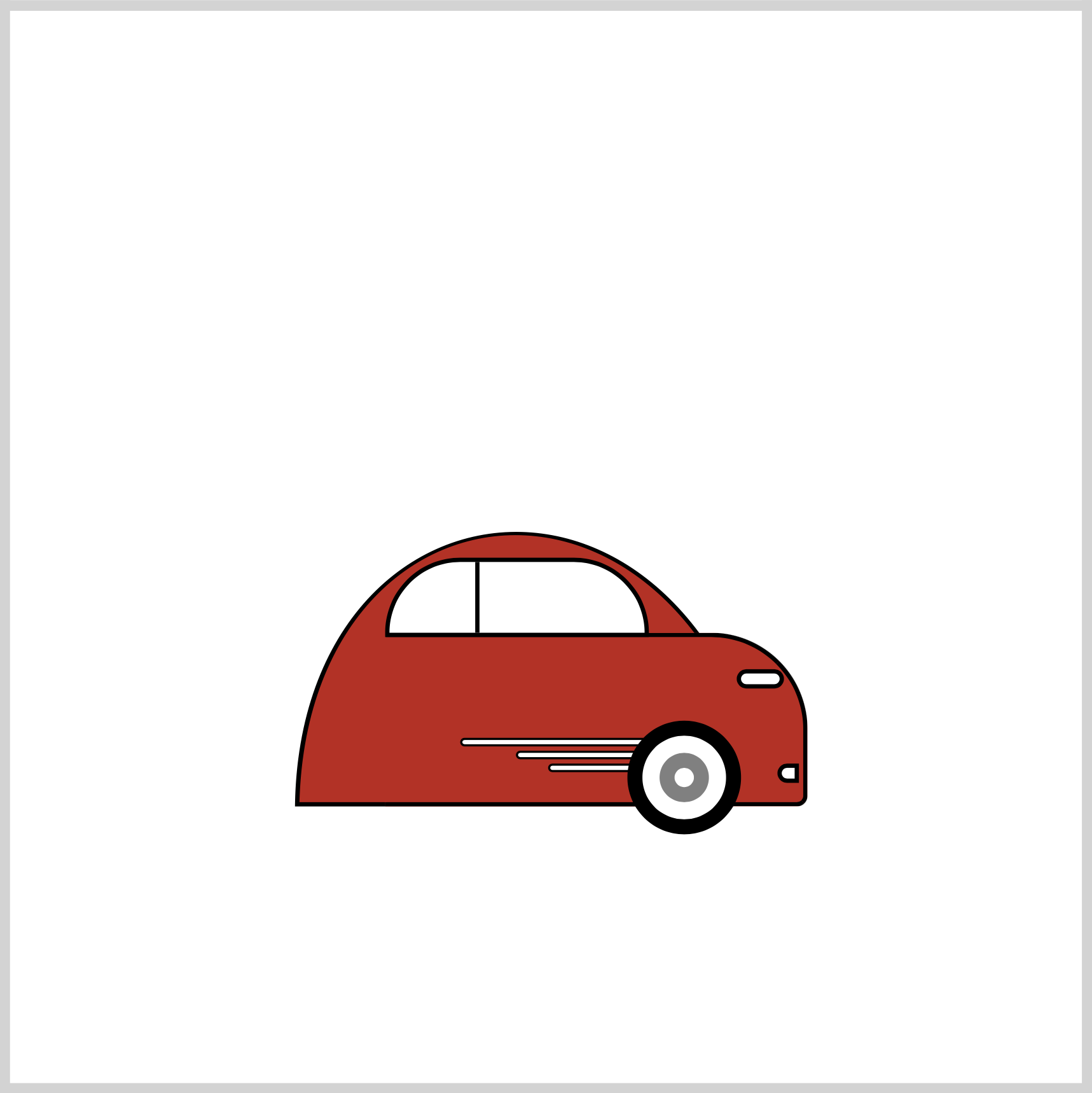
.front-tire::before {
  content: "";
  position: absolute;
  width: 9px;
  height: 9px;
  top: 8px;
  left: 8px;
  border: 7px solid gray;
  border-radius: 50%;
}
Similar to the above tire, border: 7px solid gray; makes the gray rim.
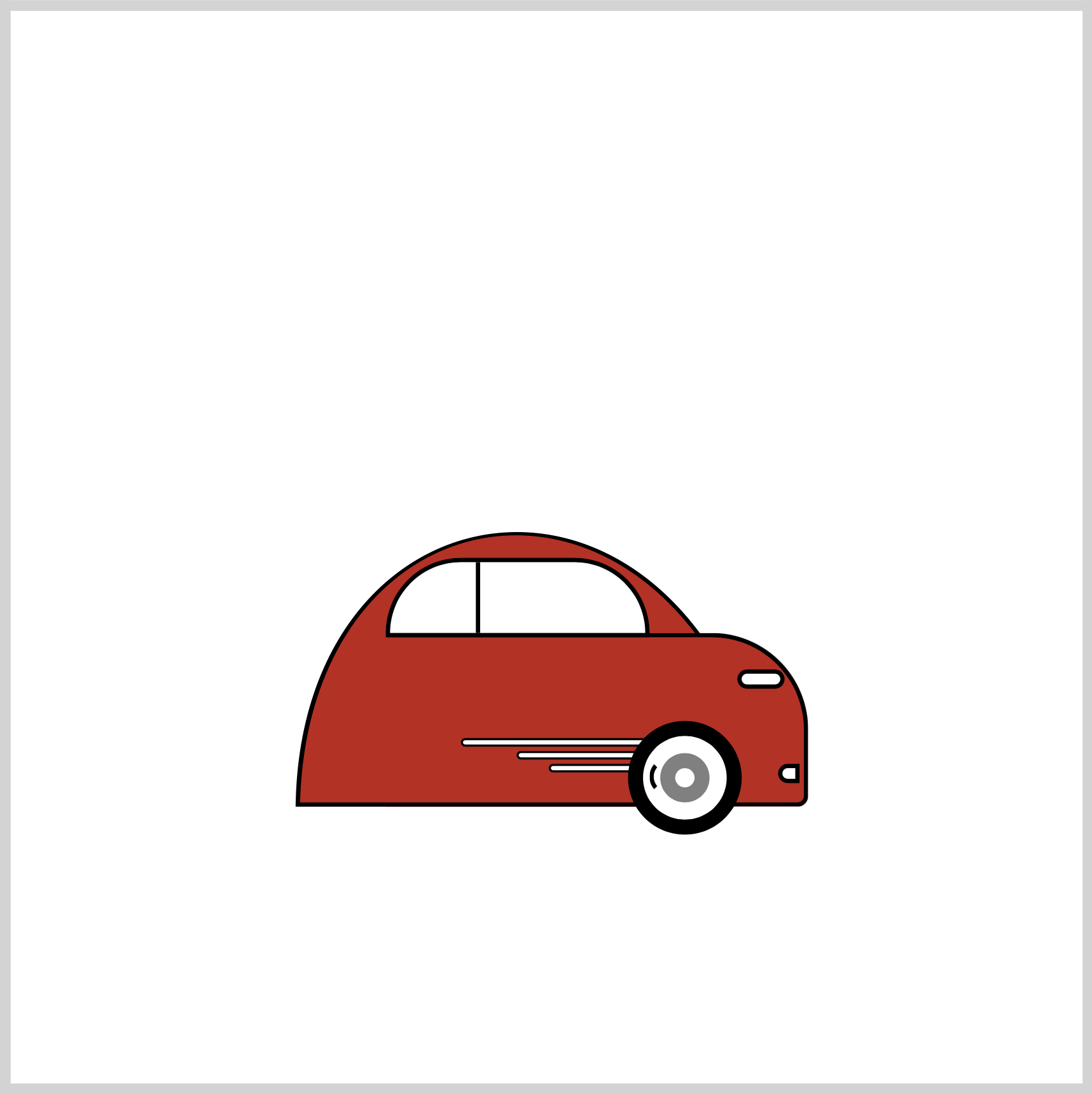
.front-tire::after {
  content: "";
  position: absolute;
  width: 10px;
  height: 12px;
  top: 11px;
  left: 3px;
  border: 2px solid transparent;
  border-left: 2px solid black;
  border-radius: 50%;
}
To make the semi-circle shape, you first set all its borders to 2px solid transparent. To place the black border on the left side, use border-left: 2px solid black;.
In the next section, you’ll make the back tire.
Back Tire
The back tire is a mirror image of the front tire. The only difference is its top and left values, and its semi-circle shape has a right border.
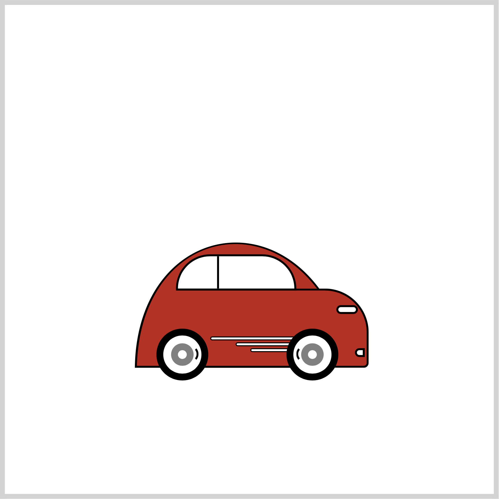
.back-tire {
  position: absolute;
  width: 39px;
  height: 39px;
  top: 321px;
  left: 145px;
  background: white;
  border: 7px solid black;
  border-radius: 50%;
}

.back-tire::before {
  content: "";
  position: absolute;
  width: 9px;
  height: 9px;
  top: 8px;
  left: 8px;
  border: 7px solid gray;
  border-radius: 50%;
}

.back-tire::after {
  content: "";
  position: absolute;
  width: 10px;
  height: 12px;
  top: 11px;
  left: 22px;
  border: 2px solid transparent;
  border-right: 2px solid black;
  border-radius: 50%;
}
Door Knob
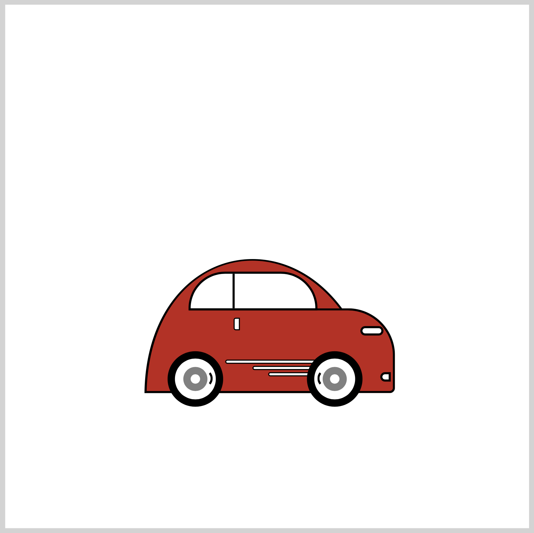
.door-knob {
  position: absolute;
  width: 4px;
  height: 10px;
  top: 289px;
  left: 208px;
  background: white;
  border-radius: 2px 0px 0px 2px;
  border: 1px solid black;
}
To simulate a car door knob, border-radius is set to 2px 0px 0px 2px. This rounds the upper and lower left side of the vertically elongated rectangle.
Tail Light
.tail-light {
  position: absolute;
  width: 13px;
  height: 5px;
  top: 314px;
  left: 129px;
  background: white;
  border-radius: 3px 3px 3px 0px;
  border: 2px solid black;
}
The tail light is similar to the headlight. border-radius is set to 3px 3px 3px 0px to round out the borders.
You can see and play with the complete code on Pyxofy’s CodePen page.
See the Pen CSS Art - Sporty Electric Car by Pyxofy (@pyxofy) on CodePen.
Conclusion
In this article, you learned how to make shapes with the CSS clip-path: path function. clip-path: path is a versatile shape tool that enables you to create complex shapes.
Using CSS pseudo-element selectors, ::before and ::after, you could make additional shapes targeting a single div element.
Modify the CSS code to your liking. Change the car color or maybe change the tire size. Share your masterpiece with us on X (Twitter) @pyxofy, LinkedIn, Mastodon, or Facebook.
We hope you liked this article. Kindly share it with your network. We appreciate it.
Related Articles


