CSS Art – How to Make a Game Character – Kirby
Pink all over and packed with powerful moves. Unforgettable starry eyes. Join us in creating the iconic Kirby in this article, step-by-step.

Introduction
What’s significant about 2022? It’s Kirby’s 30th anniversary!
In this article, we’ll create this iconic video game character using CSS and SVG. Visit our CSS Art articles if you’re unfamiliar with the below CSS technologies.
Preview

Our image will consist of these different parts:
- Eyes
- Cheek Marks
- Mouth
- Body
- Left and Right Arm
- Left and Right Foot
Prerequisites
We don’t assume prior knowledge of CSS or HTML, but it helps if you have some familiarity with how they work. Jump over to this article if you require an HTML and CSS primer.
We assume that you have set up tools to create CSS art. If you haven’t, this article will show you how to set them up.
HTML Structure
Here’s the HTML code for our image.
<div class="container">
  <div class="character">
    <div class="left-arm"></div>
    <div class="right-foot"></div>
    <div class="body"></div>
    <div class="cheek-mark"></div>
    <div class="right-arm"></div>
    <div class="right-eye"></div>
    <div class="left-eye"></div>
    <div class="mouth"></div>
    <div class="left-foot"></div>
  </div>
</div>
container is our outermost enclosure. This enables us to center the art and put a light gray border. The rest of the divs represent each of Kirby’s parts.
It’s important to keep the HTML structure as is for each part to display properly.
Color Palette
Here’s the CSS code for the color palette, body and container div.
/**************************************/
/* Color, Body and Container Settings */
/**************************************/
/* Color palette */
:root {
  /* Transparent */
  --t: transparent;

  /* Body */
  --body-1: hsla(322, 100%, 86%, 1);
  --body-2: hsla(329, 100%, 84%, 1);
  --body-3: hsla(340, 97%, 77%, 1);
  --body-4: hsla(341, 92%, 74%, 1);
  --body-5: hsla(328, 100%, 69%, 1);

  /* Eyes */
  --eye-1: hsla(300, 100%, 100%, 1);
  --eye-2: hsla(224, 78%, 51%, 1);
  --eye-3: hsla(226, 77%, 18%, 1);
  --eye-4: hsla(0, 0%, 0%, 1);

  /* Mouth */
  --mouth-1: hsla(357, 78%, 54%, 1);
  --mouth-2: hsla(353, 98%, 17%, 1);
  --mouth-3: hsla(0, 0%, 100%, 0.08);
  --mouth-4: hsla(356, 78%, 43%, 1);

  /* Feet */
  --feet-1: hsla(347, 97%, 59%, 1);
  --feet-2: hsla(342, 100%, 33%, 1);
  --feet-3: hsla(345, 95%, 29%, 1);
  --feet-4: hsla(347, 97%, 60%, 1);

  /* Shadow */
  --shadow: hsla(240, 0%, 26%, 0.5);
}

/* Center shapes */
body {
  margin: 0;
  padding: 0;
  height: 100vh;
  display: flex;
  justify-content: center;
  align-items: center;
  flex-wrap: wrap;
}

/* Set container and optional light gray border */
.container {
  width: 500px;
  height: 500px;
  /*   border: 5px solid lightgray; */
  background: transparent;
  position: relative;
  display: flex;
  justify-content: center;
  align-items: center;
  border-radius: 1px;
}
If you haven’t created a color palette before, you can check this article for an in-depth explanation.
Let’s start with Kirby’s right eye.
Right Eye
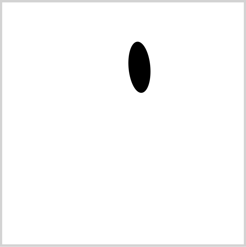
CSS Code:
.right-eye {
  position: absolute;
  width: 45px;
  height: 106px;
  top: 81px;
  left: 261.5px;
  background: var(--eye-4);
  border-radius: 50%;
  transform: rotate(-5deg);
}
This shape will be the base of Kirby’s right eye. It’s a vertically elongated ellipse. We give it a slight slant angle with transform: rotate(-5deg);.
Next, let’s make the gradient.

CSS Code:
.right-eye::before {
  content: "";
  position: absolute;
  width: 32px;
  height: 67px;
  top: 34px;
  left: 6px;
  background: linear-gradient(to top, var(--eye-2) 10%, var(--eye-3) 30%);
  border-radius: 50%;
}
We use linear-gradient() function to create the gradient. It transitions from a light blue, var(--eye-2), to a navy-blue color, var(--eye-3). We’re using CSS custom properties (variables) to set our colors.
Check this article for a step-by-step tutorial on how to set up your own color palette with CSS variables.
Let’s finish our right eye in the following section.
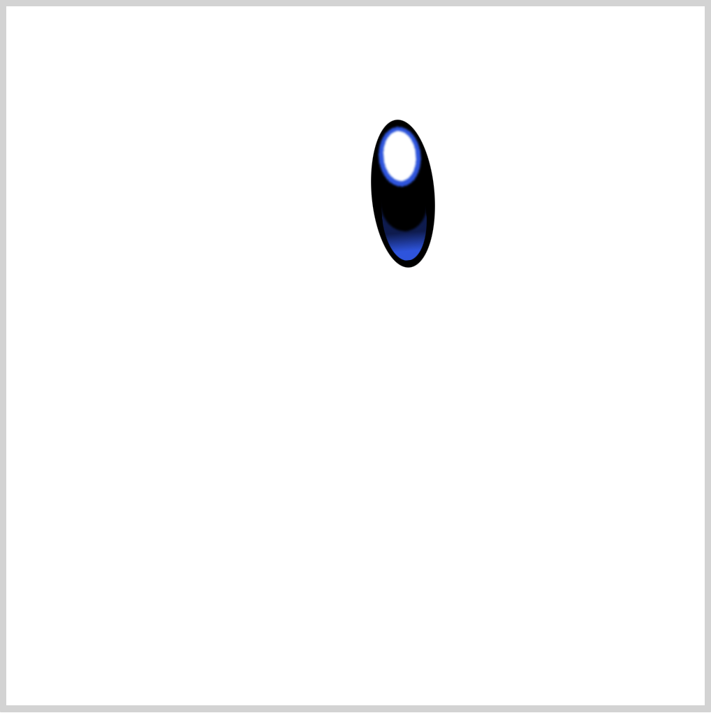
CSS Code:
.right-eye::after {
  content: "";
  position: absolute;
  width: inherit;
  height: inherit;
  background: /* Pupil - White */ radial-gradient(
        100% 100% at 50% 50%,
        var(--eye-1) 49%,
        var(--t) 50%
      )
      50% 11% / 24px 37px,
    /* Iris - Light Blue */
      radial-gradient(100% 100% at 50% 50%, var(--eye-2) 49%, var(--t) 50%) 50%
      7% / 31px 44px,
    /* Base Color */
      radial-gradient(100% 100% at 50% 50%, var(--eye-4) 49%, var(--t) 50%) 50%
      58% / 35px 45px;
  background-repeat: no-repeat;
  filter: blur(0.5px);
  border-radius: 50%;
}
Let’s break down our background code.
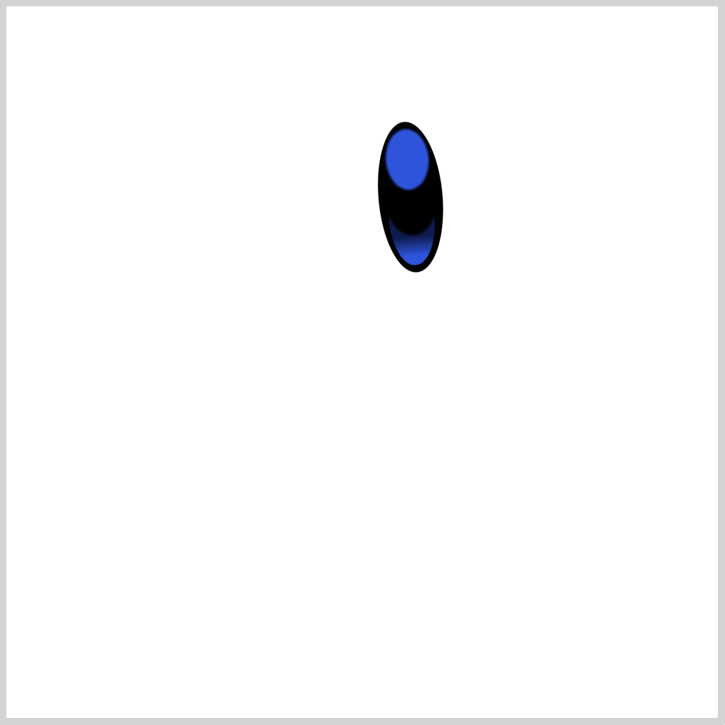
We’re using multiple radial-gradients() to simulate both Iris and Pupil shape.
We’re creating three ellipses:
- Base color
- Iris
- Pupil
Take note that the placement of each radial-gradient() code is important. The first radial-gradient() will show on top, the last gradient will show at the very bottom of the shape stack.
Make sure you put background-repeat: no-repeat; after the radial-gradient() code, this ensures that background doesn’t repeat.
1. Base color
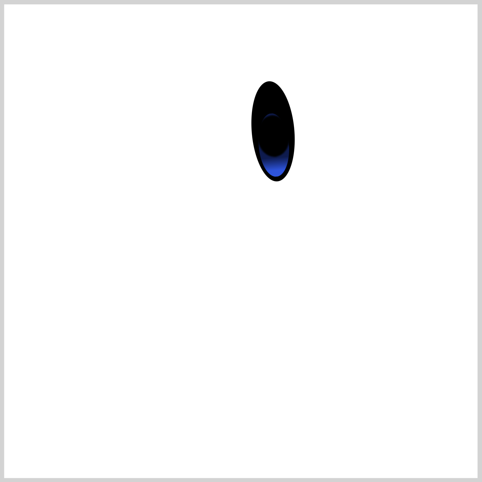
CSS Code:
/* Base Color */
radial-gradient(
	100% 100% at 50% 50%,
	var(--eye-4) 49%,
	var(--t) 50%
	)
	50% 58% / 35px 45px;
This is our base color. It covers a portion of the gradient we made in the previous section. We use a black shade with a transparent outer layer to make the ellipse shape.
2. Iris – Light Blue
CSS Code:
/* Iris - Light Blue */
radial-gradient(
	100% 100% at 50% 50%,
	var(--eye-2) 49%,
	var(--t) 50%
	)
	50% 7% / 31px 44px,
On top of the base color, we place the Iris shape. It’s a light blue ellipse.
3. Pupil – White

CSS Code:
/* Pupil - White */
radial-gradient(
	100% 100% at 50% 50%,
	var(--eye-1) 49%,
	var(--t) 50%
	)
	50% 11% / 24px 37px,
We put the Pupil shape, a white ellipse on top of the Iris, completing our right eye.
Before we proceed to create the Left Eye, let’s take a short detour. Let’s learn how to control the size and placement of multiple radial gradients.
Controlling Gradient Size and Placement
First, let’s look at a straightforward radial-gradient() code.
Syntax:
background: radial-gradient(shape size at position, start-color, ..., last-color);
Sample code:
radial-gradient(
    circle at 50% 50%,
	red 0% 50%,
	orange 50% 100%
  );
Let’s compare our sample code with the Pupil code.
/* Pupil - White */
radial-gradient(
	100% 100% at 50% 50%,
	var(--eye-1) 49%,
	var(--t) 50%
	)
	50% 11% / 24px 37px,
We used this syntax:
radial-gradient(
	100% 100% at x-in-bounding-box y-in-bounding-box,
	start color,
	last color
	)
	x-position y-position / width height
We modify the x-position and y-position to control the placement of the shape. The width and height lets you control the size of the shape.
Play around with the position, width and height argument values, see how the shape changes. For an in-depth explanation, check this article.
Ok, let’s move on to the Left Eye.
Left Eye
The Left Eye is almost a mirror image of the Right Eye; hence, we won’t provide an in-depth explanation for this section.
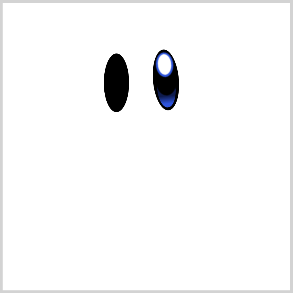
CSS Code:
.left-eye {
  position: absolute;
  width: 44px;
  height: 102px;
  top: 88px;
  left: 176px;
  background: var(--eye-4);
  border-radius: 50%;
  background-repeat: no-repeat;
  transform: rotate(0deg);
}
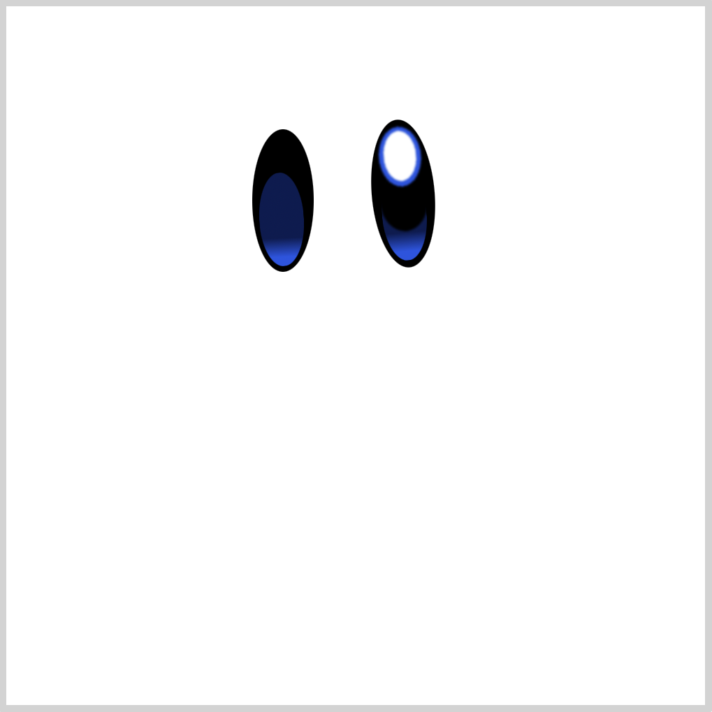
CSS Code:
.left-eye::before {
  content: "";
  position: absolute;
  width: 32px;
  height: 67px;
  top: 31px;
  left: 5px;
  background: linear-gradient(to top, var(--eye-2) 10%, var(--eye-3) 30%);
  border-radius: 50%;
  transform: rotate(-3deg);
}
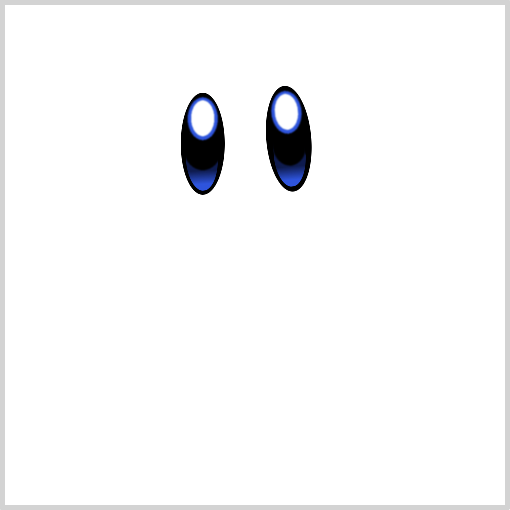
CSS Code:
.left-eye::after {
  content: "";
  position: absolute;
  width: inherit;
  height: inherit;
  background: /* Pupil - White */ radial-gradient(
        100% 100% at 50% 50%,
        var(--eye-1) 49%,
        var(--t) 50%
      )
      50% 11% / 24px 37px,
    /* Iris - Light Blue */
      radial-gradient(100% 100% at 50% 50%, var(--eye-2) 49%, var(--t) 50%) 50%
      7% / 31px 44px,
    /* Base Color */
      radial-gradient(100% 100% at 50% 50%, var(--eye-4) 49%, var(--t) 50%) 50%
      58% / 39px 45px;
  background-repeat: no-repeat;
  filter: blur(0.5px);
  border-radius: 50%;
}
Next up is our pink Cheek Marks.
Cheek Marks
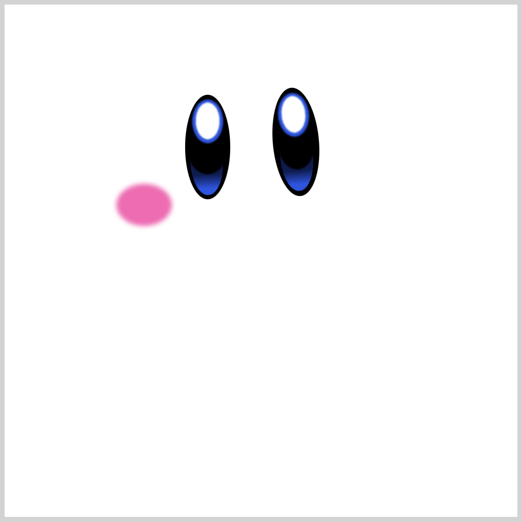
CSS Code:
.cheek-mark {
  position: absolute;
  width: 54px;
  height: 41px;
  top: 175px;
  left: 109px;
  background: var(--body-5);
  border-radius: 50%;
  filter: blur(2px);
  box-shadow: 217px -10px 2px 0 var(--body-5);
}
We use filter: blur(2px); to give our cheek marks a blur effect. For more information about blur() check this article.

CSS Code:
box-shadow: 217px -10px 2px 0 var(--body-5);
Right cheek mark is created with box-shadow. Very handy tool when creating shapes of the same size and color.
In the next section, we’ll create Kirby’s mouth using SVG and radial-gradient().

Mouth

CSS Code:
.mouth {
  position: absolute;
  width: 62px;
  height: 53px;
  top: 193px;
  left: 214px;
  background: var(--mouth-2);
  clip-path: path(
    "M 32,1 C 57,2 70,12 50,39 C 48,41 34,60 17,44 C -12,15 3,2 32,1"
  );
}
We use CSS path() and SVG commands to create the mouth shape. Check this article for more details about path() and SVG commands.
Tongue

CSS Code:
.mouth::after {
  content: "";
  position: absolute;
  width: 62px;
  height: 53px;
  background:
     /* Tongue */ radial-gradient(
      100% 100% at 50% 50%,
      var(--mouth-4),
      var(--mouth-1) 49%,
      var(--t) 50%
    )
    50% 93% / 61px 30px;
  background-repeat: no-repeat;
  transform: rotate(-2deg);
  filter: blur(0.5px);
}
Our radial-gradient() fades from wine red, var(--mouth-4), to a light red hue, var(--mouth-1).
We give it a slight blur effect with filter: blur(0.5px);.
Body

CSS Code:
.body {
  position: absolute;
  width: 365px;
  height: 358px;
  top: 25px;
  left: 64px;
  background: radial-gradient(
      100% 100% at 50% 50%,
      var(--body-1) 25%,
      var(--body-2),
      var(--body-4) 49%,
      var(--t) 50%
    )
    80% 83% / 355px 358px;
  background-repeat: no-repeat;
  filter: drop-shadow(2px 15px 5px var(--shadow));
}
We use gradient and drop-shadow() to give Kirby’s body a more rounded shape.
Gradient transitions from a light pink shade, var(--body-1) and var(--body-2) to a more dark pink, var(--body-4).
We set the shadow with filter: drop-shadow(2px 15px 5px var(--shadow));.
Check this article to learn the difference between box-shadow and drop-shadow().
Let’s work on Kirby’s arms in the next sections.
Left Arm

CSS Code:
.left-arm {
  position: absolute;
  width: 140px;
  height: 110px;
  top: 154px;
  left: 17px;
  background: radial-gradient(
    at 20% 30%,
    var(--body-2) 5%,
    var(--body-3),
    var(--body-5)
  );
  border-radius: 50%;
  transform: rotate(-32deg);
}
Similar to the body, we use a light pink to dark pink gradient. To point the arm slightly downwards, we use transform: rotate(-32deg);.
Right Arm

CSS Code:
.right-arm {
  position: absolute;
  width: 125px;
  height: 135px;
  top: 87px;
  left: 356px;
  background: radial-gradient(
    at 50% 30%,
    var(--body-1) 5%,
    var(--body-2),
    var(--body-4) 60%
  );
  border-radius: 50%;
  filter: drop-shadow(0px 5px 10px var(--shadow));
}
The right arm is a simple circle. To give it a more 3D effect, we use gradients.
This code, at 50% 30%, controls the radial gradient starting point. X-axis or vertical axis is 50% and Y-axis or horizontal axis is 30%. Modify the percentages to see how the gradient starting position changes.
With filter: drop-shadow(0px 5px 10px var(--shadow));, we give the right arm a slight drop shadow.
We’re finished with the arms. Let’s move to the foot section.
Right Foot

CSS Code:
.right-foot {
  position: absolute;
  width: 153px;
  height: 234px;
  top: 240px;
  left: 251px;
  background: radial-gradient(
    circle at 50% 75%,
    var(--feet-1) 10%,
    var(--feet-2) 50%
  );
  border-radius: 50%;
  background-repeat: no-repeat;
  transform: rotate(12deg);
}
Using gradients, we give the right foot’s simple ellipse shape a more rounded shape.
Similar to the right arm, we set the gradient starting position. Instead of the default ellipse gradient shape, we set the gradient to a circle shape and position it with this code, circle at 50% 75%.
Left Foot
This is our last section. Compared to the right foot, the left foot is slightly more complex, consisting of a base gradient, shadow, and a highlight.
1. Base Gradient

CSS Code:
.left-foot {
  position: absolute;
  width: 213px;
  height: 151px;
  top: 252px;
  left: 40px;
  background: radial-gradient(at 45% 50%, var(--feet-2), var(--feet-1));
  border-radius: 50%;
  transform: rotate(41deg);
  filter: drop-shadow(2px -1px 5px var(--shadow));
}
This is our base gradient.
We fade dark red to light red. We give it a drop shadow to push it slightly away from the body section.
2. Base Shadow

CSS Code:
.left-foot::before {
  content: "";
  position: absolute;
  width: 213px;
  height: 151px;
  background:
 /* Highlight */ radial-gradient(
        100% 100% at 50% 50%,
        var(--feet-4) 49%,
        var(--t) 50%
      )
      27% 21% / 80px 25px,
    /* Base Shadow */
      radial-gradient(100% 100% at 50% 50%, var(--feet-3) 49%, var(--t) 50%) 55%
      80% / 185px 96px;
  background-repeat: no-repeat;
  border-radius: 50%;
  filter: blur(10px);
}
We create the base shadow with this code
/* Base Shadow */
radial-gradient(
	100% 100% at 50% 50%,
	var(--feet-3) 49%,
	var(--t) 50%
	) 55% 80% / 185px 96px;
We can change the base shadow size and position by modifying 55% 80% / 185px 96px. Furthermore, we give it a 10px blur effect with filter: blur(10px);.
3. Highlight

CSS Code:
/* Highlight */
radial-gradient(
      100% 100% at 50% 50%,
      var(--feet-4) 49%,
      var(--t) 50%
     )
     27% 21% / 80px 25px,
The last part is the highlight.
Instead of using a white color, we use a lighter shade of red. Change the position and size of the highlight by modifying 27% 21% / 80px 25px.
We’re all done! How’s your version of Kirby? Does it look like the reference image?
You can see and play with the code at Pyxofy’s CodePen page.
See the Pen CSS Art - Kirby by Pyxofy (@pyxofy) on CodePen.
Conclusion
By combining basic shapes such as ellipses and circles, we created an iconic video game character.
We used CSS blur() to give our shapes softer tones. We learned how to use multiple radial gradients to make complex shapes.
Box shadow, drop shadow, radial and linear gradients gives our basic shapes a more 3D feel.
What will you create using the techniques you learned from this article? Share your awesome art with us on Twitter @pyxofy, on LinkedIn, or Facebook.
We hope you liked this article. Kindly share it with your network. We really appreciate it.
Related Articles


