CSS Art – How to Make a Color Palette
Using stock colors is so 90’s. Learn how to make custom color palettes to express your unique style and personality in this article, step-by-step.

Introduction
The internet is a vibrant ecosystem. This is reflected with the abundance of colors and gradients. Logos, websites with unique, memorable colors stand out from the crowd.
In this article, we’ll be using CSS custom properties, Hue, Saturation, Lightness, and Alpha (HSLA) color mode, and color extraction tools to create our unique color palette.
Visit our CSS Art articles if you’re unfamiliar with the above CSS technologies.
Preview
We’ll be making four images from two color palettes.
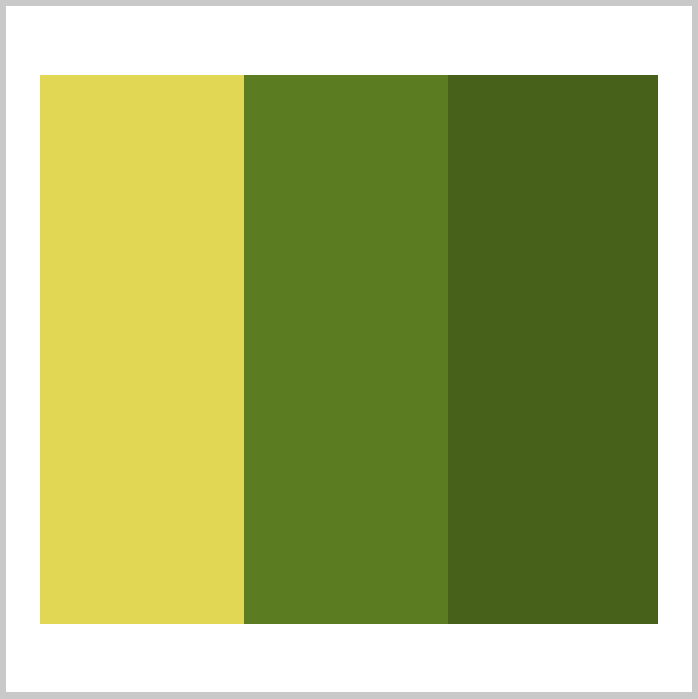
1. Leaf color bars
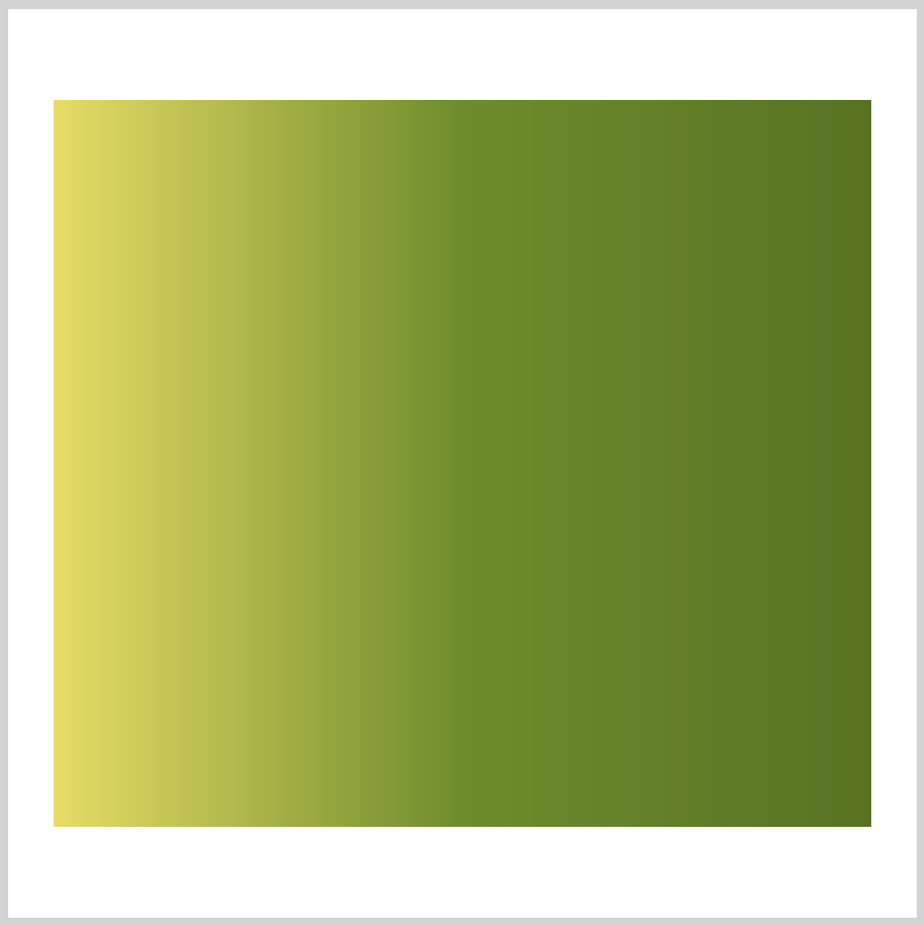
2. Leaf color gradient
3. Apple color rings

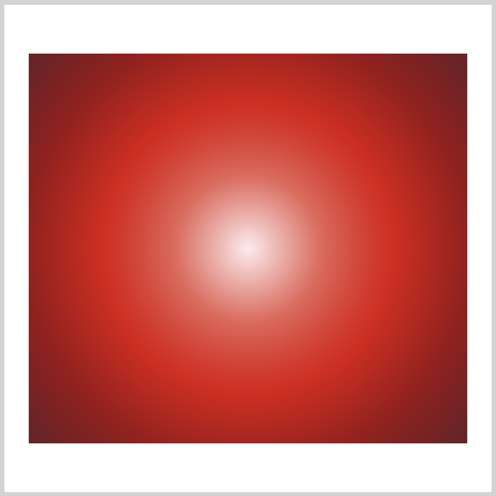
4. Apple color circular gradient
Prerequisites
We don’t assume prior knowledge of CSS or HTML, but it helps if you have some familiarity with how they work. Jump over to this article if you require HTML and CSS primer.
We assume that you have set up tools to create CSS art. If you haven’t, this article will show you how to set them up.
HTML Structure
HTML code for our sample images.
<div class="container">
  <div class="square"></div>
</div>
<div class="container">
  <div class="square-gradient"></div>
</div>
<div class="container">
  <div class="circle"></div>
</div>
<div class="container">
  <div class="circle-gradient"></div>
</div>
<div class="container">
  <div class="color-wheel"></div>
</div>
container is our outermost enclosure. This enables us to center the art and put a light gray border. The rest of divs represent each of our sample image.
It’s important to keep the HTML structure as is for each section to display properly.
Container and Body CSS Code
/**************************************/
/* Body and Container Settings */
/**************************************/

/* Center shapes */
body {
  margin: 0;
  padding: 0;
  height: 100vh;
  display: flex;
  justify-content: center;
  align-items: center;
  flex-wrap: wrap;
}

/* Set light gray border */
.container {
  width: 500px;
  height: 500px;
  border: 5px solid lightgray;
  background: transparent;
  position: relative;
  display: flex;
  justify-content: center;
  align-items: center;
  border-radius: 1px;
  margin: 5px;
}
CSS Custom Properties (variables)
CSS custom properties, sometimes referred to as CSS variables, are very useful when making CSS art. They allow you to store a value in one location, then reference it in from multiple areas throughout your document.
For complex CSS art, you want to use CSS custom properties as much as possible. It enables you to:
- Store color values in one location
- Replace color values without doing search and replace in your document
- Make color names more semantic to suit your needs
Here’s a quick example.
Declaring a custom property
:root {
  --main-bg-color: brown;
}
You declare a custom property using the :root pseudo-class, this makes the custom property globally accessible (scoped) within your document.
In our example, --main-bg-color is our custom property name. Take note that custom property names always start with a double hyphen (--). If you require a space between words, use a single hyphen -.
Custom property names are case-sensitive. --main-bg and --Main-Bg, will be treated as separate custom properties.
brown is our custom property value.
In this example, --main-bg-color: brown; is our full custom property notation. Custom property notations are always within a CSS ruleset.
Accessing a custom property
.one {
  color: white;
  background-color: var(--main-bg-color); /* CSS custom property */
  width: 50px;
  height: 50px;
}
To access a custom property, you use the var() function. In this example, we set background-color to --main-bg-color custom property. This will set our background color brown.
Since our color value is stored in one location, if you decide to change your background color from brown to let’s say light blue, you only have to change the value in --main-bg-color. The change will propagate automatically where you used the custom property. Very handy! No need for global search and replace.
In the next section, we’ll discuss a color model (system) called Hue, Saturation, Lightness, and Alpha or HSLA for short.
Hue, Saturation, Lightness, and Alpha (HSLA)
CSS has different color models you can use to set color value.
- Color Keywords
- red
- transparent
- RGB cubic-coordinate
#-hexadecimal, ex:#FF0000for red.rgb()orrgba()
- HSL cylindrical-coordinate
- HWB cylindrical-coordinate
- LCH cylindrical coordinate system
- LAB coordinate system
Each color model or system has its merits and limitations. Take the time to understand them and use one that fits your needs.
In this section we’ll focus on the Hue, Saturation, Lightness, and Alpha (HSLA) color model.
Let’s look at an example and break it down.
hsla(0, 100%, 50%, 1)
- Hue:
0
Hue indicates the degrees within the color wheel.0degrees is red. Other colors will be explained in our color wheel section in more detail. - Saturation (intensity):
100%100%indicates complete saturation. Saturation of0%will result in completely unsaturated or gray color. - Lightness (luminosity, brightness):
50%50%is considered normal lightness.100%will result in a white color, while a0%will be a black color. - Alpha (transparency):
1
You can control color transparency with this value.1equals to fully opaque and0is fully transparent. If you want to make the color semi transparent, in this case set the value to0.5.
Let’s learn about the color wheel in the next section.
Color Wheel
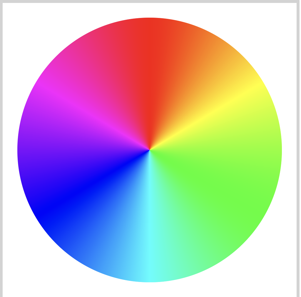
Custom property notation:
  /* Color Wheel */
  --red: hsla(0, 100%, 50%, 1);
  --yellow: hsla(60, 100%, 50%, 1);
  --green: hsla(120, 100%, 50%, 1);
  --cyan: hsla(180, 100%, 50%, 1);
  --blue: hsla(240, 100%, 50%, 1);
  --magenta: hsla(300, 100%, 50%, 1);
CSS Code:
/* Color Wheel */
.color-wheel {
  width: 450px;
  height: 450px;
  background: conic-gradient(
    var(--red) 0deg,
    var(--yellow) 60deg,
    var(--green) 120deg,
    var(--cyan) 180deg,
    var(--blue) 240deg,
    var(--magenta) 300deg,
    var(--red)
  );
  border-radius: 50%;
}
Let’s use the color wheel as a guide for our Hue value.
- Red:
0degor360deg - Yellow:
60deg - Green:
120deg - Cyan:
180deg - Blue:
240deg - Magenta:
300deg
The color wheel starts at 0 degrees, going clock-wise. We used degrees or deg in this example. Default is degrees, but you can use radians (rad) or turn (turn) as well.
When working with HSLA, it’s important to remember the color wheel. Playing with hue, saturation and lightness values, you should be able to easily find colors that will meet your needs.
In the next section, let’s see how to extract colors.

Extracting Colors
In this section, we’ll extract colors from a reference image.
Reference Image
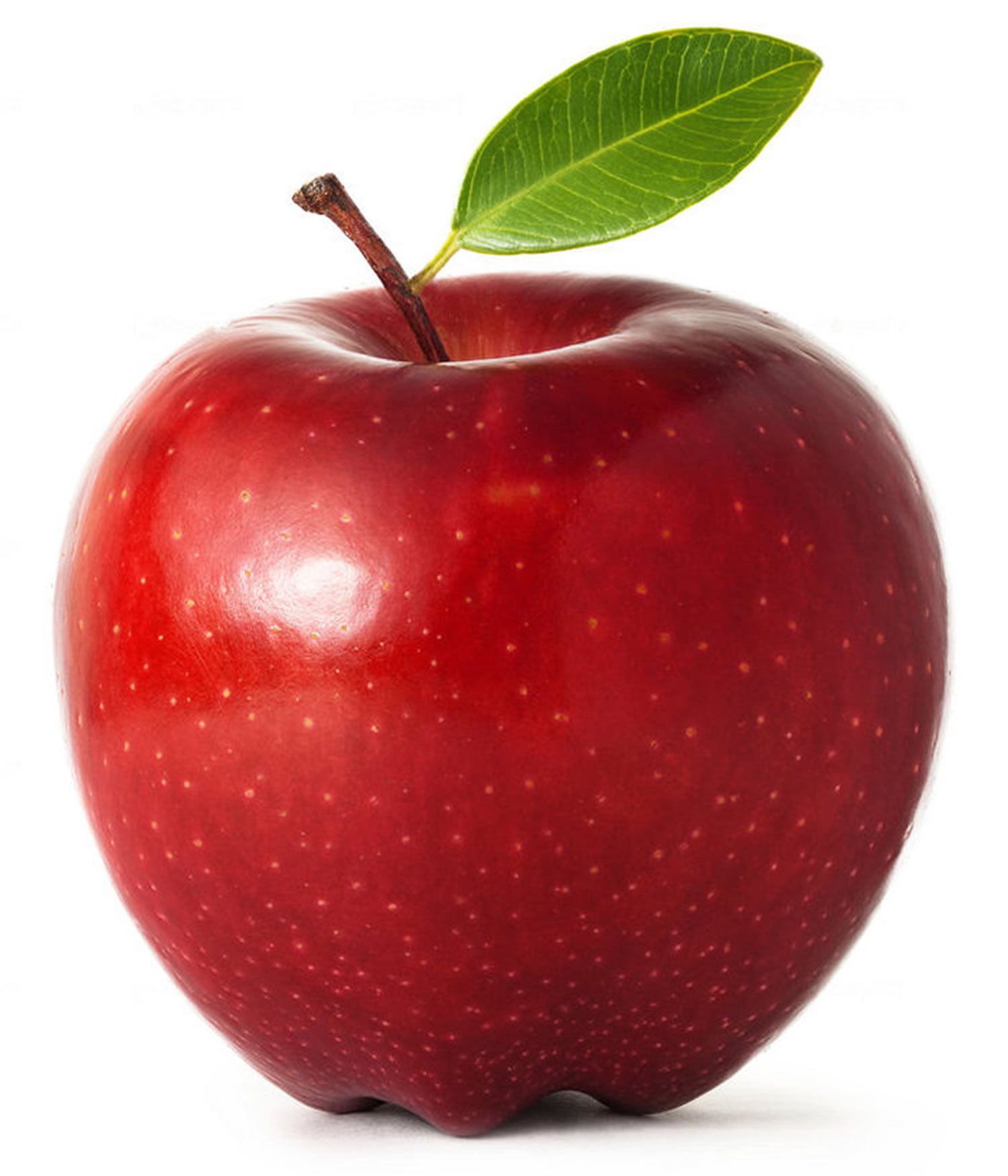
Let’s use an apple reference image. We’ll extract colors from its leaf and body section.
Download it now, you will need to upload it later to an image picker tool. You are welcome to use an image reference of your choice.
We will use Coolers Image Picker tool for color extraction. You can use another color extraction tool, but do make sure it can export colors to HSL values.
1. Access https://coolors.co/image-picker from your favorite web browser.
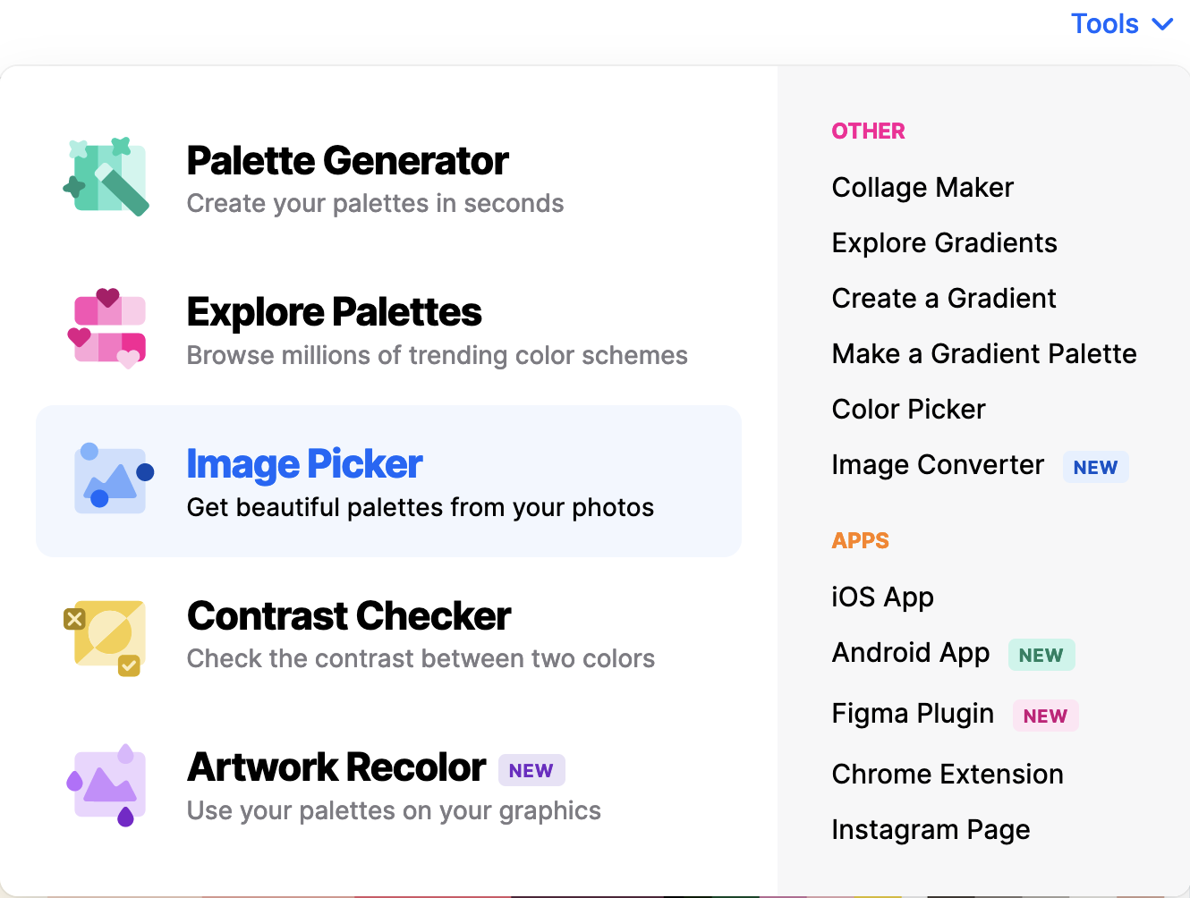
2. Click on “Browse image” button to upload reference image.
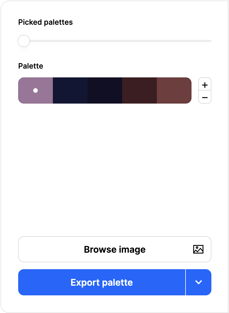
3. Click on “Upload” tab, then click “Browse or drop image” and upload reference image.

4. First, let’s extract colors from the leaf. Drag the selection circles to pick a color you like. Use the plus / minus button to add or subtract colors from the palette.
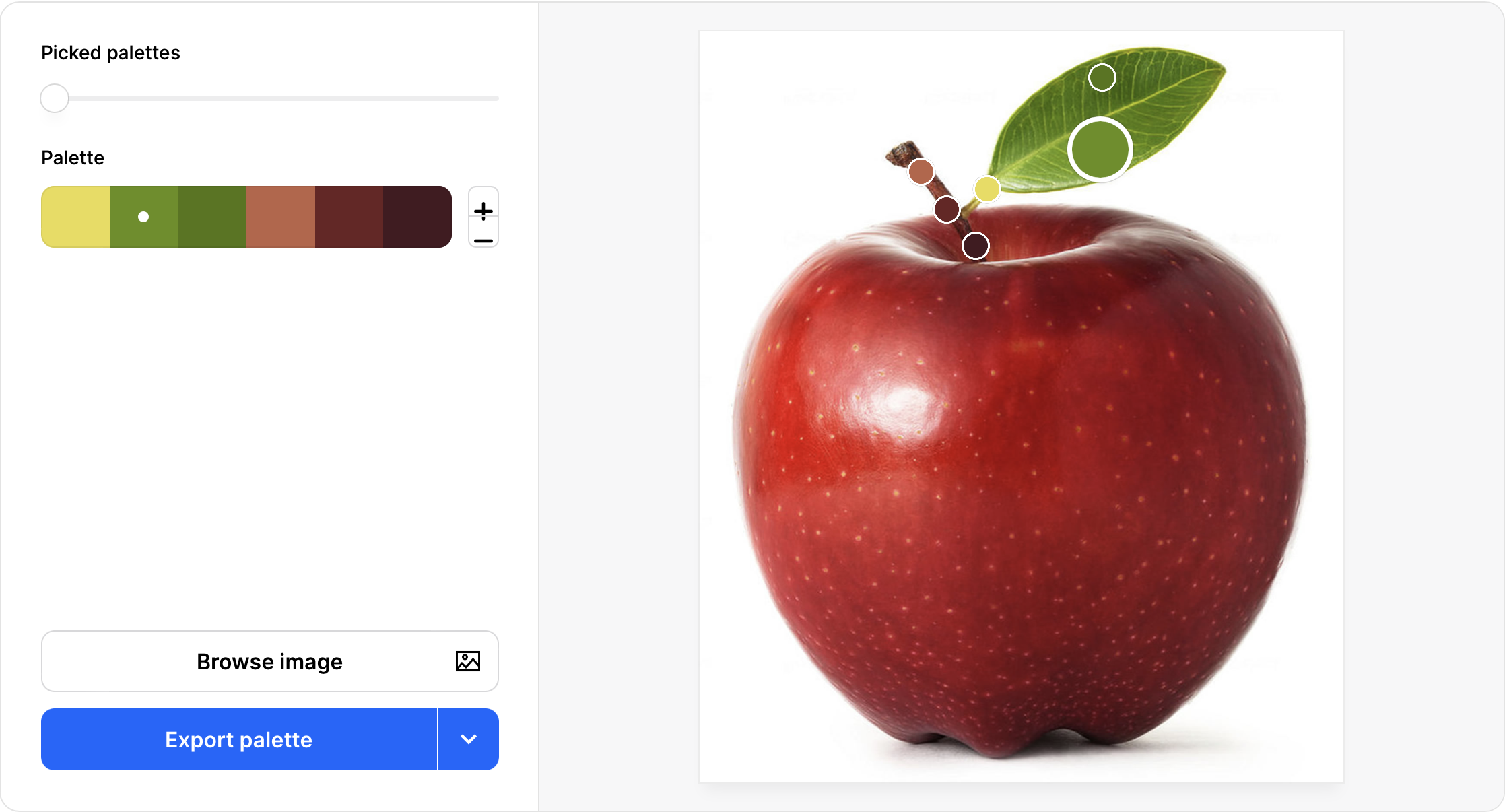
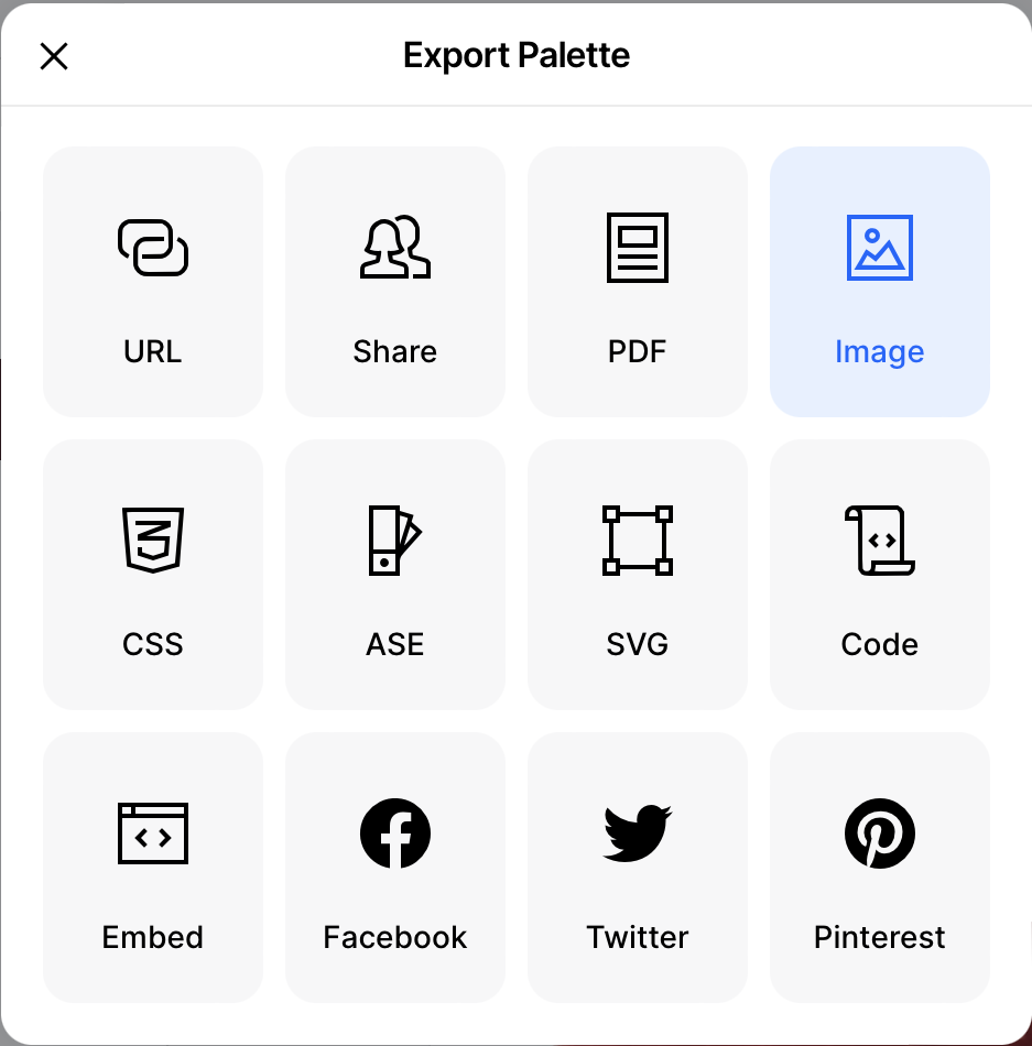
5. Now let’s export the color palette. Click on the “Export palette” button. “Export Palette” window will pop up. Select “Image” from the menu.
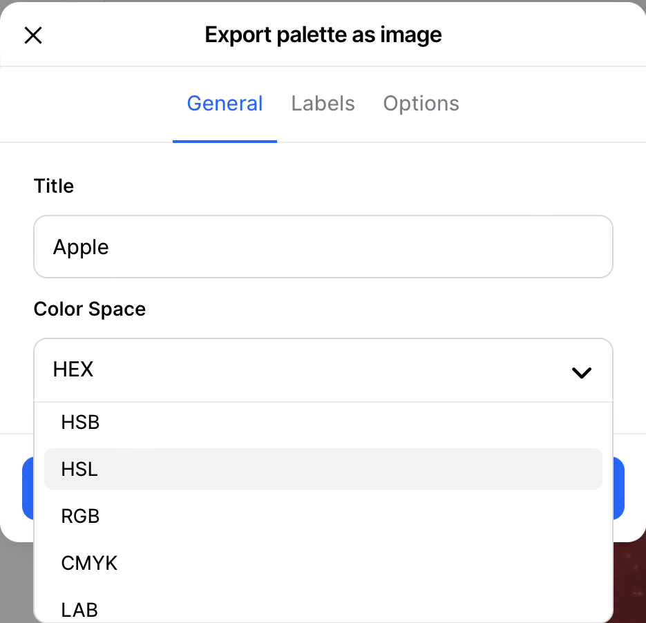
6. Give the image a title. Select HSL in the “Color Space” dropdown.
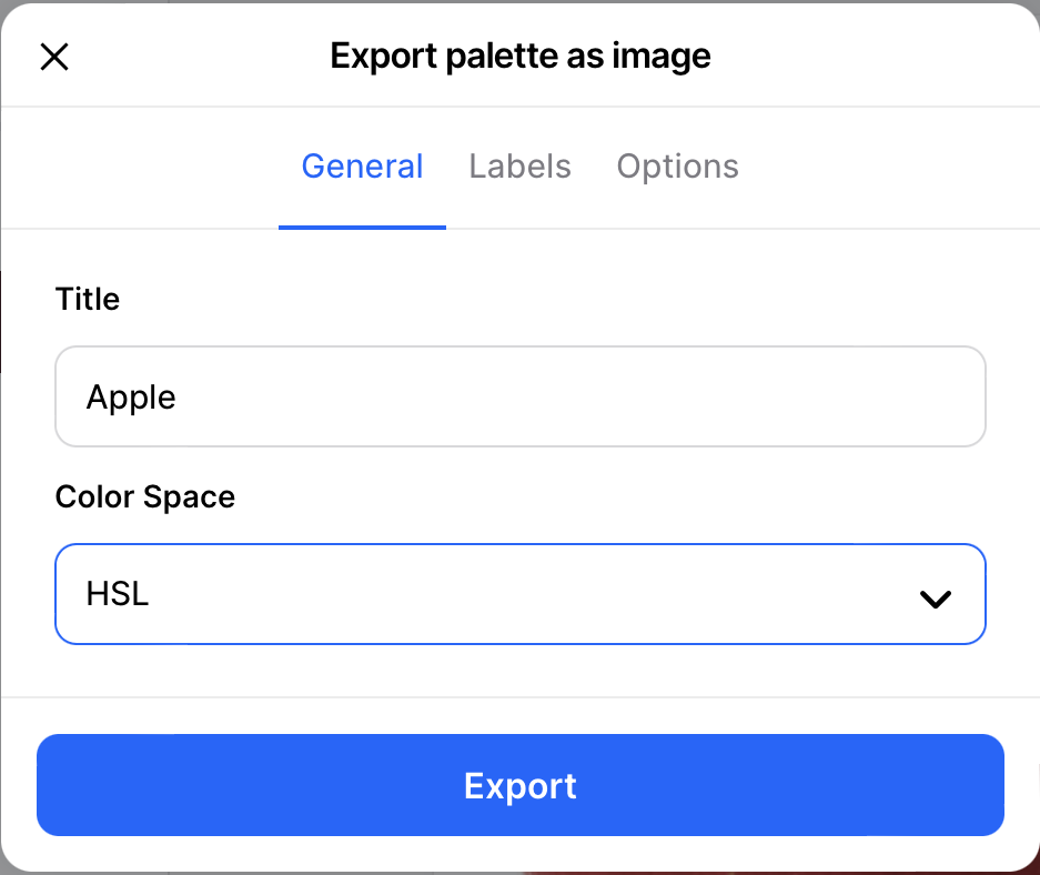
7. Click “Export” button and download the color palette image.
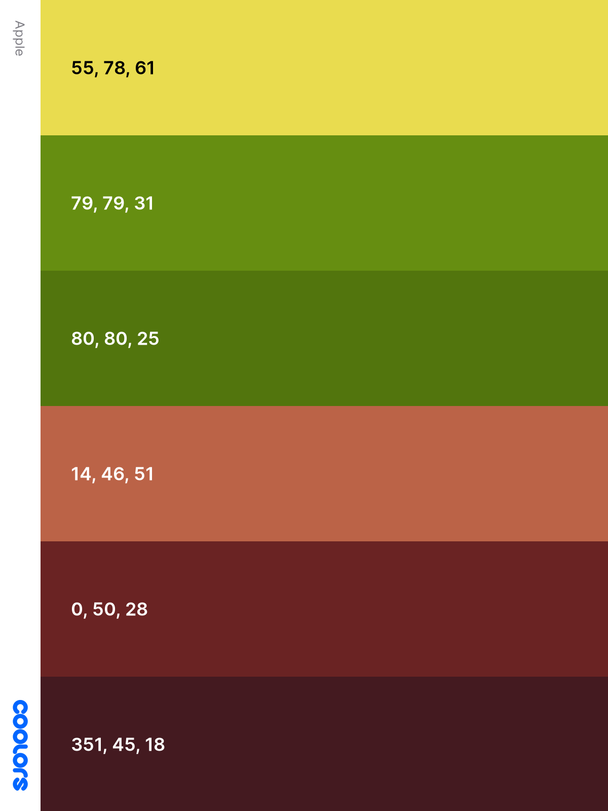
8. Open the exported color palette image. You now have the leaf HSL color values you selected.
Repeat steps 4 through 8 for the apple section.
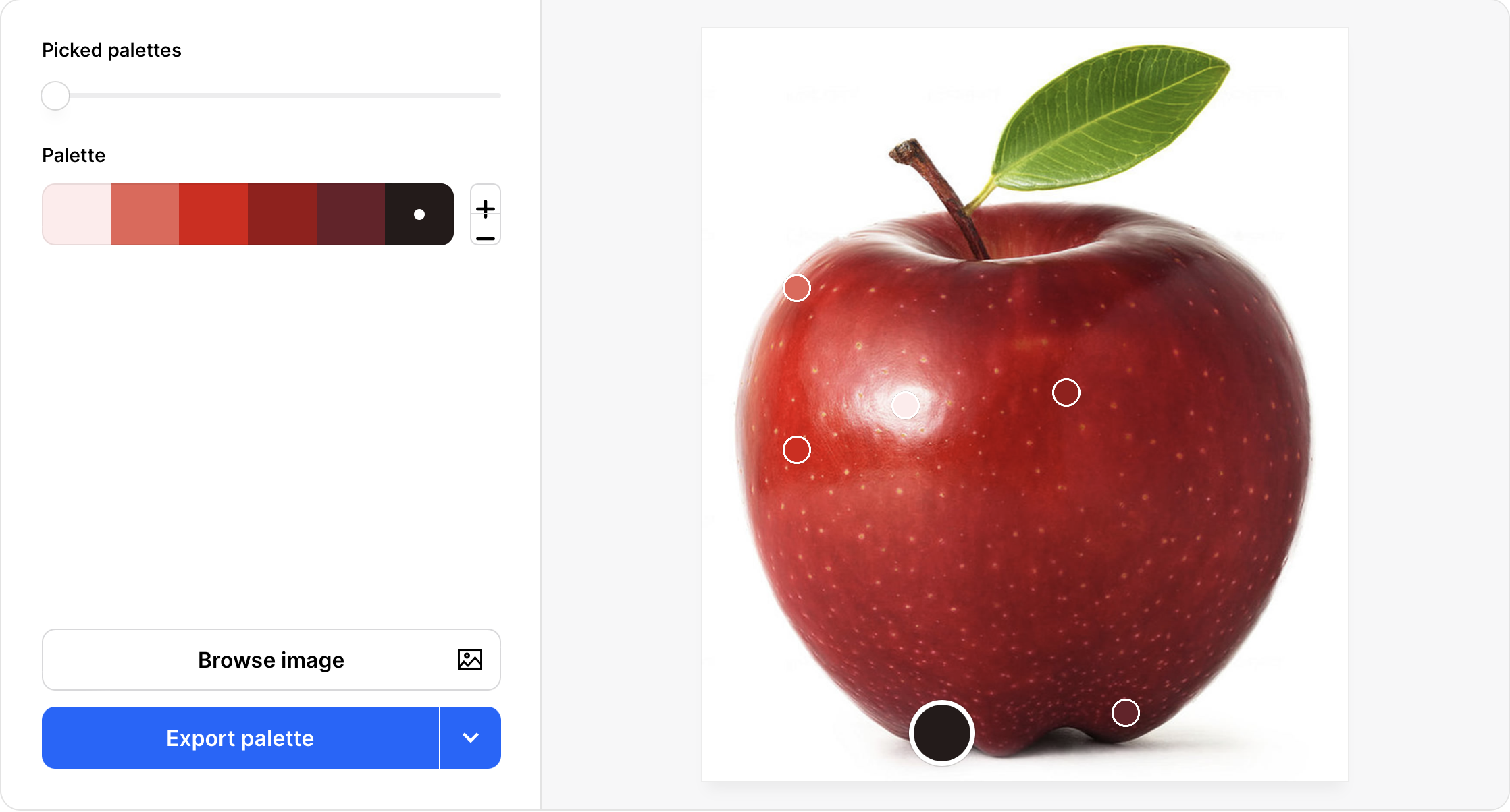
Apple color palette image.
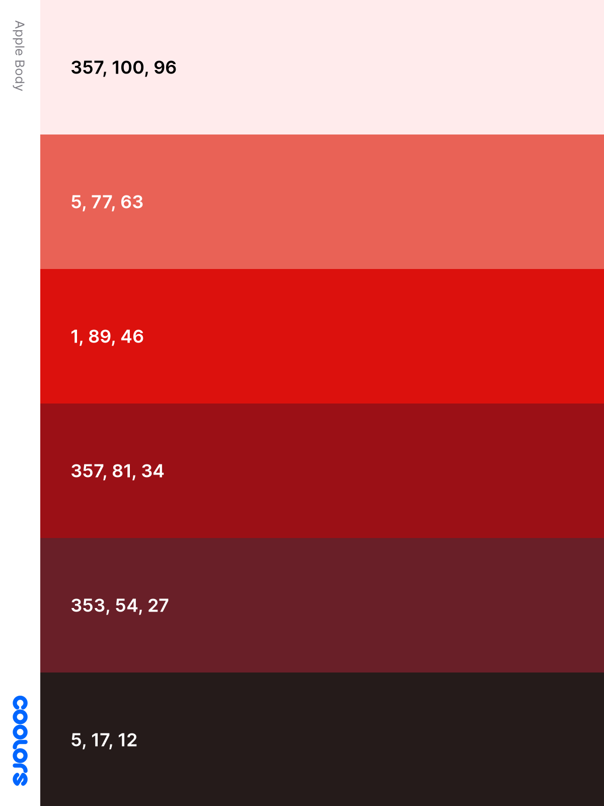
For our final section, let’s make a CSS color palette.
Make a Color Palette
Were you successful extracting colors from your reference image? There are many tools for color extraction, utilize the one you’re most familiar with.
CSS gradients will be utilized in the subsequent examples. Check this article if you’re unfamiliar with CSS gradients.
Leaf
For our first example we’ll use three leaf colors, arrange it in vertical bars.

Custom property notation:
/* Leaf */
--leaf-1: hsla(55, 78%, 61%, 1);
--leaf-2: hsla(79, 79%, 31%, 1);
--leaf-3: hsla(80, 80%, 25%, 1);
CSS Code:
/* Leaf - Bars */
.square {
  width: 450px;
  height: 400px;
  background: linear-gradient(
    to right,
    var(--leaf-1) 33%,
    var(--leaf-2) 33% 66%,
    var(--leaf-3) 66%
  );
}
We evenly split our gradient to display the leaf colors via color stop percentages. Our linear-gradient is pointing to the right, but you can change the direction, let’s say to the left, by replacing to right with to left.

CSS Code:
/* Leaf - Gradient */
.square-gradient {
  width: 450px;
  height: 400px;
  background: linear-gradient(
    to right,
    var(--leaf-1),
    var(--leaf-2),
    var(--leaf-3)
  );
}
For this image, we made the transition fluid between the three leaf colors.
Apple
For our next example, let’s use the colors extracted from the apple.

Custom property notation:
/* Apple */
--apple-1: hsla(357, 100%, 96%, 1);
--apple-2: hsla(5, 77%, 63%, 1);
--apple-3: hsla(1, 89%, 46%, 1);
--apple-4: hsla(357, 81%, 34%, 1);
--apple-5: hsla(353, 54%, 27%, 1);
CSS Code:
/* Apple - Circle */
.circle {
  width: 450px;
  height: 400px;
  background: radial-gradient(
    circle,
    var(--apple-1) 16%,
    var(--apple-2) 16% 33%,
    var(--apple-3) 33% 50%,
    var(--apple-4) 50% 66%,
    var(--apple-5) 66% 83%
  );
}
We’re using radial-gradient with color stops to simulate the rings in this example. You can make the rings bigger or smaller by changing the percentages.

CSS Code:
/* Apple - Circle Gradient */
.circle-gradient {
  width: 450px;
  height: 400px;
  background: radial-gradient(
    circle,
    var(--apple-1),
    var(--apple-2),
    var(--apple-3),
    var(--apple-4),
    var(--apple-5)
  );
}
Similar to the leaf example, our last image will be a smooth transition between all five apple colors.
Here’s the leaf and apple CSS custom properties code.
/* Color palette */
:root {
  /* Leaf */
  --leaf-1: hsla(55, 78%, 61%, 1);
  --leaf-2: hsla(79, 79%, 31%, 1);
  --leaf-3: hsla(80, 80%, 25%, 1);

  /* Apple */
  --apple-1: hsla(357, 100%, 96%, 1);
  --apple-2: hsla(5, 77%, 63%, 1);
  --apple-3: hsla(1, 89%, 46%, 1);
  --apple-4: hsla(357, 81%, 34%, 1);
  --apple-5: hsla(353, 54%, 27%, 1);
}
Our example images are simple implementation of CSS custom properties. For a more comprehensive guide, check this article.
We hope you had fun going through the examples. We strongly encourage you to experiment. Use different reference images, use different gradient techniques.
You can see and play with the code at Pyxofy’s CodePen page.
See the Pen CSS Art - How to Make a Color Palette by Pyxofy (@pyxofy) on CodePen.
Conclusion
By combining CSS custom properties, HSLA and color extraction tools, we created unique color palettes.
CSS custom properties are not limited to colors, you can use it for font size, weight, shadows, gradients, grids etc.
Go ahead, change the color values in our samples. Better yet, use different reference images to extract unique colors. Experimentation is the best way to learn.
Study websites such as amazon.com, apple.com, nytimes.com or youtube.com. Observe how each of them implement unique color palettes and gradients.
Share your awesome color palettes with us on Twitter @pyxofy, on LinkedIn, or Facebook.
We hope you liked this article. Kindly share it with your network. We really appreciate it.
Related Articles


