CSS Art – How to Make a 3D Cube With CSS
Why settle for two dimensions when you can have three? Learn how to make a three-dimensional CSS cube and then rotate it into multiple angles.

Introduction
Cubes are inherently three-dimensional (3D). This article will guide you in creating a 3D cube and then teach you how to rotate it in three-dimensional space using only CSS.
CSS functions you’ll be learning to use in this article:
rotated3d()rotateX()rotateY()translateZ()
Preview
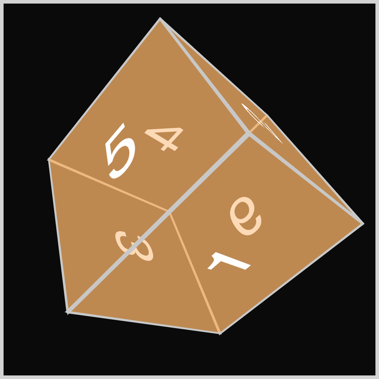
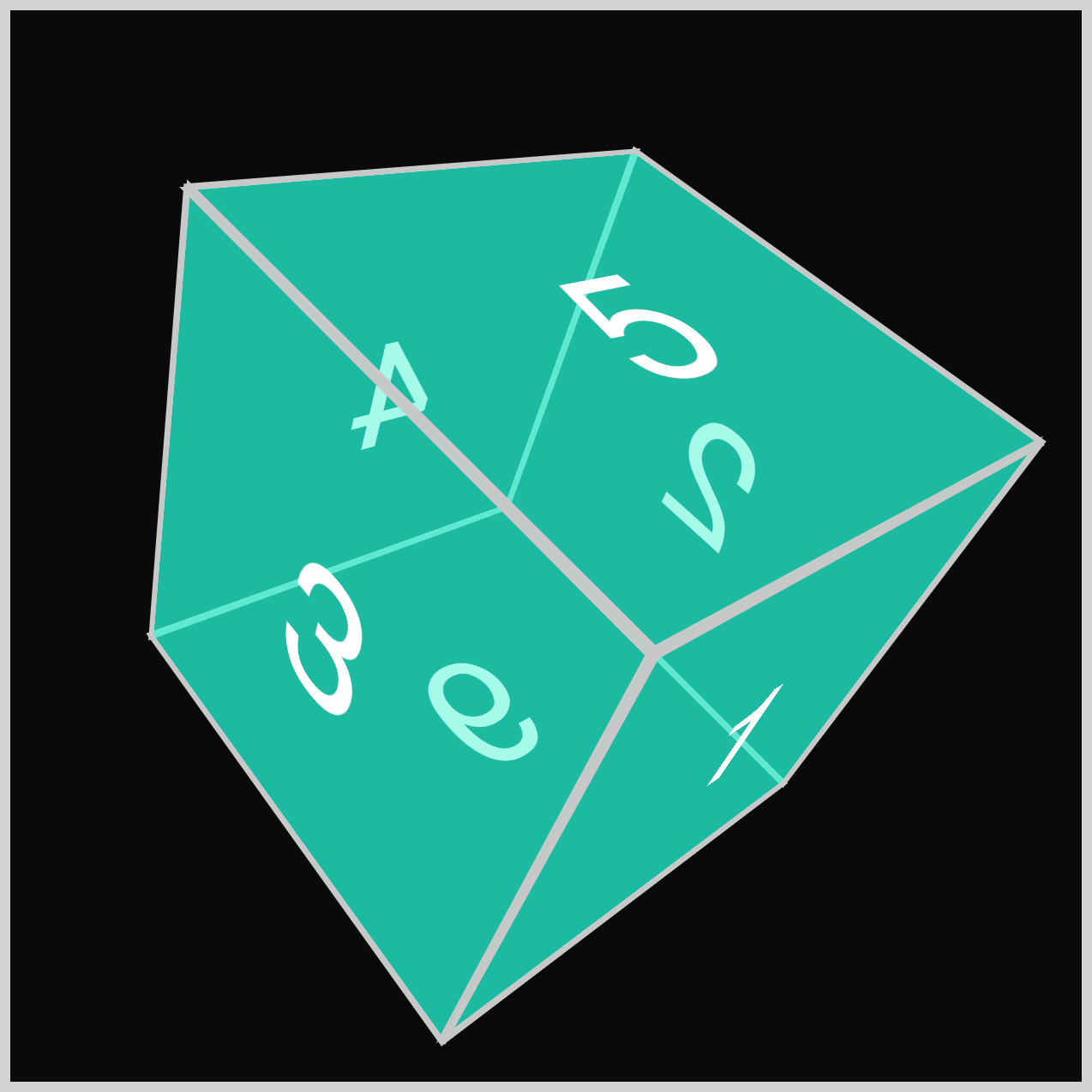
You’ll be creating four cubes with different rotation angles and colors.
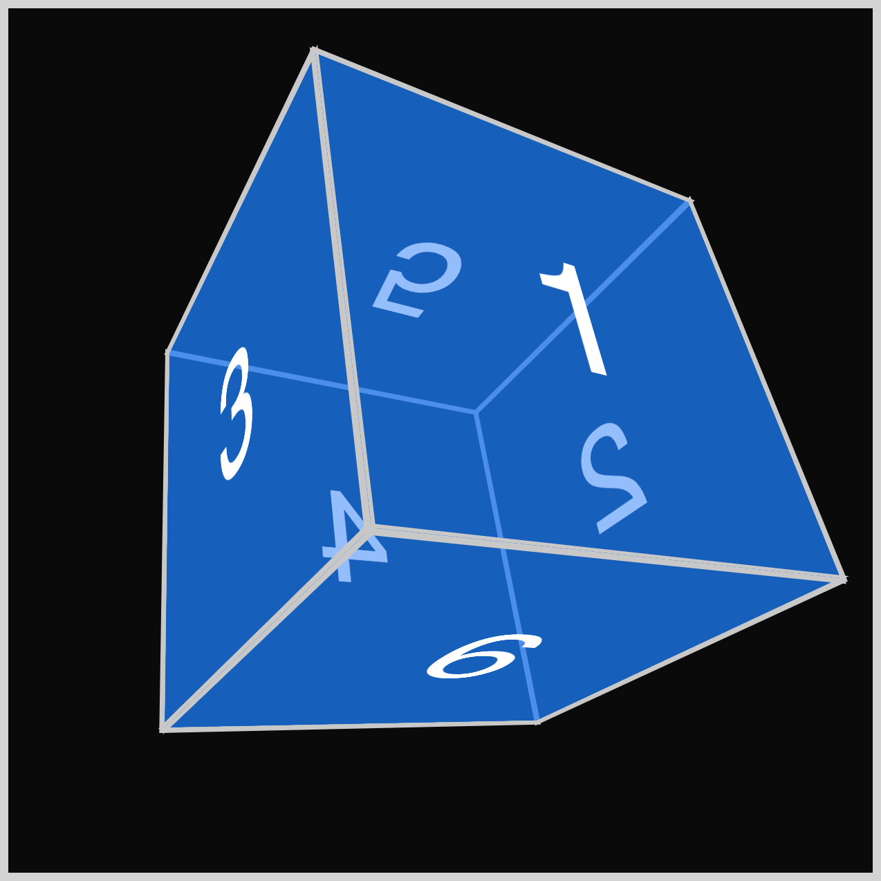
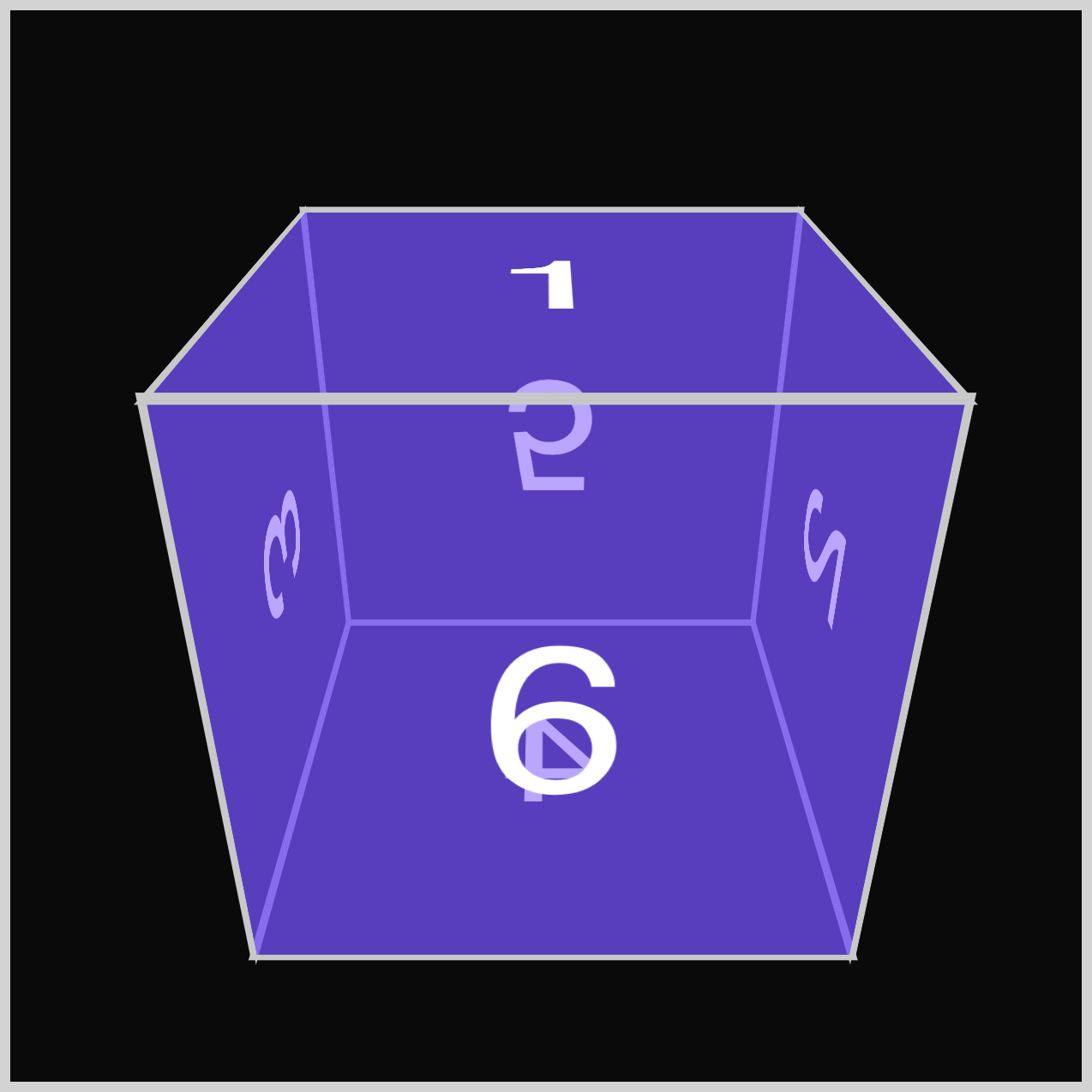
Using the CSS rotate3d() function, you’ll rotate the three-dimensional cube (3D) in the 3D space.
Prerequisites
Essential CSS and HTML knowledge will help you understand the concepts and techniques introduced in this article. Jump over to this article if you require an HTML and CSS primer.
We assume you have configured tools to modify CSS. If not, this article will guide you through the setup process.
HTML Structure
<div class="container">
  <div class="cube-container">
    <div class="cube cube-1">
      <div class="face front example-1">1</div>
      <div class="face right example-1">2</div>
      <div class="face left example-1">3</div>
      <div class="face back example-1">4</div>
      <div class="face top example-1">5</div>
      <div class="face bottom example-1">6</div>
    </div>
  </div>
</div>
<div class="container">
  <div class="cube-container">
    <div class="cube cube-2">
      <div class="face front example-2">1</div>
      <div class="face right example-2">2</div>
      <div class="face left example-2">3</div>
      <div class="face back example-2">4</div>
      <div class="face top example-2">5</div>
      <div class="face bottom example-2">6</div>
    </div>
  </div>
</div>
<div class="container">
  <div class="cube-container">
    <div class="cube cube-3">
      <div class="face front example-3">1</div>
      <div class="face right example-3">2</div>
      <div class="face left example-3">3</div>
      <div class="face back example-3">4</div>
      <div class="face top example-3">5</div>
      <div class="face bottom example-3">6</div>
    </div>
  </div>
</div>
<div class="container">
  <div class="cube-container">
    <div class="cube cube-4">
      <div class="face front example-4">1</div>
      <div class="face right example-4">2</div>
      <div class="face left example-4">3</div>
      <div class="face back example-4">4</div>
      <div class="face top example-4">5</div>
      <div class="face bottom example-4">6</div>
    </div>
  </div>
</div>
container is the outermost enclosure. It enables the content to be centered and draws a light gray border. The rest of the divs represent each image component.
Keep the HTML structure as is for the image to display correctly.
Body and Container Div CSS
CSS code for the body and container div.
/* Body and Container Settings */
/* Center shapes */
body {
  margin: 0;
  padding: 0;
  height: 100vh;
  display: flex;
  justify-content: center;
  align-items: center;
  flex-wrap: wrap;
}

/* Set background and border color */
.container {
  min-width: 500px;
  height: 500px;
  border: 5px solid lightgray;
  background: #0a0a0a;
  position: relative;
  margin: 5px;
  display: flex;
  justify-content: center;
  align-items: center;
}
Cube Container and Cube
In this section, you’ll set up the Cube Container (.cube-container) and Cube (.cube).
The selector hierarchy goes as follows:
.container: top-level container.cube-container: second-level container.cube: third-level container
Maintain the hierarchy for the 3D Cube to display correctly.
/* Cube Container */
.cube-container {
  width: 250px;
  height: 250px;
  perspective: 500px;
}
The Cube Container has a width and height of 250px. Additionally, the CSS perspective property, defining the distance from the z-plane to the user, is set at 500px.
/* Cube */
.cube {
  width: 100%;
  height: 100%;
  font-family: sans-serif;
  transform-style: preserve-3d;
}
The Cube’s width and height are both configured to 100%. The font family uses sans-serif, while the transform-style property value is set to preserve-3d.
Let’s start working on the cube faces in the next section.
Cube Face
The cube consists of six faces, each labeled with a number from 1 to 6 corresponding to a specific side.
<!-- Cube 1 Example 1 faces -->
<div class="cube cube-1">
  <div class="face front example-1">1</div>
  <div class="face right example-1">2</div>
  <div class="face left example-1">3</div>
  <div class="face back example-1">4</div>
  <div class="face top example-1">5</div>
  <div class="face bottom example-1">6</div>
</div>
- Front
- Right
- Left
- Back
- Top
- Bottom
/* Cube Face */
.face {
  width: 100%;
  height: 100%;
  position: absolute;
  border: 3px solid #c8c8c8;
  color: #fff;
  font-size: 6em;
  display: flex;
  justify-content: center;
  align-items: center;
}
The default face’s width and height are set to 100%, and its position property is set to absolute. It has a 3px wide solid, silver (#c8c8c8) border. The font color is set to white, #fff, and the font size is set to 6em.
To center the fonts, set the display property value to flex and set both the justify-content and align-items property values to center.

The initial Cube Face will feature no background color or angle. It is simply a square with a number in the center.
The initial Cube Face is done. In the next section, you’ll work on the Cube Face Angles.
Cube Face Angles
In this section, you’ll start setting the Cube Face Angles for each face using the CSS rotateY(), rotateX(), and translateZ() functions.
To visualize the Cube Face Angles better, you’ll set a background color and rotation value.

/* Cube Example 1 */
.cube-1 {
  transform: rotate3d(1, 1, 0, 45deg);
}

.example-1 {
  background-color: #0d7df57f;
}
rotate3d() CSS Function
The CSS rotate3d() function rotates an element around a fixed axis in three-dimensional (3D) space without deforming it.
Syntax:
rotated3d(x, y, z, a)
x: A number describing the horizontal or x-axis rotation vector, which can be a positive or negative number.y: A number describing the vertical or y-axis rotation vector, which can be a positive or negative number.z: A number describing the depth or z-axis rotation vector, which can be a positive or negative number.a: The angle of the rotation. A positive angle rotates the element clockwise, and a negative angle rotates counterclockwise. Degrees (deg), Gradians (grad), Radians (rad), and Turns (turn) are valid angles.
Using the CSS rotate3d() function, you rotate the face by 1 pixel on both the x- and y-axes. The rotation angle is set to 45 degrees (45deg). The background color is set to #0d7df57f, which is a blue color with a 50% opacity.
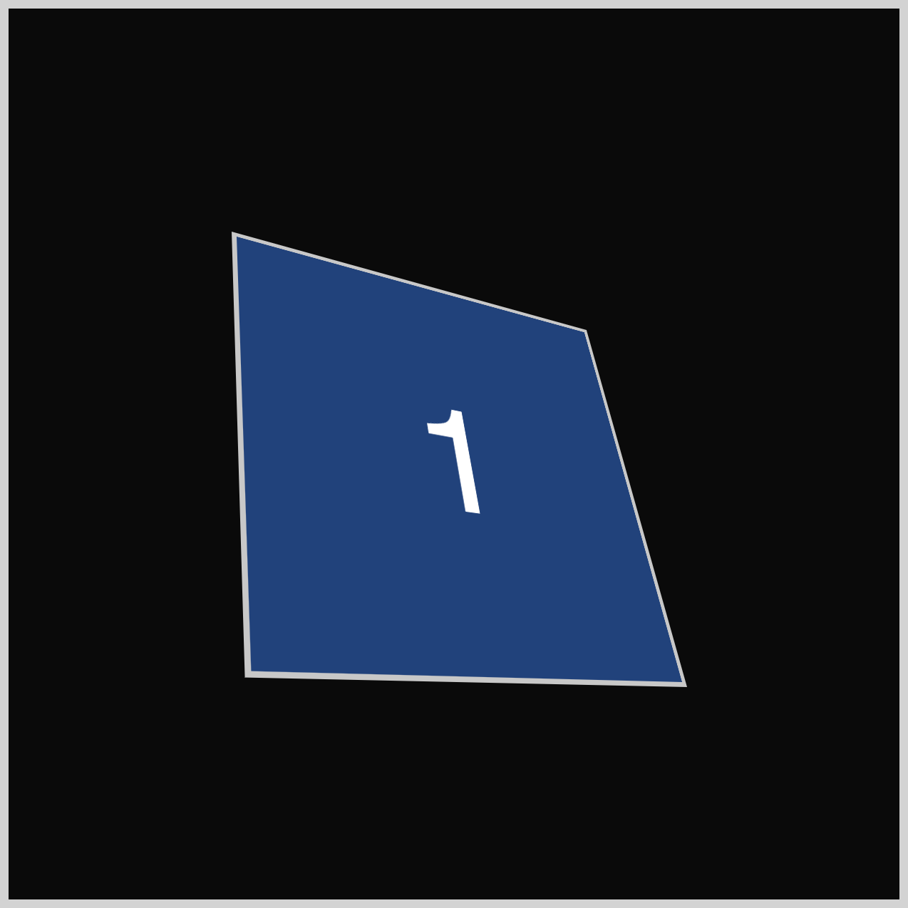
Here’s what the initial Cube looks like when 1 to 3 faces are stacked on top of each other.
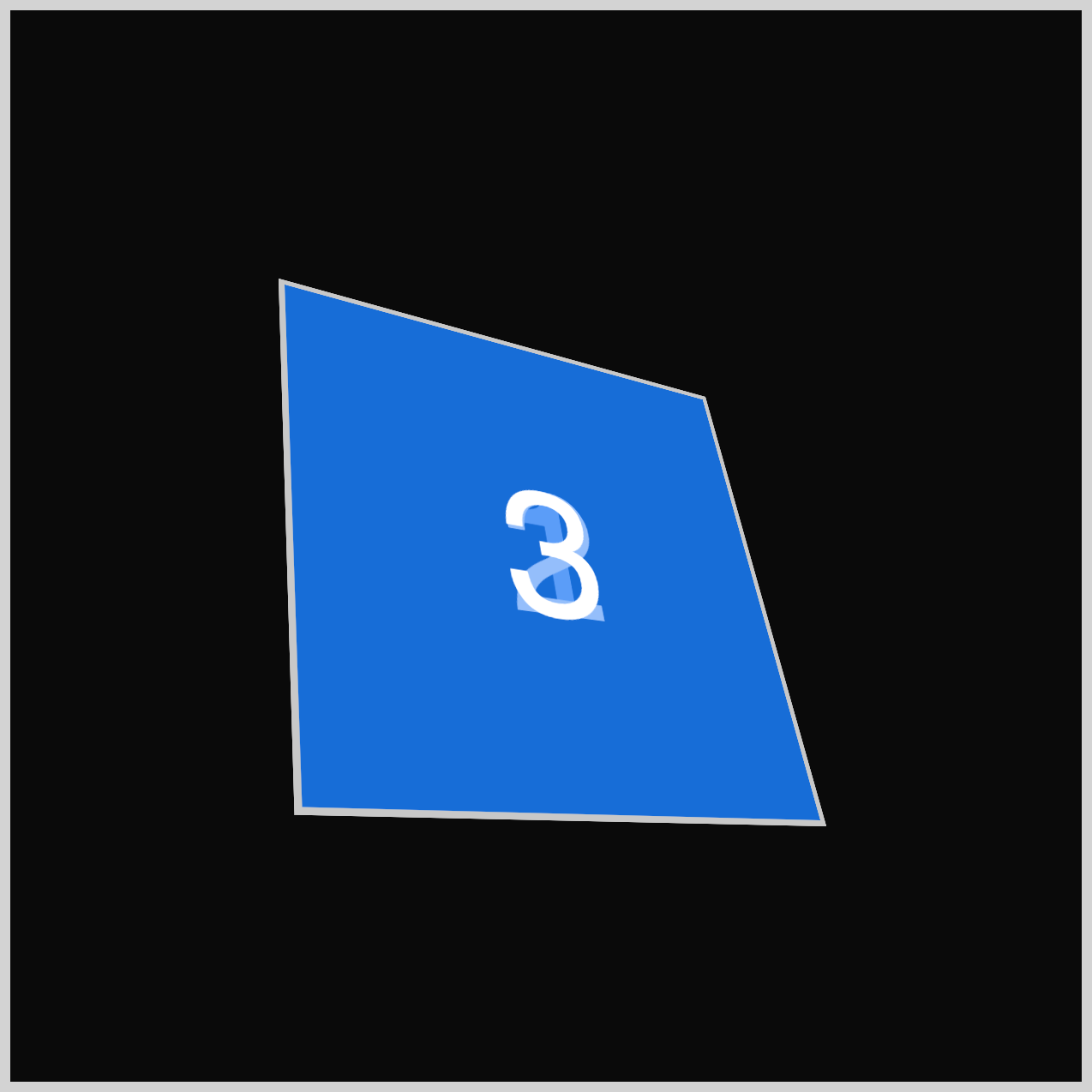
All 6 faces are stacked together.
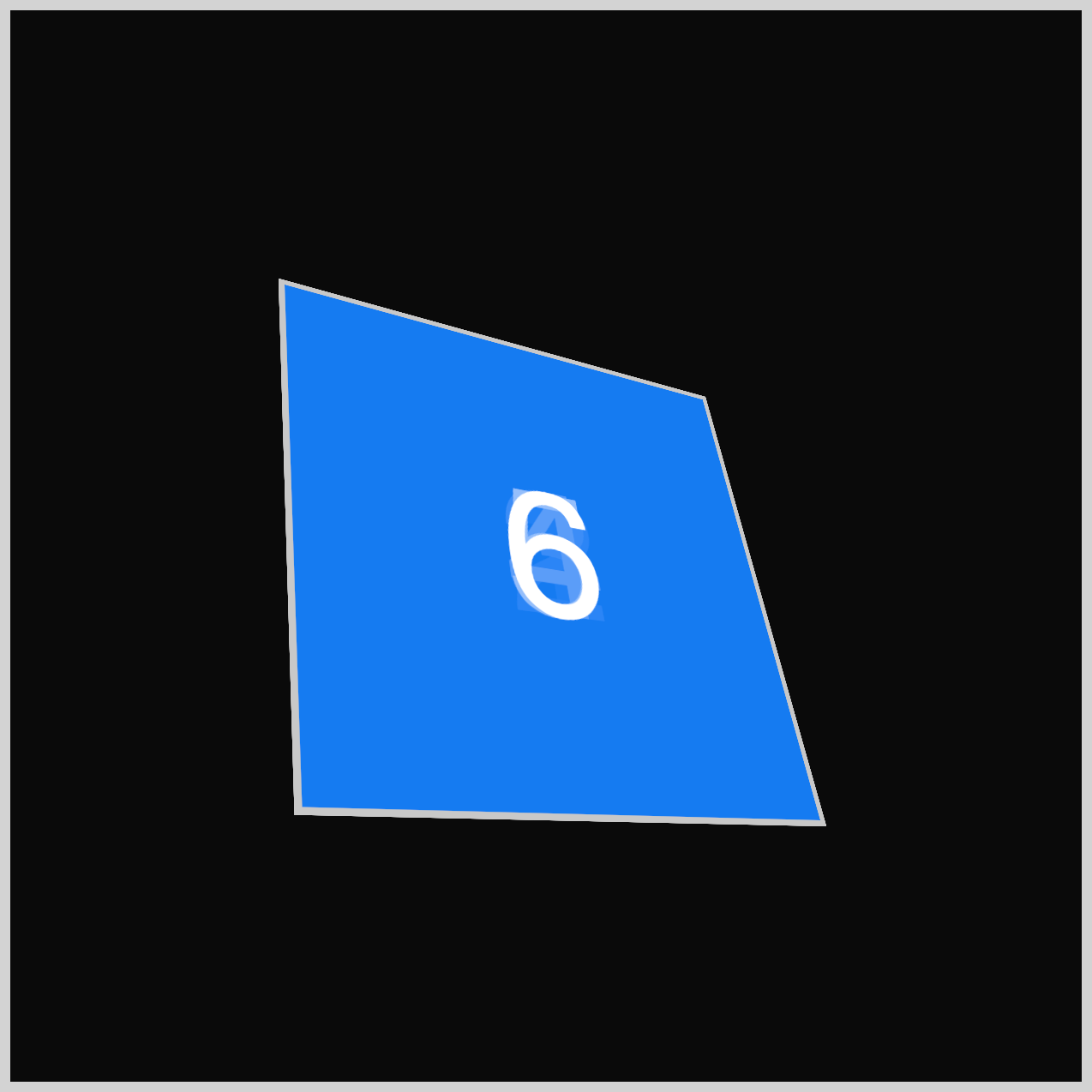
Using CSS’s rotate and translate functions, we can begin adjusting each face to arrange them into a 3D cube.
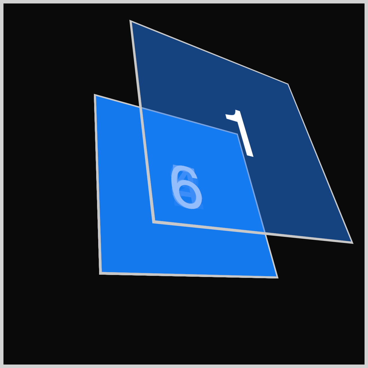
.front {
  transform: rotateY(0deg) translateZ(127.5px);
}
The Front (1) face is moved 127.5px along the z-axis using the CSS translateZ() function. All the rest of the faces will also use the translateZ(127.5px) value.
The y-axis rotation is set to 0deg using the rotateY() function.
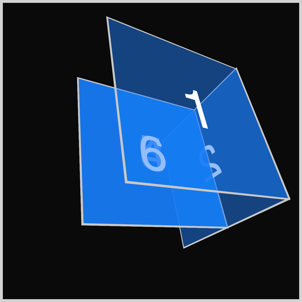
.right {
  transform: rotateY(90deg) translateZ(127.5px);
}
The Right (2) face needs to be folded out of the stack. Using rotateY(90deg), this face rotates 90 degrees out of the stack, placing it to the right of the Front (1) face.
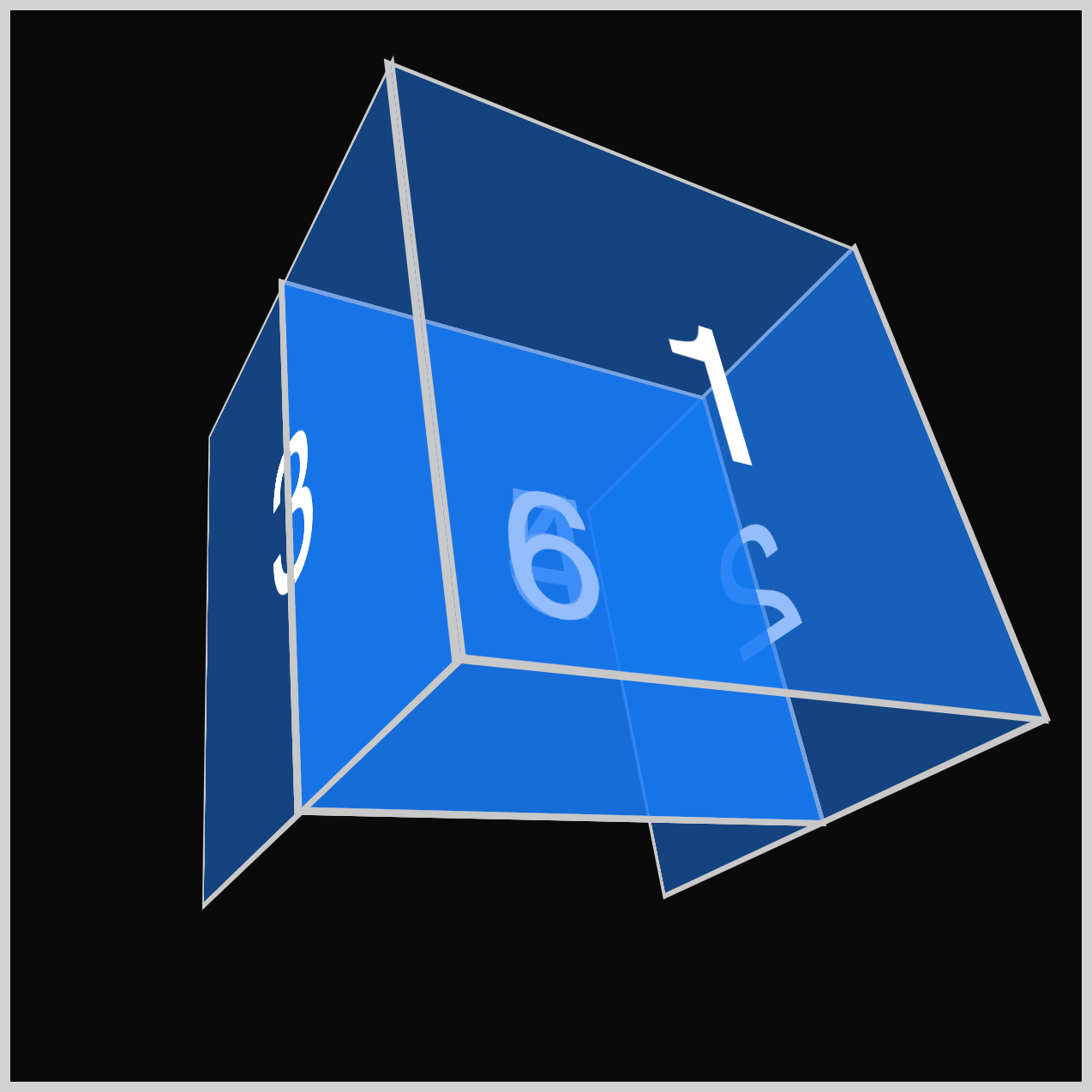
.left {
  transform: rotateY(-90deg) translateZ(127.5px);
}
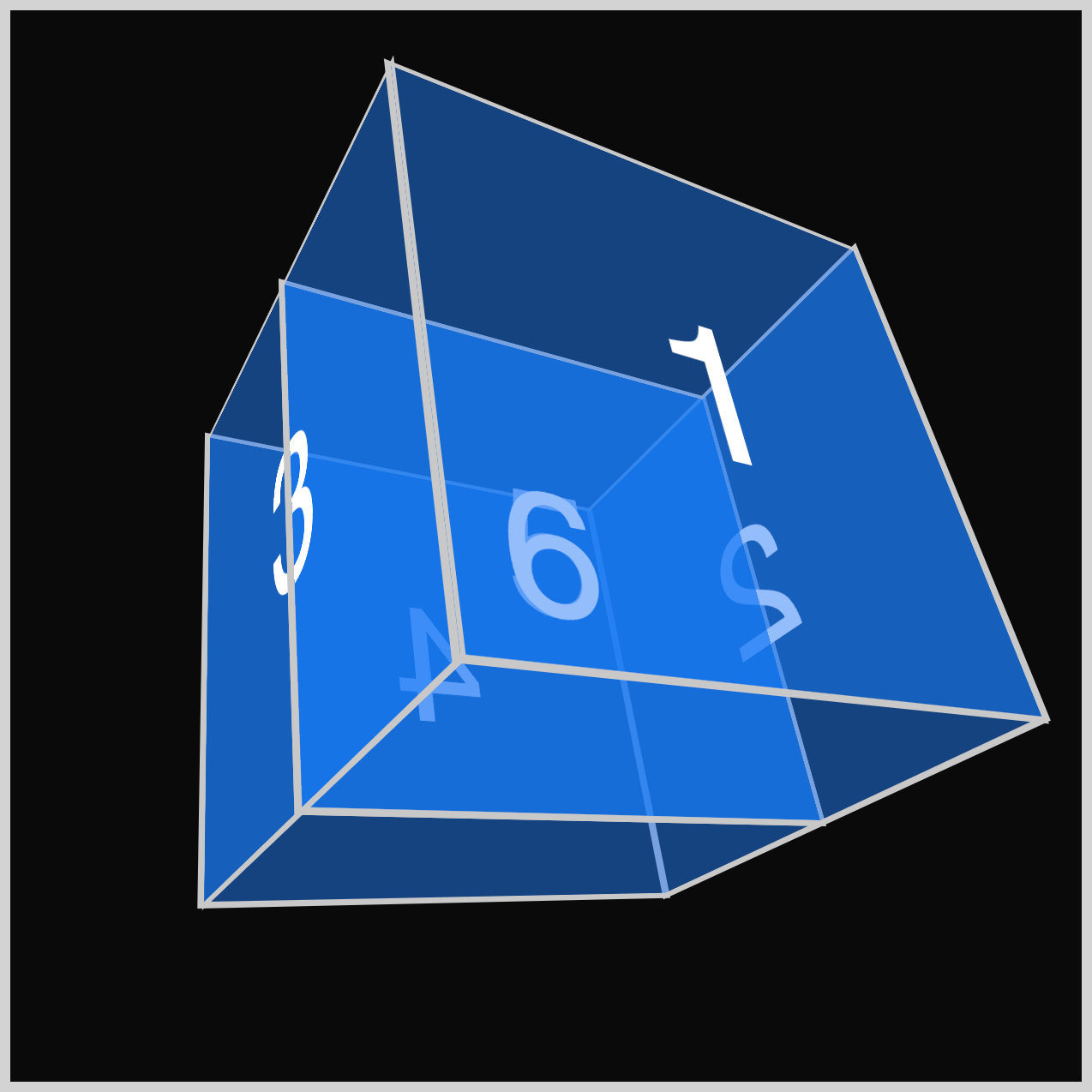
Similar to the previous Right (2) face, the Left (3) face must be folded out of the face stack. To place it on the left side, you use rotateY(-90deg) to rotate it minus (-) 90 degrees.
.back {
  transform: rotateY(180deg) translateZ(127.5px);
}
Now it’s time to rotate the Back (4) face into position. Turn it 180 degrees (180deg) on the y-axis, making sure that the number 4 is correctly aligned.
.top {
  transform: rotateX(90deg) translateZ(127.5px);
}
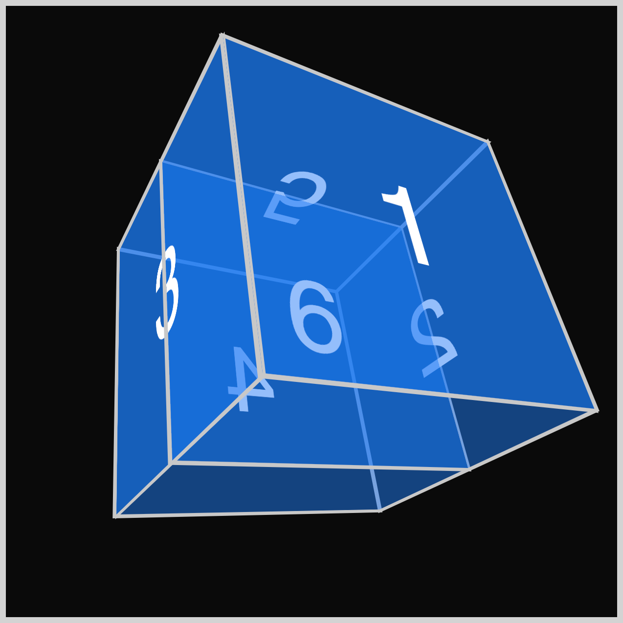
Next, the Top (5) face needs to be rotated horizontally on its x-axis using the CSS rotateX() function. Set the rotation to 90 degrees (90deg) to ensure it faces upward.

.bottom {
  transform: rotateX(-90deg) translateZ(127.5px);
}
To finish up the CSS 3D cube, rotate the Bottom (6) face minus (-) 90 degrees using rotateX(-90deg). The 3D cube is now complete, and you can rotate it to any angle of your choosing.
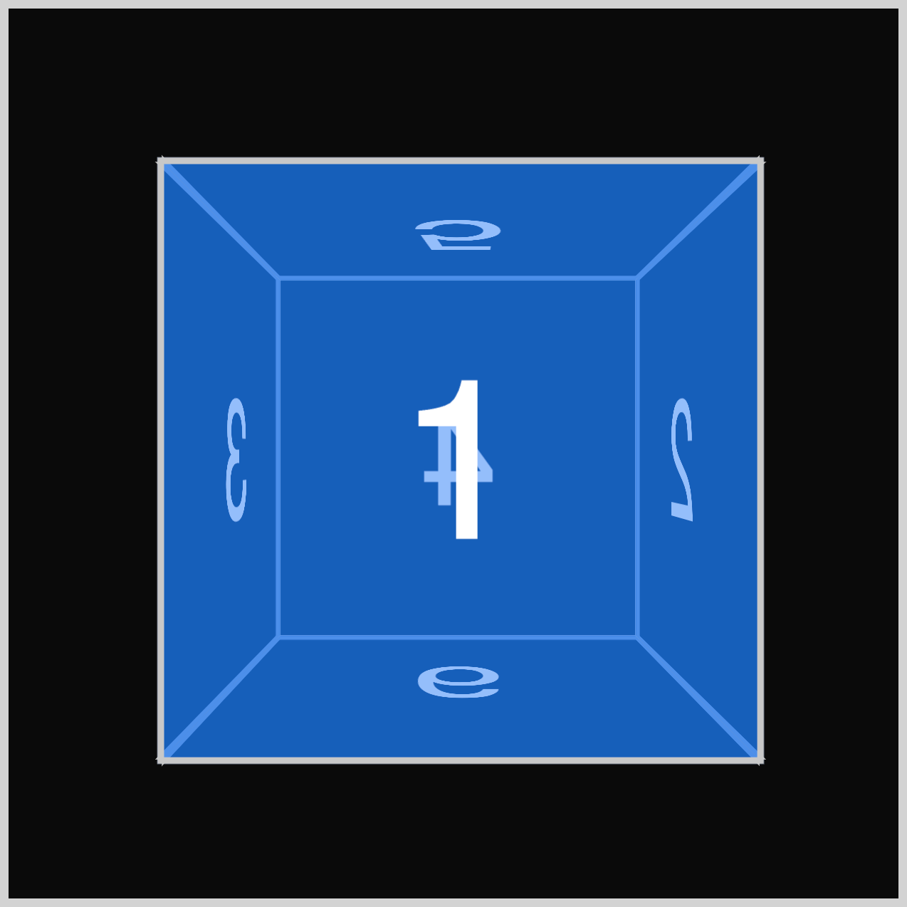
This is how Example 1 - Blue cube looks like with no rotation. In the next section, you’ll create 3 examples with different rotations.
Example 2 - Violet Cube
Example 2 will be a violet cube rotated slightly downward on its horizontal axis.
/* Cube Example 2 */
.cube-2 {
  transform: rotate3d(1, 0, 0, 60deg);
}

.example-2 {
  background-color: #6e4ff87f;
}
rotate3d(1, 0, 0, 60deg)rotates the cube by1on the x-axis and has an angle of 60 degrees (60deg).- The background color is set to a violet hue with a 50% opacity (
#6e4ff87f).

Example 3 - Orange Cube
Example 3 makes the cube look like you’re viewing it from the bottom right position.
/* Cube Example 3 */
.cube-3 {
  transform: rotate3d(1, 0, 1, 290deg);
}

.example-3 {
  background-color: #fab3677f;
}
The x- and z-axes are set to 1 and rotated by 290 degrees (290deg). It has an orange color with 50% opacity using background-color: #fab3677f.

Example 4 - Green Cube
The final cube, Example 4, rotates the cube, simulating a view from the upper left side.
/* Cube Example 4 */
.cube-4 {
  transform: rotate3d(-1, 1, 0, 65deg);
}

.example-4 {
  background-color: #0df5d37f;
}

- The x-axis is set to minus (-) 1 (
-1) - The y-axis is set to
1 - Angle is set to sixty-five degrees (
65deg) - The background color is set to a 50% translucent green shade (
#0df5d37f).
You can see and play with the complete code on Pyxofy’s CodePen page.
See the Pen CSS Art – How to Make a 3D Cube With CSS by Pyxofy (@pyxofy) on CodePen.
Conclusion
This article taught how to create a three-dimensional (3D) cube by assembling and positioning six cube faces using the CSS functions rotateY(), rotateX(), and translateZ().
Using the rotate3d() function, you changed the cube’s angles in 3D space by modifying the function’s parameter values. The 3D cube angles and viewpoints possibilities are infinite.
Modify the examples to your liking and share your masterpiece with us on LinkedIn, Threads, Bluesky, Mastodon, X (Twitter) @pyxofy, or Facebook.
We hope you liked this article. Kindly share it with your network. We appreciate it.
Related Articles
