CSS Art - Creating an Isometric Cube using CSS Transform
Making 3D objects can be difficult and time-consuming. Learn how to combine CSS and isometric projection techniques in this step-by-step article.

Introduction
Creating fully-featured three-dimensional (3D) objects for the web can be a daunting task. In this article, you’ll learn how to merge isometric projection methods with the CSS transform property to create visually appealing, “3D-ish” objects and illustrations ready for the web.
This article introduces these CSS properties and functions:
transformrepeating-linear-gradient()rotate()skewX()scaleY()translate()
Preview
A preview of the isometric cube you’ll be learning to create using CSS properties and functions.

Prerequisites
Essential CSS and HTML knowledge will help you understand the concepts and techniques introduced in this article. Jump over to this article if you require an HTML and CSS primer.
We assume you have configured tools to modify CSS. If not, this article will guide you through the setup process.
HTML Structure
<div class="container">
  <div class="isometric-cube-1">
    <div class="isometric-cube-top"></div>
    <div class="isometric-cube-right"></div>
    <div class="isometric-cube-left"></div>
  </div>
</div>
container is the outermost enclosure. It enables the content to be centered and draws a light gray border. The rest of the divs represent each image component.
Keep the HTML structure as is for the image to display correctly.
Body and Container Div CSS
CSS code for the body and container div.
/* Body and Container Settings */
/* Center shapes */
body {
  margin: 0;
  padding: 0;
  height: 100vh;
  display: flex;
  justify-content: center;
  align-items: center;
  flex-wrap: wrap;
}

/* Set background and border color */
.container {
  min-width: 500px;
  height: 500px;
  border: 5px solid lightgray;
  background: #0a0a0a;
  position: relative;
  margin: 5px;
  display: flex;
  justify-content: center;
  align-items: center;
}
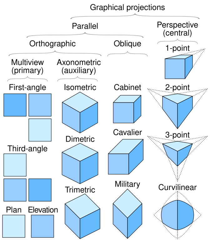
What is Isometric Projection
The term “isometric” comes from a Greek phrase meaning “equal measure,” signifying that the scale remains uniform on each axis of the projection.
Isometric projection, first defined by Professor William Farish (1759–1837), effectively represents three-dimensional (3D) objects on a two-dimensional (2D) plane, making it particularly valuable for technical and engineering illustrations.

Source: Wikipedia
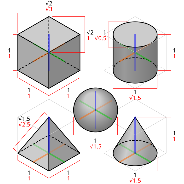
Isometric projection is a special way to draw objects that remain the same size no matter how far they are from the viewer. This makes designs clearer and avoids the confusion that can occur with other types of 3D projections.
Source: Wikipedia
By using isometric projection, you can present your ideas more reliably and effectively. It’s a straightforward way to make your visuals precise and easy to understand.
Source: Wikipedia
In the next section, you’ll learn how to implement an isometric grid guide to prepare for creating the isometric cube.
Making an Isometric Grid Guide
Employing a grid guide allows for more precise sizing and placement of isometric cube components than merely estimating or “eyeballing” them. It’s also simpler to position multiple isometric elements when using a grid guide.

Let’s make an isometric grid guide using the CSS repeating-linear-gradient() function.
The isometric grid guide is made using three color stops:
#ccca silver hue#bbba gray shadetransparenta transparent area
You’ll be making three repeating linear gradient sets using the above color stop pattern.

/* First repeating linear gradient */
repeating-linear-gradient(
    150deg,
    #ccc,
    #bbb 0.5px,
    transparent 1px,
    transparent 40px
)
- The gradient angle is set to
150degor 150 degrees. - The first color stop is
#ccc, a silver hue. #bbb, a gray shade, is the second color stop and set to0.5pxor 0.5 pixels.- The third color stop is
transparentand set to1px. - The final color stop is another
transparentarea, set to40pixels.

Next, you’ll add the second repeating gradient, creating a crisscross pattern.

/* Second repeating linear gradient */
repeating-linear-gradient(
    30deg,
    #ccc,
    #bbb 0.5px,
    transparent 1px,
    transparent 40px
)
The angle is to 30deg or 30 degrees. The color stops are the same as the previous set.

To complete the isometric grid guide, add the final repeating gradient that creates the vertical line pattern.
/* Third repeating linear gradient */
repeating-linear-gradient(
    90deg,
    #ccc,
    #bbb 0.5px,
    transparent 1px,
    transparent 41px
)
Other than the 90deg angle and the final transparent color stop adjusted to 41 pixels, 41px, the remaining values resemble those in the earlier examples.
Here’s the full isometric grid guide CSS code
/* Isometric Grid Guide */
background: repeating-linear-gradient(
    150deg,
    #ccc,
    #bbb 0.5px,
    transparent 1px,
    transparent 40px
  ),
  repeating-linear-gradient(
    30deg,
    #ccc,
    #bbb 0.5px,
    transparent 1px,
    transparent 40px
  ),
  repeating-linear-gradient(
    90deg,
    #ccc,
    #bbb 1px,
    transparent 1px,
    transparent 41px
  );
background-size: 81px 46px;
The background-size property value is set to 81px (width) and 46px (height), which controls the repeating gradient’s dimensions.
Check this article to learn more about the repeating-linear-gradient() function.
 Pyxofy
Let’s start making the isometric cube using CSS in the next section.
Creating an Isometric Cube
In this final section, you will learn how to create an isometric cube using CSS. You will utilize various CSS transform functions, including rotate(), skewX(), scaleY(), and translate().

The isometric cube consists of three square faces, each with a width and height of 130 pixels, 130px.
- Top face:
Background color is set to#085bb5, a sapphire blue color. - Right face:
Background color is set to a dark midnight blue color,#043468 - Left face:
A blue jeans,#4fa0f8, color is set as the background color.
The Top face always has a neutral color tone, and you can alternate between the highlighted and shaded areas based on the direction of the light. Here, the light source is from the left, making the Left face a lighter blue color.
Let’s start working on the Top face in the next section.
Top Face

/* Top Face */
.isometric-cube-top {
  width: 130px;
  height: 130px;
  background: #085bb5;
  transform-origin: 0 0;
  transform: rotate(210deg) skewX(-30deg) scaleY(0.864);
}
The transform-origin property value is set to 0 0 for all three faces. Let’s break down the transform property values below.

.isometric-cube-top {
  transform: rotate(210deg);
}
To position the Top face, we use the CSS rotate() function to rotate it by 210 degrees (210deg). It will temporarily extend beyond the light gray border, but that will be fixed in the next step.

.isometric-cube-top {
  transform: rotate(210deg) skewX(-30deg);
}
Immediately following the rotate() function, include skewX(-30deg). This CSS code will horizontally skew the Top face by -30 degrees, positioning it inside the light gray border.

.isometric-cube-top {
  transform: rotate(210deg) skewX(-30deg) scaleY(0.864);
}
Finish the Top face by adding scaleY(0.864), which reduces it to roughly 86% of its original size. It’s crucial to vertically scale the face by exactly 0.864 so it adheres to isometric drawing standards.
Let’s work on the Right face in the next section.
Right Face
The Right face illustrates the shadowed region of the isometric cube, with a light source originating from the left. To create a sense of depth, this face employs a darker hue than both the Top and Left faces.

/* Right Face */
.isometric-cube-right {
  position: absolute;
  height: 130px;
  width: 130px;
  background: #043468;
  transform-origin: 0 0;
  transform: rotate(-30deg) skewX(-30deg) translate(0, -113px) scaleY(0.864);
}
The position property value is configured to absolute for both the Right and following Left face.

.isometric-cube-right {
  transform: rotate(-30deg);
}
Using the CSS rotate(-30deg) function, the Right face is rotated by negative 30 degrees.

.isometric-cube-right {
  transform: rotate(-30deg) skewX(-30deg);
}
Skew the Right face horizontally by -30 degrees with skewX(-30deg).

.isometric-cube-right {
  transform: rotate(-30deg) skewX(-30deg) translate(0, -113px);
}
The Right face needs to be connected to the Top face. By using translate(0, -113px), you shift or translate the Right face upward by -113 pixels, connecting it with the Top face.

.isometric-cube-right {
  transform: rotate(-30deg) skewX(-30deg) translate(0, -113px) scaleY(0.864);
}
Finally, scale the Right face horizontally using scaleY(0.864).
Let’s work on the Left face in the next section.
Left Face
The Left face serves as the highlight area of the isometric cube, which is why it features a lighter blue compared to the Top and Right faces.

/* Left Face */
.isometric-cube-left {
  position: absolute;
  width: 130px;
  height: 130px;
  transform-origin: 0 0;
  background: #4fa0f8;
  transform: rotate(90deg) skewX(-30deg) scaleY(0.864) translate(-130.5px, 0);
}

.isometric-cube-left {
  transform: rotate(90deg);
}
The rotate(90deg) CSS property rotates the Left face 90 degrees, placing it underneath the Right face.

.isometric-cube-left {
  transform: rotate(90deg) skewX(-30deg);
}
Like the Right face, the Left face is horizontally skewed using skewX(-30deg).

.isometric-cube-left {
  transform: rotate(90deg) skewX(-30deg) scaleY(0.864);
}
Next, scale the Left face vertically using scaleY(0.864).

.isometric-cube-left {
  transform: rotate(90deg) skewX(-30deg) scaleY(0.864) translate(-130.5px, 0);
}
To connect the Left face with the other faces, apply translate(-130.5px, 0) to shift it upwards by -130.5 pixels.
You can see and play with the complete code on Pyxofy’s CodePen page.
See the Pen CSS Art – Creating an Isometric Cube using CSS Transform by Pyxofy (@pyxofy) on CodePen.
Conclusion
Isometric projection allows for the simulation of three-dimensional objects on a two-dimensional surface. It’s essential in the fields of technical and engineering illustrations. By utilizing the CSS transform property along with its functions like rotate(), skew(), scale(), and translate(), you can effortlessly incorporate isometric projections into your web designs and illustrations.
You discovered how to create an isometric grid guide using the CSS repeating-linear-gradient() function, and then you constructed an isometric cube based on this guide. Be sure to choose a light direction, as it will affect the lighting on your cube’s faces. It’s essential to include both a highlight and a shadow color tone to add depth to your CSS images.
Feel free to experiment with the code and showcase your creation with us on LinkedIn, Threads, Bluesky, Mastodon, X (Twitter) @pyxofy, or Facebook.
We hope you liked this article. Kindly share it with your network. We appreciate it.
Related Articles
 Pyxofy
 Pyxofy

 Pyxofy