CSS Art – Combining polygon() and drop-shadow() Functions
Nonagon, decagon, or a plain old arrow? Learn to make them using the CSS polygon() and drop-shadow() functions in this step-by-step article.

Introduction
You can create pentagons, decagons, and even a house using the CSS polygon() function, making it one of the most versatile tools in your CSS toolkit. Join us and learn how to combine the polygon() and drop-shadow() functions.
You’ll learn these CSS properties and functions in this article.
polygon()rotatedrop-shadow()
Preview

To create the arrow shapes, you will use the CSS polygon() function combined with the rotate property. The CSS drop-shadow() function is used to add a drop-shadow effect.
Prerequisites
Essential CSS and HTML knowledge will help you understand the concepts and techniques introduced in this article. Jump over to this article if you require an HTML and CSS primer.
We assume that you have set up tools to manipulate CSS. If you haven’t, this article will show you how to set them up.
HTML Structure
<div class="container">
  <div class="shadow">
    <div class="shape-1 arrow"></div>
    <div class="shape-2 arrow"></div>
    <div class="shape-3 arrow"></div>
    <div class="shape-4 arrow"></div>
  </div>
</div>
container is the outermost enclosure. It enables the content to be centered and draws a light gray border. The rest of the divs represent each image component.
Keep the HTML structure as is for the image to display correctly.
Body and Container Div CSS
CSS code for the body and container div.
/* Body and Container Settings */
/* Center shapes */
body {
  margin: 0;
  padding: 0;
  height: 100vh;
  display: flex;
  justify-content: center;
  align-items: center;
  flex-wrap: wrap;
}

/* Set background and border color */
.container {
  min-width: 500px;
  height: 500px;
  border: 5px solid lightgray;
  background: white;
  position: relative;
  margin: 5px;
  display: flex;
  justify-content: center;
  align-items: center;
}
Shared Properties
You’ll consolidate the shared CSS properties to make your CSS code more manageable and adhere to the DRY (Don’t Repeat Yourself) principle.
/* Shared Properties */
.arrow,
.shadow,
.shape-1,
.shape-2,
.shape-3,
.shape-4 {
  position: absolute;
}
All components’ position property value is set to absolute.
Let’s learn about the polygon() function in the next section.
polygon() Function
Using the CSS polygon() function, you’ll create an arrow template, ensuring that all four arrow shapes remain consistent.
/* Shape Template */
.arrow {
  width: 166px;
  height: 160px;
  clip-path: polygon(67% 0, 100% 50%, 67% 100%, 0 100%, 0 0);
}
The arrow template width is set to 166px and its height will be 160px.
The polygon() function takes comma-separated coordinates or points as inputs. Each point consists of a pair of space-separated x (horizontal axis) and y (vertical axis) values that define the coordinates of the points within the polygon.
polygon(x1 y1, x2 y2, x3 y3, x4 y4, x5 y5)
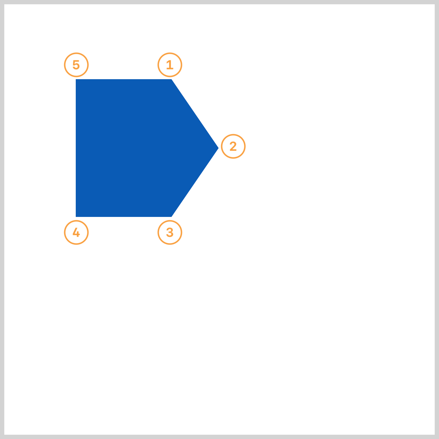
Let’s break down the polygon() points using the following illustration.

Point ① begins at the top right, with each subsequent point positioned clockwise, concluding with ⑤.
① 67% 0
② 100% 50%
③ 67% 100%
④ 0 100%
⑤ 0 0
You can use CSS clip-path maker applications to create the polygon coordinates visually. For a more detailed explanation of the polygon() function and clip-path, check this article.

Let’s work on the arrows in the next section.
Arrows
The initial blue arrow, along with the other arrows, is based on the default shape template described in the previous section. Before creating the arrow shapes, let’s take a short detour regarding the shape template’s positioning within the container element.
The arrow and shapes (shape-1 through shape-4) are enclosed by a container div element.
<div class="container"> <!-- Centering CSS applied here -->
  <div class="shadow">
    <div class="shape-1 arrow"></div>
    <div class="shape-2 arrow"></div>
    <div class="shape-3 arrow"></div>
    <div class="shape-4 arrow"></div>
  </div>
</div>
The CSS properties display, justify-content, and align-items of the container element are configured to center its contents, which affects the arrow’s top and left positioning.
.container {
  display: flex;
  justify-content: center;
  align-items: center;
}
You’ll be using negative pixel values, px, to reposition the arrows from their default center location.

.shape-1 {
  top: -163px;
  left: -167px;
  background: #085bb5;
}
shape-1 is a blue, #085bb5, arrow and positioned -163px from the top and -167px from the left.

.shape-2 {
  top: -163px;
  left: -3px;
  background: #f99f3e;
}
Apart from its orange hue, #f99f3e and its placement, shape-2, is identical to shape-1.

.shape-2 {
  rotate: 90deg;
}
Set the rotate property value to 90deg to point shape-2 downwards.

.shape-3 {
  top: 3px;
  left: -3px;
  background: #2708b5;
  rotate: 180deg;
}
The shape-3 arrow is positioned 3px from the top and -3px from the left. Its background color is #2708b5, an indigo hue, and it is rotated at an angle of 180deg.

.shape-4 {
  top: 3px;
  left: -167px;
  background: #08b95b;
  rotate: -90deg;
}
The last arrow, shape-4, features a green color, #08b95b, rotated at -90deg and positioned 3px from the top and -167px from the left.
In the next section, you’ll discover how to add drop shadow effects to the arrows.
Applying drop-shadow()
In this final section, you’ll learn how to apply a drop shadow effect on the arrows.
A quick recap. The arrow shape was made using the clip-path: polygon() function.
clip-path: polygon(67% 0, 100% 50%, 67% 100%, 0 100%, 0 0);
CSS clip-path defines a clipping area, determining which portions of an element are visible. Content within this area is displayed, while content outside it is concealed or clipped.
<div class="container">
  <div class="shadow"> <!-- Apply drop shadow here -->
    <div class="shape-1 arrow"></div>
    <div class="shape-2 arrow"></div>
    <div class="shape-3 arrow"></div>
    <div class="shape-4 arrow"></div>
  </div>
</div>
Directly applying a drop shadow effect to the arrow shape isn't possible because clip-path will cut it off. Instead, you should add the effect to a parent HTML element. Here, it's applied to the shadow div, a parent element, which encompasses all arrow shapes, from shape-1 to shape-4.

.shadow {
  filter: drop-shadow(-1px 6px 3px #3309);
}
The drop-shadow() horizontal offset is set to -1px, putting it on the left side of the arrow. The vertical offset is set to 6px, which moves the shadow slightly below the arrow. 3px is set for the blur value.
Check this article if you want to dive deeper into CSS shadows.

You can see and play with the complete code on Pyxofy’s CodePen page.
See the Pen CSS Art - Combining polygon() and drop-shadow() Functions by Pyxofy (@pyxofy) on CodePen.
Conclusion
You learned to combine multiple CSS properties and functions such as polygon(), drop-shadow(), and rotate in this article. You made arrow shapes using the polygon() function and changed their angles using the rotate CSS property.
Applying drop shadow effects directly to the arrows was challenging due to clip-path restrictions. You learned a workaround by applying the drop-shadow() function on the arrows’ parent HTML element.
What images will you make using the techniques you learned in this article? Share your masterpiece with us on LinkedIn, Threads, Mastodon, X (Twitter) @pyxofy, or Facebook.
We hope you liked this article. Kindly share it with your network. We appreciate it.
Related Articles


