CSS Art – Combining Gradients and Custom Properties – Part 2
Fireworks are dazzling, spectacular, and enjoyable to observe for any celebration. Join us and learn how to create them step-by-step using CSS.

Introduction
A glowing line streaks into the sky, exploding into multi-colored lights illuminating the night sky. Fireworks have dazzled us for millennia.
In the second part of this two-part series, you will discover how to create fireworks using CSS.
CSS functions you’ll be learning to use in this article
repeating-conic-gradient()repeating-linear-gradient()scale()drop-shadow()
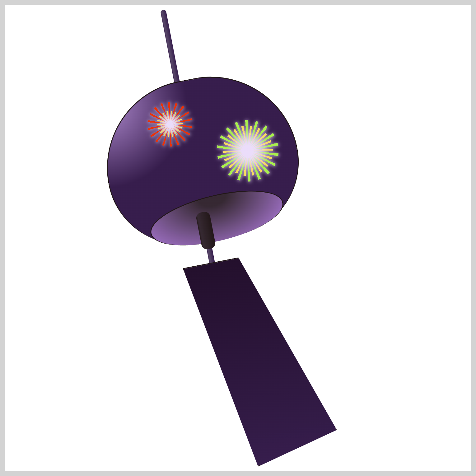
Preview

In part 1 of this two-part article, you learned how to make the Furin wind chime. In this article, you will learn how to combine multiple CSS gradients to make fireworks and fireworks streaks.
Prerequisites
Essential CSS and HTML knowledge will help you understand the concepts and techniques introduced in this article. Jump over to this article if you require an HTML and CSS primer.
We assume that you have set up tools to create CSS art. If you haven’t, this article will show you how to set them up.
HTML Structure
<div class="container">
  <div class="string"></div>
  <div class="bowl-gaiken"></div>
  <div class="bell-clapper-zetsu"></div>
  <div class="paper-tanzaku"></div>
  <div class="firework"></div>
  <div class="firework-2"></div>
  <div class="firework-3"></div>
  <div class="firework-4"></div>
  <div class="firework-streaks">
    <div class="streak-1">
      <div class="streak"></div>
    </div>
    <div class="streak-2">
      <div class="streak"></div>
    </div>
    <div class="streak-3">
      <div class="streak"></div>
    </div>
  </div>
</div>
container is the outermost enclosure. It enables the content to be centered and draws a light gray border. The rest of the divs represent each image component.
Keep the HTML structure as is for the image to display correctly.
Body and Container Div CSS
CSS code for the body and container div.
/* Body and Container Settings */
/* Center shapes */
body {
  margin: 0;
  padding: 0;
  height: 100vh;
  display: flex;
  justify-content: center;
  align-items: center;
  flex-wrap: wrap;
}

/* Set background and border color */
.container {
  min-width: 500px;
  height: 500px;
  border: 5px solid lightgray;
  background: transparent;
  position: relative;
  margin: 5px;
  display: flex;
  justify-content: center;
  align-items: center;
  overflow: hidden;
}
Fireworks
You will be combining the CSS radial-gradient() and repeating-conic-gradient() functions to design four unique, colorful fireworks patterns. The CSS drop-shadow() is used to create the glow effect.
Firework 1
To create multi-colored fireworks patterns, you’ll layer multiple CSS gradients on top of each other.

/* Firework 1 */
.firework {
  position: absolute;
  width: 120px;
  height: 120px;
  top: 68px;
  left: 117px;
  background: repeating-conic-gradient(
    transparent 0deg 15deg,
    var(--fireworks-2) 15deg 20deg
  );
}
Firework 1 is a 120px square and positioned 68px from the top and 117px from the left. The repeating conic gradient alternates between a transparent color from 0 to 15 degrees and an electric orange, --fireworks-2: #ea3109, from 15 and 20 degrees. You can change the repeating pattern by adjusting the degree values.

.firework {
  border-radius: 50%;
}
Round out the square shape by setting its border-radius property value to 50%.

.firework {
  transform: scale(0.4);
}
You need to resize Firework 1 to fit within the Furin’s bowl. You can change its width and height property values or you can use the scale() CSS function. Set the scale() property value to 0.4 to shrink Firework 1 to 40% of its original size.

.firework {
  filter: drop-shadow(var(--fireworks-6) 1px 1px 5px);
}
Let’s apply a glow effect to Firework 1 using the CSS drop-shadow() function. First, set the color to --fireworks-6: #ebddfa;, a light lavender hue, and then set the offset length property value to 1px 1px 5px.
Check this article to learn about different CSS shadows.
 Pyxofy
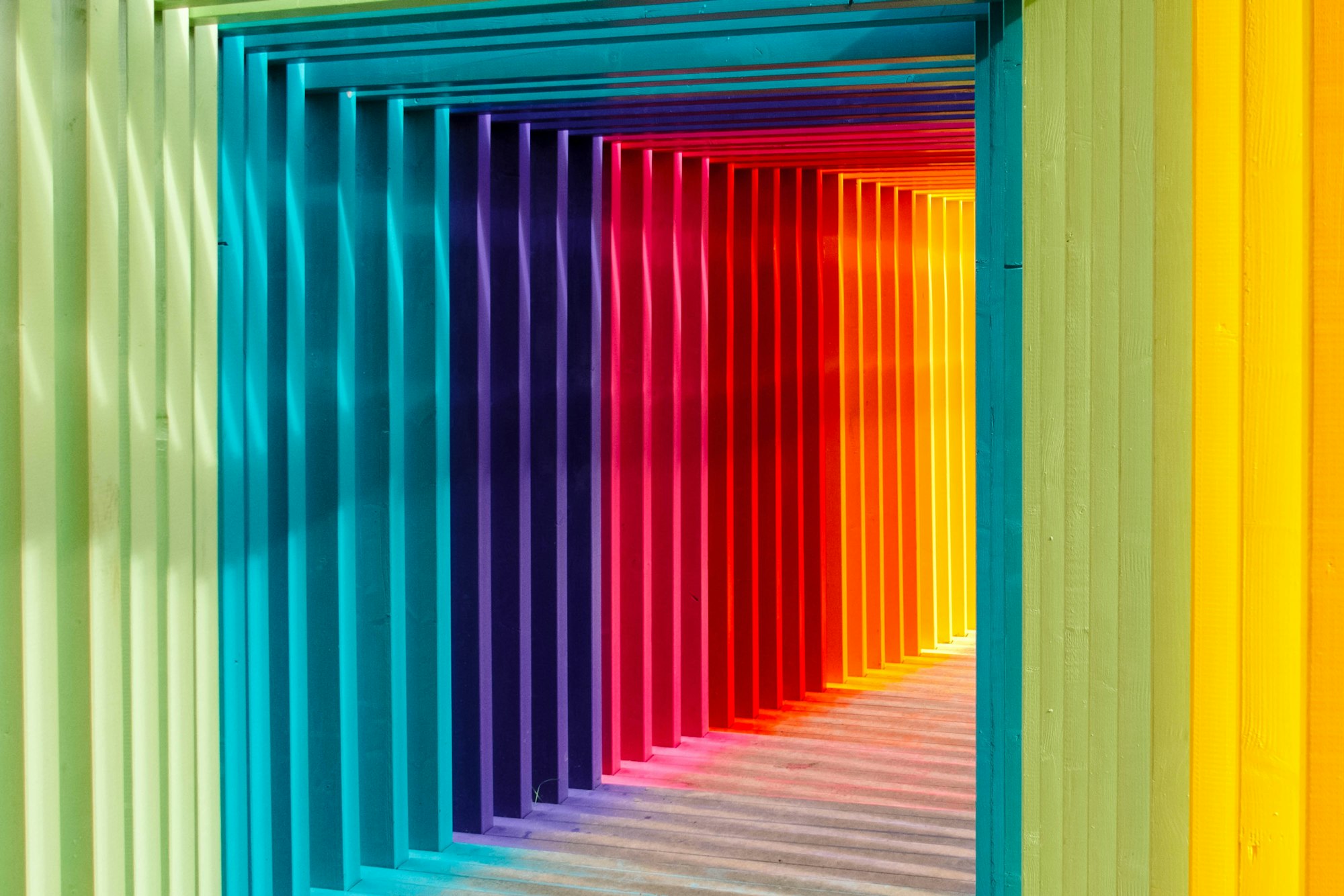

.firework::after {
  content: "";
  position: absolute;
  width: 70px;
  height: 70px;
  top: 25px;
  left: 25px;
  background: radial-gradient(var(--fireworks-6) 0% 15%, transparent 60%);
}
To create the second layer of Firework 1, you will use the CSS ::after pseudo-element. You’ll make the center white gradient by setting the background property value to radial-gradient(var(--fireworks-6) 0% 15%, transparent 60%);
The color --fireworks-6: #ebddfa is a Light Lavender color, and it will fill the space between 0% and 15%. The area between 60% and 100% will be transparent.

.firework::after {
  background: radial-gradient(var(--fireworks-6) 0% 15%, transparent 60%),
    repeating-conic-gradient(
      from 5deg,
      var(--fireworks-1) 0deg 5deg,
      transparent 5deg 20deg
    );
}
Let’s layer another repeating conic gradient after the radial gradient.
- The repeating gradient will start from
5degand will be positioned between the orange lines. - Set the color to yellow using
var(--fireworks-1)and set it to occupy0degto5deg. - Finally, set a
transparentarea between5degand20degto allow the orange lines to shine through.

.firework::after {
  border-radius: 50%;
}
Use border-radius: 50%; to round the square’s borders.
Let’s work on Firework 2 in the next section.
Firework 2
Firework 2 is a slight variation of Firework 1. Firework 2 will have longer inner rays than Firework 1. Only the difference between Firework 2 and Firework 1 will be explained for brevity.

/* Firework 2 */
.firework-2 {
  position: absolute;
  width: 165px;
  height: 165px;
  top: 74px;
  left: 178px;
  background: repeating-conic-gradient(
    transparent 0deg 15deg,
    var(--fireworks-10) 15deg 20deg
  );
}
Firework 2 starts as a 165px square and is positioned 74px from the top and 178px from the left. The outer repeating conic gradient is colored green with --fireworks-10: #a9ef4d.

.firework-2 {
  border-radius: 50%;
}
To round out the square borders, set 50% for the border-radius property value.

.firework-2 {
  transform: scale(0.4);
}
transform: scale(0.4); will scale down the gradient to 40% of its original size.

.firework-2 {
  filter: drop-shadow(var(--fireworks-6) 1px 1px 5px);
}
Apply the white drop shadow with drop-shadow(var(--fireworks-6) 1px 1px 5px);

.firework-2::after {
  content: "";
  position: absolute;
  width: 135px;
  height: 135px;
  top: 15px;
  left: 15px;
  background: radial-gradient(var(--fireworks-6) 0% 15%, transparent 60%);
}
The Firework 2’s inner area is a 135px square.

.firework-2::after {
  background: radial-gradient(var(--fireworks-6) 0% 15%, transparent 60%),
    repeating-conic-gradient(
      from 5deg,
      var(--fireworks-1) 0deg 5deg,
      transparent 5deg 20deg
    );
}
.firework-2::after {
  border-radius: 50%;
}
You’ve completed Firework 2. Let’s work on Firework 3 in the following section.
Firework 3
Fireworks 3 and 4 will feature a simpler, more streamlined design when compared to the preceding Fireworks 1 and 2.

/* Firework 3 */
.firework-3 {
  position: absolute;
  width: 20px;
  height: 20px;
  top: 88px;
  left: 220px;
  background: radial-gradient(var(--fireworks-8) 0% 10%, transparent 70%);
}
Firework 3 is a 20px square and is the smallest out of all four fireworks. The radial gradient is a yellow hue and is set using --fireworks-8: #efd80a;. The yellow color will become transparent from 70%.

.firework-3 {
  background: radial-gradient(var(--fireworks-8) 0% 10%, transparent 70%),
    repeating-conic-gradient(
      transparent 0deg 15deg,
      var(--fireworks-9) 15deg 30deg
    );
}
Use --fireworks-9: #ff4400; to give the repeating conic gradient a red-orange color.

.firework-3 {
  border-radius: 50%;
}
Round out the corners using border-radius: 50%;.

.firework-3 {
  filter: drop-shadow(var(--fireworks-6) 1px 2px 10px);
}
Apply a white drop shadow with drop-shadow(var(--fireworks-6) 1px 2px 10px);.
Firework 4
Besides the size and color, Firework 4 is similar to Firework 3. Therefore, code explanations will not be provided for brevity.

/* Firework 4 */
.firework-4 {
  position: absolute;
  width: 30px;
  height: 30px;
  top: 175px;
  left: 148px;
  background: radial-gradient(var(--fireworks-4) 0% 10%, transparent 40%);
}

.firework-4 {
  background: radial-gradient(var(--fireworks-4) 0% 10%, transparent 40%),
    repeating-conic-gradient(
      transparent 0deg 15deg,
      var(--fireworks-5) 15deg 30deg
    );
}

.firework-4 {
  border-radius: 50%;
}

.firework-4 {
  filter: drop-shadow(var(--fireworks-6) 0px 0px 10px);
}
Ok, you’ve completed all four fireworks. In the final section, let’s work on the firework streak images.
Firework Streak
The Firework Streak image is composed of two parts:
- A repeating vertical line
- A teardrop shape
The CSS repeating-linear-gradient() function will be used to create the repeating vertical line, and the function radial-gradient() will be used to form the teardrop shape. Firework Streak 1 will serve as the foundation image, and it will be modified to produce Firework Streaks 2 and 3.

/* Firework Streak 1 */
.streak {
  position: absolute;
  width: 2px;
  height: 147px;
  top: 308px;
  left: 272px;
  background: repeating-linear-gradient(
    to bottom,
    var(--fireworks-7) 40%,
    transparent 60%
  );
}
Set the firework streak width to 2px and height to 147px. The repeating linear gradient angle direction is set to bottom and alternates between bright lavender, --fireworks-7: #bc92df; and transparent color.

.streak {
  transform: rotate(-25deg);
}
Rotate the the angle to -25deg.

.streak {
  border-radius: 50%;
}
Round the square corners.

.streak {
  filter: drop-shadow(var(--fireworks-6) 1px 1px 5px);
}
Apply a white drop shadow.

.streak::before {
  content: "";
  position: absolute;
  width: 10px;
  height: 10px;
  top: -12px;
  left: -4px;
  background: radial-gradient(
    at 5% 30%,
    var(--fireworks-6) 10%,
    var(--fireworks-5) 60%
  );
}
To create the teardrop shape, you’ll be using the ::before pseudo-element. Position the teardrop shape on top of the repeating vertical line by setting its top property value to -12px and the left value to -4px.
The radial gradient begins with a light lavender color, --fireworks-6: #ebddfa; and then transitions to a wild strawberry color, --fireworks-5: #f741b1;.

.streak::before {
  border-radius: 90px 140px 30px 140px;
}
border-radius: 90px 140px 30px 140px; rounds out the square corners, making it a more teardrop shape.

.streak::before {
  transform: rotate(45deg);
}
Rotate it 45deg to align the angle with the vertical repeating line.

/* Firework Streak 2 */
.streak-2 .streak {
  width: 2px;
  height: 90px;
  top: 374px;
  left: 265px;
}
To create Firework Streak 2, you modify the width, height, top, and left property values inherited from Firework Streak 1. Take note that you’re using two CSS selectors, .streak-2 and .streak.

/* Firework Streak 3 */
.streak-3 .streak {
  width: 2px;
  height: 55px;
  top: 388px;
  left: 312px;
}
Same as the previous Firework Streak 2, you modify the inherited property values to create Firework Streak 3. The CSS selectors will be .streak-3 and .streak.
You have successfully finished coding the CSS for the fireworks and firework streaks. Pat yourself on the back! Hooray!
You can see and play with the complete code on Pyxofy’s CodePen page.
See the Pen CSS Art – Combining Gradients and Custom Properties by Pyxofy (@pyxofy) on CodePen.
Conclusion
In this article, you learned how to combine an assortment of CSS gradient functions such as repeating-linear-gradient(), repeating-conic-gradient(), and radial-gradient() to make the fireworks and firework streaks.
You gained the knowledge of using the CSS drop-shadow() function to add glowing effects, and you employed the scale() to adjust the size of the images.
What amazing images will you come up with using CSS gradients and CSS custom properties? Share your masterpiece with us on LinkedIn, Threads, Mastodon, X (Twitter) @pyxofy, or Facebook.
We hope you liked this article. Kindly share it with your network. We appreciate it.
Related Articles
Pyxofy Pyxofy
 Pyxofy