CSS Animation – Turntable – Part 2
In part 2 of this two-part step-by-step article, join us in learning how to create and animate an audio meter, headshell light, and many more.

Introduction
In part 1 of this two-part article, you learned how to animate the power button, record, and the slider button. In part 2, you will learn how to make an audio meter and animate the rest of the components.
You’ll learn how to use CSS properties such as transform-origin, height, background, transform: rotate() function, and many more in this article.
Preview
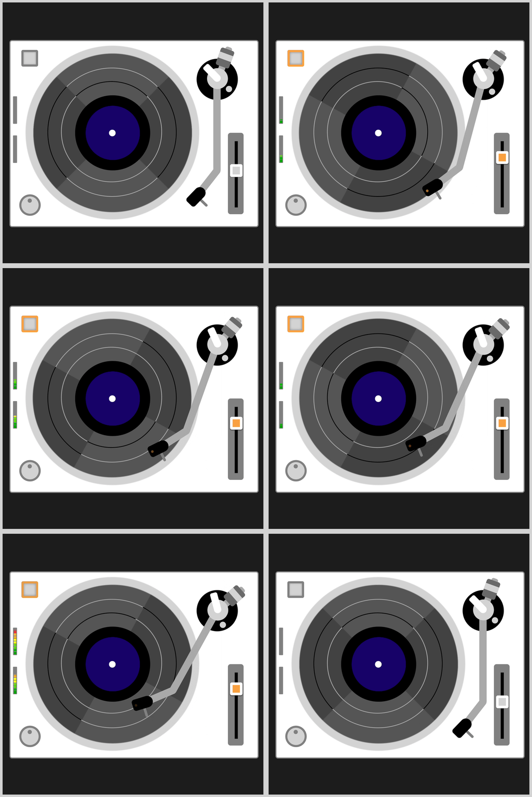
For part 2, you’ll make and animate these components:
- Tonearm Unit
- Headshell Light
- Audio Meter

Prerequisites
Essential CSS and HTML knowledge will help you understand the concepts and techniques introduced in this article. Jump over to this article if you require an HTML and CSS primer.
We assume that you have set up tools to manipulate CSS. If you haven’t, this article will show you how to set them up.
Please read this article if you’re unfamiliar with CSS animation and the @keyframes at-rule property.
HTML Structure
<div class="container">
  <!-- Base -->
  <div class="base"></div>
  <div class="power-button"></div>
  <div class="volume-button"></div>
  <div class="audio-meter-top"></div>
  <div class="audio-meter-bottom"></div>

  <!-- Turntable -->
  <div class="record"></div>
  <div class="record-center"></div>
  <div class="record-ring-1"></div>
  <div class="record-ring-2"></div>

  <!-- Slider -->
  <div class="slider-base"></div>
  <div class="slider-rail"></div>
  <div class="slider-button"></div>

  <!-- Tone arm -->
  <div class="tone-arm-unit">
    <div class="arm-base"></div>
    <div class="weight-arm"></div>
    <div class="weight"></div>
    <div class="tone-arm"></div>
    <div class="pivot-base"></div>
    <div class="pivot-mech"></div>
    <div class="headshell"></div>
  </div>
</div>
container is the outermost enclosure. It enables the content to be centered and draws a light gray border. The rest of the divs represent each animation sequence.
Keep the HTML structure as is for the animation to display correctly.
Body and Container Div CSS
CSS code for the body and container div.
/* Body and Container Settings */
/* Center shapes */
body {
  margin: 0;
  padding: 0;
  height: 100vh;
  display: flex;
  justify-content: center;
  align-items: center;
}

/* Set background and border color */
.container {
  width: 500px;
  height: 500px;
  border: 5px solid lightgray;
  background: #1c1c1c;
  position: relative;
  display: flex;
  justify-content: center;
  align-items: center;
Tonearm Unit
The tonearm unit with the headshell and stylus is responsible for reading and transferring the analog signals from the vinyl record.
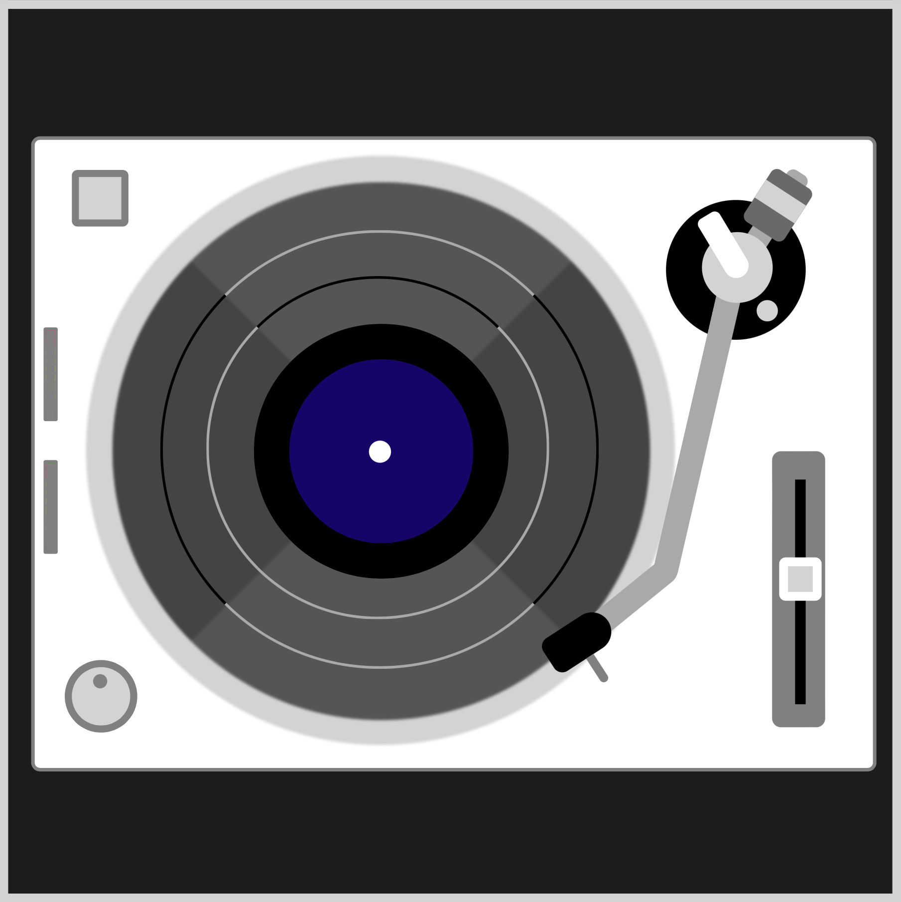
In the original turntable CSS art code, all the tonearm components are separate HTML divs. With separate divs, it will be challenging to animate all the tonearm components.
<!-- Tone arm -->
<div class="arm-base"></div>
<div class="weight-arm"></div>
<div class="weight"></div>
<div class="tone-arm"></div>
<div class="pivot-base"></div>
<div class="pivot-mech"></div>
<div class="headshell"></div>
To simplify the animation code, the tonearm components are consolidated in a new parent div called tonearm-unit. The animation code only needs to target the tonearm-unit div.
<!-- Tone arm -->
<div class="tonearm-unit">
  <div class="arm-base"></div>
  <div class="weight-arm"></div>
  <div class="weight"></div>
  <div class="tone-arm"></div>
  <div class="pivot-base"></div>
  <div class="pivot-mech"></div>
  <div class="headshell"></div>
</div>
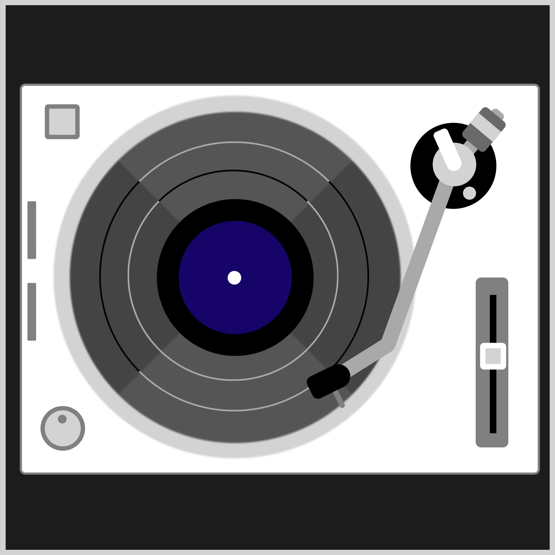
/* Tonearm Unit */
.tonearm-unit {
  position: absolute;
  width: 79px;
  height: 79px;
  left: 372px;
  top: 108px;
  transform-origin: center;
  animation: tonearm-unit linear 10s infinite;
}
The CSS transform-origin: center ensures that the tonearm unit rotates at its center point.
The animation name is tonearm-unit, and the animation timing will be linear, lasting for ten seconds, 10s, and loops infinitely with infinite.
@keyframes tonearm-unit {
  from {
    transform: rotate(0deg);
  }
  15% {
    transform: rotate(0deg);
  }
  20% {
    transform: rotate(13deg);
  }
  50% {
    transform: rotate(20deg);
  }
  93% {
    transform: rotate(30deg);
  }
  to {
    transform: rotate(0deg);
  }
}
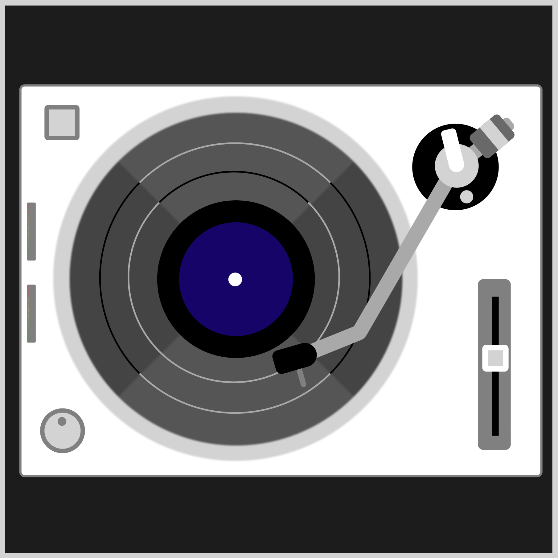
You will animate the tonearm unit by rotating it using the CSS transform: rotate() function. You use deg or degrees value within the function to control the angle of the tonearm unit.
13deg: Record starting point20deg: Midpoint30deg: Record ending point
Take note that the tonearm unit will not move between the from and 15% keyframes. Setting 0deg in the CSS rotate() function brings the tonearm unit back to its original position.
You’ve completed the tonearm unit animation. Up next is the headshell light.
Headshell Light
The headshell light is a small round, pulsing orange light you’ll add to the headshell using the CSS ::after pseudo-element. The pulsing headshell light calls attention to the headshell and tonearm unit movement.
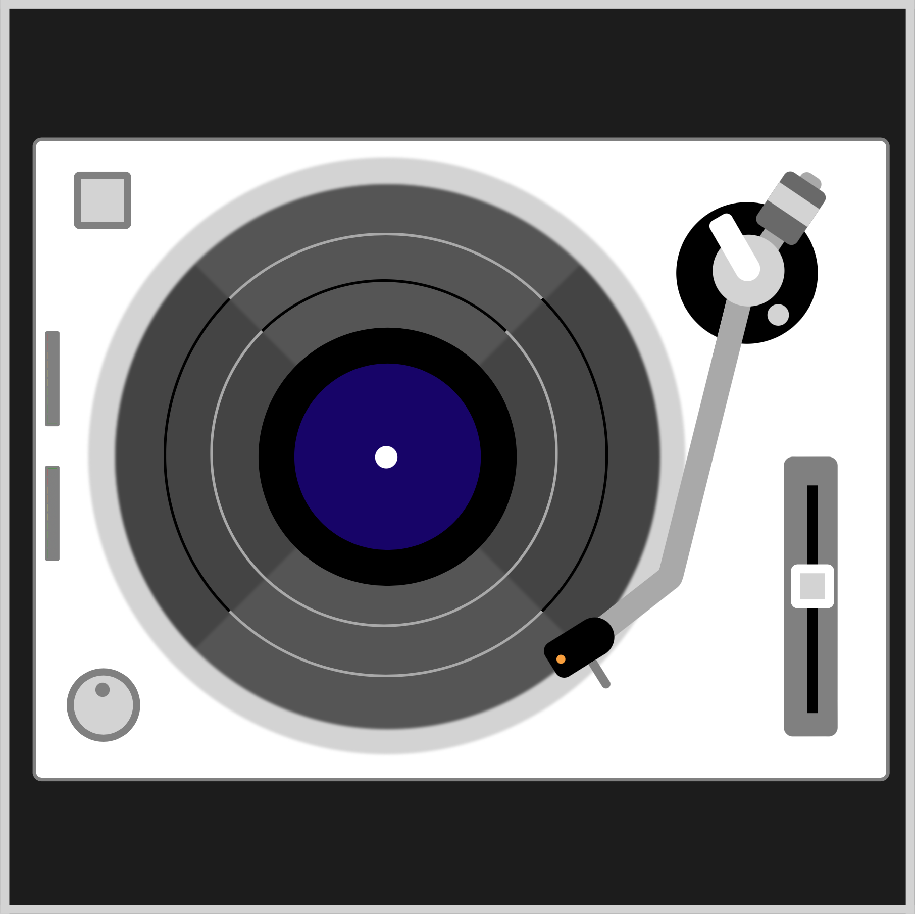
.headshell::after {
  content: "";
  width: 5px;
  height: 5px;
  background: black;
  position: absolute;
  left: 9px;
  top: 31px;
  border-radius: 50%;
  animation: headshell-light linear 10s infinite;
}
The background color is initially set to black so it blends with the headshell unit.
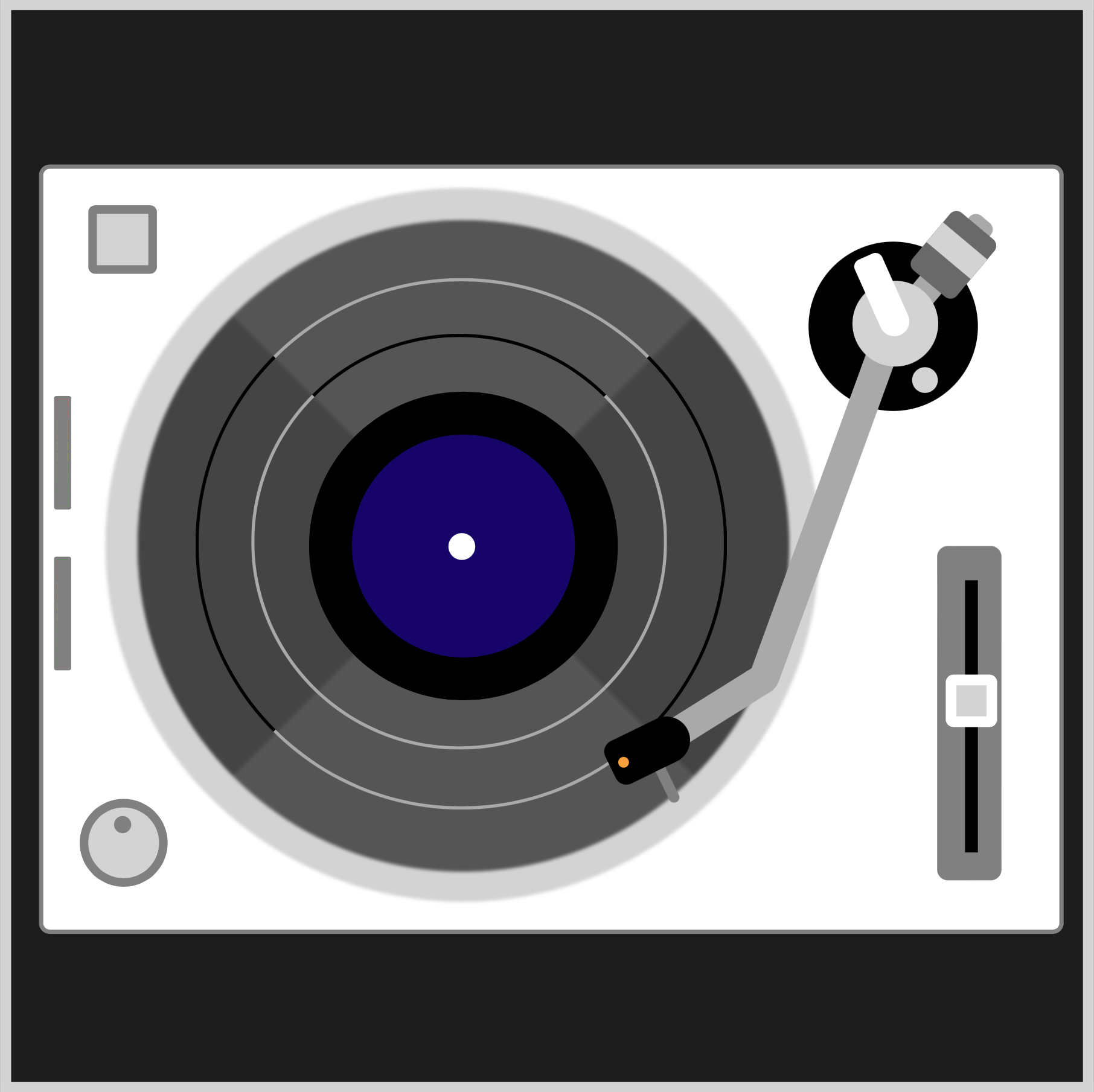
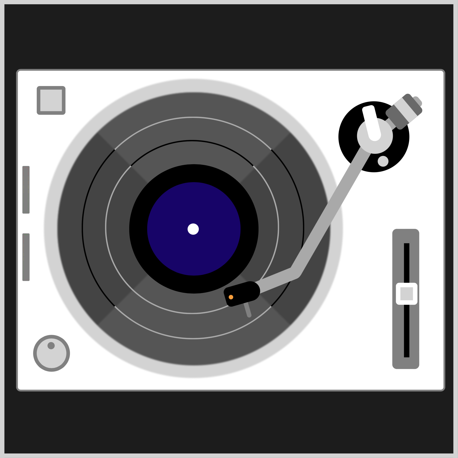
The headshell light animation is timed to sync with the record and record rings animation. The headshell light will pulse while the record is rotating.
@keyframes headshell-light {
  from {
    background: black;
  }
  19% {
    background: black;
  }
  20% {
    background: #f99f3e;
  }
  25% {
    background: black;
  }
  30% {
    background: #f99f3e;
  }
  35% {
    background: black;
  }
  40% {
    background: #f99f3e;
  }
  55% {
    background: black;
  }
  65% {
    background: #f99f3e;
  }
  70% {
    background: black;
  }
  75% {
    background: #f99f3e;
  }
  80% {
    background: black;
  }
  84% {
    background: #f99f3e;
  }
  86% {
    background: black;
  }
  87% {
    background: #f99f3e;
  }
  88% {
    background: black;
  }
  90% {
    background: #f99f3e;
  }
  91% {
    background: black;
  }
  to {
    background: black;
  }
}
Using the background CSS property, you alternate the color between black and orange, #f99f3e.
In the last section, you’ll create and animate the audio meters.
Audio Meter
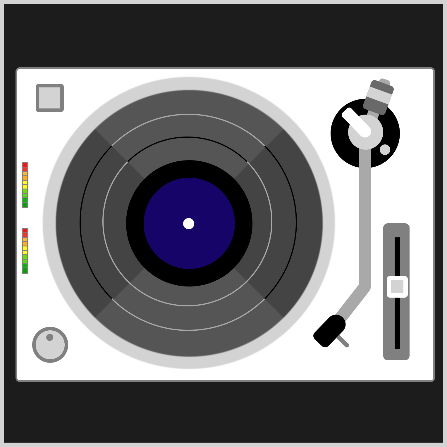
The audio meter is a new feature added to the turntable CSS animation version. Traditionally, audio meters indicate the sound output level from the left and right stereo channels.
<!-- Base -->
<div class="audio-meter-top"></div>
<div class="audio-meter-bottom"></div>
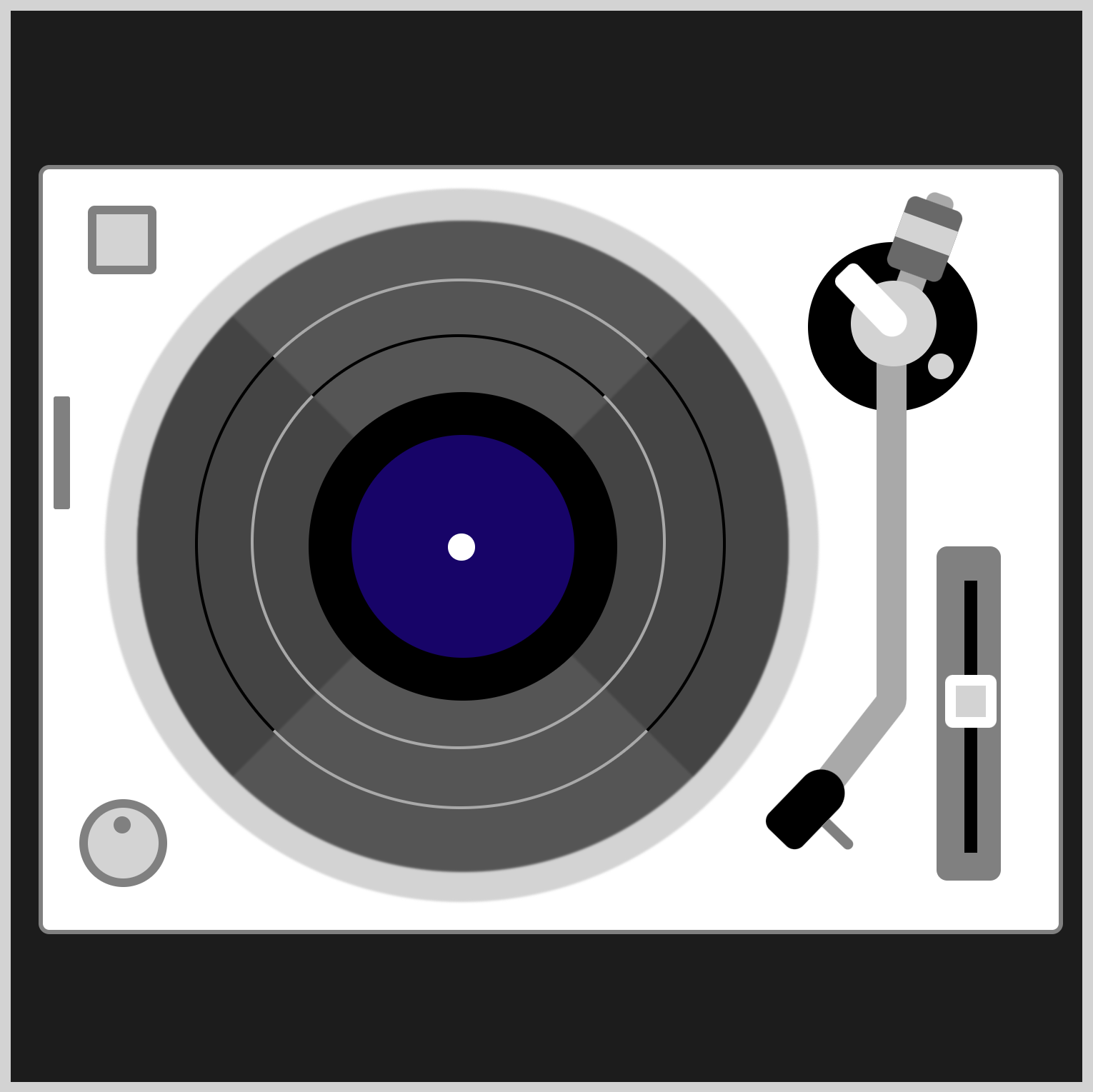
You’ll be creating two audio meters. audio-meter-top and audio-meter-bottom HTML divs will be added under the Base group.
/* Audio Meter */
.audio-meter-top {
  position: absolute;
  width: 5px;
  height: 50px;
  left: 20px;
  top: 180px;
  background: linear-gradient(gray, gray);
  border: solid 1.5px gray;
  border-radius: 1px;
}
The audio meter has a gray base. You use linear-gradient(gray, gray) to make the gray background. A solid, 1.5-pixel gray border is added using border: solid 1.5px gray. To slightly round the borders, you apply border-radius: 1px.
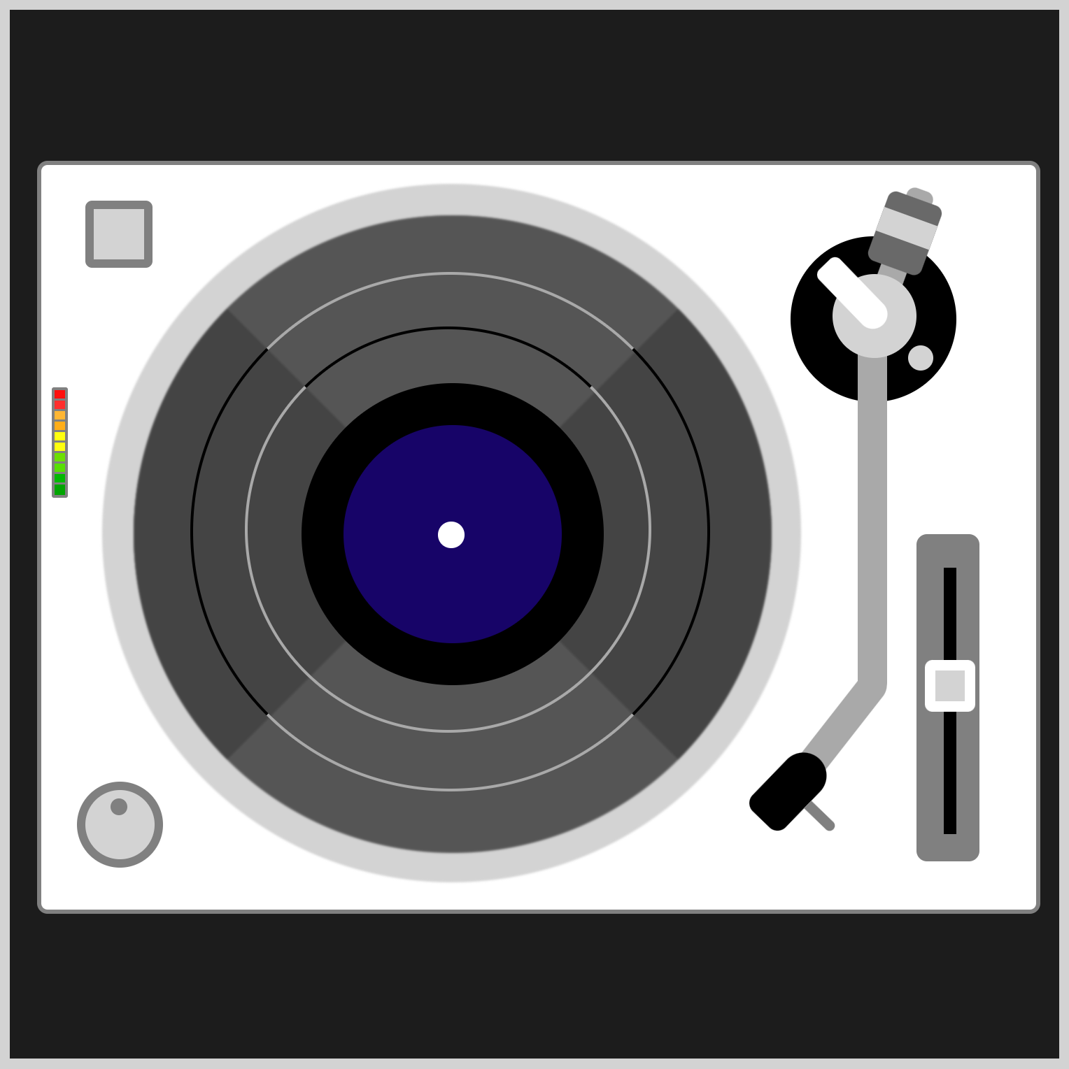
You’ll create 10 colored bars to indicate the audio level using another linear-gradient() function. The gradient direction is set to bottom, which means the code will be rendered from top to bottom.
- Red:
#ff0d0dand#ff2d2d - Orange:
#ffb633and#ffad18 - Yellow:
#feff0f - Light Green:
#6cdf01and#56df01 - Dark Green:
#00b800and#00a400
You set a 1-pixel transparent area to separate the color bars.
/* Transparent 1-pixel area */
transparent 4px,
transparent 5px
Red and Orange Bars
/* Audio Meter */
.audio-meter-top {
  background: linear-gradient(
      to bottom,
      #ff0d0d,
      #ff0d0d 4px,
      transparent 4px,
      transparent 5px,
      #ff2d2d 5px,
      #ff2d2d 9px,
      transparent 9px,
      transparent 10px,
      #ffb633 10px,
      #ffb633 14px,
      transparent 14px,
      transparent 15px,
      #ffad18 15px,
      #ffad18 19px,
      transparent 19px,
      transparent 20px,
    )
}
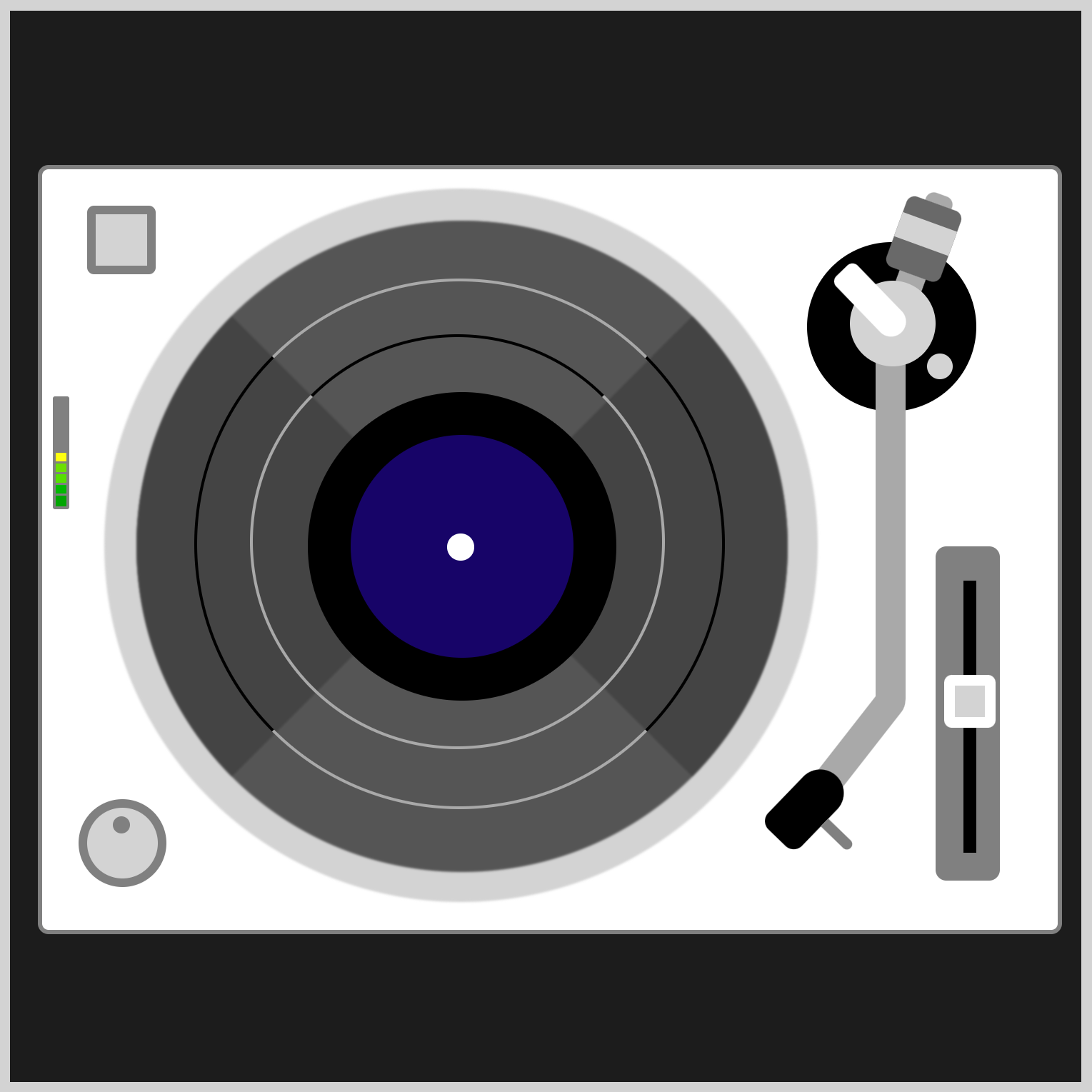
Light Green and Yellow Bars
/* Audio Meter */
.audio-meter-top {
  background: linear-gradient(
      #feff0f 20px,
      #feff0f 24px,
      transparent 24px,
      transparent 25px,
      #feff0f 25px,
      #feff0f 29px,
      transparent 29px,
      transparent 30px,
      #6cdf01 30px,
      #6cdf01 34px,
      transparent 34px,
      transparent 35px,
      #56df01 35px,
      #56df01 39px,
    )
}
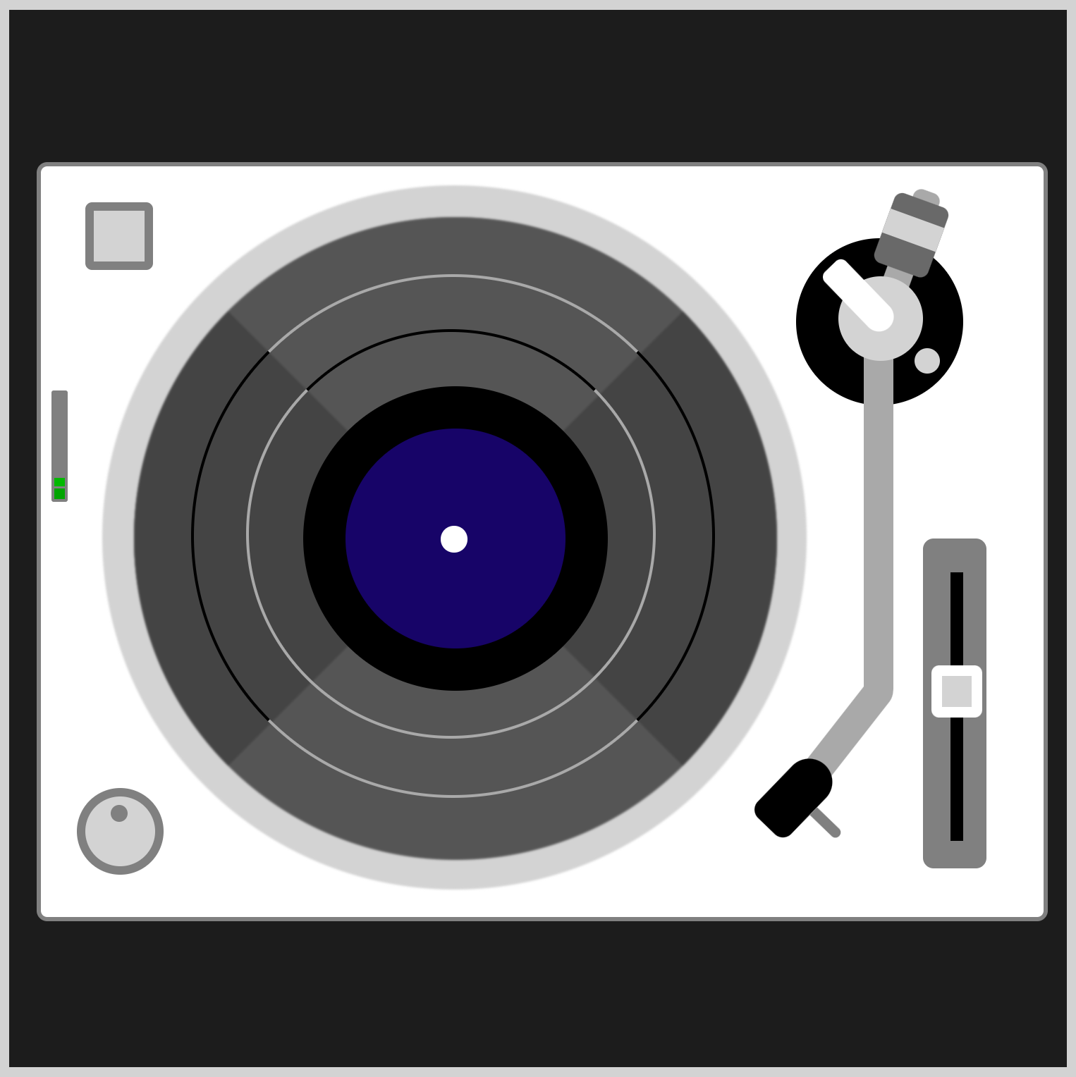
Dark Green Bars
/* Audio Meter */
.audio-meter-top {
  background: linear-gradient(
      transparent 39px,
      transparent 40px,
      #00b800 40px,
      #00b800 44px,
      transparent 44px,
      transparent 45px,
      #00a400 45px,
      #00a400 50px
	)
}
Now that the color bars are completed let’s make them move.
Audio Meter Animation
To simulate the audio meter bars lighting up, you will use another gray rectangle shape that will stretch up and down, covering and revealing the color bars underneath it.

.audio-meter-top::before {
  content: "";
  position: absolute;
  width: 5px;
  height: 50px;
  left: 0px;
  top: 0px;
  background: gray;
  animation: audio-meter-top linear 10s infinite;
}
You use the CSS Pseudo-element ::before to place a gray rectangle on top of the color bars. Combining the CSS animation, @keyframes at-rule, and the height property, you change the gray rectangle’s length.
A height: 0px fully shows the color bars, while a height: 50px will cover them.
@keyframes audio-meter-top {
  from {
    height: 50px;
  }
  20% {
    height: 50px;
  }
  21% {
    height: 30px;
  }
  30% {
    height: 45px;
  }
  35% {
    height: 0px;
  }
  40% {
    height: 45px;
  }
  45% {
    height: 5px;
  }
  50% {
    height: 45px;
  }
  60% {
    height: 15px;
  }
  70% {
    height: 45px;
  }
  75% {
    height: 0px;
  }
  80% {
    height: 35px;
  }
  85% {
    height: 0px;
  }
  90% {
    height: 5px;
  }
  92% {
    height: 50px;
  }
  to {
    height: 50px;
  }
}
The audio-meter-bottom animation code is similar to the above audio-meter-top animation, with a slight twist here and there. Modify the animation code, how about moving the meters independently or changing the bar colors?
You can see and play with the complete code on Pyxofy’s CodePen page.
See the Pen CSS Animation - Turntable by Pyxofy (@pyxofy) on CodePen.
Conclusion
In part 2 of this two-part article, you used many CSS properties such as transform-origin, transform: rotate(), and linear-gradient() functions to make and animate the turntable components.
You also learned how to use CSS Pseudo-elements such as ::before and ::after to place shapes before or after CSS elements.
What will you make with the new CSS tricks you’ve learned from this article? Share your masterpiece with us on LinkedIn, Threads, Mastodon, X (Twitter) @pyxofy or Facebook.
We hope you liked this article. Kindly share it with your network. We appreciate it.
Related Articles


