CSS Animation – SVG Motion Path with offset-path – Part 2
Matters of all forms and sizes can attract each other. Learn how to accelerate or decelerate this attraction with CSS in this step-by-step article.

Introduction
Are you ready to turn your CSS animation skills up a notch? This article will walk you through the process of enhancing your CSS animation skills by incorporating Scalable Vector Graphic (SVG) images and utilizing the CSS offset-path property to create an infinite animation effect for a circle along an ellipse motion path.
You’ll learn how to use these CSS properties in this article.
Preview
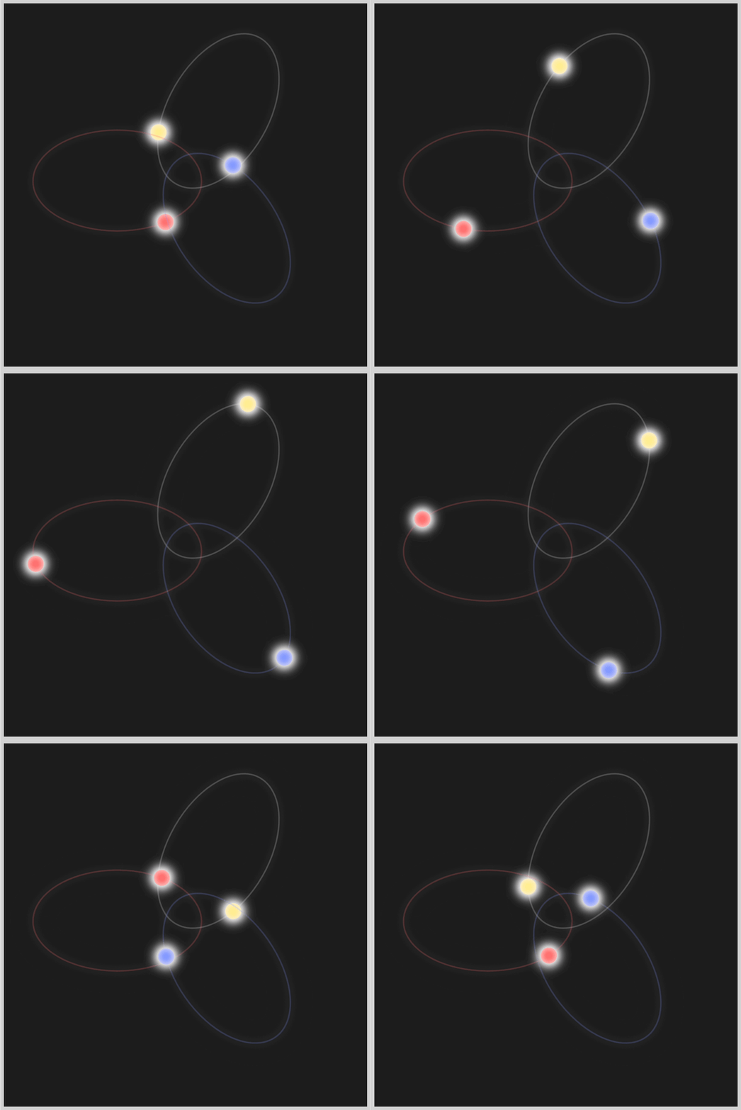
In the first installment of this two-part series, you gained insight into creating detailed SVG ellipses and CSS circle shapes by exploring a variety of properties and attributes. In this second installment, you will learn how to bring these circles to life through CSS animation techniques.
Prerequisites
Essential CSS and HTML knowledge will help you understand the concepts and techniques introduced in this article. Jump over to this article if you require an HTML and CSS primer.
We assume that you have set up tools to manipulate CSS. If you haven’t, this article will show you how to set them up.
Please read this article if you’re unfamiliar with CSS animation and the @keyframes at-rule property.
HTML Structure
<div class="container">
  <div class="body-1">
    <svg viewBox="0 0 240 240">
      <path
        d="M 120 5 A 70 115 0 1 1 120 237 A 1 1.7 0 1 1 120 5"
        fill="none"
        stroke="#f0f0f0"
        stroke-width="2"
        opacity="0.2"
      />
    </svg>
    <div class="circle body-1-motion"></div>
  </div>
  <div class="body-2">
    <svg viewBox="0 0 240 240">
      <path
        d="M 120 5 A 70 115 0 1 1 120 237 A 1 1.7 0 1 1 120 5"
        fill="none"
        stroke="#ff5c5c"
        stroke-width="2"
        opacity="0.2"
      />
    </svg>
    <div class="circle body-2-motion"></div>
  </div>
  <div class="body-3">
    <svg viewBox="0 0 240 240">
      <path
        d="M 120 5 A 70 115 0 1 1 120 237 A 1 1.7 0 1 1 120 5"
        fill="none"
        stroke="#7590ff"
        stroke-width="2"
        opacity="0.2"
      />
    </svg>
    <div class="circle body-3-motion"></div>
  </div>
</div>
container is the outermost enclosure. It enables the content to be centered and draws a light gray border. The rest of the divs represent each animation sequence.
Keep the HTML structure as is for the animation to display correctly.
Body and Container Div CSS
CSS code for the body and container div.
/* Body and Container Settings */
/* Center shapes */
body {
  margin: 0;
  padding: 0;
  height: 100vh;
  display: flex;
  justify-content: center;
  align-items: center;
}

/* Set background and border color */
.container {
  width: 500px;
  height: 500px;
  border: 5px solid lightgray;
  background: #1c1c1c;
  position: relative;
  display: flex;
  justify-content: center;
  align-items: center;
}

/* SVG position */
svg {
  position: absolute;
}
offset-path
The CSS offset-path property in web development allows you to define a path for an element to follow. This path can be a curve, line, or geometric shape, providing the ability for an element to move along it or be positioned upon it.
When using the CSS offset-path property, you have the option to combine it with other properties such as offset-distance, offset-anchor, and offset-rotate. These additional properties allow you to position an element along a specified path precisely. By leveraging these properties in combination, you can create complex and dynamic animation designs with accurate positioning and orientation of elements along a given path.
SVG Image and offset-path path()
Before starting the shape animations, you’ll learn how to combine an SVG image and the offset-path: path() function.
- SVG Ellipse Image
You make the SVG image using the <div> and <svg> HTML tags as follows.
<div class="ellipse-1">
  <svg viewBox="0 0 240 240">
    <path d="M 120 5 A 70 115 0 1 1 120 237 A 1 1.7 0 1 1 120 5" fill="none" stroke="#f0f0f0" stroke-width="2" opacity="0.2" />
  </svg>
  <div class="circle ellipse-1-motion"></div>
</div>
The SVG ellipse image, in this instance, ellipse-1, is fully visible since it has a stroke, stroke-width, and opacity property values.
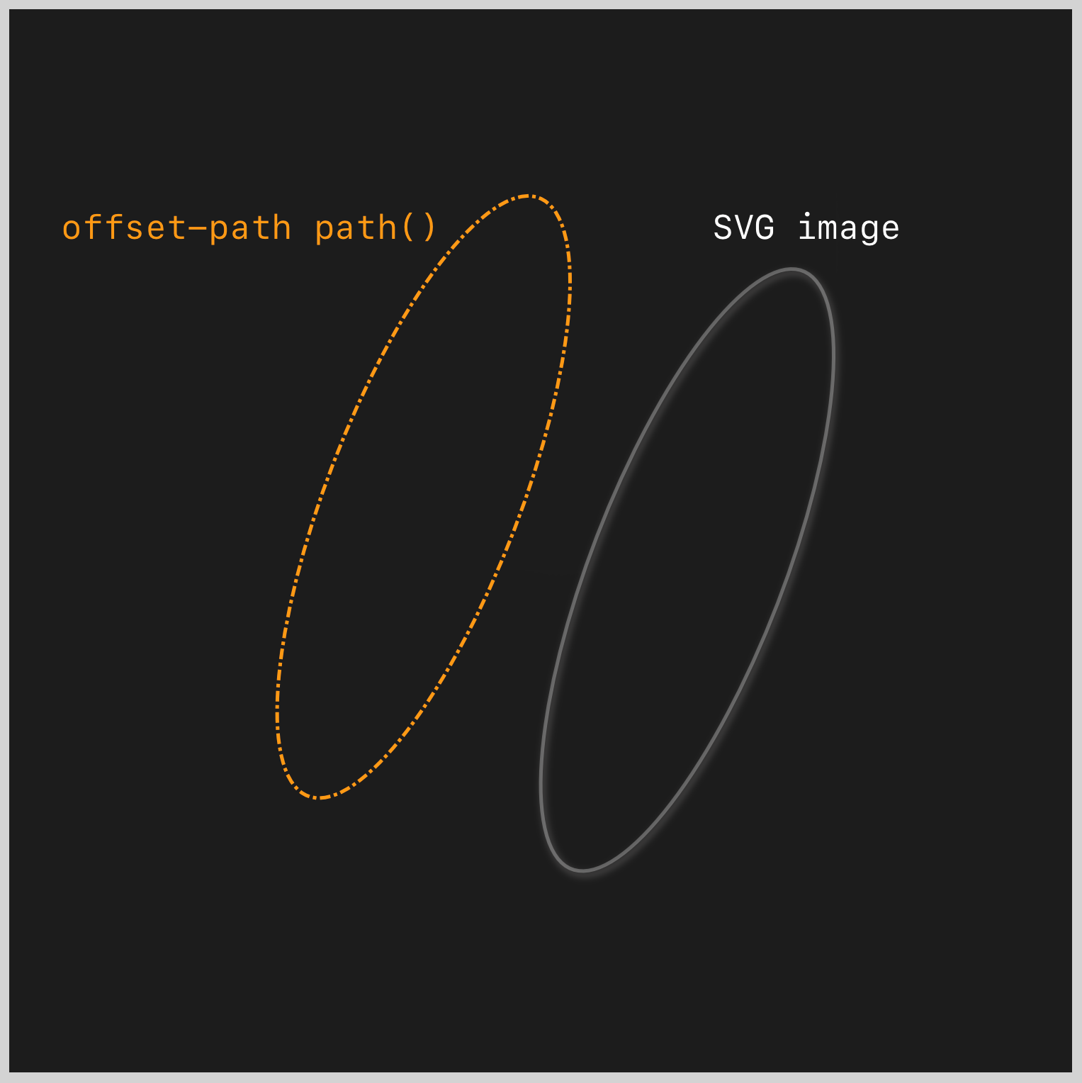
offset-path: path()
The offset-path: path() is made using the following CSS code.
.ellipse-1-motion {
  offset-path: path("M 120 5 A 70 115 0 1 1 120 237 A 1 1.7 0 1 1 120 5");
}
Take note that the offset-path: path() will not be visible. It serves as the animation “path” that the circle shape follows when you animate it. If you look at the SVG and the CSS path() values closely, you’ll notice that they’re identical.
SVG <path> Value
<path d="M 120 5 A 70 115 0 1 1 120 237 A 1 1.7 0 1 1 120 5" />
CSS path() Value
path("M 120 5 A 70 115 0 1 1 120 237 A 1 1.7 0 1 1 120 5")
The SVG and CSS path values must be identical to ensure that the circle image animates precisely on top of the SVG image.
Let’s learn about the cubic-bezier() function in the next section.
cubic-bezier() Easing Function
You’ll be using the CSS cubic-bezier() easing function to animate the circles along the ellipse shapes.

Source: MDN
A Cubic Bézier is defined by four points: P0, P1, P2, P3
- P0: Initial animation state
- P1 and P2: Mid-state animation progress
- P3: Final animation state
Cubic Bézier curves can be defined using the CSS cubic-bezier() function.
/* CSS `cubic-bezier()` syntax */
cubic-bezier(x1, y1, x2, y2)
- The values of
x1andx2are constant and fall within the range of0to1. The x-axis coordinates correspond to the animation time ratio, depicting the initial and final states. - The y-axis (
y1andy2) is used to display the animation output. Unlike the default range of0to1, the values on this axis can go beyond this range. Values outside the default range can be applied to create bouncing effects.
You’ll use this cubic-bezier() function value to animate the circles.
cubic-bezier(0.55, 0.3, 0.01, 0.24)
- x1:
0.55 - y1:
0.3 - x2:
0.01 - y2:
0.24
Cubic Bézier Tools and Websites
Most modern browsers provide cubic-bezier() visualization tools. Play around and modify the x and y-axis values directly or using the curve handles.
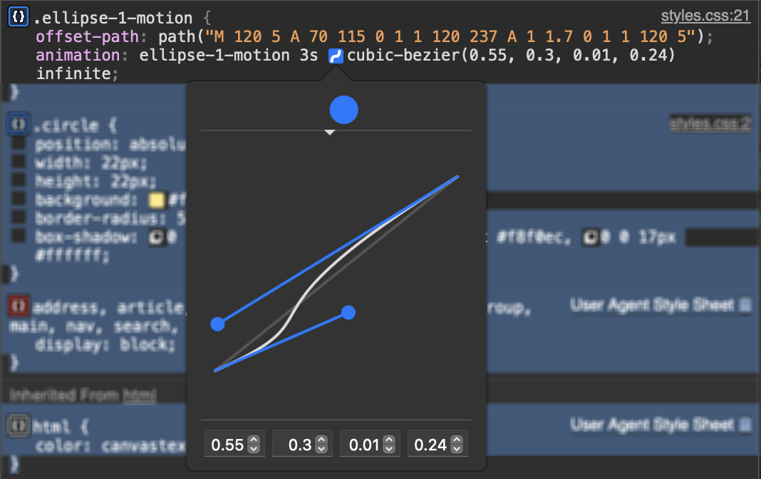
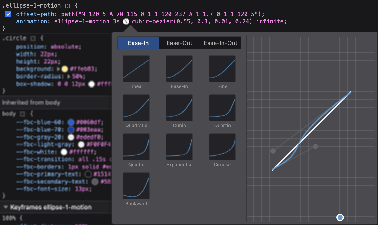
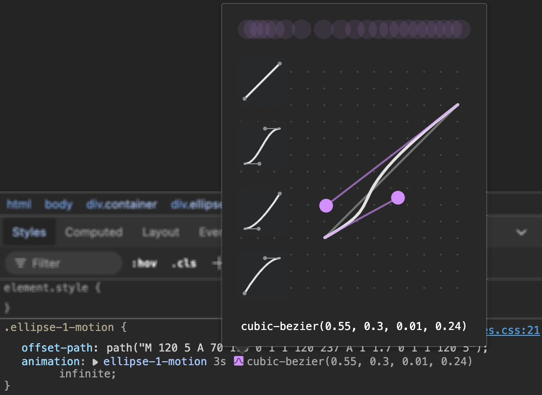
Check out these websites to explore different easing presets and how to make them with cubic-bezier().
- Easing Functions Cheat Sheet by Andrey Sitnik and Ivan Solovev.
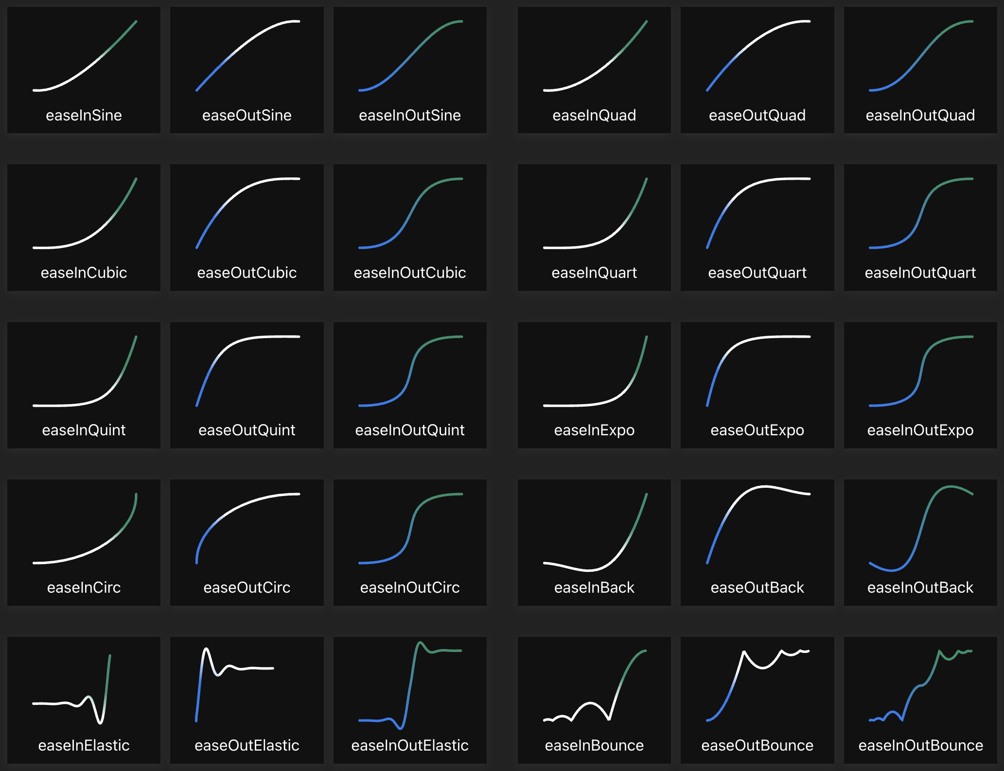
- CSS Easing Animation Tool by Matthew Lein.
For the final section, you’ll learn how to animate the circles.
Circle Animation
In this final section, you’ll learn how to animate the circles. First, you need to check each circle’s animation starting point.
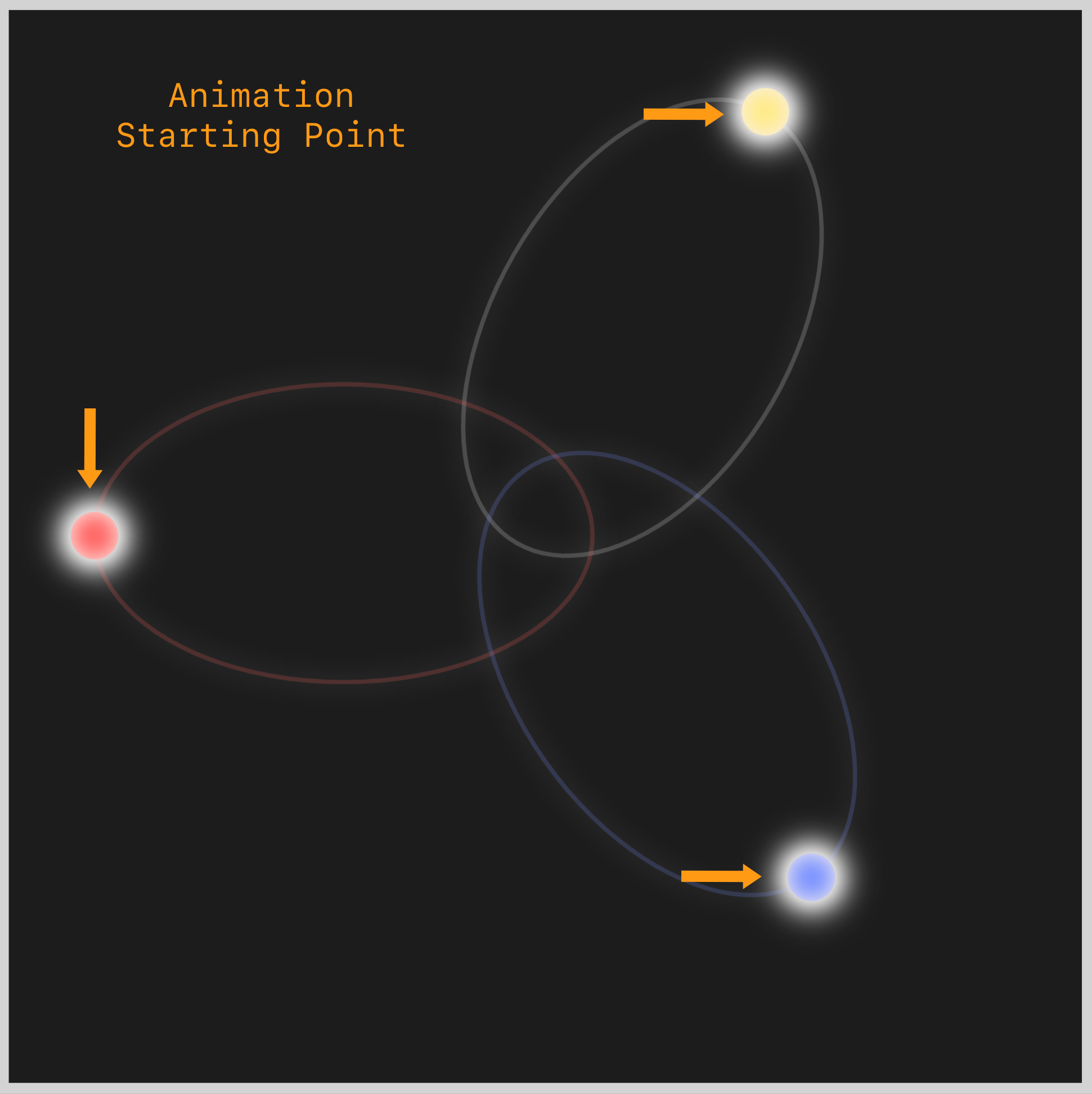
The circles will start moving from their starting points towards the center. As the circles start getting closer, they start accelerating. If the starting point is the 12 o’clock mark, the acceleration begins around the 3 o’clock mark.
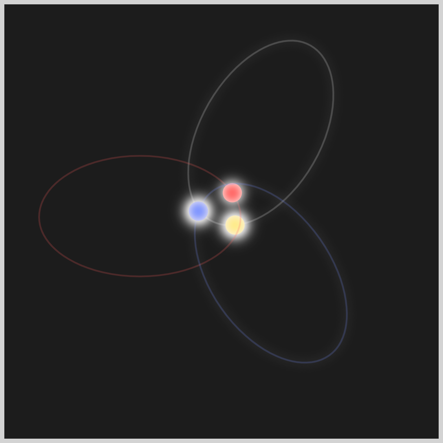
The circles accelerate more rapidly as they approach the center and then decelerate as they move away, starting around the 9 o’clock mark.
Let’s build the animation code in the following sections for each circle.
Circle 1
The circle animation will have three components.
offset-path: path()functionanimationCSS property@keyframesat-rule
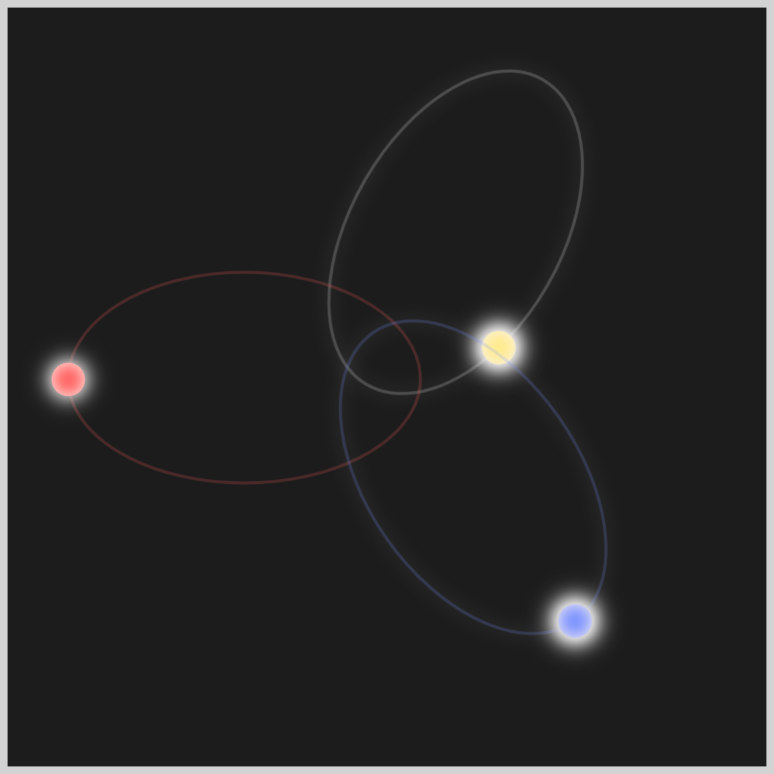
.ellipse-1-motion {
  offset-path: path("M 120 5 A 70 115 0 1 1 120 237 A 1 1.7 0 1 1 120 5");
  animation: ellipse-1-motion 3s cubic-bezier(0.55, 0.3, 0.01, 0.24) infinite;
}
offset-path: path() contains the elliptical shape path value that the circle will follow. The path() value is an exact copy of the SVG <path> value.
For the animation properties, you use ellipse-1-motion as the animation name, and the animation duration is three seconds with 3s. It uses a Cubic Bézier easing function and repeats infinitely via an infinite property value.
@keyframes ellipse-1-motion {
  100% {
    offset-distance: 100%;
  }
}
The @keyframes property value is simplified to offset-distance: 100%;. This property value moves the circle from its starting point, 0 degrees, to its endpoint, 359 degrees.
The CSS property values for Circle 2 and 3, apart from the animation names, are precisely the same as those for Circle 1.
Circle 2
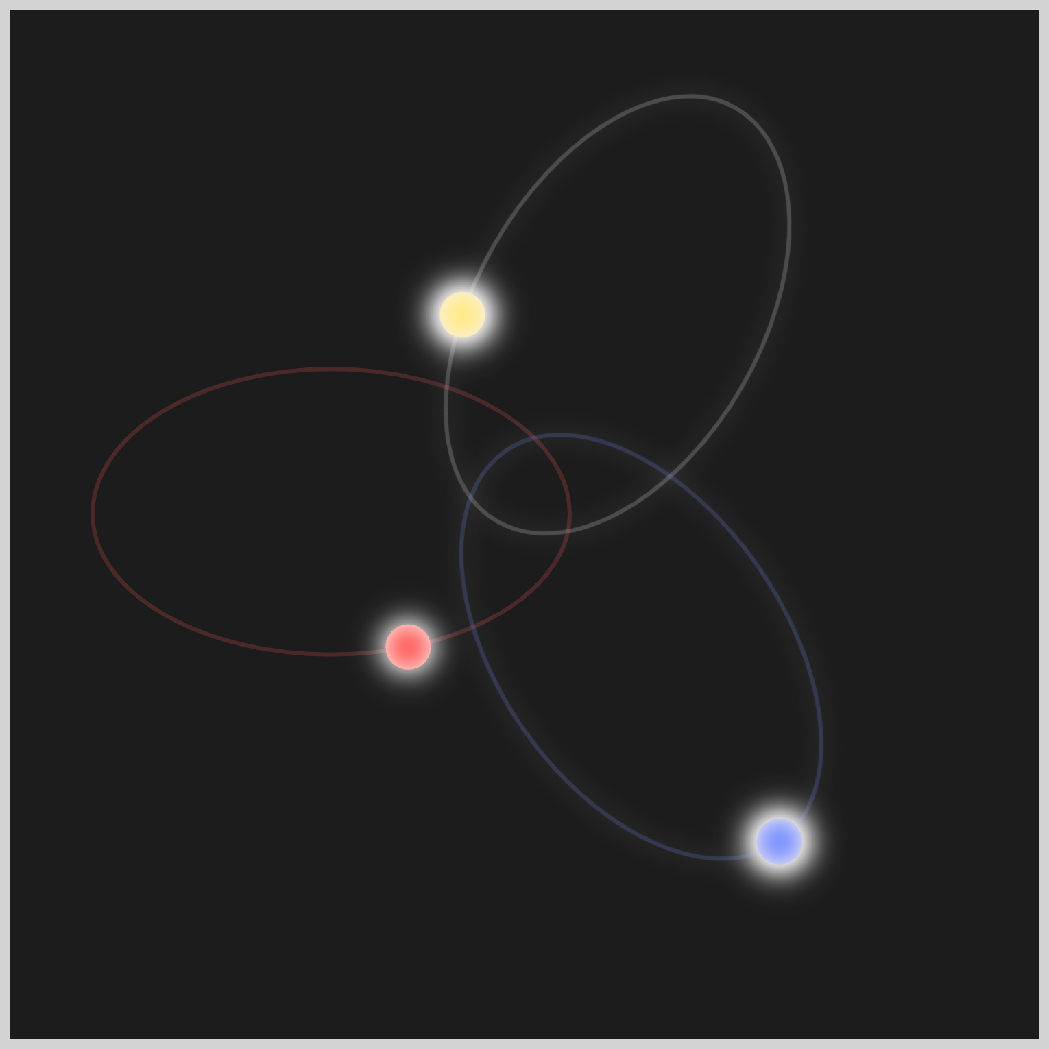
.ellipse-2-motion {
  offset-path: path("M 120 5 A 70 115 0 1 1 120 237 A 1 1.7 0 1 1 120 5");
  animation: ellipse-2-motion 3s cubic-bezier(0.55, 0.3, 0.01, 0.24) infinite;
}
@keyframes ellipse-2-motion {
  100% {
    offset-distance: 100%;
  }
}
Circle 3
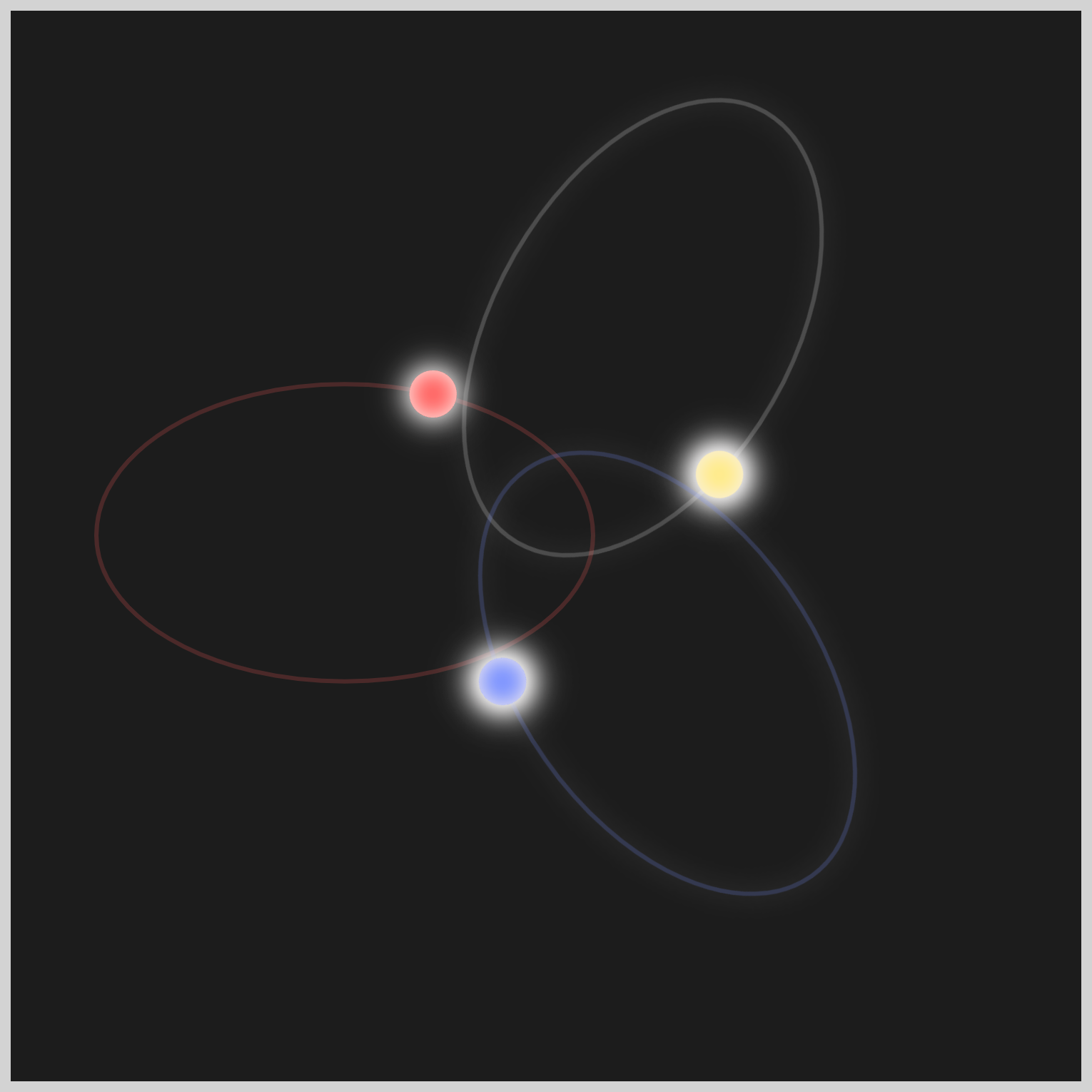
.ellipse-3-motion {
  offset-path: path("M 120 5 A 70 115 0 1 1 120 237 A 1 1.7 0 1 1 120 5");
  animation: ellipse-3-motion 3s cubic-bezier(0.55, 0.3, 0.01, 0.24) infinite;
}
@keyframes ellipse-3-motion {
  100% {
    offset-distance: 100%;
  }
}
You can see and play with the complete code on Pyxofy’s CodePen page.
See the Pen CSS Animation - SVG Motion Path with offset-path by Pyxofy (@pyxofy) on CodePen.
Conclusion
In the second part of this two-part article series, you delved into the powerful fusion of SVG images and CSS offset-path: path() functions. This combination presents an exciting realm of possibilities for crafting dynamic and distinctive animations that are both engaging and captivating.
You utilized the CSS cubic-bezier() function and offset-distance property to create an acceleration and deceleration effect, giving the impression that circles are attracting each other when moving towards the center.
Feel free to tailor the code in this article and exhibit your CSS skills with us on LinkedIn, Threads, Mastodon, X (Twitter) @pyxofy, or Facebook.
We hope you liked this article. Kindly share it with your network. We appreciate it.
Related Articles


「きょうからはじめるスクラッチプログラミング入門」
Pyxofy から Scratch の基本をまとめた電子書籍を出版しました。
Kindle・Apple Books からご購入ください。


