CSS Animation – SVG Motion Path with offset-path – Part 1
In this step-by-step article series learn how to make SVG and CSS images, as well as learning how to animate them to move along a motion path.

Introduction
Making objects move along a desired path can be captivating and enjoyable. This article will teach you how to effectively use Scalable Vector Graphic (SVG) ellipses and CSS-based circle images.
Get ready to learn the following CSS properties and functions in this article.
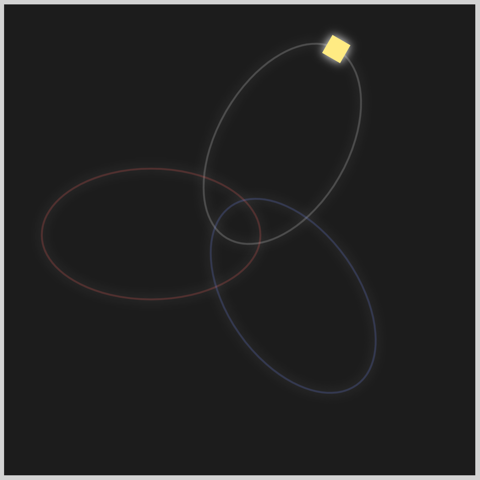
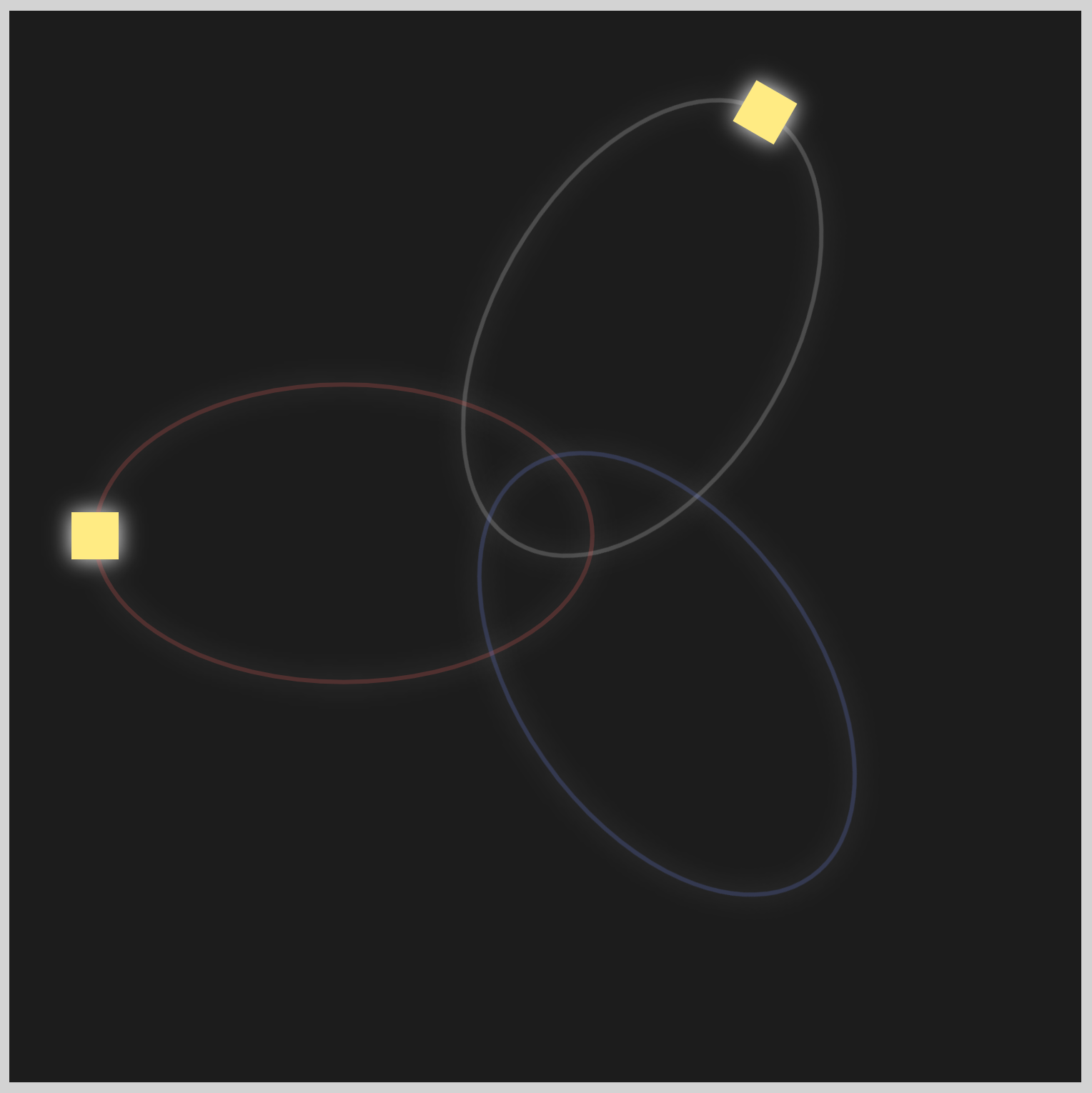
Preview

In part 1 of this two-part article, you’ll create the ellipse and circle shapes. In part 2, you’ll learn how to animate the circle shapes.
Prerequisites
Essential CSS and HTML knowledge will help you understand the concepts and techniques introduced in this article. Jump over to this article if you require an HTML and CSS primer.
We assume that you have set up tools to manipulate CSS. If you haven’t, this article will show you how to set them up.
Please read this article if you’re unfamiliar with CSS animation and the @keyframes at-rule property.
HTML Structure
<div class="container">
  <div class="body-1">
    <svg viewBox="0 0 240 240">
      <path
        d="M 120 5 A 70 115 0 1 1 120 237 A 1 1.7 0 1 1 120 5"
        fill="none"
        stroke="#f0f0f0"
        stroke-width="2"
        opacity="0.2"
      />
    </svg>
    <div class="circle body-1-motion"></div>
  </div>
  <div class="body-2">
    <svg viewBox="0 0 240 240">
      <path
        d="M 120 5 A 70 115 0 1 1 120 237 A 1 1.7 0 1 1 120 5"
        fill="none"
        stroke="#ff5c5c"
        stroke-width="2"
        opacity="0.2"
      />
    </svg>
    <div class="circle body-2-motion"></div>
  </div>
  <div class="body-3">
    <svg viewBox="0 0 240 240">
      <path
        d="M 120 5 A 70 115 0 1 1 120 237 A 1 1.7 0 1 1 120 5"
        fill="none"
        stroke="#7590ff"
        stroke-width="2"
        opacity="0.2"
      />
    </svg>
    <div class="circle body-3-motion"></div>
  </div>
</div>
container is the outermost enclosure. It enables the content to be centered and draws a light gray border. The rest of the divs represent each animation sequence.
Keep the HTML structure as is for the animation to display correctly.
Body and Container Div CSS
CSS code for the body and container div.
/* Body and Container Settings */
/* Center shapes */
body {
  margin: 0;
  padding: 0;
  height: 100vh;
  display: flex;
  justify-content: center;
  align-items: center;
}

/* Set background and border color */
.container {
  width: 500px;
  height: 500px;
  border: 5px solid lightgray;
  background: #1c1c1c;
  position: relative;
  display: flex;
  justify-content: center;
  align-items: center;
}

/* SVG position */
svg {
  position: absolute;
}
SVG Ellipses
The three colored ellipses are made with Scalable Vector Graphics, or SVG for short. An in-depth explanation of how to make SVG images using <path> is available here.
 Pyxofy
Before making the SVG ellipses, you need to set the background to a dark color.

.container {
  background: #1c1c1c;
}
You use the CSS Hex color, #1c1c1c, and set it as the background property value.
Up next is the first ellipse shape.
Ellipse 1
Ellipse 1, the first ellipse shape, is positioned on the upper right-hand area of the container. You use the <path> SVG element to define its shape.

<div class="ellipse-1">
  <svg viewBox="0 0 240 240">
    <path
      d="M 120 5 A 70 115 0 1 1 120 237 A 1 1.7 0 1 1 120 5"
      fill="none"
      stroke="#f0f0f0"
      stroke-width="2"
      opacity="0.2"
    />
  </svg>
</div>
- Set the HTML
classtoellipse-1to enable CSS targeting. M 120 5 A 70 115 0 1 1 120 237 A 1 1.7 0 1 1 120 5is the SVG<path>code to make the ellipse shape. The shape is composed of two connected arches.fill="none"sets the shape fill option to none.#f0f0f0is a white-ish hue for the stroke color.stroke-widthis set to2. You can adjust it to make the stroke thicker or thinner.opacityis0.2. Opacity set to1will make the SVG image fully opaque, and setting it to0will make it transparent.
You’ve completed the SVG shape. You’ll set its CSS properties next.

.ellipse-1 {
  position: absolute;
  width: 240px;
  height: 240px;
  top: 27px;
  left: 175px;
}
To move Ellipse 1 from its initial position to its final position, you set CSS top to 27px and left to 175px.

.ellipse-1 {
  transform: rotate(30deg);
}
Using the CSS rotate() function, you can rotate the SVG image. Set 30deg inside the function, and the image will rotate 30 degrees.

.ellipse-1 {
  filter: drop-shadow(0 0 5px #ffffff);
}
To finish up, you set a glow effect using the drop-shadow() function. Insert 0 0 5px #ffffff inside the function to get a nice glow effect.
Check this article to learn more about CSS shadows.
Pyxofy
Let’s make ellipse 2 in the next section.
Ellipse 2
Except for the shape color, Ellipse 2 and 3 have the same SVG properties as Ellipse 1.

<div class="ellipse-2">
  <svg viewBox="0 0 240 240">
    <path
      d="M 120 5 A 70 115 0 1 1 120 237 A 1 1.7 0 1 1 120 5"
      fill="none"
      stroke="#ff5c5c"
      stroke-width="2"
      opacity="0.2"
    />
  </svg>
</div>
To make the SVG shape glow with a beautiful sunset orange color, set the stroke property value to #ff5c5c.
Next up, you’ll position Ellipse 2 beside Ellipse 1.

.ellipse-2 {
  position: absolute;
  width: 240px;
  height: 240px;
  top: 125px;
  left: 35px;
}
You set the CSS top property value to 125px and left to 35px to move the Ellipse 2 position.

.ellipse-2 {
  transform: rotate(-90deg);
}
To rotate Ellipse 2 to its final angle, you set -90deg inside the rotate() function.

.ellipse-2 {
  filter: drop-shadow(0 0 5px #ffffff);
}
Let’s finish Ellipse 3 in the next section.
Ellipse 3

<div class="ellipse-3">
  <svg viewBox="0 0 240 240">
    <path
      d="M 120 5 A 70 115 0 1 1 120 237 A 1 1.7 0 1 1 120 5"
      fill="none"
      stroke="#7590ff"
      stroke-width="2"
      opacity="0.2"
    />
  </svg>
</div>
The stroke property value for Ellipse 3 is set to #7590ff, which gives it a light blue color.

.ellipse-3 {
  position: absolute;
  width: 240px;
  height: 240px;
  top: 190px;
  left: 188px;
}
Position Ellipse 3 by setting the top to 190px and left to 188px.

.ellipse-3 {
  transform: rotate(-215deg);
}
You need to rotate Ellipse 3 to minus 215 degrees. Set -215deg within the CSS rotate() function.

.ellipse-3 {
  filter: drop-shadow(0 0 5px #ffffff);
}
You’ve completed all three ellipses. In the next section, you’ll make the circles.
Circles
You will need to create three circles to correspond with the three ellipses you created in the previous section.
/* Circle Shape */
.circle {
  position: absolute;
  width: 22px;
  height: 22px;
  background: #ffeb83;
}
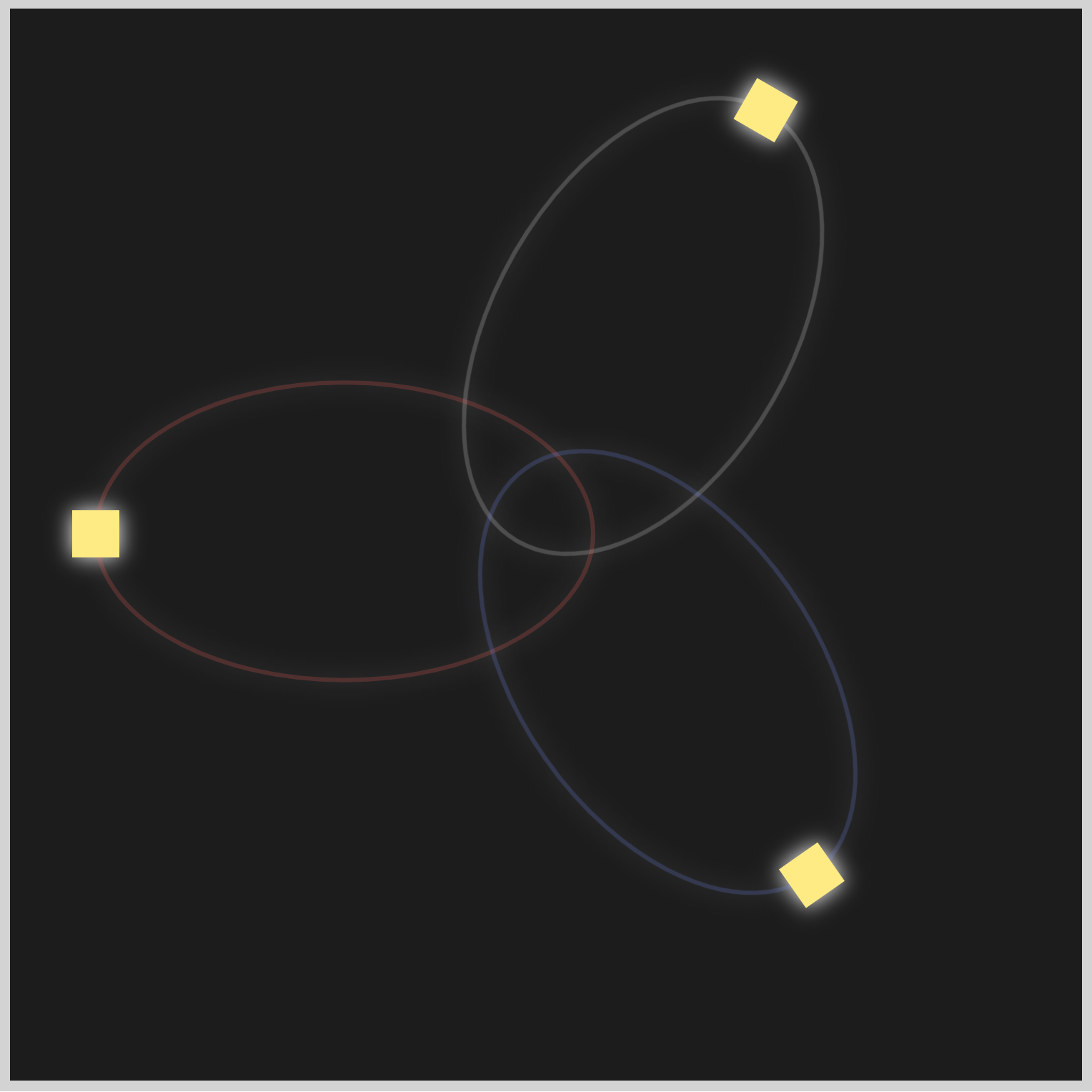
The above code will be the default code for all three circles. The initial shape will be a 22px square. You will set the background color to #ffeb83, and it will be the default color.
.ellipse-2 .circle {

}
You will reuse the default .circle CSS code for both Circle 2 and Circle 3. Use .ellipse-2 .circle to position Circle 2 on top of Ellipse 2.
.ellipse-3 .circle {

}
Similar to the previous Circle 2, you use .ellipse-3 .circle to position Circle 3 on top of Ellipse 3.
.circle {
  border-radius: 50%;
}
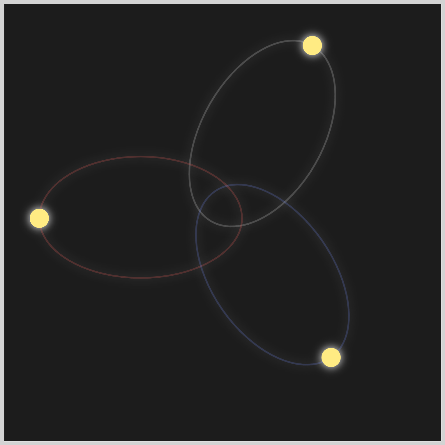
Now that all of the circles are placed on top of their respective ellipses, you set border-radius to 50% to turn the initial square shapes into circles.
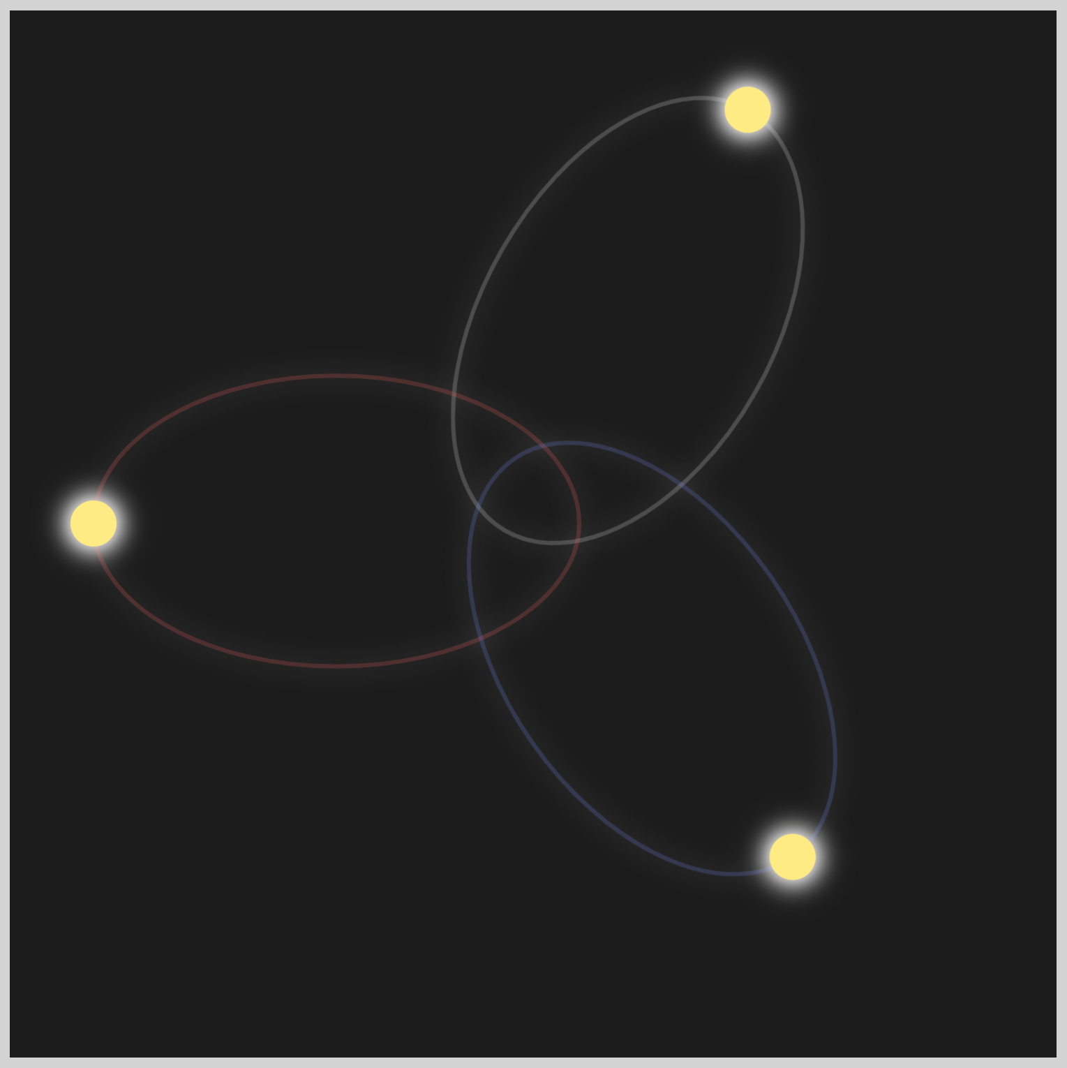
Up next is the circle shadow section.
Circle Shadow
To create a glowing effect for the circles, you will use the CSS box-shadow property to set multiple shadows.
- The First Shadow is a snow-type color that radiates outward from the circle shape.
- Inset Shadow is a pale grey-yellow color.
insetshadows are drawn inside the circle shape’s border. - The Second Shadow appears as a pure white color radiating more outward, in contrast to the First Shadow.
You can set multiple shadows by separating each property value with a comma (,).

.circle {
  box-shadow: 0 0 12px #fffbfa;
}
- The first two
0correspondents to the circle shape x and y-axis shadow offsets. A positive value will move the shadow away from the circle shape. A value of0enables the shadow to radiate evenly in all directions. 12pxis the blur radius. Positive values will make the blur bigger and lighter. Negative values are not allowed.#fffbfais the shadow color.

.circle {
  box-shadow: 0 0 12px #fffbfa, inset 0 0 10px #f8f0ec;
}
Remember to separate multiple shadows with a comma (,) to display correctly. You use the inset keyword in front of the values so the shadow is drawn inside the circle shape.

Let’s work on the Second Shadow below.

.circle {
  box-shadow: 0 0 12px #fffbfa, inset 0 0 10px #f8f0ec, 0 0 17px #ffffff;
}
The Second Shadow blur radius is set to 17px, instead of 12px, and is of a pure white hue, #ffffff.
The circle shadows are completed. You’ll work on the circle colors next.
Circle Color
In this final section, you will learn how to set the color of each circle.

.circle {
  background: #ffeb83;
}
Circle 1 color will be the default #ffeb83, a white hue.

.ellipse-2 .circle {
  background: #ff5c5c;
}
To change the default white color, you set the #ff5c5c, an orange color, as the background CSS property value.

.ellipse-3 .circle {
  background: #7590ff;
}
To complete this section, set #7590ff as the value for the background property to change the color from the default white to light blue.
You can see and play with the complete code on Pyxofy’s CodePen page.
See the Pen CSS Animation - SVG Motion Path with offset-path by Pyxofy (@pyxofy) on CodePen.
Conclusion
In part 1, you learned how to create SVG and CSS-based images using only code. Ellipses and circles are simple but versatile shapes. You learned how to rotate shapes using the CSS rotate() function.
By using the CSS drop-shadow() function and box-shadow, you created captivating glow effects around ellipses and circles, enhancing the visual appeal of the shape’s design.
In part 2, you will animate the circles using offset-path, animation, and @keyframes.
Feel free to customize the code in this article and showcase your exceptional work with us on LinkedIn, Threads, Mastodon, X (Twitter) @pyxofy, or Facebook.
We hope you liked this article. Kindly share it with your network. We appreciate it.
Related Articles
Pyxofy Pyxofy