CSS Animation – steps() Function Multi-Step Animation
Smooth animations are delightful to look at, but sometimes, you may want to control each keyframe with CSS. Learn how in this step-by-step article.

Introduction
Sometimes, you might prefer smooth animations, while at other times, you might not. This article will teach you how to utilize the CSS steps() function to create multi-step animation sequences.
CSS properties showcased in this article:
steps()functionanimation@keyframesrotateborder-radius
Preview
You’ll learn to make two step animations in this article.
- Square to Circle
- Multi-Step Shape Animation


Prerequisites
Essential CSS and HTML knowledge will help you understand the concepts and techniques introduced in this article. Jump over to this article if you require an HTML and CSS primer.
We assume that you have set up tools to manipulate CSS. If you haven’t, this article will show you how to set them up.
Please read this article if you’re unfamiliar with CSS animation and the @keyframes at-rule property.
HTML Structure
<div class="container">
  <div class="shape"></div>
</div>
<div class="container">
  <div class="circle-with-steps">
  </div>
</div>
container is the outermost enclosure. It enables the content to be centered and draws a light gray border. The rest of the divs represent each animation sequence.
Keep the HTML structure as is for the animation to display correctly.
Body and Container Div CSS
CSS code for the body and container div.
/* Body and Container Settings */
/* Center shapes */
body {
  margin: 0;
  padding: 0;
  height: 100vh;
  display: flex;
  justify-content: center;
  align-items: center;
  flex-wrap: wrap;
}

/* Set background and border color */
.container {
  width: 500px;
  height: 500px;
  border: 5px solid lightgray;
  background: royalblue;
  position: relative;
  margin: 5px;
  display: flex;
  justify-content: center;
  align-items: center;
}
What is Step Animation
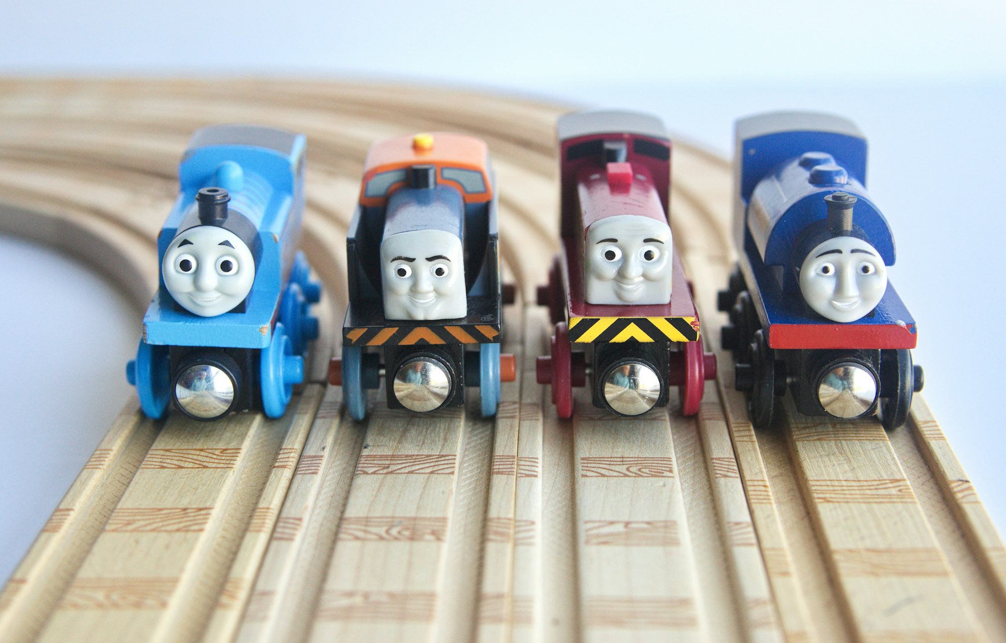
Animation has two main components: the keyframes and the inbetweens, usually referred to as tweens. The keyframes are the significant states or poses of the animation. Tweens are the “filler” drawings between the keyframes, ensuring a smooth transition between keyframes.

In the above image, the keyframes are indicated A through E, and the rest of the images are tweens. This article explains keyframes and tweens in depth.
 Pyxofy
Step animation involves setting up multiple steps in an animation sequence. For instance, if you want to animate an object transforming into different shapes, you can set up the step animation as follows:
- Start with a square
- Change the square to a circle
- Change the circle to an ellipse
- Change the ellipse to a teardrop
- End with a teardrop as your final state
By adding multiple steps between your initial and final state, you can create a more engaging and captivating animation.
In the next section, you’ll learn about the CSS steps() function.
CSS steps() Function
The steps() function is part of the CSS animation timing function. It allows precise control over the animation, displaying each step or stop for equal lengths of time.
Regular CSS animation produces a smooth transition between keyframes.

If you don't want a smooth transition between keyframes, you can use the steps() function to break up each animation iteration or tween to your preferred timing. For example, if you are creating an analog clock animation, you can use the steps() function to control the second hand of the analog clock so that it will “tick” or jump at set intervals instead of smoothly rotating.
Let’s explore a basic animation using steps().
steps() Basic Animation
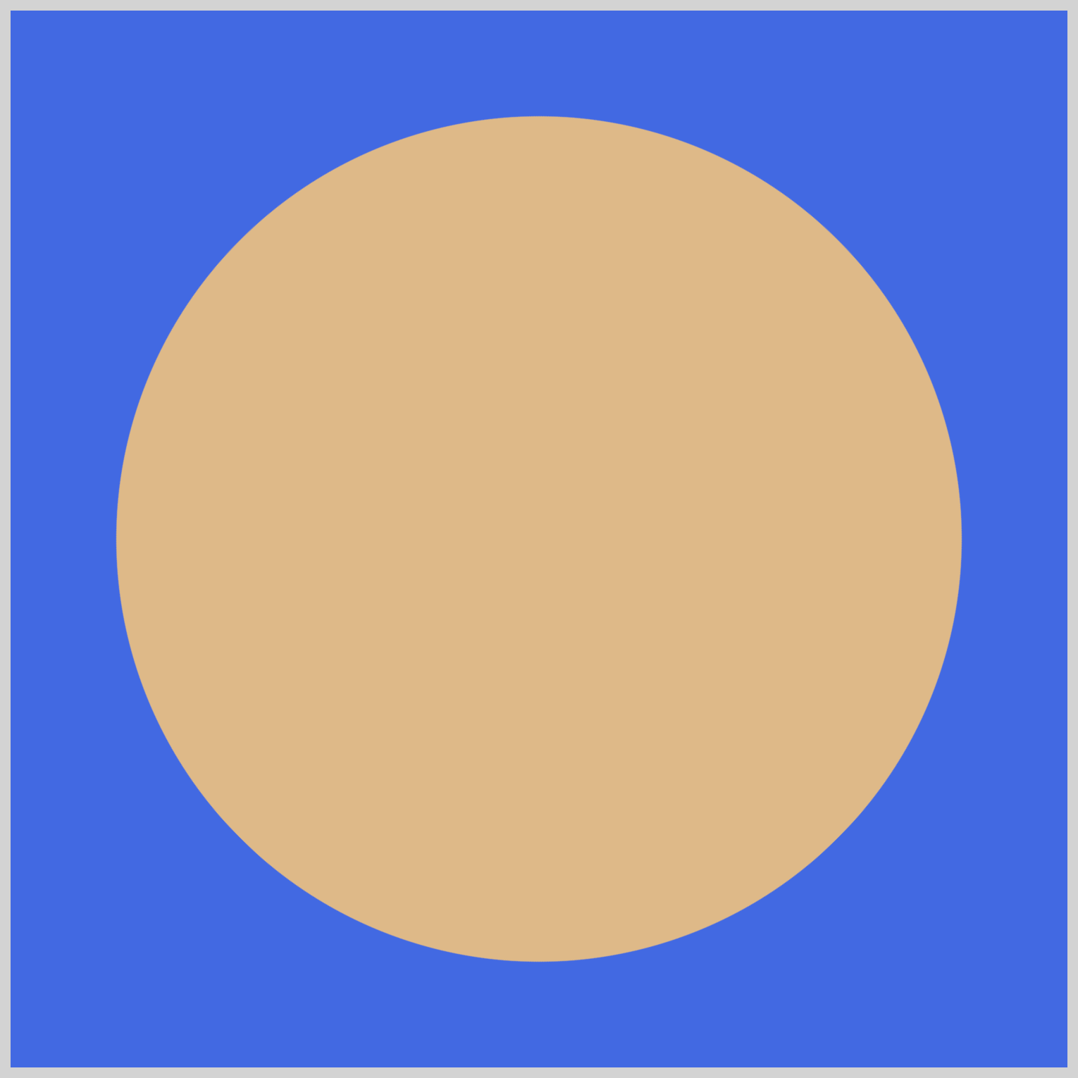
In this section, you’ll learn how to animate a square to a circle shape using the CSS steps() function. You will use the CSS border-radius property to round out the square’s corners.
The sample animation will have five steps:
- Initial square shape
border-radiusat 12.5%- 25%
- 37.5
- Circle (
border-radiusat 50%)

/* Circle with Steps */
.circle-with-steps {
  position: absolute;
  background-color: burlywood;
  width: 400px;
  height: 400px;
}
The square shape will be 400px tall and wide, and its background color will be set to burlywood.

border-radius at 12.5%.circle-with-steps {
animation: circle-with-steps 3s steps(4) infinite alternate;
}
Let’s break down the animation code:
circle-with-stepsis the animation name.3sindicates a three-second animation duration.steps(4)sets the animation step to four steps.infiniteloops the animation.alternatereverses the animation direction.

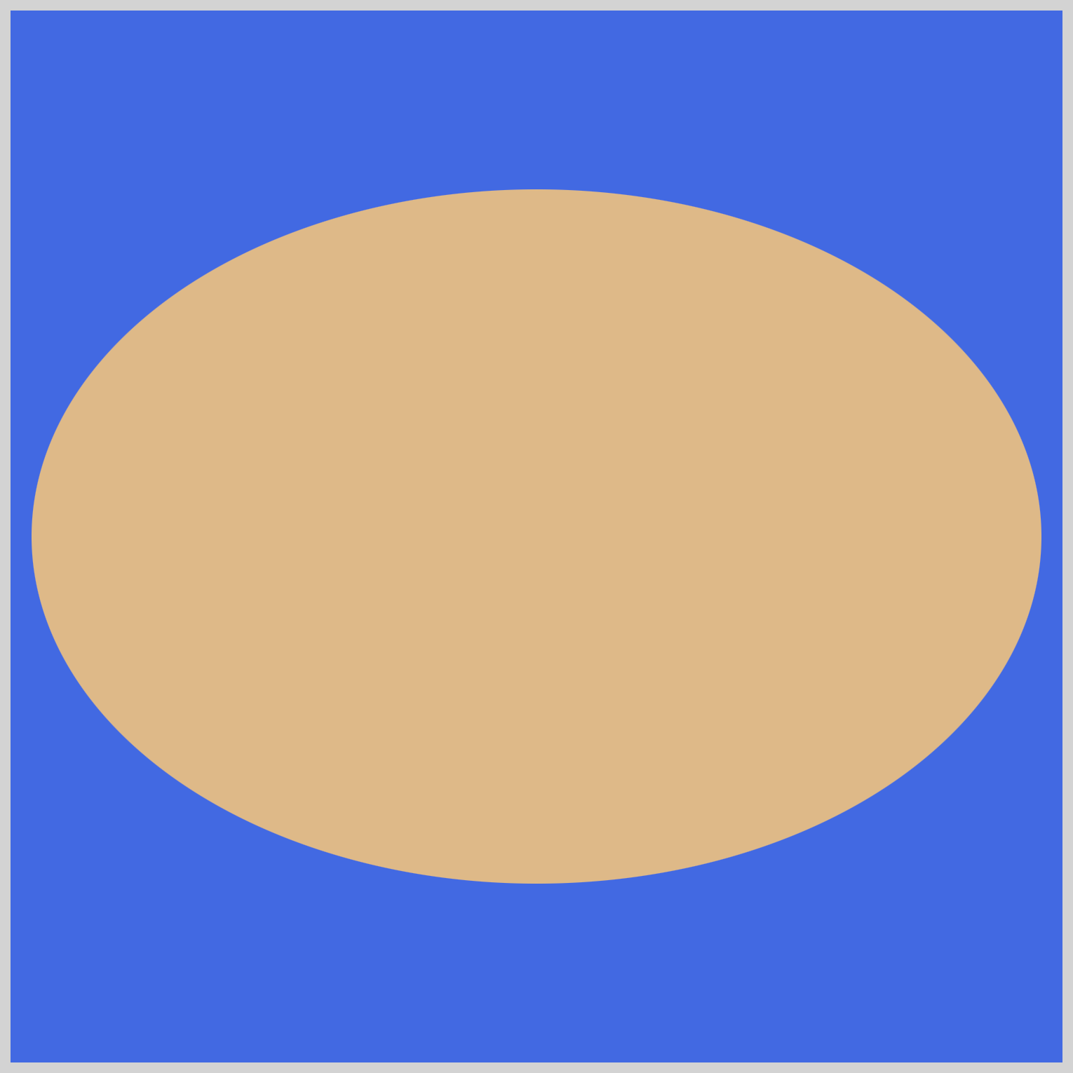
border-radius at 25%You will use the CSS @keyframes at-rule to control the intermediate steps between border-radius: 0% to border-radius: 50%.

border-radius at 37.5%/* Circle with Steps Animation */
@keyframes circle-with-steps {
from {
}
80% {
border-radius: 50%;
}
to {
border-radius: 50%;
}
}
The from state value will be left blank. This means that at the starting point of the animation, the element will have its default appearance. On the 80% intermediary step and the to state, you set the border-radius to 50%. This will transform the square into a circle by rounding all its corners.

border-radius set to 50%Now that you understand how the steps() function operates, let’s delve into a multi-step animation in the following section.
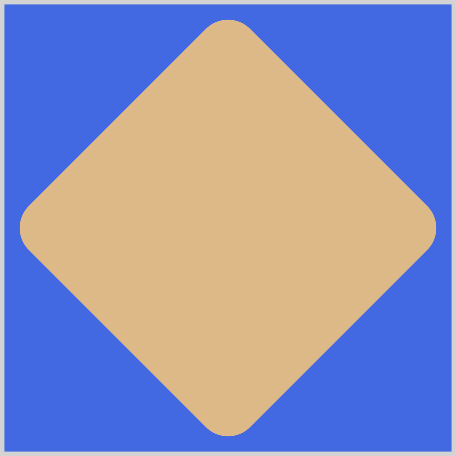
Multi-Step Shape Animation
Let’s wrap up this article with a multi-step shape animation example using the steps() function. The animation will rotate between diamond, circle, ellipse, and teardrop shapes.
/* Shape */
.shape {
  position: absolute;
  background-color: burlywood;
  width: 350px;
  height: 350px;
  rotate: 45deg;
  border-radius: 10%;
}
The initial shape will be a diamond. We make the diamond shape by rotating the square 45 degrees using the CSS rotate property and setting its border-radius value to 10%.
.shape {
  animation: shape 3s steps(1) infinite;
}
The steps() function value is set to 1. This value instructs the browser to jump directly to the next stop, in this case, 25%, 50%, and so on, without creating any intermediary tween images between the stops.
/* Shape Animation */
@keyframes shape {
  from {
  }

  /* Stops or steps inserted between from and to state */

  to {
    border-radius: 140px 140px 140px 30px;
  }
}
Using the CSS @keyframes at-rule, you’ll insert the circle, ellipse, and teardrop shapes.
@keyframes shape {
  25% {
    border-radius: 50%;
    width: 400px;
    height: 400px;
  }
}
You fully round out the square corners using border-radius: 50% and increase the shape size from 350px to 400px so that the circle matches the diamond shape size.
@keyframes shape {
  50% {
    height: 330px;
    width: 480px;
    rotate: 0deg;
  }
}
To create the ellipse, set the height property value to 330px and the width to 480px. Additionally, rotate the shape to 0 degrees to ensure the ellipse is displayed horizontally.
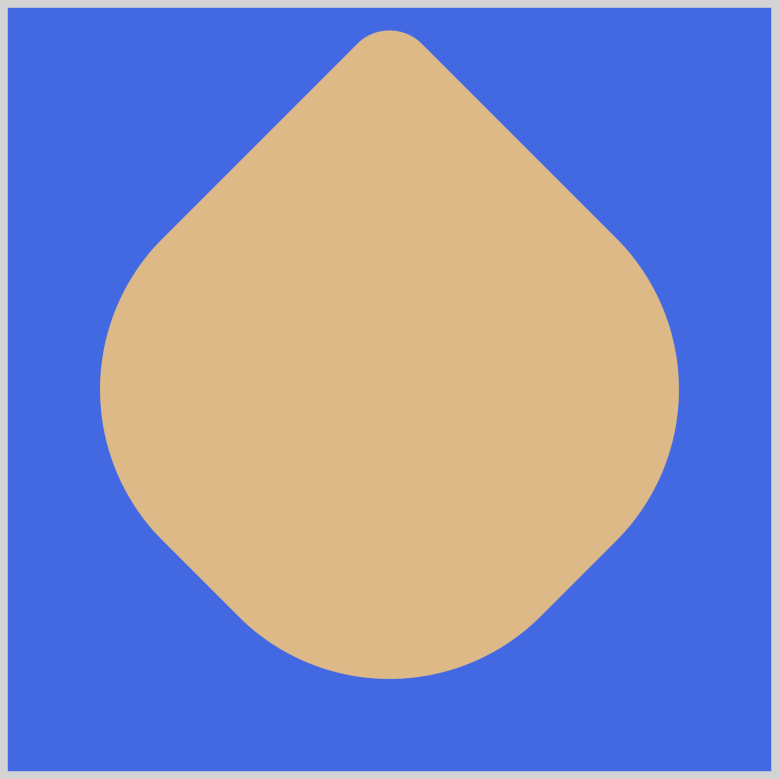
@keyframes shape {
  75% {
    border-radius: 140px 140px 140px 30px;
    height: 350px;
    width: 350px;
    rotate: 135deg;
  }
}
For the final teardrop shape, set the border-radius property value to 140px 140px 140px 30px. Set the height and width to its original size of 350px and rotate it 135 degrees.
You can see and play with the complete code on Pyxofy’s CodePen page.
See the Pen steps() Function Multi-Step Animation by Pyxofy (@pyxofy) on CodePen.
Conclusion
In this article, you learned the basics of step animation and explored the difference between keyframes and in-betweens. You learned the mechanics behind the CSS steps() animation function and how to use it to make multi-step animation.
By combining multiple CSS properties such as @keyframes, animation, and border-radius, you created a multi-shape animation sequence that transitions between a diamond, circle, ellipse, and teardrop shape.
Play around with steps() and make fascinating short or long step animations. Share your masterpiece with us on LinkedIn, Threads, Mastodon, X (Twitter) @pyxofy, or Facebook.
We hope you liked this article. Kindly share it with your network. We appreciate it.
Related Articles
Pyxofy Pyxofy
 Pyxofy