CSS Animation – rotate3d() and 3D Cube Transforms
Make 3D cubes spin and rotate! Learn to use CSS rotate3d() function and @keyframes to create exciting animation in this step-by-step article.

Introduction
In this article, you’ll learn how to animate three-dimensional (3D) cubes. You’ll dive deep into combining the CSS rotate3d() function, animation, and the @keyframes at-rule to create eye-catching 3D cube rotation and spin effects along their different axes, infusing your web design with energy and dynamism.
CSS function and properties explored in this article:
rotate3d()functionanimation@keyframestransformbackground-color
Preview
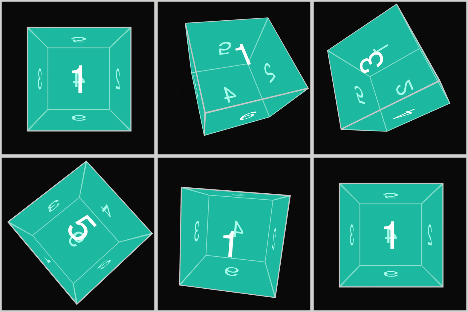
You’ll learn how to rotate the 3D cubes on their x-axis (horizontal), y-axis (vertical), and z-axis (depth).
Prerequisites
Essential CSS and HTML knowledge will help you understand the concepts and techniques introduced in this article. Jump over to this article if you require an HTML and CSS primer.
We assume you have configured tools to modify CSS. If not, this article will guide you through the setup process.
Please read this article if you’re unfamiliar with CSS animation and the @keyframes at-rule property.
HTML Structure
<div class="container">
  <div class="cube-container">
    <div class="cube x-axis">
      <div class="face front example-1">1</div>
      <div class="face right example-1">2</div>
      <div class="face left example-1">3</div>
      <div class="face back example-1">4</div>
      <div class="face top example-1">5</div>
      <div class="face bottom example-1">6</div>
    </div>
  </div>
</div>
<div class="container">
  <div class="cube-container">
    <div class="cube y-axis">
      <div class="face front example-2">1</div>
      <div class="face right example-2">2</div>
      <div class="face left example-2">3</div>
      <div class="face back example-2">4</div>
      <div class="face top example-2">5</div>
      <div class="face bottom example-2">6</div>
    </div>
  </div>
</div>
<div class="container">
  <div class="cube-container">
    <div class="cube z-axis">
      <div class="face front example-3">1</div>
      <div class="face right example-3">2</div>
      <div class="face left example-3">3</div>
      <div class="face back example-3">4</div>
      <div class="face top example-3">5</div>
      <div class="face bottom example-3">6</div>
    </div>
  </div>
</div>
<div class="container">
  <div class="cube-container">
    <div class="cube all-axes">
      <div class="face front example-4">1</div>
      <div class="face right example-4">2</div>
      <div class="face left example-4">3</div>
      <div class="face back example-4">4</div>
      <div class="face top example-4">5</div>
      <div class="face bottom example-4">6</div>
    </div>
  </div>
</div>
container is the outermost enclosure. It enables the content to be centered and draws a light gray border. The rest of the divs represent each animation sequence.
Keep the HTML structure as is for the animation to display correctly.
Body and Container Div CSS
CSS code for the body and container div.
/* Body and Container Settings */
/* Center shapes */
body {
  margin: 0;
  padding: 0;
  height: 100vh;
  display: flex;
  justify-content: center;
  align-items: center;
  flex-wrap: wrap;
}

/* Set background and border color */
.container {
  min-width: 500px;
  height: 500px;
  border: 5px solid lightgray;
  background: #0a0a0a;
  position: relative;
  margin: 5px;
  display: flex;
  justify-content: center;
  align-items: center;
}
X-axis - Blue Cube
In this section, you’ll learn how to create a 3D cube and then how to animate them. Before diving into animating the 3D cube, let’s take a short detour explaining how the 3D cubes were created.
The 3D cubes were created based on this article.

The 3D cube is composed of six unique square faces. Each face is labeled accordingly from numbers 1 to 6. The cube faces, .face, don’t come with a predefined background color assigned to them. This allows you to customize their background color, which you'll learn in the following sections.
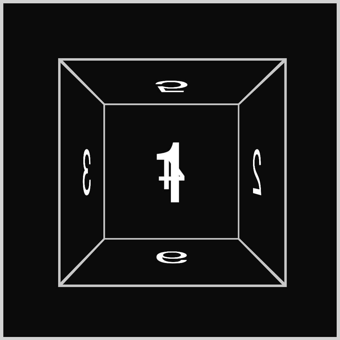
With no background color, the 3D cube is pure black and white. Now, let’s start applying colors to the cube using the CSS background-color property.
/* Cube Example 1 x-axis */
.example-1 {
  background-color: #0d7df57f;
}
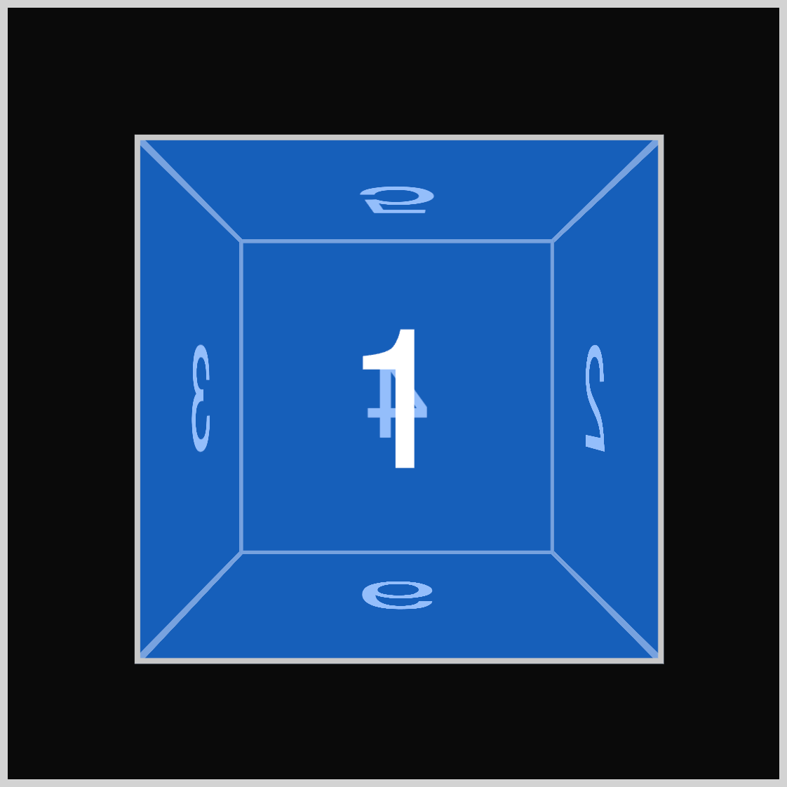
Using the CSS background-color property, we assign a blue color with 50% opacity (#0d7df57f) as its property value.
Next, set the animation property values to target the .cube and .x-axis CSS selectors.
.cube.x-axis {
  animation: x-axis-rotate 2s ease-in-out 1;
}
x-axis-rotateis the animation name.- The animation duration is set to two seconds (
2s). ease-in-outis the animation timing function.- The animation iteration count is set to
1.
The final step is to set up the @keyframes at-rule property values. If you’re not familiar with the CSS rotate3d() function, jump to this article for details.

@keyframes x-axis-rotate {
  from {
    transform: rotate3d(0, 0, 0, 0deg);
  }
  to {
    transform: rotate3d(1, 0, 0, 360deg);
  }
}
x-axis-rotateis the keyframe list identifier. Make sure this value matches your animation name; otherwise, the animation will fail.- At the
fromstarting offset, applytransform: rotate3d(0, 0, 0, 0deg), which will be the animation’s starting position. transform: rotate3d(1, 0, 0, 360deg)is set as thetoending animation offset.
The @keyframes will animate the three-dimensional (3D) cube using the rotate3d() function. Using 1 as the first function value indicates a rotation around the x-axis. An angle of 360deg will rotate the cube a full 360 degrees.
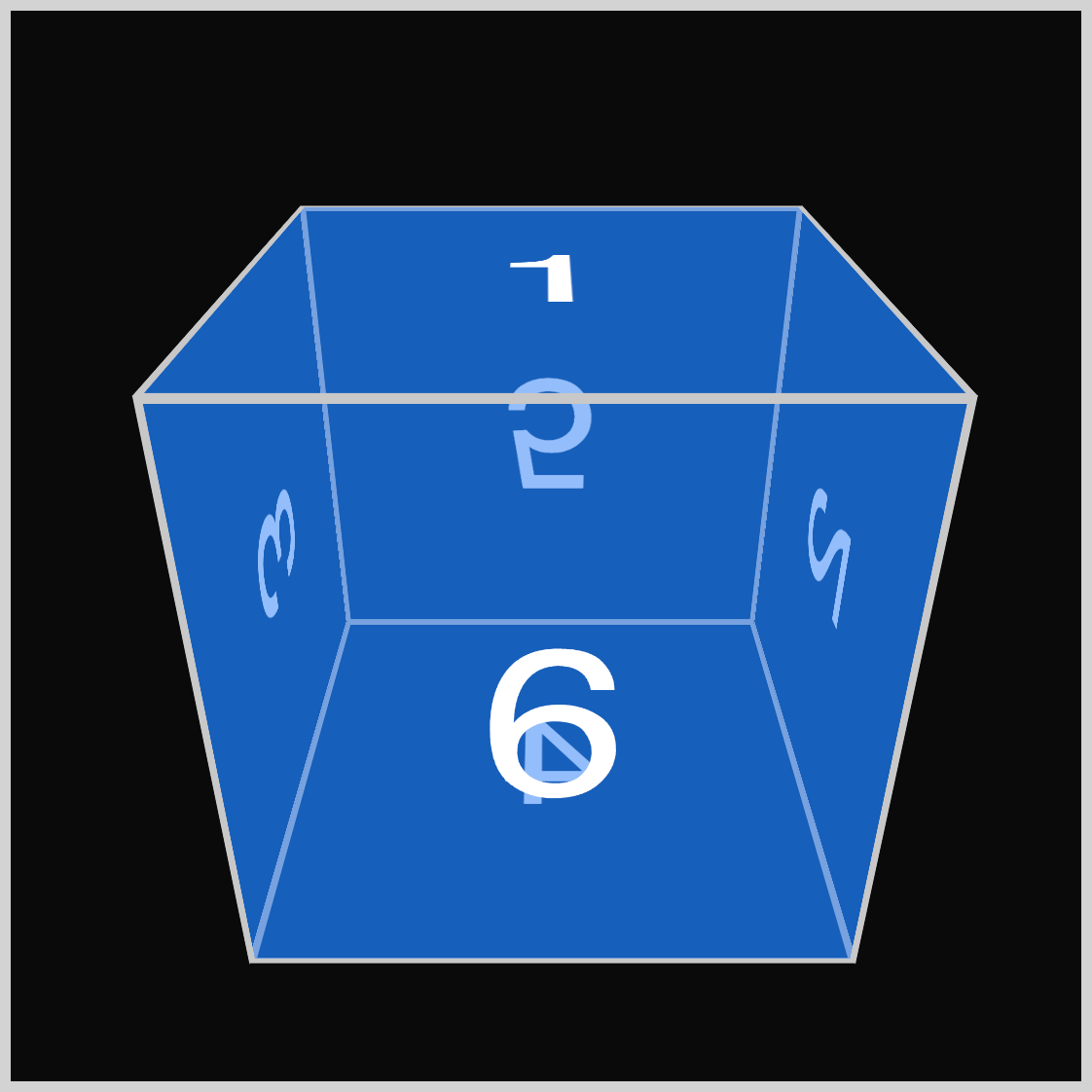
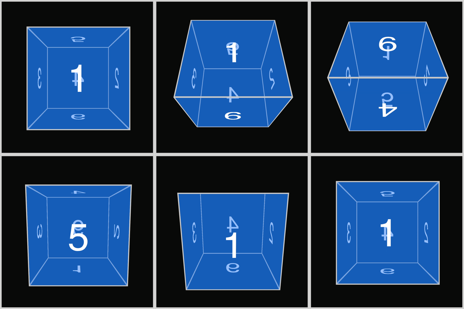
The blue cube rotates around its x-axis (horizontal). It will turn backward, causing the displayed numbers to change accordingly.
As the cube rotates, the number 1 rotates backward, and the number 6 is displayed at around 60 degrees.
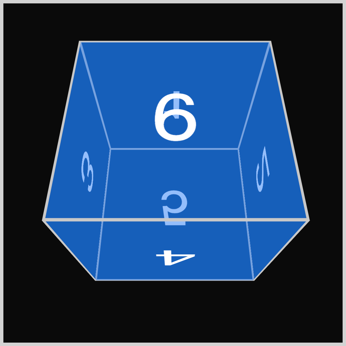
Numbers displayed during the cube rotation:
- 1
- 6
- 4
- 5
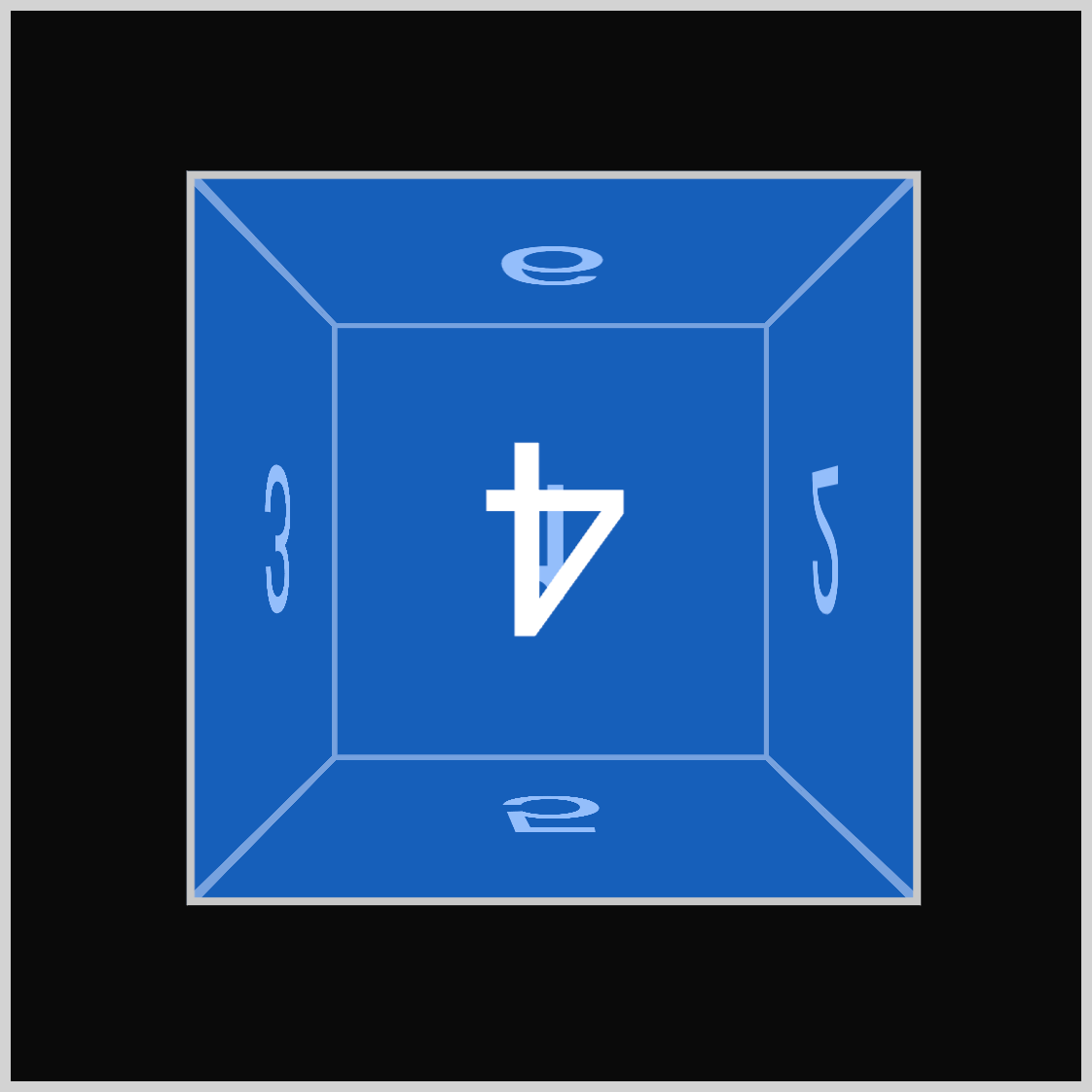
An inverted number four (4) is displayed at 180 degrees.
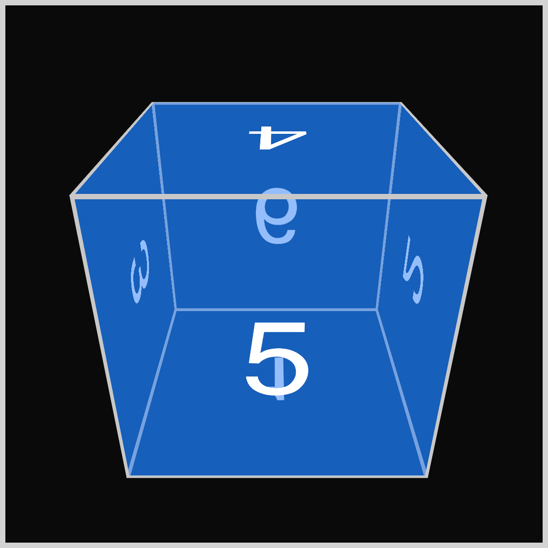
The number five (5) rotates in as number four rotates out at 240 degrees.
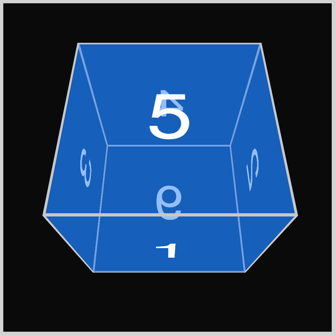
At 300 degrees, the number five is fully visible.
Let’s work on the violet cube in the next section.
Y-axis - Violet Cube
Like the previous blue cube, the violet cube also uses the default cube faces. You will customize the cube’s color and the rotation angle.
/* Cube Example 2 y-axis */
.example-2 {
  background-color: #6e4ff87f;
}
The background-color CSS property is set to a violet shade with 50% opacity using #6e4ff87f.
Next, let’s set up the CSS animation property values.
.cube.y-axis {
  animation: y-axis-rotate 2s ease-in-out 1;
}
The animation is named y-axis-rotate, with a duration of two seconds (2s). It uses the ease-in-out for the timing function value, and the iteration count is set to 1.
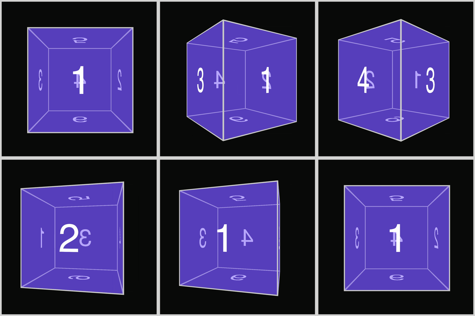
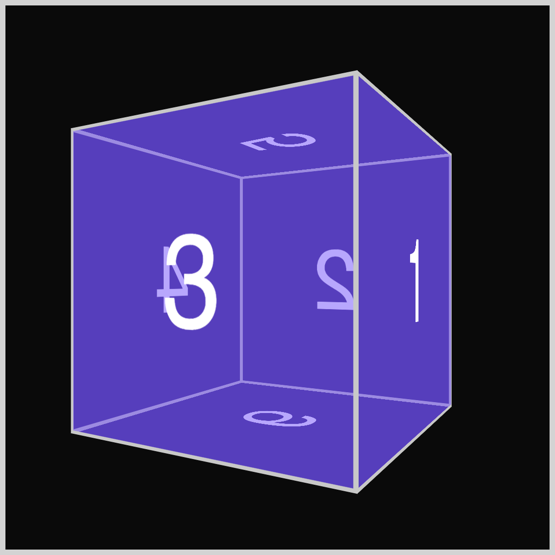
The violet will rotate on its y or vertical axis and will turn to the right side.
Next, set up the CSS @keyframes at-rule styles.
@keyframes y-axis-rotate {
  from {
    transform: rotate3d(0, 0, 0, 0deg);
  }
  to {
    transform: rotate3d(0, 1, 0, 360deg);
  }
}
Ensure the identifier name is y-axis-rotate, which must match the animation name value from the previous step. Setting one (1) as the second value in the rotate3d() function rotates the cube around its vertical or y-axis. The rest of the values are identical to the previous blue cube.

These are the numbers displayed during the cube’s rotation:
- 1
- 3
- 4
- 2
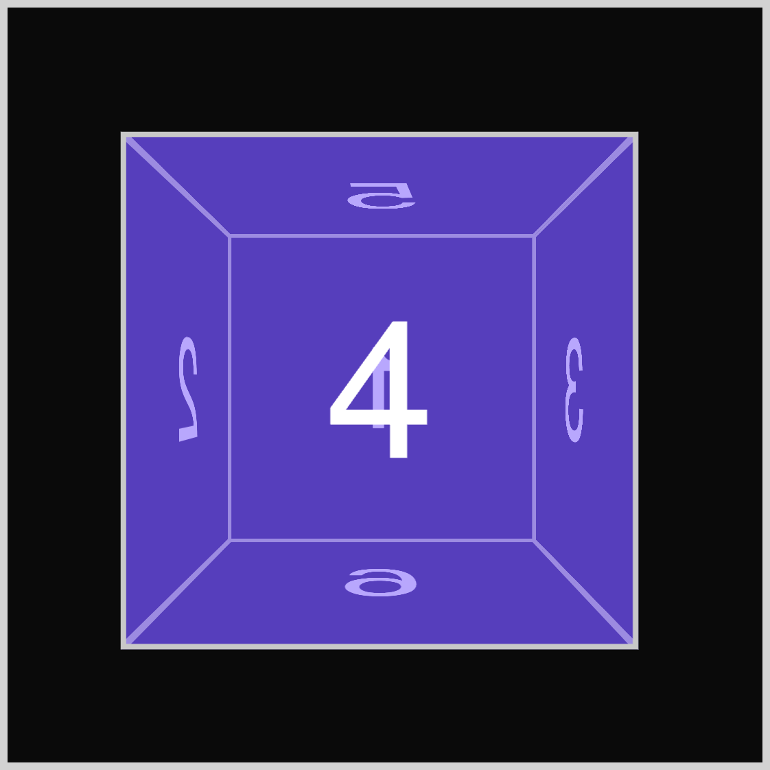
The number four (4) is fully displayed at 180 degrees.
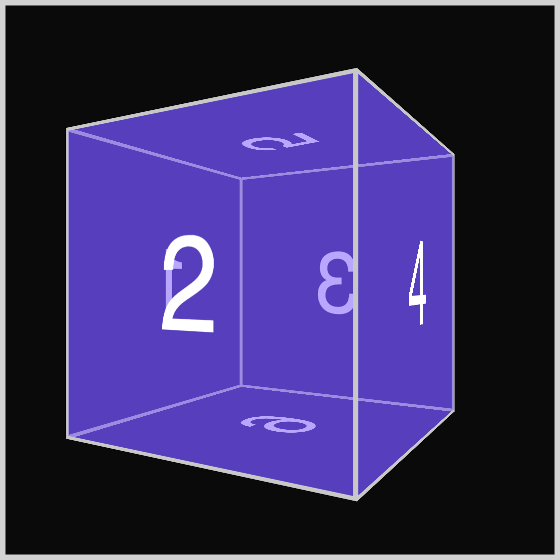
At 240 degrees, the number four is almost out of sight while the number two (2) rotates into view.
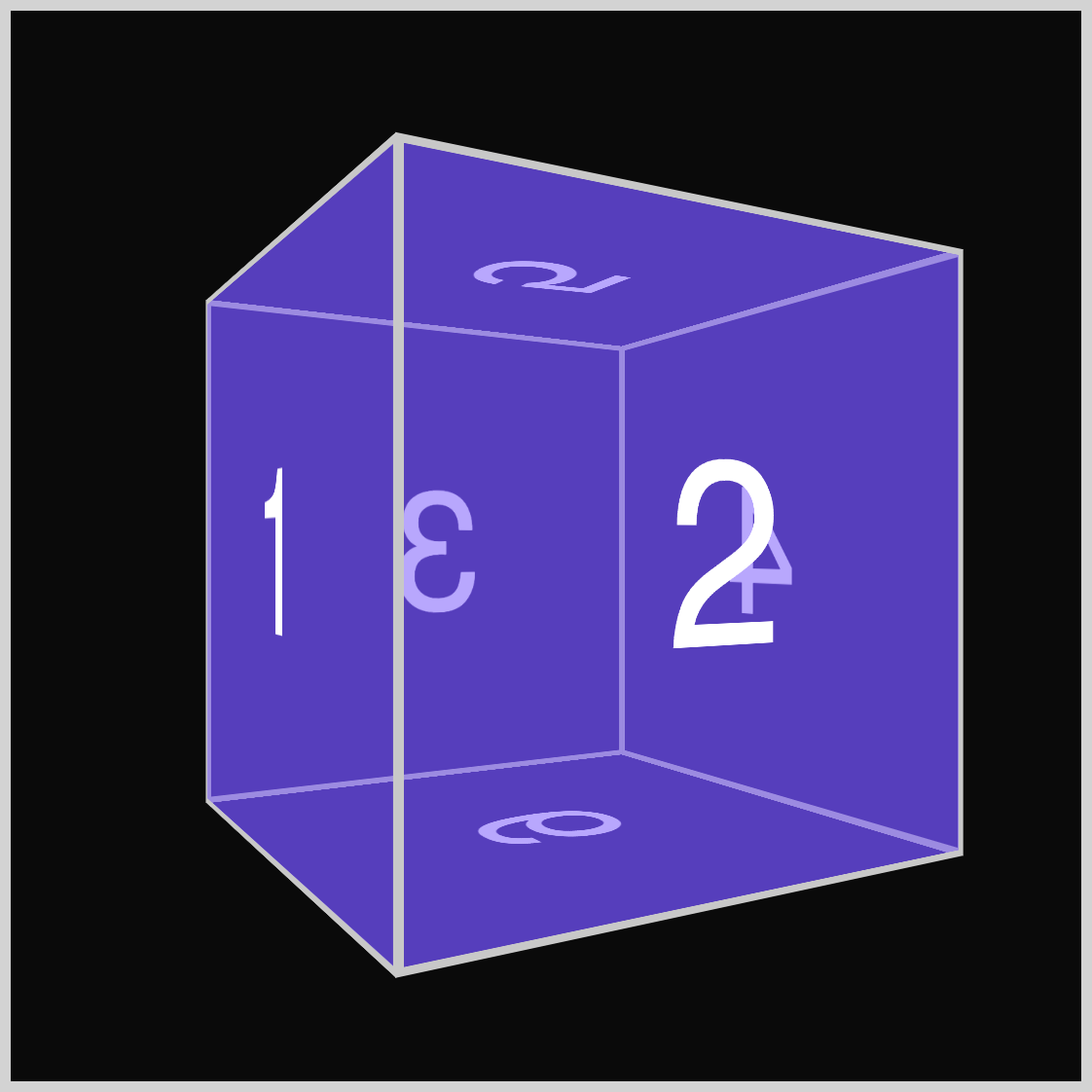
After number two, around 300 degrees, the number one (1) is slightly visible.
Next up is the orange cube.
Z-axis - Orange Cube
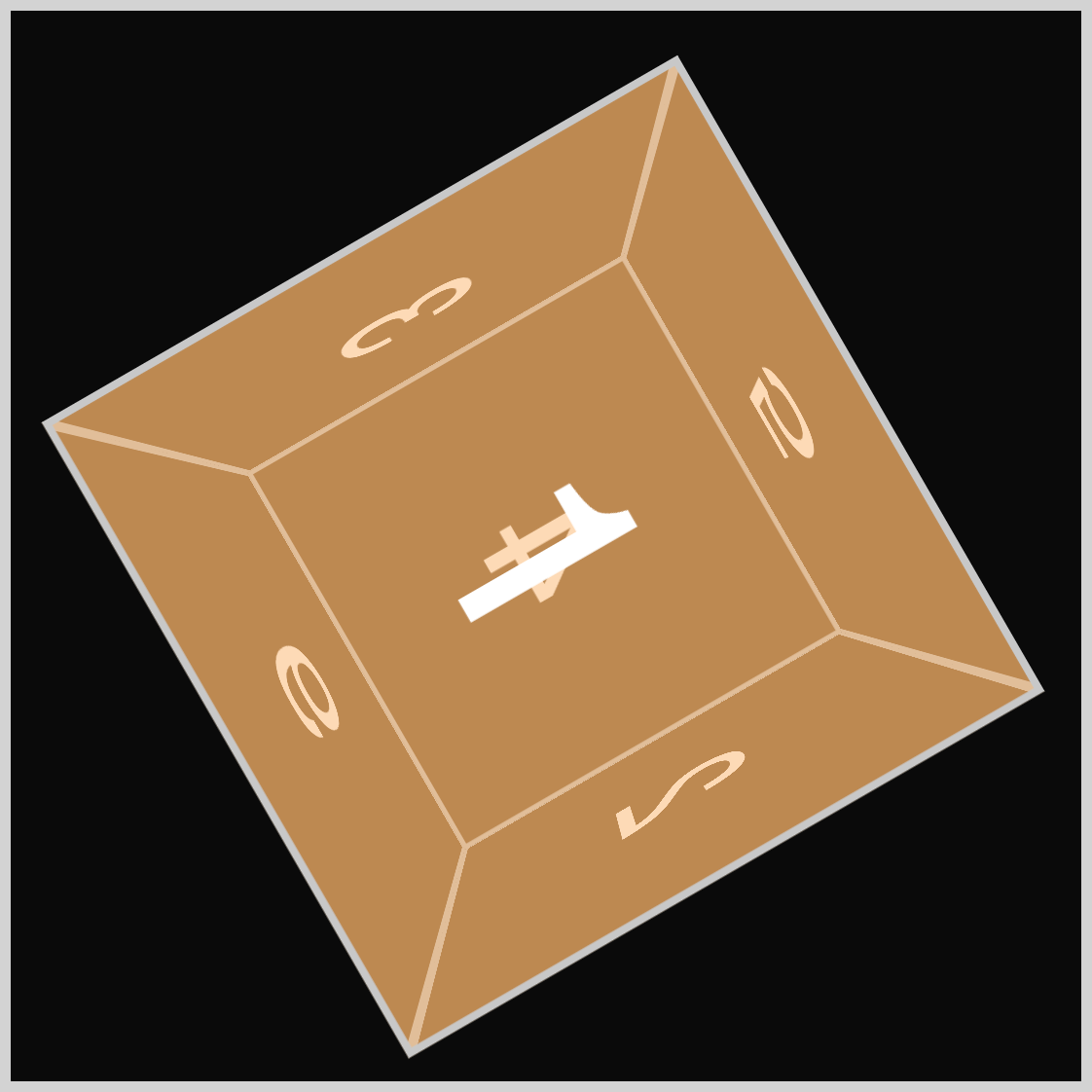
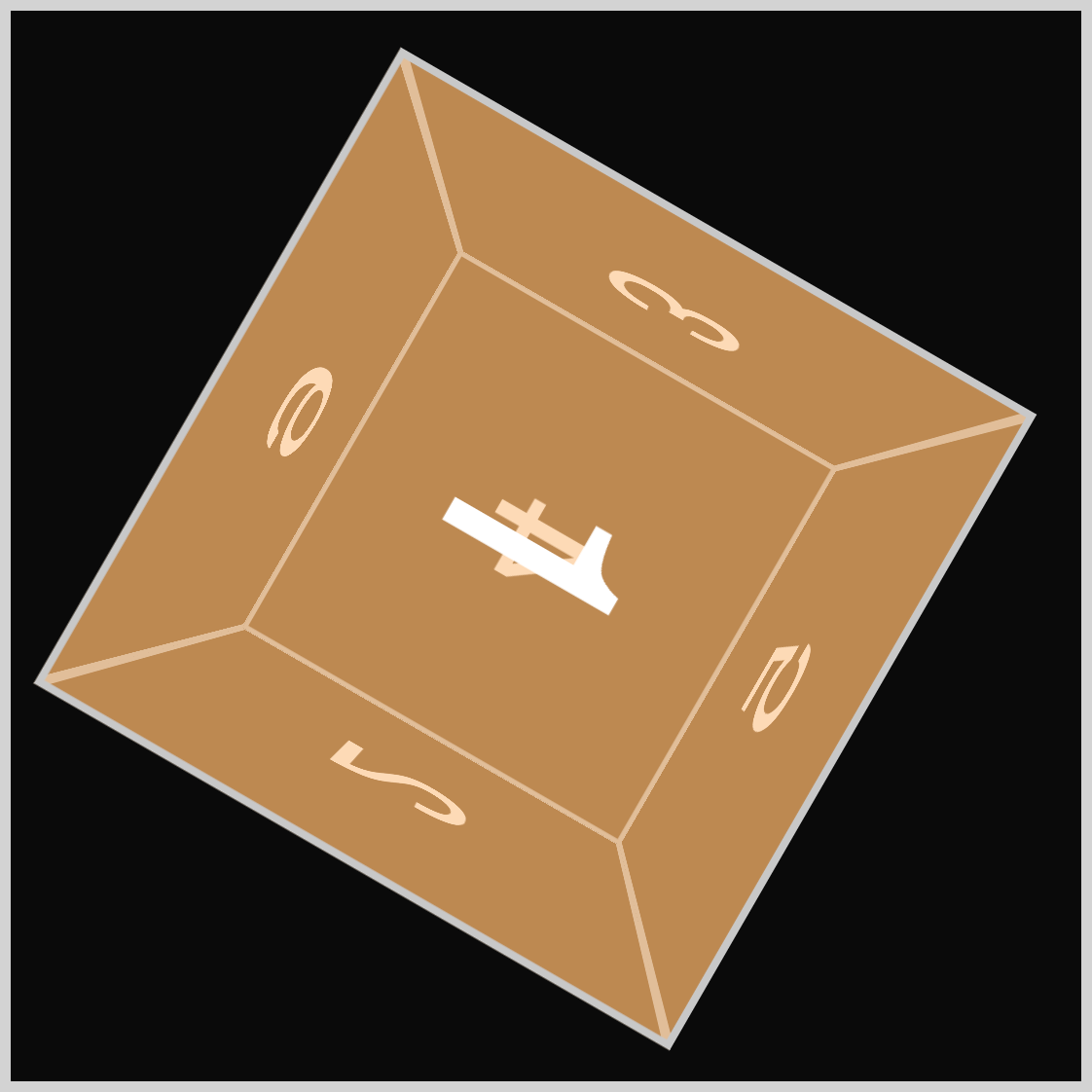
The orange cube rotates along the depth or z-axis. In this instance, it will rotate in a clockwise direction.
As with the earlier cubes, begin by setting a background color for the cube.
/* Cube Example 3 z-axis */
.example-3 {
  background-color: #fab3677f;
}
#fab3677f is an orange hue with 50% transparency that is set as the background-color property value for the .example-3 CSS selector.
Next up is the animation property values.
.cube.z-axis {
  animation: z-axis-rotate 2s ease-in-out 1;
}
The animation property values target both the .cube and .z-axis CSS selectors.
- The animation name is
z-axis-rotate. - The animation will last for two seconds (
2s). ease-in-outis the animation timing function.- Animation iteration count is set to one (
1).
The next step is to set up the @keyframes at-rule.
@keyframes z-axis-rotate {
  from {
    transform: rotate3d(0, 0, 0, 0deg);
  }
  to {
    transform: rotate3d(0, 0, 1, 360deg);
  }
}
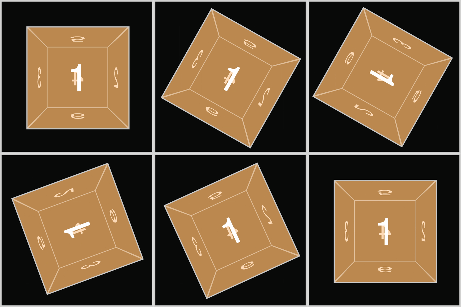
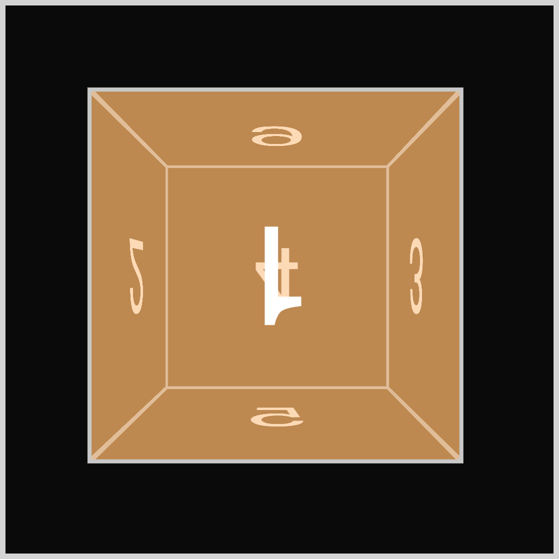
Start by naming the keyframe animation z-axis-rotate, which corresponds to the animation name defined in the previous step. The animation begins with no rotation at the starting point, from, using rotate3d(0, 0, 0, 0deg). The to or ending point of the animation is set to rotate3d(0, 0, 1, 360deg), meaning the cube will rotate on its z-axis. As a result of the 360deg positive angle, the cube appears to spin clockwise in a two-dimensional (2D) manner.
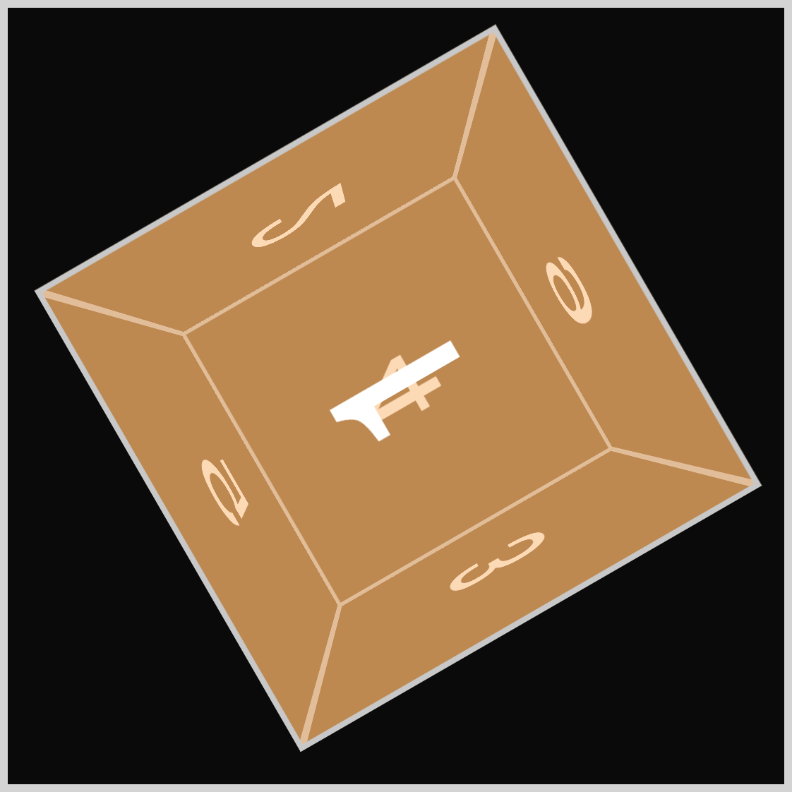
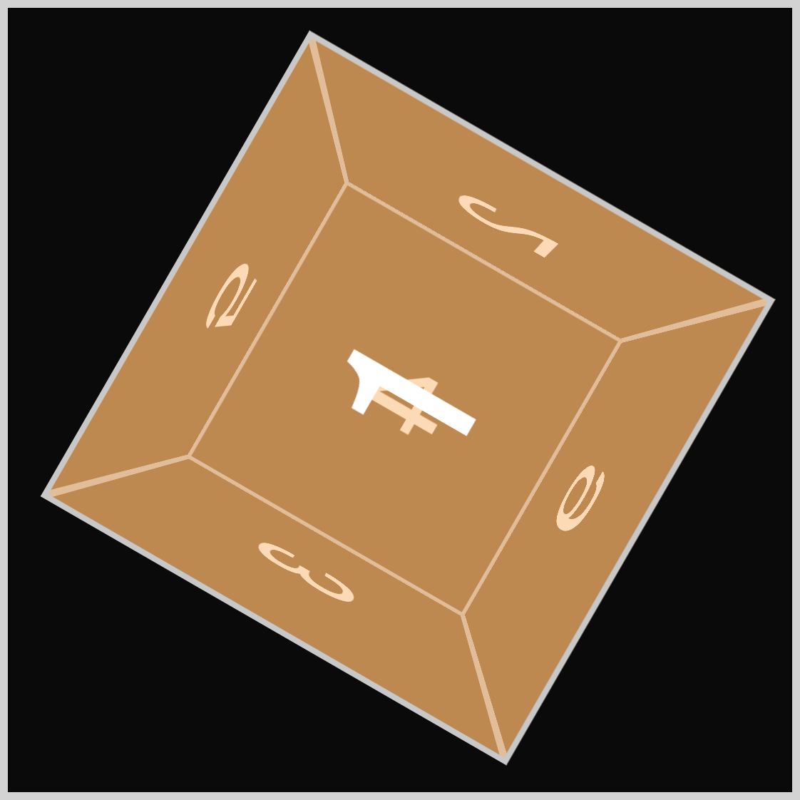
The orange cube displays the number one (1) throughout its rotation while numbers two (2), three (3), five (5), and six (6) spin clockwise.
For the final section, you’ll learn how to move the green cube in all axes.
All-axes - Green Cube
In this final section, we’ll explain how to rotate the green cube along all axes. To keep it concise, we’ll concentrate on the @keyframes at-rule, as the other CSS element’s explanations have been thoroughly covered in earlier sections.
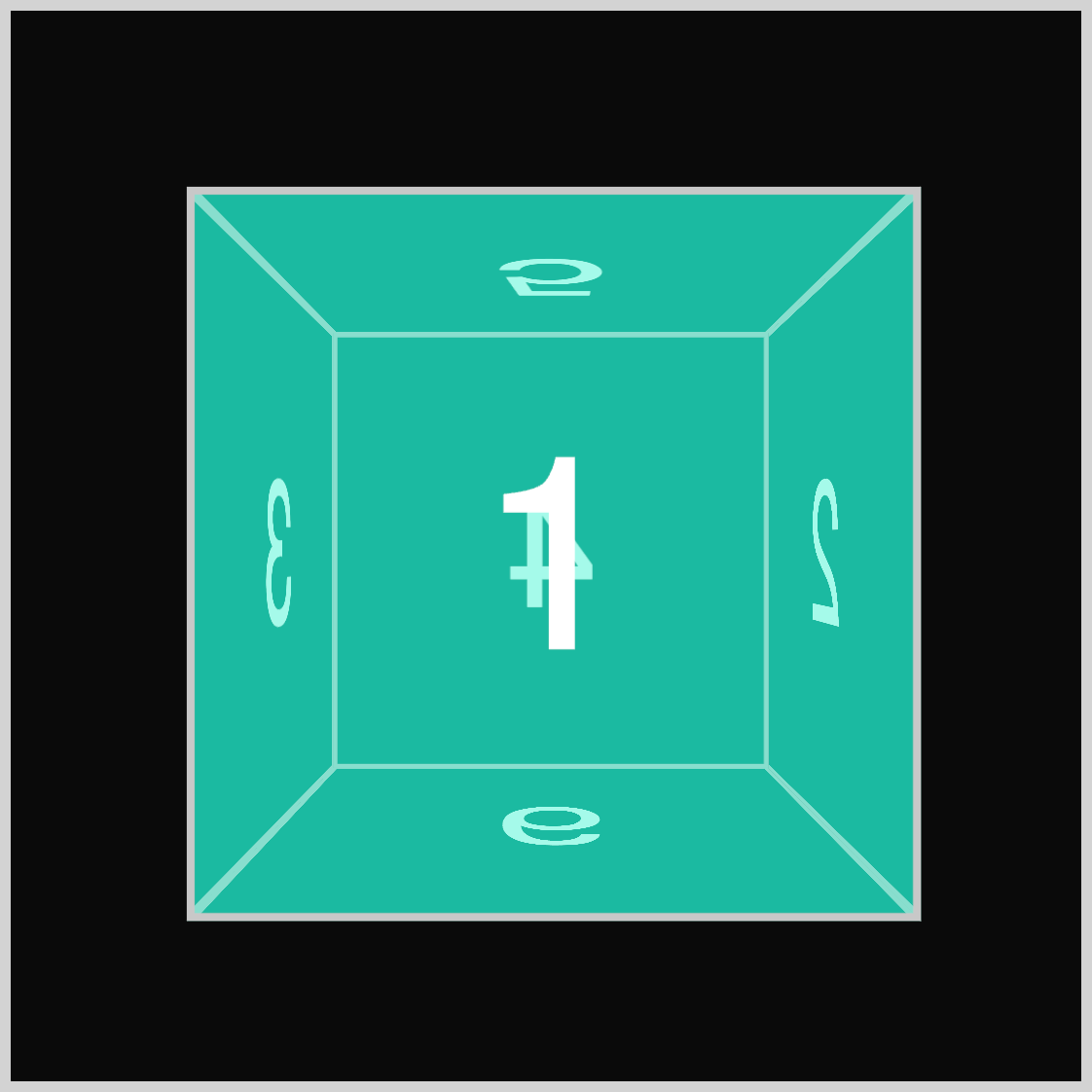
/* Cube Example 4 all-axes */
.example-4 {
  background-color: #0df5d37f;
}
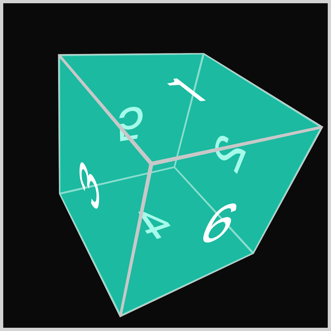
.cube.all-axes {
  animation: all-axes-rotate 2s ease-in-out 1;
}
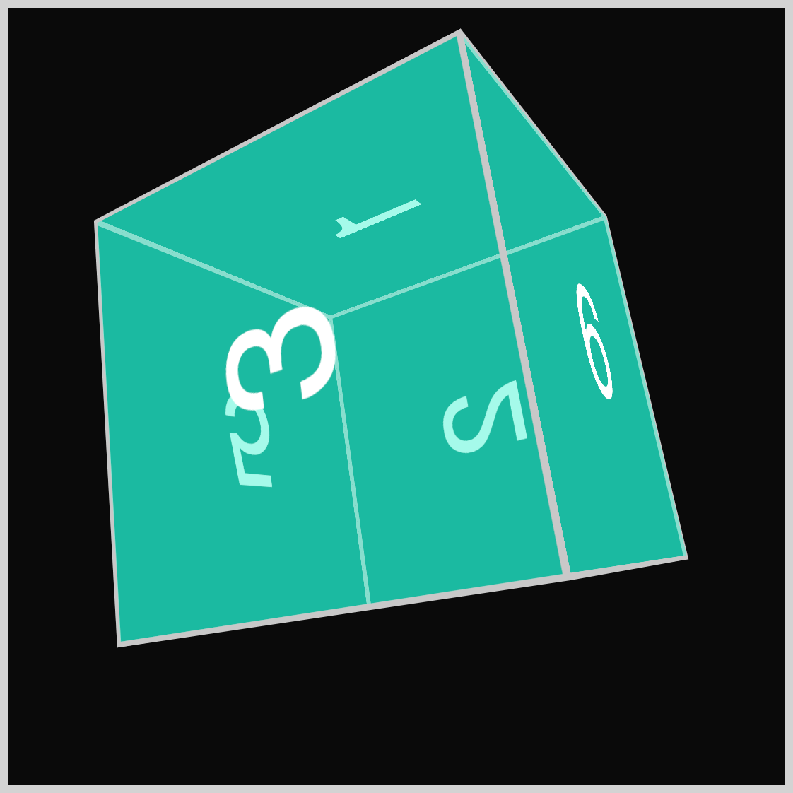
@keyframes all-axes-rotate {
  from {
    transform: rotate3d(0, 0, 0, 0deg);
  }
  to {
    transform: rotate3d(2, 1, -1, 360deg);
  }
}
- The animation name (identifier) is set to
all-axes-rotate. - The
fromkeyframe selector, animation starting point, is set torotate3d(0, 0, 0, 0deg). - The animation ending point
tohas a value ofrotate3d(2, 1, -1, 360deg). The first function value (x-axis) is set to2, and the y-axis (second value) is set to1. The final function value, z-axis, is set to negative 1 (-1). - The animation angle transitions from zero degrees (
0deg) to 360 degrees (360deg).
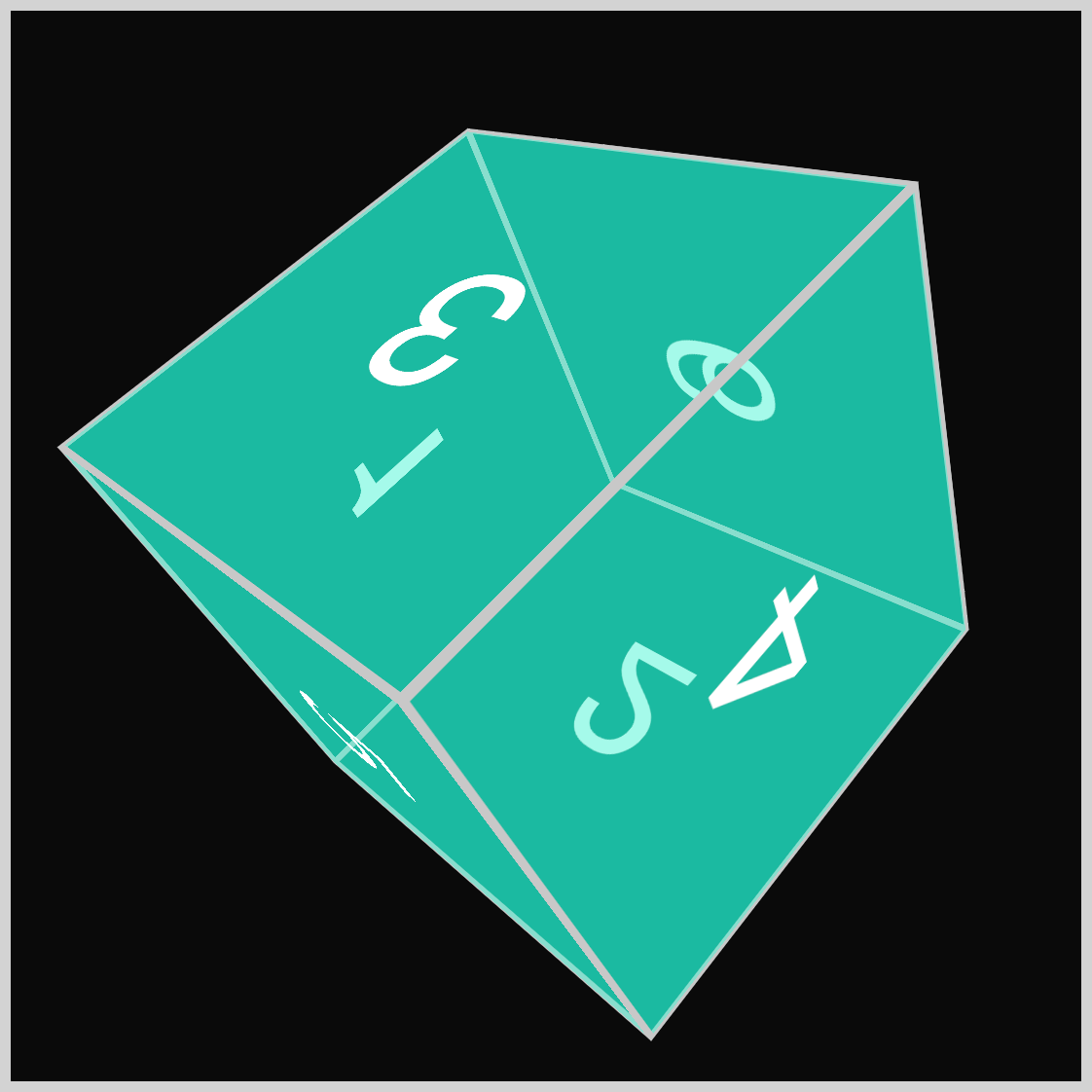
Numbers displayed during the cube rotation:
- 1
- 6
- 3
- 4
- 5
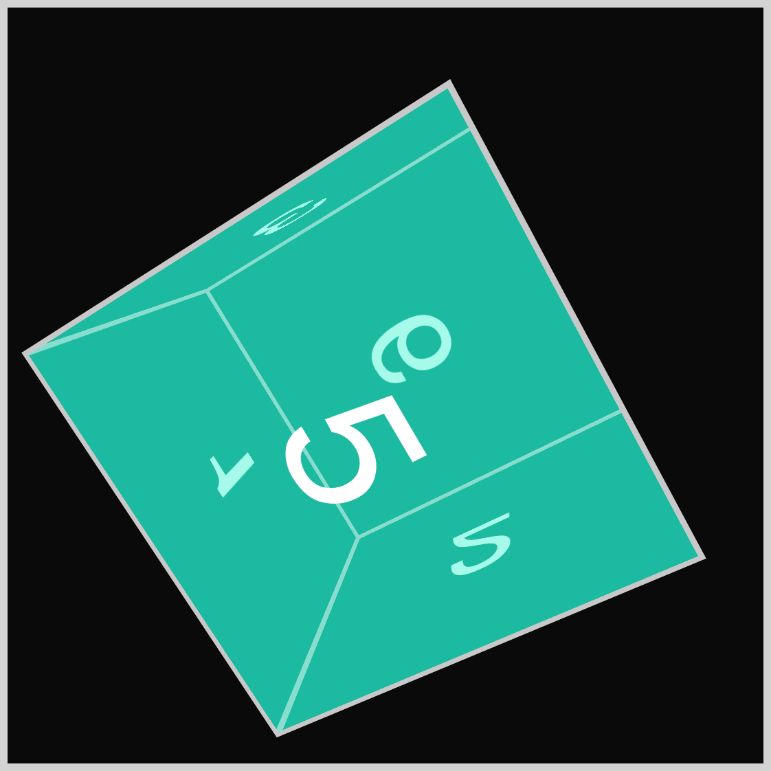
The number five (5) is front and center at 240 degrees.
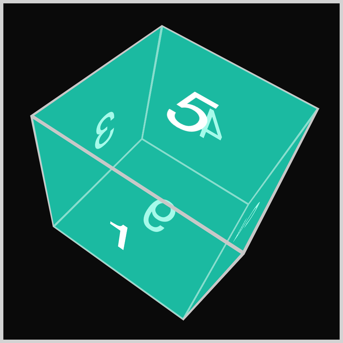
As the cube nears 300 degrees, the number one (1) rotates into view, returning to its initial state.
You can see and play with the complete code on Pyxofy’s CodePen page.
See the Pen CSS Animation - rotate3d() and 3D Cube Transforms by Pyxofy (@pyxofy) on CodePen.
Conclusion
This article explored the CSS rotate3d() function, animation, @keyframes at-rule, and transform in detail. You learned how to rotate a three-dimensional (3D) cube around its x-axis, y-axis, and z-axis and across all three axes simultaneously.
The rotate3d() function is a versatile tool that helps you create engaging 3D-looking designs. Expand on the four animation examples described in this article. How about using negative values instead of positive values or modifying the rotation angle degrees? Share your masterpiece with us on LinkedIn, Threads, Bluesky, Mastodon, X (Twitter) @pyxofy, or Facebook.
We hope you liked this article. Kindly share it with your network. We appreciate it.
Related Articles


