CSS Animation – Rotate and Transform Elements
Rotate and transform animation sequences are easy to make with CSS. Learn how to apply them to multiple elements in this step-by-step article.

Introduction
Transforming and rotating are simple but fun animations. This article explores creating an animation sequence that rotates and transforms multiple elements.
CSS Properties you’ll learn in this article:
rotateradial-gradient()blur()heightborder-radius- Custom properties (variables)
Preview
You will learn how to rotate and transform multiple elements in this article. You’ll start by creating three simple circle shapes and then apply transform and rotate animations to them.

Prerequisites
Essential CSS and HTML knowledge will help you understand the concepts and techniques introduced in this article. Jump over to this article if you require an HTML and CSS primer.
We assume that you have set up tools to manipulate CSS. If you haven’t, this article will show you how to set them up.
Please read this article if you’re unfamiliar with CSS animation and the @keyframes at-rule property.
HTML Structure
<div class="container">
  <div class="shape-1"></div>
  <div class="shape-2"></div>
  <div class="shape-3"></div>
</div>
container is the outermost enclosure. It enables the content to be centered and draws a light gray border. The rest of the divs represent each animation sequence.
Keep the HTML structure as is for the animation to display correctly.
Body and Container Div CSS
CSS code for the body and container div.
/* Body and Container Settings */
/* Center shapes */
body {
  margin: 0;
  padding: 0;
  height: 100vh;
  display: flex;
  justify-content: center;
  align-items: center;
  flex-wrap: wrap;
}

/* Set background and border color */
.container {
  width: 500px;
  height: 500px;
  border: 5px solid lightgray;
  background: royalblue;
  position: relative;
  margin: 5px;
  display: flex;
  justify-content: center;
  align-items: center;

  /* Rotate Container */
  rotate: 180.02deg;

  /* rotate: 180deg; */
  /* Causes a rendering bug in Firefox 131.0b9 (aarch64) */
}
Basic Circle Shape
In this section, you’ll learn about the circle shapes’ shared properties.

/* Shared Properties */
.shape-1,
.shape-2,
.shape-3 {
  position: absolute;
  width: 100px;
  height: 100px;
  top: 150px;
  border-radius: 50px;
  background: burlywood;
  animation-duration: 2s;
  animation-timing-function: ease-in-out;
  animation-iteration-count: infinite;
}
- The shapes’
positionproperty value is set toabsolute. - The
widthandheightvalues are set to100px. - The shape is positioned
150pxfrom the top, has aborder-radiusof50px, and itsbackgroundcolor is set toburlywood. - The animation sequence will last for two seconds,
2s, with a timing function ofease-in-outand will loop withinfinite.
/* Color Palette */
:root {
  --gradient: radial-gradient(at 5% 80%, seashell, burlywood 70%);
}
You will use a radial gradient when the shapes are transforming and rotating. The gradient colors will be seashell and burlwood and positioned 5% on the x-axis and 80% on the y-axis.
To minimize the amount of code, we will use CSS custom properties (variables) to apply the radial gradient. Please refer to this article for details on creating CSS custom properties (variables).

/* Set background and border color */
.container {
  /* Rotate Container */
  rotate: 180.02deg;

  /* rotate: 180deg; */
  /* Causes a rendering bug in Firefox 131.0b9 (aarch64) */
}
To ensure the animation works properly, you must rotate the container using rotate: 180.02deg. Do take note that since the container is rotated 180 degrees, the x-axis and y-axis direction is reversed.
At the time of this writing, a rendering bug prevents Firefox from displaying the animation. Setting 180.02deg as the rotate property value addresses the Firefox rendering bug.
Let’s start making the three shapes in the following sections.
Shape 1
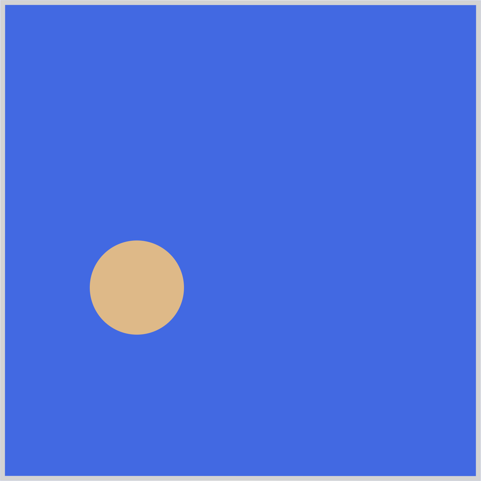
Shape 1 is the first circle, located on the left-hand side. It will move from the left to the right side of the container.
/* Shape 1 */
.shape-1 {
  left: 310px;
  animation: shape-1-movement;
}
In the previous section, we noted that the container element is rotated 180 degrees, which impacts the left property values. Shape 1's initial position is specified as left: 310px. Typically, a value of 310px would place Shape 1 on the right-hand side of the container. However, because of the container element’s rotation, Shape 1 appears visually on the left side of the container.
Shape 1’s animation name is set to shape-1-movement.
/* Shape 1 Animation */
@keyframes shape-1-movement {
  from {
  }
  50% {
    filter: blur(1.5px);
  }
  to {
    left: 100px;
  }
}
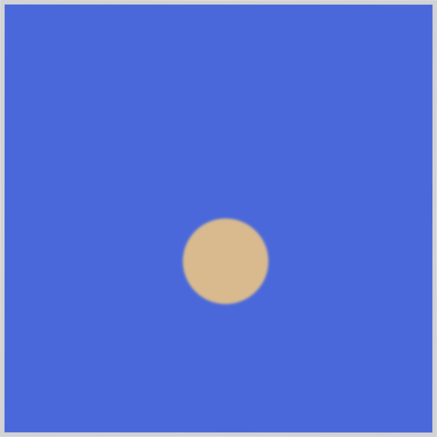
Shape 1 will move from 310px to 100px. A blur effect is added at the midpoint keyframe, 50%, using filter: blur(1.5px).
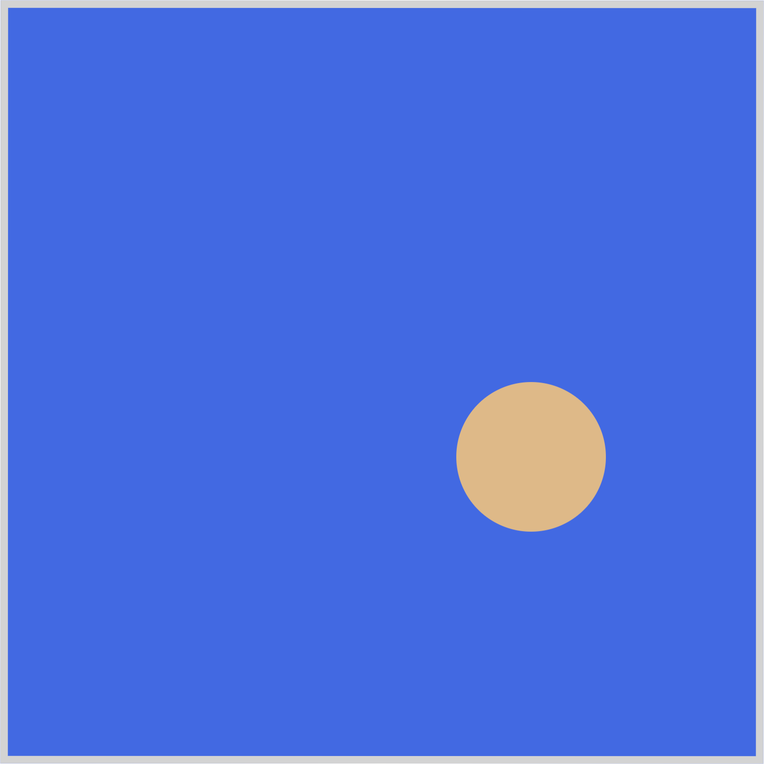
The blur effect will give Shape 1 a slight sense of depth, making it look like it’s receding from the foreground.
Let’s work on Shape 2 in the next section.
Shape 2
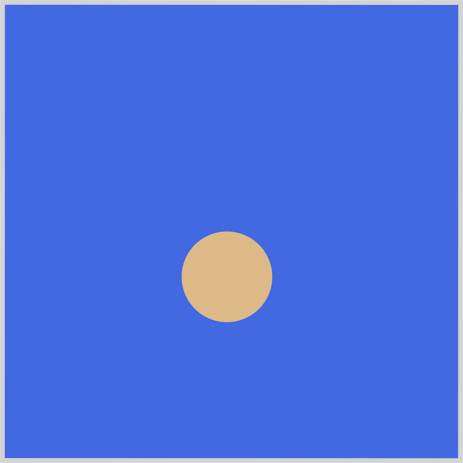
Shape 2 is the middle circle and has both a height transform and a blur effect animation sequence.
/* Shape 2 */
.shape-2 {
  left: 205px;
  animation: shape-2-movement;
}
Shape 2 is positioned left: 205px, and its animation name is set to shape-2-movement.

/* Shape 2 Animation */
@keyframes shape-2-movement {
  from {
  }
  5% {
    background: var(--gradient);
  }
  10% {
    height: 125px;
  }
  20% {
    height: 150px;
  }
  to {
    height: 100px;
  }
}
- At the
5%waypoint, thebackgroundproperty value is set to a CSS custom property (variable),var(--gradient), which equates toradial-gradient(at 5% 80%, seashell, burlywood 70%). - From the
10%waypoint, theheightproperty value is set to125px. - The
heightproperty value is further increased to150pxat the20%mark. - At the
towaypoint, the height is set back to100px.

@keyframes shape-2-movement {
  50% {
    filter: blur(1px);
  }
}
Similar to Shape 1, a slight blur effect, blur(1px), is applied to Shape 2 at the animation sequence’s 50% mark.
Shape 3
Shape 3 represents the third circle within the container, initially positioned on the right side. Its animation sequence is notably more intricate compared to the other two shapes.

/* Shape 3 */
.shape-3 {
  left: 100px;
  animation: shape-3-movement;
}
Shape 3’s animation name is set to shape-3-movement and positioned at left: 100px.
200px/* Shape 3 Animation */
@keyframes shape-3-movement {
from {
background: var(--gradient);
}
10% {
height: 150px;
}
20% {
height: 200px;
left: 100px;
}
}
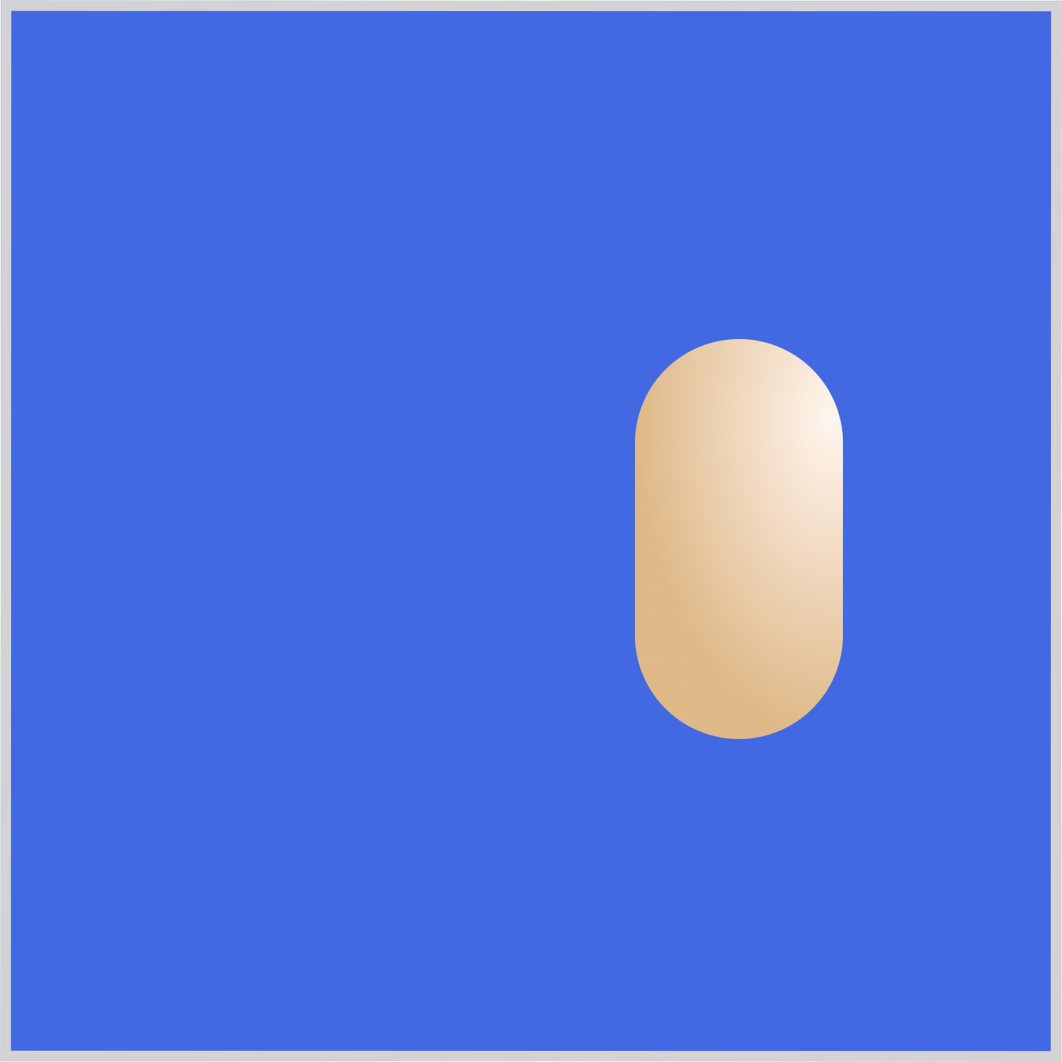
Similar to Shape 2, you assign the CSS custom property (variable), var(--gradient) as Shape 3’s background property value. At the 10% waypoint, the height is increased to 150px. The height is further increased to 200px at 20% while staying at left: 100px.

@keyframes shape-3-movement {
  50% {
    height: 200px;
    left: 205px;
  }
}
Shape 3 will move to the middle area of the container by the 50% mark while keeping its height at 200px.

@keyframes shape-3-movement {
  90% {
    height: 100px;
  }
  to {
    height: 100px;
    left: 310px;
    background: var(--gradient);
  }
}
With height: 100px, Shape 3 will shrink its height from 200px down to 100px.
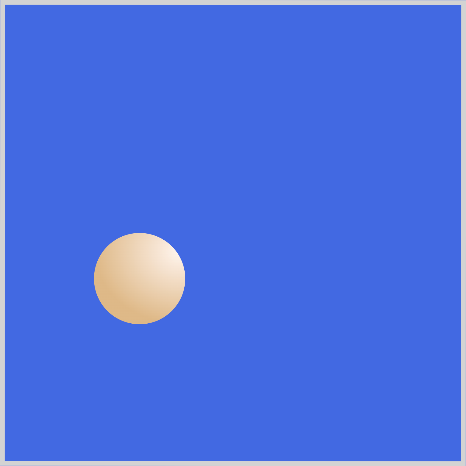
Shape 3’s final state will be left: 310px, the left area of the container, and will revert to a circle shape while retaining its gradient background.
Multi-Element Transform
In this final section, let’s break down how multiple shapes transform in tandem.

Shape 2 and Shape 3’s height properties are transformed simultaneously. Shape 2 has a max height of 150px, while shape 3 has a height of 200px.

In the middle area, Shape 2 starts to shrink, and a slight blur effect is applied to make it look like it’s receding in the background while Shape 3 is passing it.

Shape 2 and Shape 3 return to circles at their end state. Shape 3 retains its gradient background, while Shape 2 goes back to its default background color.

All shapes in their end state.
You can see and play with the complete code on Pyxofy’s CodePen page.
See the Pen CSS Animation - Rotate and Transform Elements by Pyxofy (@pyxofy) on CodePen.
Conclusion
In this article, you learned how to combine multiple CSS properties to rotate and transform elements.
First, you used the CSS custom properties (variables) to assign a radial-gradient() to the shape’s background. Next, you utilized the height, blur(), and rotate to transform the circle into an elongated shape.
You learned how to use the left property in tandem with the animation and @keyframes at-rule to simulate a rotation-like animation sequence.
Share your masterpiece with us on LinkedIn, Threads, Mastodon, X (Twitter) @pyxofy, or Facebook.
We hope you liked this article. Kindly share it with your network. We appreciate it.
Related Articles
