CSS Animation - Isometric Cubes with Move and Text Glow Animation Effects
How can you create moving isometric cubes, a radial gradient background, and glowing text? Join us in this step-by-step article to learn more.

Introduction
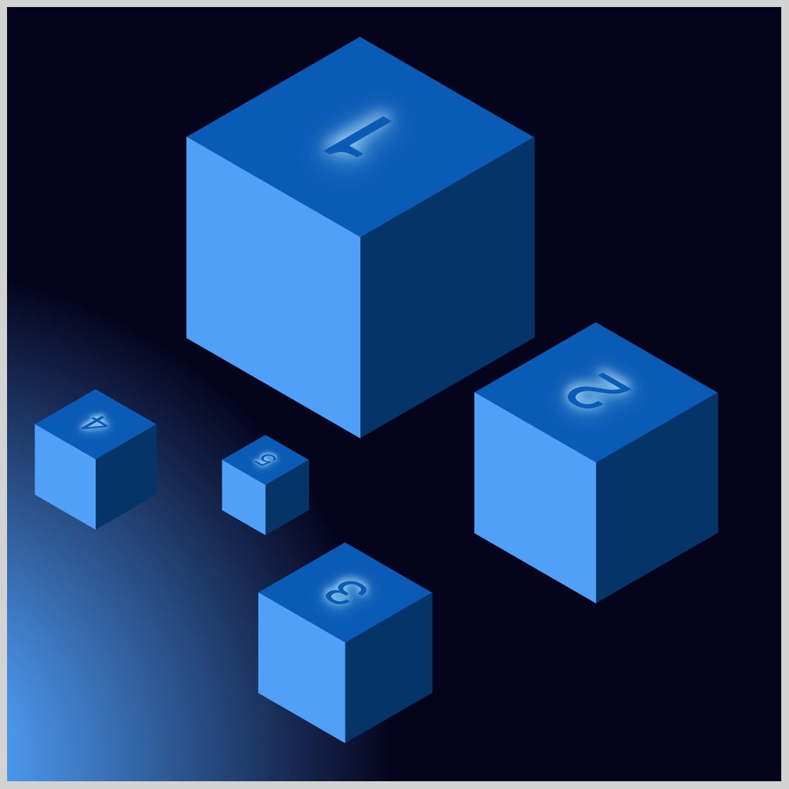
Moving elements on a screen is a key animation technique. In this article, you will discover how to animate five isometric cubes. Additionally, by combining various CSS properties and functions, you will create a radial gradient background and make the text glow.
CSS properties and functions used in this article:
topleftradial-gradient()translatetext-shadow
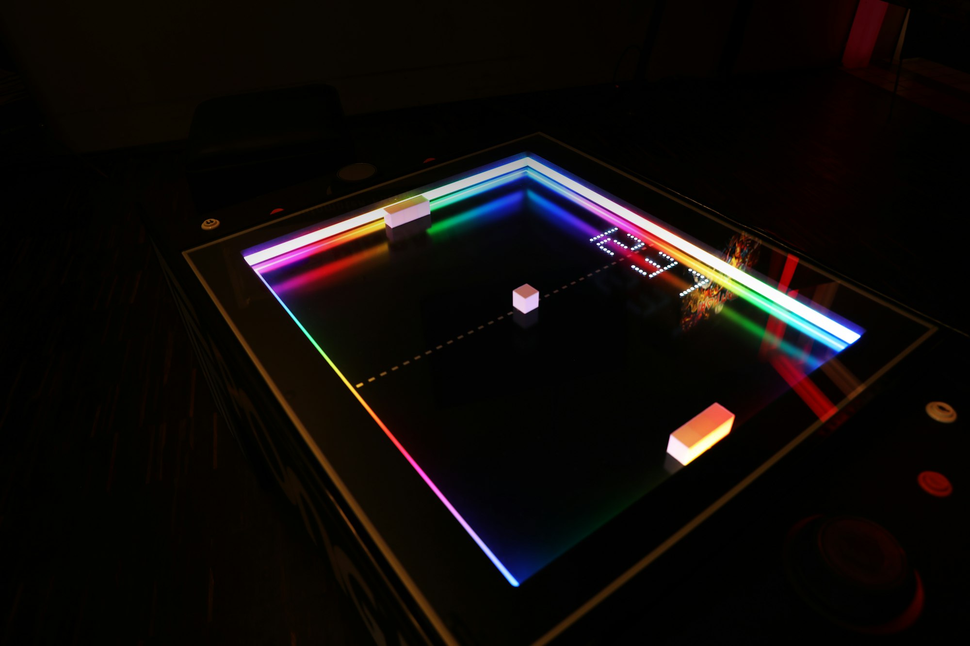
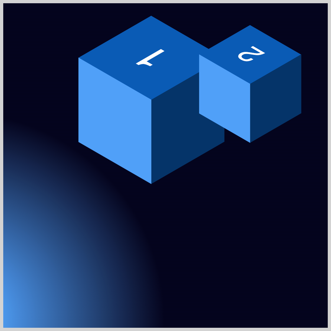
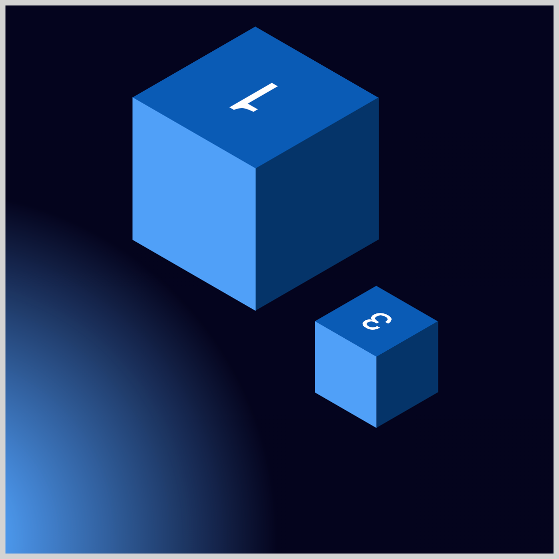
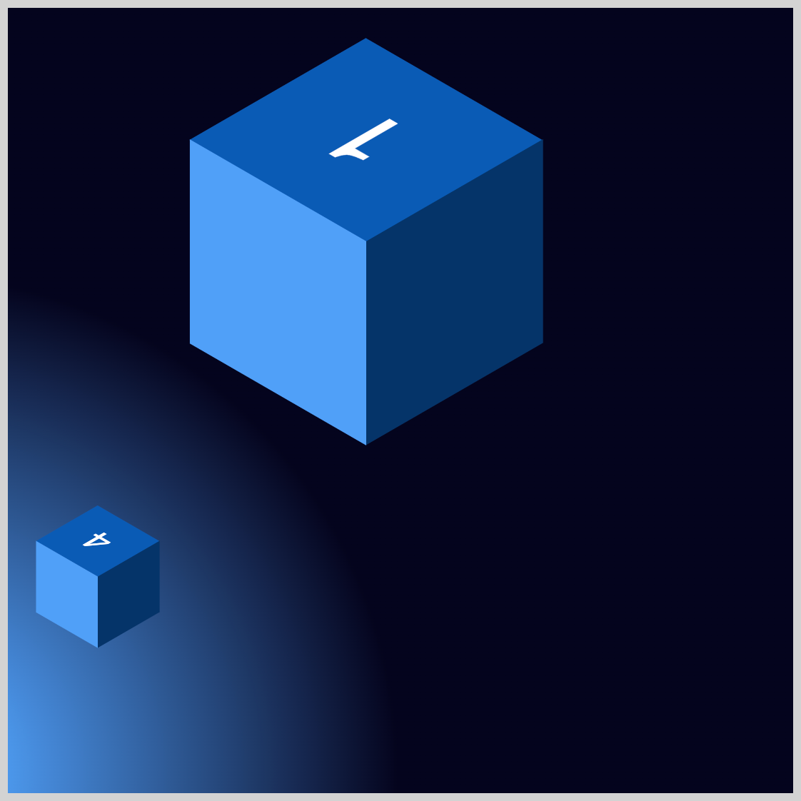
Preview

CSS makes it easy to animate multiple elements on the screen. Radial gradients and even the text glow effect are all made using only CSS.
Prerequisites
Essential CSS and HTML knowledge will help you understand the concepts and techniques introduced in this article. Jump over to this article if you require an HTML and CSS primer.
We assume you have configured tools to modify CSS. If not, this article will guide you through the setup process.
Please read this article if you’re unfamiliar with CSS animation and the @keyframes at-rule property.
HTML Structure
<div class="container">
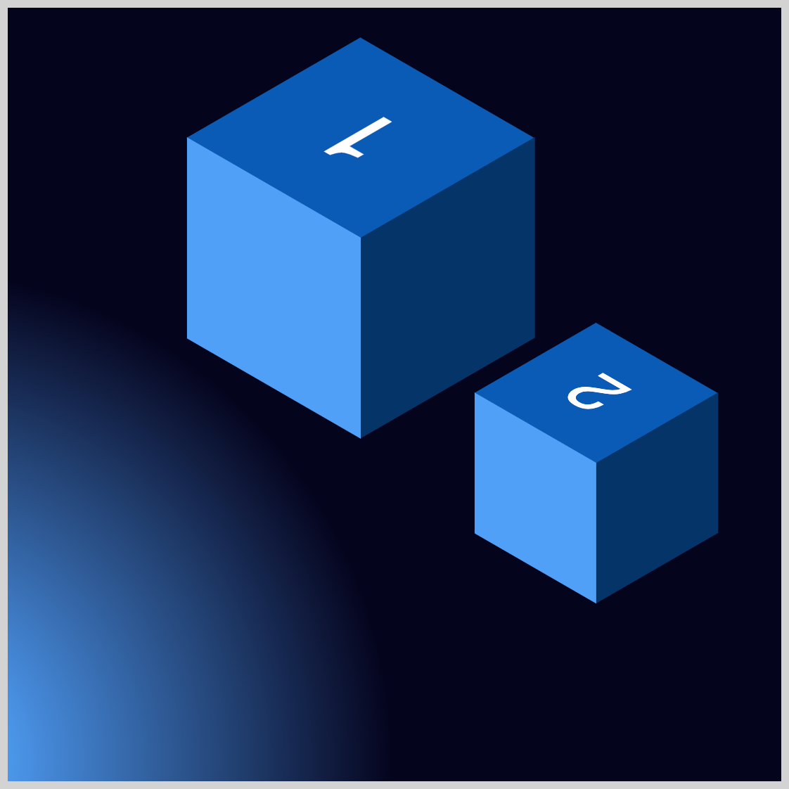
<div class="isometric-cube-1">
<div class="isometric-cube-top text">1</div>
<div class="isometric-cube-right"></div>
<div class="isometric-cube-left"></div>
</div>
<div class="isometric-cube-2">
<div class="isometric-cube-top text">2</div>
<div class="isometric-cube-right"></div>
<div class="isometric-cube-left"></div>
</div>
<div class="isometric-cube-3">
<div class="isometric-cube-top text">3</div>
<div class="isometric-cube-right"></div>
<div class="isometric-cube-left"></div>
</div>
<div class="isometric-cube-4">
<div class="isometric-cube-top text">4</div>
<div class="isometric-cube-right"></div>
<div class="isometric-cube-left"></div>
</div>
<div class="isometric-cube-5">
<div class="isometric-cube-top text">5</div>
<div class="isometric-cube-right"></div>
<div class="isometric-cube-left"></div>
</div>
</div>
container is the outermost enclosure. It enables the content to be centered and draws a light gray border. The rest of the divs represent each animation sequence.
Keep the HTML structure as is for the animation to display correctly.
Body and Container Div CSS
CSS code for the body and container div.
/* Body and Container Settings */
/* Center shapes */
body {
  margin: 0;
  padding: 0;
  height: 100vh;
  display: flex;
  justify-content: center;
  align-items: center;
  flex-wrap: wrap;
}

/* Set background and border color */
.container {
  min-width: 500px;
  height: 500px;
  border: 5px solid lightgray;
  background: radial-gradient(
    circle 710px at -13.8% 97.2%,
    #4fa0f8 7.5%,
    #04041d 44.7%
  );
  position: relative;
  margin: 5px;
  display: flex;
  justify-content: center;
  align-items: center;
}
Cube Animation Preparation
The isometric cubes you’ll be animating in the following sections were created in this article. We strongly encourage you to read the article to understand how the isometric cubes were constructed.
 Pyxofy
Radial Gradient Background
Before animating the isometric cubes, you will first create the gradient background with the CSS radial-gradient() function.

/* Set background and border color */
.container {
  background: radial-gradient(
    circle 710px at -13.8% 97.2%,
    #4fa0f8 7.5%,
    #04041d 44.7%
  );
}
The radial gradient is a 710-pixel circle positioned at -13.8% on the horizontal x-axis and 97.2% vertically on the y-axis. The gradient starts from #4fa0f8, which resembles a blue jeans color, and transitions to #04041d, which is a rich black shade.
The radial gradient is placed to start from the bottom left corner, mimicking a light source that aligns with the isometric cubes’ color scheme.
Check this article to dive deeper into CSS gradients.
 Pyxofy
Let’s start working on Cube 2 in the next section.
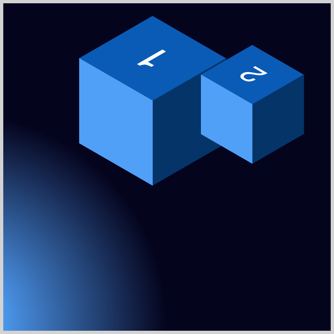
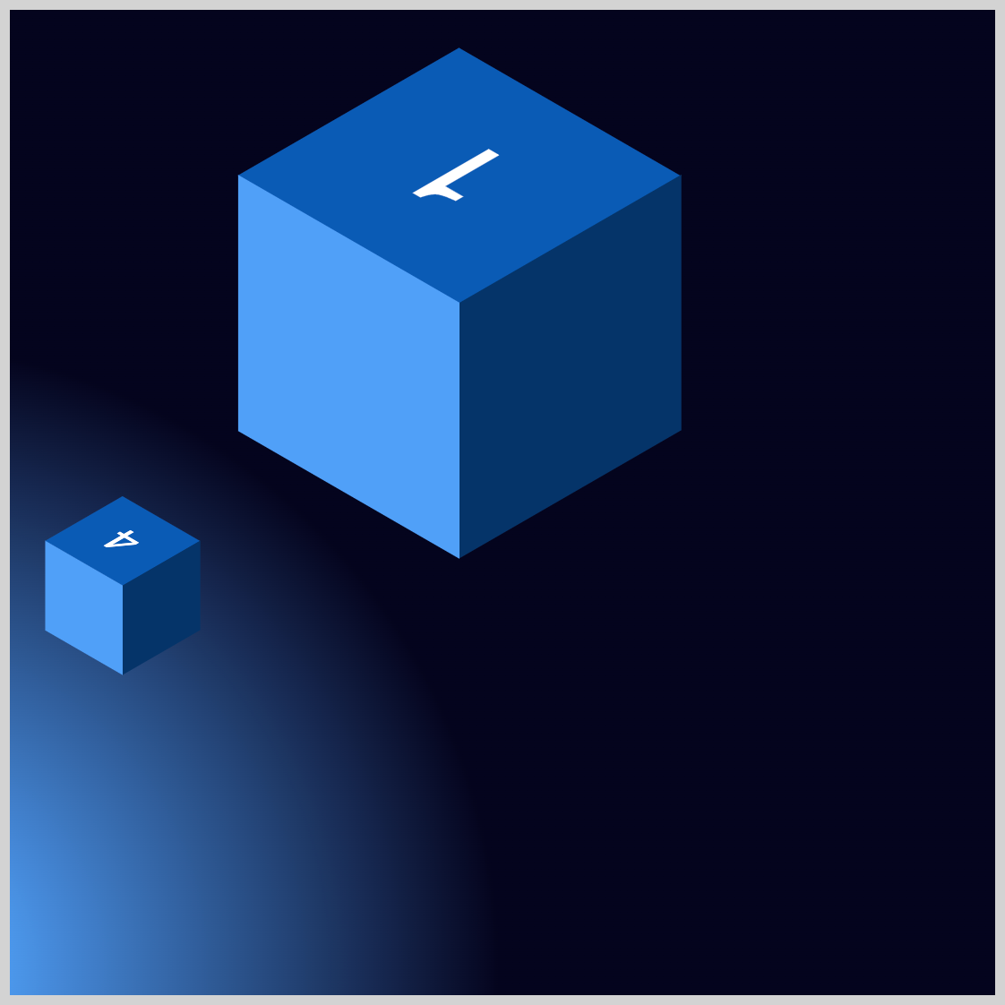
Cube 2
In this section, you’ll work on animating Cube 2. The animation sequence goes like this:
- Cube 2 starts at its default location
- Moves upward
- Floats up and down
- Cube 2 returns to its default location
/* Cube 2 */
.isometric-cube-2 {
  animation: cube-2 5s linear 1;
}
CSS animation property values:
- Animation name:
cube-2 - Duration: Five seconds (
5s) - Easing function:
linear - Iteration count: Once, (
1)
/* Cube 2 Animation Keyframes */
@keyframes cube-2 {
  from {
  }
  15% {
    top: 105px;
  }
}
Let’s begin working on the Cube 2 animation keyframes. Make sure that the identifier, in this case, cube-2, corresponds with the animation name property value. If it doesn’t match, the animation will not work.
The from state is left blank. At the 15% keyframe, Cube 2 will rise from its default top: 275px to top: 105px.
@keyframes cube-2 {
  30% {
    top: 135px;
  }
  45% {
    top: 105px;
  }
  60% {
    top: 135px;
  }
}
Between keyframes 30% and 60%, the cube will float up and down between 135px and 105px.
@keyframes cube-2 {
  75% {
    top: 80px;
  }
  to {
  }
}
At the 75% keyframe, the cube will rise to 80px and then float back down to its default location of 275px.
Cube 2 animation is done. Let’s move on to Cube 3 in the next section.
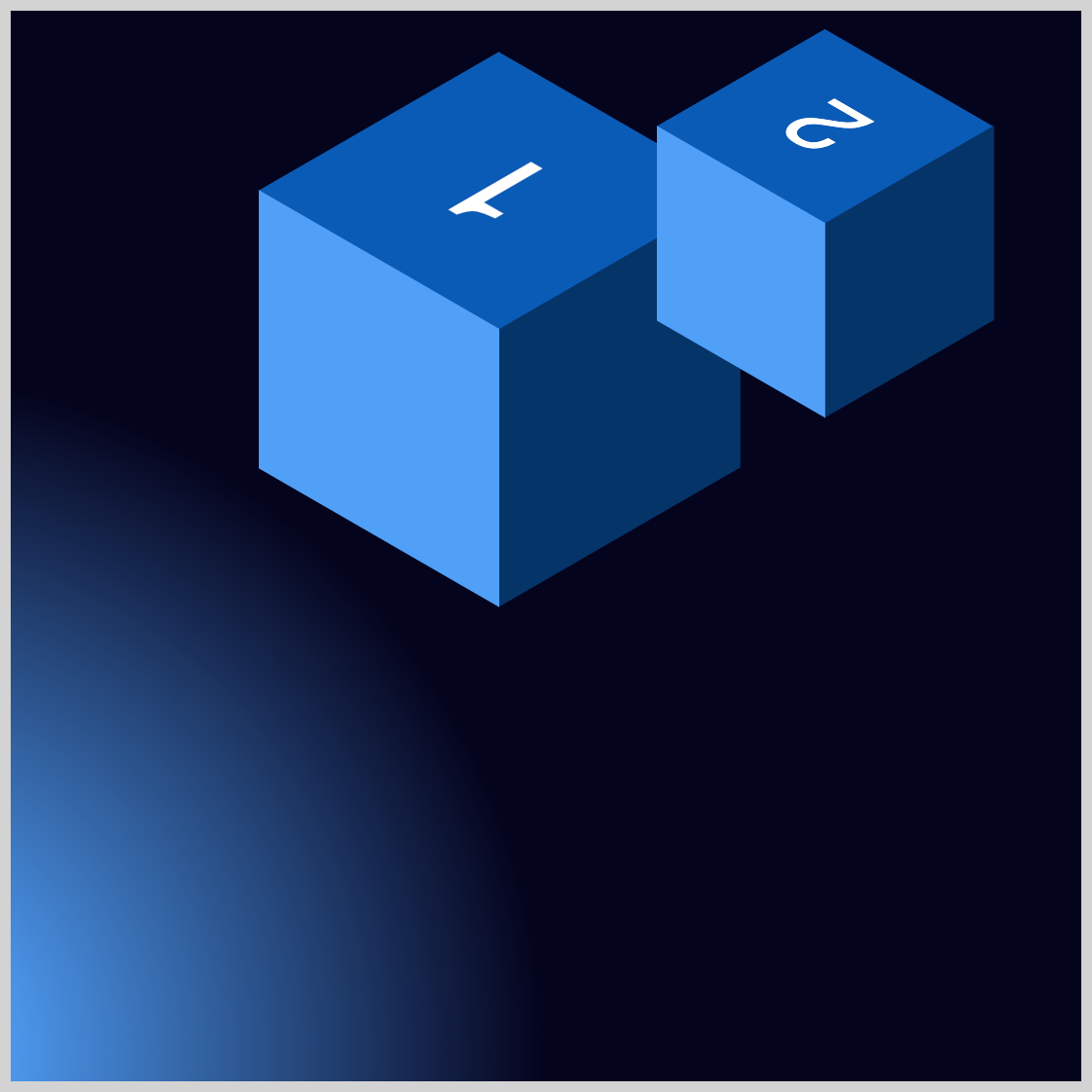
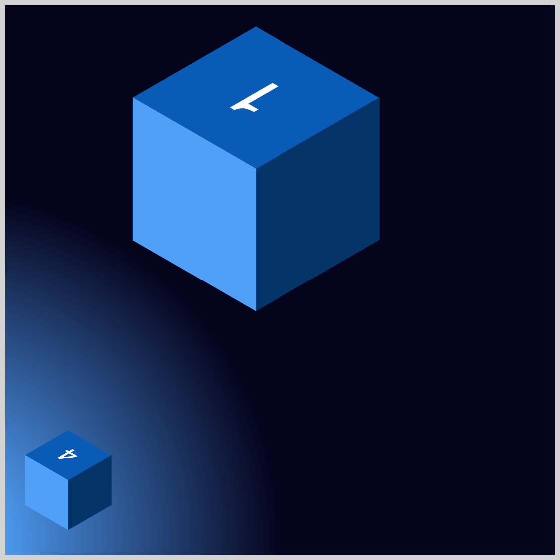
Cube 3
Cube 3 animation consists of moving from its default location to the right side of Cube 1 and then back. In this section, you’ll learn how to combine the CSS translate and opacity properties.
/* Cube 3 */
.isometric-cube-3 {
  animation: cube-3 5s ease-in-out 1s 1;
}
First, set the animation name to cube-3. The animation duration is set to five seconds, 5s, and the easing function to ease-in-out. You set a one-second delay using 1s, and the animation will iterate once with 1.
/* Cube 3 Animation Keyframes */
@keyframes cube-3 {
  from {
    opacity: 0;
  }
  15% {
    translate: 120px -90px;
    opacity: 1;
  }
  to {
  }
}
from: Cube 3 opacity is set to0, making it fully transparent.15%: The CSStranslateproperty moves or translates Cube 3’s position to120pxon the x-axis and-90pxon the vertical axis. The cube will be fully opaque withopacity: 1.to: Cube 3 slowly moves back to its original position.
Cube 4 is up next.
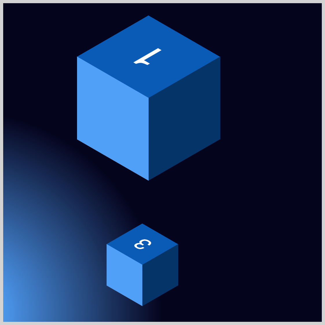
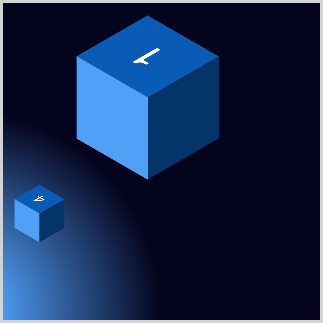
Cube 4
Cube 4 will slide down to the edge of the container. It will gradually move up and down before returning to its original position.
/* Cube 4 */
.isometric-cube-4 {
  animation: cube-4 5s linear 1.5s 1;
}
The animation is named cube-4, with a duration of five seconds (5s). It uses a linear easing function, has a one-and-a-half-second delay (1.5s), and iterates once (1).
/* Cube 4 Animation Keyframes */
@keyframes cube-4 {
  from {
  }
  15% {
    top: 390px;
  }
}
Like the previous examples, make sure the @keyframes identifier cube-4 matches the animation name. The from keyframe remains empty. At the 15% keyframe, the cube will descend to 390px.

@keyframes cube-4 {
  30% {
    top: 300px;
  }
  45% {
    top: 380px;
  }
}
Between the 30% and 45% keyframes, Cube 4 will move between 300px and 380px.
@keyframes cube-4 {
  60% {
    top: 290px;
  }
}
At the 60% keyframe, the cube shifts to 290px.
@keyframes cube-4 {
  75% {
    top: 320px;
  }
  90% {
    top: 390px;
  }
  to {
  }
}
The cube will move from 320px at the 75% keyframe to 390px at the 90% keyframe before returning to its default position at the to animation state.
Onward to the next section, let’s make Cube 5.
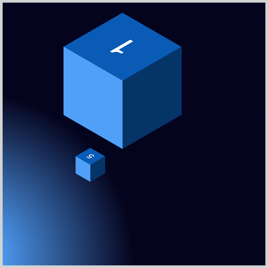
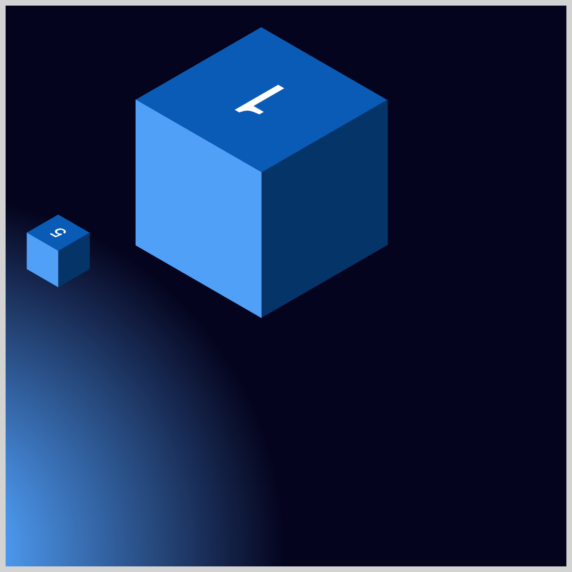
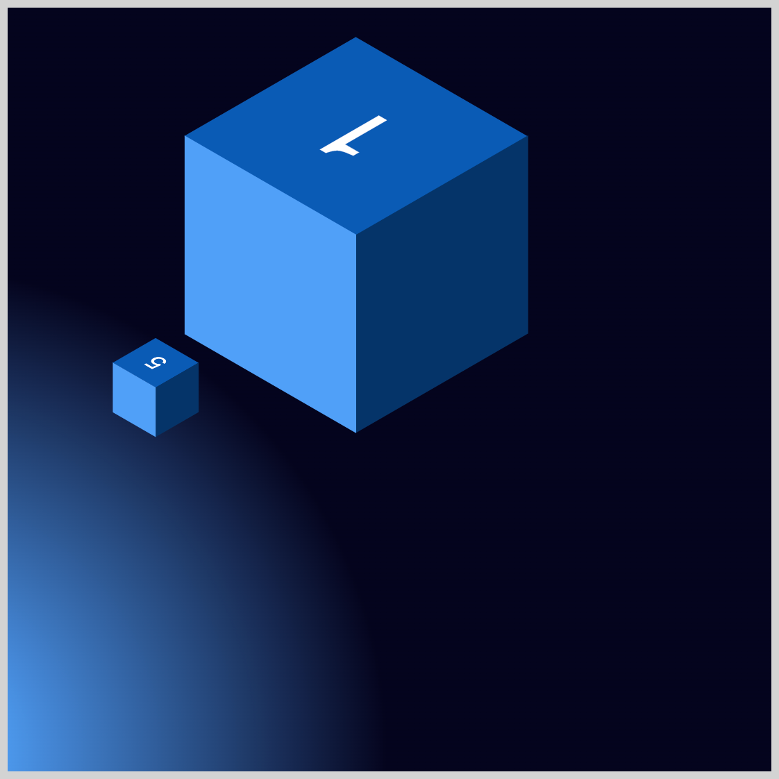
Cube 5
Cube 5 travels parallel to the left side of Cube 1, swiftly moving diagonally upwards before gradually returning to its starting position.
/* Cube 5 */
.isometric-cube-5 {
  animation: cube-5 5s ease-out 1.7s 1;
}
The animation name is cube-5, with a duration of five seconds (5s). It uses an ease-out easing function, has a delay of 1.7 seconds (1.7s), and runs for one iteration (1).
/* Cube 5 Animation Keyframes */
@keyframes cube-5 {
  from {
    opacity: 0;
  }
  15% {
    translate: -120px -90px;
    opacity: 1;
  }
  85% {
    translate: -70px -60px;
  }
  to {
  }
}
Similar to Cube 3, you start with an opacity of 0, which means Cube 5 will be fully transparent. As the cube approaches the 15% keyframe, it transitions to fully opaque with opacity: 1. translate: -120px -90px translates or moves Cube 5 minus 120 pixels horizontally and minus 90 pixels vertically.
@keyframes cube-5 {
  85% {
    translate: -70px -60px;
  }
  to {
  }
}
Towards the 85% keyframe, Cube 5 gradually shifts down to -70 pixels on the x-axis and -60 pixels on the y-axis.
This concludes all cube animations. In the final section, you’ll learn how to make the text glow.
Text Glow
For the final section, you’ll learn how to make the cube’s text glow.

/* Text Glow */
.text {
  animation: text-color 8s linear 1;
}
The animation is named text-color and has a duration of eight seconds (8s). The animation easing function is set to linear and iterates once with 1.
The text glow uses these colors:
#085bb5sapphire, the same color as the Cube Top#f99f3eorange saffron, text glow highlight color#cef5fflight blue, first text shadow#6fdaffsky blue, second text shadow
You assign multiple text shadows using a comma (,) between each property value.text-shadow: 2px 2px 10px #cef5ff, -2px -2px 20px #6fdaff;
2px 2px 10px #cef5fffirst text shadow property value-2px -2px 20px #6fdaffsecond property value
Check this article to learn more about how to make text shadows.
 Pyxofy
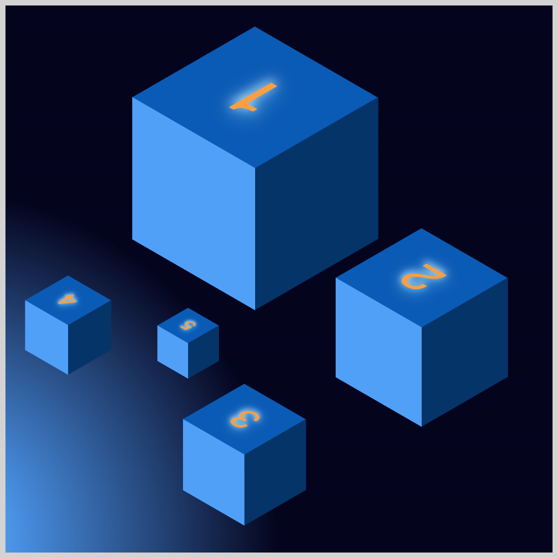
To create the text glow effect, use the CSS @keyframes at-rule to alternate between the colors #085bb5 and #f99f3e. The text shadow effect is applied to the #f99f3e color and turned off for the #085bb5 color. Disable the text shadow effect by using text-shadow: none.
@keyframes text-color {
  from {
    color: #085bb5;
  }
  12% {
    color: #f99f3e;
    text-shadow: 2px 2px 10px #cef5ff, -2px -2px 20px #6fdaff;
  }
  24% {
    color: #085bb5;
    text-shadow: none;
  }
  36% {
    color: #f99f3e;
    text-shadow: 2px 2px 10px #cef5ff, -2px -2px 20px #6fdaff;
  }
  48% {
    color: #085bb5;
    text-shadow: none;
  }
  60% {
    color: #f99f3e;
    text-shadow: 2px 2px 10px #cef5ff, -2px -2px 20px #6fdaff;
  }
  72% {
    color: #085bb5;
    text-shadow: none;
  }
  84% {
    color: #f99f3e;
    text-shadow: 2px 2px 10px #cef5ff, -2px -2px 20px #6fdaff;
  }
  to {
  }
}
You can see and play with the complete code on Pyxofy’s CodePen page.
See the Pen CSS Animation - Isometric Cubes with Move and Text Glow Animation Effects by Pyxofy (@pyxofy) on CodePen.
Conclusion
In this article, you discovered how to utilize CSS for positioning five isometric cubes. The CSS top and left, along with the translate properties, allow for the precise placement of elements on the screen.
You used the CSS radial-gradient() function to create a gradient background, enhancing the animation with a depth effect. You also learned to combine the CSS @keyframes at-rule with text-shadow to produce a glowing text effect, which makes the cube animation more engaging and visually appealing.
Play around with examples, modify them as you like, and share your masterpiece with us on LinkedIn, Threads, Bluesky, Mastodon, X (Twitter) @pyxofy, or Facebook.
We hope you liked this article. Kindly share it with your network. We appreciate it.
Related Articles
 Pyxofy
 Pyxofy
 Pyxofy
 Pyxofy