CSS Animation – Car Driving Infinite Scroll - Part 2
In part 1 of this multipart article, you learned how to animate the street. In part 2, we’ll make clouds and animate them step-by-step.
Introduction
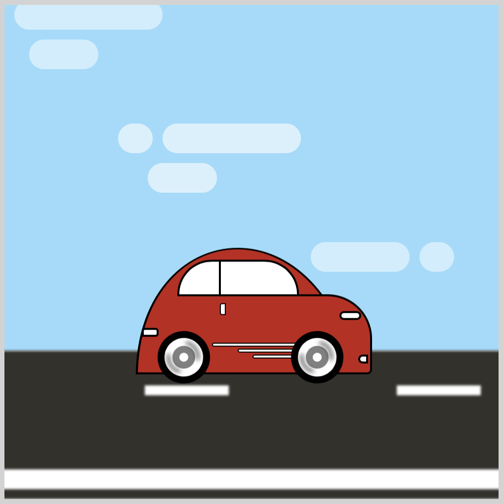
In part 1 of this multipart article, you learned how to animate the street and its surrounding elements. In this article, we’ll change the sky color, add some clouds and animate them.
Part 2. Cloud Animation
This article focuses on the cloud animation. For details on how to make the sporty electric car, please read this CSS art article.
Preview
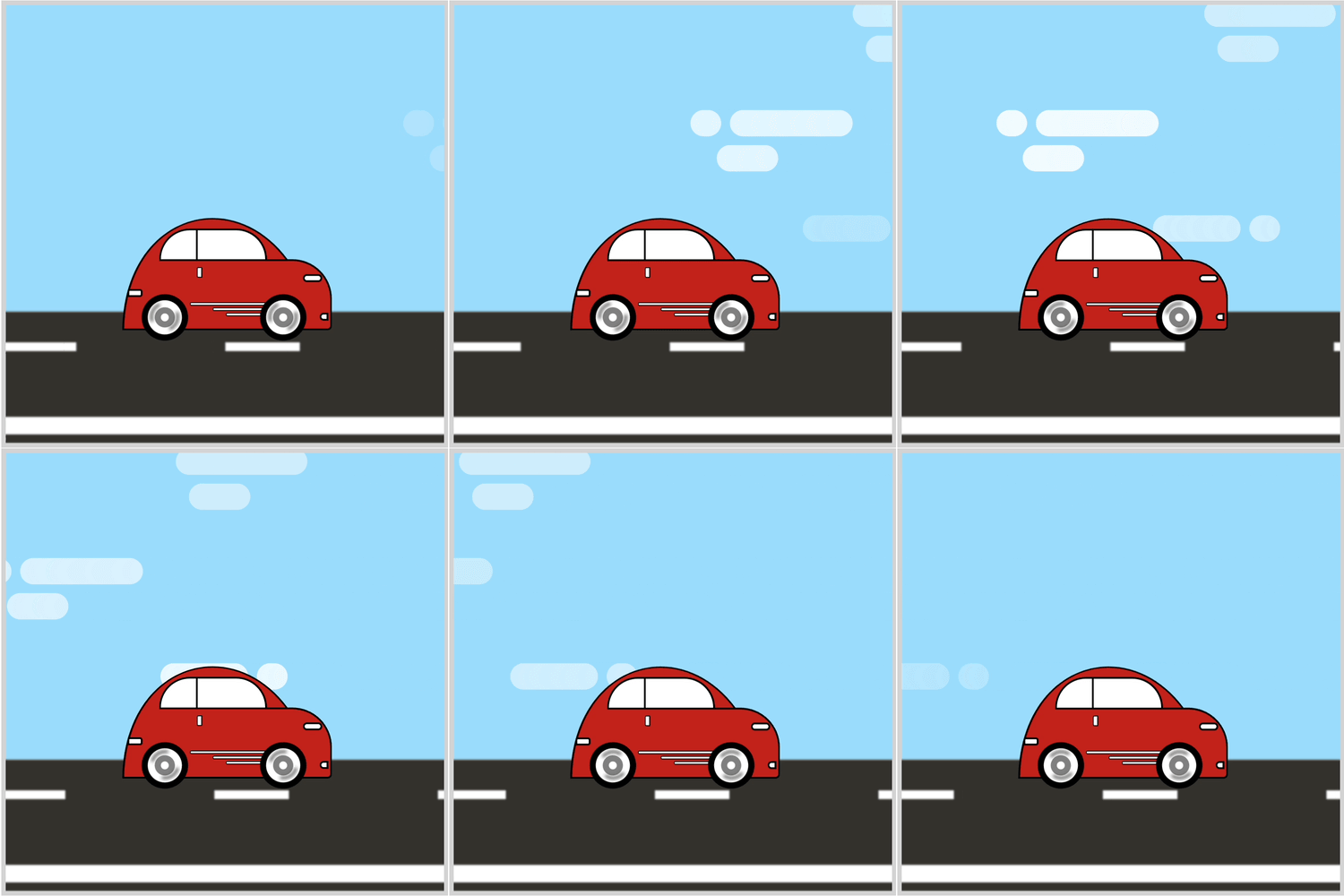
Car Driving Infinite Scroll with Clouds
Prerequisites
Essential CSS and HTML knowledge will help you understand the concepts and techniques introduced in this article. Jump over to this article if you require an HTML and CSS primer.
We assume that you have set up tools to create CSS animation. If you haven’t, this article will show you how to set them up.
Please read this article if you’re unfamiliar with CSS animation and the @keyframes at-rule property.
HTML Structure
<div class="container">
  <!-- Background -->
  <div class="background-container">
  </div>
  <!-- Clouds -->
  <div class="clouds-container">
    <div class="cloud-1"></div>
    <div class="cloud-2"></div>
    <div class="cloud-3"></div>
  </div>
  <!-- Foreground -->
  <div class="foreground-container">
    <div class="street-sideline"></div>
    <div class="street-middle-line"></div>
  </div>
  <!-- Car -->
  <div class="car-container">
    <div class="car-roof"></div>
    <div class="car-body"></div>
    <div class="design-line"></div>
    <div class="window"></div>
    <div class="head-light"></div>
    <div class="fog-light"></div>
    <div class="door-knob"></div>
    <div class="tail-light"></div>
  </div>
  <!-- Tire -->
  <div class="front-tire"></div>
  <div class="back-tire"></div>
</div>
container is the outermost enclosure. It enables the content to be centered and draws a light gray border. The rest of the divs represent each animation sequence.
Keep the HTML structure as is for each animation to display correctly.
Body and Container Div CSS
CSS code for the body and container div.
/* Body and Container Settings */
/* Center shapes */
body {
  margin: 0;
  padding: 0;
  height: 100vh;
  display: flex;
  justify-content: center;
  align-items: center;
  flex-wrap: wrap;
}

/* Set background and border color */
.container {
  min-width: 500px;
  height: 500px;
  border: 5px solid lightgray;
  background: transparent;
  position: relative;
  margin: 5px;
  display: flex;
  justify-content: center;
  align-items: center;
  overflow: hidden;
}
Background Color
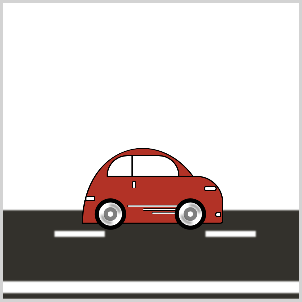
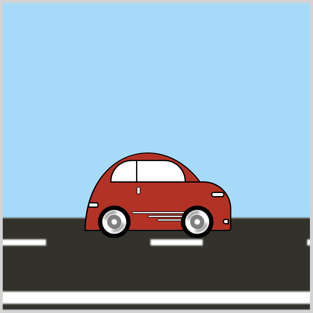
To simulate a sky color, the background color needs to be changed from the original white color to a sky blue color.
/* Background */
.background-container {
  position: absolute;
  width: 500px;
  height: 350px;
  top: 0px;
  left: 0px;
  background: #99dcfb;
}
- The
backgroundis set to#99dcfb, a sky blue hue. - The
widthis500pxand theheightis350px. Increasing thebackground-containerheight over350pxwill cover the street section.
Let’s move to the next section and start creating the clouds.
Cloud Shapes
We’ll make a total of three cloud shapes in this section.
- Cloud 1 has two components, rounded rectangles stacked on top of each other.
- Cloud 2 is comprised of three components: a semi-circle shape positioned to the left, a long rounded rectangle beside it, and a shorter rounded rectangle.
- Cloud 3 is made with two components: a short, rounded rectangle and a semi-circle shape.
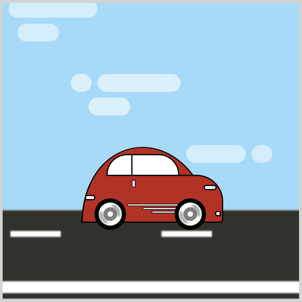
CSS pseudo-elements, ::before and ::after are used to make the cloud shapes. Check this article if you’re unfamiliar with CSS pseudo-elements.

Cloud 1
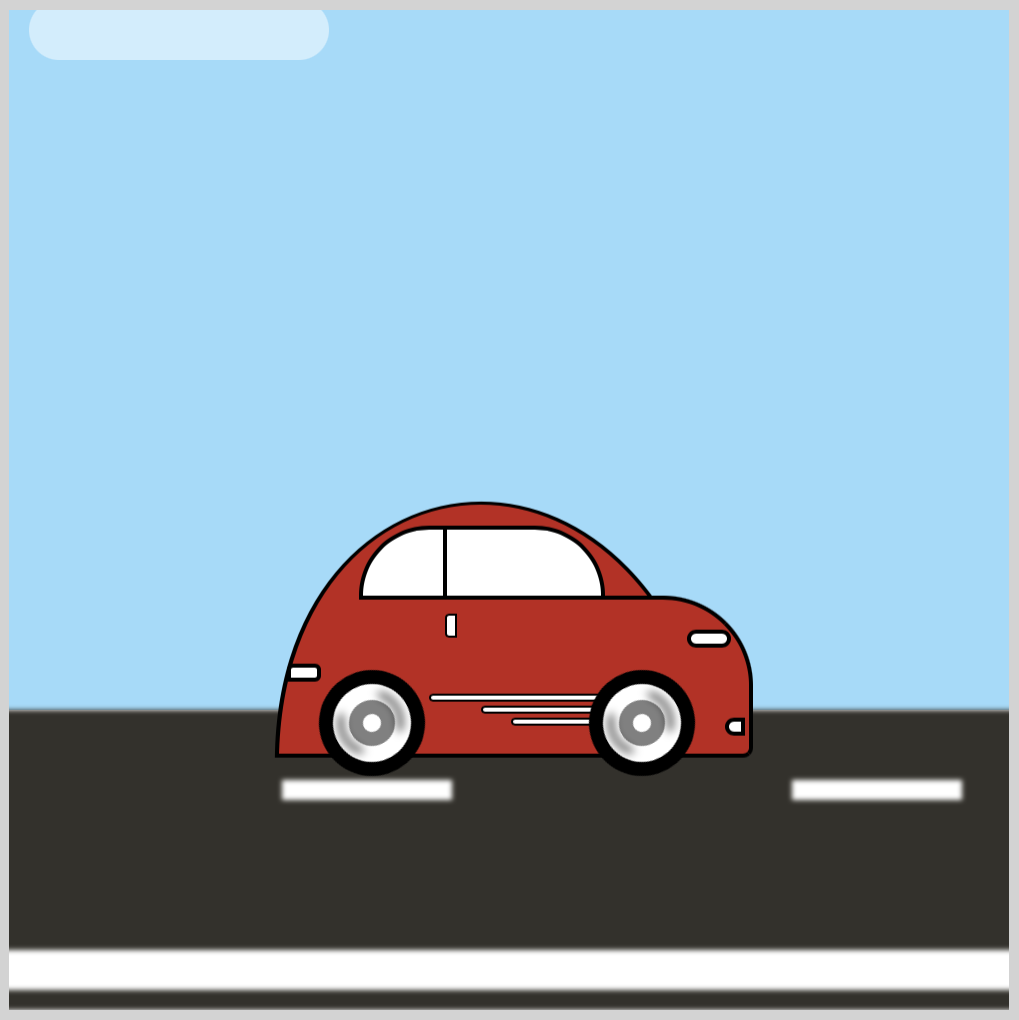
Let’s work on the first cloud.
.cloud-1 {
  position: absolute;
  width: 150px;
  height: 30px;
  top: -5px;
  left: 450px;
  background: white;
  opacity: 0.5;
  border-radius: 20px;
}
- The
topproperty is set to-5pxso that the cloud is set slightly outside the border frame. Theleftproperty value is set to450px, pushing cloud 1 to the right edge. Do take note that for our sample image, we temporarily set theleftproperty to10px. - We set the
opacityto0.5to make the cloud semi-transparent. - The
border-radiusproperty value is20pxto round the rectangle edges.
.cloud-1::before {
  content: "";
  position: absolute;
  width: 70px;
  height: 30px;
  top: 40px;
  left: 15px;
  background: white;
  border-radius: 20px;
}
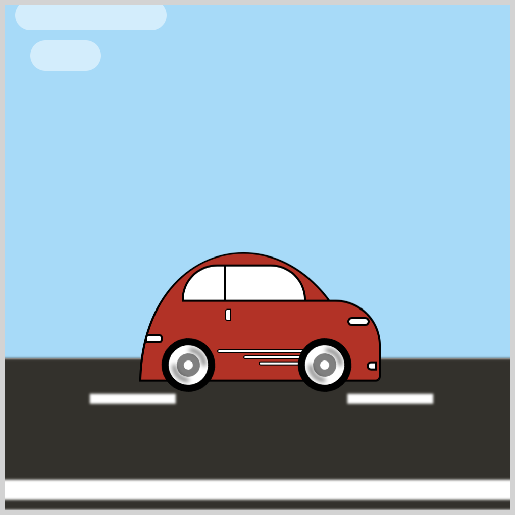
- The CSS
::beforepseudo-element is used to style the cloud 1 bottom shape.topis set to40pxandleftto15pxto move the bottom shape slightly to the right.
Cloud 2
For cloud 2, both ::before and ::after are used to style the shapes.
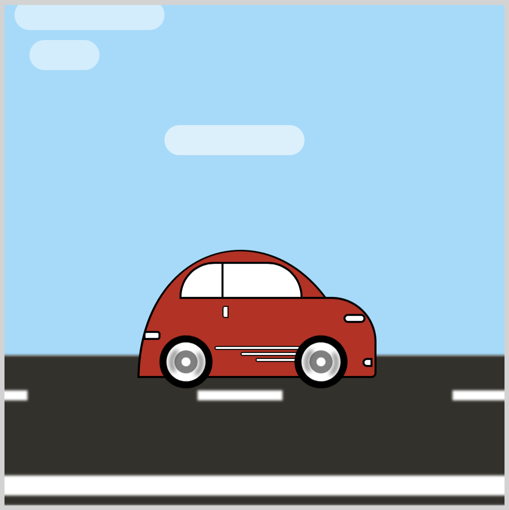
.cloud-2 {
  position: absolute;
  width: 140px;
  height: 30px;
  top: 120px;
  left: 0px;
  background: white;
  opacity: 0.6;
  border-radius: 20px;
}
- The
opacityvalue is0.6for cloud 2.
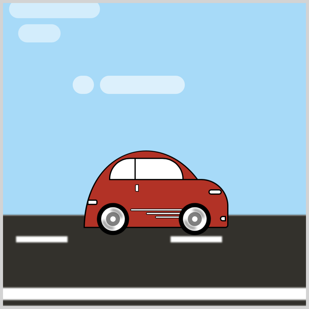
.cloud-2::before {
  content: "";
  position: absolute;
  width: 35px;
  height: 30px;
  top: 0px;
  left: -45px;
  background: white;
  border-radius: 20px;
}
- To push the semi-circle shape slightly to the left, we set
-45pxfor theleftproperty value.
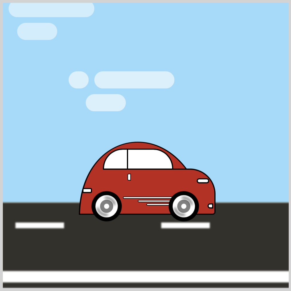
.cloud-2::after {
  content: "";
  position: absolute;
  width: 70px;
  height: 30px;
  top: 40px;
  left: -15px;
  background: white;
  border-radius: 20px;
}
- The bottom shape is positioned with
top: 40pxandleft: -15px.
Cloud 3
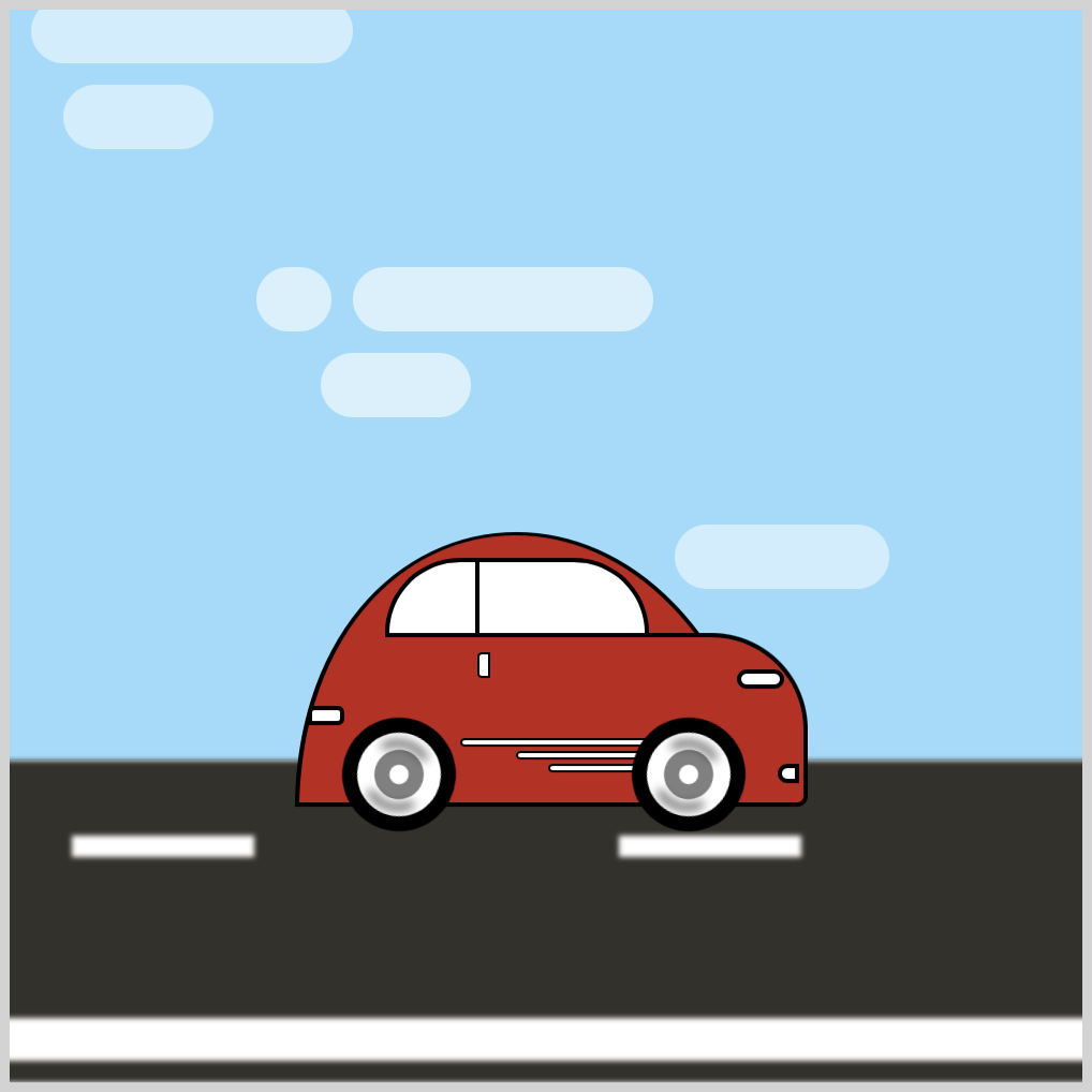
.cloud-3 {
  position: absolute;
  width: 100px;
  height: 30px;
  top: 240px;
  left: 0px;
  background: white;
  opacity: 0.5;
  border-radius: 20px;
}
- Cloud 3
opacityis set to0.5. - The
topvalue is240pxto push cloud 3 closer to the car.
.cloud-3::before {
  content: "";
  position: absolute;
  width: 35px;
  height: 30px;
  top: 0px;
  left: 110px;
  background: white;
  border-radius: 20px;
}
- The CSS
leftvalue is set to110pxto position the semi-circle shape to the right side of the rounded rectangle.
In the next section, let’s apply animation to the individual clouds.
Cloud Animation
All cloud animation flows from the right side of the screen to the left. Each cloud animation is slightly different for variation and randomness.
- Cloud 1 Animation
The cloud 1 animation is straightforward.
.cloud-1 {
  animation: cloud-1 10s ease-in infinite;
}
The animation name is cloud-1 and lasts for ten seconds, 10s. The CSS ease-in property adds an ease in effect, a slight slow down during the beginning of the animation, and will loop infinitely, infinite.
@keyframes cloud-1 {
  from {
    left: 500px;
  }
  to {
    left: -200px;
  }
}
Cloud 1 is positioned out of frame with left: 500px and moves across the screen. Its end position is -200px.
- Cloud 2 Animation
For cloud 2, we use the left and opacity CSS properties.
.cloud-2 {
  animation: cloud-2 12s ease-out infinite;
}
The animation name is cloud-2. It lasts for twelve seconds, 12s, and loops infinitely with the CSS infinite property value. With ease-out, the cloud will slow down at the tail end of the animation.
@keyframes cloud-2 {
  from {
    left: 500px;
    opacity: 0.2;
  }
  30% {
    opacity: 0.9;
  }
  to {
    left: -200px;
    opacity: 0.2;
  }
}
Both start and end positions are out of frame, respectively, by setting left: 500px and -200px. The opacity will start from 0.2 and will transition to 0.9 as it reaches the thirty percent mark, 30%, and will transition back to 0.2 as it exits the screen.
- Cloud 3 Animation
The third cloud is animated linearly, meaning its speed will be constant as it moves across the screen. Similar to cloud 2, we combine the CSS left and opacity properties for its animation.
.cloud-3 {
  animation: cloud-3 12s linear infinite;
}
The third cloud animation name is cloud-3 and loops infinitely with infinite. The animation will last for twelve seconds, 12s, and move evenly across the screen with the linear CSS property value.
@keyframes cloud-3 {
  from {
    left: 510px;
    opacity: 0;
  }
  50% {
    opacity: 0.8;
  }
  to {
    left: -150px;
    opacity: 0;
  }
}
Cloud 3 animation start and end positions are out of frame. The start position is 510px and its end position is -150px. The opacity property value is initially set to 0 and fades into 0.8 at the fifty percent mark, 50%. It fades out to 0 as it exits the screen.
You can see and play with the complete code on Pyxofy’s CodePen page.
See the Pen CSS Animation - Car Driving Infinite Scroll - Part 2 by Pyxofy (@pyxofy) on CodePen.
Conclusion
In part 2 of this multi-part article series, you learned how to make simple cloud shapes. You animated the clouds using CSS @keyframes.
You combined the left and opacity properties with @keyframes to move the clouds from right to left and make them fade in and fade out.
Modify the CSS code to your liking. How about making the sky a bright orange or a fiery red? You can reverse the clouds’ animation, let’s say, making them move from left to right instead. Share your masterpiece with us on LinkedIn, Threads, Mastodon, X (Twitter) @pyxofy or Facebook.
We hope you liked this article. Kindly share it with your network. We appreciate it.
Related Articles


