CSS Animation - 3D Transforms with scale3d() Function
Scaling and rotating squares to different 3D shapes is eye-catching and fun. Join us and learn scale3d() transforms in this step-by-step article.

Introduction
Scaling animations are exciting! In this article, you’ll discover how to scale a square horizontally, vertically, and along its z-axis (depth) using the CSS scale3d() function.
You’ll explore how to combine both the scale3d() and rotate3d() CSS functions to simulate three-dimensional (3D) depth.
CSS functions and properties you’ll learn in this article:
scale3d()functionrotate3d()function@keyframesanimation
You’ll learn how to animate square shapes horizontally and vertically.
Integrating scaling with rotation enhances the visual appeal of your animation.
Prerequisites
Essential CSS and HTML knowledge will help you understand the concepts and techniques introduced in this article. Jump over to this article if you require an HTML and CSS primer.
We assume you have configured tools to modify CSS. If not, this article will guide you through the setup process.
Please read this article if you’re unfamiliar with CSS animation and the @keyframes at-rule property.
HTML Structure
<div class="container">
  <div class="shape-container">
    <div class="square one">1</div>
  </div>
</div>
<div class="container">
  <div class="shape-container">
    <div class="square two">2</div>
  </div>
</div>
<div class="container">
  <div class="shape-container">
    <div class="square three">3</div>
  </div>
</div>
<div class="container">
  <div class="shape-container">
    <div class="square four">4</div>
  </div>
</div>
container is the outermost enclosure. It enables the content to be centered and draws a light gray border. The rest of the divs represent each animation sequence.
Keep the HTML structure as is for the animation to display correctly.
Body and Container Div CSS
CSS code for the body and container div.
/* Body and Container Settings */
/* Center shapes */
body {
  margin: 0;
  padding: 0;
  height: 100vh;
  display: flex;
  justify-content: center;
  align-items: center;
  flex-wrap: wrap;
}

/* Set background and border color */
.container {
  min-width: 500px;
  height: 500px;
  border: 5px solid lightgray;
  background: #0a0a0a;
  position: relative;
  margin: 5px;
  display: flex;
  justify-content: center;
  align-items: center;
}
Horizontal Scaling Animation
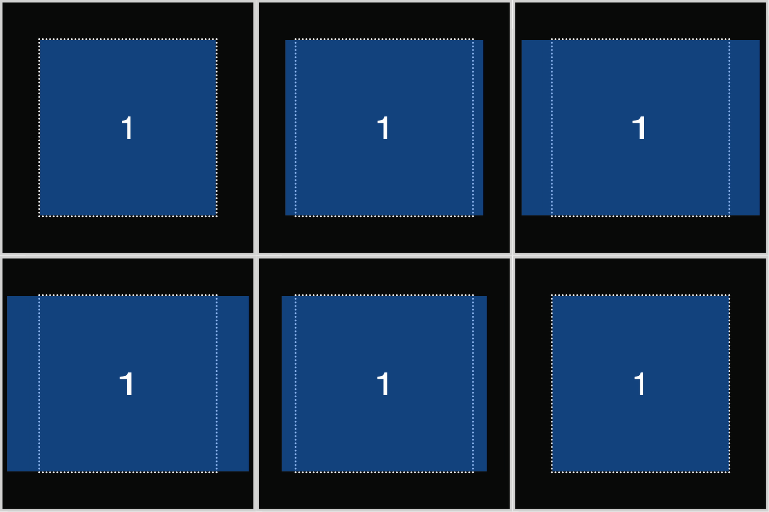
The first example illustrates how to animate horizontal scaling. All four square image examples were created in this article. For brevity, we will focus solely on describing the animation sequence for all examples.

.square.one {
  animation: horizontal-animation 1.5s ease-in-out infinite alternate;
}
- The animation name is
horizontal-animation. 1.5sor one and a half seconds is the animation duration.- The timing function is set to
ease-in-out. - The animation will loop using the
infiniteproperty value. alternatereverses the animation flow from end to beginning and vice versa.
@keyframes horizontal-animation {
  from {
    transform: scale3d(1, 1, 1);
  }
  to {
    transform: scale3d(1.4, 1, 1);
  }
}
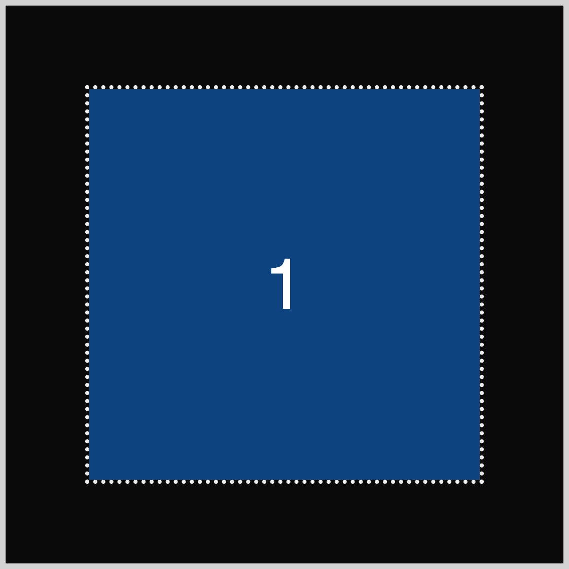
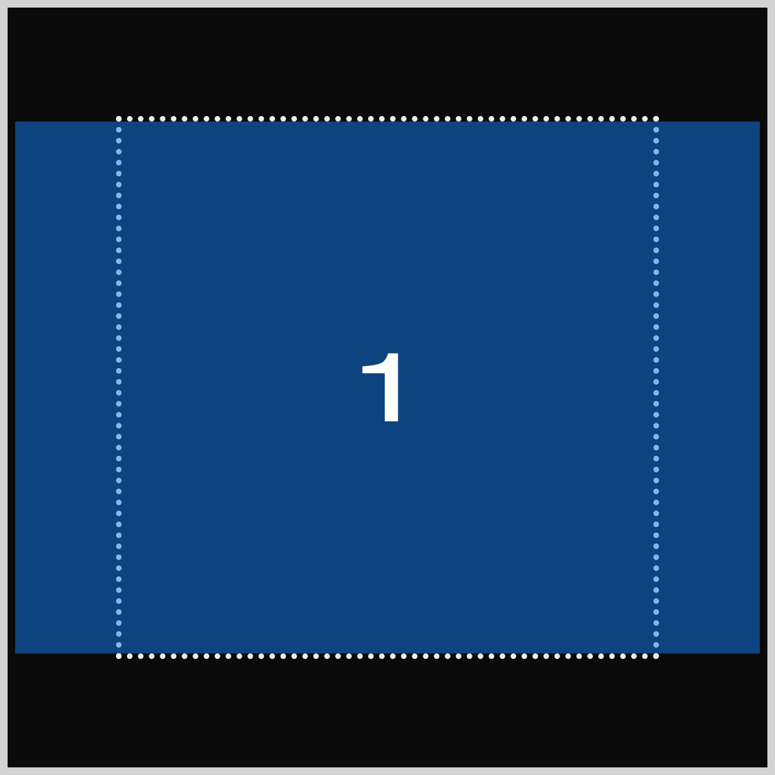
The from animation start state of scale3d(1, 1, 1) establishes the image scale at its default width and height of 350px. The animation concludes with scale3d(1.4, 1, 1), resulting in the square being horizontally scaled up by approximately 40% from its original width.
The following animation example will be vertical scaling.
Vertical Scaling Animation
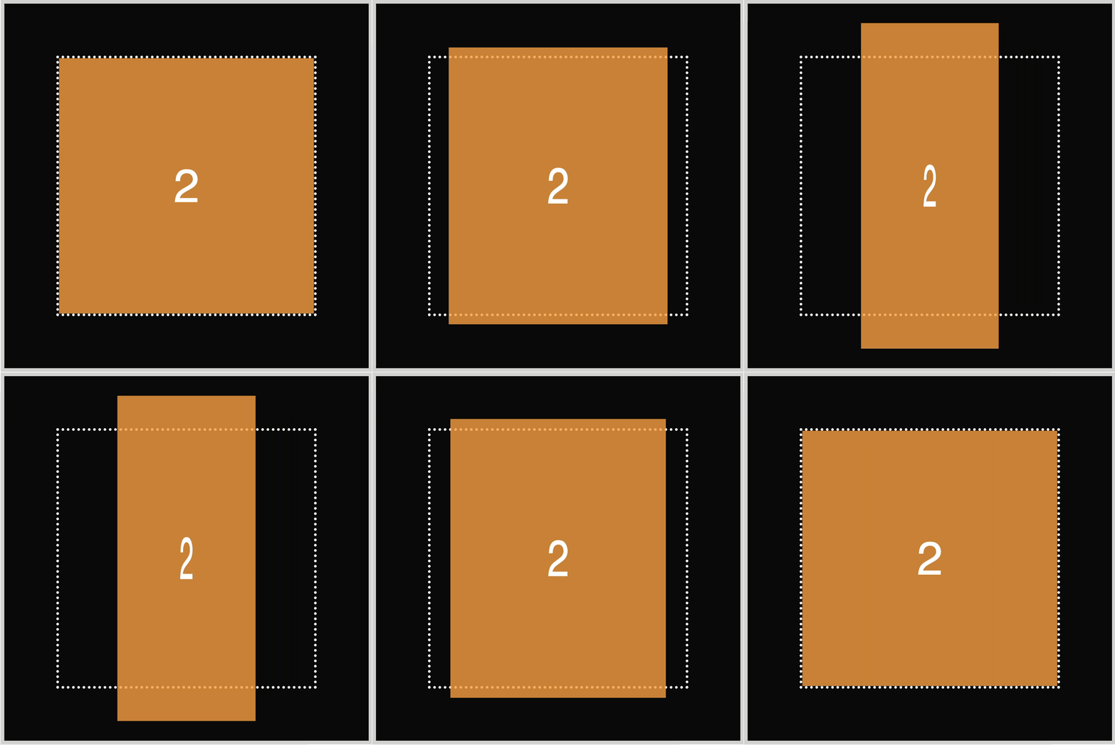
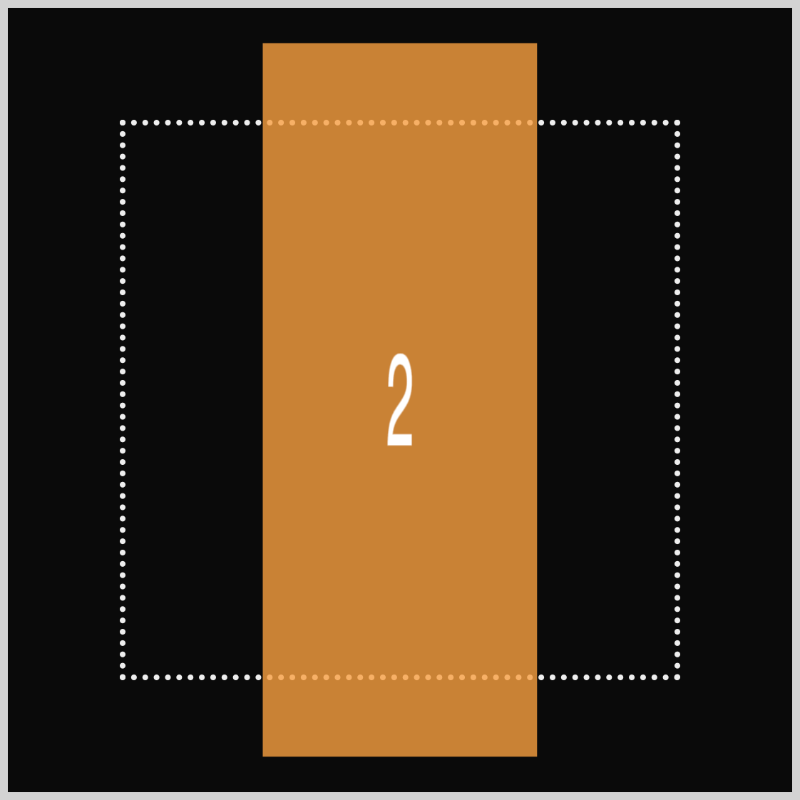
The vertical scaling example shows how we can make an image look taller and slimmer by using both vertical and horizontal scaling. This process transforms a square shape into a vertically elongated rectangle.
.square.two {
  animation: vertical-animation 1.5s ease-in-out infinite alternate;
}
Set the animation name to vertical-animation and assign the animation duration as 1.5s, which equals one and a half seconds. Like the horizontal scaling example, configure the animation timing function to ease-in-out. Use infinite to enable infinite looping, and reverse the animation direction with alternate.
@keyframes vertical-animation {
  from {
    transform: scale3d(1, 1, 1);
  }
  to {
    transform: scale3d(0.5, 1.3, 1);
  }
}
- The
scale3d(1, 1, 1)in thefromor animation beginning state scales the square to its default width and height. - The final state of the animation,
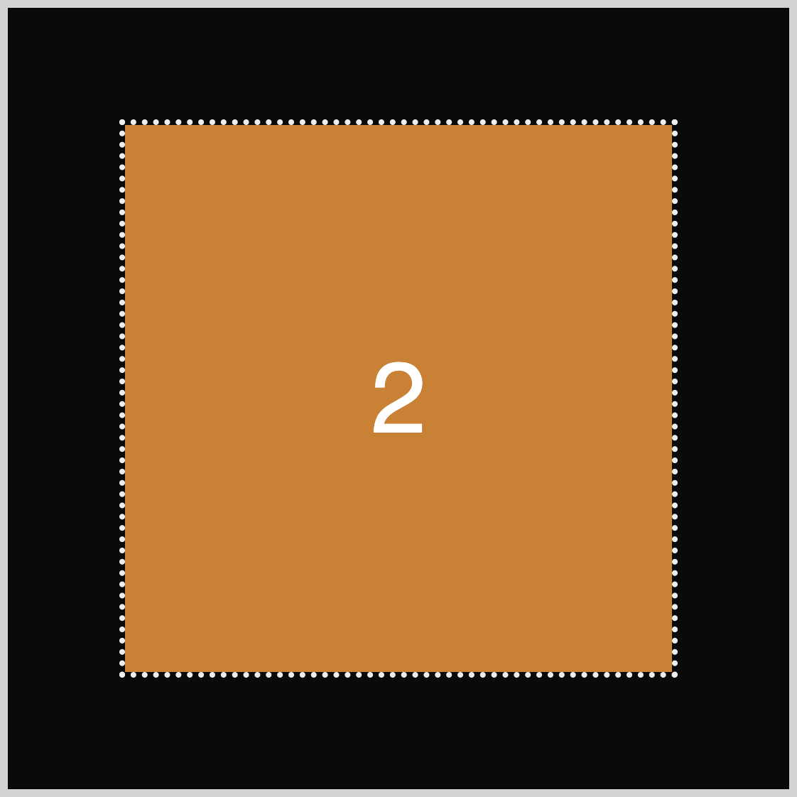
to, is defined asscale3d(0.5, 1.3, 1). This operation vertically enlarges the square by 30% compared to its original height while compressing its width to 50% of the initial size.
The next section will teach how to combine both depth scaling and rotation.
Depth Scaling and Rotation Animation
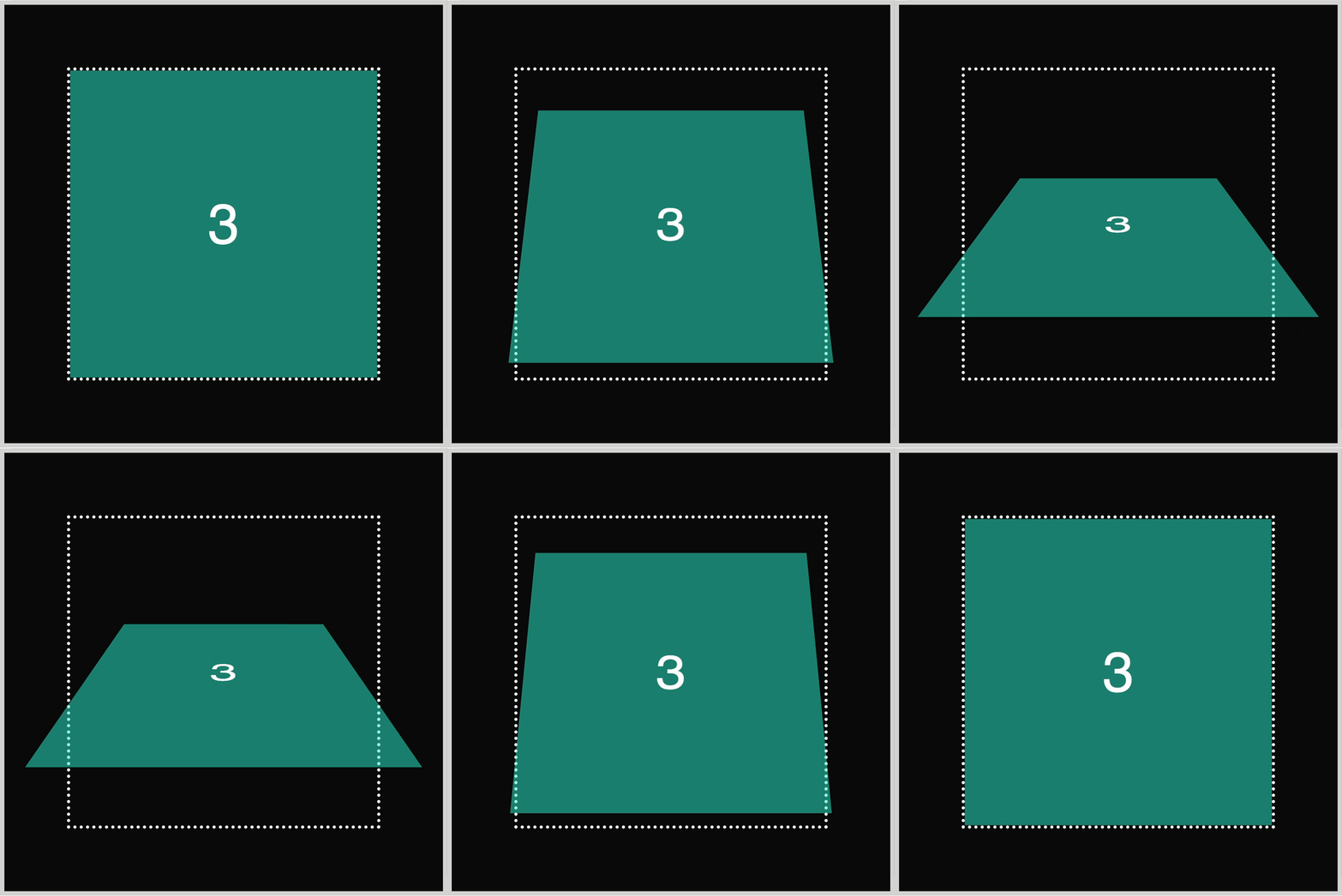
In the previous section, you learned how to combine vertical and horizontal scaling. In this section, you’ll learn how to combine depth scaling and x-axis horizontal rotation.
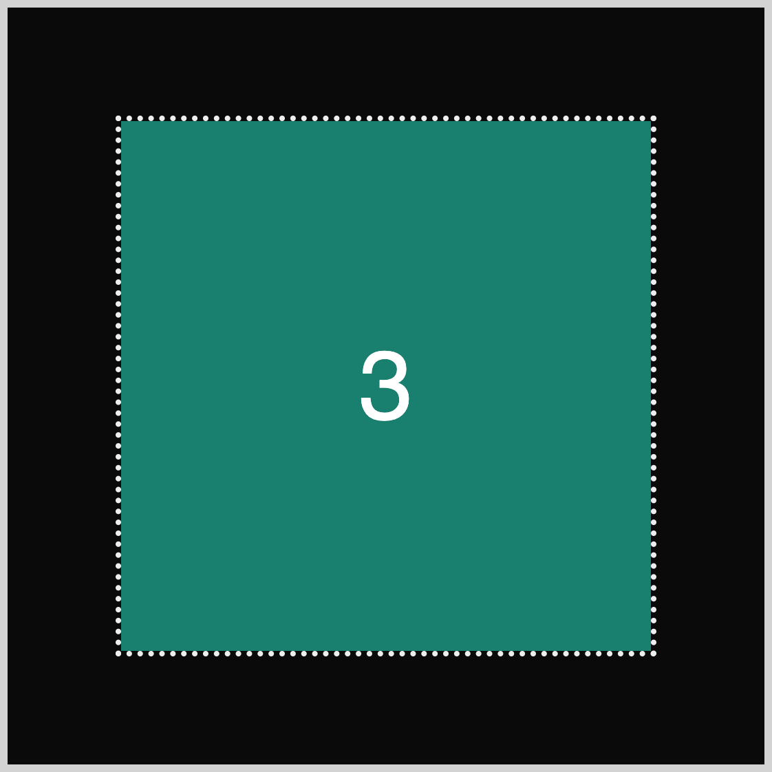
.square.three {
  animation: depth-rotate-animation 1.5s ease-in-out infinite alternate;
}
Besides the animation name, depth-rotate-animation, the rest of the property values are identical to the previous examples.
@keyframes depth-rotate-animation {
  from {
    transform: scale3d(1, 1, 1);
  }
  to {
    transform: scale3d(0.85, 0.5, 1.5) rotate3d(1, 0, 0, 45deg);
  }
}
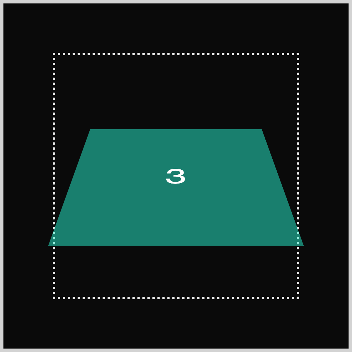
To ensure the animation functions properly, ensure that the @keyframes identifier is the same as the animation name, in this instance, depth-rotate-animation. The from animation start state is set to scale3d(1, 1, 1).
Using scale3d(0.85, 0.5, 1.5), the square scales from its default size to 85% horizontally, 50% vertically, and 150% on the z-axis (depth). Combining the scaling animation with rotate3d(1, 0, 0, 45deg), the square rotates around its horizontal axis by 45 degrees (45deg).
For the last example, let’s combine vertical scaling and rotation animation.
Vertical Scaling with Rotation Animation
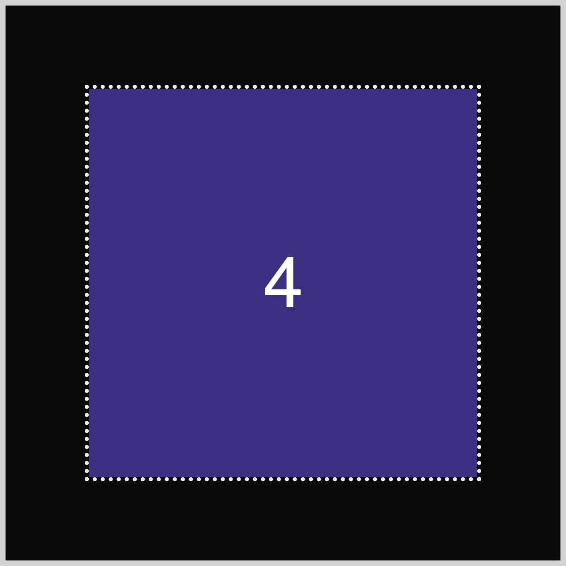
.square.four {
  animation: vertical-rotate-animation 1.5s ease-in-out infinite alternate;
}
All the property values are similar to the previous example except for the animation name, which you set to vertical-rotate-animation.
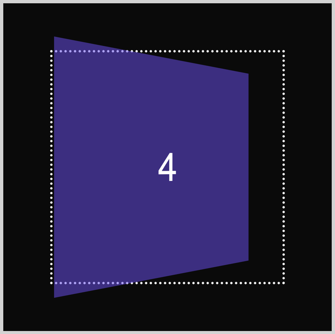
@keyframes vertical-rotate-animation {
  from {
    transform: scale3d(1, 1, 1);
  }
  to {
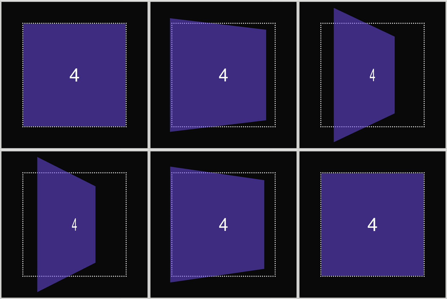
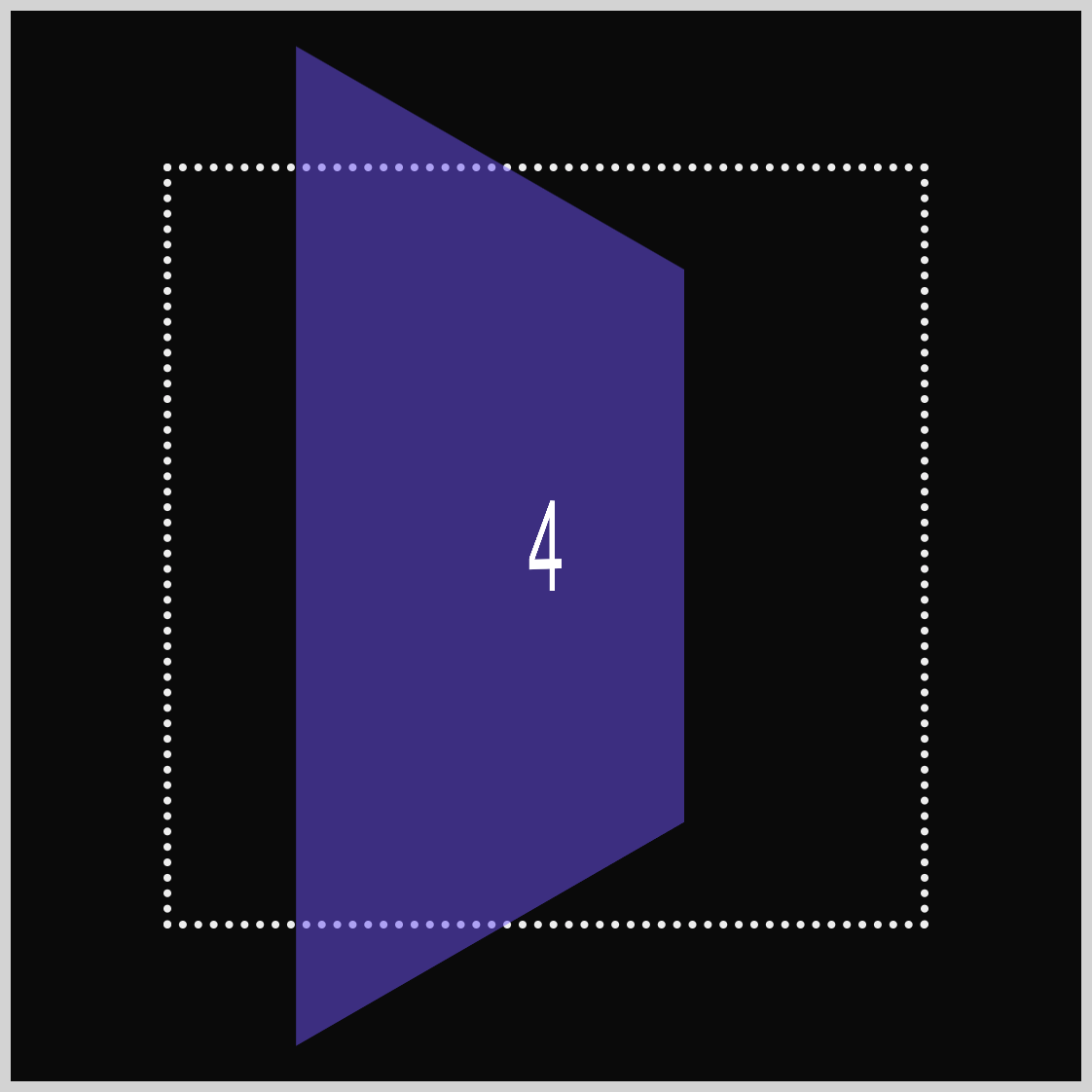
    transform: scale3d(0.95, 0.95, 0.95) rotate3d(0, 1, 0, 60deg);
  }
}
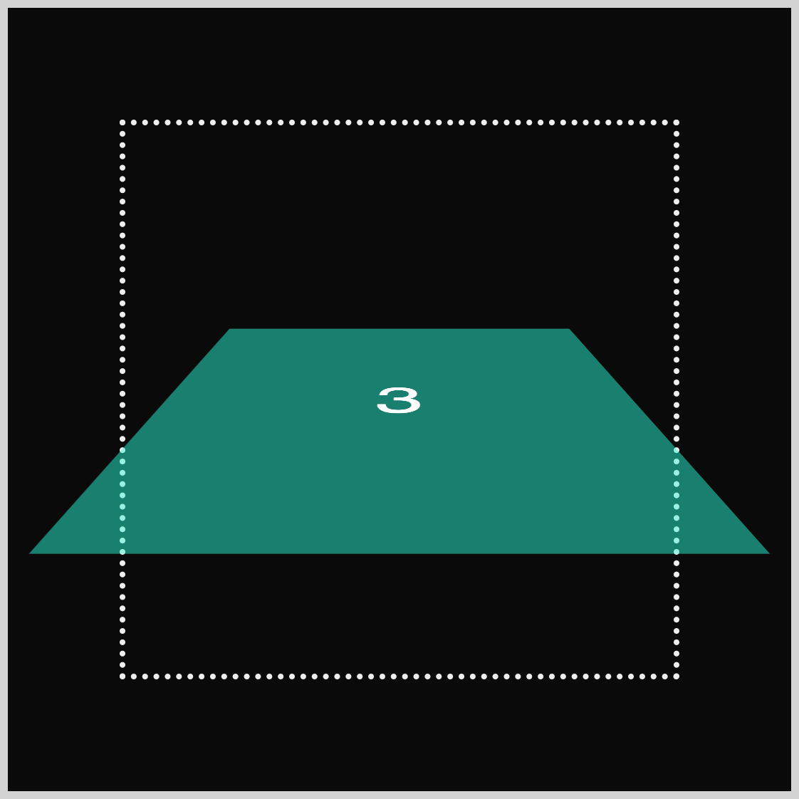
Identical to the previous examples, the animation start state (from) is set to scale3d(1, 1, 1). The animation end state (to) is set to scale3d(0.95, 0.95, 0.95), which scales the square shape to 95% of its original size and rotates it vertically by sixty degrees with rotate3d(0, 1, 0, 60deg).
You can see and play with the complete code on Pyxofy’s CodePen page.
See the Pen CSS Animation – 3D Transforms with scale3d() Function by Pyxofy (@pyxofy) on CodePen.
Conclusion
This article explored the CSS scale3d() function, focusing on its capabilities for horizontal, vertical, and depth scaling. You discovered how to use vertical and horizontal scaling together to change a square into a rectangle and how to reverse that animation.
The last two examples demonstrated how to combine scaling and rotation animations using the CSS scale3d() and rotate3d() functions together, allowing you to simulate three-dimensional (3D) depth. What animations will you create based on what you learned in this article? Share your masterpiece with us on LinkedIn, Threads, Bluesky, Mastodon, X (Twitter) @pyxofy, or Facebook.
We hope you liked this article. Kindly share it with your network. We appreciate it.
Related Articles


