CSS Animation – 3D Transforms Using translate3d()
2D? Nope. We live in a three-dimensional (3D) world! Learn 3D transforms using the CSS translate3d() and many more in this step-by-step article.

Introduction
Screens may be two-dimensional (2D), but don’t let it prevent you from simulating three-dimensional (3D) images and objects. This article will teach you how to utilize the CSS translate3d() function to create 3D transforms.
CSS functions and properties explored in this article:
translate3d()translateX()translateY()translateZ()perspective
Preview
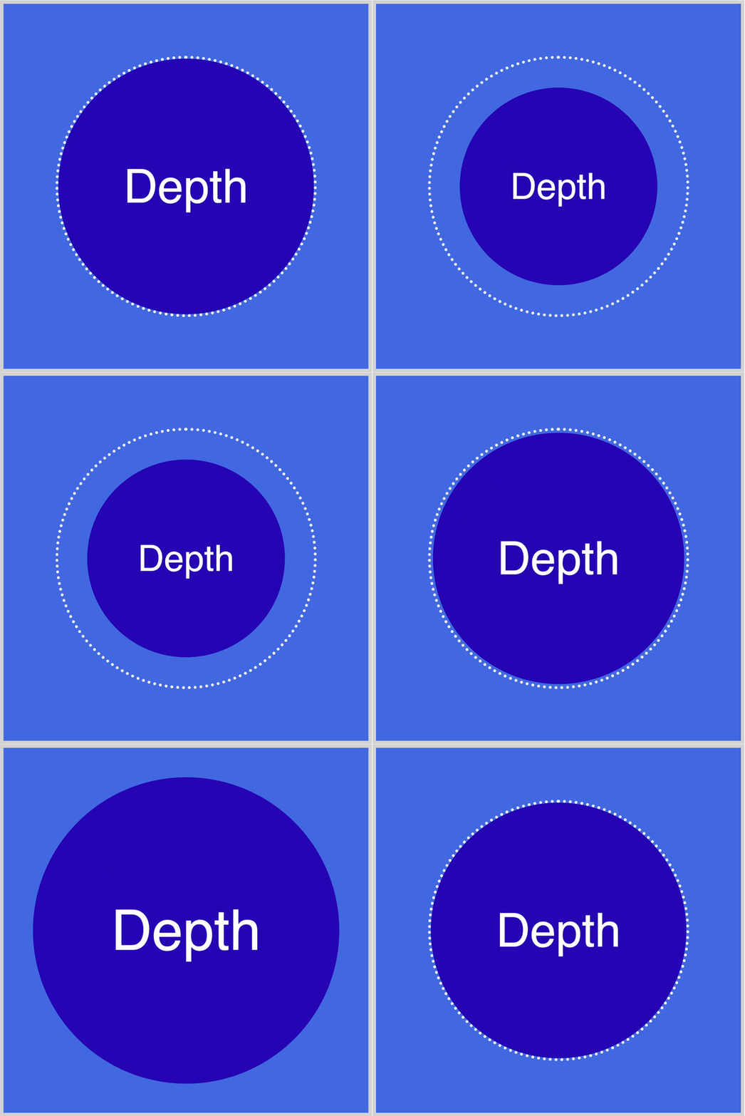
The Depth example shows you how to control the element’s z-axis.
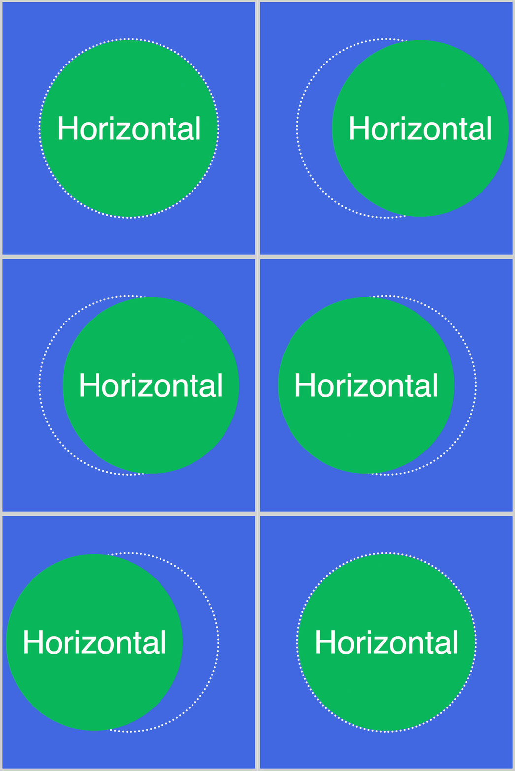
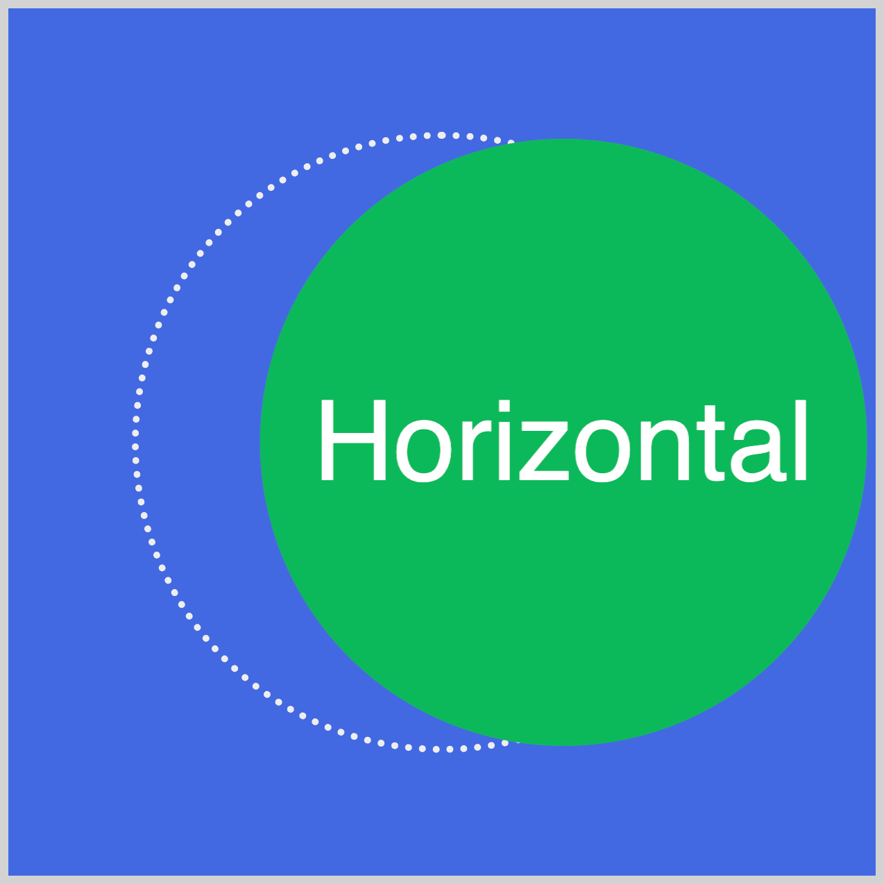
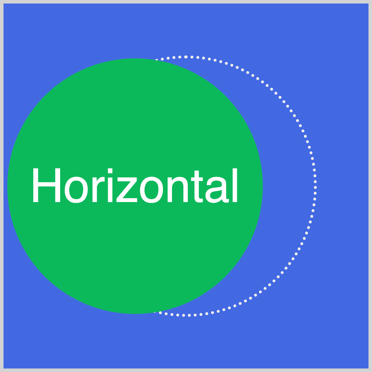
The Horizontal or x-axis example demonstrates how to move the circle from side to side.
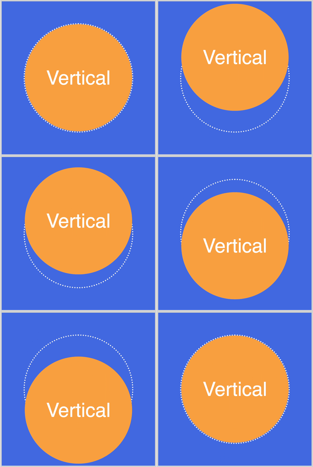
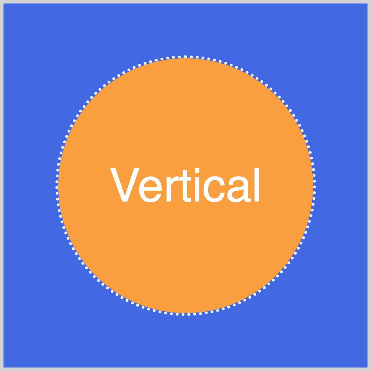
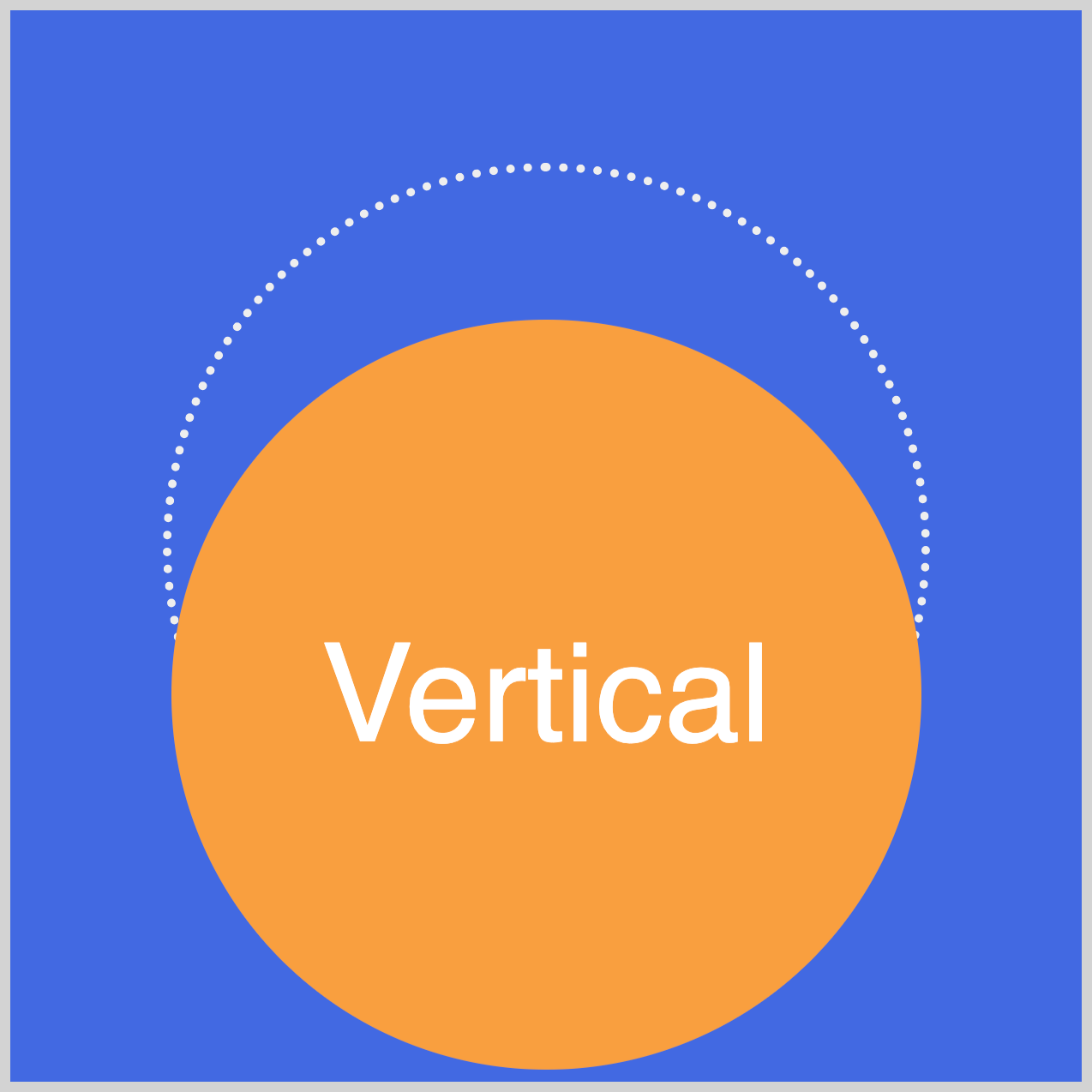
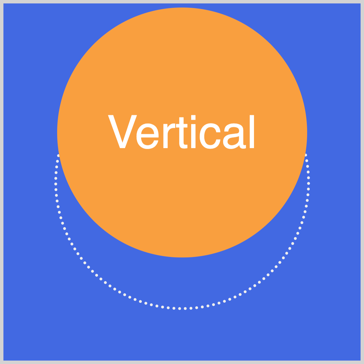
The third example, Vertical, illustrates how to manage the y-axis of the element.
Prerequisites
Essential CSS and HTML knowledge will help you understand the concepts and techniques introduced in this article. Jump over to this article if you require an HTML and CSS primer.
We assume you have configured tools to modify CSS. If not, this article will guide you through the setup process.
Please read this article if you’re unfamiliar with CSS animation and the @keyframes at-rule property.
HTML Structure
<div class="container">
  <div class="shape-container">
    <div class="circle depth">Depth</div>
  </div>
</div>
<div class="container">
  <div class="shape-container">
    <div class="circle horizontal">Horizontal</div>
  </div>
</div>
<div class="container">
  <div class="shape-container">
    <div class="circle vertical">Vertical</div>
  </div>
</div>
container is the outermost enclosure. It enables the content to be centered and draws a light gray border. The rest of the divs represent each animation sequence.
Keep the HTML structure as is for the animation to display correctly.
Body and Container Div CSS
CSS code for the body and container div.
/* Body and Container Settings */
/* Center shapes */
body {
  margin: 0;
  padding: 0;
  height: 100vh;
  display: flex;
  justify-content: center;
  align-items: center;
  flex-wrap: wrap;
}

/* Set background and border color */
.container {
  min-width: 500px;
  height: 500px;
  border: 5px solid lightgray;
  background: royalblue;
  position: relative;
  margin: 5px;
  display: flex;
  justify-content: center;
  align-items: center;
}
translate3d() Function
Using the translate3d() function, you can reposition or translate elements in three-dimensional (3D) space. 3D space has three axes or vectors:
- Horizontal or x-axis
- Vertical or y-axis
- Depth or z-axis
The translate3d() function accepts all three axes parameter values using this syntax.
translate3d(tx, ty, tz)
txcan be a length or percentage valuetycan be a length or percentage valuetzcan only be a length value; setting a percentage value will invalidate the translate command
You can assign values separately to perform a single-axis translation or combine multiple values for a multi-axis translation. As an alternative, you can use single-axis translate CSS functions such as:
translateX(): translates an element horizontallytranslateY(): translates an element verticallytranslateZ(): translates an element along the z-axis
The translate3d() function is considered a shorthand property for the above three functions. Using shorthand properties makes your CSS style sheets more concise and readable.
Let’s start working on the shape container and the circle in the next section.
Shape Container and Circle
In this section, you’ll make the shape container and the circle. The shape container encapsulates the circle and has a white dotted border.
<div class="shape-container">
  <div class="circle depth">Depth</div>
</div>
The circle and depth elements are placed within the shape-container div element.
/* Shape Container */
.shape-container {
  position: relative;
  width: 350px;
  height: 350px;
  border: 4px dotted #eeeeee;
  border-radius: 50%;
  perspective: 600px;
}
The shape container has a relative position value and is 350px wide and high. It has a 4px wide dotted white border, #eeeeee, and the corners are rounded out using border-radius: 50%. The CSS perspective property value, which determines the distance between the z-plane and the user, is set to 600px.
/* Circle */
.circle {
  position: relative;
  width: 100%;
  height: 100%;
  border-radius: 50%;
  color: white;
  font-family: sans-serif;
  font-size: 4em;
  display: flex;
  justify-content: center;
  align-items: center;
}
The circle’s width and height property values are set to 100%. The font color is white, it uses the sans-serif font family, and the font size is 4em. To center the text within the circle, set the display property to flex, and use center for both justify-content and align-items CSS properties.
Next up is the depth z-axis example.
Depth z-axis
Our first example uses translate3d()’s depth or z-axis translate feature.
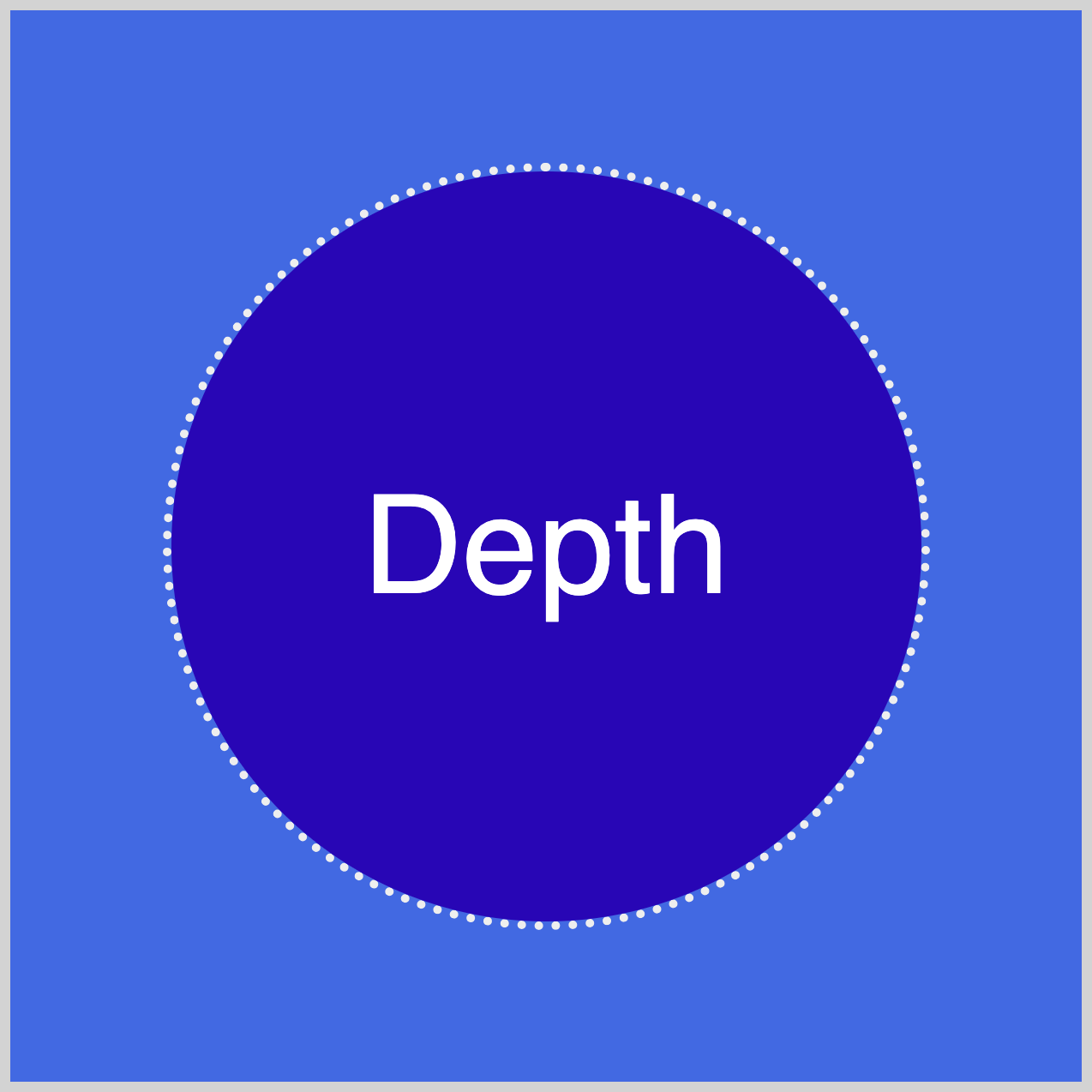
.circle.depth {
  animation: depth-animation 1.5s ease-in-out infinite alternate;
  background: #2708b5;
}
The .circle.depth CSS selector targets HTML elements that have both the circle and depth classes. This dual selector pattern is also repeated in the subsequent examples.
The animation is called depth-animation and lasts for 1.5 seconds (1.5s). It uses an easing function of ease-in-out and repeats indefinitely with infinite. Additionally, the alternate property value reverses the cycle of the animation direction.
The circle background is set to #2708b5, a neon blue shade.
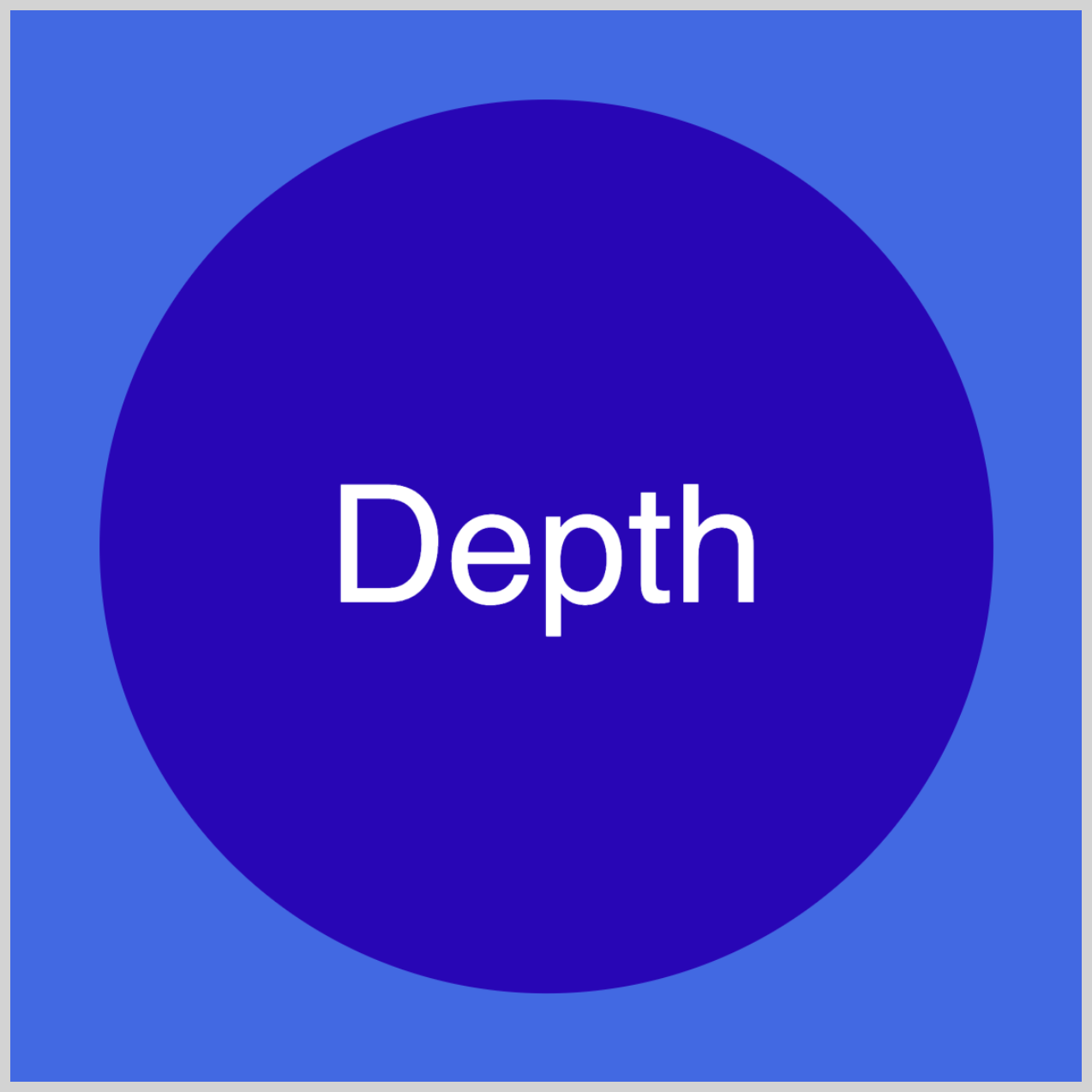
@keyframes depth-animation {
  from {
    transform: translate3d(0, 0, 100px);
  }
  to {
    transform: translate3d(0, 0, -200px);
  }
}
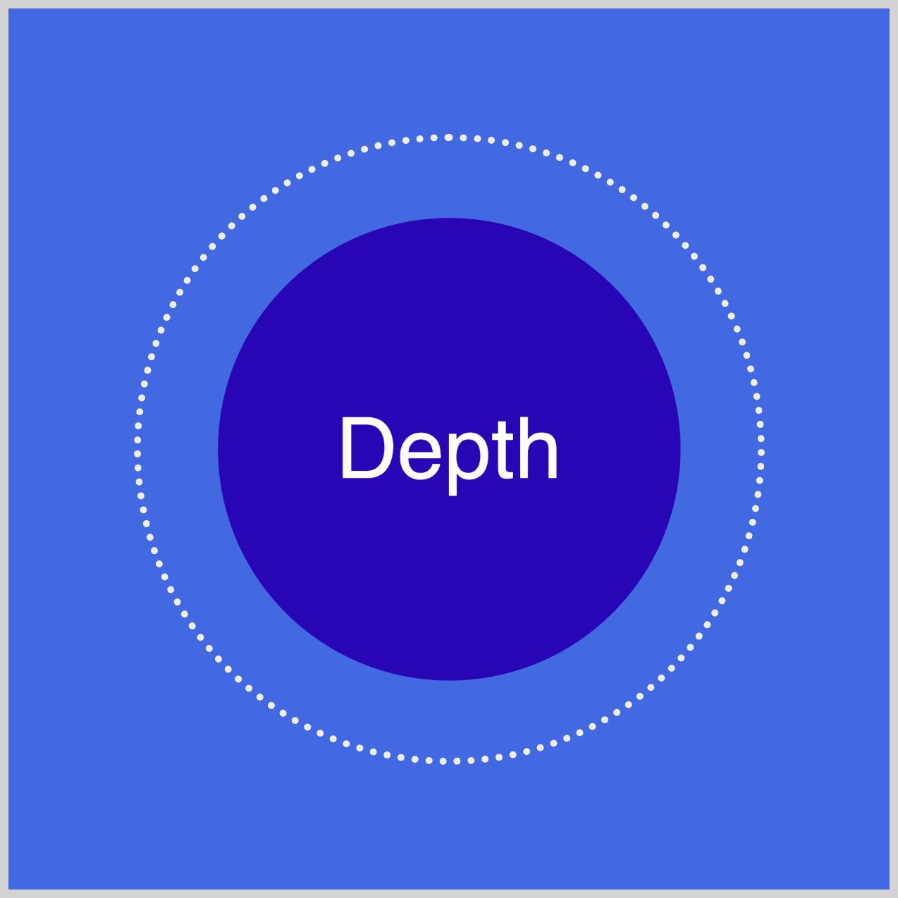
You specify 100px for the third parameter of the function to adjust the depth or z-axis of the element. By setting it to 100px, the element moves closer to the foreground. A -200px parameter value will shift the element toward the background, giving the circle a smaller appearance.
Let’s work on the horizontal translation in the next section.
Horizontal x-axis
The green circle will initially move to the right and then move to the left side of the screen.
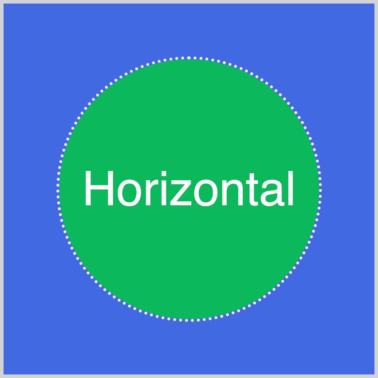
.circle.horizontal {
  animation: horizontal-animation 1.5s ease-in-out infinite alternate;
  background: #08b95b;
}
Apart from the animation name, horizontal-animation, the other settings are the same as the Depth example. The circle background is set to a green hue with background: #08b95b.
@keyframes horizontal-animation {
  from {
    transform: translate3d(70px, 0, 0);
  }
  to {
    transform: translate3d(-70px, 0, 0);
  }
}
Specifying 70px in the first parameter moves the green circle to the right. By setting -70px in the @keyframes to state, the circle moves to the left side of the screen.
The last example will move the circle on its vertical y-axis.
Vertical y-axis
translater3d()’s second parameter controls the vertical y-axis of the selected element.
.circle.vertical {
  animation: vertical-animation 1.5s ease-in-out infinite alternate;
  background: #f99f3e;
}
The animation name is set to vertical-animation, and the background color is set to #f99f3e, a deep Saffron color.
@keyframes vertical-animation {
  from {
    transform: translate3d(0, 70px, 0);
  }
  to {
    transform: translate3d(0, -70px, 0);
  }
}
The circle will descend by 70px in the from state and will move upwards to the @keyframes to state by -70px.
You can see and play with the complete code on Pyxofy’s CodePen page.
See the Pen CSS Animation – 3D Transforms Using translate3d() by Pyxofy (@pyxofy) on CodePen.
Conclusion
The CSS translate3d() 3D function provides complete control over an element’s depth (z-axis), vertical (y-axis), and horizontal (x-axis) positioning on the screen. You can use a single parameter for a single-axis transformation or all its parameters for multi-axis element translation.
Combining colored shapes and text elements and moving them across the screen is not only fun but also captivating. Using the translate3d() function, what kind of 3D animation will you create?
Share your masterpiece with us on LinkedIn, Threads, Mastodon, X (Twitter) @pyxofy, or Facebook.
We hope you liked this article. Kindly share it with your network. We appreciate it.
Related Articles


