CSS Animation – Car Driving Infinite Scroll – Part 1
Infinite, auto-scrolling animations are amazing to look at and easy to create with CSS. Learn how in this multi-part, step-by-step article.
Introduction
Don’t you love infinite scroll animations? They’re mesmerizing and fun to look at.
In this multi-part article, you’ll combine the repeating-linear-gradient and transform CSS properties to make a car driving scene.
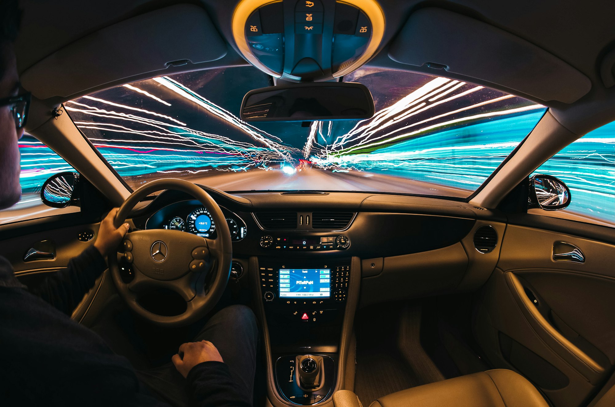
Preview
Car Driving Infinite Scroll

Prerequisites
Essential CSS and HTML knowledge will help you understand the concepts and techniques introduced in this article. Jump over to this article if you require an HTML and CSS primer.
We assume that you have set up tools to create CSS animation. If you haven’t, this article will show you how to set them up.
Please read this article if you’re unfamiliar with CSS animation and the @keyframes at-rule property.
HTML Structure
<div class="container">
    <!-- Foreground -->
	<div class="foreground-container">
    	<div class="street-sideline"></div>
        <div class="street-middle-line"></div>
    </div>
    <!-- Car -->
	<div class="car-container">
		<div class="car-roof"></div>
        <div class="car-body"></div>
        <div class="design-line"></div>
        <div class="window"></div>
        <div class="head-light"></div>
        <div class="fog-light"></div>
        <div class="door-knob"></div>
        <div class="tail-light"></div>
	</div>
    <!-- Tire -->
    <div class="front-tire"></div>
    <div class="back-tire"></div>
</div>
container is the outermost enclosure. It enables the content to be centered and draws a light gray border. The rest of the divs represent each animation sequence.
Keep the HTML structure as is for each animation to display correctly.
Body and Container Div CSS
CSS code for the body and container div.
/* Body and Container Settings */
/* Center shapes */
body {
  margin: 0;
  padding: 0;
  height: 100vh;
  display: flex;
  justify-content: center;
  align-items: center;
  flex-wrap: wrap;
}

/* Set background and border color */
.container {
  min-width: 500px;
  height: 500px;
  border: 5px solid lightgray;
  background: transparent;
  position: relative;
  margin: 5px;
  display: flex;
  justify-content: center;
  align-items: center;
  overflow: hidden;
}
Foreground Street
The foreground street has three parts
- Street Foundation
- Sideline
- Middle line

All three parts are 1700px wide to create the infinite loop effect.
You use the CSS overflow property to enclose the three parts within its container. Read this article for details on how to use the overflow property.
 Pyxofy
Let’s break down each part.

/* Foreground Street Foundation */
.foreground-container {
  position: absolute;
  width: 1700px;
  height: 150px;
  top: 350px;
  left: 0;
  background: #33312b;
}
- The street foundation
widthis set to1700pxandheightis set to150px. - The position is
350pxfrom thetopand0pixels from theleft. - The background color is set to
#33312b, a dark graphite hue.

/* Street Sideline */
.street-sideline {
  position: absolute;
  width: 1700px;
  height: 20px;
  top: 120px;
  left: 0;
  background: white;
}
The street sideline is a white line that’s 1700px wide and 20px high. It’s positioned 120px from the top.

/* Street Middle Line */
.street-middle-line {
  position: absolute;
  width: 1700px;
  height: 10px;
  top: 35px;
  left: 0;
  background: repeating-linear-gradient(
    to right,
    #33312b 5% 15%,
    white 15% 20%
  );
}
The street middle line is drawn using the CSS repeating-linear-gradient function. You create a repeating pattern using two colors, white and #33321b, a graphite hue. #33321b is drawn between 5% and 15%. After that, white is painted between 15% and 20%. This color pattern repeats within the background’s 1700px width.
If you’re unfamiliar with repeating-linear-gradient, read this article.
Pyxofy
You will apply a blur effect to the foreground street as a finishing touch.

/* Foreground Street Foundation */
.foreground-container {
  filter: blur(1px);
}
You use the CSS filter: blur() function to apply a Gaussian blur effect to the street elements. The blur is set to 1px, but feel free to change it to your liking.
In the next section, let’s animate the street to infinitely scroll horizontally.
Street Animation
You will use the transform: translate() CSS function to create the street animation.
/* Foreground Street Foundation */
.foreground-container {
  animation: foreground 1s linear infinite;
}
The animation name is foreground. It lasts for one second, 1s. The animation will be linear and repeat infinitely.
@keyframes foreground {
  from {
    left: 0;
  }
  to {
    left: -51%;
  }
}
The 1700px street will move from left 0 to -51%, meaning the entire street image will move from right to left.
In the following section, we’ll add a sporty electric car to the street to complete the driving scene.
Adding the Sporty Electric Car
We’ll be using the sporty electric car CSS art in this article.
Pyxofy
To animate the car body and tires separately, their HTML elements were separated as follows
<!-- Car -->
<div class="car-container">
	<div class="car-roof"></div>
    <div class="car-body"></div>
    <div class="design-line"></div>
    <div class="window"></div>
    <div class="head-light"></div>
    <div class="fog-light"></div>
    <div class="door-knob"></div>
    <div class="tail-light"></div>
</div>
<!-- Tire -->
<div class="front-tire"></div>
<div class="back-tire"></div>
Let’s start with the tire animation.
Car Tire Animation
The car tire has two circular lines. You’ll animate these two lines to simulate a spinning tire.

{
border: 2px solid transparent;
border-left: 2px solid black;
border-right: 2px solid black;
border-radius: 50%;
filter: blur(2px);
}
A solid 2px black border is added to the left and right sides to create the circular lines.

{
filter: blur(2px);
}
Add filter: blur(2px); to both .front-tire::after and .back-tire::after CSS selectors to simulate a Gaussian blur.

Add the animation property below to the .front-tire and .back-tire CSS selectors to rotate the tires.
animation: tire-animation 0.5s linear infinite;
The CSS transform: rotate() function rotates both tire images.
@keyframes tire-animation {
  from {
    transform: rotate(0deg);
  }
  to {
    transform: rotate(350deg);
  }
}
The tires will rotate from 0 to 350 degrees.
Next up will be the car body animation.
Car Body Animation
Modern cars have suspension for a smoother ride experience. Let’s simulate that suspension up and down motion using CSS.
/* Car */
.car-container {
  animation: car-body 1s linear infinite;
}
Add the animation property to the car-container CSS selector. The animation name is car-body, set to 1 second, linear, and will loop infinitely.
@keyframes car-body {
  from {
    transform: translateY(0);
  }
  50% {
    transform: translateY(3px);
  }
  to {
    transform: translateY(0);
  }
}
The CSS transform: translateY() makes the car body move up and down. The car body will rise 3 pixels and return to its initial state.
This concludes all the CSS code and animation for this article. You can see and play with the complete code on Pyxofy’s CodePen page.
See the Pen CSS Animation - Car Drive by Pyxofy (@pyxofy) on CodePen.
Conclusion
You created an infinite scrolling car driving scene in this article.
The CSS repeating-linear-gradient was used to make the street middle lines. You used the filter: blur() function to add a Gaussian blur effect to the street and car tires.
You used the CSS transform: rotate property to animate the car tires and the transform: translate property to make the car body move up and down.
Customize the code to your liking. How about giving the street a lighter color or making the middle lines longer? Share your masterpiece with us on X (Twitter) @pyxofy, LinkedIn, Mastodon, or Facebook.
We hope you liked this article. Kindly share it with your network. We appreciate it.
Articles
Pyxofy
 Pyxofy
 Pyxofy